Data Visualization. or Graphical Data Presentation. Jerzy Stefanowski Instytut Informatyki
|
|
|
- Walter Pope
- 10 years ago
- Views:
Transcription
1 Data Visualization or Graphical Data Presentation Jerzy Stefanowski Instytut Informatyki Data mining for SE

2 Ack. Inspirations are coming from: G.Piatetsky Schapiro lectures on KDD J.Han on Data Mining Ken Brodlie Envisioning Information Chris North Information Visualisation

3

4 What is visualization and data mining? Visualize: To form a mental vision, image, or picture of (something not visible or present to the sight, or of an abstraction); to make visible to the mind or imagination. Visualization is the use of computer graphics to create visual images which aid in the understanding of complex, often massive representations of data. Visual Data Mining is the process of discovering implicit but useful knowledge from large data sets using visualization techniques.

5 Tables vs graphs A table is best when: You need to look up specific values Users need precise values You need to precisely compare related values You have multiple data sets with different units of measure A graph is best when: The message is contained in the shape of the values You want to reveal relationships among multiple values (similarities and differences) Show general trends You have large data sets Graphs and tables serve different purposes. Choose the appropriate data display to fit your purpose.

6 Exploratory Data Analysis Pioneer -> John Tukey New approach to data analysis, heavily based on visualization, as an alternative to classical data analysis See its bio Two stage process: Exploratory: Search for evidence using all tools available Confirmatory: evaluate strength of evidence using classical data analysis

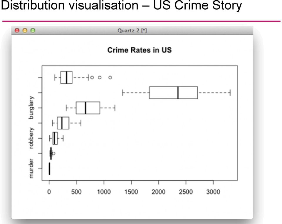
7 Box Plots In some situations we have, not a single data value at a point, but a number of data values, or even a probability distribution When might this occur? Tukey proposed the idea of a boxplot to visualize the distribution of values For explanation and some history, see: M median Q1, Q3 quarrtiles Whiskers 1.5 * interquartile range Dots - outliers Darwin s plant study WhiskerPlot.html

8 Distribution visualisation US Crime Story
9 Data Visualization Common Display Types Common Display Types Bar Charts Line Charts Pie Charts Bubble Charts Stacked Charts Scatterplots

10 When to use which type? Line Graph x-axis requires quantitative variable Variables have contiguous values Familiar/conventional ordering among ordinals % 80% R 2 = % 40% 20% 0% Bar Graph Comparison of relative point values Scatter Plot Convey overall impression of relationship between two variables Pie Chart Emphasizing differences in proportion among a few numbers

11 Line Graph Trend visualization Fundamental technique of data presentation Used to compare two variables X-axis is often the control variable Y-axis is the response variable Good at: Showing specific values Trends Trends in groups (using multiple line graphs) Students participating in sporting activities Mobile Phone use Note: graph labelling is fundamental

12 Time line graph show dynamics of measurements

13 Stratified graphs Trends of values with respect to time and different qualitative categories

14 Demo Baby Names Voyager

15 Scatter Plot Wykresy rozrzutu XY Used to present measurements of two variables Effective if a relationship exists between the two variables Car ownership by household income Example taken from NIST Handbook Evidence of strong positive correlation

16

17 Simple Representations Bar Graph Bar graph Presents categorical variables Height of bar indicates value Double bar graph allows comparison Note spacing between bars Can be horizontal (when would you use this?) Number of police officers Note more space for labels Internet use at a school

18 Dot Graph Very simple but effective Horizontal to give more space for labelling

19 Bad Visualization: Spreadsheet Year Sales , , , , , Sales Sales What is wrong with this graph?

20 Bad Visualization: Spreadsheet with misleading Y axis Year Sales , , , , , Sales Sales Y-Axis scale gives WRONG impression of big change

21 Better Visualization Year Sales , , , , , Sales Sales Axis from 0 to 2000 scale gives correct impression of small change + small formatting tricks
22 Integrating various graphs
23 Pie Chart Pie chart summarises a set of categorical/nominal data But use with care too many segments are harder to compare than in a bar chart Should we have a long lecture? Favourite movie genres
24 Visualizing in 4+ Dimensions Extensions of Scatterplots Parallel Coordinates Radar Figures Other tools
25 Multiple Views Give each variable its own display 1 A B C D E Problem: does not show correlations A B C D E
26 Tableau bar comparisons
27 Buisness Analytics Tools Manager Dashboards
28 Scatterplot Matrix Represent each possible pair of variables in their own 2-D scatterplot (car data) Q: Useful for what? A: linear correlations (e.g. horsepower & weight) Q: Misses what? A: multivariate effects
29 Parallel Coordinates Encode variables along a horizontal row Vertical line specifies values Dataset in a Cartesian coordinates Same dataset in parallel coordinates Invented by Alfred Inselberg while at IBM,
30 Parallel Coordinates: 4 D Sepal Length Sepal Width Petal length Petal Width sepal sepal petal petal length width length width
31 Parallel Coordinates Plots for Iris Data
32 Radar Figures Agregate multidimensional observations Each observation gets a separate colour or graph symbols Variables corresponds to angles
33 Wybrana dziedzina Wykres radarowy oceny wskaźników w ramach dziedziny I poziom oceny
34 F. Nightingale (1856) abstract representation
35 Buisness Analytics Tools Typical Reports Raport more traditional Other forms
36 Buisness Analytics Tools Manager Dashboards
37 Bars in business dashboards Tableau Software
38 Data analytics kokpity menadżerskie
39 Multidimensional Stacking
40 Multidimensional presentation of nominal attributes VL1 diagrams (Michalski 70) for machine learning STAGGER and concept drif
41 Hierarchiczne wizualizacje - Treemaps Treemaps display hierarchical data using rectangles. Each branch of the tree is assigned a rectangle. Then each sub-branch gets assigned to a rectangle and this continues recursively until a leaf node is found. Depending on choice the rectangle representing the leaf node is colored, sized or both according to chosen attributes.
42
43
44 Gapminder Motion Charts Using Bubble presentations
45 Spotfire
46 Chernoff Faces Encode different variables values in characteristics of human face Cute applets:
47
48 Hierarchical Techniques Cone Trees [RMC91] animated 3D visualizations of hierarchical data file system structure visualized as a cone tree
49 Abstract Hierarchical Information Preview Traditional Treemap Hyperbolic Tree ConeTree SunTree Botanical
50 Visualization of Search Results & Inter-Document Similarities
51 Abstract Text MetaSearch Previews Grokker Kartoo MSN Lycos AltaVista MetaCrystal searchcrystal
52 Other buisness tools
53 Visualization of different conditions
54 Overview and Detail
55 Brushing and Linking
56 Census Data
57 57 Visualization of Association Rules in SGI/MineSet 3.0
58 IBM Miner visualization of mining results
59 SGI other tools
60 Graph-based Techniques Narcissus Visualization of a larg number of web pages visualization of compl highly interconnected data
61 Visualization of knowledge discovery process A graphical tool for arranging components / steps of KDD Just a graph flow of actions Graphical objects plug and place Parametrization Often you may produce a kind of scipt representing a graphical flow of KD process
62 Statsoft Data mining graphical panel
63 RapidMiner (YALE)
64 Tukey s recommendations
65 Tufte s Principles of Graphical Excellence Give the viewer the greatest number of ideas in the shortest time with the least ink in the smallest space. Tell the truth about the data!.r. Tufte, The Visual Display of Quantitative Information,, 2nd edition)
66 Look for other references And play with different software tools Excel is not the only and best software
67 Thank you for you coming to my lecture and asking questions!
Data Exploration Data Visualization
 Data Exploration Data Visualization What is data exploration? A preliminary exploration of the data to better understand its characteristics. Key motivations of data exploration include Helping to select
Diagrams and Graphs of Statistical Data
 Diagrams and Graphs of Statistical Data One of the most effective and interesting alternative way in which a statistical data may be presented is through diagrams and graphs. There are several ways in
Information Visualization Multivariate Data Visualization Krešimir Matković
 Information Visualization Multivariate Data Visualization Krešimir Matković Vienna University of Technology, VRVis Research Center, Vienna Multivariable >3D Data Tables have so many variables that orthogonal
CSU, Fresno - Institutional Research, Assessment and Planning - Dmitri Rogulkin
 My presentation is about data visualization. How to use visual graphs and charts in order to explore data, discover meaning and report findings. The goal is to show that visual displays can be very effective
Data Visualization Handbook
 SAP Lumira Data Visualization Handbook www.saplumira.com 1 Table of Content 3 Introduction 20 Ranking 4 Know Your Purpose 23 Part-to-Whole 5 Know Your Data 25 Distribution 9 Crafting Your Message 29 Correlation
Visualization Quick Guide
 Visualization Quick Guide A best practice guide to help you find the right visualization for your data WHAT IS DOMO? Domo is a new form of business intelligence (BI) unlike anything before an executive
Iris Sample Data Set. Basic Visualization Techniques: Charts, Graphs and Maps. Summary Statistics. Frequency and Mode
 Iris Sample Data Set Basic Visualization Techniques: Charts, Graphs and Maps CS598 Information Visualization Spring 2010 Many of the exploratory data techniques are illustrated with the Iris Plant data
an introduction to VISUALIZING DATA by joel laumans
 an introduction to VISUALIZING DATA by joel laumans an introduction to VISUALIZING DATA iii AN INTRODUCTION TO VISUALIZING DATA by Joel Laumans Table of Contents 1 Introduction 1 Definition Purpose 2 Data
TIES443. Lecture 9: Visualization. Lecture 9. Course webpage: http://www.cs.jyu.fi/~mpechen/ties443. November 17, 2006
 TIES443 Lecture 9 Visualization Mykola Pechenizkiy Course webpage: http://www.cs.jyu.fi/~mpechen/ties443 Department of Mathematical Information Technology University of Jyväskylä November 17, 2006 1 Topics
Data Mining: Exploring Data. Lecture Notes for Chapter 3. Introduction to Data Mining
 Data Mining: Exploring Data Lecture Notes for Chapter 3 Introduction to Data Mining by Tan, Steinbach, Kumar Tan,Steinbach, Kumar Introduction to Data Mining 8/05/2005 1 What is data exploration? A preliminary
Principles of Data Visualization for Exploratory Data Analysis. Renee M. P. Teate. SYS 6023 Cognitive Systems Engineering April 28, 2015
 Principles of Data Visualization for Exploratory Data Analysis Renee M. P. Teate SYS 6023 Cognitive Systems Engineering April 28, 2015 Introduction Exploratory Data Analysis (EDA) is the phase of analysis
Data Mining: Exploring Data. Lecture Notes for Chapter 3. Slides by Tan, Steinbach, Kumar adapted by Michael Hahsler
 Data Mining: Exploring Data Lecture Notes for Chapter 3 Slides by Tan, Steinbach, Kumar adapted by Michael Hahsler Topics Exploratory Data Analysis Summary Statistics Visualization What is data exploration?
Data Visualization Techniques
 Data Visualization Techniques From Basics to Big Data with SAS Visual Analytics WHITE PAPER SAS White Paper Table of Contents Introduction.... 1 Generating the Best Visualizations for Your Data... 2 The
Data Mining: Exploring Data. Lecture Notes for Chapter 3. Introduction to Data Mining
 Data Mining: Exploring Data Lecture Notes for Chapter 3 Introduction to Data Mining by Tan, Steinbach, Kumar What is data exploration? A preliminary exploration of the data to better understand its characteristics.
COM CO P 5318 Da t Da a t Explora Explor t a ion and Analysis y Chapte Chapt r e 3
 COMP 5318 Data Exploration and Analysis Chapter 3 What is data exploration? A preliminary exploration of the data to better understand its characteristics. Key motivations of data exploration include Helping
Visualizing Data. Contents. 1 Visualizing Data. Anthony Tanbakuchi Department of Mathematics Pima Community College. Introductory Statistics Lectures
 Introductory Statistics Lectures Visualizing Data Descriptive Statistics I Department of Mathematics Pima Community College Redistribution of this material is prohibited without written permission of the
Visualization Techniques in Data Mining
 Tecniche di Apprendimento Automatico per Applicazioni di Data Mining Visualization Techniques in Data Mining Prof. Pier Luca Lanzi Laurea in Ingegneria Informatica Politecnico di Milano Polo di Milano
Visualization methods for patent data
 Visualization methods for patent data Treparel 2013 Dr. Anton Heijs (CTO & Founder) Delft, The Netherlands Introduction Treparel can provide advanced visualizations for patent data. This document describes
Cours de Visualisation d'information InfoVis Lecture. Multivariate Data Sets
 Cours de Visualisation d'information InfoVis Lecture Multivariate Data Sets Frédéric Vernier Maître de conférence / Lecturer Univ. Paris Sud Inspired from CS 7450 - John Stasko CS 5764 - Chris North Data
Visualization Software
 Visualization Software Maneesh Agrawala CS 294-10: Visualization Fall 2007 Assignment 1b: Deconstruction & Redesign Due before class on Sep 12, 2007 1 Assignment 2: Creating Visualizations Use existing
Hierarchical Data Visualization
 Hierarchical Data Visualization 1 Hierarchical Data Hierarchical data emphasize the subordinate or membership relations between data items. Organizational Chart Classifications / Taxonomies (Species and
Exploratory data analysis (Chapter 2) Fall 2011
 Fall 2011") Exploratory data analysis (Chapter 2) Fall 2011 Data Examples Example 1: Survey Data 1 Data collected from a Stat 371 class in Fall 2005 2 They answered questions about their: gender, major, year in school,
Exploratory data analysis (Chapter 2) Fall 2011 Data Examples Example 1: Survey Data 1 Data collected from a Stat 371 class in Fall 2005 2 They answered questions about their: gender, major, year in school,
All Visualizations Documentation
 All Visualizations Documentation All Visualizations Documentation 2 Copyright and Trademarks Licensed Materials - Property of IBM. Copyright IBM Corp. 2013 IBM, the IBM logo, and Cognos are trademarks
CS171 Visualization. The Visualization Alphabet: Marks and Channels. Alexander Lex [email protected]. [xkcd]
![CS171 Visualization. The Visualization Alphabet: Marks and Channels. Alexander Lex alex@seas.harvard.edu. [xkcd]](/thumbs/39/19465011.jpg "CS171 Visualization. The Visualization Alphabet: Marks and Channels. Alexander Lex alex@seas.harvard.edu. [xkcd]") CS171 Visualization Alexander Lex [email protected] The Visualization Alphabet: Marks and Channels [xkcd] This Week Thursday: Task Abstraction, Validation Homework 1 due on Friday! Any more problems
CS171 Visualization Alexander Lex [email protected] The Visualization Alphabet: Marks and Channels [xkcd] This Week Thursday: Task Abstraction, Validation Homework 1 due on Friday! Any more problems
Numbers as pictures: Examples of data visualization from the Business Employment Dynamics program. October 2009
 Numbers as pictures: Examples of data visualization from the Business Employment Dynamics program. October 2009 Charles M. Carson 1 1 U.S. Bureau of Labor Statistics, Washington, DC Abstract The Bureau
Data Visualization Techniques
 Data Visualization Techniques From Basics to Big Data with SAS Visual Analytics WHITE PAPER SAS White Paper Table of Contents Introduction.... 1 Generating the Best Visualizations for Your Data... 2 The
Tutorial 3: Graphics and Exploratory Data Analysis in R Jason Pienaar and Tom Miller
 Tutorial 3: Graphics and Exploratory Data Analysis in R Jason Pienaar and Tom Miller Getting to know the data An important first step before performing any kind of statistical analysis is to familiarize
Microsoft Business Intelligence Visualization Comparisons by Tool
 Microsoft Business Intelligence Visualization Comparisons by Tool Version 3: 10/29/2012 Purpose: Purpose of this document is to provide a quick reference of visualization options available in each tool.
Exercise 1.12 (Pg. 22-23)
") Individuals: The objects that are described by a set of data. They may be people, animals, things, etc. (Also referred to as Cases or Records) Variables: The characteristics recorded about each individual.
Individuals: The objects that are described by a set of data. They may be people, animals, things, etc. (Also referred to as Cases or Records) Variables: The characteristics recorded about each individual.
Northumberland Knowledge
 Northumberland Knowledge Know Guide How to Analyse Data - November 2012 - This page has been left blank 2 About this guide The Know Guides are a suite of documents that provide useful information about
Multi-Dimensional Data Visualization. Slides courtesy of Chris North
 Multi-Dimensional Data Visualization Slides courtesy of Chris North What is the Cleveland s ranking for quantitative data among the visual variables: Angle, area, length, position, color Where are we?!
Motion Charts: Telling Stories with Statistics
 Motion Charts: Telling Stories with Statistics Victoria Battista, Edmond Cheng U.S. Bureau of Labor Statistics, 2 Massachusetts Avenue, NE Washington, DC 20212 Abstract In the field of statistical and
The Forgotten JMP Visualizations (Plus Some New Views in JMP 9) Sam Gardner, SAS Institute, Lafayette, IN, USA
 Sam Gardner, SAS Institute, Lafayette, IN, USA") Paper 156-2010 The Forgotten JMP Visualizations (Plus Some New Views in JMP 9) Sam Gardner, SAS Institute, Lafayette, IN, USA Abstract JMP has a rich set of visual displays that can help you see the information
Paper 156-2010 The Forgotten JMP Visualizations (Plus Some New Views in JMP 9) Sam Gardner, SAS Institute, Lafayette, IN, USA Abstract JMP has a rich set of visual displays that can help you see the information
Data Visualisation and Its Application in Official Statistics. Olivia Or Census and Statistics Department, Hong Kong, China [email protected].
 Data Visualisation and Its Application in Official Statistics Olivia Or Census and Statistics Department, Hong Kong, China [email protected] Abstract Data visualisation has been a growing topic of
Data Mining and Visualization
 Data Mining and Visualization Jeremy Walton NAG Ltd, Oxford Overview Data mining components Functionality Example application Quality control Visualization Use of 3D Example application Market research
Information visualization examples
 Information visualization examples 350102: GenICT II 37 Information visualization examples 350102: GenICT II 38 Information visualization examples 350102: GenICT II 39 Information visualization examples
What is Visualization? Information Visualization An Overview. Information Visualization. Definitions
 What is Visualization? Information Visualization An Overview Jonathan I. Maletic, Ph.D. Computer Science Kent State University Visualize/Visualization: To form a mental image or vision of [some
A Correlation of. to the. South Carolina Data Analysis and Probability Standards
 A Correlation of to the South Carolina Data Analysis and Probability Standards INTRODUCTION This document demonstrates how Stats in Your World 2012 meets the indicators of the South Carolina Academic Standards
TIBCO Spotfire Business Author Essentials Quick Reference Guide. Table of contents:
 Table of contents: Access Data for Analysis Data file types Format assumptions Data from Excel Information links Add multiple data tables Create & Interpret Visualizations Table Pie Chart Cross Table Treemap
The Value of Visualization 2
 The Value of Visualization 2 G Janacek -0.69 1.11-3.1 4.0 GJJ () Visualization 1 / 21 Parallel coordinates Parallel coordinates is a common way of visualising high-dimensional geometry and analysing multivariate
Using SPSS, Chapter 2: Descriptive Statistics
 1 Using SPSS, Chapter 2: Descriptive Statistics Chapters 2.1 & 2.2 Descriptive Statistics 2 Mean, Standard Deviation, Variance, Range, Minimum, Maximum 2 Mean, Median, Mode, Standard Deviation, Variance,
Chapter 6: Constructing and Interpreting Graphic Displays of Behavioral Data
 Chapter 6: Constructing and Interpreting Graphic Displays of Behavioral Data Chapter Focus Questions What are the benefits of graphic display and visual analysis of behavioral data? What are the fundamental
A GENERAL TAXONOMY FOR VISUALIZATION OF PREDICTIVE SOCIAL MEDIA ANALYTICS
 A GENERAL TAXONOMY FOR VISUALIZATION OF PREDICTIVE SOCIAL MEDIA ANALYTICS Stacey Franklin Jones, D.Sc. ProTech Global Solutions Annapolis, MD Abstract The use of Social Media as a resource to characterize
Exploratory Data Analysis
 Exploratory Data Analysis Learning Objectives: 1. After completion of this module, the student will be able to explore data graphically in Excel using histogram boxplot bar chart scatter plot 2. After
Variables. Exploratory Data Analysis
 Exploratory Data Analysis Exploratory Data Analysis involves both graphical displays of data and numerical summaries of data. A common situation is for a data set to be represented as a matrix. There is
An example. Visualization? An example. Scientific Visualization. This talk. Information Visualization & Visual Analytics. 30 items, 30 x 3 values
 Information Visualization & Visual Analytics Jack van Wijk Technische Universiteit Eindhoven An example y 30 items, 30 x 3 values I-science for Astronomy, October 13-17, 2008 Lorentz center, Leiden x An
WebFOCUS RStat. RStat. Predict the Future and Make Effective Decisions Today. WebFOCUS RStat
 Information Builders enables agile information solutions with business intelligence (BI) and integration technologies. WebFOCUS the most widely utilized business intelligence platform connects to any enterprise
Table of Contents Find the story within your data
 Visualizations 101 Table of Contents Find the story within your data Introduction 2 Types of Visualizations 3 Static vs. Animated Charts 6 Drilldowns and Drillthroughs 6 About Logi Analytics 7 1 For centuries,
MicroStrategy Desktop
 MicroStrategy Desktop Quick Start Guide MicroStrategy Desktop is designed to enable business professionals like you to explore data, simply and without needing direct support from IT. 1 Import data from
White Paper. Data Visualization Techniques. From Basics to Big Data With SAS Visual Analytics
 White Paper Data Visualization Techniques From Basics to Big Data With SAS Visual Analytics Contents Introduction... 1 Tips to Get Started... 1 The Basics: Charting 101... 2 Line Graphs...2 Bar Charts...3
Demographics of Atlanta, Georgia:
 Demographics of Atlanta, Georgia: A Visual Analysis of the 2000 and 2010 Census Data 36-315 Final Project Rachel Cohen, Kathryn McKeough, Minnar Xie & David Zimmerman Ethnicities of Atlanta Figure 1: From
Lecture 2: Descriptive Statistics and Exploratory Data Analysis
 Lecture 2: Descriptive Statistics and Exploratory Data Analysis Further Thoughts on Experimental Design 16 Individuals (8 each from two populations) with replicates Pop 1 Pop 2 Randomly sample 4 individuals
Visualization of Multivariate Data. Dr. Yan Liu Department of Biomedical, Industrial and Human Factors Engineering Wright State University
 Visualization of Multivariate Data Dr. Yan Liu Department of Biomedical, Industrial and Human Factors Engineering Wright State University Introduction Multivariate (Multidimensional) Visualization Visualization
Criteria for Evaluating Visual EDA Tools
 Criteria for Evaluating Visual EDA Tools Stephen Few, Perceptual Edge Visual Business Intelligence Newsletter April/May/June 2012 We visualize data for various purposes. Specific purposes direct us to
Data Visualization - A Very Rough Guide
 Data Visualization - A Very Rough Guide Ken Brodlie University of Leeds 1 What is This Thing Called Visualization? Visualization Use of computersupported, interactive, visual representations of data to
Statistics Revision Sheet Question 6 of Paper 2
 Statistics Revision Sheet Question 6 of Paper The Statistics question is concerned mainly with the following terms. The Mean and the Median and are two ways of measuring the average. sumof values no. of
Relationships Between Two Variables: Scatterplots and Correlation
 Relationships Between Two Variables: Scatterplots and Correlation Example: Consider the population of cars manufactured in the U.S. What is the relationship (1) between engine size and horsepower? (2)
Module 2: Introduction to Quantitative Data Analysis
 Module 2: Introduction to Quantitative Data Analysis Contents Antony Fielding 1 University of Birmingham & Centre for Multilevel Modelling Rebecca Pillinger Centre for Multilevel Modelling Introduction...
On History of Information Visualization
 On History of Information Visualization Mária Kmeťová Department of Mathematics, Constantine the Philosopher University in Nitra, Tr. A. Hlinku 1, Nitra, Slovakia [email protected] Keywords: Abstract: abstract
Effective Big Data Visualization
 Effective Big Data Visualization Every Picture Tells A Story Don t It? Mark Gamble Dir Technical Marketing Actuate Corporation 1 Data Driven Summit 2014 Agenda What is data visualization? What is good?
Figure 1. An embedded chart on a worksheet.
 8. Excel Charts and Analysis ToolPak Charts, also known as graphs, have been an integral part of spreadsheets since the early days of Lotus 1-2-3. Charting features have improved significantly over the
Part 1: Background - Graphing
 Department of Physics and Geology Graphing Astronomy 1401 Equipment Needed Qty Computer with Data Studio Software 1 1.1 Graphing Part 1: Background - Graphing In science it is very important to find and
Information Literacy Program
 Information Literacy Program Excel (2013) Advanced Charts 2015 ANU Library anulib.anu.edu.au/training [email protected] Table of Contents Excel (2013) Advanced Charts Overview of charts... 1 Create a chart...
Data Visualization & Reporting for Case Management
 1 January, 2014 Data Visualization & Reporting for Case Management By Shantanu Paknikar Happiest Minds, IT Services Group Ankit Arya Gautam Karni Suresh Kumar Varun Mehta IIM Rohtak, PGPM 2014 2 Table
Visualizations. Cyclical data. Comparison. What would you like to show? Composition. Simple share of total. Relative and absolute differences matter
 Visualizations Variable width chart Table or tables with embedded charts Bar chart horizontal Circular area chart per item Many categories Cyclical data Non-cyclical data Single or few categories Many
Summarizing and Displaying Categorical Data
 Summarizing and Displaying Categorical Data Categorical data can be summarized in a frequency distribution which counts the number of cases, or frequency, that fall into each category, or a relative frequency
Data Exploration and Preprocessing. Data Mining and Text Mining (UIC 583 @ Politecnico di Milano)
") Data Exploration and Preprocessing Data Mining and Text Mining (UIC 583 @ Politecnico di Milano) References Jiawei Han and Micheline Kamber, "Data Mining: Concepts and Techniques", The Morgan Kaufmann
Data Exploration and Preprocessing Data Mining and Text Mining (UIC 583 @ Politecnico di Milano) References Jiawei Han and Micheline Kamber, "Data Mining: Concepts and Techniques", The Morgan Kaufmann
Exercise 1: How to Record and Present Your Data Graphically Using Excel Dr. Chris Paradise, edited by Steven J. Price
 Biology 1 Exercise 1: How to Record and Present Your Data Graphically Using Excel Dr. Chris Paradise, edited by Steven J. Price Introduction In this world of high technology and information overload scientists
Good Graphs: Graphical Perception and Data Visualization
 Good Graphs: Graphical Perception and Data Visualization Nina Zumel August 28th, 2009 1 Introduction What makes a good graph? When faced with a slew of numeric data, graphical visualization can be a more
Chapter 1: Looking at Data Section 1.1: Displaying Distributions with Graphs
 Types of Variables Chapter 1: Looking at Data Section 1.1: Displaying Distributions with Graphs Quantitative (numerical)variables: take numerical values for which arithmetic operations make sense (addition/averaging)
Choosing a successful structure for your visualization
 IBM Software Business Analytics Visualization Choosing a successful structure for your visualization By Noah Iliinsky, IBM Visualization Expert 2 Choosing a successful structure for your visualization
This file contains 2 years of our interlibrary loan transactions downloaded from ILLiad. 70,000+ rows, multiple fields = an ideal file for pivot
 Presented at the Southeastern Library Assessment Conference, October 22, 2013 1 2 3 This file contains 2 years of our interlibrary loan transactions downloaded from ILLiad. 70,000+ rows, multiple fields
MARS STUDENT IMAGING PROJECT
 MARS STUDENT IMAGING PROJECT Data Analysis Practice Guide Mars Education Program Arizona State University Data Analysis Practice Guide This set of activities is designed to help you organize data you collect
MetroBoston DataCommon Training
 MetroBoston DataCommon Training Whether you are a data novice or an expert researcher, the MetroBoston DataCommon can help you get the information you need to learn more about your community, understand
Describing, Exploring, and Comparing Data
 24 Chapter 2. Describing, Exploring, and Comparing Data Chapter 2. Describing, Exploring, and Comparing Data There are many tools used in Statistics to visualize, summarize, and describe data. This chapter
Common Tools for Displaying and Communicating Data for Process Improvement
 Common Tools for Displaying and Communicating Data for Process Improvement Packet includes: Tool Use Page # Box and Whisker Plot Check Sheet Control Chart Histogram Pareto Diagram Run Chart Scatter Plot
Data Visualization. Scientific Principles, Design Choices and Implementation in LabKey. Cory Nathe Software Engineer, LabKey cnathe@labkey.
 Data Visualization Scientific Principles, Design Choices and Implementation in LabKey Catherine Richards, PhD, MPH Staff Scientist, HICOR [email protected] Cory Nathe Software Engineer, LabKey [email protected]
Analytics Data Discovery QlikView
 Analytics Data Discovery QlikView 3 rd -5 th September 2014 KS Gopinath Narayan, IAAS CIA, CFE, PMP Pr. Director (IT Audit) Office of the CAG of India [email protected] Presentation Outline About Data
Excel Tutorial. Bio 150B Excel Tutorial 1
 Bio 15B Excel Tutorial 1 Excel Tutorial As part of your laboratory write-ups and reports during this semester you will be required to collect and present data in an appropriate format. To organize and
Data Visualization. BUS 230: Business and Economic Research and Communication
 Data Visualization BUS 230: Business and Economic Research and Communication Data Visualization 1/ 16 Purpose of graphs and charts is to show a picture that can enhance a message, or quickly communicate
Data exploration with Microsoft Excel: analysing more than one variable
 Data exploration with Microsoft Excel: analysing more than one variable Contents 1 Introduction... 1 2 Comparing different groups or different variables... 2 3 Exploring the association between categorical
Data visualisation. Statistics Methods (201209) Statistics Netherlands. The Hague/Heerlen, 2012
 Statistics Netherlands. The Hague/Heerlen, 2012") Data visualisation 1 12Edwin de Jonge Statistics Methods (201209) Statistics Netherlands The Hague/Heerlen, 2012 Explanation of symbols. data not available * provisional figure ** revised provisional figure
Data visualisation 1 12Edwin de Jonge Statistics Methods (201209) Statistics Netherlands The Hague/Heerlen, 2012 Explanation of symbols. data not available * provisional figure ** revised provisional figure
Statistics Chapter 2
 Statistics Chapter 2 Frequency Tables A frequency table organizes quantitative data. partitions data into classes (intervals). shows how many data values are in each class. Test Score Number of Students
An introduction to IBM SPSS Statistics
 An introduction to IBM SPSS Statistics Contents 1 Introduction... 1 2 Entering your data... 2 3 Preparing your data for analysis... 10 4 Exploring your data: univariate analysis... 14 5 Generating descriptive
Interactive Data Mining and Visualization
 Interactive Data Mining and Visualization Zhitao Qiu Abstract: Interactive analysis introduces dynamic changes in Visualization. On another hand, advanced visualization can provide different perspectives
Introduction to Dashboards in Excel 2007. Craig W. Abbey Director of Institutional Analysis Academic Planning and Budget University at Buffalo
 Introduction to Dashboards in Excel 2007 Craig W. Abbey Director of Institutional Analysis Academic Planning and Budget University at Buffalo Course Objectives 1. Learn how to layout various types of dashboards
Big Data: Rethinking Text Visualization
 Big Data: Rethinking Text Visualization Dr. Anton Heijs [email protected] Treparel April 8, 2013 Abstract In this white paper we discuss text visualization approaches and how these are important
COC131 Data Mining - Clustering
 COC131 Data Mining - Clustering Martin D. Sykora [email protected] Tutorial 05, Friday 20th March 2009 1. Fire up Weka (Waikako Environment for Knowledge Analysis) software, launch the explorer window
Principles of Data Visualization
 Principles of Data Visualization by James Bernhard Spring 2012 We begin with some basic ideas about data visualization from Edward Tufte (The Visual Display of Quantitative Information (2nd ed.)) He gives
STATS8: Introduction to Biostatistics. Data Exploration. Babak Shahbaba Department of Statistics, UCI
 STATS8: Introduction to Biostatistics Data Exploration Babak Shahbaba Department of Statistics, UCI Introduction After clearly defining the scientific problem, selecting a set of representative members
Microsoft Excel 2010 Charts and Graphs
 Microsoft Excel 2010 Charts and Graphs Email: [email protected] Web Page: http://training.health.ufl.edu Microsoft Excel 2010: Charts and Graphs 2.0 hours Topics include data groupings; creating
GRAPHING DATA FOR DECISION-MAKING
 GRAPHING DATA FOR DECISION-MAKING Tibor Tóth, Ph.D. Center for Applied Demography and Survey Research (CADSR) University of Delaware Fall, 2006 TABLE OF CONTENTS Introduction... 3 Use High Information
Human-Computer Interaction
 Human-Computer Interaction an introduction to data visualization Above all else show the data. Edward R. Tufte reality Data is no longer scarce reality Data is no longer scarce http://www.worldometers.info/
Week 1. Exploratory Data Analysis
 Week 1 Exploratory Data Analysis Practicalities This course ST903 has students from both the MSc in Financial Mathematics and the MSc in Statistics. Two lectures and one seminar/tutorial per week. Exam
Examples of Data Representation using Tables, Graphs and Charts
 Examples of Data Representation using Tables, Graphs and Charts This document discusses how to properly display numerical data. It discusses the differences between tables and graphs and it discusses various
Effective Visualization Techniques for Data Discovery and Analysis
 WHITE PAPER Effective Visualization Techniques for Data Discovery and Analysis Chuck Pirrello, SAS Institute, Cary, NC Table of Contents Abstract... 1 Introduction... 1 Visual Analytics... 1 Static Graphs...