CSU, Fresno - Institutional Research, Assessment and Planning - Dmitri Rogulkin
|
|
|
- Natalie Bishop
- 10 years ago
- Views:
Transcription
1 My presentation is about data visualization. How to use visual graphs and charts in order to explore data, discover meaning and report findings. The goal is to show that visual displays can be very effective and efficient, but one has to put some thought into design choices.

2 I am going to show why I think visualization can be an effective tool in analysis and reporting of statistical data. When graphs and charts might do a better job than tables or narrative. How to build graphic designs that help to understand data easily and quicker, rather than mislead or distort data. I will show examples that we used in our office in various projects.

3 Visualization : to draw our attention to data, to help us to understand it and remember it. By exploring and discovering meaning through visualization we move from data to information, and by remembering information we can use it as our knowledge.

4 Two years ago we were working on our annual data book. While producing tables I was trying to identify patterns and trends and found that it was not an easy task just by looking at rows and columns of numbers. I put together a few charts and found them not only visually appealing but also helping me to think about the data and discover patterns and trends. I though, if we add charts and graphs to the tables in our databook people might find it interesting and useful too. Thus we created the visual data book and published it on our website. Basically it s a pdf copy of our printed version of the datebook, but each table has a link to a corresponding chart. The feedback from faculty and staff was very positive. They found the Visual Databook very useful and easy to use. But it did take a lot of time and work to make one. This is when I really started thinking about how to produce charts and graphs that are clear and understandable for everyone. The excel has lot s of chart options, but which one works better for certain data? I wondered whether there are any rules and guidelines in graph designing.

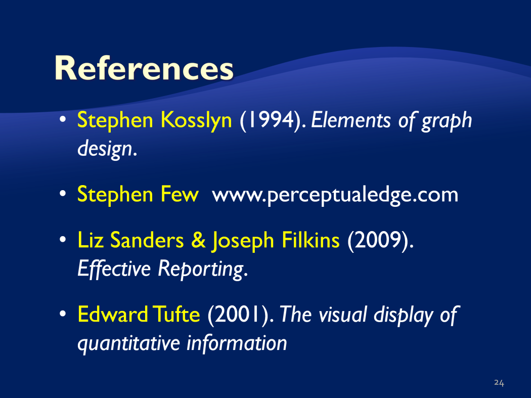
5 For example, here are four different charts that present the same data on first-time fulltime freshmen retention across five years by ethnic groups. Which chart do you think presents the data the best?... As one of the statisticians and authors on graph designing, Stephen Kosslyn, said A picture can be worth a thousand words but only if you can decipher it I will show my version of the graph later on in the presentation.


6 Indeed, after reading various books on data visualization including a classic by Edward Tufte, using charts and graphs extensively in various projects for analysis and presentation of data and getting feedback from viewers, I found that there are certain principles and rules that one should remember when designing graphics. Tufte came up with five principles of graphical excellence: - Well-designed presentation of interesting data a matter of substance, of statistics, and of design - Complex ideas communicated with clarity, precision, and efficiency - Gives to the viewer the greatest number of ideas in the shortest time with the least ink in the smallest space. - Nearly always multivariate. - Requires telling the truth about the data The principles don t need to be applied rigidly. But we do want to aim for Clear portrayal of complexity, not the complication of the simple.

7 Not everything needs to be graphed. A lot of times, tables or text are more efficient ways of communicating data. If you want to know exact values, if you have small data sets or if you need to make localized comparisons consider using tables. However, if you want to show relations, trends or patterns, a graph might be a very efficient and effective medium of display.


8 Before you can determine how to effectively present the message you, first, need to know what the message is. Then consider your data: line graphs work better with ratio scales and time-series, bar-graphs with categorical or nominal data, scatter-plots in correlations. Finally, know your audience. Do they have an expertise to read your chart, how much detail they need, or what they want to focus on. Present the data needed to answer specific questions (no more or less) and use concepts and displays that are familiar to the audience.


9 A well-designed graph shows complex data in a simple to understand form. In order to build one, we need to have a combination of three skills: substantive, statistical and artistic, If we miss one, we can get a misleading or confusing message.

10 Some common mistakes in designing graphs include using: - non-zero baseline in bar graphs. The length of a bar encode the value - unequal intervals in time-series - designing elements that distract from actual data, such as colored background, fancy fonts, 3-D format, objects - cluttered displays, for example when you have multiple lines placed on one chart - color choices that don t work with black-and white prints or can be hard to read for colorblind people. For example, red and green - Frame proportions (Y-X aspect ratio) too narrow or too wide, when it distorts the display It s always good to put in some thoughts on what design will work better instead of using default options.


11 So here is my solution. Since we have time series data, I am using line graphs, which are particularly good in showing changes over time. Because we have quite a few ethnic groups, I decided to split them between two panels, so we can clearly see trends for each of the groups. I put ethnic groups that had their retention rates going up in the last fall semester in the left panel (White, Hispanic and International). Ethnic groups that had their retention rate decreased displayed on the right side. The dashed line showing the overall rate is displayed in both panels so we can easily compare each group against average. Placing labels next to lines help to identify lines quicker rather if we would use the color legend. I tried to use colors and line styles that would be easy to distinguish if printed in black and white. Non-zero baseline is okay in this case, since we are not using bar charts. By moving the scale base to 60% we can see changes in retention better. The graph shows that Whites have slightly higher rate than Hispanics, but both are very close to the overall rate. Which is not surprising since both groups have the largest representation in the student body. Jumps in rates of international students and American Indians explained by low group sizes. I think that this graph is superior in communicating the message than the previous versions built using the default options.


12 In the next example I used vertical bars to compare number of applications across five years among ethnic groups. This example is similar to the previous one, but I decided to go with vertical graphs instead of lines, since I wanted to emphasize individual values, instead of showing trends. When you use bars, your baseline must be zero. This is because the length of the bars encode their values. By sorting values, I can easily see that the largest number of applications comes from Hispanics and Whites. Since American Indians had a very small number of applicants compared to other groups and the change across years is difficult to see on the current scale, I placed the first and last values above the bars. Now we can see that the number of applicants for American Indians increased slightly from over the five years. If we use default option, we usually get bright color bars. In this case, I replaced them with variations of gray, with the darkest one showing the latest year. This way, this graph will work fine if printed or photocopied in black and white

13 If you want to show a complex picture or in some way tell a story unveiled by numbers, consider using multiple panels, Here I am using multiple panels to show various aspects of application data and compare trends among three student types (FTF, transfer, and New PBAC). The horizontal axis displays five fall semesters from 2005 to 2009 on the left and spring semesters on the right. The vertical axis include three sections: the top section showing number of applicants, the middle one percentage of admits of applicants, and the bottom section - percentage of enrollees of admits. This matrix display allows us to compare trends among student types and between fall and spring semesters. It s clear that the largest number of applications come from freshmen in fall semester, however in spring we get more transfers and PBACs.The trends in number of applications are relatively stable across semesters. Percentage of FTF admits is going up in spring, while percentage of transfer and Pbac admits is going down. Pbacs have the highest enrollment yield, while FTF the lowest (around 30%) I am using first letters of the student levels in addition to shades of gray so we can easily identify lines on the graph. Also notice that the horizontal label showing the years is only shown on the very bottom of the graph to avoid duplication and clutter.

14 If you have two related measures (interval or ratio scale), consider using scatter plots to show the relationship This graph using scatter plots shows the relationship between first-term gpa and high school gpa and impact of those on the first-year retention. The horizontal axis shows HS GPA, the vertical axis shows First-Term GPA. Left side of the graphs displays values for drop outs, right side for those who stayed after the first year of enrollment, At first sight, this graph might look overwhelming. But what you want to look at is the shape and density of the cloud. It s clear that for those who stayed, the cloud is more dense in the upper right corner meaning they had higher first-term gpa and high school gpa. For those who dropped out, the cloud is dispersed and we see a lot of values at the bottom left corner. The average lines prove that students who stayed had higher first-term and high school gpa. Slope of the trend line shows that there is a positive correlation between both gpas. Don t include grid (the point is to convey an overall trend, not individual values) For individual values use table.

15 To show geographic location or distance maps are invaluable. This map with pie charts displays retention statistics by county of residence. Pie chart typically is not the best choice for graphic displays since it s hard to make comparison of angles. In this graph, I think it works. It s relatively easy to compare the proportions of the orange wedge. The size of the whole pie varies based on the count of students. I displayed the max and min counts to give an idea of sizes. Consider colors carefully. Avoid red and green to define a boundary, because about 8% of the male population have trouble distinguishing these colors. Also when printed in black and white, you might not be able to distinguish the elements. Use colors that are well separated in the spectrum. Warm colors (red, orange) work better for a foreground.


16 When using graphs for reporting findings in specific projects it s important to know your audience, You need to know what you want your readers to focus on and how they will use the information.

17 Charts and diagrams to display qualitative data.

18 In the same project, we used a graph to show comparison of W-courses against each other and against the UDW exam. Because of a large number of courses I used horizontal bars. Sorting by Pass/Fail ratio made it easy to identify courses with the highest and lowest passing rates and to compare among courses (see left part of the graph). The right side of the graph displays counts of students in each of the course. By using bars I can clearly see what courses are more popular than others (such us ENGL 160, IS 105, and BA 105). At the same time, enrollment in some of the courses was very low (lower than 30 students), which makes comparison of these courses to other not practical. However, I left them on the graph, as well as I displayed all individual values, because I knew that the requester was interested in seeing the whole picture and capable of reading the data. In the middle part of the graph, I showed average GPA of the students who failed or passed courses. I used reference line (average GPA) to compare GPA values against each other. Highlighting helps to communicate the findings. First, the writing exam is a more difficult option in satisfying the requirement than w-courses average GPA of those who failed the test is at the same level as average GPA of students passing W-courses. Second, some courses (PLANT 110W) seemed relatively easier than others (ENGL 115, PHIL 113) high passing rates, but low students GPA.
, which makes comparison of these courses to other not practical.")

19 We had a request from Registar office to analyze students registration activity. They had a feeling that some students register for the maximum of units during the first week of registration, hold up the seats until the instruction starts and then drop the classes they don t want. Thus, other students are not able to register for the classes, since all seats are taken. So, is it the case? The graph seems to prove it. The vertical bars represent proportions of units registered. The horizontal axis shows weeks of registration. By looking at proportion changes we can see how students drop or add more classes during the whole period of registration. The top section of the chart shows students who registered for 1 to 11 units during the first week of registration. The bottom section is of a particular interest in our case: students who registered for units. We clearly see that at census date less than half of those students keep the same course load (18-22 units). The major drop occurred during the first week of instruction.

20 I use visualization not just for reporting but also for exploring and analysis of the data. A lot of time, visual displays make it easier to identify patterns in large data sets.

21 This data mining output is a cluster profile of the first-time full-time freshmen cohort. I input ERS data, students GPA and first-year retention outcome into the SQL Server data mining clustering algorithm.
22 The process split the whole cohort into 10 different clusters, which each has a set of students with similar characteristics. For example, cluster #1 has 352 students with first term gpa from 3.3 to 4.0, HS GPA from 3.4 to 4.4, no English or math remediation need, mainly whites, with almost 100 percent retention rate. Vertical stack bars allow easy and quick comparison between the clusters.

23
24
25 Here is my little son. They said that looking at those various lines stimulates brain development at that age. And this is how he discovers this world - through pictures; he doesn t know the numbers yet!
Visualization Quick Guide
 Visualization Quick Guide A best practice guide to help you find the right visualization for your data WHAT IS DOMO? Domo is a new form of business intelligence (BI) unlike anything before an executive
Introduction to Dashboards in Excel 2007. Craig W. Abbey Director of Institutional Analysis Academic Planning and Budget University at Buffalo
 Introduction to Dashboards in Excel 2007 Craig W. Abbey Director of Institutional Analysis Academic Planning and Budget University at Buffalo Course Objectives 1. Learn how to layout various types of dashboards
GRAPHING DATA FOR DECISION-MAKING
 GRAPHING DATA FOR DECISION-MAKING Tibor Tóth, Ph.D. Center for Applied Demography and Survey Research (CADSR) University of Delaware Fall, 2006 TABLE OF CONTENTS Introduction... 3 Use High Information
Statistics Chapter 2
 Statistics Chapter 2 Frequency Tables A frequency table organizes quantitative data. partitions data into classes (intervals). shows how many data values are in each class. Test Score Number of Students
Data Visualization. BUS 230: Business and Economic Research and Communication
 Data Visualization BUS 230: Business and Economic Research and Communication Data Visualization 1/ 16 Purpose of graphs and charts is to show a picture that can enhance a message, or quickly communicate
A Picture Really Is Worth a Thousand Words
 4 A Picture Really Is Worth a Thousand Words Difficulty Scale (pretty easy, but not a cinch) What you ll learn about in this chapter Why a picture is really worth a thousand words How to create a histogram
Principles of Data Visualization
 Principles of Data Visualization by James Bernhard Spring 2012 We begin with some basic ideas about data visualization from Edward Tufte (The Visual Display of Quantitative Information (2nd ed.)) He gives
Quantitative Displays for Combining Time-Series and Part-to-Whole Relationships
 Quantitative Displays for Combining Time-Series and Part-to-Whole Relationships Stephen Few, Perceptual Edge Visual Business Intelligence Newsletter January, February, and March 211 Graphical displays
Data Visualization Basics for Students
 Data Visualization Basics for Students Dionisia de la Cerda Think about Your Message You want your audience to understand your message. This takes time. Think about your audience and plan your message.
Tutorial 3: Graphics and Exploratory Data Analysis in R Jason Pienaar and Tom Miller
 Tutorial 3: Graphics and Exploratory Data Analysis in R Jason Pienaar and Tom Miller Getting to know the data An important first step before performing any kind of statistical analysis is to familiarize
Principles of Data Visualization for Exploratory Data Analysis. Renee M. P. Teate. SYS 6023 Cognitive Systems Engineering April 28, 2015
 Principles of Data Visualization for Exploratory Data Analysis Renee M. P. Teate SYS 6023 Cognitive Systems Engineering April 28, 2015 Introduction Exploratory Data Analysis (EDA) is the phase of analysis
an introduction to VISUALIZING DATA by joel laumans
 an introduction to VISUALIZING DATA by joel laumans an introduction to VISUALIZING DATA iii AN INTRODUCTION TO VISUALIZING DATA by Joel Laumans Table of Contents 1 Introduction 1 Definition Purpose 2 Data
Creating Bar Charts and Pie Charts Excel 2010 Tutorial (small revisions 1/20/14)
") Creating Bar Charts and Pie Charts Excel 2010 Tutorial (small revisions 1/20/14) Excel file for use with this tutorial GraphTutorData.xlsx File Location http://faculty.ung.edu/kmelton/data/graphtutordata.xlsx
Creating Bar Charts and Pie Charts Excel 2010 Tutorial (small revisions 1/20/14) Excel file for use with this tutorial GraphTutorData.xlsx File Location http://faculty.ung.edu/kmelton/data/graphtutordata.xlsx
Choosing Colors for Data Visualization Maureen Stone January 17, 2006
 Choosing Colors for Data Visualization Maureen Stone January 17, 2006 The problem of choosing colors for data visualization is expressed by this quote from information visualization guru Edward Tufte:
Visualizing Data from Government Census and Surveys: Plans for the Future
 Censuses and Surveys of Governments: A Workshop on the Research and Methodology behind the Estimates Visualizing Data from Government Census and Surveys: Plans for the Future Kerstin Edwards March 15,
Diagrams and Graphs of Statistical Data
 Diagrams and Graphs of Statistical Data One of the most effective and interesting alternative way in which a statistical data may be presented is through diagrams and graphs. There are several ways in
Chapter 6: Constructing and Interpreting Graphic Displays of Behavioral Data
 Chapter 6: Constructing and Interpreting Graphic Displays of Behavioral Data Chapter Focus Questions What are the benefits of graphic display and visual analysis of behavioral data? What are the fundamental
Expert Color Choices for Presenting Data
 Expert Color Choices for Presenting Data Maureen Stone, StoneSoup Consulting The problem of choosing colors for data visualization is expressed by this quote from information visualization guru Edward
Demographics of Atlanta, Georgia:
 Demographics of Atlanta, Georgia: A Visual Analysis of the 2000 and 2010 Census Data 36-315 Final Project Rachel Cohen, Kathryn McKeough, Minnar Xie & David Zimmerman Ethnicities of Atlanta Figure 1: From
This file contains 2 years of our interlibrary loan transactions downloaded from ILLiad. 70,000+ rows, multiple fields = an ideal file for pivot
 Presented at the Southeastern Library Assessment Conference, October 22, 2013 1 2 3 This file contains 2 years of our interlibrary loan transactions downloaded from ILLiad. 70,000+ rows, multiple fields
Exploratory data analysis (Chapter 2) Fall 2011
 Fall 2011") Exploratory data analysis (Chapter 2) Fall 2011 Data Examples Example 1: Survey Data 1 Data collected from a Stat 371 class in Fall 2005 2 They answered questions about their: gender, major, year in school,
Exploratory data analysis (Chapter 2) Fall 2011 Data Examples Example 1: Survey Data 1 Data collected from a Stat 371 class in Fall 2005 2 They answered questions about their: gender, major, year in school,
Visualizing Data. Contents. 1 Visualizing Data. Anthony Tanbakuchi Department of Mathematics Pima Community College. Introductory Statistics Lectures
 Introductory Statistics Lectures Visualizing Data Descriptive Statistics I Department of Mathematics Pima Community College Redistribution of this material is prohibited without written permission of the
Part 2: Data Visualization How to communicate complex ideas with simple, efficient and accurate data graphics
 Part 2: Data Visualization How to communicate complex ideas with simple, efficient and accurate data graphics Why visualize data? The human eye is extremely sensitive to differences in: Pattern Colors
HOW TO USE DATA VISUALIZATION TO WIN OVER YOUR AUDIENCE
 HOW TO USE DATA VISUALIZATION TO WIN OVER YOUR AUDIENCE + TABLE OF CONTENTS HOW DATA SUPPORTS YOUR MESSAGE 1 Benefits of Data Visualization WHEN TO USE DATA VISUALIZATION HOW TO FIND THE STORY IN YOUR
The basics of storytelling through numbers
 Data Visualizations 101 The basics of storytelling through numbers C olleges and universities have a lot of stories to tell to a lot of different people. Prospective students and parents want to know if
Scatter Plots with Error Bars
 Chapter 165 Scatter Plots with Error Bars Introduction The procedure extends the capability of the basic scatter plot by allowing you to plot the variability in Y and X corresponding to each point. Each
Plotting Data with Microsoft Excel
 Plotting Data with Microsoft Excel Here is an example of an attempt to plot parametric data in a scientifically meaningful way, using Microsoft Excel. This example describes an experience using the Office
Numbers as pictures: Examples of data visualization from the Business Employment Dynamics program. October 2009
 Numbers as pictures: Examples of data visualization from the Business Employment Dynamics program. October 2009 Charles M. Carson 1 1 U.S. Bureau of Labor Statistics, Washington, DC Abstract The Bureau
The Forgotten JMP Visualizations (Plus Some New Views in JMP 9) Sam Gardner, SAS Institute, Lafayette, IN, USA
 Sam Gardner, SAS Institute, Lafayette, IN, USA") Paper 156-2010 The Forgotten JMP Visualizations (Plus Some New Views in JMP 9) Sam Gardner, SAS Institute, Lafayette, IN, USA Abstract JMP has a rich set of visual displays that can help you see the information
Paper 156-2010 The Forgotten JMP Visualizations (Plus Some New Views in JMP 9) Sam Gardner, SAS Institute, Lafayette, IN, USA Abstract JMP has a rich set of visual displays that can help you see the information
Choosing a successful structure for your visualization
 IBM Software Business Analytics Visualization Choosing a successful structure for your visualization By Noah Iliinsky, IBM Visualization Expert 2 Choosing a successful structure for your visualization
Drawing a histogram using Excel
 Drawing a histogram using Excel STEP 1: Examine the data to decide how many class intervals you need and what the class boundaries should be. (In an assignment you may be told what class boundaries to
Northumberland Knowledge
 Northumberland Knowledge Know Guide How to Analyse Data - November 2012 - This page has been left blank 2 About this guide The Know Guides are a suite of documents that provide useful information about
Data Visualization Best Practice. Sophie Sparkes Data Analyst
 Data Visualization Best Practice Sophie Sparkes Data Analyst http://graphics.wsj.com/infectious-diseases-and-vaccines/ http://blogs.sas.com/content/jmp/2015/03/05/graph-makeover-measles-heat-map/ http://graphics.wsj.com/infectious-diseases-and-vaccines/
Gestation Period as a function of Lifespan
 This document will show a number of tricks that can be done in Minitab to make attractive graphs. We work first with the file X:\SOR\24\M\ANIMALS.MTP. This first picture was obtained through Graph Plot.
Excel Unit 4. Data files needed to complete these exercises will be found on the S: drive>410>student>computer Technology>Excel>Unit 4
 Excel Unit 4 Data files needed to complete these exercises will be found on the S: drive>410>student>computer Technology>Excel>Unit 4 Step by Step 4.1 Creating and Positioning Charts GET READY. Before
Based on Chapter 11, Excel 2007 Dashboards & Reports (Alexander) and Create Dynamic Charts in Microsoft Office Excel 2007 and Beyond (Scheck)
 and Create Dynamic Charts in Microsoft Office Excel 2007 and Beyond (Scheck)") Reporting Results: Part 2 Based on Chapter 11, Excel 2007 Dashboards & Reports (Alexander) and Create Dynamic Charts in Microsoft Office Excel 2007 and Beyond (Scheck) Bullet Graph (pp. 200 205, Alexander,
Reporting Results: Part 2 Based on Chapter 11, Excel 2007 Dashboards & Reports (Alexander) and Create Dynamic Charts in Microsoft Office Excel 2007 and Beyond (Scheck) Bullet Graph (pp. 200 205, Alexander,
Chapter 4 Creating Charts and Graphs
 Calc Guide Chapter 4 OpenOffice.org Copyright This document is Copyright 2006 by its contributors as listed in the section titled Authors. You can distribute it and/or modify it under the terms of either
PURPOSE OF GRAPHS YOU ARE ABOUT TO BUILD. To explore for a relationship between the categories of two discrete variables
 3 Stacked Bar Graph PURPOSE OF GRAPHS YOU ARE ABOUT TO BUILD To explore for a relationship between the categories of two discrete variables 3.1 Introduction to the Stacked Bar Graph «As with the simple
INF2793 Research Design & Academic Writing Prof. Simone D.J. Barbosa [email protected] sala 410 RDC. presentation
 On Presentations INF2793 Research Design & Academic Writing Prof. Simone D.J. Barbosa [email protected] sala 410 RDC presentation @ 2013 Simone DJ Barbosa, Departamento de Informática, PUC-Rio 1 communication
Data Visualization Techniques
 Data Visualization Techniques From Basics to Big Data with SAS Visual Analytics WHITE PAPER SAS White Paper Table of Contents Introduction.... 1 Generating the Best Visualizations for Your Data... 2 The
SPSS Manual for Introductory Applied Statistics: A Variable Approach
 SPSS Manual for Introductory Applied Statistics: A Variable Approach John Gabrosek Department of Statistics Grand Valley State University Allendale, MI USA August 2013 2 Copyright 2013 John Gabrosek. All
Data representation and analysis in Excel
 Page 1 Data representation and analysis in Excel Let s Get Started! This course will teach you how to analyze data and make charts in Excel so that the data may be represented in a visual way that reflects
Data Visualization. or Graphical Data Presentation. Jerzy Stefanowski Instytut Informatyki
 Data Visualization or Graphical Data Presentation Jerzy Stefanowski Instytut Informatyki Data mining for SE -- 2013 Ack. Inspirations are coming from: G.Piatetsky Schapiro lectures on KDD J.Han on Data
MetroBoston DataCommon Training
 MetroBoston DataCommon Training Whether you are a data novice or an expert researcher, the MetroBoston DataCommon can help you get the information you need to learn more about your community, understand
How To: Analyse & Present Data
 INTRODUCTION The aim of this How To guide is to provide advice on how to analyse your data and how to present it. If you require any help with your data analysis please discuss with your divisional Clinical
Exploratory Spatial Data Analysis
 Exploratory Spatial Data Analysis Part II Dynamically Linked Views 1 Contents Introduction: why to use non-cartographic data displays Display linking by object highlighting Dynamic Query Object classification
Data Visualization Techniques
 Data Visualization Techniques From Basics to Big Data with SAS Visual Analytics WHITE PAPER SAS White Paper Table of Contents Introduction.... 1 Generating the Best Visualizations for Your Data... 2 The
Effective Visualization Techniques for Data Discovery and Analysis
 WHITE PAPER Effective Visualization Techniques for Data Discovery and Analysis Chuck Pirrello, SAS Institute, Cary, NC Table of Contents Abstract... 1 Introduction... 1 Visual Analytics... 1 Static Graphs...
Exercise 1.12 (Pg. 22-23)
") Individuals: The objects that are described by a set of data. They may be people, animals, things, etc. (Also referred to as Cases or Records) Variables: The characteristics recorded about each individual.
Individuals: The objects that are described by a set of data. They may be people, animals, things, etc. (Also referred to as Cases or Records) Variables: The characteristics recorded about each individual.
R Graphics Cookbook. Chang O'REILLY. Winston. Tokyo. Beijing Cambridge. Farnham Koln Sebastopol
 R Graphics Cookbook Winston Chang Beijing Cambridge Farnham Koln Sebastopol O'REILLY Tokyo Table of Contents Preface ix 1. R Basics 1 1.1. Installing a Package 1 1.2. Loading a Package 2 1.3. Loading a
Iris Sample Data Set. Basic Visualization Techniques: Charts, Graphs and Maps. Summary Statistics. Frequency and Mode
 Iris Sample Data Set Basic Visualization Techniques: Charts, Graphs and Maps CS598 Information Visualization Spring 2010 Many of the exploratory data techniques are illustrated with the Iris Plant data
Effective Big Data Visualization
 Effective Big Data Visualization Every Picture Tells A Story Don t It? Mark Gamble Dir Technical Marketing Actuate Corporation 1 Data Driven Summit 2014 Agenda What is data visualization? What is good?
TEXT-FILLED STACKED AREA GRAPHS Martin Kraus
 Martin Kraus Text can add a significant amount of detail and value to an information visualization. In particular, it can integrate more of the data that a visualization is based on, and it can also integrate
(Also, how to do it right, and MOST IMPORTANTLY, how to tell the difference!)
") (Also, how to do it right, and MOST IMPORTANTLY, how to tell the difference!) How does Statistics and Graphical Displays (truthful or not) matter in a computer science class??? Data and information are
(Also, how to do it right, and MOST IMPORTANTLY, how to tell the difference!) How does Statistics and Graphical Displays (truthful or not) matter in a computer science class??? Data and information are
Session 7 Bivariate Data and Analysis
 Session 7 Bivariate Data and Analysis Key Terms for This Session Previously Introduced mean standard deviation New in This Session association bivariate analysis contingency table co-variation least squares
Dashboard Design for Rich and Rapid Monitoring
 Dashboard Design for Rich and Rapid Monitoring Stephen Few Visual Business Intelligence Newsletter November 2006 This article is the fourth in a five-part series that features the winning solutions to
Top 5 best practices for creating effective dashboards. and the 7 mistakes you don t want to make
 Top 5 best practices for creating effective dashboards and the 7 mistakes you don t want to make p2 Financial services professionals are buried in data that measure and track: relationships and processes,
Data Analysis, Statistics, and Probability
 Chapter 6 Data Analysis, Statistics, and Probability Content Strand Description Questions in this content strand assessed students skills in collecting, organizing, reading, representing, and interpreting
Exercise 1: How to Record and Present Your Data Graphically Using Excel Dr. Chris Paradise, edited by Steven J. Price
 Biology 1 Exercise 1: How to Record and Present Your Data Graphically Using Excel Dr. Chris Paradise, edited by Steven J. Price Introduction In this world of high technology and information overload scientists
Data exploration with Microsoft Excel: analysing more than one variable
 Data exploration with Microsoft Excel: analysing more than one variable Contents 1 Introduction... 1 2 Comparing different groups or different variables... 2 3 Exploring the association between categorical
Visualizing Historical Agricultural Data: The Current State of the Art Irwin Anolik (USDA National Agricultural Statistics Service)
") Visualizing Historical Agricultural Data: The Current State of the Art Irwin Anolik (USDA National Agricultural Statistics Service) Abstract This paper reports on methods implemented at the National Agricultural
Visualizing Historical Agricultural Data: The Current State of the Art Irwin Anolik (USDA National Agricultural Statistics Service) Abstract This paper reports on methods implemented at the National Agricultural
Making Visio Diagrams Come Alive with Data
 Making Visio Diagrams Come Alive with Data An Information Commons Workshop Making Visio Diagrams Come Alive with Data Page Workshop Why Add Data to A Diagram? Here are comparisons of a flow chart with
Intro to Excel spreadsheets
 Intro to Excel spreadsheets What are the objectives of this document? The objectives of document are: 1. Familiarize you with what a spreadsheet is, how it works, and what its capabilities are; 2. Using
Examples of Data Representation using Tables, Graphs and Charts
 Examples of Data Representation using Tables, Graphs and Charts This document discusses how to properly display numerical data. It discusses the differences between tables and graphs and it discusses various
Good Graphs: Graphical Perception and Data Visualization
 Good Graphs: Graphical Perception and Data Visualization Nina Zumel August 28th, 2009 1 Introduction What makes a good graph? When faced with a slew of numeric data, graphical visualization can be a more
 T O P I C 1 2 Techniques and tools for data analysis Preview Introduction In chapter 3 of Statistics In A Day different combinations of numbers and types of variables are presented. We go through these
DATA VISUALISATION. A practical guide to producing effective visualisations for research communication
 DATA VISUALISATION A practical guide to producing effective visualisations for research communication Rebecca Wolfe, 2014 Research Uptake Manager, RESYST Consortium London School of Hygiene & Tropical
Visualizing Multidimensional Data Through Time Stephen Few July 2005
 Visualizing Multidimensional Data Through Time Stephen Few July 2005 This is the first of three columns that will feature the winners of DM Review's 2005 data visualization competition. I want to extend
Universal Simple Control, USC-1
 Universal Simple Control, USC-1 Data and Event Logging with the USB Flash Drive DATA-PAK The USC-1 universal simple voltage regulator control uses a flash drive to store data. Then a propriety Data and
Intellect Platform - The Workflow Engine Basic HelpDesk Troubleticket System - A102
 Intellect Platform - The Workflow Engine Basic HelpDesk Troubleticket System - A102 Interneer, Inc. Updated on 2/22/2012 Created by Erika Keresztyen Fahey 2 Workflow - A102 - Basic HelpDesk Ticketing System
Data Visualization Handbook
 SAP Lumira Data Visualization Handbook www.saplumira.com 1 Table of Content 3 Introduction 20 Ranking 4 Know Your Purpose 23 Part-to-Whole 5 Know Your Data 25 Distribution 9 Crafting Your Message 29 Correlation
Petrel TIPS&TRICKS from SCM
 Petrel TIPS&TRICKS from SCM Maps: Knowledge Worth Sharing Map Annotation A map is a graphic representation of some part of the earth. In our industry, it may represent either the surface or sub surface;
STATGRAPHICS Online. Statistical Analysis and Data Visualization System. Revised 6/21/2012. Copyright 2012 by StatPoint Technologies, Inc.
 STATGRAPHICS Online Statistical Analysis and Data Visualization System Revised 6/21/2012 Copyright 2012 by StatPoint Technologies, Inc. All rights reserved. Table of Contents Introduction... 1 Chapter
Best Practices in Data Visualizations. Vihao Pham January 29, 2014
 Best Practices in Data Visualizations Vihao Pham January 29, 2014 Agenda Best Practices in Data Visualizations Why We Visualize Understanding Data Visualizations Enhancing Visualizations Visualization
Best Practices in Data Visualizations. Vihao Pham 2014
 Best Practices in Data Visualizations Vihao Pham 2014 Agenda Best Practices in Data Visualizations Why We Visualize Understanding Data Visualizations Enhancing Visualizations Visualization Considerations
Statistics and Probability
 Statistics and Probability TABLE OF CONTENTS 1 Posing Questions and Gathering Data. 2 2 Representing Data. 7 3 Interpreting and Evaluating Data 13 4 Exploring Probability..17 5 Games of Chance 20 6 Ideas
Co-Curricular Activities and Academic Performance -A Study of the Student Leadership Initiative Programs. Office of Institutional Research
 Co-Curricular Activities and Academic Performance -A Study of the Student Leadership Initiative Programs Office of Institutional Research July 2014 Introduction The Leadership Initiative (LI) is a certificate
Charting LibQUAL+(TM) Data. Jeff Stark Training & Development Services Texas A&M University Libraries Texas A&M University
 Data. Jeff Stark Training & Development Services Texas A&M University Libraries Texas A&M University") Charting LibQUAL+(TM) Data Jeff Stark Training & Development Services Texas A&M University Libraries Texas A&M University Revised March 2004 The directions in this handout are written to be used with SPSS
Charting LibQUAL+(TM) Data Jeff Stark Training & Development Services Texas A&M University Libraries Texas A&M University Revised March 2004 The directions in this handout are written to be used with SPSS
DATA VISUALIZATION 101: HOW TO DESIGN CHARTS AND GRAPHS
 DATA VISUALIZATION 101: HOW TO DESIGN CHARTS AND GRAPHS + TABLE OF CONTENTS INTRO 1 FINDING THE STORY IN YOUR DATA 2 KNOW YOUR DATA 3 GUIDE TO CHART TYPES 5 Bar Chart Pie Chart Line Chart Area Chart Scatter
TIBCO Spotfire Business Author Essentials Quick Reference Guide. Table of contents:
 Table of contents: Access Data for Analysis Data file types Format assumptions Data from Excel Information links Add multiple data tables Create & Interpret Visualizations Table Pie Chart Cross Table Treemap
Effectively Communicating Numbers
 EMBARKING ON A NEW JOURNEY Effectively Communicating Numbers Selecting the Best Means and Manner of Display by Stephen Few Principal, Perceptual Edge November 2005 SPECIAL ADDENDUM Effectively Communicating
Simple Predictive Analytics Curtis Seare
 Using Excel to Solve Business Problems: Simple Predictive Analytics Curtis Seare Copyright: Vault Analytics July 2010 Contents Section I: Background Information Why use Predictive Analytics? How to use
This document contains Chapter 2: Statistics, Data Analysis, and Probability strand from the 2008 California High School Exit Examination (CAHSEE):
:") This document contains Chapter 2:, Data Analysis, and strand from the 28 California High School Exit Examination (CAHSEE): Mathematics Study Guide published by the California Department of Education. The
This document contains Chapter 2:, Data Analysis, and strand from the 28 California High School Exit Examination (CAHSEE): Mathematics Study Guide published by the California Department of Education. The
Formulas, Functions and Charts
 Formulas, Functions and Charts :: 167 8 Formulas, Functions and Charts 8.1 INTRODUCTION In this leson you can enter formula and functions and perform mathematical calcualtions. You will also be able to
Information Literacy Program
 Information Literacy Program Excel (2013) Advanced Charts 2015 ANU Library anulib.anu.edu.au/training [email protected] Table of Contents Excel (2013) Advanced Charts Overview of charts... 1 Create a chart...
Years after 2000. US Student to Teacher Ratio 0 16.048 1 15.893 2 15.900 3 15.900 4 15.800 5 15.657 6 15.540
 To complete this technology assignment, you should already have created a scatter plot for your data on your calculator and/or in Excel. You could do this with any two columns of data, but for demonstration
Describing, Exploring, and Comparing Data
 24 Chapter 2. Describing, Exploring, and Comparing Data Chapter 2. Describing, Exploring, and Comparing Data There are many tools used in Statistics to visualize, summarize, and describe data. This chapter
Chapter 32 Histograms and Bar Charts. Chapter Table of Contents VARIABLES...470 METHOD...471 OUTPUT...472 REFERENCES...474
 Chapter 32 Histograms and Bar Charts Chapter Table of Contents VARIABLES...470 METHOD...471 OUTPUT...472 REFERENCES...474 467 Part 3. Introduction 468 Chapter 32 Histograms and Bar Charts Bar charts are
A DATA ANALYSIS TOOL THAT ORGANIZES ANALYSIS BY VARIABLE TYPES. Rodney Carr Deakin University Australia
 A DATA ANALYSIS TOOL THAT ORGANIZES ANALYSIS BY VARIABLE TYPES Rodney Carr Deakin University Australia XLStatistics is a set of Excel workbooks for analysis of data that has the various analysis tools
Excel -- Creating Charts
 Excel -- Creating Charts The saying goes, A picture is worth a thousand words, and so true. Professional looking charts give visual enhancement to your statistics, fiscal reports or presentation. Excel
Using Excel as a Management Reporting Tool with your Minotaur Data. Exercise 1 Customer Item Profitability Reporting Tool for Management
 Using Excel as a Management Reporting Tool with your Minotaur Data with Judith Kirkness These instruction sheets will help you learn: 1. How to export reports from Minotaur to Excel (these instructions
Briefing document: How to create a Gantt chart using a spreadsheet
 Briefing document: How to create a Gantt chart using a spreadsheet A Gantt chart is a popular way of using a bar-type chart to show the schedule for a project. It is named after Henry Gantt who created
Intermediate PowerPoint
 Intermediate PowerPoint Charts and Templates By: Jim Waddell Last modified: January 2002 Topics to be covered: Creating Charts 2 Creating the chart. 2 Line Charts and Scatter Plots 4 Making a Line Chart.
Infographics in the Classroom: Using Data Visualization to Engage in Scientific Practices
 Infographics in the Classroom: Using Data Visualization to Engage in Scientific Practices Activity 4: Graphing and Interpreting Data In Activity 4, the class will compare different ways to graph the exact
Survey Analysis Guidelines Sample Survey Analysis Plan. Survey Analysis. What will I find in this section of the toolkit?
 What will I find in this section of the toolkit? Toolkit Section Introduction to the Toolkit Assessing Local Employer Needs Market Sizing Survey Development Survey Administration Survey Analysis Conducting