Introduction to Dashboards in Excel Craig W. Abbey Director of Institutional Analysis Academic Planning and Budget University at Buffalo
|
|
|
- Alison Kelly
- 8 years ago
- Views:
Transcription
1 Introduction to Dashboards in Excel 2007 Craig W. Abbey Director of Institutional Analysis Academic Planning and Budget University at Buffalo

2 Course Objectives 1. Learn how to layout various types of dashboards in Excel 2. Learn how to create high quality graphs for use in a dashboard 3. Learn when and how to change graph scaling, gridlines and data labels 4. Learn how to use colors to emphasize and highlight data series and data points

3 Topics Covered Theory and Examples Creating and formatting charts for time series, ranking, distribution, and nominal comparison relationships Resizing columns and rows to define spaces Filling cells, setting borders, formatting axes Time saving tricks and tips

4 Suggested Book Information Dashboard Design by Stephen Few Excel 2007 Charts by John Walkenbach

5 Data, Information and Knowledge Data are raw. They are symbols or isolated and non interpreted facts. Information is data that has been given meaning through interpretation by way of relational connection and pragmatic context. Knowledge is information, which has been cognitively processed and integrated into an existing human knowledge structure. Source: S. O. Tergan and T. Keller (Eds.): Knowledge and Information Visualization, LNCS 3426, p.3

6 Tables vs. Graphs Table (Data) Data are expressed in the form of text (that is, words and numbers rather than graphically) Data are arranged in columns and rows Graph (Information) Data are express graphically (that is, as a picture) Data are displayed in relation to one or more axes along which run scales that assign meaning to the values Work best when the display will be used to look up individual values or the quantitative values must be precise. Work best when the message you wish to communicate resides in the shape of the data (that is, in patterns, trends and exceptions) Source: Effectively Communicating Numbers by Stephen Few, November 2005, p. 4.

7 Table vs. Graph Example Table Shows Actual Values Graphs Show Trend First time, Full Time Retention Sem ester nd 81.9% 83.4% 83.5% 86.1% 87.6% 87.6% 89.3% 3 rd 78.0% 81.0% 80.0% 83.0% 85.0% 84.0% 86.0% 4 th 71.8% 73.7% 74.4% 73.9% 79.9% 77.0% 77.1% 5 th 69.8% 71.1% 72.3% 71.8% 75.4% 74.3% 75.0% 6 th 65.8% 69.2% 68.2% 67.7% 72.7% 72.3% 70.7% 90% 85% 80% 75% 70% 65% 60% 7 th 64.0% 66.8% 66.3% 65.8% 68.6% 69.8% 68.8% 8 th 61.7% 64.9% 64.5% 63.6% 66.2% 67.8% 66.1% 3rd Semester 5th Semester

8 Data Table versus Inner Harbor University November 09 Chart # Enrollment and Outcomes F 05 F 06 F 07 F 08 F 09 1 Headcount Total 16,751 17,204 17,426 16,998 16,293 Undergraduate 11,780 11,884 11,953 11,796 11,388 Graduate 4,971 5,320 5,473 5,202 4,905 1 Full-time Equivalent Students (FTE) 14,020 14,524 14,576 14,314 13,992 2 New Students (Total Full-Time) 3,347 3,312 3,469 3,259 3,097 First-Time, Full-Time 2,218 2,221 2,282 2,158 2,013 Transfer, Full-Time 1,129 1,091 1,187 1,101 1,084 Freshman Quality 3 Mean SAT Mean HS GPA Applicants 19,947 20,673 21,170 20,843 20,669 Freshman 16,394 16,934 17,534 17,194 17,078 Transfer 3,553 3,739 3,636 3,649 3,591 Residency of New Studnents 6 % MD Res. 86.5% 85.4% 84.5% 83.9% 83.5% 6 % Non-MD, US 8.7% 9.4% 10.2% 11.3% 11.3% 6 % Int'l 4.7% 5.2% 5.3% 4.8% 5.2% SAT Score Distributiom Poli Sci Chemistry Biology English History 7 Intended Major of New Students

9 Dashboard Inner Harbor University November 2009 Dashboard 1 Headcount and FTE New Students Freshman Quality Applicants 18,000 17,426 17,204 16,998 17,000 16,751 16,293 16,000 15,000 14,524 14,576 14,314 14,020 13,992 14,000 13,000 12,000 11,000 10,000 F 05 F 06 F 07 F 08 F 09 Full- and Part -t ime St udent s (Bars), Full-t ime Equivalent St udent s (Line) 3,500 3,400 3,300 3,200 3,100 3,000 2,900 F 05 F 06F 07F 08F 09 Full-Time Freshmen and Transf ers SAT in Red, HS GPA in Blue Freshmen and Transf ers 1,200 1, SAT Distribution Residency Intended Major First -t ime, Full-Time Ent ering Cohort % F 05 F % F % F 08 Residency of New St udent s F % MD Res. 21,500 21,000 20,500 20,000 19,500 19, % Non- 100 MD, US 50 % Int'l 0 F 05F 06F 07F 08F 09 Poli Sci Chem Biology English History University System of Maryland

10 The Use of Color Saturated Colors Should be Used for Emphasis Choose Common Colors Standard Colors Emphasis Colors

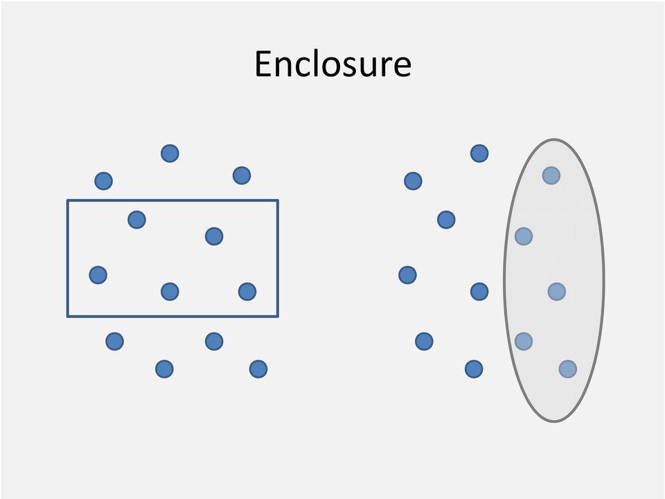
11 Gestalt Principles of Visual Perception Proximity Closure Similarity Continuity Enclosure Connection

12 Proximity 3 Groups or 10 Dots? Rows and Columns

13 Closure See the Shape? Only Need Two Axis

14 Similarity Group by Color, Size, Shape In a Graph

15 Continuity How many lines? Indentation Headcount Full time 4,302 Part time 1,293 Degrees Associates 1,007 Bachelors 2,982

16 Enclosure
17 Connection

18 Design is Important! Total Research Federal Research Endowment $250,000 $200,000 $150,000 $100,000 $50,000 $ Total Resea rch Nation al Rank Contr ol Rank 120, ,000 80,000 60,000 40,000 20,000 0 National Rank Control Rank M M M M M M 0.0 M National Rank Control Rank versus Total Research Federal Research Endowment $250,000 0 $120,000 0 $600 $200, $100, $500 $150, $80, $ $60, $300 $100,000 $50, $40,000 $20, $200 $100 $0 120 $0 120 National Rank Control Rank National Rank Control Rank $0 National Rank Control Rank Total NSF R&D ($ In Thousands) Federal NSF R&D ($ In Tho usands) Endo wment ($ In M illions)

19 Keep it Simple Extraneous Features Less is Better Annual Budget Annual Budget $ in Millions $4.70M $4.60M $4.50M $4.40M $4.30M $4.20M $4.10M $4.00M $3.90M $3.80M $4.20 $4.10 $4.60 $4.50 $4.40 FY FY FY FY FY Year Annual Budget $4.8M $4.6M $4.4M $4.2M $4.0M $3.8M

20 100% 80% 60% 40% 20% 0% Chart Scaling Start at Zero Graduation Rate 64% 63% 62% 61% 60% 59% 58% 57% 56% Scale to Show Change Graduation Rate Fall 2000 Fall 2001 Fall 2002 Fall 2003 Fall 2004 Fall 2005 Fall 2006 Fall 2007 Fall 2008 Fall 2009 Fall 2000 Fall 2001 Fall 2002 Fall 2003 Fall 2004 Fall 2005 Fall 2006 Fall 2007 Fall 2008 Fall 2009

21 Times Series Level versus Trend 94% 93% 92% 91% 90% 89% 88% 87% 86% 88.9% 89.8% 91.9% Level 1st Year Retention 90.9% 92.1% 92.8% 91.8% 93.1% 93.3% 92.9% 94% 93% 92% 91% 90% 89% 88% 87% 86% Trend 1st Year Retention Fall 2000 Fall 2001 Fall 2002 Fall 2003 Fall 2004 Fall 2005 Fall 2006 Fall 2007 Fall 2008 Fall 2009 Fall 2000 Fall 2001 Fall 2002 Fall 2003 Fall 2004 Fall 2005 Fall 2006 Fall 2007 Fall 2008 Fall 2009
22 Stacked Bar Charts What s Important? Better View Blue series accounts for most of difference in total value Cat 1 Cat 2 Cat 3 Cat 4 0 Cat 1 Cat 2 Cat 3 Cat 4
23 Ranking Relationships Sort by Category Degrees Awarded Biology Political Science Sort by Value Degrees Awarded Chemistry Biology English Geography Geography History Political Science Chemistry English History Sorting by value gives us a sense of the rank
24 Part to Whole Relationship Pie Chart Enrollment by County 9% 17% 19% 28% 27% Erie Niagra Monroe Genesee Orleans 30% 25% 20% 15% 10% 5% 0% Bar Chart Enrollment by County
25 Deviation Relationship Number Actual less Goal 25% 15% 5% 5% 15% 25% Percentage Actual less Goal
26 Distribution Relationship Area Chart Overlapping Bar Chart CHEM 101 Grades CHEM 101 Grades 18% 16% 14% 12% 10% 8% 6% 4% 2% 0% F D D+ C C C+ B B B+ A A 18% 16% 14% 12% 10% 8% 6% 4% 2% 0% F D D+ C CC+B BB+A A
27 Correlation Relationship Graduation Rate 100% 90% 80% 70% 60% 50% 40% 30% 20% 10% 0% Graduation Rates and SAT Average SAT Score
28 Nominal Relationships Wrong Program Credit Hours Right Program Credit Hours
29 Exercise 1 Time Series Charts 15,000 14,000 13,000 12,000 11,000 10,000 9,000 8,000 Total Headcount Enrollment ,000 14,000 12,000 10,000 8,000 6,000 4,000 2,000 Headcount Enrollment 14,123 12,521 12,987 13,346 11,045 2,617 2,805 3,310 3,686 2,209 8,836 9,904 10,182 10,036 10, Undergraduate Graduate
30 Exercise 1 Time Series Charts Steps Line Chart Trend 1. Open Exercise 1 Workbook 2. Select A3:F4 3. Choose Insert, Line with Markers Chart (Under Charts) 4. Delete the Legend 5. Re title the Chart Total Headcount Enrollment 6. Select the Y axis, Format it So it Ranges from 8,000 to 16,000 Stacked Bar Values 1. Select A3:F6 2. Choose Insert, Stacked Column (Under Charts) 3. Select Total on the Legend and Press Delete 4. Format the Legend so It s on the Bottom 5. Select Each Data Series, Right Click and Select Add Data Lables 6. Over the Plot Area, Right Click and Choose Select Data, Using the Arrows, Move the Total series to last in the list, Click Ok 7. Select a Data Series, Choose Format Data Series, Set the Gap Width to Select the Lables for Undergraduate, Change Font Color to White, Repeat for Graduate 9. Select the Labels for Total, Right Click, Select Format Data Labels, Change the Label Position to Inside Base 10. Select the Total Data Series (Blue), Right Click, Select Format Data Series, Set Fill to No Fill, Set Border Color to No Line. 11. Select the Y axis, Format it So it Ranges from 0 to 16, Under Chart Tools, Layout on Ribbon Bar, add a Title and Turn off the Gridlines
31 Exercise 2 Distribution Charts SAT Scores SAT Scores
32 Exercise 2 Distribution Charts 1. Open Exercise 2 Workbook 2. Select A3:I4 3. Select Insert, Clustered Column under Charts Area 4. Select the Legend, Press Delete 5. Select the Data Series, Right Click, Select Format, Change Gap Width to 0, Select Close 6. For an Area Chart, Select the Plot Area, Right Click, Select Change Chart Type, Select Area Chart, Click Ok TIP: Use Copy and Paste to Save Time. Select the Chart, Copy and Paste. Change the Chart Type Back to Clustered Column. Now You Have Both Styles.
33 Exercise 3 Nominal / Categorical Charts Degrees Biology Chemistry English History Poli Sci
34 Exercise 3 Nominal / Categorical Charts 1. Open Exercise 3 Workbook 2. Select A3:F4 3. Choose Insert, Clustered Column under Charts Area 4. Select the Legend, Press Delete 5. With the Chart Selected, Select Layout, Gridlines under Axes, Select Primary Horizontal Gridlines, Select None 6. Select the Data Series, Right Click, Select Format Data Series, Set Gap Width to 75, Select Close 7. Select the Data Series, Right Click, Select Add Data Labels TIP: Select the Data Label for History (a single data label can be selected by selecting the data labels and then clicking again), Right Click, Select Format Data Label, Select Fill and the Solid Fill, Under Color, Select the Fill Color of Your Choice to Emphasize, Select Close.
35 Exercise 4 Ranking Charts Degrees Degrees Poli Sci Chemistry Biology English History Poli Sci Chemistry Biology English History
36 Exercise 4 Ranking Charts 1. Open Exercise 4 Workbook 2. Select B3:F4 3. Select Sort & Filter, Custom Sort under Editing Area of Home Ribbon 4. Select Options, Sort Left to Right, Click OK 5. Set Sort by to Row 4, Set Order to Largest to Smallest 6. Select the Chart, Copy, Select A21 and Paste 7. Select the 2nd Column Chart, Right Click, Select Change Chart Type, Select Clustered Bar 8. Select the Y axis, Right Click, Select Format Axis 9. Check the Categories in Reverse Order Box 10. Select the At Maximum Category Radio Button
37 Exercise 5 Create a Simple Dashboard A Very Simple Dashboard 15,000 14,000 13,000 12,000 11,000 10,000 9,000 8,000 Fall Enrollment SAT Distribution Degrees Granted Headcount Enrollment Mean Verbal and Math Academic Year
38 Exercise 5 Create a Simple Dashboard Steps 1. Open Exercise 5 Workbook 2. Resize Columns A, C, E, G to 3 Wide 3. Resize Columns B, D, F to 30 Wide 4. Resize Row 4 to 150 Height 5. Fill A1 through G6 with White 6. Merge A1 through G1 and Fill with Color of Your Choice 7. Fill B3, D3, F3 with Color of Your Choice, Change Text Color to White 8. Fill B4:B5, D4:D5, F4:F5 with a Lighter Shade 9. Create Graphs using Data Worksheet Data 10. Be sure to Enter Titles in Row 3 Headers and a Title on Row 1. Enter data notes in B5, D5 and F5.
39 Exercise 6 Create a Fancier Dashboard A Fancier Dashboard 16,000 14,000 12,000 10,000 8,000 6,000 4,000 2,000 Fall Enrollment 14,123 12,987 13,346 12,521 3,686 11,045 2,805 3,310 2,617 2,209 9,904 10,182 10,036 10,437 8, SAT Distribution Mean Verbal and Math Degrees Granted Undergraduate Graduate Headcount Enrollment Academic Year
40 Exercise 6 Create a Fancier Dashboard Steps 1. Open Exercise 6 Workbook 2. Select and Copy A3:G6. Paste then in A7. 3. Copy the Format of Rows 3:6 to Rows 7: Delete contents of F3:F5. You ll need to Select the Chart and Delete It Separately. Repeat for D7:D9. 5. Cut D3:D5 and Paste it in F3. 6. Select B3:D3. Merge and Center. 7. Select B4:D8. Merge and Center. 8. Select B9:D9. Merge and Center. 9. Create a Stack Bar Chart from A3:F6 on the Data Worksheet. Resize it to fit in B4:D8 of your Dashboard. 10. Set the Chart s Border Color and Fill Color to No Line and No Fill 11. Change the Position of the Legend to the Bottom. Select the Fall Enrollment on the Legend and Delete it. 12. Use Select Data to Change the Data Series Order. Move Total Enrollment to the Bottom of the List. 13. Add Data Labels to All Data Series. Format as Desired. 14. Format the Total Enrollment Data Labels, Setting the Label Position to Inside Base. 15. Format the Total Enrollment Data Series, Setting Border Color and Fill Color to No Line and No Fill 16. Format the Y axis to Range from 0 to 16,000.
41 Sample Dashboard Inner Harbor University November 2009 Dashboard Headcount and FTE New Students Freshman Quality Applicants 18,000 17,000 16,000 15,000 14,000 16,751 14,020 17,204 17,426 14,524 14,576 16,998 14,314 16,293 13,992 3,500 3,400 3,300 3,200 3,100 3,000 2,900 F 05 F 06 F 07 F 08 F F 05 21,500 21,000 20,500 20,000 19,500 19,000 Full-Time Freshmen and Transf ers SAT in Red, HS GPA in Blue Freshmen and Transf ers F 06 F F 08 F F 05F 06F 07F 08F 09 13,000 12,000 11,000 10,000 F 05 F 06 F 07 F 08 F 09 Full- and Part -t ime St udent s (Bars), Full-t ime Equivalent St udent s (Line) 1,200 1, SAT Distribution Residency Intended Major 250 First -t ime, Full-Time Ent ering Cohort 11.3 % 5.2% 83.5 % Residency of New St udent s % MD Res % Non- 100 MD, US 50 % Int'l 0 Poli Sci Chem Biology English History University System of Maryland
42 Summary Advice, Tricks and Tips Think About the Point You are Trying to Make before You Graph Design Matters and Can Help You Communicate Information Data that Doesn t Show Anything Can still Tell a Story Resize or Merge Cells so Graphs Fit Inside Single Cells Copy and Paste Graphs to Save Time Limited Color Palate Often Better
43 That s All Folks! Contact Information: Craig W. Abbey cwabbey@buffalo.edu
Excel Unit 4. Data files needed to complete these exercises will be found on the S: drive>410>student>computer Technology>Excel>Unit 4
 Excel Unit 4 Data files needed to complete these exercises will be found on the S: drive>410>student>computer Technology>Excel>Unit 4 Step by Step 4.1 Creating and Positioning Charts GET READY. Before
Excel -- Creating Charts
 Excel -- Creating Charts The saying goes, A picture is worth a thousand words, and so true. Professional looking charts give visual enhancement to your statistics, fiscal reports or presentation. Excel
Microsoft Excel 2010 Charts and Graphs
 Microsoft Excel 2010 Charts and Graphs Email: training@health.ufl.edu Web Page: http://training.health.ufl.edu Microsoft Excel 2010: Charts and Graphs 2.0 hours Topics include data groupings; creating
Visualization Quick Guide
 Visualization Quick Guide A best practice guide to help you find the right visualization for your data WHAT IS DOMO? Domo is a new form of business intelligence (BI) unlike anything before an executive
CREATING EXCEL PIVOT TABLES AND PIVOT CHARTS FOR LIBRARY QUESTIONNAIRE RESULTS
 CREATING EXCEL PIVOT TABLES AND PIVOT CHARTS FOR LIBRARY QUESTIONNAIRE RESULTS An Excel Pivot Table is an interactive table that summarizes large amounts of data. It allows the user to view and manipulate
Computer Skills Microsoft Excel Creating Pie & Column Charts
 Computer Skills Microsoft Excel Creating Pie & Column Charts In this exercise, we will learn how to display data using a pie chart and a column chart, color-code the charts, and label the charts. Part
Information Literacy Program
 Information Literacy Program Excel (2013) Advanced Charts 2015 ANU Library anulib.anu.edu.au/training ilp@anu.edu.au Table of Contents Excel (2013) Advanced Charts Overview of charts... 1 Create a chart...
Microsoft Excel 2013: Charts June 2014
 Microsoft Excel 2013: Charts June 2014 Description We will focus on Excel features for graphs and charts. We will discuss multiple axes, formatting data, choosing chart type, adding notes and images, and
DIGITAL DESIGN APPLICATIONS Word Exam REVIEW
 DIGITAL DESIGN APPLICATIONS Word Exam REVIEW Directions: Complete the following word processing document, and know how to use proper formatting techniques on it. 1. Before keying in the text in the box
Create Charts in Excel
 Create Charts in Excel Table of Contents OVERVIEW OF CHARTING... 1 AVAILABLE CHART TYPES... 2 PIE CHARTS... 2 BAR CHARTS... 3 CREATING CHARTS IN EXCEL... 3 CREATE A CHART... 3 HOW TO CHANGE THE LOCATION
CSU, Fresno - Institutional Research, Assessment and Planning - Dmitri Rogulkin
 My presentation is about data visualization. How to use visual graphs and charts in order to explore data, discover meaning and report findings. The goal is to show that visual displays can be very effective
STC: Descriptive Statistics in Excel 2013. Running Descriptive and Correlational Analysis in Excel 2013
 Running Descriptive and Correlational Analysis in Excel 2013 Tips for coding a survey Use short phrases for your data table headers to keep your worksheet neat, you can always edit the labels in tables
Basic Excel Handbook
 2 5 2 7 1 1 0 4 3 9 8 1 Basic Excel Handbook Version 3.6 May 6, 2008 Contents Contents... 1 Part I: Background Information...3 About This Handbook... 4 Excel Terminology... 5 Excel Terminology (cont.)...
Computer Training Centre University College Cork. Excel 2013 Pivot Tables
 Computer Training Centre University College Cork Excel 2013 Pivot Tables Table of Contents Pivot Tables... 1 Changing the Value Field Settings... 2 Refreshing the Data... 3 Refresh Data when opening a
Creating Bar Charts and Pie Charts Excel 2010 Tutorial (small revisions 1/20/14)
") Creating Bar Charts and Pie Charts Excel 2010 Tutorial (small revisions 1/20/14) Excel file for use with this tutorial GraphTutorData.xlsx File Location http://faculty.ung.edu/kmelton/data/graphtutordata.xlsx
Creating Bar Charts and Pie Charts Excel 2010 Tutorial (small revisions 1/20/14) Excel file for use with this tutorial GraphTutorData.xlsx File Location http://faculty.ung.edu/kmelton/data/graphtutordata.xlsx
Figure 1. An embedded chart on a worksheet.
 8. Excel Charts and Analysis ToolPak Charts, also known as graphs, have been an integral part of spreadsheets since the early days of Lotus 1-2-3. Charting features have improved significantly over the
Excel Intermediate Session 2: Charts and Tables
 Excel Intermediate Session 2: Charts and Tables Agenda 1. Introduction (10 minutes) 2. Tables and Ranges (5 minutes) 3. The Report Part 1: Creating and Manipulating Tables (45 min) 4. Charts and other
Getting Started with Excel 2008. Table of Contents
 Table of Contents Elements of An Excel Document... 2 Resizing and Hiding Columns and Rows... 3 Using Panes to Create Spreadsheet Headers... 3 Using the AutoFill Command... 4 Using AutoFill for Sequences...
This activity will show you how to draw graphs of algebraic functions in Excel.
 This activity will show you how to draw graphs of algebraic functions in Excel. Open a new Excel workbook. This is Excel in Office 2007. You may not have used this version before but it is very much the
Scientific Graphing in Excel 2010
 Scientific Graphing in Excel 2010 When you start Excel, you will see the screen below. Various parts of the display are labelled in red, with arrows, to define the terms used in the remainder of this overview.
Creating Charts in Microsoft Excel A supplement to Chapter 5 of Quantitative Approaches in Business Studies
 Creating Charts in Microsoft Excel A supplement to Chapter 5 of Quantitative Approaches in Business Studies Components of a Chart 1 Chart types 2 Data tables 4 The Chart Wizard 5 Column Charts 7 Line charts
Creating and Formatting Charts in Microsoft Excel
 Creating and Formatting Charts in Microsoft Excel This document provides instructions for creating and formatting charts in Microsoft Excel, which makes creating professional-looking charts easy. The chart
Microsoft Excel 2010 Pivot Tables
 Microsoft Excel 2010 Pivot Tables Email: training@health.ufl.edu Web Page: http://training.health.ufl.edu Microsoft Excel 2010: Pivot Tables 1.5 hours Topics include data groupings, pivot tables, pivot
Using Excel for descriptive statistics
 FACT SHEET Using Excel for descriptive statistics Introduction Biologists no longer routinely plot graphs by hand or rely on calculators to carry out difficult and tedious statistical calculations. These
Excel 2007 - Using Pivot Tables
 Overview A PivotTable report is an interactive table that allows you to quickly group and summarise information from a data source. You can rearrange (or pivot) the table to display different perspectives
Using Excel s PivotTable to Analyze Learning Assessment Data
 Using Excel s PivotTable to Analyze Learning Assessment Data Assessment Office University of Hawaiʻiat Mānoa Feb 13, 2013 1 Mission: Improve student learning through program assessment 2 1 Learning Outcomes
3 What s New in Excel 2007
 3 What s New in Excel 2007 3.1 Overview of Excel 2007 Microsoft Office Excel 2007 is a spreadsheet program that enables you to enter, manipulate, calculate, and chart data. An Excel file is referred to
Excel Tutorial. Bio 150B Excel Tutorial 1
 Bio 15B Excel Tutorial 1 Excel Tutorial As part of your laboratory write-ups and reports during this semester you will be required to collect and present data in an appropriate format. To organize and
Introduction to Microsoft Excel 2007/2010
 to Microsoft Excel 2007/2010 Abstract: Microsoft Excel is one of the most powerful and widely used spreadsheet applications available today. Excel's functionality and popularity have made it an essential
Intro to Excel spreadsheets
 Intro to Excel spreadsheets What are the objectives of this document? The objectives of document are: 1. Familiarize you with what a spreadsheet is, how it works, and what its capabilities are; 2. Using
Appendix 2.1 Tabular and Graphical Methods Using Excel
 Appendix 2.1 Tabular and Graphical Methods Using Excel 1 Appendix 2.1 Tabular and Graphical Methods Using Excel The instructions in this section begin by describing the entry of data into an Excel spreadsheet.
Microsoft Excel Training - Course Topic Selections
 Microsoft Excel Training - Course Topic Selections The Basics Creating a New Workbook Navigating in Excel Moving the Cell Pointer Using Excel Menus Using Excel Toolbars: Hiding, Displaying, and Moving
ITS Training Class Charts and PivotTables Using Excel 2007
 When you have a large amount of data and you need to get summary information and graph it, the PivotTable and PivotChart tools in Microsoft Excel will be the answer. The data does not need to be in one
Integrating Microsoft Word with Other Office Applications
 Integrating Microsoft Word with Other Office Applications The Learning Center Staff Education 257-79226 http://www.mc.uky.edu/learningcenter/ Copyright 2006 Objectives After completing this course, you
Scott Harvey, Registrar Tri County Technical College. Using Excel Pivot Tables to Analyze Student Data
 Scott Harvey, Registrar Tri County Technical College Using Excel Pivot Tables to Analyze Student Data 1Introduction to PivotTables 2Prepare the source data Discussion Points 3Create a PivotTable 5Show
Drawing a histogram using Excel
 Drawing a histogram using Excel STEP 1: Examine the data to decide how many class intervals you need and what the class boundaries should be. (In an assignment you may be told what class boundaries to
Excel 2007: Basics Learning Guide
 Excel 2007: Basics Learning Guide Exploring Excel At first glance, the new Excel 2007 interface may seem a bit unsettling, with fat bands called Ribbons replacing cascading text menus and task bars. This
2. Creating Bar Graphs with Excel 2007
 2. Creating Bar Graphs with Excel 2007 Biologists frequently use bar graphs to summarize and present the results of their research. This tutorial will show you how to generate these kinds of graphs (with
Chapter 4 Displaying and Describing Categorical Data
 Chapter 4 Displaying and Describing Categorical Data Chapter Goals Learning Objectives This chapter presents three basic techniques for summarizing categorical data. After completing this chapter you should
Working with Spreadsheets
 osborne books Working with Spreadsheets UPDATE SUPPLEMENT 2015 The AAT has recently updated its Study and Assessment Guide for the Spreadsheet Software Unit with some minor additions and clarifications.
Microsoft Excel 2007 Level 2
 Information Technology Services Kennesaw State University Microsoft Excel 2007 Level 2 Copyright 2008 KSU Dept. of Information Technology Services This document may be downloaded, printed or copied for
Excel 2013 - Using Pivot Tables
 Overview A PivotTable report is an interactive table that allows you to quickly group and summarise information from a data source. You can rearrange (or pivot) the table to display different perspectives
Advanced Microsoft Excel 2010
 Advanced Microsoft Excel 2010 Table of Contents THE PASTE SPECIAL FUNCTION... 2 Paste Special Options... 2 Using the Paste Special Function... 3 ORGANIZING DATA... 4 Multiple-Level Sorting... 4 Subtotaling
Charting LibQUAL+(TM) Data. Jeff Stark Training & Development Services Texas A&M University Libraries Texas A&M University
 Data. Jeff Stark Training & Development Services Texas A&M University Libraries Texas A&M University") Charting LibQUAL+(TM) Data Jeff Stark Training & Development Services Texas A&M University Libraries Texas A&M University Revised March 2004 The directions in this handout are written to be used with SPSS
Charting LibQUAL+(TM) Data Jeff Stark Training & Development Services Texas A&M University Libraries Texas A&M University Revised March 2004 The directions in this handout are written to be used with SPSS
Basic Microsoft Excel 2007
 Basic Microsoft Excel 2007 The biggest difference between Excel 2007 and its predecessors is the new layout. All of the old functions are still there (with some new additions), but they are now located
Microsoft Excel 2010 Part 3: Advanced Excel
 CALIFORNIA STATE UNIVERSITY, LOS ANGELES INFORMATION TECHNOLOGY SERVICES Microsoft Excel 2010 Part 3: Advanced Excel Winter 2015, Version 1.0 Table of Contents Introduction...2 Sorting Data...2 Sorting
As in the example above, a Budget created on the computer typically has:
 Activity Card Create a How will you ensure that your expenses do not exceed what you planned to invest or spend? You can create a budget to plan your expenditures and earnings. As a family, you can plan
Excel: Analyze PowerSchool Data
 Excel: Analyze PowerSchool Data Trainer Name Trainer/Consultant PowerSchool University 2012 Agenda Welcome & Introductions Organizing Data with PivotTables Displaying Data with Charts Creating Dashboards
Microsoft Excel 2010 Tutorial
 1 Microsoft Excel 2010 Tutorial Excel is a spreadsheet program in the Microsoft Office system. You can use Excel to create and format workbooks (a collection of spreadsheets) in order to analyze data and
Plots, Curve-Fitting, and Data Modeling in Microsoft Excel
 Plots, Curve-Fitting, and Data Modeling in Microsoft Excel This handout offers some tips on making nice plots of data collected in your lab experiments, as well as instruction on how to use the built-in
MARS STUDENT IMAGING PROJECT
 MARS STUDENT IMAGING PROJECT Data Analysis Practice Guide Mars Education Program Arizona State University Data Analysis Practice Guide This set of activities is designed to help you organize data you collect
How to make a line graph using Excel 2007
 How to make a line graph using Excel 2007 Format your data sheet Make sure you have a title and each column of data has a title. If you are entering data by hand, use time or the independent variable in
Spreadsheet. Parts of a Spreadsheet. Entry Bar
 Spreadsheet Parts of a Spreadsheet 1. Open the AppleWorks program. Select spreadsheet. 2. Explore the spreadsheet setup for a while. Active Cell Address Entry Bar Column Headings Row Headings Active Cell
Publisher 2010 Cheat Sheet
 April 20, 2012 Publisher 2010 Cheat Sheet Toolbar customize click on arrow and then check the ones you want a shortcut for File Tab (has new, open save, print, and shows recent documents, and has choices
PERFORMING REGRESSION ANALYSIS USING MICROSOFT EXCEL
 PERFORMING REGRESSION ANALYSIS USING MICROSOFT EXCEL John O. Mason, Ph.D., CPA Professor of Accountancy Culverhouse School of Accountancy The University of Alabama Abstract: This paper introduces you to
Excel Math Project for 8th Grade Identifying Patterns
 There are several terms that we will use to describe your spreadsheet: Workbook, worksheet, row, column, cell, cursor, name box, formula bar. Today you are going to create a spreadsheet to investigate
Data representation and analysis in Excel
 Page 1 Data representation and analysis in Excel Let s Get Started! This course will teach you how to analyze data and make charts in Excel so that the data may be represented in a visual way that reflects
WEBFOCUS QUICK DATA FOR EXCEL
 WEBFOCUS QUICK DATA FOR EXCEL BRIAN CARTER INFORMATION BUILDERS SUMMIT 2008 USERS CONFERENCE JUNE 2008 Presentation Abstract: Even with the growing popularity and evolvement of Business Intelligence products
Excel 2007 Charts and Pivot Tables
 Excel 2007 Charts and Pivot Tables Table of Contents Working with PivotTables... 2 About Charting... 6 Creating a Basic Chart... 13 Formatting Your Chart... 18 Working with Chart Elements... 23 Charting
MetroBoston DataCommon Training
 MetroBoston DataCommon Training Whether you are a data novice or an expert researcher, the MetroBoston DataCommon can help you get the information you need to learn more about your community, understand
MICROSOFT WORD: MAIL MERGE
 SIU Medical Library / Department of Information and Communication Sciences MICROSOFT WORD: MAIL MERGE MICROSOFT WORD 2010 OVERVIEW Mail Merge allows you to automatically merge a list of variable information,
"Excel with Excel 2013: Pivoting with Pivot Tables" by Venu Gopalakrishna Remani. October 28, 2014
 Teaching Excellence and Innovation 1 Pivot table Pivot table does calculations with criteria Data should be arranged as : Field names in the first rows, records in rows No blank rows or blank columns should
GUIDELINES FOR PREPARING POSTERS USING POWERPOINT PRESENTATION SOFTWARE
 Society for the Teaching of Psychology (APA Division 2) OFFICE OF TEACHING RESOURCES IN PSYCHOLOGY (OTRP) Department of Psychology, Georgia Southern University, P. O. Box 8041, Statesboro, GA 30460-8041
Advanced Presentation Features and Animation
 There are three features that you should remember as you work within PowerPoint 2007: the Microsoft Office Button, the Quick Access Toolbar, and the Ribbon. The function of these features will be more
4. Are you satisfied with the outcome? Why or why not? Offer a solution and make a new graph (Figure 2).
.") Assignment 1 Introduction to Excel and SPSS Graphing and Data Manipulation Part 1 Graphing (worksheet 1) 1. Download the BHM excel data file from the course website. 2. Save it to the desktop as an excel
Assignment 1 Introduction to Excel and SPSS Graphing and Data Manipulation Part 1 Graphing (worksheet 1) 1. Download the BHM excel data file from the course website. 2. Save it to the desktop as an excel
Plotting: Customizing the Graph
 Plotting: Customizing the Graph Data Plots: General Tips Making a Data Plot Active Within a graph layer, only one data plot can be active. A data plot must be set active before you can use the Data Selector
Briefing document: How to create a Gantt chart using a spreadsheet
 Briefing document: How to create a Gantt chart using a spreadsheet A Gantt chart is a popular way of using a bar-type chart to show the schedule for a project. It is named after Henry Gantt who created
Formulas, Functions and Charts
 Formulas, Functions and Charts :: 167 8 Formulas, Functions and Charts 8.1 INTRODUCTION In this leson you can enter formula and functions and perform mathematical calcualtions. You will also be able to
Data Visualization. Brief Overview of ArcMap
 Data Visualization Prepared by Francisco Olivera, Ph.D., P.E., Srikanth Koka and Lauren Walker Department of Civil Engineering September 13, 2006 Contents: Brief Overview of ArcMap Goals of the Exercise
Overview What is a PivotTable? Benefits
 Overview What is a PivotTable? Benefits Create a PivotTable Select Row & Column labels & Values Filtering & Sorting Calculations Data Details Refresh Data Design options Create a PivotChart Slicers Charts
Using Excel 2003 with Basic Business Statistics
 Using Excel 2003 with Basic Business Statistics Introduction Use this document if you plan to use Excel 2003 with Basic Business Statistics, 12th edition. Instructions specific to Excel 2003 are needed
PowerPoint Tables / Charts / Graphs
 PowerPoint Tables / Charts / Graphs Open PowerPoint: Click on Start (located on the Taskbar at the bottom) Click on Programs Click on Microsoft PowerPoint Click on the Microsoft PowerPoint icon (located
Table of Contents TASK 1: DATA ANALYSIS TOOLPAK... 2 TASK 2: HISTOGRAMS... 5 TASK 3: ENTER MIDPOINT FORMULAS... 11
 Table of Contents TASK 1: DATA ANALYSIS TOOLPAK... 2 TASK 2: HISTOGRAMS... 5 TASK 3: ENTER MIDPOINT FORMULAS... 11 TASK 4: ADD TOTAL LABEL AND FORMULA FOR FREQUENCY... 12 TASK 5: MODIFICATIONS TO THE HISTOGRAM...
How to Use Excel for Law Firm Billing
 How to Use Excel for Law Firm Billing FEATURED FACULTY: Staci Warne, Microsoft Certified Trainer (MCT) (801) 463-1213 computrainhelp@hotmail.com Staci Warne, Microsoft Certified Trainer (MCT) Staci Warne
Tutorial 2: Using Excel in Data Analysis
 Tutorial 2: Using Excel in Data Analysis This tutorial guide addresses several issues particularly relevant in the context of the level 1 Physics lab sessions at Durham: organising your work sheet neatly,
Excel 2007 A Beginners Guide
 Excel 2007 A Beginners Guide Beginner Introduction The aim of this document is to introduce some basic techniques for using Excel to enter data, perform calculations and produce simple charts based on
WHAT S NEW IN OBIEE 11.1.1.7
 Enterprise Data Management OBI Author Training, March 2015 WHAT S NEW IN OBIEE 11.1.1.7 NEW PRESENTATION FEATURES VIEWS 1) Recommended Visualizations Feature When you create a new view, OBIEE looks at
Spreadsheet - Introduction
 CSCA0102 IT and Business Applications Chapter 6 Spreadsheet - Introduction Spreadsheet A spreadsheet (or spreadsheet program) is software that permits numerical data to be used and to perform automatic
Accessing REDCap Data Guide
 Accessing REDCap Data Guide 2014 Author: Tasha Wells, Program Assistant The University of Iowa School of Social Work National Resource Center for Family Centered Practice 1200 Grand Avenue, Suite 123 Des
Analyzing Excel Data Using Pivot Tables
 NDUS Training and Documentation Analyzing Excel Data Using Pivot Tables Pivot Tables are interactive worksheet tables you can use to quickly and easily summarize, organize, analyze, and compare large amounts
NAVIGATION TIPS. Special Tabs
 rp`=j~êëü~ää=påüççä=çñ=_ìëáåéëë Academic Information Services Excel 2007 Cheat Sheet Find Excel 2003 Commands in Excel 2007 Use this handout to find where Excel 2003 commands are located in Excel 2007.
BASIC TECHNIQUES IN USING EXCEL TO ANALYZE ASSESSMENT DATA
 1 BASIC TECHNIQUES IN USING EXCEL TO ANALYZE ASSESSMENT DATA University of Hawai i at Mānoa 11/15/12 2 Mission: Improve Student Learning Through Program Assessment 1 3 Workshop outcomes By the end of this
Excel Project Creating a Stock Portfolio Simulation
 Background Vocabulary Excel Project Creating a Stock Portfolio Simulation 1. What is a stock? A stock is a share in the ownership of a corporation, a large business organization. A stock, also, represents
To create a histogram, you must organize the data in two columns on the worksheet. These columns must contain the following data:
 You can analyze your data and display it in a histogram (a column chart that displays frequency data) by using the Histogram tool of the Analysis ToolPak. This data analysis add-in is available when you
Data Visualization. Prepared by Francisco Olivera, Ph.D., Srikanth Koka Department of Civil Engineering Texas A&M University February 2004
 Data Visualization Prepared by Francisco Olivera, Ph.D., Srikanth Koka Department of Civil Engineering Texas A&M University February 2004 Contents Brief Overview of ArcMap Goals of the Exercise Computer
Microsoft Excel Tutorial
 Microsoft Excel Tutorial Microsoft Excel spreadsheets are a powerful and easy to use tool to record, plot and analyze experimental data. Excel is commonly used by engineers to tackle sophisticated computations
To launch the Microsoft Excel program, locate the Microsoft Excel icon, and double click.
 EDIT202 Spreadsheet Lab Assignment Guidelines Getting Started 1. For this lab you will modify a sample spreadsheet file named Starter- Spreadsheet.xls which is available for download from the Spreadsheet
Handout: How to Use Excel 2010
 How to Use Excel 2010 Table of Contents THE EXCEL ENVIRONMENT... 4 MOVE OR SCROLL THROUGH A WORKSHEET... 5 USE THE SCROLL BARS TO MOVE THROUGH A WORKSHEET... 5 USE THE ARROW KEYS TO MOVE THROUGH A WORKSHEET...
Page 1. 1.0 Create and Manage a Presentation 1.1 Create a Presentation Pages Where Covered
 Page 1 Study Guide for MOS Objectives in Microsoft PowerPoint 2013 Illustrated 1.0 Create and Manage a Presentation 1.1 Create a Presentation creating blank presentations 6 creating presentations using
Creating a Poster Presentation using PowerPoint
 Creating a Poster Presentation using PowerPoint Course Description: This course is designed to assist you in creating eye-catching effective posters for presentation of research findings at scientific
Using Microsoft Word. Working With Objects
 Using Microsoft Word Many Word documents will require elements that were created in programs other than Word, such as the picture to the right. Nontext elements in a document are referred to as Objects
SECTION 2-1: OVERVIEW SECTION 2-2: FREQUENCY DISTRIBUTIONS
 SECTION 2-1: OVERVIEW Chapter 2 Describing, Exploring and Comparing Data 19 In this chapter, we will use the capabilities of Excel to help us look more carefully at sets of data. We can do this by re-organizing
Getting started in Excel
 Getting started in Excel Disclaimer: This guide is not complete. It is rather a chronicle of my attempts to start using Excel for data analysis. As I use a Mac with OS X, these directions may need to be
Microsoft Office Excel 2007 Key Features. Office of Enterprise Development and Support Applications Support Group
 Microsoft Office Excel 2007 Key Features Office of Enterprise Development and Support Applications Support Group 2011 TABLE OF CONTENTS Office of Enterprise Development & Support Acknowledgment. 3 Introduction.
II-13Category Plots. Chapter II-13
 Chapter II-13 II-13Category Plots Overview... 316 Creating a Category Plot... 316 Combining Category Plots and XY Plots... 317 Modifying a Category Plot... 317 Bar and Category Gaps... 317 Tick Mark Positioning...
Advanced Excel 10/20/2011 1
 Advanced Excel Data Validation Excel has a feature called Data Validation, which will allow you to control what kind of information is typed into cells. 1. Select the cell(s) you wish to control. 2. Click
Excel 2010: Create your first spreadsheet
 Excel 2010: Create your first spreadsheet Goals: After completing this course you will be able to: Create a new spreadsheet. Add, subtract, multiply, and divide in a spreadsheet. Enter and format column
How to Use a Data Spreadsheet: Excel
 How to Use a Data Spreadsheet: Excel One does not necessarily have special statistical software to perform statistical analyses. Microsoft Office Excel can be used to run statistical procedures. Although
Updates to Graphing with Excel
 Updates to Graphing with Excel NCC has recently upgraded to a new version of the Microsoft Office suite of programs. As such, many of the directions in the Biology Student Handbook for how to graph with
MS Excel. Handout: Level 2. elearning Department. Copyright 2016 CMS e-learning Department. All Rights Reserved. Page 1 of 11
 MS Excel Handout: Level 2 elearning Department 2016 Page 1 of 11 Contents Excel Environment:... 3 To create a new blank workbook:...3 To insert text:...4 Cell addresses:...4 To save the workbook:... 5