BIRD SONG SYSTEM Using Microsoft Excel to Graph Data Courtesy of Jared Wong
|
|
|
- Jonas Fleming
- 7 years ago
- Views:
Transcription
1 BIRD SONG SYSTEM Using Microsoft Excel to Graph Data Courtesy of Jared Wong PART 1: BASIC GRAPHING WITH EXCEL Suppose we want to create column graphs depicting the difference in mean weights between a sample of 10 males and 10 females. The tabulated data might look like this: The first step is to organize your data into a means table. This step is especially useful Excel can use this simplified table to organize and categorize your data automatically, thus saving a lot of manual work. To obtain a mean, the formula is: =AVERAGE(select the cells that you want to calculate the mean of) In this example, for the mean weight of all the 10 males in our sample, the formula should be: =AVERAGE(B2:B11)
2 Hit Enter. The formula should now turn into the mean weight of all 10 males in our sample. Repeat the process for Females. The completed table should look like this:
3 We now have all the data we want to be graphed into one concise table. To tell Excel that we want a graph of those values, we need to highlight the entire table: With the table highlighted, we will click on Chart Wizard in the Excel toolbar (the icon that looks like a colorful 3-D column graph). If this shortcut is not visible, you can access it from Insert Chart.


4 The Chart Wizard window should appear. Since a column graph is appropriate for our data, we will select Column under Chart type:, and go with the first Chart sub-type. Click Next. Because we put all our values in a nice concise table, Excel has already picked out the relevant values and graphed it appropriately for us:
 axis, we would enter Sex, and under Value (Y) axis, we will enter Mean weight (kg).")
5 Click on Next. Note that even though our X and Y axes have been labeled, the axes themselves have not. Thus, under Category (X) axis, we would enter Sex, and under Value (Y) axis, we will enter Mean weight (kg). NEVER FORGET YOUR UNITS OF MEASUREMENT (e.g., cm, kg, mv, etc.)!

6 Click Next. This window merely asks you if you want your chart in the same worksheet you ve been working on, or if you want it in a new worksheet on its own. Select your desired choice and click Finish. For this example, we will stick the chart in the same worksheet we ve been working on.

7 In most cases we would want the background to be white (instead of the default gray). To erase the background color, simply click on any region of the chart that is gray, and press the delete key. We now have our basic column graph.
, Teens (13-19 years old), Middle-aged (30-40 years old), and Seniors (65-80 years")
8 PART 2: GRAPHING MORE THAN TWO GROUPS WITHIN ONE VARIABLE Suppose we have more than two groups in our sample that we want to graph. For example, we may be interested in the average weights of individuals in 4 categories: Children (5-12 years old), Teens (13-19 years old), Middle-aged (30-40 years old), and Seniors (65-80 years old). We sample 10 subjects from each age group. The tabulated data may look like this: Again, we begin by organizing the data into a means table using the AVERAGE formula so that we end up with only one mean per group: Now we highlight the entire table, and then click on the Chart Wizard button:
9 Since we want a column graph, we can just leave the default option alone and click Next : Excel should automatically figure out the appropriate graph, as can be seen in the preview window:
10 Click on Next. On the following window, enter all relevant information (e.g., Name your X and Y axes): Once you click Finish, everything should look like this:

11 As before, remove the grey color by clicking on any grey region and hitting the delete key: And there we have it a column graph with more than two groups.
12 PART 3: (SLIGHTLY) ADVANCED GRAPHING WITH EXCEL: ERROR BARS In scientific journals, a graph with no error bars is an incomplete graph. An error bar indicates the variance, or spread of the data, and can serve as a quick visual gauge as to how different (or similar) our two mean values are. The more different they are, the more likely that the difference is significantly different, and vice-versa. As a measure of spread, the most commonly used indicator is the standard error, which is defined as the standard deviation divided by the square root of n (where n = the number of samples in each group. We will return to the twogroup (Male vs. Female) example for simplicity. In that sample, n = 10 for both males and females since we have 10 males and 10 females. Excel has a formula that allows us to easily calculate the standard deviation, but unfortunately, not the standard error. Thus, we ll have to calculate it ourselves. The formulae we need are: and: =STDEV(pick the cells that we want the standard deviation of) =SQRT(n) This gives us the square root of n. We can calculate the standard error in one compounded formula by the following: (1) Start by creating a table similar to the one we used to construct our column graphs: (2) We ll do the standard error for males first. Highlight the cell that we want the value in.

13 (3) Now it s time to enter the formula. Begin by entering: =STDEV(
14 (4) Now, select the data that we want to create the standard deviation of. We will highlight all the values in our Males column: (5) Close the STDEV formula with a close parenthesis so that the formula looks like: =STDEV(B2:B11) (6) We need to now divide this standard deviation by the square root of n. Continue typing: =STDEV(B2:B11)/SQRT(10) Whereby 10 is the number of subjects in our Male condition. Hit enter. (7) Voila we have now the standard error for our males. If we repeat the same process for the females, we should get:
15 Now that we have the standard error, we can incorporate them into our graph as error bars. Right click on either one of the columns in our graph. A menu should appear: Select Format Data Series.
16 Click on the Y Error Bars tab. Since Standard Error is not an option, we will have to manually tell Excel what values we want to serve as our error bars. Under Display, click on Both. Then click on the round button for Custom, and click on the button on the right of the + field. This will tell Excel what values to pick as the upper bound. Note that since our table for Standard Error is EXACTLY the same in format as our mean weight table, we can select the Standard Error values for both the Males and Females at the same time. Excel will automatically figure out which error bars belong to which mean. Click on enter, and then repeat the same process for the - field (i.e. again select the Standard Error values for both the Males and Females this tells Excel what to use as a lower bound for our error bars).


17 After you ve done the same for Females, hit Enter. The window should now look like this: Click OK.
18 We now have our graph, complete with error bars.
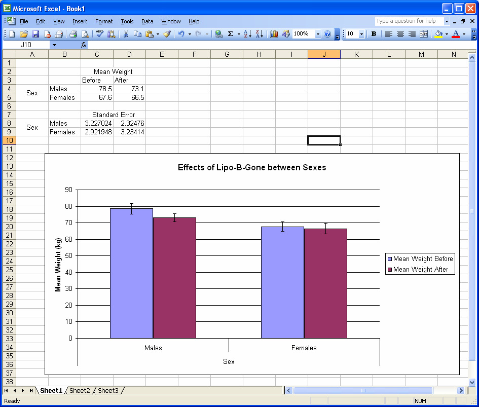
19 PART 4: (EVEN MORE) ADVANCED GRAPHING WITH EXCEL: MAKING GRAPHS WITH MORE THAN ONE VARIABLE So far, we have only been dealing with one variable (weight). What if we want to graph something with two variables? Suppose we want to test the effectiveness of a weight-loss program for males and females. Thus, for both males and females, each subject is going to have a Before weight and an After weight (i.e., weights taken before the program, and after the program). Fortunately, Excel allows us to make graphs with more than one variable very easily as long as we create a good table from the raw data, like so: (Note that the format of the Standard Error table looks EXACTLY like the Mean Weight table, except for the numbers. This is important!!) Once you have the data organized like this, highlight the data that we want to graph:
 you want on the X or Y axis.")

20 Click on the Chart Wizard button, and like before, select Column under Chart type, select the first option under Chart sub-type, and click on Next. Presto! Excel has already done the appropriate labeling and grouping. You only need to tell Excel which variable (i.e., Weight Before/After or Male/Female ) you want on the X or Y axis. Since in this example, we want to compare the effectiveness of the weight loss program for males and females separately, it would make more sense to make Sex our X-axis. To do this, simply click on Columns in the Series in: portion.
21 Click on Next. Note that from the data we ve entered in our nice table that we selected to make this graph from, the axes have already been pre-entered. We just need to tweak it to perfection by adding ( kg ) after Mean Weight, deleting Sex under Category (X) axis (since Excel has already labeled it for us), and if we want, enter a Chart title.

22 Click on Next to select where you want your chart, click on Finish, get rid of the gray background, and we ve got our chart!
23 The final finishing touch would be the addition of the error bars. The process is almost exactly the same as adding error bars in our one-variable example (once we ve calculated our Standard Errors and put them in a nice table, that is). We ll need to enter the error bars twice: Once for Before, and once for After. To make our error bars for Before, right click on any bar for Before, and select Format Data Series : As before, select the Y Error Bars tab, and click on Both under Display. Then click on the round button next to Custom. We ll now need to tell Excel which values we want to use as the upper and lower bound for the Before condition. Once again, click on the button to the right of the + field, and select both values under the Before condition:

24 Repeat the same for the - field for the Before condition (select exactly the same two cells), click on OK, and we will have our error bars for the Before condition. Last step: Repeat the same process to obtain the error bars for the After condition (using the Standard Error values under the After column), and we re done!
25
Coins, Presidents, and Justices: Normal Distributions and z-scores
 activity 17.1 Coins, Presidents, and Justices: Normal Distributions and z-scores In the first part of this activity, you will generate some data that should have an approximately normal (or bell-shaped)
Excel Tutorial. Bio 150B Excel Tutorial 1
 Bio 15B Excel Tutorial 1 Excel Tutorial As part of your laboratory write-ups and reports during this semester you will be required to collect and present data in an appropriate format. To organize and
ITS Training Class Charts and PivotTables Using Excel 2007
 When you have a large amount of data and you need to get summary information and graph it, the PivotTable and PivotChart tools in Microsoft Excel will be the answer. The data does not need to be in one
2. Creating Bar Graphs with Excel 2007
 2. Creating Bar Graphs with Excel 2007 Biologists frequently use bar graphs to summarize and present the results of their research. This tutorial will show you how to generate these kinds of graphs (with
Summary of important mathematical operations and formulas (from first tutorial):
:") EXCEL Intermediate Tutorial Summary of important mathematical operations and formulas (from first tutorial): Operation Key Addition + Subtraction - Multiplication * Division / Exponential ^ To enter a
EXCEL Intermediate Tutorial Summary of important mathematical operations and formulas (from first tutorial): Operation Key Addition + Subtraction - Multiplication * Division / Exponential ^ To enter a
Step Sheet: Creating a Data Table and Charts
 Step Sheet: Creating a Data Table and Charts Using Microsoft Excel Spreadsheets with Data This step sheet will help you build a data table and convert the data into histograms and circle graphs for your
EXCEL Tutorial: How to use EXCEL for Graphs and Calculations.
 EXCEL Tutorial: How to use EXCEL for Graphs and Calculations. Excel is powerful tool and can make your life easier if you are proficient in using it. You will need to use Excel to complete most of your
Graphing in excel on the Mac
 Graphing in excel on the Mac Quick Reference for people who just need a reminder The easiest thing is to have a single series, with y data in the column to the left of the x- data. Select the data and
Updates to Graphing with Excel
 Updates to Graphing with Excel NCC has recently upgraded to a new version of the Microsoft Office suite of programs. As such, many of the directions in the Biology Student Handbook for how to graph with
In this example, Mrs. Smith is looking to create graphs that represent the ethnic diversity of the 24 students in her 4 th grade class.
 Creating a Pie Graph Step-by-step directions In this example, Mrs. Smith is looking to create graphs that represent the ethnic diversity of the 24 students in her 4 th grade class. 1. Enter Data A. Open
A Guide to Using Excel in Physics Lab
 A Guide to Using Excel in Physics Lab Excel has the potential to be a very useful program that will save you lots of time. Excel is especially useful for making repetitious calculations on large data sets.
Getting started in Excel
 Getting started in Excel Disclaimer: This guide is not complete. It is rather a chronicle of my attempts to start using Excel for data analysis. As I use a Mac with OS X, these directions may need to be
Microsoft Excel Basics
 COMMUNITY TECHNICAL SUPPORT Microsoft Excel Basics Introduction to Excel Click on the program icon in Launcher or the Microsoft Office Shortcut Bar. A worksheet is a grid, made up of columns, which are
Presentations and PowerPoint
 V-1.1 PART V Presentations and PowerPoint V-1.2 Computer Fundamentals V-1.3 LESSON 1 Creating a Presentation After completing this lesson, you will be able to: Start Microsoft PowerPoint. Explore the PowerPoint
TIPS FOR DOING STATISTICS IN EXCEL
 TIPS FOR DOING STATISTICS IN EXCEL Before you begin, make sure that you have the DATA ANALYSIS pack running on your machine. It comes with Excel. Here s how to check if you have it, and what to do if you
Scatter Plots with Error Bars
 Chapter 165 Scatter Plots with Error Bars Introduction The procedure extends the capability of the basic scatter plot by allowing you to plot the variability in Y and X corresponding to each point. Each
Intro to Excel spreadsheets
 Intro to Excel spreadsheets What are the objectives of this document? The objectives of document are: 1. Familiarize you with what a spreadsheet is, how it works, and what its capabilities are; 2. Using
What is Microsoft Excel?
 What is Microsoft Excel? Microsoft Excel is a member of the spreadsheet family of software. Spreadsheets allow you to keep track of data, create charts based from data, and perform complex calculations.
Years after 2000. US Student to Teacher Ratio 0 16.048 1 15.893 2 15.900 3 15.900 4 15.800 5 15.657 6 15.540
 To complete this technology assignment, you should already have created a scatter plot for your data on your calculator and/or in Excel. You could do this with any two columns of data, but for demonstration
Using Excel for Business Analysis: A Guide to Financial Modelling Fundamentals
 Excel 2003 Instructions Using Excel for Business Analysis: A Guide to Financial Modelling Fundamentals contains extensive instructions for using Excel 2010 and Excel for Mac 2011. There are a few instances
Spreadsheets and Laboratory Data Analysis: Excel 2003 Version (Excel 2007 is only slightly different)
") Spreadsheets and Laboratory Data Analysis: Excel 2003 Version (Excel 2007 is only slightly different) Spreadsheets are computer programs that allow the user to enter and manipulate numbers. They are capable
Spreadsheets and Laboratory Data Analysis: Excel 2003 Version (Excel 2007 is only slightly different) Spreadsheets are computer programs that allow the user to enter and manipulate numbers. They are capable
STEP TWO: Highlight the data set, then select DATA PIVOT TABLE
 STEP ONE: Enter the data into a database format, with the first row being the variable names, and each row thereafter being one completed survey. For this tutorial, highlight this table, copy and paste
SECTION 2-1: OVERVIEW SECTION 2-2: FREQUENCY DISTRIBUTIONS
 SECTION 2-1: OVERVIEW Chapter 2 Describing, Exploring and Comparing Data 19 In this chapter, we will use the capabilities of Excel to help us look more carefully at sets of data. We can do this by re-organizing
Microsoft Excel 2010 Training. Use Excel tables to manage information
 Microsoft Excel 2010 Training Use Excel tables to manage information Overview: Help with data management In this course, you ll learn how to manage information by using tables in Excel. Tables make it
To launch the Microsoft Excel program, locate the Microsoft Excel icon, and double click.
 EDIT202 Spreadsheet Lab Assignment Guidelines Getting Started 1. For this lab you will modify a sample spreadsheet file named Starter- Spreadsheet.xls which is available for download from the Spreadsheet
Creating a Gradebook in Excel
 Creating a Spreadsheet Gradebook 1 Creating a Gradebook in Excel Spreadsheets are a great tool for creating gradebooks. With a little bit of work, you can create a customized gradebook that will provide
Beginning PowerPoint: Hands-On Exercise (Windows XP) Regent University
 Regent University") Beginning PowerPoint: Hands-On Exercise (Windows XP) 10/1/02 (Creation Date) 01/08/2004 Regent University The Center for Teaching & Learning 1 Beginning PowerPoint: Hands-On Exercise (Windows XP) 1. Open
Beginning PowerPoint: Hands-On Exercise (Windows XP) 10/1/02 (Creation Date) 01/08/2004 Regent University The Center for Teaching & Learning 1 Beginning PowerPoint: Hands-On Exercise (Windows XP) 1. Open
Charting LibQUAL+(TM) Data. Jeff Stark Training & Development Services Texas A&M University Libraries Texas A&M University
 Data. Jeff Stark Training & Development Services Texas A&M University Libraries Texas A&M University") Charting LibQUAL+(TM) Data Jeff Stark Training & Development Services Texas A&M University Libraries Texas A&M University Revised March 2004 The directions in this handout are written to be used with SPSS
Charting LibQUAL+(TM) Data Jeff Stark Training & Development Services Texas A&M University Libraries Texas A&M University Revised March 2004 The directions in this handout are written to be used with SPSS
WHAT S NEW IN MS EXCEL 2013
 Contents Excel... 1 Filling empty cells using Flash Fill... 1 Filtering records using a Timeline... 2 Previewing with Quick Analysis... 4 Using Chart Advisor recommendations... 5 Finding errors and issues
CREATING FORMAL REPORT. using MICROSOFT WORD. and EXCEL
 CREATING a FORMAL REPORT using MICROSOFT WORD and EXCEL TABLE OF CONTENTS TABLE OF CONTENTS... 2 1 INTRODUCTION... 4 1.1 Aim... 4 1.2 Authorisation... 4 1.3 Sources of Information... 4 2 FINDINGS... 4
Probability Distributions
 CHAPTER 5 Probability Distributions CHAPTER OUTLINE 5.1 Probability Distribution of a Discrete Random Variable 5.2 Mean and Standard Deviation of a Probability Distribution 5.3 The Binomial Distribution
When to use Excel. When NOT to use Excel 9/24/2014
 Analyzing Quantitative Assessment Data with Excel October 2, 2014 Jeremy Penn, Ph.D. Director When to use Excel You want to quickly summarize or analyze your assessment data You want to create basic visual
Creating and Formatting Charts in Microsoft Excel
 Creating and Formatting Charts in Microsoft Excel This document provides instructions for creating and formatting charts in Microsoft Excel, which makes creating professional-looking charts easy. The chart
Using Microsoft Excel to Manage and Analyze Data: Some Tips
 Using Microsoft Excel to Manage and Analyze Data: Some Tips Larger, complex data management may require specialized and/or customized database software, and larger or more complex analyses may require
Data exploration with Microsoft Excel: analysing more than one variable
 Data exploration with Microsoft Excel: analysing more than one variable Contents 1 Introduction... 1 2 Comparing different groups or different variables... 2 3 Exploring the association between categorical
Migrating to Excel 2010 from Excel 2003 - Excel - Microsoft Office 1 of 1
 Migrating to Excel 2010 - Excel - Microsoft Office 1 of 1 In This Guide Microsoft Excel 2010 looks very different, so we created this guide to help you minimize the learning curve. Read on to learn key
How to make a line graph using Excel 2007
 How to make a line graph using Excel 2007 Format your data sheet Make sure you have a title and each column of data has a title. If you are entering data by hand, use time or the independent variable in
Absorbance Spectrophotometry: Analysis of FD&C Red Food Dye #40 Calibration Curve Procedure
 Absorbance Spectrophotometry: Analysis of FD&C Red Food Dye #40 Calibration Curve Procedure Note: there is a second document that goes with this one! 2046 - Absorbance Spectrophotometry. Make sure you
Sample Table. Columns. Column 1 Column 2 Column 3 Row 1 Cell 1 Cell 2 Cell 3 Row 2 Cell 4 Cell 5 Cell 6 Row 3 Cell 7 Cell 8 Cell 9.
 Working with Tables in Microsoft Word The purpose of this document is to lead you through the steps of creating, editing and deleting tables and parts of tables. This document follows a tutorial format
Engineering Problem Solving and Excel. EGN 1006 Introduction to Engineering
 Engineering Problem Solving and Excel EGN 1006 Introduction to Engineering Mathematical Solution Procedures Commonly Used in Engineering Analysis Data Analysis Techniques (Statistics) Curve Fitting techniques
This activity will show you how to draw graphs of algebraic functions in Excel.
 This activity will show you how to draw graphs of algebraic functions in Excel. Open a new Excel workbook. This is Excel in Office 2007. You may not have used this version before but it is very much the
Advanced Microsoft Excel 2010
 Advanced Microsoft Excel 2010 Table of Contents THE PASTE SPECIAL FUNCTION... 2 Paste Special Options... 2 Using the Paste Special Function... 3 ORGANIZING DATA... 4 Multiple-Level Sorting... 4 Subtotaling
Making an online form in Serif WebPlus
 Making an online form in Serif WebPlus Before you begin your form, it is a very good idea to plan it out on a piece of paper. Decide what information you wish to collect, and which type of fields will
Using Microsoft Excel to Plot and Analyze Kinetic Data
 Entering and Formatting Data Using Microsoft Excel to Plot and Analyze Kinetic Data Open Excel. Set up the spreadsheet page (Sheet 1) so that anyone who reads it will understand the page (Figure 1). Type
Microsoft Excel 2007. Introduction to Microsoft Excel 2007
 Microsoft Excel 2007 Introduction to Microsoft Excel 2007 Excel is an electronic spreadsheet to organize your data into rows and columns. One can use it to perform basic to advanced level mathematical
Formulas, Functions and Charts
 Formulas, Functions and Charts :: 167 8 Formulas, Functions and Charts 8.1 INTRODUCTION In this leson you can enter formula and functions and perform mathematical calcualtions. You will also be able to
Q&As: Microsoft Excel 2013: Chapter 2
 Q&As: Microsoft Excel 2013: Chapter 2 In Step 5, why did the date that was entered change from 4/5/10 to 4/5/2010? When Excel recognizes that you entered a date in mm/dd/yy format, it automatically formats
Excel for Data Cleaning and Management
 Excel for Data Cleaning and Management Background Information This workshop is designed to teach skills in Excel that will help you manage data from large imports and save them for further use in SPSS
Graphing Parabolas With Microsoft Excel
 Graphing Parabolas With Microsoft Excel Mr. Clausen Algebra 2 California State Standard for Algebra 2 #10.0: Students graph quadratic functions and determine the maxima, minima, and zeros of the function.
Dealing with Data in Excel 2010
 Dealing with Data in Excel 2010 Excel provides the ability to do computations and graphing of data. Here we provide the basics and some advanced capabilities available in Excel that are useful for dealing
How To Run Statistical Tests in Excel
 How To Run Statistical Tests in Excel Microsoft Excel is your best tool for storing and manipulating data, calculating basic descriptive statistics such as means and standard deviations, and conducting
Excel -- Creating Charts
 Excel -- Creating Charts The saying goes, A picture is worth a thousand words, and so true. Professional looking charts give visual enhancement to your statistics, fiscal reports or presentation. Excel
0 Introduction to Data Analysis Using an Excel Spreadsheet
 Experiment 0 Introduction to Data Analysis Using an Excel Spreadsheet I. Purpose The purpose of this introductory lab is to teach you a few basic things about how to use an EXCEL 2010 spreadsheet to do
Microsoft Excel 2007 Level 2
 Information Technology Services Kennesaw State University Microsoft Excel 2007 Level 2 Copyright 2008 KSU Dept. of Information Technology Services This document may be downloaded, printed or copied for
CREATING EXCEL PIVOT TABLES AND PIVOT CHARTS FOR LIBRARY QUESTIONNAIRE RESULTS
 CREATING EXCEL PIVOT TABLES AND PIVOT CHARTS FOR LIBRARY QUESTIONNAIRE RESULTS An Excel Pivot Table is an interactive table that summarizes large amounts of data. It allows the user to view and manipulate
One-Way ANOVA using SPSS 11.0. SPSS ANOVA procedures found in the Compare Means analyses. Specifically, we demonstrate
 1 One-Way ANOVA using SPSS 11.0 This section covers steps for testing the difference between three or more group means using the SPSS ANOVA procedures found in the Compare Means analyses. Specifically,
Avery Wizard: Using the wizard with Microsoft Word. This is a simple step-by-step guide showing how to use the Avery wizard in word
 Avery Wizard: Using the wizard with Microsoft Word This is a simple step-by-step guide showing how to use the Avery wizard in word Open up a blank document in Microsoft Word and click the Avery Tab at
Excel Math Project for 8th Grade Identifying Patterns
 There are several terms that we will use to describe your spreadsheet: Workbook, worksheet, row, column, cell, cursor, name box, formula bar. Today you are going to create a spreadsheet to investigate
Using Excel for Analyzing Survey Questionnaires Jennifer Leahy
 University of Wisconsin-Extension Cooperative Extension Madison, Wisconsin PD &E Program Development & Evaluation Using Excel for Analyzing Survey Questionnaires Jennifer Leahy G3658-14 Introduction You
Mac Outlook Calendar/Scheduler and Tasks
 Introduction Schedule an event and/or meeting. Schedule all-day and recurring events. Assign tasks to another user and use special shortcut keys. Contents Introduction Contents Calendar View Edit an appointment
EXCEL PIVOT TABLE David Geffen School of Medicine, UCLA Dean s Office Oct 2002
 EXCEL PIVOT TABLE David Geffen School of Medicine, UCLA Dean s Office Oct 2002 Table of Contents Part I Creating a Pivot Table Excel Database......3 What is a Pivot Table...... 3 Creating Pivot Tables
Using Microsoft Office to Manage Projects
 (or, Why You Don t Need MS Project) Using Microsoft Office to Manage Projects will explain how to use two applications in the Microsoft Office suite to document your project plan and assign and track tasks.
As in the example above, a Budget created on the computer typically has:
 Activity Card Create a How will you ensure that your expenses do not exceed what you planned to invest or spend? You can create a budget to plan your expenditures and earnings. As a family, you can plan
Analyzing Data Using Excel
 Analyzing Data Using Excel What you will do: Create a spreadsheet Use formulas and basic formatting Import text files Save worksheets as web pages Add interactivity to web worksheets Use pivot tables Create
4. Are you satisfied with the outcome? Why or why not? Offer a solution and make a new graph (Figure 2).
.") Assignment 1 Introduction to Excel and SPSS Graphing and Data Manipulation Part 1 Graphing (worksheet 1) 1. Download the BHM excel data file from the course website. 2. Save it to the desktop as an excel
Assignment 1 Introduction to Excel and SPSS Graphing and Data Manipulation Part 1 Graphing (worksheet 1) 1. Download the BHM excel data file from the course website. 2. Save it to the desktop as an excel
Using SPSS, Chapter 2: Descriptive Statistics
 1 Using SPSS, Chapter 2: Descriptive Statistics Chapters 2.1 & 2.2 Descriptive Statistics 2 Mean, Standard Deviation, Variance, Range, Minimum, Maximum 2 Mean, Median, Mode, Standard Deviation, Variance,
Word 2010: Mail Merge to Email with Attachments
 Word 2010: Mail Merge to Email with Attachments Table of Contents TO SEE THE SECTION FOR MACROS, YOU MUST TURN ON THE DEVELOPER TAB:... 2 SET REFERENCE IN VISUAL BASIC:... 2 CREATE THE MACRO TO USE WITHIN
This activity will guide you to create formulas and use some of the built-in math functions in EXCEL.
 Purpose: This activity will guide you to create formulas and use some of the built-in math functions in EXCEL. The three goals of the spreadsheet are: Given a triangle with two out of three angles known,
Microsoft Word 2011: Create a Table of Contents
 Microsoft Word 2011: Create a Table of Contents Creating a Table of Contents for a document can be updated quickly any time you need to add or remove details for it will update page numbers for you. A
APPLYING BENFORD'S LAW This PDF contains step-by-step instructions on how to apply Benford's law using Microsoft Excel, which is commonly used by
 APPLYING BENFORD'S LAW This PDF contains step-by-step instructions on how to apply Benford's law using Microsoft Excel, which is commonly used by internal auditors around the world in their day-to-day
Formulas & Functions in Microsoft Excel
 Formulas & Functions in Microsoft Excel Theresa A Scott, MS Biostatistician II Department of Biostatistics Vanderbilt University theresa.scott@vanderbilt.edu Table of Contents 1 Introduction 1 1.1 Using
If there is not a Data Analysis option under the DATA menu, you will need to install the Data Analysis ToolPak as an add-in for Microsoft Excel.
 If there is not a Data Analysis option under the DATA menu, you will need to install the Data Analysis ToolPak as an add-in for Microsoft Excel. 1. Click on the FILE tab and then select Options from the
Microsoft Excel: Exercise 5
 Microsoft Excel: Exercise 5 In this exercise: Using AutoSum Using the fill handle to copy formulas Using AutoFormat Using the Chart Wizard to create a pie and bar graph This is a case study exercise. In
How To Create A Powerpoint Intelligence Report In A Pivot Table In A Powerpoints.Com
 Sage 500 ERP Intelligence Reporting Getting Started Guide 27.11.2012 Table of Contents 1.0 Getting started 3 2.0 Managing your reports 10 3.0 Defining report properties 18 4.0 Creating a simple PivotTable
IT Quick Reference Guides Performing Mail Merges in Word 2010
 IT Quick Reference Guides Performing Mail Merges in Word 2010 Word Guides Mail merges are useful when you want to create form letters or other documents sent to or drawing information from multiple customers.
Computer Skills Microsoft Excel Creating Pie & Column Charts
 Computer Skills Microsoft Excel Creating Pie & Column Charts In this exercise, we will learn how to display data using a pie chart and a column chart, color-code the charts, and label the charts. Part
Gestation Period as a function of Lifespan
 This document will show a number of tricks that can be done in Minitab to make attractive graphs. We work first with the file X:\SOR\24\M\ANIMALS.MTP. This first picture was obtained through Graph Plot.
Scientific Graphing in Excel 2010
 Scientific Graphing in Excel 2010 When you start Excel, you will see the screen below. Various parts of the display are labelled in red, with arrows, to define the terms used in the remainder of this overview.
Microsoft Office Excel 2007 Key Features. Office of Enterprise Development and Support Applications Support Group
 Microsoft Office Excel 2007 Key Features Office of Enterprise Development and Support Applications Support Group 2011 TABLE OF CONTENTS Office of Enterprise Development & Support Acknowledgment. 3 Introduction.
Formulas & Functions in Microsoft Excel
 Formulas & Functions in Microsoft Excel Theresa A Scott, MS Biostatistician III Department of Biostatistics Vanderbilt University theresa.scott@vanderbilt.edu Table of Contents 1 Introduction 1 1.1 Using
Assignment objectives:
 Assignment objectives: Regression Pivot table Exercise #1- Simple Linear Regression Often the relationship between two variables, Y and X, can be adequately represented by a simple linear equation of the
INTRODUCTION TO EXCEL
 INTRODUCTION TO EXCEL 1 INTRODUCTION Anyone who has used a computer for more than just playing games will be aware of spreadsheets A spreadsheet is a versatile computer program (package) that enables you
Create Mailing Labels Using Excel Data (Mail Merge)
") Create Mailing Labels Using Excel Data (Mail Merge) This quick guide will show you how to create mailing labels from an Excel spreadsheet. To print mailing labels, you ll import Excel spreadsheet data
Create Mailing Labels Using Excel Data (Mail Merge) This quick guide will show you how to create mailing labels from an Excel spreadsheet. To print mailing labels, you ll import Excel spreadsheet data
Basic Quantitative Analysis: Using Excel to Analyze Your Data
 Basic Quantitative Analysis: Using Excel to Analyze Your Data Kimberly Yousey, PhD. Associate Director, Assessment Programs StudentVoice 716-652-9400 press 1 kyouseyelsener@studentvoice.com Defining Quantitative
Creating Bar Charts and Pie Charts Excel 2010 Tutorial (small revisions 1/20/14)
") Creating Bar Charts and Pie Charts Excel 2010 Tutorial (small revisions 1/20/14) Excel file for use with this tutorial GraphTutorData.xlsx File Location http://faculty.ung.edu/kmelton/data/graphtutordata.xlsx
Creating Bar Charts and Pie Charts Excel 2010 Tutorial (small revisions 1/20/14) Excel file for use with this tutorial GraphTutorData.xlsx File Location http://faculty.ung.edu/kmelton/data/graphtutordata.xlsx
Basic Pivot Tables. To begin your pivot table, choose Data, Pivot Table and Pivot Chart Report. 1 of 18
 Basic Pivot Tables Pivot tables summarize data in a quick and easy way. In your job, you could use pivot tables to summarize actual expenses by fund type by object or total amounts. Make sure you do not
Working with sections in Word
 Working with sections in Word Have you have ever wanted to create a Microsoft Word document with some pages numbered in Roman numerals and the rest in Arabic, or include a landscape page to accommodate
Describing Populations Statistically: The Mean, Variance, and Standard Deviation
 Describing Populations Statistically: The Mean, Variance, and Standard Deviation BIOLOGICAL VARIATION One aspect of biology that holds true for almost all species is that not every individual is exactly
USING EXCEL ON THE COMPUTER TO FIND THE MEAN AND STANDARD DEVIATION AND TO DO LINEAR REGRESSION ANALYSIS AND GRAPHING TABLE OF CONTENTS
 USING EXCEL ON THE COMPUTER TO FIND THE MEAN AND STANDARD DEVIATION AND TO DO LINEAR REGRESSION ANALYSIS AND GRAPHING Dr. Susan Petro TABLE OF CONTENTS Topic Page number 1. On following directions 2 2.
Chapter 4 Displaying and Describing Categorical Data
 Chapter 4 Displaying and Describing Categorical Data Chapter Goals Learning Objectives This chapter presents three basic techniques for summarizing categorical data. After completing this chapter you should
Instructions for applying data validation(s) to data fields in Microsoft Excel
 to data fields in Microsoft Excel") 1 of 10 Instructions for applying data validation(s) to data fields in Microsoft Excel According to Microsoft Excel, a data validation is used to control the type of data or the values that users enter
1 of 10 Instructions for applying data validation(s) to data fields in Microsoft Excel According to Microsoft Excel, a data validation is used to control the type of data or the values that users enter
Excel 2007 A Beginners Guide
 Excel 2007 A Beginners Guide Beginner Introduction The aim of this document is to introduce some basic techniques for using Excel to enter data, perform calculations and produce simple charts based on
Implementing Mission Control in Microsoft Outlook 2010
 Implementing Mission Control in Microsoft Outlook 2010 How to Setup the Calendar of Occasions, Not Doing Now List, Never Doing Now List, Agendas and the Vivid Display In Outlook 2010 Handout Version 3
Excel basics. Before you begin. What you'll learn. Requirements. Estimated time to complete:
 Excel basics Excel is a powerful spreadsheet and data analysis application, but to use it most effectively, you first have to understand the basics. This tutorial introduces some of the tasks and features
Statgraphics Getting started
 Statgraphics Getting started The aim of this exercise is to introduce you to some of the basic features of the Statgraphics software. Starting Statgraphics 1. Log in to your PC, using the usual procedure
Making a Chart Using Excel
 Name Date Section Making a Chart Using Excel In this activity you will use an Excel spreadsheet to find the total number of students in a survey, and then you will create a graph to display the results
Indiana County Assessor Association Excel Excellence
 Indiana County Assessor Association Excel Excellence Basic Excel Data Analysis Division August 2012 1 Agenda Lesson 1: The Benefits of Excel Lesson 2: The Basics of Excel Lesson 3: Hands On Exercises Lesson
SPSS Explore procedure
 SPSS Explore procedure One useful function in SPSS is the Explore procedure, which will produce histograms, boxplots, stem-and-leaf plots and extensive descriptive statistics. To run the Explore procedure,
MS WORD 2007 (PC) Macros and Track Changes Please note the latest Macintosh version of MS Word does not have Macros.
 Macros and Track Changes Please note the latest Macintosh version of MS Word does not have Macros.") MS WORD 2007 (PC) Macros and Track Changes Please note the latest Macintosh version of MS Word does not have Macros. Record a macro 1. On the Developer tab, in the Code group, click Record Macro. 2. In
MS WORD 2007 (PC) Macros and Track Changes Please note the latest Macintosh version of MS Word does not have Macros. Record a macro 1. On the Developer tab, in the Code group, click Record Macro. 2. In
Intermediate PowerPoint
 Intermediate PowerPoint Charts and Templates By: Jim Waddell Last modified: January 2002 Topics to be covered: Creating Charts 2 Creating the chart. 2 Line Charts and Scatter Plots 4 Making a Line Chart.