Responsive Design
|
|
|
- Barbara Hicks
- 9 years ago
- Views:
Transcription
1 Responsive Design For the Hospitality Industry By Arek Klauza, Linda Tran & Carrie Messmore February 2013


2 Responsive Design There has been a lot of chatter in recent months in regards to Responsive Design. Yes, this is a big change in doing things and it s not simple, but don't be worried if you are a little intimidated by it. We've been testing responsive design for awhile in order to help you answer the four burning questions everyone seems to have: 1. What is it? 2. Is it worth the effort and cost? 3. Can you really see a difference? 4. How do you build a responsive design template? What is Responsive Design? Responsive Design addresses the need to design s that can adjust to a range of screen sizes and resolutions. In responsive design, a marketer would design an that would automatically display an optimized version of the depending on the device in which the is viewed, as opposed to developing (for example, one for desktops and a second mobile version for mobile devices). Responsive Design has more limitations than Responsive Web Design because of the inconsistency of rendering across clients (such as Outlook, Gmail and Yahoo), lack of CSS support across clients, and the inability to use scripts to aid with optimizing s. Is it worth the effort and cost? Consider the following statistics: 38% of is now opened on a mobile device, with 33% for desktop and 29% for webmail Litmus " Analytics" (September 2012) 78% Of U.S. Users Will Also Access Their s Via Mobile By 2017 Forrester Research Marketing Forecast (2012) 56% of U.S. consumers made at least one purchase using their smartphone in response to an 88% of smartphone owners check their on the mobile phone daily

3 The above two charts make it clear that mobile is very important. Mobile will dominate over other types of as more people purchase mobile devices. What does mobile mean? It can mean s opened on a smartphone (with the lion s share going to the iphone and Android phones) as well as tablets such as Apple s ipad and Google s Nexus 7 or Nexus 10. What does all of this mean? When designing an , marketers can no longer afford to ignore mobile . Marketers must now consider how their s will look on different sized screens across different media devices. Therefore, the effort and cost associated with responsive design is worth it. Consider this that does not utilize responsive design:

4 Non Responsive Design Responsive Design
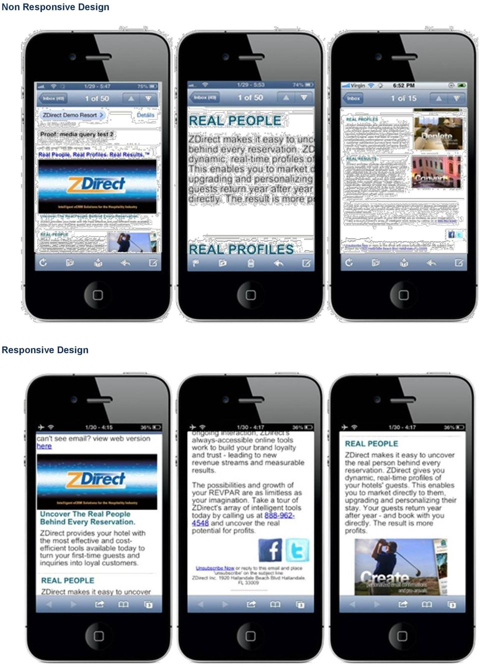
5 What were the differences? 1. Text automatically converted to 22px for easier viewing 2. Header text does not appear to condense length 3. 2-column collapsed to one column 4. width is slimmer, no need to scroll horizontally to see entire 5. Social Media icons appear double size for easy screen clicking How Do You Build a Responsive Template? Using media queries is a great method to implement Responsive Design. Happily, in the hospitality industry, for now, most mobile s are read on ios devices, which use the Webkit rendering engine which has great support for CSS. This makes media queries a consistent method that will work across the majority of mobile devices. A media query is CSS code in your HTML that can check the following: Width and height of the browser window Device width/height Orientation (landscape vs. portrait) Resolution Then, depending on the query results, the HTML will render accordingly. Typically, when an is designed with encoding for media queries, the will become narrower, large images will become smaller, and text sizes become larger for easier viewing on a mobile device. Sometimes entire sections of an will disappear when viewed on a mobile device, so as to condense the length of the . The breakpoint for a media query is generally at 480px width, which is the landscape view of an iphone (iphone screens measure 320px by 480px). A media query takes this only screen and (max-width: 480px) { insert smartphone-specific style declarations for smartphone viewing here The code above tells the device that all code between the brackets applies to only devices where the screen is smaller than 480px. All desktop screens are wider than 480px; therefore, when the is viewed on a desktop, the code in between this section is ignored; while the code is applied when viewed on a mobile device. In between these brackets are instructions for HTML formatting when the is viewed on a mobile device. Instructions inside media queries can include: Increasing font size, so there is no need to zoom in to see the text Decreasing the width, so that the width fits flush with the smartphone Collapsing sections to make the shorter in length Converting multi-column s into a single-column Decreasing image sizes Increasing sizes of social media buttons, to make it easier to tap with a finger on a phone Changing the image resolution for retina displays

6 What we want to do Build a fully responsive HTML that displays properly in a desktop web browser as well as a mobile web browser and client.

7 HTML Container CSS Styles Smartphone Style Desktop Styles Golden Rules There are a few Golden Rules to follow when doing responsive HTML design: Design using a one column layout. Using more than one column is usually not a good layout choice for small screens as those present in mobile devices. Never write styles in pixels. Try to always use relative sizes (%). And if that's not possible, you will always have to use media queries to adapt your element between different viewports. Remember that 300px looks completely different in a desktop or notebook monitor than in a mobile display. Don't repeat styles for the font family and font size in each paragraph, just once in the table tag is sufficient. Creating a Responsive Design The Container The first element we need to develop a responsive is the main container. We will use a 600px width container for the desktop and a 100% width container for mobile devices. (See next page) The first thing we note in this code is the CSS Styles block in the top of the HTML. This block is composed of two segments. The first one (in red) is used for displaying the in a desktop or notebook computer, while the second segment is used only for mobile devices. Each of these segments has two CSS rules. The first one sets the width of the container and its margins, while the second sets the font family, size and line height of the text in the . The most important things to see at this point is that the container width is 600px for desktop while 100% for mobile and the font size differs from desktop to mobile, being almost twice as big in mobile than in desktop. This is one of keys when designing for mobile as we want to avoid the user constantly zooming in and out. <style type="text/css">.container { width: 600px!important; margin: 2em auto; * { font-family: Helvetica, Arial, sans-serif; font-size: 10pt; line-height: only screen and (max-device-width: 480px) {.container,.container table { width: 100%!important; max-width: none!important; * { font-family: Helvetica, Arial, sans-serif; font-size: 18pt; line-height: 28pt; </style> The second block (in green) corresponds to the HTML container where the content will be placed. As we can see this container is a table inside a div tag. We should note that although designing layouts with tables is highly undesirable because of its rigidity, we have to do it this way because we want to maintain compatibility with Outlook. The width of the container div and table should match the width in the CSS styles. So in this case the div tag s max-width attribute should be 600px, and the table's width and max-width attributes should also be 600 in the first case (the width attribute for a table doesn't need the px suffix) and 600px in the second case. <div style="border: 1px solid #c1c1c1; width: 100%; max-width: 600px; margin: 1em auto;" class="container"> <table width="600" style="width: 100%; max-width: 600px;" align="center" border="0" cellpadding="0" cellspacing="0" style="font-family: Helvetica, Arial, sans-serif; font-size: 10pt; line-height: 20pt;"> <!-- Here goes the content of the --> <!-- End of the content -->

8 Changing 's Width for the Desktop The container we defined above is set to 600px for a desktop. Let's show how to change it to 700px (but still maintaining 100% width for mobile). We will display only those lines of code that have to be changed. <style type="text/css">.container { width: 700px!important; margin: 2em auto; </style> <div style="border: 1px solid #c1c1c1; width: 100%; max-width: 700px; margin: 1em auto;" class="container"> <table width="700" style="width: 100%; max-width: 700px;" align="center" border="0" cellpadding="0" cellspacing="0" style="style="font-family: Helvetica, Arial, sans-serif; font-size: 10pt; line-height: 20pt;"> </div> Changing the 's Font If we want to change the font by default you can do it easily by changing the font-family in the CSS styles block and in the container table tag. The default font we are using in our example is Helvetica, but let's suppose we prefer to use Comic Sans as our preferred font. <style type="text/css"> * { font-family: Comic Sans ms, only screen and (max-device-width: 480px) { </style> * { font-family: Comic Sans ms, cursive; <div style="border: 1px solid #c1c1c1; width: 100%; max-width: 600px; margin: 1em auto;" class="container"> <table width="600" style="width: 100%; max-width: 600px;" align="center" border="0" cellpadding="0" cellspacing="0" style="font-family: Comic Sans ms, cursive; font-size: 10pt; line-height: 20pt;"> </table> </div> Changing the 's Border If we want to change the color border of the we only have to change one line of code. Let's first suppose we want to change the border color from the current grey color to a green border (hex color code: #249100) <div style="border: 1px solid #249100; width: 100%; max-width: 700px; margin: 1em auto;" class="container"> </div> And now, as a second example, we will show how to remove the border. <div style="border: none; width: 100%; max-width: 700px; margin: 1em auto;" class="container"> </div>

9 Adding Content Now we ve defined a responsive container for different devices, we can start adding content to our . We will do that in the HTML container section of the HTML. As we can see the inner container is a table, so each block of the is going to be a row inside this table. It is important to note that we will use a single column table for the content, because this is the best and easiest way to create good looking designs for mobile devices. <div style="border: 1px solid #c1c1c1; width: 100%; max-width: 600px; margin: 1em auto;" class="container"> <table width="600" style="width: 100%; max-width: 600px;" align="center" border="0" cellpadding="0" cellspacing="0" style="font-family: Helvetica, Arial, sans-serif;"> <!-- Here goes the content of the --> </table> </div> <!-- End of the content --> Adding a Header Image Let's build our following a top-bottom approach. The first element we are going to insert is a big header image with a nice picture and our logo. But we can't simply add an image tag, it has to be inside one row in the table, so we will wrap it with the row tags (<tr><td>image). <!-- Here goes the content of the --> <tr><td> <img style="width: 100%" src=" /> <!-- End of the content --> An important point when adding images to a responsive layout is that we never use width or height in absolute amounts (i.e. dimensions defined in pixels). We should always use relative dimensions (i.e. %). Here we are defining the image to fill all of the space (100%) that the container provides. Note that we don't have to specify the height of the image because the browser or client will display it according to the width we specified. It's a good practice not to define the height of any image, just the width in %. Adding a Text Block In the following content we want to add our header image as a text paragraph. The code for this would be: <img <tr><td style="padding: 5%"> <p>lorem ipsum dolor sit amet, consectetur adipisicing elit, sed do eiusmod tempor incididunt ut labore et dolore magna aliqua. Ut enim ad minim veniam, quis nostrud exercitation ullamco laboris nisi ut aliquip ex ea commodo consequat. Duis aute irure dolor in reprehenderit in voluptate velit esse cillum dolore eu fugiat nulla pariatur. <strong> Excepteur sint occaecat cupidatat non proident, sunt in culpa qui officia deserunt mollit anim id est laborum.</strong></p> <p>excepteur sint occaecat cupidatat non proident, sunt in culpa qui officia deserunt mollit anim id est laborum.</p> We ve highlighted a padding inline style that adds space around the text and helps make it a cleaner design. It's important to note again that the amount of padding is not in pixels or any other absolute amount, but as a percentage to make it a responsive design.

10 Adding a Text Block with a Divider It is very common to separate the different blocks of content with divider images or borders above or below the text blocks. In the following example we are going to illustrate how to add a divider image on the top of the text block and a border on the bottom of the same block. Again we start by wrapping our content inside a table row with padding of 5% and a bottom border of 1px, and then we put the content inside this row. The first element in the row is our divider image, we add a style width: 100% because we want this image to be adapted to all the width provided by the row. However, we have to note that, as opposed to the header image, this will have padding on the right and left side of the image because we defined a padding of 5% for the row which contains the image. <tr><td style="padding: 5%; border-bottom: 1px solid #DDD"> <img style="width: 100%; margin-bottom: 1em" src=" /> <img style="width: 35%; margin: 1em; float: right; box-shadow: 0 0 1em #333;" src=" /> Ut enim ad minim veniam, quis nostrud exercitation ullamco:<br /> <ul> <li>lorem ipsum dolor sit amet</li> <li>consectetur adipisicing elit</li> <li>ut enim ad minim veniam</li> <li><em>sed do eiusmod</em> tempor incididunt ut labore et dolore magna aliqua.</li> <li>quis nostrud exercitation ullamco laboris nisi ut aliquip ex ea commodo consequat</li> </ul> The second element we can see is a small image which is defined to float on the right side (ie float: right) of the text block. Using a float image instead of a two column table (one column for text and one for the image) offers a better result when displaying the in a mobile device than using a two column table. If instead of displaying the image on the right side of the text block we would prefer to display it in the left side, the style would be float: left. It's also important to note that we defined again the image width as a percentage of the container, instead of using pixels, this way is strongly preferred when doing a responsive design layout. We also added a margin of 1em around the image to avoid sticking the image with the text. The measure 1em is a relative measure to the default font size. So if we have set up the desktop default font size to be 10pt, 1em will be equal to 10pt, and at the same time, if the default font size for mobile devices is 18pt, 1em in a Smartphone will be 18pt. The image also has a small shadow around it to make it prettier. Adding a Text Block with an Image on the Left Side and Different Font Family This block is very similar to the previous one, but in this case we don't want the divider image, just text and a floating image, this time on the left side of the text. We will also change the font for the text in this block and highlight one of the sentences in red. <tr><td style="padding: 5%; border-bottom: 1px solid #DDD; font-family: 'Times New Roman';"> <img style="width: 35%; float: left; margin-right: 2em; box-shadow: 0px 0px 10px #333;" src=" /> Lorem ipsum dolor sit amet, consectetur adipisicing elit, <span style="color: #a00">sed do eiusmod tempor</span> incididunt ut labore et dolore magna aliqua. Ut enim ad minim veniam, quis nostrud exercitation ullamco laboris nisi ut aliquip As you can see the structure is very similar to the previous block, in this case, because we want the text to be displayed with a different font than the default, we added our new font style in the row. The image is defined in percentage terms and floating, this time in the left of the text. We ve also added a margin on the right side of 1em to avoid sticking the image to the text of the block.

11 Adding a Footer with a Smaller Font Size and Different Color The last block to finish building our responsive design is the footer. We want this footer to have a link centered with a blue color and a text paragraph with a smaller font than the default one <tr><td style="padding: 5%;"> <p style="text-align: center;"><a href=" style="color: #0ae; text-decoration: none; font-weight: bold;">terms and Conditions</a></p> <p style="font-size: 80%; line-height: 1.2em; text-align: justify; color: #BBB;">* Lorem ipsum dolor sit amet, consectetur adipisicing elit, sed do eiusmod tempor incididunt ut labore et dolore magna aliqua. Ut enim ad minim veniam, quis nostrud exercitation ullamco laboris nisi ut aliquip ex ea commodo consequat. Duis aute irure dolor in reprehenderit in voluptate velit esse cillum dolore eu fugiat nulla pariatur.</p> Because we want the link to be centered horizontally, we have to wrap it in a p (paragraph) HTML tag and give this tag a text-align: center style. For the inner link we also define a set of inline CSS styles like the color, no underline (text-decoration: none) and a bold font weight. The second paragraph contains the footer text which we want to have a different font size than the layout default. It is important to note that we don't define the font-size in pixels or pt, but in percentage. In this case we wanted the font size to be slightly smaller than the default size in the (80% of the default font size). Appendix: Full HTML Code On next page

12 Appendix: Full HTML Code <html> <head> </head> <body> <style type="text/css">.container { width: 600px!important; margin: 2em auto; * { font-family: Helvetica, Arial, sans-serif; font-size: 10pt; line-height: only screen and (max-device-width: 480px) {.container,.container table { width: 100%!important; max-width: none!important; * { font-family: Helvetica, Arial, sans-serif; font-size: 18pt; line-height: 28pt; </style> <div style="border: 1px solid #c1c1c1; width: 100%; max-width: 600px; margin: 1em auto;" class="container"> <table width="600" style="width: 100%; max-width: 600px;" align="center" border="0" cellpadding="0" cellspacing="0" style="font-family: Helvetica, Arial, sans-serif; font-size: 10pt; line-height: 20pt;"> <tr><td> <img width="100%" style="width: 100%" src=" /> <tr><td style="padding: 5%"> <p>lorem ipsum dolor sit amet, consectetur adipisicing elit, sed do eiusmod tempor incididunt ut labore et dolore magna aliqua. Ut enim ad minim veniam, quis nostrud exercitation ullamco laboris nisi ut aliquip ex ea commodo consequat. Duis aute irure dolor in reprehenderit in voluptate velit esse cillum dolore eu fugiat nulla pariatur. <strong> Excepteur sint occaecat cupidatat non proident, sunt in culpa qui officia deserunt mollit anim id est laborum.</strong></p> <p>excepteur sint occaecat cupidatat non proident, sunt in culpa qui officia deserunt mollit anim id est laborum.</p> <tr><td style="padding: 5%; border-bottom: 1px solid #DDD"> <img width="100%" style="width: 100%; margin-bottom: 1em" src=" /> <img width="35%" style="width: 35%; margin: 1em; float: right; box-shadow: 0px 0px 10px #333;" src=" /> Ut enim ad minim veniam, quis nostrud exercitation ullamco:<br /> <ul> <li>lorem ipsum dolor sit amet</li>

13 </body> </html> <li>consectetur adipisicing elit</li> <li>ut enim ad minim veniam</li> <li><em>sed do eiusmod</em> tempor incididunt ut labore et dolore magna aliqua.</li> <li>quis nostrud exercitation ullamco laboris nisi ut aliquip ex ea commodo consequat</li> </ul> <tr><td style="padding: 5%; border-bottom: 1px solid #DDD; font-family: 'Times New Roman';"> <img style="width: 35%; float: left; margin-right: 2em; box-shadow: 0px 0px 10px #333;" src=" /> Lorem ipsum dolor sit amet, consectetur adipisicing elit, <span style="color: #a00">sed do eiusmod tempor</span> incididunt ut labore et dolore magna aliqua. Ut enim ad minim veniam, quis nostrud exercitation ullamco laboris nisi ut aliquip <tr><td style="padding: 5%;"> <p style="text-align: center;"><a href=" style="color: #0ae; text-decoration: none; font-weight: bold;">terms and Conditions</a></p> <p style="font-size: 80%; line-height: 1.2em; text-align: justify; color: #BBB;">* Lorem ipsum dolor sit amet, consectetur adipisicing elit, sed do eiusmod tempor incididunt ut labore et dolore magna aliqua. Ut enim ad minim veniam, quis nostrud exercitation ullamco laboris nisi ut aliquip ex ea commodo consequat. Duis aute irure dolor in reprehenderit in voluptate velit esse cillum dolore eu fugiat nulla pariatur.</p> </table> </div>

Thesis Format Guidelines. Department of Curriculum and Instruction Purdue University
 Thesis Format Guidelines Department of Curriculum and Instruction Purdue University 2 Overview All theses must be prepared according to both departmental format requirements and University format requirements,
CONTENTS. 03 BRAND IDENTITY 04 Logo 06 Wordmark 07 Graphic Element 08 Logo Usage 13 Logo Elements
 GRAPHIC STANDARDS 1 CONTENTS 2 03 BRAND IDENTITY 04 Logo 06 Wordmark 07 Graphic Element 08 Logo Usage 13 Logo Elements 14 SUPPORTING ELEMENTS 15 Color Specifications 16 Typography 17 Layout & Photography
www.xad.com Creative GUIDELINES
 www.xad.com Creative GUIDELINES General Guidelines Required Assets For best results, please provide fully editable assets. FILES Design Files - Layered PSD (Photoshop) / Layered PNG (Fireworks) Fonts -
franchise applications
 using this style guide business card stationery PowerPoint RFP cover fax coversheet e-mail signature grammar style building signage trucks boxes yellow pages marketing materials web sites 1 business card
Email Creator Coding Guidelines Toolbox
 Email Creator Coding Guidelines Toolbox The following information is needed when coding your own template from html to be imported into the Email Creator. You will need basic html and css knowledge for
How to Extend your Identity Management Systems to use OAuth
 How to Extend your Identity Management Systems to use OAuth THE LEADER IN API AND CLOUD GATEWAY TECHNOLOGY How to extend your Identity Management Systems to use OAuth OAuth Overview The basic model of
Practicing Law with a Virtual Law Office
 Practicing Law with a Virtual Law Office presented by Stephanie Kimbro, MA, JD Attorney, Kimbro Legal Services Technology Consultant, Total Attorneys Greensboro Bar March 29, 2011 Overview Part One: Introduction
Identity Guidelines. by SMARTBEAR
 Identity Guidelines version 1.0 nov 2 2012 Conteents SmartBear Corporate Identity Guide Contents 3...Introduction 4... Brand Architecture 5... The SmartBear Brand 6-7... Sub-Brand Family 8... Why and How
Cincinnati State Admissions UX Design 06.02.14
 Cincinnati State Admissions UX Design 06.0.4 About This Document This documents seeks to establish high level requirements for functionality and UI. It suggests content and ways to accommodate content.
SA-1 SMOKE ALARM installation & user guide
 SA-1 SMOKE ALARM installation & user guide SA-1 Smoke Alarm A smoke alarm is an excellent safety device and with the IT Watchdogs SA-1, not only will you have the usual audible alarm signal if something
Web Design Basics. Cindy Royal, Ph.D. Associate Professor Texas State University
 Web Design Basics Cindy Royal, Ph.D. Associate Professor Texas State University HTML and CSS HTML stands for Hypertext Markup Language. It is the main language of the Web. While there are other languages
University at Albany Graphic Identity Manual
 University at Albany Identity Guidelines 1 University at Albany Graphic Identity Manual Version 4.0 (Updated 01/11) University at Albany Graphic Identity Manual 1 Contents 1 Introduction 1.1 The World
RESPONSIVE EMAIL DESIGN BY COMMUNIGATOR
 RESPONSIVE EMAIL DESIGN BY COMMUNIGATOR RESPONSIVE EMAIL DESIGN According to stats from Litmus, in 2014 at least 53% of emails were opened on a mobile device. That is a huge increase from 2011 when the
Web Design and Databases WD: Class 7: HTML and CSS Part 3
 Web Design and Databases WD: Class 7: HTML and CSS Part 3 Dr Helen Hastie Dept of Computer Science Heriot-Watt University Some contributions from Head First HTML with CSS and XHTML, O Reilly Recap! HTML
English. Italiano. Français
 Annex 2b - UN Visual Identity Manual - updated 31.07.2014 UN-EXPO MILANO 2015 LOGO BOOK English Italiano Français LOGO BOOK Annex 2b - UN Visual Identity Manual - updated 31.07.2014 UN-EXPO MILANO 2015
Branding Guidelines CONEXPO Latin America, Inc. 2013 10-1657 (Rev-1) 08.2010 1
 08.2010 1") Branding Guidelines CONEXPO Latin America, Inc. 2013 10-1657 (Rev-1) 08.2010 1 UNDERSTANDING THE BRAND CONEXPO Latin America AEM sets the global standard in the organization and operation of high quality
Branding Guidelines CONEXPO Latin America, Inc. 2013 10-1657 (Rev-1) 08.2010 1 UNDERSTANDING THE BRAND CONEXPO Latin America AEM sets the global standard in the organization and operation of high quality
EVENT PLANNING MYTHBUSTER. Building Pre-event Engagement: How to Make an Email Invite
 EVENT PLANNING MYTHBUSTER Building Pre-event Engagement: How to Make an Email Invite YOUR STEP BY STEP GUIDE In reality, most events begin months before the doors open on the first day. The internet is
Desktop Publishing (DTP)
") Desktop Publishing (DTP) ICHS Graphic Communication What is it? Desktop Publishing is what graphic designers would use to produce work which requires organization of text, images and style. Desktop Publishing
Desktop Publishing (DTP) ICHS Graphic Communication What is it? Desktop Publishing is what graphic designers would use to produce work which requires organization of text, images and style. Desktop Publishing
Web Design with CSS and CSS3. Dr. Jan Stelovsky
 Web Design with CSS and CSS3 Dr. Jan Stelovsky CSS Cascading Style Sheets Separate the formatting from the structure Best practice external CSS in a separate file link to a styles from numerous pages Style
Website Style Guide 2014
 Website Style Guide 2014 Contents 3 Color / Pallette 29-30 Images / Tablet & Mobile Icons 4 Page Templates / List 31 Images / What Not to Do 5 Typography / Fonts 32 Portal / Image Specifications 6-7 Typography
GUIDE TO CODE KILLER RESPONSIVE EMAILS
 GUIDE TO CODE KILLER RESPONSIVE EMAILS THAT WILL MAKE YOUR EMAILS BEAUTIFUL 3 Create flawless emails with the proper use of HTML, CSS, and Media Queries. But this is only possible if you keep attention
Email Campaign Guidelines and Best Practices
 epromo Guidelines HTML Maximum width 700px (length = N/A) Maximum total file size, including all images = 200KB Only use inline CSS, no stylesheets Use tables, rather than layout Use more TEXT instead
8 STEPS TO CODE KILLER RESPONSIVE EMAILS
 8 STEPS TO CODE KILLER RESPONSIVE EMAILS THAT WILL MAKE YOUR EMAILS BEAUTIFUL 3 BUILD RESPONSIVE EMAIL STEP BY STEP Steps to create a simple responsive email template. (fluid image, main content, two
KNOWLEDGE TRANSFER, CONTINUITY, AND DOCUMENTATION
 S O L A R C A R C O N F E R E N C E M A R C H 2 0-2 2, 2 0 1 5 U N I V E R S I T Y O F M I C H I G A N KNOWLEDGE TRANSFER, CONTINUITY, AND DOCUMENTATION Aaron Frantz Operations Director, University of
The Future of Ticketing: Solutions for Museums of All Sizes
 The Future of Ticketing: Solutions for Museums of All Sizes May 21, 2014 Lord Cultural Resources Creating Cultural Capital STRATEGIC QUESTIONS Should museums have queues? How could a strategic approach
Bold Future 2007 Building our Company with the needs of future generations in mind Activity Report 2007
 Bold Future 2007 Building our Company with the needs of future generations in mind Activity Report 2007 Key Figures ArcelorMittal is the largest and the most integrated steel company in the world, with
A Step by Step Guide to Creating an App. by Carter Thomas, Bluecloud LLC
 A Step by Step Guide to Creating an App by Carter Thomas, Bluecloud LLC Disclaimer No part of this publication may be reproduced or transmitted in any form or by any means, mechanical or electronic, including
Email marketing Best practice guide
 Email marketing Best practice guide March 2012 Campaignmaster UK Email Marketing - Best Practice Guide Congress House 4th Floor 14 Lyon Road Harrow London, HA1 2EN Notice of Rights No part of this guide
Basic Website Maintenance Tutorial*
 Basic Website Maintenance Tutorial* Introduction You finally have your business online! This tutorial will teach you the basics you need to know to keep your site updated and working properly. It is important
Using Style Sheets for Consistency
 Cascading Style Sheets enable you to easily maintain a consistent look across all the pages of a web site. In addition, they extend the power of HTML. For example, style sheets permit specifying point
Creating a Resume Webpage with
 Creating a Resume Webpage with 6 Cascading Style Sheet Code In this chapter, we will learn the following to World Class CAD standards: Using a Storyboard to Create a Resume Webpage Starting a HTML Resume
The Essential Guide to HTML Email Design
 The Essential Guide to HTML Email Design Index Introduction... 3 Layout... 4 Best Practice HTML Email Example... 5 Images... 6 CSS (Cascading Style Sheets)... 7 Animation and Scripting... 8 How Spam Filters
Magento Responsive Theme Design
 Magento Responsive Theme Design Richard Carter Chapter No. 2 "Making Your Store Responsive" In this package, you will find: A Biography of the author of the book A preview chapter from the book, Chapter
DevOps: Extending Agile Development Disciplines to Deployment. 2009 IBM Corporation
 DevOps: Extending Agile Development Disciplines to Deployment Please note IBM Corporation 2012 The information contained in this presentation is provided for informational purposes only. While efforts
Modern Web Apps with HTML5 Web Components, Polymer, and Java EE MVC 1.0. Kito Mann (@kito99), Virtua, Inc.
, Virtua, Inc.") Modern Web Apps with HTML5 Web Components, Polymer, and Java EE MVC 1.0 Kito Mann (@kito99), Virtua, Inc. Kito D. Mann (@kito99) Principal Consultant at Virtua (http://www.virtua.com) Training, consulting,
Modern Web Apps with HTML5 Web Components, Polymer, and Java EE MVC 1.0 Kito Mann (@kito99), Virtua, Inc. Kito D. Mann (@kito99) Principal Consultant at Virtua (http://www.virtua.com) Training, consulting,
How to Properly Compose E-Mail HTML Code : 1
 How to Properly Compose E-Mail HTML Code : 1 For any successful business, creating and sending great looking e-mail is essential to project a professional image. With the proliferation of numerous e-mail
MCH Strategic Data Best Practices Review
 MCH Strategic Data Best Practices Review Presenters Alex Bardoff Manager, Creative Services [email protected] Lindsey McFadden Manager, Campaign Production Services [email protected] 2 Creative
RESPONSIVE DESIGN FOR MOBILE RENDERING
 WHITEPAPER RESPONSIVE DESIGN FOR MOBILE RENDERING DELIVER MOBILE-SPECIFIC CONTENT USING MEDIA QUERIES EXECUTIVE SUMMARY With the widespread adoption of smartphones and tablets, proper email rendering in
I WORK FOR UX PORTFOLIO GUIDANCE
 I WORK FOR UX PORTFOLIO GUIDANCE CONTENTS INTRODUCTION 3 THE DESIGN OF YOUR PORTFOLIO 4 UX DELIVERABLES CLIENTS WANT TO SEE 8 TIPS 14 ABOUT ZEBRA PEOPLE 15 INTRODUCTION Viewing, sending and receiving feedback
Principles of Web Design 6 th Edition. Chapter 12 Responsive Web Design
 Principles of Web Design 6 th Edition Chapter 12 Responsive Web Design Objectives Recognize the need for responsive web design Use media queries to apply conditional styles Build a basic media query Create
Outline of CSS: Cascading Style Sheets
 Outline of CSS: Cascading Style Sheets nigelbuckner 2014 This is an introduction to CSS showing how styles are written, types of style sheets, CSS selectors, the cascade, grouping styles and how styles
Dreamweaver CS4 Day 2 Creating a Website using Div Tags, CSS, and Templates
 Dreamweaver CS4 Day 2 Creating a Website using Div Tags, CSS, and Templates What is a DIV tag? First, let s recall that HTML is a markup language. Markup provides structure and order to a page. For example,
About the Tutorial. Audience. Prerequisites. Copyright & Disclaimer
 i About the Tutorial Twitter Bootstrap is the most popular front end framework in the recent time. It is sleek, intuitive, and powerful mobile first front-end framework for faster and easier web development.
Designing HTML Emails for Use in the Advanced Editor
 Designing HTML Emails for Use in the Advanced Editor For years, we at Swiftpage have heard a recurring request from our customers: wouldn t it be great if you could create an HTML document, import it into
The views expressed in this publication are those of the authors and do not necessarily represent those of Lumina Foundation, the Bill and Melinda
 The views expressed in this publication are those of the authors and do not necessarily represent those of Lumina Foundation, the Bill and Melinda Gates Foundation, or the U.S. Department of Education,
<Insert Picture Here>
 Designing the Oracle Store with Oracle Application Express Marc Sewtz Software Development Manager Oracle Application Express Oracle USA Inc. 540 Madison Avenue,
ITNP43: HTML Lecture 4
 ITNP43: HTML Lecture 4 1 Style versus Content HTML purists insist that style should be separate from content and structure HTML was only designed to specify the structure and content of a document Style
CST 150 Web Design I CSS Review - In-Class Lab
 CST 150 Web Design I CSS Review - In-Class Lab The purpose of this lab assignment is to review utilizing Cascading Style Sheets (CSS) to enhance the layout and formatting of web pages. For Parts 1 and
A send-a-friend application with ASP Smart Mailer
 A send-a-friend application with ASP Smart Mailer Every site likes more visitors. One of the ways that big sites do this is using a simple form that allows people to send their friends a quick email about
8 Ways Marketing Automation Can Expand Your Search Marketing Practice. 8 Ways Marketing Automation Can Expand Your Search Marketing Practice 1
 8 Ways Marketing Automation Can Expand Your Search Marketing Practice 8 Ways Marketing Automation Can Expand Your Search Marketing Practice 1 If you re already good at search marketing M arketing automation
Web layout guidelines for daughter sites of Scotland s Environment
 Web layout guidelines for daughter sites of Scotland s Environment Current homepage layout of Scotland s Aquaculture and Scotland s Soils (September 2014) Design styles A daughter site of Scotland s Environment
HTML TIPS FOR DESIGNING
 This is the first column. Look at me, I m the second column.
Web Design Revision. AQA AS-Level Computing COMP2. 39 minutes. 39 marks. Page 1 of 17
 Web Design Revision AQA AS-Level Computing COMP2 204 39 minutes 39 marks Page of 7 Q. (a) (i) What does HTML stand for?... () (ii) What does CSS stand for?... () (b) Figure shows a web page that has been
Web Design and Development ACS-1809. Chapter 9. Page Structure
 Web Design and Development ACS-1809 Chapter 9 Page Structure 1 Chapter 9: Page Structure Organize Sections of Text Format Paragraphs and Page Elements 2 Identifying Natural Divisions It is normal for a
Selectors in Action LESSON 3
 LESSON 3 Selectors in Action In this lesson, you will learn about the different types of selectors and how to use them. Setting Up the HTML Code Selectors are one of the most important aspects of CSS because
CREATING A NEWSLETTER IN ADOBE DREAMWEAVER CS5 (step-by-step directions)
") CREATING A NEWSLETTER IN ADOBE DREAMWEAVER CS5 (step-by-step directions) Step 1 - DEFINE A NEW WEB SITE - 5 POINTS 1. From the welcome window that opens select the Dreamweaver Site... or from the main
CREATING A NEWSLETTER IN ADOBE DREAMWEAVER CS5 (step-by-step directions) Step 1 - DEFINE A NEW WEB SITE - 5 POINTS 1. From the welcome window that opens select the Dreamweaver Site... or from the main
JJY s Joomla 1.5 Template Design Tutorial:
 JJY s Joomla 1.5 Template Design Tutorial: Joomla 1.5 templates are relatively simple to construct, once you know a few details on how Joomla manages them. This tutorial assumes that you have a good understanding
What is CSS? Official W3C standard for controlling presentation Style sheets rely on underlying markup structure
 CSS Peter Cho 161A Notes from Jennifer Niederst: Web Design in a Nutshell and Thomas A. Powell: HTML & XHTML, Fourth Edition Based on a tutorials by Prof. Daniel Sauter / Prof. Casey Reas What is CSS?
No Frills Magento Layout. Alan Storm
 No Frills Magento Layout Alan Storm April 2011 Contents 0 No Frills Magento Layout: Introduction 5 0.1 Who this Book is For........................ 6 0.2 No Frills................................ 6 0.3
Last week we talked about creating your own tags: div tags and span tags. A div tag goes around other tags, e.g.,:
 CSS Tutorial Part 2: Last week we talked about creating your own tags: div tags and span tags. A div tag goes around other tags, e.g.,: animals A paragraph about animals goes here
ICE: HTML, CSS, and Validation
 ICE: HTML, CSS, and Validation Formatting a Recipe NAME: Overview Today you will be given an existing HTML page that already has significant content, in this case, a recipe. Your tasks are to: mark it
Responsive Web Design: Media Types/Media Queries/Fluid Images
 HTML Media Types Responsive Web Design: Media Types/Media Queries/Fluid Images Mr Kruyer s list of HTML Media Types to deliver CSS to different devices. Important note: Only the first three are well supported.
CHAPTER 10. When you complete this chapter, you will be able to:
 Data Tables CHAPTER 10 When you complete this chapter, you will be able to: Use table elements Use table headers and footers Group columns Style table borders Apply padding, margins, and fl oats to tables
Creative Guidelines for Emails
 Version 2.1 Contents 1 Introduction... 3 1.1 Document Aim and Target Audience... 3 1.2 WYSIWYG editors... 3 1.3 Outlook Overview... 3 2 Quick Reference... 4 3 CSS and Styling... 5 3.1 Positioning... 5
Structured Product Labeling (SPL) Implementation Guide with Validation Procedures
 Implementation Guide with Validation Procedures") Structured Product Labeling (SPL) Implementation Guide with Validation Procedures Technical Specifications Document This Document is incorporated by reference into the following Guidance Document(s): Guidance
Structured Product Labeling (SPL) Implementation Guide with Validation Procedures Technical Specifications Document This Document is incorporated by reference into the following Guidance Document(s): Guidance
Disclosure Obligations of Issuers of Municipal Securities
 Disclosure Obligations of Issuers of Municipal Securities brooke d. abola and stephen a. spitz About the Authors Brooke D. Abola, a senior associate in the San Francisco office of Orrick, Herrington &
Looking Good! Troubleshooting Email Display Problems
 E-mail Direct Mail Digital Marketing Sales Tools Funding Data Creative Services Looking Good! Troubleshooting Email Display Problems November 19, 2014 Today s Speaker Geoff Phillips Senior Editor & Email
Essential HTML & CSS for WordPress. Mark Raymond Luminys, Inc. 949-654-3890 [email protected] www.luminys.com
 Essential HTML & CSS for WordPress Mark Raymond Luminys, Inc. 949-654-3890 [email protected] www.luminys.com HTML: Hypertext Markup Language HTML is a specification that defines how pages are created
This document will describe how you can create your own, fully responsive. drag and drop email template to use in the email creator.
 1 Introduction This document will describe how you can create your own, fully responsive drag and drop email template to use in the email creator. It includes ready-made HTML code that will allow you to
Contents. Downloading the Data Files... 2. Centering Page Elements... 6
 Creating a Web Page Using HTML Part 1: Creating the Basic Structure of the Web Site INFORMATION TECHNOLOGY SERVICES California State University, Los Angeles Version 2.0 Winter 2010 Contents Introduction...
Mobile Web Site Style Guide
 YoRk University Mobile Web Site Style Guide Table of Contents This document outlines the graphic standards for the mobile view of my.yorku.ca. It is intended to be used as a guide for all York University
Introduction to Adobe Dreamweaver CC
 Introduction to Adobe Dreamweaver CC What is Dreamweaver? Dreamweaver is the program that we will be programming our websites into all semester. We will be slicing our designs out of Fireworks and assembling
WHITEPAPER. Skinning Guide. Let s chat. 800.9.Velaro www.velaro.com [email protected]. 2012 by Velaro
 WHITEPAPER Skinning Guide Let s chat. 2012 by Velaro 800.9.Velaro www.velaro.com [email protected] INTRODUCTION Throughout the course of a chat conversation, there are a number of different web pages that
Web Design I. Spring 2009 Kevin Cole Gallaudet University 2009.03.05
 Web Design I Spring 2009 Kevin Cole Gallaudet University 2009.03.05 Layout Page banner, sidebar, main content, footer Old method: Use , , New method: and "float" CSS property Think
CSS for Page Layout. Key Concepts
 CSS for Page Layout Key Concepts CSS Page Layout Advantages Greater typography control Style is separate from structure Potentially smaller documents Easier site maintenance Increased page layout control
How to craft a modern, mobile-optimized HTML email template. Jason Samuels, NCFR IT Manager DrupalCamp Twin Cities May 2012
 How to craft a modern, mobile-optimized HTML email template Jason Samuels, NCFR IT Manager DrupalCamp Twin Cities May 2012 Our old email template Pros Simple Lightweight Worked as plain-text Rendered OK
CREATING HORIZONTAL NAVIGATION BAR USING ADOBE DREAMWEAVER CS5
 CREATING HORIZONTAL NAVIGATION BAR USING ADOBE DREAMWEAVER CS5 Step 1 - Creating list of links - (5 points) Traditionally, CSS navigation is based on unordered list - . Any navigational bar can be
BlueHornet Whitepaper
 BlueHornet Whitepaper Best Practices for HTML Email Rendering BlueHornet.com Page Page 1 1 2007 Inc. A wholly owned subsidiary of Digital River, Inc. (619) 295-1856 2150 W. Washington Street #110 San Diego,
Responsive Web Design
 Rogatnev Nikita Responsive Web Design Bachelor s Thesis Information Technology May 2015 DESCRIPTION Date of the bachelor's thesis 28.05.2015 Author(s) Rogatnev Nikita Degree programme and option Technology,
HTML CSS Basic Structure. HTML Structure [Source Code] CSS Structure [Cascading Styles] DIV or ID Tags and Classes. The BOX MODEL
![HTML CSS Basic Structure. HTML Structure [Source Code] CSS Structure [Cascading Styles] DIV or ID Tags and Classes. The BOX MODEL](/thumbs/40/20611446.jpg "HTML CSS Basic Structure. HTML Structure [Source Code] CSS Structure [Cascading Styles] DIV or ID Tags and Classes. The BOX MODEL") HTML CSS Basic Structure HTML [Hypertext Markup Language] is the code read by a browser and defines the overall page structure. The HTML file or web page [.html] is made up of a head and a body. The head
HTML CSS Basic Structure HTML [Hypertext Markup Language] is the code read by a browser and defines the overall page structure. The HTML file or web page [.html] is made up of a head and a body. The head
{color:blue; font-size: 12px;}
 CSS stands for cascading style sheets. Styles define how to display a web page. Styles remove the formatting of a document from the content of the document. There are 3 ways that styles can be applied:
Web Design for Print Designers WEB DESIGN FOR PRINT DESIGNERS: WEEK 6
 Web Design for Print Designers CSS uses a variety of declarations for styling text. Many use the variations of the font declaration. Other styles are done using different declarations. The font declaration
Web Building Blocks. Joseph Gilbert User Experience Web Developer University of Virginia Library joe.gilbert@virginia.
 Web Building Blocks Core Concepts for HTML & CSS Joseph Gilbert User Experience Web Developer University of Virginia Library [email protected] @joegilbert Why Learn the Building Blocks? The idea
Going Beyond SAP ITS Mobile Apps to a Responsive Design Mobile Apps. JK (JayaKumar Pedapudi) Principal Consultant NTT DATA, Inc.
 Principal Consultant NTT DATA, Inc.") Going Beyond SAP ITS Mobile Apps to a Responsive Design Mobile Apps JK (JayaKumar Pedapudi) Principal Consultant NTT DATA, Inc. Introduction. Learning Points. What is Responsive Design and its Role? Design
Going Beyond SAP ITS Mobile Apps to a Responsive Design Mobile Apps JK (JayaKumar Pedapudi) Principal Consultant NTT DATA, Inc. Introduction. Learning Points. What is Responsive Design and its Role? Design