Building Responsive Layouts
|
|
|
- Brianna Stevenson
- 10 years ago
- Views:
Transcription
1 Building Responsive Layouts by Zoe Mickley August 28, 2012 Responsive Web Design Summit

2 What I do Books Stunning CSS3: A Project-based Guide to the Latest in CSS Flexible Web Design: Creating Liquid and Elastic Layouts with CSS Web Accessibility specialist at AT&T Visual designer CSS developer and consultant 2

3 why responsive web design works 3

4 what why responsive web design means 4

5 what why? how to do responsive web design 5

6 fluid/liquid layout uses percentage widths to adapt to size of viewport 6

7 hybrid layout one+ column flexible, one+ not 7

8 responsive web design fluid layout and flexible images adapted with media queries 8

9 adaptive layouts multiple fixed-width layouts swapped with media queries 9

10 Look at this! This is so tough! I'm in such peril way up here! 10

11 Oh, wait 11

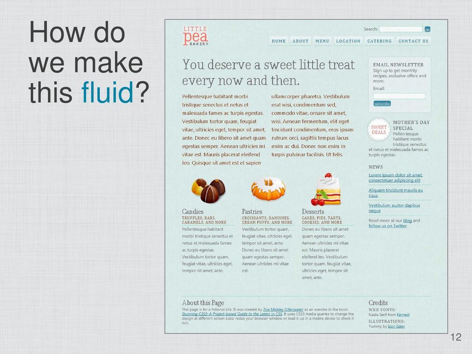
12 How do we make this fluid? 12
13 Start with fluid wrapper 13

14 Add opposing floats inside 14

15 3-column layout: nest 2-column layout inside 2-column layout 15

16 Percentages are relative 16

17 Determining nested widths width of column you want to match width of parent column = width of nested column 17

18 Determining nested widths width of column you want to match width of parent column = width of nested column target context = result 18

19 Determining nested widths width of column you want to match width of parent column = width of nested column target context = result =.25 which means 25% 19

20 That's more like it 20

21 What about fluid grids? 21
22 Width of this nested block? 22
23 Well that's not right 23
24 To the laboratory! width of column you want to match width of parent column = width of nested column target context = result =.4 which means 40% 24
25 There we go 25
26 widths? spacing between and in fluid columns 26
27 Leave a gap via widths 27
28 Declaring fluid margin/padding Adjust widths so everything adds up to just under 100% Avoids problems due to rounding % to px Nesting affects margin/padding values too Use target/context formula to match outer spacing with inner spacing 28
29 Using box-sizing Makes fixed-width margin/padding on fluid layout easy Standard box model box-sizing: content-box Padding & border added on to width/height New box model box-sizing: border-box Padding & border subtracted from width/height 29
30 Fluid grid, fixed-width spacing.column { float: left; -webkit-box-sizing: border-box; -moz-box-sizing: border-box; box-sizing: border-box; padding: 0 20px; } 30
31 Use border as faux margin.column { float: left; -webkit-box-sizing: border-box; -moz-box-sizing: border-box; box-sizing: border-box; padding: 0 20px; border-left: 10px solid rgba(0,0,0,0); -moz-background-clip: padding-box; -webkit-background-clip: padding-box; background-clip: padding-box; }.row { margin-left: -10px; } 31
32 Fix box-sizing in IE 7 and 6 Feed different dimensions based on content-box-model, or Use Christian Schaefer's box-sizing polyfill { box-sizing: border-box; *behavior: url(boxsizing.htc); } 32
33 I recommend gridpak.com 33
34 fluid? hybrid main column fluid, sidebar fixed 34
35 Hybrid layout options Easy: sidebars first in HTML Float sidebars, main content moves up between floats But usually not option in responsive design Tricky: main content first in HTML Need to float it, but with what width? One solution: negative margins 35
36 Fixed-width sidebar starting point 36
37 Add wrapper with padding #content-wrapper { padding-right: 290px; } 37
38 Lay out main content div #content-main { float: left; width: 100%; } 38
39 Float sidebar #content-secondary { float: right; width: 250px; } 39
40 A positive right margin 150px 40
41 A negative right margin -150px 41
42 Add negative right margin matching wrapper's right padding #content-secondary { float: right; width: 250px; margin-right: -290px; } 42
43 Success! 43
44 To make sidebar show in IE 6 #content-wrapper { zoom: 1; } #content-main, #content-secondary { display: inline; } 44
45 3-column hybrid layout Nest one 2-column layout inside another Components of each layout: 1. Wrapper with padding on one side 2. Fixed-width sidebar Same width as padding (or smaller) Floated same direction as padding Negative margin matching padding on same side 3. Fluid column Floated opposite direction Width 100% 45
46 fluid layout? media queries feed different styles based on viewport size 46
47 Choosing default styles Start "mobile," layer on wider styles? Start "desktop," layer on narrower styles? Start somewhere in between, layer on both? Learn full pros/cons: 47
48 Starting in the middle 48
49 Wide-screen media query /*all the other styles up screen and (min-width: 1200px) { /*styles for larger screens in here*/ } 49
50 Add third screen and (min-width: 1200px) { #nav-main { position: fixed; top: 136px; width: 13%; margin: 0; } #content-main { width: 58%; margin-left: 18%; } #content-secondary { width: 20%; } } 50
51 Style nav as vertical screen and (min-width: 1200px) {... #nav-main li { float: none; margin: 0; } #nav-main a { -moz-border-radius: 0; -webkit-border-radius: 0; border-radius: 0; } } 51
52 Wide-screen design 52
53 Small-screen media query /*all the other styles up screen and (max-width: 760px) { /*styles for smaller screens in here*/ } 53
54 Things to fix too few words per line, so make all one column each too narrow, so stack instead and put pic on left 54
55 Narrowscreen design 55
56 Mobile media query /*all the other styles up screen and (max-width: 550px) { /*styles for tiny screens in here*/ } 56
57 Non-overlapping screen and (min-width: 551px) and (max-width: 760px) { /*styles for small screens in here*/ screen and (max-width: 550px) { /*styles for tiny screens in here*/ } 57
58 Changing to single screen and (max-width: 550px) { #content-main, #content-secondary, #about, #credits { float: none; width: 100%; } } 58
59 Changing feature screen and (max-width: 550px) {....feature { padding-left: 70px; } #feature-candy { background-image: url(icon_candy_64.png); } #feature-pastry { background-image: url(icon_pastry_64.png); } #feature-dessert { background-image: url(icon_dessert_64.png); } } 59
60 Mobile design 60
61 Viewport meta tag Forces mobile devices to scale viewport to actual device width <meta name="viewport" content="width=device-width"> 61
62 Zoom problem in ios The device-width on ios devices always matches portrait width This means design doesn't reflow when you switch to landscape, but instead just zooms 62
63 Fixing (and adding) zoom issues Option 1: add maximum-scale=1 But disables user scaling <meta name="viewport" content="width=device-width, maximum-scale=1"> Option 2: add initial-scale=1 Allows user scaling But triggers over-zoom/crop bug when changing from portrait to landscape <meta name="viewport" content="width=device-width, initial-scale=1"> 63
64 The best way to fix zoom issues Option 3: add initial-scale=1 plus script to fix over-zoom bug See the_ios_orientationchange_zoom_bug/ <head>... <meta name="viewport" content="width=device-width, initial-scale=1"> <script src="ios-orientationchange-fix.js">... </head> 64
65 conditional comments or JavaScript to deal with IE 8 and earlier 65
66 Conditional comments Split styles into separate sheets and feed applicable sheet to IE based on whether it's IE on desktop or mobile Approach varies based on which set of styles are your default 66
67 Conditional comment when desktop styles are default Feed IE Mobile 7 media query sheet: <link rel="stylesheet" href="global.css" media="all"> <link rel="stylesheet" href="mobile.css" media="all and (max-width: 700px)"> <!--[if IEMobile 7]> <link rel="stylesheet" href="mobile.css" media="all"> <![endif]--> Source: 67
68 Conditional comment when mobile styles are default Feed older IE media query sheet, hide from IE Mobile 7: <link rel="stylesheet" href="global.css" media="all"> <link rel="stylesheet" href="desktop.css" media="all and (min-width: 700px)"> <!--[if (lt IE 9)&(!IEMobile 7)]> <link rel="stylesheet" href="desktop.css" media="all"> <![endif]--> Source: 68
69 Pre-fab JavaScript for nonsupporting browsers Simply add one of these scripts: Respond: css3-mediaqueries.js: Avoid extra HTTP request for non-old-ie browsers using conditional comments: <!--[if (lt IE 9)&(!IEMobile 7)]> <script src="respond.min.js"></script> <![endif]--> 69
70 View it live 70
71 Learn more Download slides and get links at Zoe Mickley zomigi.com stunningcss3.com flexiblewebbook.com Title photo by Steve James ( Rock climbing photo by Justin Johnson ( 71
You can use percentages for both page elements and text. Ems are used for text,
 By Megan Doutt Speaking broadly, responsive web design is about starting from a reference resolution, and using media queries to adapt it to other contexts. - Ethan Marcotte (creator of the term Responsive
Going Beyond SAP ITS Mobile Apps to a Responsive Design Mobile Apps. JK (JayaKumar Pedapudi) Principal Consultant NTT DATA, Inc.
 Principal Consultant NTT DATA, Inc.") Going Beyond SAP ITS Mobile Apps to a Responsive Design Mobile Apps JK (JayaKumar Pedapudi) Principal Consultant NTT DATA, Inc. Introduction. Learning Points. What is Responsive Design and its Role? Design
Going Beyond SAP ITS Mobile Apps to a Responsive Design Mobile Apps JK (JayaKumar Pedapudi) Principal Consultant NTT DATA, Inc. Introduction. Learning Points. What is Responsive Design and its Role? Design
Responsive Web Design: Media Types/Media Queries/Fluid Images
 HTML Media Types Responsive Web Design: Media Types/Media Queries/Fluid Images Mr Kruyer s list of HTML Media Types to deliver CSS to different devices. Important note: Only the first three are well supported.
Principles of Web Design 6 th Edition. Chapter 12 Responsive Web Design
 Principles of Web Design 6 th Edition Chapter 12 Responsive Web Design Objectives Recognize the need for responsive web design Use media queries to apply conditional styles Build a basic media query Create
Responsive Web Design (RWD) Best Practices Guide Version: 2013.11.20
 Best Practices Guide Version: 2013.11.20") Responsive Web Design (RWD) Best Practices Guide Version: 2013.11.20 This document includes best practices around responsive web design (RWD) when developing hybrid applications. Details on each checklist
Responsive Web Design (RWD) Best Practices Guide Version: 2013.11.20 This document includes best practices around responsive web design (RWD) when developing hybrid applications. Details on each checklist
CREATING RESPONSIVE UI FOR WEB STORE USING CSS
 CREATING RESPONSIVE UI FOR WEB STORE USING CSS Magdalena Wiciak Bachelor s Thesis May 2014 Degree Programme in Information Technology Technology, communication and transport DESCRIPTION Author(s) WICIAK,
Web Design Basics. Cindy Royal, Ph.D. Associate Professor Texas State University
 Web Design Basics Cindy Royal, Ph.D. Associate Professor Texas State University HTML and CSS HTML stands for Hypertext Markup Language. It is the main language of the Web. While there are other languages
Responsive Web Design for Drupal
 Responsive Web Design for Drupal www.responsivewebdesignguild.com @emmajanedotnet [email protected] I am IAM Sorry A boot eh? Drupal drupal.org/user/1773 Photo: morten.dk Legs: walkah Author / Trainer
Responsive Web Design (RWD) Building a single web site for the desktop, tablet and smartphone
 Building a single web site for the desktop, tablet and smartphone") Responsive Web Design (RWD) Building a single web site for the desktop, tablet and smartphone An Infopeople Webinar November 13, 2013 Jason Clark Head of Digital Access & Web Services Montana State University
Responsive Web Design (RWD) Building a single web site for the desktop, tablet and smartphone An Infopeople Webinar November 13, 2013 Jason Clark Head of Digital Access & Web Services Montana State University
This document will describe how you can create your own, fully responsive. drag and drop email template to use in the email creator.
 1 Introduction This document will describe how you can create your own, fully responsive drag and drop email template to use in the email creator. It includes ready-made HTML code that will allow you to
Outline of CSS: Cascading Style Sheets
 Outline of CSS: Cascading Style Sheets nigelbuckner 2014 This is an introduction to CSS showing how styles are written, types of style sheets, CSS selectors, the cascade, grouping styles and how styles
Responsive Web Design. birds of feather
 Responsive Web Design birds of feather Approaches to Mobile Development 1. No Mobile Approach 2. Native Mobile Applications 3. Mobile Websites 4. Responsive (universal) design No Mobile Approach Website
Web layout guidelines for daughter sites of Scotland s Environment
 Web layout guidelines for daughter sites of Scotland s Environment Current homepage layout of Scotland s Aquaculture and Scotland s Soils (September 2014) Design styles A daughter site of Scotland s Environment
Responsive Web Design for Teachers. Exercise: Building a Responsive Page with the Fluid Grid Layout Feature
 Exercise: Building a Responsive Page with the Fluid Grid Layout Feature Now that you know the basic principles of responsive web design CSS3 Media Queries, fluid images and media, and fluid grids, you
Building Responsive Websites with the Bootstrap 3 Framework
 Building Responsive Websites with the Bootstrap 3 Framework Michael Slater and Charity Grace Kirk [email protected] 888.670.6793 1 Today s Presenters Michael Slater President and Cofounder of Webvanta
Chapter 8 More on Links, Layout, and Mobile Key Concepts. Copyright 2013 Terry Ann Morris, Ed.D
 Chapter 8 More on Links, Layout, and Mobile Key Concepts Copyright 2013 Terry Ann Morris, Ed.D 1 Learning Outcomes Code relative hyperlinks to web pages in folders within a website Configure a hyperlink
8 STEPS TO CODE KILLER RESPONSIVE EMAILS
 8 STEPS TO CODE KILLER RESPONSIVE EMAILS THAT WILL MAKE YOUR EMAILS BEAUTIFUL 3 BUILD RESPONSIVE EMAIL STEP BY STEP Steps to create a simple responsive email template. (fluid image, main content, two
Web Design and Development ACS-1809. Chapter 9. Page Structure
 Web Design and Development ACS-1809 Chapter 9 Page Structure 1 Chapter 9: Page Structure Organize Sections of Text Format Paragraphs and Page Elements 2 Identifying Natural Divisions It is normal for a
Using Style Sheets for Consistency
 Cascading Style Sheets enable you to easily maintain a consistent look across all the pages of a web site. In addition, they extend the power of HTML. For example, style sheets permit specifying point
Style & Layout in the web: CSS and Bootstrap
 Style & Layout in the web: CSS and Bootstrap Ambient intelligence: technology and design Fulvio Corno Politecnico di Torino, 2014/2015 Goal Styling web content Advanced layout in web pages Responsive layouts
Chapter 7 Page Layout Basics Key Concepts. Copyright 2013 Terry Ann Morris, Ed.D
 Chapter 7 Page Layout Basics Key Concepts Copyright 2013 Terry Ann Morris, Ed.D 1 Learning Outcomes float fixed positioning relative positioning absolute positioning two-column page layouts vertical navigation
Mobile Web Design with HTML5, CSS3, JavaScript and JQuery Mobile Training BSP-2256 Length: 5 days Price: $ 2,895.00
 Course Page - Page 1 of 12 Mobile Web Design with HTML5, CSS3, JavaScript and JQuery Mobile Training BSP-2256 Length: 5 days Price: $ 2,895.00 Course Description Responsive Mobile Web Development is more
Responsive Web Design with HTML5 and CSS3
 Responsive Web Design with HTML5 and CSS3 Ben Frain Chapter No. 3 "Embracing Fluid Layouts" In this package, you will find: A Biography of the author of the book A preview chapter from the book, Chapter
Responsive Design: Ben Callahan
 Responsive Design: Ben Callahan (Video: 0_Introduction.mp4): Introduction 00:00:0000:08:15: Ben describes a moment that changed his life. Receiving his first iphone and coming to the realization the web
DESIGNING MOBILE FRIENDLY EMAILS
 DESIGNING MOBILE FRIENDLY EMAILS MAKING MOBILE EMAILERS SELECT PLAN CONTEXT CONTENT DESIGN DELIVERY Before you go mobile For optimal usage PICTURES OF DESKTOP VS MOBILE SAME SAME BUT DIFFERENT EMAIL CLIENTS
Responsive Web Design
 Rogatnev Nikita Responsive Web Design Bachelor s Thesis Information Technology May 2015 DESCRIPTION Date of the bachelor's thesis 28.05.2015 Author(s) Rogatnev Nikita Degree programme and option Technology,
JJY s Joomla 1.5 Template Design Tutorial:
 JJY s Joomla 1.5 Template Design Tutorial: Joomla 1.5 templates are relatively simple to construct, once you know a few details on how Joomla manages them. This tutorial assumes that you have a good understanding
Recommendations for Websites Optimization for Mobile Devices Using Mobile Centric CSS. February 2014 Update
 Recommendations for Websites Optimization for Mobile Devices Using Mobile Centric CSS February 2014 Update Is Mobile SEO Required Now? In a Google Smartphone User study, mobile searches will make up 25%
Treble: One Page Website. Step 8 - Responsive Web Design
 Step 8 - Responsive Web Design 29 WHAT IS RESPONSIVE WEB DESIGN? Back in the earlier days of web design the only way to access the internet was using your desktop computer. Although monitor sizes changed
Magento Responsive Theme Design
 Magento Responsive Theme Design Richard Carter Chapter No. 2 "Making Your Store Responsive" In this package, you will find: A Biography of the author of the book A preview chapter from the book, Chapter
GUIDE TO CODE KILLER RESPONSIVE EMAILS
 GUIDE TO CODE KILLER RESPONSIVE EMAILS THAT WILL MAKE YOUR EMAILS BEAUTIFUL 3 Create flawless emails with the proper use of HTML, CSS, and Media Queries. But this is only possible if you keep attention
White Paper Using PHP Site Assistant to create sites for mobile devices
 White Paper Using PHP Site Assistant to create sites for mobile devices Overview In the last few years, a major shift has occurred in the number and capabilities of mobile devices. Improvements in processor
ICE: HTML, CSS, and Validation
 ICE: HTML, CSS, and Validation Formatting a Recipe NAME: Overview Today you will be given an existing HTML page that already has significant content, in this case, a recipe. Your tasks are to: mark it
Web Design with CSS and CSS3. Dr. Jan Stelovsky
 Web Design with CSS and CSS3 Dr. Jan Stelovsky CSS Cascading Style Sheets Separate the formatting from the structure Best practice external CSS in a separate file link to a styles from numerous pages Style
Web Design I. Spring 2009 Kevin Cole Gallaudet University 2009.03.05
 Web Design I Spring 2009 Kevin Cole Gallaudet University 2009.03.05 Layout Page banner, sidebar, main content, footer Old method: Use , , New method: and "float" CSS property Think
CSS for Page Layout. Key Concepts
 CSS for Page Layout Key Concepts CSS Page Layout Advantages Greater typography control Style is separate from structure Potentially smaller documents Easier site maintenance Increased page layout control
Responsive Web Design in Application Express
 Insert Information Protection Policy Classification from Slide 13 1 Responsive Web Design in Application Express using HTML5 and CSS3 Shakeeb Rahman @shakeeb Principal Member of Technical Staff Oracle
Coding HTML Email: Tips, Tricks and Best Practices
 Before you begin reading PRINT the report out on paper. I assure you that you ll receive much more benefit from studying over the information, rather than simply browsing through it on your computer screen.
Responsive Design Best Practices
 Responsive Design Best Practices Heather Shore Account Director Silverpop Harlan Cayetano Sr. Email Specialist Silverpop Yin Mac Program Manager Silverpop Andrea Shyrock Production Manager Alchemy Worx
IBM Worklight: Responsive Design for Mul8- Channel Applica8on Development
 IBM Worklight: Responsive Design for Mul8- Channel Applica8on Development Please Note IBM s statements regarding its plans, directions, and intent are subject to change or withdrawal without notice at
CST 150 Web Design I CSS Review - In-Class Lab
 CST 150 Web Design I CSS Review - In-Class Lab The purpose of this lab assignment is to review utilizing Cascading Style Sheets (CSS) to enhance the layout and formatting of web pages. For Parts 1 and
THE SAS OUTPUT DELIVERY SYSTEM: BOLDLY TAKE YOUR WEB PAGES WHERE THEY HAVE NEVER GONE BEFORE! CHEVELL PARKER, SAS INSTITUTE INC.
 THE SAS OUTPUT DELIVERY SYSTEM: BOLDLY TAKE YOUR WEB PAGES WHERE THEY HAVE NEVER GONE BEFORE! CHEVELL PARKER, SAS INSTITUTE INC. Copyright 2012, SAS Institute Inc. All rights reserved. Overview Mobile
Responsive Email Design
 Responsive Email Design For the Hospitality Industry By Arek Klauza, Linda Tran & Carrie Messmore February 2013 Responsive Email Design There has been a lot of chatter in recent months in regards to Responsive
CSS 101. CSS CODE The code in a style sheet is made up of rules of the following types
 CSS 101 WHY CSS? A consistent system was needed to apply stylistic values to HTML elements. What CSS does is provide a way to attach styling like color:red to HTML elements like . It does this by defining
PLAYER DEVELOPER GUIDE
 PLAYER DEVELOPER GUIDE CONTENTS CREATING AND BRANDING A PLAYER IN BACKLOT 5 Player Platform and Browser Support 5 How Player Works 6 Setting up Players Using the Backlot API 6 Creating a Player Using the
Essential HTML & CSS for WordPress. Mark Raymond Luminys, Inc. 949-654-3890 [email protected] www.luminys.com
 Essential HTML & CSS for WordPress Mark Raymond Luminys, Inc. 949-654-3890 [email protected] www.luminys.com HTML: Hypertext Markup Language HTML is a specification that defines how pages are created
Let's Dig Into the Omega Theme October 27, 2012. http://bit.ly/omega-training http://bit.ly/omega-tips
 Let's Dig Into the Omega Theme October 27, 2012 http://bit.ly/omega-training http://bit.ly/omega-tips brought to you by Kendall Totten Bachelors in Communication Technology & Graphic Design from Eastern
HTML CSS Basic Structure. HTML Structure [Source Code] CSS Structure [Cascading Styles] DIV or ID Tags and Classes. The BOX MODEL
![HTML CSS Basic Structure. HTML Structure [Source Code] CSS Structure [Cascading Styles] DIV or ID Tags and Classes. The BOX MODEL](/thumbs/40/20611446.jpg "HTML CSS Basic Structure. HTML Structure [Source Code] CSS Structure [Cascading Styles] DIV or ID Tags and Classes. The BOX MODEL") HTML CSS Basic Structure HTML [Hypertext Markup Language] is the code read by a browser and defines the overall page structure. The HTML file or web page [.html] is made up of a head and a body. The head
HTML CSS Basic Structure HTML [Hypertext Markup Language] is the code read by a browser and defines the overall page structure. The HTML file or web page [.html] is made up of a head and a body. The head
How to Properly Compose E-Mail HTML Code : 1
 How to Properly Compose E-Mail HTML Code : 1 For any successful business, creating and sending great looking e-mail is essential to project a professional image. With the proliferation of numerous e-mail
Designing HTML emailers
 24 SEPTEMBER 2015 Designing a beautiful but functional HTML emailer can be challenging for the most experienced designer, especially if you don t have a lot of experience working with code. This guide
Responsive Design How to get started
 Responsive Design How to get started Website traffic from mobile devices has grown significantly year over year prompting marketers to include responsive website design into their digital marketing strategy.
The Essential Guide to HTML Email Design
 The Essential Guide to HTML Email Design Index Introduction... 3 Layout... 4 Best Practice HTML Email Example... 5 Images... 6 CSS (Cascading Style Sheets)... 7 Animation and Scripting... 8 How Spam Filters
Fast track to HTML & CSS 101 (Web Design)
") Fast track to HTML & CSS 101 (Web Design) Level: Introduction Duration: 5 Days Time: 9:30 AM - 4:30 PM Cost: 997.00 Overview Fast Track your HTML and CSS Skills HTML and CSS are the very fundamentals of
Fast track to HTML & CSS 101 (Web Design) Level: Introduction Duration: 5 Days Time: 9:30 AM - 4:30 PM Cost: 997.00 Overview Fast Track your HTML and CSS Skills HTML and CSS are the very fundamentals of
Web Browser. Fetches/displays documents from web servers. Mosaic 1993
 HTML5 and CSS3 Web Browser Fetches/displays documents from web servers Mosaic 1993 Firefox,IE,Chrome,Safari,Opera,Lynx,Mosaic,Konqueror There are standards, but wide variation in features Desktop Browser
WEB DEVELOPMENT IA & IB (893 & 894)
") DESCRIPTION Web Development is a course designed to guide students in a project-based environment in the development of up-to-date concepts and skills that are used in the development of today s websites.
DESCRIPTION Web Development is a course designed to guide students in a project-based environment in the development of up-to-date concepts and skills that are used in the development of today s websites.
HOW Interactive Design Conference 2013
 HOW Interactive Design Conference 2013 Photoshop to HTML Chris Converse Use this QR code to get the mobile schedule for this conference. Get session and speaker info, lunch ideas, and links for getting
Intro to Web Design. ACM Webmonkeys @ UIUC
 Intro to Web Design ACM Webmonkeys @ UIUC How do websites work? Note that a similar procedure is used to load images, etc. What is HTML? An HTML file is just a plain text file. You can write all your HTML
Introduction to Adobe Dreamweaver CC
 Introduction to Adobe Dreamweaver CC What is Dreamweaver? Dreamweaver is the program that we will be programming our websites into all semester. We will be slicing our designs out of Fireworks and assembling
Pay with Amazon Integration Guide
 2 2 Contents... 4 Introduction to Pay with Amazon... 5 Before you start - Important Information... 5 Important Advanced Payment APIs prerequisites... 5 How does Pay with Amazon work?...6 Key concepts in
Web Design and Databases WD: Class 7: HTML and CSS Part 3
 Web Design and Databases WD: Class 7: HTML and CSS Part 3 Dr Helen Hastie Dept of Computer Science Heriot-Watt University Some contributions from Head First HTML with CSS and XHTML, O Reilly Recap! HTML
RESPONSIVE EMAIL DESIGN
 RESPONSIVE EMAIL DESIGN SELLIGENT The contents of this manual cover material copyrighted by Selligent. This manual cannot be reproduced, in part or in whole, or distributed or transferred by means electronic
Email Creator Coding Guidelines Toolbox
 Email Creator Coding Guidelines Toolbox The following information is needed when coding your own template from html to be imported into the Email Creator. You will need basic html and css knowledge for
Building Your First Drupal 8 Company Site
 Building Websites with Drupal: Learn from the Experts Article Series Building Your First Drupal 8 Company Site by Todd Tomlinson July, 2014 Unicon is a Registered Trademark of Unicon, Inc. All other product
RESPONSIVE EMAIL DESIGN BY COMMUNIGATOR
 RESPONSIVE EMAIL DESIGN BY COMMUNIGATOR RESPONSIVE EMAIL DESIGN According to stats from Litmus, in 2014 at least 53% of emails were opened on a mobile device. That is a huge increase from 2011 when the
Web Development I & II*
 Web Development I & II* Career Cluster Information Technology Course Code 10161 Prerequisite(s) Computer Applications Introduction to Information Technology (recommended) Computer Information Technology
Responsive Web Design Creative License
 Responsive Web Design Creative License Level: Introduction - Advanced Duration: 16 Days Time: 9:30 AM - 4:30 PM Cost: 2197 Overview Web design today is no longer just about cross-browser compatibility.
Designing HTML Emails for Use in the Advanced Editor
 Designing HTML Emails for Use in the Advanced Editor For years, we at Swiftpage have heard a recurring request from our customers: wouldn t it be great if you could create an HTML document, import it into
HTML5 & CSS3. ( What about SharePoint? ) presented by @kyleschaeffer
 presented by @kyleschaeffer") HTML5 & CSS3 ( What about SharePoint? ) presented by @kyleschaeffer The Agenda HTML5 What is it? What can it do? Does SharePoint do HTML5? CSS3 What is it? What can it do? Does SharePoint do CSS3? HTML5
HTML5 & CSS3 ( What about SharePoint? ) presented by @kyleschaeffer The Agenda HTML5 What is it? What can it do? Does SharePoint do HTML5? CSS3 What is it? What can it do? Does SharePoint do CSS3? HTML5
Designing Web Sites for Phone Browsers
 Designing Web Sites for Phone Browsers April 2010 Microsoft Corporation Rev. 2.0 Information in this document, including URL and other Internet Web site references, is subject to change without notice.
Email Campaign Guidelines and Best Practices
 epromo Guidelines HTML Maximum width 700px (length = N/A) Maximum total file size, including all images = 200KB Only use inline CSS, no stylesheets Use tables, rather than layout Use more TEXT instead
RESPONSIVE DESIGN FOR MOBILE RENDERING
 WHITEPAPER RESPONSIVE DESIGN FOR MOBILE RENDERING DELIVER MOBILE-SPECIFIC CONTENT USING MEDIA QUERIES EXECUTIVE SUMMARY With the widespread adoption of smartphones and tablets, proper email rendering in
Slide.Show Quick Start Guide
 Slide.Show Quick Start Guide Vertigo Software December 2007 Contents Introduction... 1 Your first slideshow with Slide.Show... 1 Step 1: Embed the control... 2 Step 2: Configure the control... 3 Step 3:
jquery Tutorial for Beginners: Nothing But the Goods
 jquery Tutorial for Beginners: Nothing But the Goods Not too long ago I wrote an article for Six Revisions called Getting Started with jquery that covered some important things (concept-wise) that beginning
CIS 467/602-01: Data Visualization
 CIS 467/602-01: Data Visualization HTML, CSS, SVG, (& JavaScript) Dr. David Koop Assignment 1 Posted on the course web site Due Friday, Feb. 13 Get started soon! Submission information will be posted Useful
CREATING A NEWSLETTER IN ADOBE DREAMWEAVER CS5 (step-by-step directions)
") CREATING A NEWSLETTER IN ADOBE DREAMWEAVER CS5 (step-by-step directions) Step 1 - DEFINE A NEW WEB SITE - 5 POINTS 1. From the welcome window that opens select the Dreamweaver Site... or from the main
CREATING A NEWSLETTER IN ADOBE DREAMWEAVER CS5 (step-by-step directions) Step 1 - DEFINE A NEW WEB SITE - 5 POINTS 1. From the welcome window that opens select the Dreamweaver Site... or from the main
Website Planning Checklist
 Website Planning Checklist The following checklist will help clarify your needs and goals when creating a website you ll be surprised at how many decisions must be made before any production begins! Even
Responsive website design for higher education utilizing mobile centric features
 Responsive website design for higher education utilizing mobile centric features Deanna Klein, Minot State University, [email protected] Aleksandar Gubic, [email protected] Abstract
Web Development CSE2WD Final Examination June 2012. (a) Which organisation is primarily responsible for HTML, CSS and DOM standards?
 Which organisation is primarily responsible for HTML, CSS and DOM standards?") Question 1. (a) Which organisation is primarily responsible for HTML, CSS and DOM standards? (b) Briefly identify the primary purpose of the flowing inside the body section of an HTML document: (i) HTML
Question 1. (a) Which organisation is primarily responsible for HTML, CSS and DOM standards? (b) Briefly identify the primary purpose of the flowing inside the body section of an HTML document: (i) HTML
Web Development 1 A4 Project Description Web Architecture
 Web Development 1 Introduction to A4, Architecture, Core Technologies A4 Project Description 2 Web Architecture 3 Web Service Web Service Web Service Browser Javascript Database Javascript Other Stuff:
Web Design & Development - Tutorial 04
 Table of Contents Web Design & Development - Tutorial 04... 1 CSS Positioning and Layout... 1 Conventions... 2 What you need for this tutorial... 2 Common Terminology... 2 Layout with CSS... 3 Review the
ios App Development Using Cordova
 ios App Development Using Cordova Created by Todd Treece Last updated on 2015-06-29 08:20:06 AM EDT Guide Contents Guide Contents Overview Installing Dependencies Creating a New App index.html index.css
Extended Reference for Freeway 7
 1 Extended Reference for Freeway 7 Extended Reference for Freeway 7 1 Introduction This guide covers the new features and improvements offered in Freeway 7. While the main new feature is support for building