Responsive Design Best Practices
|
|
|
- Timothy Gardner
- 10 years ago
- Views:
Transcription


1 Responsive Design Best Practices


2 Heather Shore Account Director Silverpop Harlan Cayetano Sr. Specialist Silverpop Yin Mac Program Manager Silverpop Andrea Shyrock Production Manager Alchemy Worx


3 Multi-Screen Optimization

4 Litmus/Knotice Multi-Screen Optimization January 2013 Opens Most brands can expect to see 50% of their s opened on a mobile device in the coming six to 12 months. 25% 42% Mobile Desktop Webmail 33%

5 Multi-Screen Optimization

6 Multi-Screen Optimization Start with grid design Plan for multiple screens Simple Calls to Action Larger fonts Large CTA buttons Use media queries

7 Multi-Screen Optimization s should be clear and simple and any non essential elements removed Create larger buttons so easier to click or design whole sections to be clickable Wrap content so mobile users only need to scroll up and down and not left and right Streamline content really think about what users on their mobile will interact with.

8 Responsive

9 Source: Style Campaign 3 column to 2 column

10 Responsive Design Uses media queries Detects screen size of the device being read on and enables alternate styles accordingly Not a line of code, more like a conditional statement which enables alternate styles If the screen size is x, they display y If the screen size is x, then increase headline to y If screen size is x, then show image at 100%

11 Responsive Design Adult finger covers 45 pixels Call to action" buttons should have proper padding space - 15 pixels. s without 15 pixels have a 28% lower conversion rate. Causes "tap error Source: Style Campaign

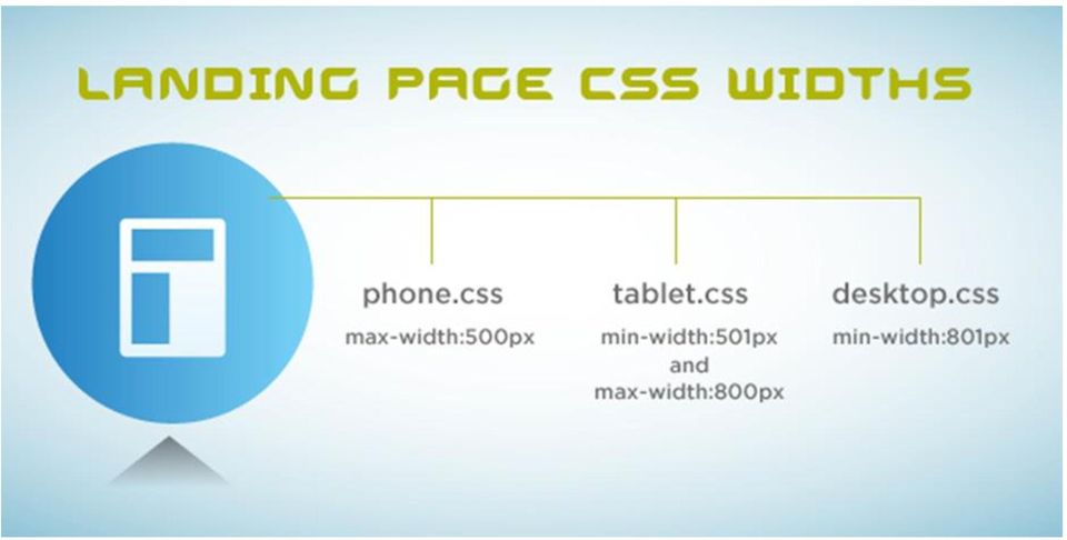
12 Responsive Design Beyond Call-to-action needs to go to a responsive landing page Responsive principals apply to landing pages: Clear CTA above the fold Branded design matching experience Figure out where to place elements within the larger page Figure out element order for smaller screens Make sure you can code the placement in CSS without breaking the layout.

13 Responsive Design in Landing Pages here is the code in the <head> section: <meta name="viewport" content="width=device-width; initial-scale=1.0; maximum-scale=1.0; user-scalable=0;"/> This line snaps the page to the width of the screen <meta http-equiv="x-ua-compatible" content="ie=9" /> This line makes sure ie 9 reads queries <!--[if lt IE 9]> Default css for ie older browsers <script src=" <link rel="stylesheet" href="includes/test-2col.css" type="text/css"> <![endif]--> <!-- Phone --> <link href="includes/phone.css" rel="stylesheet" type="text/css" media="only screen and (max-width:600px)"> <!-- Tablet --> <link href="includes/tablet.css" rel="stylesheet" type="text/css" media="only screen and (min-width:601px) and (max-width:800px)"> <!-- Desktop --> <link href="includes/desktop.css" rel="stylesheet" type="text/css" media="only screen and (min-width:801px)"> Hides url bar on phones <script type="application/x-javascript"> if (navigator.useragent.indexof('iphone')!= -1) { addeventlistener("load", function() { settimeout(hideurlbar, 0); }, false); } function hideurlbar() { window.scrollto(0, 1); } </script> This code goes in the landing page html and references a css file for each screen size (phone, tablet, desktop). The browser or the client will pull in the correct CSS file.
![--[if lt IE 9]> Default css for ie older browsers <script src="http://html5shiv.googlecode.com/svn/trunk/html5.js"></script> <link rel="stylesheet" href="includes/test-2col.css" type="text/css"> <!](/docs-images/45/7798297/images/page_13.jpg "[endif]--> <!-- Phone --> <link href=\"includes/phone.css\" rel=\"stylesheet\" type=\"text/css\" media=\"only screen and (max-width:600px)\"> <!-- Tablet --> <link href=\"includes/tablet.")
14
15 Responsive Design Device / Native Client Media Query Support Android 2.1 Android Gmail BB OS 5 Droid Exchange Droid Yahoo Win Mobile 6.1 WP7 Yahoo No No No No No No No No

16 Responsive Testing Always test before deploying your campaigns Use a rendering tool like Insights to test Yahoo not showing Desktop version, but Mobile version

17 Client Examples

18 Client Examples Scaleable layout and images

19

20


21
22 UPS Shows the framework of table structure.
23 Simplify header image and remove text from the background image
24 Stack elements of intro section
25 This is an example of a totally fluid design that will fit any screen size when opened.
26 Multi-Screen Optimization: Things to consider Final s may not be a perfect match to wireframes as the code controls the final layout, and dealing with multiple devices, screen sizes, mail clients and browsers.

27 How can Silverpop help? Download the Multi-Screen Optimization whitepaper Listen to Multiscreen Design: Lessons from the Pros webinar

28 Thank you
Responsive Email Design Guide. The fundamentals of designing and building mobile optimized email
 Responsive Email Design Guide The fundamentals of designing and building mobile optimized email With the rapid increase of smartphone and tablet adoption, mobile email opens are growing exponentially every
A GUIDE TO MOBILE EMAIL
 A GUIDE TO MOBILE EMAIL UNDERSTANDING THE WHAT, HOW & WHY TABLE OF CONTENTS EMAILS OPENED ON MOBILE? 1 Email open market share 2011-2013 WHAT DOES THIS MEAN? 2 FIRST THINGS FIRST 2 From and Subject Lines
RESPONSIVE DESIGN FOR MOBILE RENDERING
 WHITEPAPER RESPONSIVE DESIGN FOR MOBILE RENDERING DELIVER MOBILE-SPECIFIC CONTENT USING MEDIA QUERIES EXECUTIVE SUMMARY With the widespread adoption of smartphones and tablets, proper email rendering in
Recommendations for Websites Optimization for Mobile Devices Using Mobile Centric CSS. February 2014 Update
 Recommendations for Websites Optimization for Mobile Devices Using Mobile Centric CSS February 2014 Update Is Mobile SEO Required Now? In a Google Smartphone User study, mobile searches will make up 25%
DESIGNING MOBILE FRIENDLY EMAILS
 DESIGNING MOBILE FRIENDLY EMAILS MAKING MOBILE EMAILERS SELECT PLAN CONTEXT CONTENT DESIGN DELIVERY Before you go mobile For optimal usage PICTURES OF DESKTOP VS MOBILE SAME SAME BUT DIFFERENT EMAIL CLIENTS
MCH Strategic Data Best Practices Review
 MCH Strategic Data Best Practices Review Presenters Alex Bardoff Manager, Creative Services [email protected] Lindsey McFadden Manager, Campaign Production Services [email protected] 2 Creative
Responsive Email Design. Our guide to helping you get started. March 2013 Version 0.4
 Responsive Email Design Our guide to helping you get started March 2013 Version 0.4 Contents Introduction... 3 What is Responsive Design?... 4 What about email?... 5 So what are the pros and cons?... 6
Responsive Web Design. birds of feather
 Responsive Web Design birds of feather Approaches to Mobile Development 1. No Mobile Approach 2. Native Mobile Applications 3. Mobile Websites 4. Responsive (universal) design No Mobile Approach Website
HOW Interactive Design Conference 2013
 HOW Interactive Design Conference 2013 Photoshop to HTML Chris Converse Use this QR code to get the mobile schedule for this conference. Get session and speaker info, lunch ideas, and links for getting
Responsive Web Design for Drupal
 Responsive Web Design for Drupal www.responsivewebdesignguild.com @emmajanedotnet [email protected] I am IAM Sorry A boot eh? Drupal drupal.org/user/1773 Photo: morten.dk Legs: walkah Author / Trainer
The Essential Guide to HTML Email Design
 The Essential Guide to HTML Email Design Index Introduction... 3 Layout... 4 Best Practice HTML Email Example... 5 Images... 6 CSS (Cascading Style Sheets)... 7 Animation and Scripting... 8 How Spam Filters
Principles of Web Design 6 th Edition. Chapter 12 Responsive Web Design
 Principles of Web Design 6 th Edition Chapter 12 Responsive Web Design Objectives Recognize the need for responsive web design Use media queries to apply conditional styles Build a basic media query Create
Responsive Web Design (RWD) Building a single web site for the desktop, tablet and smartphone
 Building a single web site for the desktop, tablet and smartphone") Responsive Web Design (RWD) Building a single web site for the desktop, tablet and smartphone An Infopeople Webinar November 13, 2013 Jason Clark Head of Digital Access & Web Services Montana State University
Responsive Web Design (RWD) Building a single web site for the desktop, tablet and smartphone An Infopeople Webinar November 13, 2013 Jason Clark Head of Digital Access & Web Services Montana State University
SellerDeck 2014 Responsive Design Guide
 SellerDeck 2014 Responsive Design Guide Version: 1.0.0 SellerDeck 2014 Responsive Design 1 Contents Introduction...3 Themes and Wireframe...4 Classic Theme...4 Smart Theme...5 Wireframe...6 How the Responsive
Responsive Web Design. vs. Mobile Web App: What s Best for Your Enterprise? A WhitePaper by RapidValue Solutions
 Responsive Web Design vs. Mobile Web App: What s Best for Your Enterprise? A WhitePaper by RapidValue Solutions The New Design Trend: Build a Website; Enable Self-optimization Across All Mobile De vices
Looking Good! Troubleshooting Email Display Problems
 E-mail Direct Mail Digital Marketing Sales Tools Funding Data Creative Services Looking Good! Troubleshooting Email Display Problems November 19, 2014 Today s Speaker Geoff Phillips Senior Editor & Email
This document will describe how you can create your own, fully responsive. drag and drop email template to use in the email creator.
 1 Introduction This document will describe how you can create your own, fully responsive drag and drop email template to use in the email creator. It includes ready-made HTML code that will allow you to
Going Beyond SAP ITS Mobile Apps to a Responsive Design Mobile Apps. JK (JayaKumar Pedapudi) Principal Consultant NTT DATA, Inc.
 Principal Consultant NTT DATA, Inc.") Going Beyond SAP ITS Mobile Apps to a Responsive Design Mobile Apps JK (JayaKumar Pedapudi) Principal Consultant NTT DATA, Inc. Introduction. Learning Points. What is Responsive Design and its Role? Design
Going Beyond SAP ITS Mobile Apps to a Responsive Design Mobile Apps JK (JayaKumar Pedapudi) Principal Consultant NTT DATA, Inc. Introduction. Learning Points. What is Responsive Design and its Role? Design
GUIDE TO CODE KILLER RESPONSIVE EMAILS
 GUIDE TO CODE KILLER RESPONSIVE EMAILS THAT WILL MAKE YOUR EMAILS BEAUTIFUL 3 Create flawless emails with the proper use of HTML, CSS, and Media Queries. But this is only possible if you keep attention
Table of Contents Recommendation Summary... 3 Introduction... 4 Formatting Recommendations... 5 Creative:... 7 Deliverability & Infrastructure:...
 Table of Contents Recommendation Summary... 3 Technical:... 3 Creative:... 3 Introduction... 4 Formatting Recommendations... 5 JavaScript:... 5 Forms:... 5 Background Tags and Colors:... 5 Html Text:...
Mobile Friendly Email Design
 Mobile Friendly Email Design Create emails that look good on every device. A guide by Mobile friendly email design Contents Why Design for Mobiles?...3 You Must Optimise for Mobiles...4 Mobile User s Behvaiour...5
THE SAS OUTPUT DELIVERY SYSTEM: BOLDLY TAKE YOUR WEB PAGES WHERE THEY HAVE NEVER GONE BEFORE! CHEVELL PARKER, SAS INSTITUTE INC.
 THE SAS OUTPUT DELIVERY SYSTEM: BOLDLY TAKE YOUR WEB PAGES WHERE THEY HAVE NEVER GONE BEFORE! CHEVELL PARKER, SAS INSTITUTE INC. Copyright 2012, SAS Institute Inc. All rights reserved. Overview Mobile
Designing for the Mobile Web Lesson 3: HTML5 Web Apps
 Designing for the Mobile Web Lesson 3: HTML5 Web Apps Michael Slater, CEO Andrew DesChenes, Dir. Services [email protected] 888.670.6793 www.webvanta.com Welcome! Four sessions 1: The Mobile
Recreate your Newsletter Content and Layout within Informz (Workshop) Monica Capogna and Dan Reade. Exercise: Creating two types of Story Layouts
 Monica Capogna and Dan Reade. Exercise: Creating two types of Story Layouts") Recreate your Newsletter Content and Layout within Informz (Workshop) Monica Capogna and Dan Reade Exercise: Creating two types of Story Layouts 1. Creating a basic story layout (with title and content)
Recreate your Newsletter Content and Layout within Informz (Workshop) Monica Capogna and Dan Reade Exercise: Creating two types of Story Layouts 1. Creating a basic story layout (with title and content)
HTML TIPS FOR DESIGNING
 This is the first column. Look at me, I m the second column.
Informz for Mobile Devices: Making Your Emails PDA and Phone-Friendly
 Informz for Mobile Devices: Making Your Emails PDA and Phone-Friendly The use of personal digital assistants (PDAs) has increased exponentially since the early days of rudimentary Palm Pilots and similar
Dreamweaver Domain 2: Planning Site Design and Page Layout
 Dreamweaver Domain 2: Planning Site Design and Page Layout Adobe Creative Suite 5 ACA Certification Preparation: Featuring Dreamweaver, Flash, and Photoshop 1 Objectives Identify best practices for designing
Sizmek Formats. HTML5 Page Skin. Build Guide
 Formats HTML5 Page Skin Build Guide Table of Contents Overview... 2 Supported Platforms... 7 Demos/Downloads... 7 Known Issues:... 7 Implementing a HTML5 Page Skin Format... 7 Included Template Files...
CONTENT + CONTEXT = INBOUND EMAIL MARKETING
 CONTENT + CONTEXT = INBOUND EMAIL MARKETING We will be starting at 2:00 pm ET. Use the Question Pane in GoToWebinar to Ask Questions! 1 Use the hashtag #InboundLearning on Twitter 2 Question of the day
RESPONSIVE EMAIL DESIGN
 RESPONSIVE EMAIL DESIGN SELLIGENT The contents of this manual cover material copyrighted by Selligent. This manual cannot be reproduced, in part or in whole, or distributed or transferred by means electronic
Get Started with LeadSquared Guide for Marketing Users. Complete lead to revenue platform
 Get Started with LeadSquared Guide for Marketing Users Complete lead to revenue platform Bookmark LeadSquared Login Page Login to LeadSquared at https://run.leadsquared.com (Bookmark the URL) LeadSquared
Converting Prospects to Purchasers.
 Email Template Guide LASSO EMAIL TEMPLATE EDITOR... 2 ABOUT LASSO EMAIL TEMPLATE EDITOR... 2 CREATING AN EMAIL TEMPLATE... 2 ACCESSING EMAIL TEMPLATES... 2 ADDING AN EMAIL TEMPLATE FOLDER... 3 BASIC PRINCIPLES
Email Marketing Best Practices in a Mobile World. Ruth Presslaff President [email protected]
 Email Marketing Best Practices in a Mobile World Ruth Presslaff President [email protected] Presslaff Interactive Revenue Help publishers build and execute vibrant, engaged email marketing campaigns.
The Third Screen: What Email Marketers Need to Know About Mobile Rendering
 BlueHornet Whitepaper The Third Screen: What Email Marketers Need to Know About Mobile Rendering Part One: Your Marketing Message on the Third Screen Executive Summary The rapid rise in adoption of so-called
Administrator s Guide ALMComplete Support Ticket Manager
 Administrator s Guide ALMComplete Support Ticket Manager This guide provides an overview of ALMComplete s Support Manager with setup instructions. SoftwarePlanner Release 9.6.0 and higher April 2011 1
Designing HTML emailers
 24 SEPTEMBER 2015 Designing a beautiful but functional HTML emailer can be challenging for the most experienced designer, especially if you don t have a lot of experience working with code. This guide
ios App Development Using Cordova
 ios App Development Using Cordova Created by Todd Treece Last updated on 2015-06-29 08:20:06 AM EDT Guide Contents Guide Contents Overview Installing Dependencies Creating a New App index.html index.css
Guide to B2B email marketing. Part Three: Building great emails
 Guide to B2B email marketing Part Three: Building great emails Executive Summary of Recommendations Take a look at our guidelines for building great emails in this quick, at-a-glance format Technical Email
You can use percentages for both page elements and text. Ems are used for text,
 By Megan Doutt Speaking broadly, responsive web design is about starting from a reference resolution, and using media queries to adapt it to other contexts. - Ethan Marcotte (creator of the term Responsive
Guidelines for Effective Email Creative
 Guidelines for Effective Email Creative While the need for quality and effective design has always existed from a marketing standpoint, challenges unique to the email space require a different look at
Airangel s WiFi Portal Best Practice Guidelines Get the most out of your WiFi infrastructure
 CONTROL PERSONALISE SOCIALISE www.airangel.com Airangel s WiFi Portal Best Practice Guidelines Get the most out of your WiFi infrastructure Contents Why is my portal design so important? Page 03 - You
Timeline for Microsoft Dynamics CRM
 Timeline for Microsoft Dynamics CRM A beautiful and intuitive way to view activity or record history for CRM entities Version 2 Contents Why a timeline?... 3 What does the timeline do?... 3 Default entities
RESPONSIVE EMAIL DESIGN BY COMMUNIGATOR
 RESPONSIVE EMAIL DESIGN BY COMMUNIGATOR RESPONSIVE EMAIL DESIGN According to stats from Litmus, in 2014 at least 53% of emails were opened on a mobile device. That is a huge increase from 2011 when the
Read Me! Click Me! Innovations in Email Invitation Design for Today s Digital World. Ted Saunders. Alexa Kessler
 Read Me! Click Me! Innovations in Email Invitation Design for Today s Digital World Ted Saunders Manager - Digital Solutions MaritzCX Alexa Kessler Analyst - Quality, Loyalty & Brand Research Market Intelligence
Generate Android App
 Generate Android App This paper describes how someone with no programming experience can generate an Android application in minutes without writing any code. The application, also called an APK file can
Application Note. Building a Website Using Dreamweaver without Programming. Nan Xia. MSU ECE 480 Team 5
 Application Note Building a Website Using Dreamweaver without Programming Nan Xia MSU ECE 480 Team 5 11/16/2012 Table of Contents Abstract... 3 Introduction and Background... 3 Keywords... 3 Procedure...
Email Guidelines. The following guidelines are for companies who develop email HTML design/creative and copy.
 The following guidelines are for companies who develop email HTML design/creative and copy. In today s email environment it is imperative that mailers consider the limitations presented by email readers
Email Marketing Best Practices - Top 10 tips
 Email Marketing Best Practices - Top 10 tips Contents 1. Make a good first impression... 2 2. Above the fold... 3 3. Keep it short and to the point.... 3 4. Send what your customer wants not what you want
Mobile Optimisation 2014
 IAB Email Marketing Series 2014 Ryan Hickling, Head of Email, TMW Landscape Over the past two to three years we ve seen a massive change in the way consumers interact with brands digitally. As technology
separate the content technology display or delivery technology
 Good Morning. In the mobile development space, discussions are often focused on whose winning the mobile technology wars how Android has the greater share of the mobile market or how Apple is has the greatest
Website Builder Overview
 Website Builder Overview The Website Builder tool gives users the ability to create and manage their own website, which can be used to communicate with students and parents outside of the classroom. Users
CSS SUPPORT IN EMAIL THE PROBLEM WE SHOULD BE FIXING FIRST #LETSFIXEMAIL
 CSS SUPPORT IN EMAIL THE PROBLEM WE SHOULD BE FIXING FIRST #LETSFIXEMAIL Standards are not usually standard 2 Standards are not usually standard 3 it can be funny. but not always. 4 on our panel ROS HODGEKISS
Making the Most of Existing Public Web Development Frameworks WEB04
 Making the Most of Existing Public Web Development Frameworks WEB04 jquery Mobile Write less, do more 2 The jquery Suite UI Overhaul Look and Feel Transitions Interactions Touch, Mouse, Keyboard Don t
Responsive Versus Adaptive Web Design
 White Paper Responsive Versus Adaptive Web Design A development approach comparison Authors Sriram Ramanathan, Chief Technology Officer Matthew Trevathan, Director of Product Platform Development Amit
Creating Effective HTML Email Campaigns
 Creating Effective HTML Email Campaigns This event is being recorded. You will receive a copy of the audio/video at the end of the presentation. 701 South Broad Street, Lititz, PA 17543 www.listrak.com
Coding HTML Email: Tips, Tricks and Best Practices
 Before you begin reading PRINT the report out on paper. I assure you that you ll receive much more benefit from studying over the information, rather than simply browsing through it on your computer screen.
<Insert Picture Here>
 Oracle Application Express: Mobile User Interfaces Marc Sewtz Senior Software Development Manager Oracle Application Express Oracle USA Inc. 520 Madison Avenue,
EMAIL MARKETING BEST PRACTICES GUIDE
 EMAIL MARKETING BEST PRACTICES GUIDE V12 Group s Best Practices Guidelines and recommendations were implemented to help clients create clean looking emails that improve delivery and overall performance
White Paper Using PHP Site Assistant to create sites for mobile devices
 White Paper Using PHP Site Assistant to create sites for mobile devices Overview In the last few years, a major shift has occurred in the number and capabilities of mobile devices. Improvements in processor
INSTRUCTOR HELP & WALKTHROUGH
 INSTRUCTOR HELP & WALKTHROUGH 2015 Jones & Bartlett Learning, LLC, An Ascend Learning Company Contents What are the system requirements for Navigate 2 TestPrep? 3 How do I review my students performance?
HTML Email Power Tips. HTML messages improve your CTR. World s Easiest Email Marketing.
 A quick guide to Learn easy and effective ways to engage your subscribers, increase your click-through ratio (CTR), and get better results from your email marketing. HTML Email Power Tips Be readable get
Quick Start Guide Mobile Entrée 4
 Table of Contents Table of Contents... 1 Installation... 2 Obtaining the Installer... 2 Installation Using the Installer... 2 Site Configuration... 2 Feature Activation... 2 Definition of a Mobile Application
Responsive HTML email and Drupal
 Responsive HTML email and Drupal Mobile + Email + Drupal Drew Gorton Drew Gorton Founder gortonstudios.com Responsive HTML email Why? ~19% of email messages are read on smartphones or tablets. Source:
EMAIL SUCCESS TOOLKIT
 WHITEPAPER EMAIL SUCCESS TOOLKIT EXECUTIVE SUMMARY Before you hit the send button on yet another oops message, use this toolkit to prevent mistakes. Included are a Project Brief to help with your process,
Republic Polytechnic School of Infocomm C308 Web Framework. Module Curriculum
 Republic Polytechnic School of Infocomm C308 Web Framework Module Curriculum This document addresses the content related abilities, with reference to the module. Abilities of thinking, learning, problem
Tracking True & False Demystifying Recruitment Marketing Analytics
 Tracking True & False Demystifying Recruitment Marketing Analytics THE CANDIDATE JOURNEY SIMPLIFIED THE DECISION CYCLE SIMPLIFIED Awareness & Attraction Research & Decision Conversion Action THE CANDIDATE
The Essential Guide to HTML Email Design
 The Essential Guide to HTML Email Design Emailmovers Limited, Pindar House, Thornburgh Road Scarborough, North Yorkshire, YO11 3UY Tel: 0845 226 7181 Fax: 0845 226 7183 Email: [email protected]
TECHNICAL SPECIFICATIONS
 TECHNICAL SPECIFICATIONS INDEX Leaderboard... 3 Medium Rectangle... 3 Skin... 3 Intro Fullscreen Flash... 3 Intro Fullscreen Video... 3 Custom (Skin+Leaderboard+Medium Rectangle)... 4 Leaderboard EXP....
Landing Page Creator 101. Series from HOW TO... Landing Page Creator 101. 1 How to? Series by GetResponse
 Series from Landing Page Creator 101 HOW TO... Landing Page Creator 101 1 How to? Series by GetResponse Table of contents What is Landing Page Creator? Know your way around Workspace Settings Blocks History
Mobile Web Site Style Guide
 YoRk University Mobile Web Site Style Guide Table of Contents This document outlines the graphic standards for the mobile view of my.yorku.ca. It is intended to be used as a guide for all York University
DreamFactory & Modus Create Case Study
 DreamFactory & Modus Create Case Study By Michael Schwartz Modus Create April 1, 2013 Introduction DreamFactory partnered with Modus Create to port and enhance an existing address book application created
WP Popup Magic User Guide
 WP Popup Magic User Guide Introduction Thank you so much for your purchase! We're excited to present you with the most magical popup solution for WordPress! If you have any questions, please email us at
Building Responsive Layouts
 Building Responsive Layouts by Zoe Mickley Gillenwater @zomigi August 28, 2012 Responsive Web Design Summit What I do Books Stunning CSS3: A Project-based Guide to the Latest in CSS www.stunningcss3.com
Login and Pay with Amazon Integration Guide
 Login and Pay with Amazon Integration Guide 2 2 Contents...4 Introduction...5 Important prerequisites...5 How does Login and Pay with Amazon work?... 5 Key concepts...5 Overview of the buyer experience...
1.1. Design elements
 1.1 Design elements 1 The fundamental design elements, color, typography, structure and imagery contribute to an optimal user experience. The following section details the specifics of these elements.
Creating mobile layout designs in Adobe Muse
 Creating mobile layout designs in Adobe Muse Using Adobe Muse, you can create site layouts for web content to be displayed on desktop, smartphones, and tablets. Using the mobile design features, you can
Mobile Technique and Features
 Smart evision International, Inc. Mobile Technique and Features Smart evision White Paper Prepared By: Martin Hu Last Update: Oct 16, 2013 2013 1 P a g e Overview Mobile Business intelligence extends and
Table of Contents. What is ProSite? What is Behance? How do ProSite & Behance work together? Get Started in 6 Easy Steps.
 The Beginners Guide Table of Contents 03 04 05 06 34 35 What is ProSite? What is Behance? How do ProSite & Behance work together? Get Started in 6 Easy Steps See Live Examples Need More Help? What is ProSite?