PERCIFAL. Perceptual spatial analysis of colour and light. SYN-TES Report 2E. Background and study guidelines Ulf Klarén 2011
|
|
|
- Andrew Lindsey
- 7 years ago
- Views:
Transcription
1 PERCIFAL Perceptual spatial analysis of colour and light Background and study guidelines Ulf Klarén 2011 SYN-TES Report 2E

2 Using the visual concepts discussed in PERCIFAL you may learn to assess an environment on the basis of the visual character of light and shadows.

3 Preface The study guide PERCIFAL Perceptual analysis of colour and light introduces concepts and methodological framework for describing and analysing visual experiences in spatial contexts. The starting point is a method for visual evaluation of light in space, developed by professor Anders Liljefors at the KTH School of Architecture in Stockholm. Anders Liljefors has also participated as a consultant on the PERCIFALproject. The aim is to enable description and communication around the spatial total effect of colour and light; through discussion and analysis of systematically gathered data it is possible to learn more about how we see and gain a better understanding of how colour and light shape our spatial experience. The working process resembles that of artists; less essential details are sacrificed in favour of the overall impression. Thereby one can describe important basic aesthetic and visually functional spatial qualities that are difficult to reveal by other means. The international research on colour focuses largely on issues regarding colour measuring and colour rendering in different media, and rarely touches on issues concerning the holistic understanding of space. For several decades now, Swedish research has been an international leader in the investigation of the experience of colour and light in spatial interaction. During 2010 and 2011 an interdisciplinary project called SYN-TES: Human colour and light synthesis: Towards a coherent field of knowledge was carried out at Konstfack University College of Arts, Crafts and Design, Stockholm. SYN-TES was financed by the The Knowledge Foundation (ref. no 2009/0195) and involved about fifteen colour- and light specialists from companies and different academic disciplines. All participants were also working on other research and/or developmental work on light or colour issues. Within SYN-TES the group met regularly for seminars to bring different knowledge traditions closer to one another and to join in formulating the basics for a unified field of knowledge covering both colour and light. In connection with this a number of sub-projects has been carried out on adjacent issues. PERCIFAL is one of these projects. Stockholm, October 2011 PERCIFAL project group Associate Professor Ulf Klarén

, researcher at Konstfack, Stockholm Harald Arnkil, Artist, Lecturer and researcher in Colour Studies at Aalto University School of Arts, Design and Architecture, Helsinki Barbara")

4 Project group for the PERCIFAL projectl Reference group = seminar group within the SYN-TES project Ulf Klarén, Associate Professor, researcher at Konstfack, Stockholm Karin Fridell Anter, Associate Professor (Reader), researcher at Konstfack, Stockholm Harald Arnkil, Artist, Lecturer and researcher in Colour Studies at Aalto University School of Arts, Design and Architecture, Helsinki Barbara Matusiak, Professor, Dept. of Architectural Design, Form and Colour Studies / NTNU Norwegian University of Science and Technology, Trondheim Consultant and discussion partner: Anders Liljefors, Professor, KTH- Royal Institute of Technology, Stockholm, and Department of Lighting Design, School of engineering, Jönköping University Leif Berggren, Senior light expert, Stockholm Monica Billger, Professor, department of Architecture, Chalmers, Göteborg Pär Duwe, Technical sales manager, Alcro-Beckers AB, Stockholm Johanna Enger, Lighting- and industrial designer, researcher at Konstfack, Stockholm Anders Gustafsson, Technical manager, Alcro-Beckers AB, Stockholm. Cecilia Häggström, Associate Professor, Interior Architect and artist, HDK, Gothenburg Yvonne Karlsson, Colourist, Alcro-Beckers AB, Stockholm Thorbjörn Laike, Associate Professor (Reader) in Environmental Psychology, University of Lund Johan Lång, Director of sales, Philips AB, Lighting, Stockholm Anders Nilsson, Manager of Colorimetric Operation at NCS Colour, Stockholm Svante Pettersson, Lighting Designer, Philips AB Lighting Helle Wijk, Associate Professor in Medical Science at the Department for Health Sciences, University of Gothenburg PERCIFAL The Perception Studio / Konstfack Univ. College of Arts, Crafts and Design Partners in the SYN-TES project Financed by: The Knowledge Foundation, Sweden, through the SYN-TES project Project number: 2009/0195 Project leader: Karin Fridell Anter Assistant project leader: Ulf Klarén Layout and graphic form: Johanna Enger Photo: Johanna Enger (Where not otherwise specified) Translated by: Philips /Harald Arnkil /Ulf Klarén

5 SYN-TES report series Contents 1. About the PERCIFAL study guide 6 2. Describing colour and light 8 Experiencing spatial coherence Adaption of perception to change Measuring colour and light Human experience and physical readings 3. PERCIFAL s visual concepts 10 Definitions and comments Light level, Light distribution, Shadows, Light patches Specular reflections, Glare, Colour of light, Surface colours 4. Perceptual spatial analysis 14 Teacher s guide Other uses for PERCIFAL 5. PERCIFAL Observation form Checklist for documentation of observation location Literature on light, colour and space Appendix 34 Two conference papers on PERFICAL, presented at: AIC 2011 Midterm Meeting, Zurich, Interaction of colour & light in the arts and sciences Available for downloading at 1. OPTIMA Metodstudie om färg, ljus och rumsupplevelse (OPTIMA Methodological study on colour, light and spatial experience) by Karin Fridell Anter 2. PERCIFAL Perceptiv rumslig analys av färg och ljus (PERCIFAL Perceptive spatial analysis of colour and light). Background and study guidelines by Ulf Klarén (Also available in Norwegian and English) 3. LJUS- OCH FÄRGBEGREPP och deras användning by Karin Fridell Anter (Light and colour concepts and their application) 4. LJUSFÖRSTÄRKANDE FÄRGSÄTTNING AV RUM (Interior colour design effects on preferred level of light) by Cecilia Häggström & Karin Fridell 5. SYN-TES Interdisciplinära studier om färg ljus rum (SYN- TES Interdisciplinary studies about colour-light-space) by Karin Fridell Anter, Leif Berggren, Ulf Klarén, Johan Lång & Pär Duwe. 6. FORSKNINGSÖVERSIKT; Rumslig samverkan mellan färg och ljus. (Research survey: Spatial interaction between colour and light ) by Karin Fridell Anter et al. 7. Colour shifts behind modern GLAZING (in English) by Barbara Matusiak, Kine Angelo & Karin Fridell Anter Printing instructions Please note that the layout is based on horizontal double A4-format. Therefore print the papers double-sided, if possible.. The chapters 1 About the PERCIFAL study guide (p. 6), 4. Perceptual spatial analysis (pp ) and 6. Checklist for documentation of observation location (pp ) addresses the teacher or tutor. These passages contain a methodological description and a teacher s guide. The passages to be copied for the participants are 2. Describing color and light (pp. 8-9), 3. PERCI- FAL s visual concepts (pp ) and 5. PERCIFAL Observation form (pp ) 7. Literature on light, color and space (pp ) can be printed and handed out to the participants as guidelines for further reading.

6 About the PERCIFAL study guide This study guide is first and foremost meant for use at university-level education in architecture and design. With certain level adjustments it can also be used at high schoollevel, art and design studies or intermediate-level, preparatory and orientational studies in architecture, interior and furniture design. The guide can also be used by professionals in the colour- and light fields as well as by end-users and clients for systematic visual description and dialogue about planned or existing spaces. The guide contains a short theoretical introduction to colour, light and space, followed by a specific overview where the eight visual concepts of PERCIFAL are defined and commented on. Also included is a teacher s tutorial with practical advice, instructions and suggestions for the visual analysis along with an observation form with systematically posed questions. 22 This model of analysis has been tested and developed step-by-step within the frames of educational programmes for design and architecture in Sweden (Ulf Klarén, Karin Fridell Anter, Perceptionsstudion, Konstfack, Stockholm), Norway (Barbara Matusiak, Institutt for byggekunst, form och farge, NTNU, Trondheim) and Finland (Harald Arnkil, Aalto University School of Arts, Design and Architecture, Helsinki). It has also been tried during seminars with professionals in the fields of color and light. The trials show that PERCIFAL more than meets the stated pedagogical goals and opens up to compelling comparisons between physical description and visual experience of color, light and space. Given strict definitions at each stage it should, according to the SYN- TES Research Group, also be eligible as an analysis tool in scientific contexts. The method and an evaluation of the pedagogical trials were presented and debated at AIC 2011, Midterm Meeting of the International Colour Association, Zurich University of the Arts, Zurich, Switzerland (see appendix, p ).

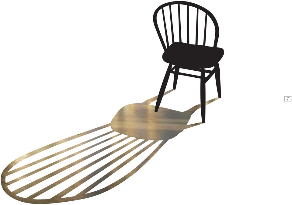
7 7
8 2 22 Describing colour and light People working with colour and light design know the importance of a trained eye and an intuitive capability to interpret one s own experience of colour and light. However, this is not all it takes. These professionals also know that apprehension of visual environments calls for a conscious discrimination of the different colour- and light qualities comprising the spatial total experience, along with the ability to observe the interaction of these qualities. Another factor to take into account is that colour and light design are always factors in teamwork involving a large number of interests. What is experienced or imagined must in some way be mediated to others. Colour and light interact in a very rich and complex manner in our environment. Still, in practice, we tend to treat colour and light separately and we are yet to develop linguistic concepts for describing color and light together in spatial contexts. PERCIFAL is an attempt to introduce, test and discuss some such concepts. In lieu of visual concepts, colour and light experiences are often described and analysed using physical or technical terms. This may contribute to the false premise that physical readings also measure what we see and experience. Using physical readings to describe what we gather from vision is both misleading and false. It is to give a simplified picture of something we know to be more complicated. Experiencing spatial coherence The experience of colour and light springs from very complex perceptual processes, but occurs seemingly without hindrance and conscious exertion. Appearance is only revealed in living creatures. Available to us when attempting to describe the human experience of colour and light are comparisons of our own observations to those of others. We live in a spatial world set in constant change. Our perception and comprehension of the world around have been shaped by ecological conditions. What we see is colour and light, we register visual differences and similarities, but we do not primarily attend to colour or light conditions as such. Our spontaneous experience is a complex and living world around. Colour and light mediate and construct our experience; we experience the world visually through colour and light. All senses contribute to this, but our vision affords us instant appraisal of the spatial whole.

9 In order to serve the shared needs of creative work, our spontaneous experiences must be made apprehensible and communicable. Understanding and dialogue is facilitated by shared concepts. In PERCIAL, eight defined visual concepts are used to pinpoint the spatial colour/light experience: Light level, Light distribution, Shadows, Light patches, Specular reflections, Glare, Colour of light and Surface colours. The internal relations of these experiences in the coherent spatial context are discussed in the visual analysis. Adaption of perception to change Our perception of colour and light varies with our movement through the space. The direction of the light affects the shape of the shadows and creates front- and backlight. Different light sources produce lighting with different colour of light, while the colour of daylight varies continually throughout the day. This affects the colour we see in objects around us. Thus, the outer spatial world is in constant change. Our visual system counterbalances physical alterations in our environment, which helps us perceive the external reality as relatively constant. To experience is to go through continuing adaption to the changes and contingencies in the environment and as far as possible to spontaneously ignore natural shifts in perspective as well as variations in colour of light. This so-called adaption is not governed by will, but happens spontaneously. When the light in one space is altered from for example cool morning light to warm evening light, the colour variations are less noticeable than what a physical reading would indicate. When the alterations in our environment grow too big for spontaneous adaption we grasp the spatial context. Our intuition tells us that an altered wall colour is the result of an external light source or is being affected by light reflecting from another wall. We can at the same time imagine what colour a surface would be during normal lighting conditions. Measuring colour and light The physical properties contributing to light- and colour experiences can be measured using instruments. It is for example possible to measure the spectral power distribution in the reflection from a coloured surface or from a light source, or to describe the strength in the radiation found in a given location within a space. In physics, radiation is expressed through wavelengths and energy content (measuring units: nanometer, nm, and kilowatt hours, kwh). Within psychophysics radiation is measured weighed against the presumed sensitivity of the human eye (measuring units: lux, lumen and candela). Physical readings enable comparison of the physical level of illumination and the spectral distribution at different locations as well as how different colour materials reflect radiation. When manufacturing light sources or colour materials it is of pivotal importance to use measuring instruments to guarantee a certain product standard and even quality in production series. The word light is often used to describe both the radiation (which cannot be seen) and the light we see and experience. This creates confusion: a given amount of light (-radiation) measured in lumen or lux can give rise to very different amounts of experienced light. And vice versa: a given experience of light does not necessarily correspond with the lux or lumen readings. Human experience and physical readings Physical or psychophysical readings tell us nothing about the coherent perception of spatial light- and colour variations; they do not describe light- or colour adaption or experienced contrasts of colour or brightness. While the task of human perception is to make the surrounding world complete, stable and apprehensible, the measuring instruments simply show what is valid for a specific measuring point at a specific moment in time. The work connected to PERCIFAL is aimed at getting a firmer grasp of the total perceptual effect of colour and light. This is done through observation and formulation of concepts related to human experience, attention and reflection. 9

10 In PERCIFAL, eight defining visual concepts are used to define the spatial colour/light experience: Light level, Light distribution, Shadows, Light patches, Specular reflections, Glare, Colour of light and Surface colour. These concepts are defined and briefly commented on below. (Concepts and definitions are also included in PERCIFAL s observation form. This form contains, apart from questions regarding the visual concepts, queries concerning the ability to perceive shape under current light- and colour conditions; objects, faces, written text, etc.) Light level Light level is aimed at describing whether the totality of the space is perceived as light or dark. The overall light level sets the character of a space and affects how we orientate ourselves within the space. To estimate the light level as low or high is not to judge it as bad or good generally or for a specific task. 3PERCIFAL s visual concepts Definitions and comments Light distribution Light distribution describes how we experience the way dark and bright areas are located in relation to each other within a space; how darkness and light are distributed throughout the space. Light distribution can affect our experience of disunity /variation as well as unity in a room. Light distribution can vary greatly; it can stretch from monotony with very small light variations to extremely dramatic with strong contrasts between light and darkness. We are very sensitive to how light is distributed and the perception of space is much dependent on the light distribution. Shadows Shadows occur in areas not completely reached by the light; objects have form shadows and when they are in directional light, they produce cast shadows. In this particular case shadows refer to the overall experience of the shading s impact on the room as a whole.
 Light level Light level is aimed at describing whether the totality of the space is perceived as light or dark.")
11 11 Kalmar Castle (Photo: Johanna Enger)

12 12 Shadows can articulate and emphasize surface structures and the shape of the objects as well as the space. They can also provide an indirect description of the character of the light through, for example, strong or weak contrast in relation to illuminated surfaces or diffuse vs. sharp edges of shadows. Light patches Light patches are defined by their size and deviation from the general light level of a space. They are caused by outside light, reflected sunlight or by stray artificial light sources. For most part, we ignore light patches while experiencing a room. We know that they are temporary and we understand why they arise. Although we do not notice them, they still intuitively affect our total experience of a space. Sometimes light patches are observed due to their location, quantity or particular character (e.g. their deviant colour). Specular reflections Specular reflections can occur on any surface that is totally smooth, glossy and mirrorlike, such as glass, metal, polished stone, water or high-gloss paint. They are entirely dependent on angle of view and thus appear differently in different locations in space. Specular reflections can go quite unnoticed; they contribute to our experience of the space, but are perceived as natural elements in the spatial totality. In some cases the specular reflections through their deviant colour, large contrasts or unusual spatial locations, etc. disrupt the total spatial experience. On the other hand, reflections and highlights can be consciously used to bring life to a space. Examples of the latter include occasions when high status or festiveness are to be emphasized through the use of reflecting and shiny objects and materials. Glare Glare means that the brightness contrasts in our field of vision are larger than what is experienced as ideal. Glare can be caused by daylight, by windows and electrical lighting from insufficiently screened light sources as well as by specular reflections of bright lights. Glare can arise from large or small areas of light caused by point sources or by lights covering a major part of our field of vision. Glare is so common that it almost always occurs somewhere in the visual field, but we can usually ignore it. In this case we are to judge the total effect of glare; if it any way affects our total experience of the space. Colour of light Colour of light refers to the colour - or tone - generally experienced in the light in a particular space. The colour of light does not equal the colour of the light source, nor is it the same as the surface colours we can perceive in a space. The most common concepts used to describe an experienced colour of light are warm and cool. The colour of the light is most clearly perceived when juxtaposed with another colour of light. Imagine you are standing in a room lit with an incandescent light source and it is dusk outside; if you look out of the window, you can clearly see the cooler blue tone of the daylight compared to the warmer yellow tone of the incandescent light. In combination with light distribution and light level, colour of light plays an important role in setting the mood, thus noticeably contributing to how we experience a space. Surface colours A surface colour is a colour that is perceived as belonging to or being an inseparable part of a surface. Our ability to distinguish chromatic differences (contrasts of colour) aid us in separating objects from their backgrounds and objects from each other. Conversely, low contrast between colours presents objects and surfaces as being visually connected to one another. Colour variations and colour uniformity therefore contribute to both spatial variation and coherence. Surface colours or object colours are experienced as relatively permanent and constant, except under extreme variations of the colour of light.

13 Light distribution as a concept refers to how light and shade are distributed across a space. 2. Light patches can be caused by exterior light, reflected sunlight or by narrow beams from artificial light sources. 3. Examples of cool and warm colour of light. (Photo: Ulf Klarén)

14 Teachers guide A pedagogical tool can never replace the live pedagogical interaction. However, it can contribute clear starting points and key concepts, relevant questions and methodical processing. That is why only general advice and guidelines are provided here. Your role as a supervisor is to adapt the material to the specific pedagogical situation. The work with the visual evaluation includes (a) Introduction, (b) Observation and on-the-scene documentation as well as (c) Follow-up discussion, reflection and analysis. The Introduction and the Follow-up discussion are vital parts of the process and should, if possible, be allocated plenty of time and are therefore benefited by being scheduled separately, not too close in time to the observation portion of the process. A carefully planned and well carried-out introduction prevents misunderstandings and leads to well-grounded observations, which in turn provide a good foundation for discussion, analysis and reflection. 4Perceptual spatial analysis Teacher s guide and alternative applications (a) Introduction Review of basic issues and theoretical background The introduction has its starting point in the text Describing colour and light (pp. 8 9). It starts with a review/discussion about prerequisites, possibilities and limitations for describing colour and light perception in spatial contexts. Key factors here are the clarification and discussion of what separates physical measurement from perceptual assessment of colour and light. The text can be handed out for reading by the participants beforehand or presented to the group by the tutor. It is up to the tutor at the Introduction to choose the most suitable pedagogical form. Review of the observation form: questions and visual concepts As preparation for the upcoming observation portion of the process, PERCIFAL s observation questions and visual concepts are introduced. This is conducted with the observation form (pp ) and the text about PERCIFAL s visual concepts (pp ) as starting points.

15 During the introduction each participant should have access to his or her own copy of the observation form as well as the above mentioned text. The best way to familiarize the participants with the visual concepts and and with the observation process is to carry out the review as a group observation of the colour and light conditions in the room where the lecture is held. The participants collaborate in tackling the observation questions and the concepts in relation to the colour and light present in the room. To enable comparisons of observations, we recommend that all participants observe the room from the same direction during this part of the process. Information about the observation part This is an ideal time to inform the participants about the formalities of the upcoming observation as well as practical prerequisites and observation location(s). (b) Observation and location documentation Choosing a location for observation The choice of location is naturally a question of accessibility as well as of availability of time for making the observations. Regardless of whether the chosen location is inside your own institution or outside it, the selection should as far as possible be governed by the pedagogical aim. Two or more locations, with slightly different conditions, facilitate comparisons. An informed selection will result in a more interesting follow-up discussion. It is also a good idea to station the observations to spaces with well-articulated architectural shape, where the light treatment has a clear purpose. However, this is only a recommendation and not a requirement. Choice of location can be based on many different factors, two key ones being the presence of something interesting to observe and clear pedagogical goals formulated by the tutor. Public places, such as libraries, museums, malls, churches, etc., provide the advantage of free access and room to comfortably accommodate an observation group. These spaces are, as a rule, well-planned and thought through, architecturally as well as light-wise. In the trials conducted while developing PERCIFAL the tutors regularly chose several different observation locations with slightly different conditions. For example a trial in Trondheim was carried out in three different public spaces: one showroom with artificial lighting, a hotel atrium and a museum room with a skylight. (Appendix: PERCI- FAL method in use: Visual evaluation of three spaces, p. 41). Before the observation On location, it may be advisable to make a brief introduction, to go through the practical considerations and repeat the questions again. It may also be helpful to give a briefing about the place, but not too detailed, as it can affect the assessments later in the observations. It is important that the boundaries of the space to be examined are clearly defined. Using a moment for orientation will also give participants the opportunity to adapt to the current light conditions; they should have stayed on the observation site at least 20 minutes before the start of the observation. During the observation The tutor should have planned in advance how participants should be placed on the observation site. The participants observation points should be distributed in such a way that the group s collective observations in the subsequent discussion can provide a comprehensive, complex and nuanced picture of the colour and lighting conditions. Time of observation should be at least one hour. The participants responses and comments are to be submitted to the tutor at the end of the observation. Documenting the location The observation locale should be documented as a foundation for the final discussion (see Checklist for documentation pp ). This is done by the tutor. Some parts of the documentation are to be done in advance, for example noting types of light sources and 15

16 Right: Atrium of the hotel building - Port Hall in downtown Trondheim, daytime (main light: daylight). Below: Museum space with sky-light in the Museum of Art in Trondheim, daytime (main light: daylight). Below right: Part of the exhibition in Nordenfieldske Kunstindustrimuseum (artificial light). Several different observation sites with different conditions were often chosen for observation during the development of PERCIFAL. For example, in Trondheim the decision was made to investigate three public spaces, an exhibition space with artificial lighting, an atrium of a hotel building and a museum space with skylight. (Appendix: PERCIFAL method in use: Visual evaluation of three spaces, p. 41). 16 (Photo: Kine Angelo och Barbara Matusiak)

17 their positioning, layout of the location, which year it was built, name of architect, etc. However, the gathered facts are not to be presented to the participants before or during the observation(s), as the knowledge may influence the results. There are exceptions to this rule, such as year of building or name of architect; these facts can be useful to have while getting acquainted to the location. The majority of the documentation must be done during observation, for example, noting time of day, current weather conditions, light- and colour measuring, etc. If there is time, it may be pedagogically justifiable to let the participants partake in the physical documentation, as long as it takes place after the visual analysis. Documentation of facts concerning the observation locale must be available at the follow-up discussion and is ideally handed out to the participants before the discussion. Alternative uses for PERCIFAL When pressed for time If circumstances demand it, the introduction and the following analysis can be linked with the observation part, which means that (a), (b) and (c) are scheduled on the same day. In this case, to avoid a false start on the observation, it is best to give the introduction in a space separate from the observation locale. It is also important to stress the discussion- and reflection phase. If you are very pressed for time or the purpose is merely to give a general synthesis, it is possible to select from the introduction (a) the brief background, the joint observation and an the on-scene discussion, without losing any vital aspects. If carefully planned and prepared, this brief one-hour version can still grant participants a general insight into the complexity of colour and light experience in spatial contexts. c) Follow-up discussion, reflection and analysis The final discussion constitutes the most vital part of the process: its purpose is to provide a complete and conscious image of the group s experience of the space, and also highlights experiences of the process. Given sufficient time between the observation and the final discussion, the tutor will be able to compile the on-scene documentation and note tendencies or features in the participants answers and comments. Thus, the tutor has a foundation for answering specific questions that may arise during the discussion and also contributing to making the joint analysis substantiated and structured. The observation forms are to be handed back to the participants before the discussion. The answers and comments are primarily to be seen as notes to aid in the joint analysis. One or more participants may be charged with the task of compiling the discussion: it is important that participants are granted an opportunity to comment on the compilation in retrospect. Shared concepts in a professional group The analysis material can also be used by professionals within colour and light fields for systematic visual description during the design process. Repeated assessment exercises, starting from PERCIFAL s visual concepts, help develop systematic observation; the group can develop the joint conceptual apparatus and an attention structure with connection to said apparatus in their daily work. It is naturally also possible to practice individual systematic attention using the analysis material. It takes repeated methodical training to develop more secure professional assessment skills. It is in the individual s own interest to carefully observe each finished space. One learns successively by identifying mistakes made and by considering what could have been done differently. 17

18 5 PERCIFAL Perceptual spatial analysis of colour and light Observation form (Foto: Harald Arnkil)

19 Prerequisites: The observation forms and the concepts have been discussed and subjected to a joint trial in a different space before the observation is carried out. It has been made clear, which space and which part of said space is to be observed. To enable adaptation, the participants have been in the space for at least 20 minutes before observation starts. All participants observe the space from previously agreed positions (approximately alike or distinctly different). The position of observation is recorded. Name of observer: Date: Name of space: Position in space (stated in consultation with observation leader): 19 Important: Answer the questions in the order in which they are presented! When answers are to be given on a scale: only check ONE box.
. The position of observation is recorded.")
20 1. Your spontaneous total experience of the space In a few sentences, describe your spontaneous overall experience of the space s character and ambience Light level Light level describes how dark or bright the space as a whole appears. Assess the space s light level. You should not be concerned in your assessment with whether the light level is good or bad. A dark space A bright space Comments:

21 3. Light distribution Light distribution describes the experience of how dark and bright areas are located in relation to each other in the space as a whole, how light is distributed across the space. a) Is the space, at eye-level, characterized by even light distribution or by differences of darkness and brightness? Very even distribution Very big differences Which part is darker, less bright? Which part is brighter? Comments: b) Is the space characterized by an even light distribution or by differences in light distribution between higher and lower parts of the space? Very even distribution Very uneven distribution Which part is darker, less bright? Which part is brighter? Comments: c) Can you identify any clear direction in the light of the space? Describe and comment briefly. 21
22 4. Shadows Shadows refer to the overall experience of the shadows effect in the space as a whole. Is the space characterized by contrasts from shadows? Strong contrasts No contrasts 5. Light patches Light patches are small areas of brightness deviating from the general light level within a space. They can be caused by external light sources, reflected sunlight or by narrow beams from artificial light sources. Is the space characterized by strong contrasts created by light patches from windows and/or light sources? 22 Which part of the space has distinct shadows? What colour are the shadows? Comments: Strong contrasts No contrasts Where are the strongest light patches located? What colour are the light patches? Comments:
23 6. Specular reflections Specular reflections are image-forming reflections, which are typically caused by polished and glossy surfaces, such as glass and metal. Specular reflections are dependent on the angle from which you view them, thus they appear different from different positions in the same space. a) Is the space characterized by specular reflections? 7. Glare Glare refers to brightness contrasts in our field of vision that exceed levels of visual comfort. Are you disturbed by glare in the space? Very much so Not at all Very much so Not at all Which part of the space have specular reflections? How do the specular reflections change when you move about in the space? Comments: Which surfaces or light sources create a glare? How does your experience of glare change when you move about in the space? Comments: 23
24 24 8. The colour of light Colour of light refers to the hue or tone of the ambient light in the space. The colour of light is not the same as the colour of the light source. Neither is it the surface colours we can perceive within the space. The colour of the light is the result of interaction between the colours of the space and its lighting. Do you experience the light as having a uniform colour or can you spot clear variations? Describe these variations and state where in the space the light appears warm or cool or characterized by a specific hue or tone. 9. Surface colours Surface colour is the colour perceived as belong to an object or surface a) What is your general impression of the space s colouring? Using your own words, briefly describe the overall colouring of the space. a) Do you experience the space s surface colours as warm or cool? Warm Cool Comments:
25 b) Do you experience the surface colours of the space as a whole as unified or varied? Very coherent Comments: c) Is the space characterized by contrasts between different surface colours? Not at all Very varied Very much so Where can you find distinct contrasts? Comments: e) What are the surface colours? Trying to ignore the variations caused by light, what colours do you perceive the surfaces to be? Describe them in your own words and state which surface is which colour. Walls (state the colour wall by wall, if they differ) Ceiling (one or more colours) 25
26 26 Floors (one or more colours) Doors, windows, wall mouldings and other features (specify) Specific colour accents, f ex. art works or fabrics (specify) f ) Select a few surfaces clearly affected by the colour of the light. Describe the colour they appear to have as a result of the colour of the light (selection and level of detail are specified by your tutor) 10. Visual perception of objects, people and text a) How does the light affect your perception of the shape of objects in the room? Greatly enhances Greatly impedes Comments:
27 b) Does the light keep people s natural facial colours the same? d) How does the light in this space affect your ability to read the sample text below from a standard reading distance? Completely natural Very unnatural Comments: c) How does the light affect your ability to perceive people s facial expressions? Sample text: The colour and the light in the built environment affect our experiences and emotions, our comfort and our physiological well-being. The colours of the ambient room influences the light experience and the need for lighting, while the intensity, quality and positioning of the lighting is vital to how we see and experience the colours of the space. Light and colour is of great importance to our health and can also support people s perception, function, orientation and safety. The technical development of the last few decades has created new light sources. These often fulfil the requirements of more efficient energy consumption than incandescent light sources, but we simultaneously lack the overall image and systematic knowledge about the new light source s experiential effects in interior and exterior contexts, their impact on spatial perception and their interaction with colour and other properties in natural and artificial materials. Different methods of defining good light are weighed against one another and provide solutions that to varying extents satisfy the demands for energy efficiency, influence on alertness and circadian rhythm, experienced colour of light and colour rendering. The result always ends up being a compromise: to be able to weigh together all these demands, you need a wide understanding of many different aspects of light. Greatly facilitates Greatly obstructs Greatly facilitates Greatly obstructs Comments: Comments: 27
28 The checklist consists of notes made by the tutor and/or an assistant. They can be used for discussions about the connection between physically measurable units and the visual experience of the space or an outward presentation of the room and its different properties. General facts about the spaces/building Where is it? Its function Approximate year of construction Name of architect, if known Name of lighting consultant designer/consultant, if known Is the building/space presented in any publication? If yes, which one? Day, time and weather conditions at the time of observation Photograph the room and any interesting details, e.g. fixtures and windows These photographs are used mainly as an aid to memory when necessary 6Checklist for documenting location for observation Window placement Positioning and measurements of windows (including breast height = the measurement from floor to the lower edge of the window) Which cardinal directions are the windows facing? Are there any curtains or awnings? Are there any other buildings or any vegetation in close proximity outside the windows, which may influence your assessment of the colour of daylight? If so, describe! Measurements of space (area + height) If possible, use architectural drawings (including a north arrow!) Set the physical boundaries for the space being observed
29 Walls and floors What materials are the different surfaces made of? (Wallpaper, marble, painted surface surface, etc.) Describe their structure and other visual properties (smooth, uneven, coarse, patterned, etc.) State how glossy they are (can be determined through visual comparison with a gloss scale or through measuring with a gloss meter) Measure the nominal colours of the surfaces deemed important. This can be done by means of visual comparison to NCS-, Munsell-, RAL- or other standard colour samples placed directly onto the surface) State on the plan or elevation or in other suitable way where the different materials/ glosses/colours can be found The ceiling is probably difficult to measure describe it the best you can Furniture Describe the furniture briefly (e.g. dark brown conference table in the centre of the room with dark green chairs around three red upholstered couches with a glass table in between) Lighting Positioning of armature Types of armature Direction/distribution of light from the armatures If possible state what kind of light sources are used in the armature Describe and/or mark on the plans and elevations or in other suitable way Measuring of light If you have access to instruments designed for measuring light lux meter or luminance meter it can be useful to perform readings of the light on the observation location. This enables comparison of physical readings to the human experience as well as comparisons of light radiation in several different observations points. The visual assessment does not always match the readings; a space can be experienced as brighter than another in spite of lower illuminance, which can be explained by e.g. variations in colour- and light distribu- tion. Comparing observations to readings can be part of learning. For more on light measuring: see To measure light on p. 31. Comments on the usefulness and function of the room Depending on the function of the evaluated space and the building in which it is located, there may be a number of different questions relevant to the gathered perception of the space. Examples of relevant questions: Were the end-users consulted during the planning process? Was the space specifically designed for one function or can it be used in different ways? Is it possible to vary or personalize the furnishing? Is it possible to see out of the windows from different positions within the space and from a sitting/horizontal position? Is the room protected from outside view? Visual measuring of the surface s nominal colour. Make sure you place the sample flat against the surface. 29
30 30
31 Measuring light (-radiation) Measuring illuminance Illuminance is the measure of incident light on a surface and is expressed in units lux (lx). The lux meter measures the light radiation that hits the measuring cell, usually the radiation falling against the measuring cell s level at an angle of 180. The illuminance is always stated as a mean value of several readings evenly spaced out across an area. The most common method is measuring the horizontal illuminance, which means that the measuring cell is to be placed parallel to the measuring level. The vertical lighting is important for certain tasks, for example in libraries, on reading- and writing boards and store shelves. When measuring the vertical illuminance the cell is placed parallel to the vertical surface. When measuring the general lighting in a space you usually measure at a level 0,85 metres above the floor. Luminous flux, lumen Measuring luminance Luminance states how much light radiation is reflected or radiated to the eye from a surface or a light source. It is expressed in units candela per square meters (cd/ m²). The measuring angle of a luminance meter is usually 1 or less thus, you need many readings to get a grasp of the total situation: it is important to have a well-defined measuring area whose luminance differences are not too great. There are recommendations for suitable luminance levels and distributions for different spaces. Luminous intensity, candela 31 Luminance, candela/m² Illuminance, lux
32 SYN-TES publications in English 7Literature on colour, light and space Angelo K., K. Matusiak, K. Fridell Anter. Colour shift behind modern glazing. In Conference Proceedings, AIC 2012 In Colour We Live Colour and Environment Midterm Meeting of the International Color Association, September 2012,Tai-Pei, Taiwan Arnkil,H., K. Fridell Anter, U.Klarén. Colour and light: concepts and confusions. In Conference Proceedings, AIC 2012 In Colour We Live Colour and Environment Midterm Meeting of the International Color Association, September 2012,Tai-Pei, Taiwan Arnkil, H., Ed. (2012a). Colour and Light - Concepts and Confusions. Helsinki: Aalto University School of Arts, Architecture and Design in cooperation with SYN-TES project. Arnkil, H. (2012b). Lightness and Brightness and other Confusions. In Colour and Light - Concepts and Confusions. H. Arnkil, Ed. Helsinki: Aalto University School of Arts, Architecture and Design. Arnkil, H. (2012c). Seeing and Perceiving. In Colour and light - Concepts and Confusions. H. Arnkil, Ed. Helsinki: Aalto University School of Arts, Architecture and Design. Arnkil, H., K. Fridell Anter, U. Klarén & B. Matusiak (2011). PERCIFAL. Visual analysis of space, light and colour. In AIC 2011, Interaction of Colour & Light in the Arts and Sciences, Midterm Meeting of the International Color Association, Zurich, Switzerland,7 10 June 2011: Conference Proceedings. V. M. Schindler & S. Cuber, Eds. Zürich: pro/colore:
33 Fridell Anter K. (2013) Spatial interaction between light and colour. An overview over current international research. In Nordic Light & Colour B. Szybińska Matusiak & K. Fridell Anter, Eds.Trondheim: Faculty of Architecture, NTNU. Fridell Anter, K, C. Häggström, U. Klarén & B. Matusiak A trans-disciplinary approach to the spatial interaction of light and colour. In Conference Proceedings Lighting Quality & Energy 19-21September 2012, Hangzhou, China Fridell Anter K., H. Arnkil, L. Berggren, M. Billger, P. Duwe, J. Enger, A. Gustafsson, C. Häggström, Y. Karlsson, U. Klarén, T. Laike, J. Lång, B. Matusiak, A. Nilsson, S. Pettersson, H. Wijk. SYN-TES Interdisciplinary Research on Colour and Light In Conference Proceedings, AIC 2012 In Colour We Live Colour and Environment Midterm Meeting of the International Color Association, September 2012,Tai-Pei, Taiwan Fridell Anter, K. (2012). Light and Colour: Concepts and their use. In Colour and Light- Concepts and Confusions. Red. H. Arnkil. Helsinki: Aalto University School of Arts, Architecture and Design. Fridell Anter, K. & U. Klarén (2011). Successive approximation in full scale rooms. Colour and light research starting from design experience. In AIC 2011, Interaction of Colour & Light in the Arts and Sciences, Midterm Meeting of the International Color Association, Zurich, Switzerland, 7 10 June 2011: Conference Proceedings. V. M. Schindler & S. Cuber, Eds. Zurich: pro/colore: Fridell Anter, K. & U. Klarén (2010a). SYN-TES: Human Colour and Light Synthesis. Towards a coherent field of knowledge. In Colour & Light in Architecture. P. Zennaro, Ed. Verona: Knemesi. Fridell Anter, K. & U. Klarén (2010b). SYN-TES: Human colour and light synthesis. Towards a coherent field of knowledge. In Proceedings of CIE 2010 Lighting Quality and Enery Efficiency Vienna Austria Klarén U., H.Arnkil, K.Fridell Anter (2013). Levels of experiencing colour and light. In Nordic Light & Colour B. Szybińska Matusiak & K. Fridell Anter, Eds.Trondheim: Faculty of Architecture, NTNU. Klarén, U. (2012). Natural Experiences and Physical Abstractions. On epistemology of colour and light. In Colour and Light - Concepts and Confusions. H. Arnkil. Ed. Helsinki: Aalto University School of Arts, Architecture and Design. Klarén, U., K. Fridell Anter (2011). Colour and light in space: Dynamic adaptation and spatial understanding. In AIC 2011, Interaction of Colour & Light in the Arts and Sciences, Midterm Meeting of the International Color Association, Zurich, Switzerland, 7 10 June 2011: Conference Proceedings. V. M. Schindler & S. Cuber, Ed. Zürich: pro/ colore: Klarén, U., K. Fridell Anter (2012). Seeing Color. In Color and Design. M. DeLong & B. Martinson, Eds. London: Berg. Klarén U., H.Arnkil, K. Fridell Anter. Colour and Light in Design Levels of experiencing colour and light. In Proceedings from the 2nd International Conference for Design Education Researchers, May 2013, Oslo, Norway Klarén U, K. Fridell Anter, H. Arnkil (2012). Always something else Levels of experiencing colour and light In Conference Proceedings, AIC 2012 In Colour We Live Colour and Environment Midterm Meeting of the International Color Association, September 2012,Tai-Pei, Taiwan Matusiak, B., K. Fridell Anter, H. Arnkil & U. Klarén (2011). PERCIFAL method in use: Visual evaluation of three spaces. In AIC 2011, Interaction of Colour & Light in the Arts and Sciences, Midterm Meeting of the International Color Association, Zurich, Switzerland, 7 10 June 2011: Conference Proceedings. V. M. Schindler & S. Cuber, Eds. Zürich: pro/colore: Häggström, C & K. Fridell Anter. Interior colour design effects on preferred level of light. In Conference Proceedings, AIC 2012 In Colour We Live Colour and Environment Midterm Meeting of the International Color Association, September 2012, Tai-Pei, Taiwan Szybińska Matusiak, B. & K. Fridell Anter, Eds. (2013). Nordic Light & Colour Trondheim: Faculty of Architecture, NTNU.
34 Selected Swedish literature Alsterstad, K. (2006) Belysningsanpassning i hemmet. Mölndal, Forum Vision Annell (2011)Våra vanligaste ljuskällor Stockholm: Annell Färg+Ljus Brunnström, G. (2004) Betydelsen av bra belysning. Goda miljöer och aktiviteter för äldre. H. Wijk. Lund, Studentlitteratur Klarén U.& Fridell Anter K. (2009). Den relativa vitheten Kort om projektet Så vitt vi vet. I Björn Larsson (red), Fem konstnärliga utvecklingsprojekt. KU-projekt Stockholm: Konstfack University Press. KU-rapporten Så vitt vi vet Nominellt kulörta färger som vithetsankare kan laddas ner som pdf från Klarén, U. (1996) Vad färg är. Stockholm: HLS Förlag 34 Fridell Anter, K.& Klarén, U. (2008) Den rymliga gråheten Om färg, ljus och rum. I Katji Lindberg (red), Fem konstnärliga utvecklingsprojekt på interdisciplinär grund. Stockholm: Konstfack. KU-rapporten Den rymliga gråheten Om färg, ljus och rum kan laddas ner som pdf från Fridell Anter, K (2008). LJUS / FÄRG och deras samverkan i rummet - Kunskapsöversikt Stockholm: Föreningen SE RUM. Fridell Anter, K (2008). Aktuell svensk litteratur om ljus och färg Annoterad bibliografi Stockholm: Föreningen SE RUM. Fridell Anter, K.: Att inreda med färger. I: Häggquist P (red) (2007) Stora boken om inredning. Stockholm, Infotain&Infobooks (sid 26-43) Fridell Anter, K. (2006) (red). Forskare och praktiker om FÄRG LJUS RUM. Stockholm, Formas Garnert, J. (1993) Anden i lampan Etnologiska pespektiv på ljus och mörker. Stockholm: Carlssons Hjertén, R., I. Mattsson & H. Westholm (2001). Ljus inomhus. Stockholm, Arkus. Håkansson, P. & K. Renström (2004). Ljus & Belysning. En handbok om ljus, seende, ljusplanering och belysningsteknik, Liber. Hård, A. & Å. Svedmyr (1995). Färgsystemet NCS. Tanke, tillkomst, tillämpning. Färgantologi bok 1. Stockholm, Byggforskningsrådet Liljefors, A.(2003). Seende och ljusstrålning. Jönköping, Belysningslära, Ljushögskolan, Högskolan i Jönköping. Ljuskultur: Ljus & Rum. Planeringsguide för belysning inomhus. Andra utgåvan, Stockholm: 2010 Olsson, S. (2004) Ljus i konstmuseer. Stockholm, Arkus Sandström, M., U. Bergqvist, R. Küller, T. Laike, A. Ottosson & R. Wibom (2002). Belysning och hälsa. En kunskapsöversikt med fokus på ljusets modulation, spektralfördelning och dess kronobiologiska betydelse. Stockholm, Arbetslivsinstitutet. Sisefsky, J. (1995)Om färg Att uppleva, förstå och använda färg. Västerås: ICA bokförlag Swirnoff,L. (2003) Dimensional Color (2nd ed.). New York/London: WW Norton&Co Wijk, H., Ed. (2004). Goda miljöer och aktiviteter för äldre. Lund, Studnetlitteratur. Wilhide, E. (2000). Belysningsboken, Forum.
35 35 Kalmar Castle
36 8Appendix As a part of the ongoing work with PERCIFAL, a location description with two presentations was carried out and presented at the Midterm Meeting of the International Colour Association (AIC) in Zurich, Switzerland. The texts below are taken directly from the proceedings of the conference. The first Visual analysis of space, light and colour is an attempt to describe the method s theoretical background, while the second one PERCIFAL method in use: Visual evaluation of three spaces describes a practical attempt involving the method and discusses its applicability. Please note that the method has been further developed since these texts were written.
37 AIC 2011 midterm meeting, Zürich Interaction of colour & light in the arts and sciences Proceedings PERCIFAL: Visual analysis of space, light and colour Harald Arnkil, 1 Karin Fridell Anter, 2 Ulf Klarén, 2 and Barbara Matusiak, 3 1 Aalto University School of Art and Design, Helsinki 2 University College of Arts, Crafts and Design (Konstfack), Stockholm 3 Norwegian University of Science and Technology, Department of Architectural Design, Form and Colour Studies, Trondheim 1. Introduction PERCIFAL (Perceptive Spatial Analysis of Colour and Light) is a subproject within the Nordic research project SYN-TES: Human colour and light synthesis; towards a coherent field of knowledge. SYN-TES grew from a need to share knowledge and find better ways of communicating across disciplines and research areas that deal with the human experience of light and colour in space. The SYN-TES project gathers together experts in lighting, colour, design and teaching from several Nordic universities, research institutions and companies. This paper presents PERCIFAL s background and methodology. In a separate paper Professor Barbara Matusiak et al. present some examples of its use as a tool for visual analysis. 2. Background Abstract This paper addresses the need for better and more accurate methods of recording and analyzingthe visual experience of architectural space. PERCIFAL (Perceptive Spatial Analysis of Colour and Light) is an ongoing project that aims at developing a method of analysis that can capture coherent spatial experiences of colour and light. The starting point for PERCIFAL is a method of visual evaluation of space and light, developed by Professor Anders Liljefors at the former department of architectural lighting at KTH Architecture. PERCIFAL is based on direct visual observations and the recording of these observations by verbal-semantic descriptions using a questionnaire. It has been developed primarily as an educational tool, but we see in it potential for a design tool for professionals as well as for an analytical method for research. The first test results, conducted in Sweden, Norway and Finland, show that the method has significant pedagogical merits and that it allows interesting comparisons between physical measurements and visual experiences of space, light and colour. Our visual experience of the world consists of a totality of inseparable qualities: space, motion, light, colour, objects, details surfaces and textures. Two essential aspects of spatial experience that are among the most difficult to record and describe accurately, are light and colour. All existing methods tend to reduce the temporal and multidimensional experience of space into either static and flat images or into abstract alphanumerical data. Static flat images, such as drawings, paintings and photographs, the conventional methods for recording experiences of light and colour in space, are able to convey much of the total layout and atmosphere of spaces. They are also extremely useful in recording shape, location and details, but they cannot communicate reliably information about surface colours or levels of illumination. These can be recorded and communicated by photometric means and colour sample matching, but these methods tell us nothing about the spatial context and therefore the coherent experience of the colours, lights, shadows and surfaces. As Arne Valberg states: There is a fundamental difference between the physically defined stimulus magnitudes (if they are photometric, colorimetric or other) and the subjectively perceived qualities. (Valberg 2005:178-79). 37
38 38 We experience colour and light largely as a result of perceptual adjustment and adaptation. Spatial perceptual situations are highly complex; as we move around and through space, our perception and experience of the spatial totality are successively and simultaneously affected by global and local adaptation to varying illuminations and colours. (Noë, 2004 :17). This interaction of subject and surroundings is essential to our perception and experience of the world and cannot be described in photometric terms. The total experience of space, conveyed mostly by visual perception, is the final test of the success or failure of any designed environment. PERCIFAL is aimed at providing a tool for understanding the role of some key visual components in successful spatial design. Such visual experiences as lightness, brightness, highlight, glare, colour and shadow cannot be captured or communicated by measuring. They are relational qualities that arise from the subject s participation and action in space. They must therefore be addressed and analyzed in the context of participation and action. 3. The PERCIFAL method The starting point for PERCIFAL is a method of visual evaluation of space and light, developed by Professor Anders Liljefors at the former department of architectural lighting at KTH Architecture (Liljefors, 2006). The cornerstone of this method is the realization that key visual aspects of space and light cannot be described in photometric terms. Originally the method had a purely educational purpose and for several years it has been an important part of the diploma course in lighting design in Jönköping University. This is still a central feature of PERCIFAL and we aim to develop this aspect further. However, the project sees in it also significant potential for a design tool for professionals and a method of analysis for research purposes. questionnaire. These can be complemented with photography, photometric measurement and colour sample matching for later comparison with the visual observations. When possible, plans and elevations of the space in question are used for marking observer positions and measurements. Before moving to the chosen space, the observers are prepared in a training session lasting about one hour. The purpose of the training is to ensure that concepts involved and the use of the questionnaire are clear to the observers. The method and its background are related and discussed with the group. A dry run in the training room or some other preliminary space can also be used as a part of the training. The observers are told that there are no right or wrong answers to the questions and that they should answer according to their observations, i.e. visual perceptions only. After moving to the space to be analyzed, the observers are given about twenty minutes to adapt to the lighting before starting observations proper. The observers can each be given specific viewing positions within the space or can be let move freely. The viewing positions are also recorded. The observation time can vary, but usually at least one hour is needed for a comprehensive analysis. The observers answers are later analyzed statistically and their remarks summed up by the supervisor(s). The results are shown and discussed in debriefing session with the observers. The debriefing is an important pedagogic aspect of the process. The development is carried out under consent of and in collaboration with professor Liljefors. As an essential part of developing the method, the SYN-TES research team members have discussed and carried out their own perceptive spatial analyses starting from Liljefors s concepts. The PERCIFAL method is based on direct visual observations and the recording of these observations by verbal-semantic descriptions using a
39 The questionnaire is divided into the following eight main topics: 1) General impression of the space, 2) Overall level of light 3) Light distribution in the space, 4) Shadows and flecks of light,5) Reflections and glare, 6) Colour of light, 7) Surface colours, 8) Interaction of space, objects and people. Under the main headings there are more specific questions, which are either in the form of semantic differential scales or forced choice answers. For example under 3) Light distribution in the space the observer is asked to answer the following questions: a) Horizontal distribution of light (between different parts of the space, at the same height from the floor): very even very uneven? Which part of the space is dark/shaded? Which part is bright? b) Vertical distribution of light (between building parts at different heights): very even very uneven? Which part of the space is dark/shaded? Which part is bright? After each main topic the observer can add further remarks. There are several other places where observers are asked to answer freely in their own words. Sometimes the terms in question are given a short definition to help the observer understand the question and attend to the right phenomenon. For example: Glare = an uncomfortable brightness contrast in one s field of vision. Some questions draw attention to factors that are not intrinsic qualities of the space itself, but rather indicators of visual experience in interaction with the space. Under the heading Interaction of space, objects and people observers are asked: How natural does the colour of human skin/facial colour look in the space? an indicator of the chromatic quality of the ambient light; and How easy/difficult is it to read the below text at normal reading distance in this space? the provided text is set in Arial 8pt, medium grey colour. The aim of the question is to assess both the level and chromatic quality of the ambient light. 39 Tempelplatsens kyrka Bergskyrkan, Helsingfors
40 40 4. Results and discussion The authors have so far tried out the PERCIFAL method and accompanying questionnaire with seven groups in nine locations in Stockholm and Katrineholm (Sweden), Helsinki (Finland) and Trondheim (Norway) during spring and summer The observers were in most cases students of art, architecture and design but also lighting and design professionals were involved. So far the observers have had little difficulty in understanding the task at hand. A lot depends on how carefully the briefing is carried out and it is important to stress that observers should rely on their immediate perceptions rather than their preconceived conceptions of colour and light in space. Some terms in the questionnaire were more susceptible to misinterpretation than others. For instance the concept of glare needed clarification. Glare is an entirely subjective percept, and at the same time one of the most important negative factors in lighting design. The definition of horizontal and vertical distribution of light and shadow, particularly in the case of very high spaces, also caused some difficulties. Light and shadow distribution can become extremely complex and difficult to describe on a single scale. The effects of cueing and expectations became apparent in the questions concerning glare and glitter: they tended to elicit observations of many local instances of strong brightness contrasts and highlights rather than an overall analysis about visual comfort/discomfort. Also the whole notion of visual discomfort is highly contextual: car headlights at night can be irritatingly, even dangerously glaring whereas sunlight sparkling on water (with a far greater level of luminance) can be experienced as pleasant and enjoyable. Such problems have led the authors to consider using questions that are less direct (e.g. the ones concerning skin colour and legibility). This subjective nature of some of the percepts brings us to the question: how reliable is PERCIFAL as a research method? The very aim of PERCIFAL is to help to describe the coherent and holistic experience of space rather than discreet and individual details. The approach is very similar to that of an artist: nonessential details must be sacrificed for the truthfulness of the whole. We have found that such a method can help to reveal essential aesthetic and visual-functional qualities of space that cannot be addressed equally well by other means. PERCIFAL is a way of collecting and systemizing analyzable data from individual observations. The methods of analysis are still under development, but even as such the method and data retrieved so far have proven to be of great educational value. Most of the observers reported that their perception and understanding of the visual factors in space became heightened as a result of the tests. They became particularly aware of the effect of adaptation to the perception of brightness and colour tone. They became also more aware of the meaning of such visual terms as brightness and lightness. The method and questionnaire are under continuous augmentation as the tests continue with more groups and locations. Each test so far has led to improvements and additions to the method. Acknowledgments SYN-TES is funded by the Knowledge Foundation, Sweden (Stiftelsen för kunskapsoch kompetensutveckling, KK-stiftelsen). References Liljefors A Ljus och färg i seendets rum. In: Fridell Anter, K., ed: Forskare och praktiker om FÄRG LJUS RUM. Stockholm: Formas: Noë, A Action in Perception. Cambridge: The MIT Press Valberg, A Light Vision Color. Chichester: John Wiley & Sons Ltd Address Harald Arnkil, Department of Art, Aalto University School of Art and Design, Hämeentie 135 C, FIN Helsinki, Finland s harald.arnkil@aalto.fi, karin.fridell.anter@konstfack.se, ulf.klaren@konstfack.se, barbara.matusiak@ntnu.no
41 AIC 2011 midterm meeting, Zürich Interaction of colour & light in the arts and sciences Proceedings PERCIFAL method in use: Visual evaluation of three spaces 1. Background PERCIFAL Perceptive Spatial Analysis of Colour and Light is a subproject within the Nordic research project SYN-TES: Human colour and light synthesis; towards a coherent field of knowledge. SYN-TES is funded by the Knowledge Foundation, Sweden. The project grew from a need to share knowledge and to find better ways of communication across disciplines and research areas that deal with the human experience of light and colour in space. For further presentation of the PERCIFAL method see Arnkil et al. Barbara Matusiak,1 Karin Fridell Anter,2 Harald Arnkil 3 and Ulf Klarén 2 1 Faculty of Architecture and Fine Art, Norwegian Univ. of Science and Technology 2 University College of Arts, Crafts and Design (Konstfack), Stockholm 3 Aalto University School of Art and Design, Helsinki Abstract In this paper we describe the use of PERCIFAL method for visual registration and evaluation of three architectural spaces in Trondheim: an atrium, a skylight room and a room lit by electrical light. A group of subjects visited those three rooms in August They were asked to make a spontaneous verbal evaluation as well as evaluation with the help of quality descriptor differentials developed in the PERCIFAL project. Despite differences between subjects, it was possible to find a strong correlation between surface illuminances, the score at Light level scale and the impression of openness/spaciousness versus darkness/gloominess. Furthermore, it was possible to find a correlation between the occurrence/absence of chromatic colors in the room and the impression of the room being serious and severe versus lively and playful. 2. Method Three architectural spaces in Trondheim, Norway, were chosen for evaluation: 1. Atrium, 2. Skylight room and 3. Electrical light room. The Atrium is a part of the hotel building situated in Trondheim Centrum and called Porthuset. The courtyard is nearly square in plan (11 x 12m) and has a height of 5 storeys. The courtyard is the secondary daylight source for apartment rooms adjacent to it. The glazed roof covers the whole courtyard, some of the window panes at the roof are made of coloured glass; this contributes to a nice play of coloured and uncoloured daylight at the facades of the courtyard, especially during sunshine hours. Daylighting is supplemented by an artificial lighting system that consists of evenly distributed, spherical lamps with compact fluorescent light bulbs, hanging about 3m over the floor. The room is also characterized by a strident colour composition with strong colour contrasts, see figures 1 and 2. The Skylight room is the largest and most spectacular room in Kunstmuseum, the Art Museum in Trondheim. There is a linear, large and elegantly designed skylight in the room that early dominates the visual environment in the room. It has a specially designed internal sun shading device fastened to a steel construction that has a similar shape to the skylight, but is oriented downwards. Different types of lamps (spots and wall-washers) are fastened around the skylight, but they were not switched on during the visit. The colours chosen on the room surfaces are solely nuances of grey, see figure 3. 41


42 42 Figure 1 and 2. Atrium in the Porthuset, photos Kine Angelo. Figure 3. Skylight room and 4. Electrical light room, photos B. M. Figure 5. Evaluation results for Light level and Light distribution. Figure 6. Evaluation results for Temperature and Unity of coloration
Why is lighting in the workplace important?
 OSH Brief No. 3c Why is lighting in the workplace important? From the workers perspective, poor lighting at work can lead to eye strain, fatigue, headaches, stress and accidents. On the other hand, too
Effect of skylight configuration and sky type on the daylight impression of a room
 Eco-Architecture IV 53 Effect of skylight configuration and sky type on the daylight impression of a room P. Seuntiens, M. van Boven & D. Sekulovski Philips Research, Eindhoven, The Netherlands Abstract
Total Credits for Diploma of Interior Design and Decoration 63
 Diploma of Interior Design and Decoration programme Code: MSF50213 Program Description The BHCK Diploma of Interior design and Decoration provides the skills and knowledge required to perform design and
Colour and Light in Design - Levels of experiencing colour and light
 DRS // CUMULUS 2013 2nd International Conference for Design Education Researchers Oslo, 14 17 May 2013 Colour and Light in Design - Levels of experiencing colour and light Ulf KLARÉN *a, Harald ARNKIL
COURSE DESCRIPTION. Degree project in Design, specialization Individual Study Plan and Summary and Projection /
 KONSTFACK Department of Design, Crafts and Arts Master s programme in Design Course code: MDE202 and MDE204 Test code: MDE202 (ID10, ID20) and MDE204 (ID10) Level: Advanced level Valid for: H15 and V16
Open Office Plan. Function and Orientation. Space Characteristics. Material Properties. - 37 - Gregory Wolfe 2004 Senior Thesis Lighting / Electrical
 Open Office Plan Function and Orientation The open office plan on the top floor of the Westwood Community church holds 14 cubicles and doubles as the circulation space for the entire top floor. The area
Stow Lighting Advisory Subcommittee Terminology Guide
 Stow Lighting Advisory Subcommittee Terminology Guide Stow Lighting Advisory Subcommittee Terminology Guide Page 1 of 9 Revision Date Description 1.0 5 Feb 2003 Beginning of first draft. 1.1 5 Mar 2003
UNDERSTANDING DIFFERENT COLOUR SCHEMES MONOCHROMATIC COLOUR
 UNDERSTANDING DIFFERENT COLOUR SCHEMES MONOCHROMATIC COLOUR Monochromatic Colours are all the Colours (tints, tones and shades) of a single hue. Monochromatic colour schemes are derived from a single base
DEPLOSUN REFLECTORS. Carrer dels Vergós, 11 08017 Barcelona Spain Tel: (+34) 934.090.359 Fx: (+34) 934.090.358 info@espaciosolar.
 934.090.359 Fx: (+34) 934.090.358 info@espaciosolar.") DEPLOSUN REFLECTORS DEPLOSUN REFLECTORS DEPLOSUN REFLECTORS is an innovative reflector system which captures the sun rays in the upper part of the atria and redirects them downwards, increasing daylight
DEPLOSUN REFLECTORS DEPLOSUN REFLECTORS DEPLOSUN REFLECTORS is an innovative reflector system which captures the sun rays in the upper part of the atria and redirects them downwards, increasing daylight
ELEMENTS AND PRINCIPLES OF DESIGN
 APPENDIX A1 4 T T ELEMENTS AND PRINCIPLES OF DESIGN Groups: 1. Select an advertisement. 2. Examine the advertisement to find examples of a few elements and principles of design that you are familiar with.
Teaching Methodology for 3D Animation
 Abstract The field of 3d animation has addressed design processes and work practices in the design disciplines for in recent years. There are good reasons for considering the development of systematic
Apples & Pears, a CELMA guiding paper: Why standardisation of performance criteria for LED luminaires is important
 Apples & Pears, a CELMA guiding paper: Why standardisation of performance criteria for LED luminaires is important Enabling like-for-like comparison of LED luminaire performance starts with published initial
Three Key Paper Properties
 Three Key Paper Properties Whiteness, Brightness and Shade Demystifying Three Key Paper Properties Whiteness, Brightness and Shade Xerox Supplies, See the Difference Quality Makes Prepared by: Xerox Corporation
The Lighting Effects Filter
 Appendix appendix E The Lighting Effects Filter The Lighting Effects filter is like a little program in itself. With this filter, you can create a wealth of different lighting effects, from making a particular
Display/Exhibit/Museum
 Display/Exhibit/Museum Museums and art galleries collect, preserve, analyze, and display natural artifacts and examples of human achievement and their impact on us. Effective exhibit lighting must balance
The Little black book of lighting For Film and Video
 nd cover The Little black book of lighting For Film and Video Index to Kino Flo Lighting Handbook Introduction to Lighting with Kino Flos..... 2 KinoFloProducts... 4 Lighting Interviews....................
ARTIFICIAL LIGHTING lecture notes
 ARTIFICIAL LIGHTING lecture notes Dr. Habil. András Majoros Figures, images and tables by Levente Filetóth Budapest University of Technology and Economics Faculty of Architecture Department of Building
Lighting (Illumination) in Warehouses
 in Warehouses") Lighting (Illumination) in Warehouses Importance of Lighting Workers at a warehouse need to spot oncoming vehicles, pedestrians, slippery floors and other hazards in time to prevent injuries and accidents.
Lighting (Illumination) in Warehouses Importance of Lighting Workers at a warehouse need to spot oncoming vehicles, pedestrians, slippery floors and other hazards in time to prevent injuries and accidents.
2.2 REFLECTIVE ROOFING (ADOPTED 19 DECEMBER 2006) 1. INTRODUCTION
 1. INTRODUCTION") 2.2 REFLECTIVE ROOFING (ADOPTED 19 DECEMBER 2006) 1. INTRODUCTION There has been increasing awareness of the need for energy efficiency in housing in recent years, with the Residential Design Codes now
2.2 REFLECTIVE ROOFING (ADOPTED 19 DECEMBER 2006) 1. INTRODUCTION There has been increasing awareness of the need for energy efficiency in housing in recent years, with the Residential Design Codes now
THE BACKGROUND LUMINANCE AND COLOUR TEMPERATURES INFLUENCE ON ALERTNESS AND MENTAL HEALTH
 THE BACKGROUND LUMINANCE AND COLOUR TEMPERATURES INFLUENCE ON ALERTNESS AND MENTAL HEALTH T. Govén, T. Laike, B. Pendse, K. Sjöberg, 2007 1. Purpose of the study to lay down the appropriate luminance levels
LIGHTING IN THE WORKPLACE
 LIGHTING IN THE WORKPLACE Too little: eye strain; fatigue; headaches; stress; accidents. Too much: glare headaches; stress. Lower quality lower productivity Increased absenteeism increased ill health SOME
Bornholms Kunstmuseum
 Bornholms Kunstmuseum James Carpenter Design Associates Inc / Ramboll Bornholms Kunstmuseum Bornholm, Denmark Concept Design September 16, 2011 OVERVIEW OF EXISTING MUSEUM: SITE The Danish island of Bornholm
The Information Processing model
 The Information Processing model A model for understanding human cognition. 1 from: Wickens, Lee, Liu, & Becker (2004) An Introduction to Human Factors Engineering. p. 122 Assumptions in the IP model Each
2.00 Artificial Workplace Lighting
 Prepared by Guaranteed by Approved by Sheets Annexes Ing. Jiří Nohejl VSU VS 10 This workplace lighting concept is valid for all facilities of ŠKODA AUTO. Table of Contents 1. General 3 1.1 Introduction
Important Notes Color
 Important Notes Color Introduction A definition for color (MPI Glossary) The selective reflection of light waves in the visible spectrum. Materials that show specific absorption of light will appear the
Color Talk Every color has several dimensions. The following chart shows various words used to describe the characteristics of color.
 HHF-MWB.148 Color Basics Color is a powerful design tool that affects a room s appearance as well as your feelings. It surrounds us, intrigues us and excites us! We plan for its use in our homes and workplaces.
ICC Recommendations for Color Measurement
 White Paper #3 Level: Introductory Date: Dec 2004 ICC Recommendations for Color Measurement Introduction In order to prepare a useful device profile based on the International Color Consortium s Specification,
GUIDELINES FOR REHABILITATION OF TRADITIONAL COMMERCIAL BUILDINGS DESIGN GUIDELINES
 GUIDELINES FOR REHABILITATION OF TRADITIONAL COMMERCIAL BUILDINGS DESIGN GUIDELINES PAGE 13 DESIGN GUIDELINES The following design guidelines have been developed to guide appropriate design in the Downtown
General Syllabus for Third Cycle Studies for the Degree of Doctor in Cognitive Science
 GENERAL SYLLABUS 21 March 2013 Reg. no HT 2013/50 1 Department of Philosophy Cognitive Science General Syllabus for Third Cycle Studies for the Degree of Doctor in Cognitive Science This syllabus was approved
Thank you for choosing NCS Colour Services, annually we help hundreds of companies to manage their colours. We hope this Colour Definition Report
 Thank you for choosing NCS Colour Services, annually we help hundreds of companies to manage their colours. We hope this Colour Definition Report will support you in your colour management process and
LESSON 7: LEARNING MODELS
 LESSON 7: LEARNING MODELS INTRODUCTION mobility motivation persistence sociological Think about your favorite class. Does the teacher lecture? Do you do experiments or go on field trips? Does the teacher
At the completion of this guide you should be comfortable with the following:
 This guide provides instructions and best practices for deployment of the Yealink W52P IP DECT phones and repeaters RT10, which is intended for qualified technicians (or administrator) who will deploy
8. EXTERIOR SITE LIGHTING
 8. EXTERIOR SITE LIGHTING Goal: Exterior lighting should be used to provide illumination for the security and safety of entry drives, parking, service and loading areas, pathways, courtyards and plazas,
Creating a History Day Exhibit Adapted from materials at the National History Day website
 Creating a History Day Exhibit Adapted from materials at the National History Day website Exhibits are designed to display visual and written information on topics in an attractive and understandable manner.
Any source of light can be described in terms of four unique and independently respective properties:
 LIGHTING Effective lighting is the essence of cinematography. Often referred to as painting with light, the art requires technical knowledge of film stocks, lighting instruments, color, and diffusion filters,
HealWell - A new lighting solution for patient rooms
 - A new lighting solution for patient rooms Enhancing the healing environment in hospitals, using the natural power of light The natural power of light Light has an amazing effect on people. Used effectively
Perception of Light and Color
 Perception of Light and Color Theory and Practice Trichromacy Three cones types in retina a b G+B +R Cone sensitivity functions 100 80 60 40 20 400 500 600 700 Wavelength (nm) Short wavelength sensitive
Design Elements & Principles
 Design Elements & Principles I. Introduction Certain web sites seize users sights more easily, while others don t. Why? Sometimes we have to remark our opinion about likes or dislikes of web sites, and
PATTERN: A two-dimensional decorative visual repetition. A pattern has no movement and may or may not have rhythm.
 Project: Elements of Design - NAME Elements: Line, Color, Value, Shape, Space, Texture Principles: Consider what principles you may have used based on the definition of each. Artist to Remember: Research
Light in the Greenhouse: How Much is Enough?
 Light in the Greenhouse: How Much is Enough? by: James W. Brown http://www.cropking.com/articlelghe Most of us know that green plants need light for photosynthesis, growth, and development. As important
ID 101 INTRODUCTION TO INTERIOR DESIGN.
 101 INTRODUCTION TO INTERIOR DESIGN. (1) An introduction to the profession of Interior Design: historical perspective, career specializations, and career opportunities. 102 THE INTERIOR DESIGN PROFESSION.
ABS 731 Lighting Design & Technology. Spring 2006
 ABS 731 Lighting Design & Technology Spring 2006 AGI32 is used to predict the photometric performance of selected luminaires or daylight penetration in a simulated environment. The environments that can
What Do Master s Thesis Titles Inform about Media Technology?
 What Do Master s Thesis Titles Inform about Media Technology? Oittinen, P. Aalto University, School of Science (Aalto SCI), Department of Media Technology, P.O.Box 15500, FIN-00076 Aalto, Finland, http://media.tkk.fi
Technical Report An Analysis on the Use of LED Lighting for Video Conferencing
 An Analysis on the Use of Lighting for Video Conferencing Jim Yorgey, PE Frank Neher, Joe Volkert, and Christina Katrinak March 14, 2016 03/2016 Lutron Electronics Co., Inc. I P/N 367-2622 REV A 1) Abstract...
Standards A complete list of the standards covered by this lesson is included in the Appendix at the end of the lesson.
 Lesson 3: Albedo Time: approximately 40-50 minutes, plus 30 minutes for students to paint pop bottles Materials: Text: Albedo (from web site 1 per group) Small thermometers, at least 0ºC to 100ºC range
Miami Science Museum DoE Modelling Grant. Light Planning. 19 December 2008 Concept Design
 DoE Modelling Grant 19 December 2008 Concept Design 155 Avenue of the Americas, New York NY 10013 Tel +1 212 229 2669 Fax +1 212 229 1056 www.arup.com Job Number 131761 au Introduction Table of Contents
Digital Photography Composition. Kent Messamore 9/8/2013
 Digital Photography Composition Kent Messamore 9/8/2013 Photography Equipment versus Art Last week we focused on our Cameras Hopefully we have mastered the buttons and dials by now If not, it will come
The Industry s Most Advanced Sun-Sensing, Adaptive-Tinting Technology For Dynamic Windows
 by The Industry s Most Advanced Sun-Sensing, Adaptive-Tinting Technology For Dynamic Windows In Alliance with OCCUPANT COMFORT All of the windows above have the same exterior tint of glass. Why such a
Introduction to Comparative Study
 Introduction to Comparative Study The comparative study question asks you to compare and contrast two texts under one of the three modes of comparison. The comparative modes for the exam in June 2014 are:
Measurement of illuminance in electrically lit spaces
 August 2012 3 1 Measurement of illuminance in electrically lit spaces 1.0 Introduction This paper offers practical guidance on the measurement of illuminance in workplaces. This criterion is given prominence
Enhancing Student Engagement A CDIO Approach in an Engineering Physics Master Program
 Enhancing Student Engagement A CDIO Approach in an Engineering Physics Master Program Joakim Wren and Johan Renner Department of Management and Engineering, Linkoping University, 581 83 Linkoping, Sweden
COMMUNICATION STRATEGY FOR THE UNIVERSITY OF GOTHENBURG
 STYRDOKUMENT Dnr F V 2014/71 COMMUNICATION STRATEGY FOR THE UNIVERSITY OF GOTHENBURG Published Decision-maker Responsible body medarbetarportalen.gu.se/styrdokument Vice-Chancellor Kommunikationsenheten
At the core of this relationship there are the three primary pigment colours RED, YELLOW and BLUE, which cannot be mixed from other colour elements.
 The Colour Wheel The colour wheel is designed so that virtually any colours you pick from it will look good together. Over the years, many variations of the basic design have been made, but the most common
ART A. PROGRAM RATIONALE AND PHILOSOPHY
 ART A. PROGRAM RATIONALE AND PHILOSOPHY Art education is concerned with the organization of visual material. A primary reliance upon visual experience gives an emphasis that sets it apart from the performing
ANNE ARUNDEL COUNTY PUBLIC SCHOOLS GIFTED VISUAL ARTS ENRICHMENT PROGRAM 2015 16 General Information
 ANNE ARUNDEL COUNTY PUBLIC SCHOOLS GIFTED VISUAL ARTS ENRICHMENT PROGRAM 2015 16 General Information The Anne Arundel County Gifted Visual Arts Enrichment Program consists of eligible students identified
D E F I N E V E L O D O. Telemedicine Room Design PROGRAM GUIDE. CTEConline.org
 L O D E F I N E D E V E P D O Telemedicine Room Design PROGRAM GUIDE CTEConline.org Telemedicine Room Design Program Guide A Publication of: California Telemedicine and ehealth Center Christine Martin,
Filters for Black & White Photography
 Filters for Black & White Photography Panchromatic Film How it works. Panchromatic film records all colors of light in the same tones of grey. Light Intensity (the number of photons per square inch) is
ADVANCED THEORIES FOR CG LIGHTING
 ADVANCED THEORIES FOR CG LIGHTING 0.1 INTRODUCTION To become skilled at 3D lighting, one must have an understanding of how light works. CG lighting has been established based on rules from cinematography,
AIRCRAFT WARNING LIGHTS
 AIRCRAFT WARNING LIGHTS Ing. Pierangelo Lodolo, ing. Giuseppe Menta Calzavara S.p.a 1. Summary are lighting devices used to make tall structures more visible to aircrafts, during both daytime and nighttime.
Architectural Visualization: Understandings And Misunderstandings
 Architectural Visualization: Understandings And Misunderstandings Vesselin Gueorguiev, TU- Sofia, Sofia, Bulgaria Desislava Georgieva New Bulgarian University, Sofia, Bulgaria Abstract: In the last 10
ART/VCDMA PORTFOLIO TIPS
 ART/VCDMA PORTFOLIO TIPS What is a portfolio? A portfolio represents your skills as an artist, including craftsmanship, technique, creativity, and the ability to communicate visual ideas. High school seniors
Lighting with Artificial Light
 Lighting with Artificial Light The basics of lighting Lighting with Artificial Light page 1 What is light? The visible part of electromagnetic radiation, which is made up of oscillating quanta of energy
Contrast ratio what does it really mean? Introduction...1 High contrast vs. low contrast...2 Dynamic contrast ratio...4 Conclusion...
 Contrast ratio what does it really mean? Introduction...1 High contrast vs. low contrast...2 Dynamic contrast ratio...4 Conclusion...5 Introduction Contrast, along with brightness, size, and "resolution"
Implications IN THIS ISSUE. A Newsletter by InformeDesign. A Web site for design and human behavior research.
 A Newsletter by InformeDesign. A Web site for design and human behavior research. VOL. 02 ISSUE 02 IN THIS ISSUE Lighting: Its Effect on People and Spaces Related Research Summaries Lighting: Its Effect
Projects. Cultural centre in Jinan. Europaconcorsi Beta. Grand Theatre. JINAN, China. Publications Jinan Cultural Centre
 Language: Italiano English Europaconcorsi Beta Projects JINAN, China Cultural centre in Jinan Grand Theatre PAUL ANDREU ARCHITECTE PARIS, RICHEZ_ASSOCIÉS ARCHITECTURE, BIAD Publications Jinan Cultural
INTERIOR DESIGN COURSE DESCRIPTIONS
 INTERIOR DESIGN COURSE DESCRIPTIONS The proposed curriculum adheres to the guidelines of the Council of Design Professional Standards. BA Year 2 30 credits DES 201 Theory of Art and Design This course
OLED Lighting Workshop
 OLED Lighting Workshop UC DAVIS CALIFORNIA LIGHTING TECHNOLOGY CENTER May 17 th, 2016 Lighting considered as a slow moving industry until the invention of blue LED mid 1990 s the beginning of modern lighting.
DESIGN ELEMENTS OF DESIGN
 DESIGN Definition of Design: The term has different connotations in different fields. Informally, a design refers to a plan for the construction of an object (as in architectural blueprints and sewing
4.430 Daylighting. Christoph Reinhart. 4.430 Daylight Simulations
 4.430 Daylighting Christoph Reinhart 4.430 Daylight Simulations Massachusetts Institute of Technology Department of Architecture Building Technology Program 1 MISC Google DIVA forum, onebuilding.org, radianceonline.org
Greetings Card. Projects 1
 Projects 1 h b Whether it s to celebrate a birthday, an anniversary, or a graduation, or simply to tell a friend you are thinking of them, we all enjoy sending and receiving greetings cards. With PagePlus,
VISUAL ARTS VOCABULARY
 VISUAL ARTS VOCABULARY Abstract Artwork in which the subject matter is stated in a brief, simplified manner; little or no attempt is made to represent images realistically, and objects are often simplified
COME AND MEET US AND DISCOVER WHY DESIGN IS IN OUR DNA
 2 COME AND MEET US AND DISCOVER WHY DESIGN IS IN OUR DNA Our interior design studio is now open to all those home renovators and DIY devotees who appreciate the value and beauty of great design. The Porter
General Syllabus for Third Cycle Studies for the Degree of
 GENERAL SYLLABUS 1 10 December 2015 Reg. no U 2015/469 Centre for Theology and Religious Studies Philosophy of Religion and Ethics General Syllabus for Third Cycle Studies for the Degree of Doctor in Philosophy
DESIGN GUIDELINES FOR UTILITY METERS D.C. HISTORIC PRESERVATION REVIEW BOARD
 DESIGN GUIDELINES FOR UTILITY METERS D.C. HISTORIC PRESERVATION REVIEW BOARD Introduction Utility meters are a necessary component for any building. When older buildings were originally provided with utility
HOW TO SUCCEED WITH NEWSPAPER ADVERTISING
 HOW TO SUCCEED WITH NEWSPAPER ADVERTISING With newspaper advertising, Consistent Advertising = Familiarity = Trust = Customers. People won t buy from you until they trust you! That trust and confidence
Green Building Handbook for South Africa Chapter: Lighting Luke Osburn CSIR Built Environment
 Green Building Handbook for South Africa Chapter: Lighting Luke Osburn CSIR Built Environment Lighting consumes between about 29-35% of the energy used within commercial office space while lighting only
Reflection Report International Semester
 Reflection Report International Semester Studying abroad at KTH Royal Institute of Technology Stockholm 18-01-2011 Chapter 1: Personal Information Name and surname: Arts, Rick G. B. E-mail address: Department:
CBIR: Colour Representation. COMPSCI.708.S1.C A/P Georgy Gimel farb
 CBIR: Colour Representation COMPSCI.708.S1.C A/P Georgy Gimel farb Colour Representation Colour is the most widely used visual feature in multimedia context CBIR systems are not aware of the difference
Processing the Image or Can you Believe what you see? Light and Color for Nonscientists PHYS 1230
 Processing the Image or Can you Believe what you see? Light and Color for Nonscientists PHYS 1230 Optical Illusions http://www.michaelbach.de/ot/mot_mib/index.html Vision We construct images unconsciously
General Syllabus for Third Cycle Studies in Music Education Leading to a Doctor of Philosophy
 1 Faculty of Fine and Performing Arts, Malmö General Syllabus for Third Cycle Studies in Music Education Leading to a Doctor of Philosophy 1. Programme details Programme and specialisation: Third cycle
User operations and preferences in a test room equipped with advanced natural and artificial light sources
 User operations and preferences in a test room equipped with advanced natural and artificial light sources Michele Zinzi, Gaetano Fasano ENEA-UDA Italian Agency for Energy, Environment and New Technologies,
MEANS OF EXIT / ESCAPE / EGRESS SELF INSPECTION CHECKLIST
 OPTIONAL INFORMATION Name of School: Date of Inspection: Vocational Program/Course/Room: Signature of Inspector: MEANS OF EXIT / ESCAPE / EGRESS Guidelines: This checklist covers some of the regulations
Bachelor s Programme in Craft and Design, 180 credit points
 Study programme syllabus Bachelor s Programme in Craft and Design, 180 credit points (Kandidatprogram i slöjd, hantverk och formgivning, 180 högskolepoäng) Craft and Design The aim of the study programme
RULES FOR THE BARBARA PETCHENIK CHILDREN'S WORLD MAP COMPETITION 2013
 RULES FOR THE BARBARA PETCHENIK CHILDREN'S WORLD MAP COMPETITION 2013 The Barbara Petchenik Award was created by the International Cartographic Association in 1993 as a memorial for Barbara Petchenik,
Solid State Lighting Definitions for Functional and Decorative Applications
 NEMA Lighting Systems Division & American Lighting Association Joint Document: LSD 51-2009 Solid State Lighting Definitions for Functional and Decorative Applications Prepared by Solid State Lighting Section,
Improved predictive modeling of white LEDs with accurate luminescence simulation and practical inputs
 Improved predictive modeling of white LEDs with accurate luminescence simulation and practical inputs TracePro Opto-Mechanical Design Software s Fluorescence Property Utility TracePro s Fluorescence Property
PRESCHOOL. Curriculum for the Preschool Lpfö 98
 PRESCHOOL Curriculum for the Preschool Lpfö 98 Revised 2010 Orders to: Fritzes kundservice SE-106 47 Stockholm Telephone: +46 (0)8 598 191 90 Fax: +46 (0)8 598 191 91 E-mail: order.fritzes@nj.se www.fritzes.se
SEW-EURODRIVE exhibition concept: Seeing the Big Picture
 SEW-EURODRIVE exhibition concept: Seeing the Big Picture Taunusstein/Hanover, April 2009. At Hannover Messe Industry (HMI) 2009, the world's most important venue for groundbreaking technologies, materials
Acoustic design according to room shape
 Acoustic design according to room shape The shape of the room defines the movement of the sound waves within the room. Placement of acoustic materials should be determined by the way the sound moves in
Common Mistakes in Data Presentation Stephen Few September 4, 2004
 Common Mistakes in Data Presentation Stephen Few September 4, 2004 I'm going to take you on a short stream-of-consciousness tour through a few of the most common and sometimes downright amusing problems
DATA VISUALIZATION GABRIEL PARODI STUDY MATERIAL: PRINCIPLES OF GEOGRAPHIC INFORMATION SYSTEMS AN INTRODUCTORY TEXTBOOK CHAPTER 7
 DATA VISUALIZATION GABRIEL PARODI STUDY MATERIAL: PRINCIPLES OF GEOGRAPHIC INFORMATION SYSTEMS AN INTRODUCTORY TEXTBOOK CHAPTER 7 Contents GIS and maps The visualization process Visualization and strategies
Composition and Layout Techniques
 Composition and Layout Techniques Composition Techniques Composition Composition is the placement or arrangement of visual elements or ingredients in a work of art, as distinct from the subject of a work.
REQUIREMENTS FOR APPLICATION FOR ADMISSION TO THE PROGRAMME BA (VISUAL ARTS) IN 2015
 IN 2015") REQUIREMENTS FOR APPLICATION FOR ADMISSION TO THE PROGRAMME BA (VISUAL ARTS) IN 2015 Dear Applicant, Thank you for your enquiry regarding study in Visual Arts. In order to have the best chance of judging
REQUIREMENTS FOR APPLICATION FOR ADMISSION TO THE PROGRAMME BA (VISUAL ARTS) IN 2015 Dear Applicant, Thank you for your enquiry regarding study in Visual Arts. In order to have the best chance of judging
Reflectance Measurements of Materials Used in the Solar Industry. Selecting the Appropriate Accessories for UV/Vis/NIR Measurements.
 T e c h n i c a l N o t e Reflectance Measurements of Materials Used in the Solar Industry UV/Vis/NIR Author: Dr. Jeffrey L. Taylor PerkinElmer, Inc. 710 Bridgeport Avenue Shelton, CT 06484 USA Selecting
Interior Design & Decorating
 Sylvia Sandford s Interior Design & Decorating Analyse Create Inspire WELCOME TO OPEN POLYTECHNIC Whether you are looking to improve your career prospects, or just learn something new, we can help you
THE NATIONAL LIBRARY of Finland Bulletin 2014
 THE NATIONAL LIBRARY of Finland Bulletin 2014 The renovation of the National Library of Finland respects Engel's architecture Dorrit Gustafsson Completed in 1845, the main building of the National Library
UPPER SECONDARY SCHOOL. Curriculum for the upper secondary school
 UPPER SECONDARY SCHOOL Curriculum for the upper secondary school Curriculum for the upper secondary school Address for ordering: Fritzes customer service 106 47 Stockholm Tel: 08-598 191 90 Fax: 08-598
ADVANCES IN DAYLIGHT SIMULATION. Why is Daylight design the Cinderella of Building Modelling. David Mooney Regional Associate PB
 ADVANCES IN DAYLIGHT SIMULATION A joint event by the CIBSE Building Simulation Group and the CIBSE Daylight Group Why is Daylight design the Cinderella of Building Modelling David Mooney Regional Associate
Choosing Colors for Data Visualization Maureen Stone January 17, 2006
 Choosing Colors for Data Visualization Maureen Stone January 17, 2006 The problem of choosing colors for data visualization is expressed by this quote from information visualization guru Edward Tufte:
Information Technology and Knowledge Management
 Information Technology and Knowledge Management E. Shimemura and Y. Nakamori Japan Advanced Institute of Science and Technology 1-1 Asahidai, Tatsunokuchi, Ishikawa 923-1292, Japan Abstract This paper