Microsoft Excel 2010 Charts and Graphs. Class Workbook
|
|
|
- Diane Lewis
- 9 years ago
- Views:
Transcription
1 Microsoft Excel 2010 Charts and Graphs July Aug July Aug Sept Oct Sept Oct Nov Nov Dec Dec Class Workbook A UCSD Biomedical Library Workshop Information Commons Educational Services Page 1

2 Introduc on Charts and graphs are a great way of represen ng your data visually. Microso Excel 2010 offers a variety of chart types and makes it easy to draw them so that your data can be quickly understood in a graphical format. In this workshop you will learn about each chart type, what the chart represents, and addi onal func onality you might not have heard about. The goal of this workshop is to make you more efficient and effec ve in crea ng visual displays of informa on using Excel 2007/2010. Page 2

3 Excel s Range of 73 Excel Charts Page 3

4 Iden fying Chart Elements Ver cal Axis, also called the Y axis Chart Area Data Label Grid Lines Chart Title Plot Area Data Series Ver cal Axis Title Inquiries Legend Horizontal Axis Also called the X axis 0 July Aug Sept Oct Nov Dec Months Data Table Horizontal Axis Title Page 4

5 How to Create an Excel Chart Charts make data visual. Instead of having to analyze columns of numbers, you can see at a plethora of informa on at glance. To create a chart: 1. Select the table in which you have your data for the chart 2. Click the Insert Tab 3. Click the down arrow of the chart category you want to create (column, line, pie, bar or etc.) 4. Select the type of chart within the category 5. Select and drag the chart to where you want it situated 6. Fine tune it with options in the Chart Tools menu (Design, Layout, and Format) Page 5
 4.")
6 Design Tab The Design tab provides tools that give you quick and easy choices for how your chart is laid out, how the elements are labeled, and some color combina ons and 3 D effects that can add impact to the overall presenta on. Use this tab when you are not concerned about details. Change Chart Type This command will change the type of chart that you have currently selected in your spreadsheet, to a different type that you select from a drop down menu (See Page 3). The old chart disappears and the newly selected chart replaces it. Save As Template Saves a chart with the.crtx extension so it can be used as a basis for future charts. Switch columns and rows If Excel has misinterpreted your data and mixed up your X and Y axis, you can rec fy the problem by pressing this bu on. This will automa cally switch the Y axis data to the X axis and the X axis data to the Y axis, Select Data This command will start the Select Data Source dialog box which will allow you to edit the range of data included in the chart. Chart Layout Gallery Depending on the chart type you have chosen, the Chart Layout Gallery offers 4 12 built in combina on of chart elements. When you choose a new chart layout from the gallery, you get a predefined combina on of tles, legend, gridlines, data labels, and etc. These layouts may not always be what you need, but they will give you the basic elements, which you can then modify. Page 6

7 Chart Styles The Design tab is also home to the Chart Styles gallery that offers 48 varia ons of color and effects. The gallery has columns for each of the six accent colors, monochromes and mixed colors. Moving Charts If you want to move your chart to another worksheet, the dialog box associated with this func on will make it possible. You can choose to have it transferred to a new sheet or to one of the exis ng sheets using the drop down menu provided in the dialog box. Layout Tab The Layout tab contains a few popular choices for forma ng 15 chart elements. In 60% of cases, you can use op ons from the drop down menus on the Layout tab to create a perfect chart. Current Selec on Command Group Select Chart Elements This feature provides a drop down menu that lists all the elements in the selected chart, such that when you select one from the list, the corresponding element in the chart will be selected Format Selec on Once the chart element has been selected, you can press this bu on, which will bring up the format dialog box which can be used to format the element at a very high degree of detail. Page 7

8 Reset to Match Style If you don t like the changes you ve made to the chart element, you can press this bu on to get back to where you started. Insert Command Group Picture Opens files for selec on and inser on of an image into whatever cell is selected Shapes Allows for the selec on and drawing of a wide range of shapes Text Box Provides for the drawing of a text box anywhere in the chart Labels Command Group Chart Title By default, a chart with more than one series is created without any tle. When the tle is added above the chart, Excel shrinks the plot area to make more room for the tle. The tle is selected by default so you can immediately type the actual tle, which will appear in the formula bar. Press the Enter key to finalize your chart tle. You can also select the text in the box and type your tle over it. To edit the tle text, select the text and use the text edi ng tools in the Font and Paragraph sec ons of the Home tab. To edit the tle box you can either use the Chart Tools Format ribbon on the tool bar, or right click the Title box and select Format Chart Title which provides an extensive range of op ons. To help the reader interpret the chart, include the message in the tle. Instead of using an Excel generated tle such as Sales, you can actually use a two or three lined tle such as Sales have grown every quarter except for Q3, when a strike impacted produc on. Page 8

9 Axis Titles The Axis Title bu on on the Layout tab displays four op ons when clicked: No Title, Rotated Title, Horizontal Title, and Ver cal Title. The Rotated Title faces the plot area of the chart, the Horizontal tle is parallel to the horizontal axis, the Ver cal tle reads from top to bo om. For the Horizontal Axis tle the only op on is to turn it on or off. Legend All the forma ng op ons available for the chart tle also apply to the axis tles. Rotated Title Ver cal Title Horizontal Title The built in choices for the legend include having the legend outside the le, right, bo om, or top of the plot area. If you move the legend to the top or the bo om, Excel rearranges the legend in a horizontal format. Floa ng a Legend in the Plot Area To float the legend in the Plot Area: From the Layout tab, select the Legend drop down Overlay Legend at Right. This keeps the legend in a ver cal arrangement and stretches the plot area out to the edge of the chart. Carefully click inside the legend. When the mouse pointer is a four headed arrow, drag the mouse and drop the legend in a free spot on the chart. While the legend is s ll selected, click the Format tab. Select Shape Fill, White, to convert the transparent fill to a solid fill. The fill prevents gridlines from overwri ng your legend tles. Select Format Shape Outline Black to add a border around the legend. Page 9

10 Changing the Arrangement of a Legend To change the arrangement of a legend: Click the legend to ac vate the resizing handles Drag the bo om right corner of the legend up and out to produce a legend with the labels arranged in a horizontal format Data Labels Data labels can make things clearer and help you communicate the significance of what is being presented. Adding Data Labels to a chart You can insert data labels by selec ng the series for which you want the labels, selec ng the Data Labels bu on on the Layout tab, or selec ng one of the following loca ons from the drop down list. Data Labels Outside End, Center, Inside End, Inside Base, and None. The three inside choices are useful when you have a stacked column chart. Nudging a Label If you want to adjust the posi on of your data labels to either separate them from each other or get them closer to the series to which they relate, you can do so by clicking once on the one you want to move (this selects all the labels in the series) then click again (which selects only the one you are selec ng), holding down the mouse key, and nudge the label with the mouse to the desired loca on Forma ng Labels The Forma ng Labels dialog box contains a wide range of forma ng op ons that can enhance labels and make them stand out. However, it does not contain font commands To change the font, font color, font size and alignment, you will need to use the font sec on of the Home tab, or right click and select Data Labels. Page 10

11 Data Table A Data Table is a mini worksheet that appears below a chart. An advantage of a data table is that you can see the values of each data point without having to insert labels. There are two built in op ons in the Data Table drop down on the Layout tab: You can show the data table with or without legend keys Choosing to show the legend keys can save space because it obviates the need for a legend. If you select the More Data Table op ons in the Data Table drop down, you will see the usual op ons for fill, border styles, shadow, and 3 D, plus special data op ons Data Table Page 11

12 Axes Command Group The Horizontal Axis The Horizontal Axis, also called the Category or X Axis, appears along the bo om of the chart in column, line, area, and stock charts Your most important choice for this axis is whether it should be me based or text based. In a text based axis, the points along the axis are equally spaced. In a chart that uses a me based axis, the points are spaced on the rela ve me distance between points. Ver cal (Y) Axis 100% 90% 80% 70% 60% 50% 40% 30% 20% 10% 0% July Aug Sept Oct Nov Dec Horizontal (Y) Axis The Ver cal Axis Contains the scale for the numbers plo ed in the chart. The primary ver cal axis appears along the le side of the chart in column, line, area, and stock charts. Choices for this axis include scaling of the axis, the minimum and maximum value for the axis, and the distance between ck marks on the axis. Page 12
 Axis 100% 90% 80% 70% 60% 50% 40% 30% 20% 10% 0% July Aug Sept Oct Nov Dec 2009 2008 Horizontal (Y) Axis The Ver cal Axis Contains the scale for the numbers plo ed in the chart.")
13 More choices are available in the Format Axis Dialog. If your data has numbers of different scales you should specify a logarithmic axis Say that you have a series of data with both large and small data values such as Bookstore sales by products. The Bookstore has high flying products that account for 80% of its revenue and then some older product lines that are s ll hanging around. When you try to plot these items on a chart, Excel must make the axis scale large enough to show the sales for the best selling products. This causes the detail for the smaller product lines to become lost because the values are a rela vely small percentage of the en re scale. When this occurs the solu on is to convert the axis to a logarithmic axis. In a logarithmic axis, the distance form 1 to 10 is the same as the distance from one to 100, and so on. This allows you to see detail of the product selling a few hundreds units as well as the products selling 100,000 units. To convert to a logarithmic scale, select Layout, Axes, Primary Ver cal Axis, Show Axis with Log Scale. The result is a chart which shows detailed data for both small and large amounts. Overriding Scale Op ons When you create a chart, Excel automa cally decides whether the ver cal axis should reach to zero To over ride the Maximum/Minimum se ngs for the ver cal axis, and thus create the illusion of greater variances in series data: Double click on the axis Go to Axis Op ons Override the minimum value on the axis by selec ng the Fixed op on bu on for Minimum Type a value for the minimum Page 13

14 Gridlines Gridlines help the reader locate data on the chart Without gridlines, it is difficult to follow the plo ed points over the ver cal axis to figure out the value of a point. Gridlines work in conjunc on with the Major Unit and Minor Unit se ngs in the Format Axis dialog box. Built in op ons on the Layout tab for both horizontal and ver cal lines allow you to turn on major or minor, major and minor, or no gridlines Crea ng unobtrusive Gridlines by using format Gridlines Each Format Gridlines dialog box has three categories in the le naviga on bar, which can be used to dim the impact of gridlines Line Color: Use pale, light colors Line Style: Use do ed or dashed lines at.25 points Shadow: Use dim colored, blurred shadow Unobtrusive Gridlines Page 14

15 Background Command Group Plot Area Using a Gradient To apply a gradient to the plot area, do the following steps: Select Plot Area More Plot Area Op ons from the Background sec on of the Layout Tab Change the Fill se ng from Automa c to Gradient Fill Choose Linear Gradient Change the angle to 90 degrees Each chevron shape on the Gradient Stops bar indicates a gradient stop. If there are more than 2 stops, select the last stop and click the minus bu on to remove that stop. Con nue to remove any stop higher than Stop 2 Click the first stop chevron to work with Stop 1 Choose a green color. Set the stop posi on at 5% by either using the spin bu on or dragging the chevron Set the transparency to 25% to make a lighter green Click the Stop 2 chevron Choose white as the color Set the stop posi on to 95% The result is a 2 color gradient from dark green at the top to white at the bo om Page 15

16 Using a Picture or Texture When you select the Picture or Texture op on, texture is the default se ng, and you can select a texture of your choice using the Texture bu on. To use a picture, click the File or Clip Art bu on and browse to locate a picture to insert Use your Picture as Texture check box to create a repea ng image across the background You can adjust the size of the image using the offsets set out below the Stretch Op ons heading You can lighten the background image, and thus make it less intrusive, by using the Transparency slider at the bo om of the box. Page 16

17 Controlling 3 D Rota on in a 3 D Chart A number of op ons are available for rota ng a 3 D chart. Of the available op ons, you are most likely to change the X rota on and leave the other angels alone: X Rota on: Turns the floor of the chart clockwise, then counter clockwise degrees Y Rota on: Tilts the chart up and down from +90 to 90 degrees. For best results use a value from 0 20 degrees. Perspec ve: Adds distor on to a chart causing close items to be unusually large and items further away to be smaller. You need to uncheck Right Angle Axis box in order for this feature to work. Depth: Increasing the depth causes columns to become wide rectangles. Height: Clear the Auto Scale check box to enable the Height se ng. You can choose a value from percent of the base X = 10 Y = 20 Z = 0 Perspec ve = 60 X = 20 Y = 30 Z = 0 Perspec ve = 75 X = 0 Y = 0 Z = 0 Perspec ve = 100 X = 0 Y = 90 Z = 0 Perspec ve = 0 Page 17

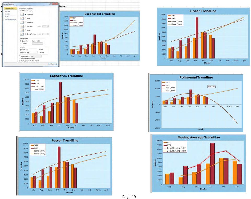
18 Analysis Command Group Trendlines A trendline a empts to fit exis ng data points to a formula and extend that formula for exis ng points or into the future. To add a trendline, select: Layout Trendline Linear Trendline Excel asks which series it should add the trendline toselect the series and press OK To format a trendline: right click the trendline select Format Trendline Op ons in the Format Trendline dialog box allow you to change the line color and the line style. Choosing a forecast method In business a linear trendline is used most o en, which assumes a constant rate of progress throughout the life of the chart. Several other forecast methods are available for trendlines: Exponen al Trendline: Used most o en in science. It describes a popula on that is rapidly increasing over successive genera ons such as the number of fungi in a petri dish over a period of me. Logarithm Trendline: Results when there is an ini al period of rapid growth that levels off over me. Polynomial Trendline: Can describe a line that undulates due to two to six external factors. When you specify a polynomial trendline, you have to specify which order of polynomial. For example, in a third order polynomial, the line is fit to the equa on Y=b+c1x+c2x2+c3x3x. Power Trendline: Fits the points to a line, where y=cxb. This describes a line that increases at a specific exponen al rate over me. Moving Average Trendline: Used to smooth out data that fluctuates over me. A typical trendline would use a three month moving average. Page 18

19 Page 19
20 Adding Drop Lines to a Line or Area Chart A drop line is a ver cal line that extends from a point on a line or area chart down to the corresponding value on the horizontal axis. It s purpose is to make it easier for the reader to discern the exact value of data points. To add a drop line select: Layout Lines Drop Lines Adding High/Low and Up/Down Bars to a Line Chart These lines and Bars enable you to compare two series at each point along the horizontal axis. There are two different op ons for this comparison that are available in the two loca ons along the Layout tab High Low lines extend from one line to the other: Select Layout Lines High Low Lines Up/Down Bars extend from one line to the other. These bars appear in contras ng colors, depending on which line is higher at that par cular point Select: Layout UP/Down Bars Up/Down Bars Page 20

21 Showing Acceptable Tolerances by Using Error Bars Error bars tell you the acceptable range of tolerance for a given range of sta s cs, and when that tolerance has been exceeded. Select one series in the chart and then select Layout Error Bars More Error Bar Op ons In the Format Error Bars dialog, select whether you want the error bars to extend up, down or both from the line. You can add a cap (op onal). In the lower sec on specify one of the five methods for calcula ng the size of the error bar. Based on the standard devia on, specify that the error bars should extend a fixed number of units. Forma ng a Series Ini ate the Format Series Dialog by doubleclicking or right clicking one of the series in a chart, or using the Current Selec on dropdown box in the le side of the Layout ribbon and selec ng Series and clicking the Format Selec on bu on. The Series Op ons category allows you to plot a series on a secondary axis, which is helpful if one data series contains data that is of a different order of magnitude than the other series. When you move one or more series to the secondary axis, you should change the chart type of those series. Otherwise the column Page 21
22 markers are drawn on top of each other Using the remaining categories, you can edit the Marker style for a series, including the marker color, line color, line style, shadow and 3 D forma ng. Forma ng a Single Data Point When you click a single data point once, all the data points in a series are selected. When you double click, only that data point is selected. Once you have clicked a data point twice, you can proceed to modify it using the Format dialog box Selec ng a single data label is helpful if you have two labels on top of each other and you need to move one to another posi on. The Format Tab The Format tab contains icons that enable you to micromanage the color, fill, outline, and effects for any individual chart element. For example, if you want to apply a so glow, a metal finish, and a reflec on to the January data point, you can do so using the Format tab. Conver ng Text to WordArt The WordArt Styles on the Format tab is used to apply WordArt styles to any text on a chart. You can add shadow, glow, or reflec on to the 20 styles in the WordArt menu. Page 22
23 Shape Styles The Shape Styles gallery contains 6 built in styles for six accent colors in the current theme. The six styles progress from simple on the first row to extreme on the last row. To format a par cular element, click that element and choose a new style from the gallery The styles and effects change if you change the theme Using Shape Fill and Shape Effects In addi on to the shape styles, you can add customized effects using the Shape Fill, Shape Outline and Shape Effects drop downs on the Format tab Replacing Data Markers with Clip Art or Shapes Using Clip Art as a Data Marker Follow these steps to create a pictograph: In a 2 D column chart, select a data series. Right click the data series and select Format Data Series Select the Fill category in the Le panel In the right panel choose Picture or Texture Fill Click the ClipArt bu on. Excel displays a shortened version of the ClipArt panel. Select Picture Select the Include Content from Office Online check box. In the Search Text Box, type a keyword to describe the clip art and then click Go Browse through the returned images. You are looking for something that is cartoonish and narrow. Rather than clip art with ta detailed background, look for clip art where only the character appears. When you find an acceptable image, click OK Click the border Color category and select No Line. Click Close to close the Format Data Series dialog Page 23
24 Using a Shape in Place of a Data Marker The fill se ngs on the Format Data Series dialog do not allow you to specify a shape. However they allow you to import a shape from the clipboard. Create a 2 D column chart Select a cell in the worksheet. From the Insert menu, choose an upward arrow from the Shapes drop down. Click and drag to draw an arrow on the worksheet Right click the shape and then select Copy. Click the data series in the chart Right click and select Format Data Series. In the Format Data Series dialog that appears, choose the Fill category in the le panel. In the right panel, choose Picture or Texture Fill In the Insert From sec on, click the Clipboard bu on. Excel replaces the columns with the arrows. Click Close to close the Format Data Series dialog. Page 24
25 Page 25
26 Column Charts Types of Charts A Column Chart shows data changes over a period of me or illustrates comparisons among items. Categories are organized horizontally, values ver cally, to emphasize varia on over me. Stacked column charts show the rela onship of individual items to the whole. The 3 D perspec ve column chart compares data points along two axes. Clustered column and clustered column in 3 D Clustered column charts compare values across categories. A clustered column chart displays values in 2 D ver cal rectangles. A clustered column in 3 D chart displays the data by using a 3 D perspec ve only. A third value axis (depth axis) is not used. You can use a clustered column chart type when you have categories that represent: Ranges of values (for example, item counts). Specific scale arrangements (for example, a Likert scale with entries, such as strongly agree, agree, neutral, disagree, strongly disagree) July Aug Sept Oct Nov Dec July Aug Sept Oct Nov Dec Page 26
27 Stacked column and stacked column in 3 D Stacked column charts show the rela onship of individual items to the whole, comparing the contribu on of each value to a total across categories. A stacked column chart displays values in 2 D ver cal stacked rectangles. A 3 D stacked column chart displays the data by using a 3 D perspec ve only. A third value axis (depth axis) is not used. You can use a stacked column chart when you have mul ple data series and when you want to emphasize the total. 100% stacked column and 100% stacked column in 3 D 100% stacked column charts and 100% stacked column in 3 D charts compare the percentage that each value contributes to a total across categories. A 100% stacked column chart displays values in 2 D ver cal 100% stacked rectangles. You can use a 100% stacked column chart when you have two or more data series and you want to emphasize the contribu ons to the whole, especially if the total is the same for each category. Page 27
28 July Aug Sept Oct Nov Dec 3 D Column 3 D column charts use three axes that you can modify (a horizontal axis, a ver cal axis, and a depth axis), and they compare data points along the horizontal and the depth axes. You can use a 3 D column chart when you want to compare data across the categories and across the series equally, because this chart type shows categories along both the horizontal axis and the depth axis, whereas the ver cal axis displays the values Cylinder, cone, and pyramid Cylinder, cone, and pyramid charts are available in the same clustered, stacked, 100% stacked, and 3 D chart types that are provided for rectangular column charts, and they show and compare data the same way. The only difference is that these chart types display cylinder, cone, and pyramid shapes instead of rectangles. Page 28
29 Line Charts Data that is arranged in columns or rows on a worksheet can be plotted in a line chart. Line charts can display continuous data over time, set against a common scale, and are therefore ideal for showing trends in data at equal intervals. In a line chart, category data is distributed evenly along the horizontal axis, and all value data is distributed evenly along the vertical axis. You should use a line chart if your category labels are text, and are representing evenly spaced values such as months, quarters, or iscal years. This is especially true if there are multiple series for one series, you should consider using a scatter chart. You should also use a line chart if you have several evenly spaced numeric labels, especially years. If you have more than ten numeric labels, use a scatter chart instead. Line and line with markers Displayed with markers to indicate individual data values, or without, line charts are useful to show trends over time or ordered categories, especially when there are many data points and the order in which they are presented is important. If there are many categories or the values are approximate, use a line chart without markers. Page 29
30 100% stacked line and 100% stacked line with markers Displayed with markers to indicate individual data values, or without, 100% stacked line charts are useful to show the trend of the percentage each value contributes over time or ordered categories. If there are many categories or the values are approximate, use a 100% stacked line chart without markers. For a better presentation of this type of data, consider using a 100% stacked area chart instead. 3 D line 3 D line charts show each row or column of data as a 3 D ribbon. A 3 D line chart has horizontal, ver cal, and depth axes that you can modify July Aug Sept Oct Nov Dec Page 30
31 Pie Charts Pie charts show the size of items in one data series, proportional to the sum of the items. They are good for comparing two to five different components. You typically select a range that contains category labels in Column A and values in Column B. Categories are generally sorted so that the largest value is at the top and the other values are sorted in descending order Excel gives you choices about what you can display in data labels in the Format Data Labels dialog, as illustrated on the right. You can also edit each individual label by clicking inside it. The leader lines category is helpful if you have to move a label outside, as in the 3-D table below, if the slice is too narrow to adequately fit the label. The leader line appears automatically to link Pie and pie in 3 D Pie charts display the contribu on of each value to a total in a 2 D or 3 D format. Showing both the value and the category is par cularly helpful if you have to display the chart in black and white Page 31
32 Pie of Pie and Bar of Pie Pie of pie or bar of pie charts display pie charts with user defined values that are extracted from the main pie chart and combined into a secondary Exploded pie and exploded pie in 3 D Exploded pie charts display the contribu on of each value to a total while emphasizing individual values. Exploded pie charts can be displayed in 3 D format. You can change the pie explosion se ng for all slices and individual slices, but you cannot move the slices of an exploded pie manually. Page 32
33 Bar charts Data that is arranged in columns or rows on a worksheet can be plo ed in a bar chart. Bar charts illustrate comparisons among individual items, as opposed to column charts which are be er for displaying trends. Bar charts can be used to show how something changes over me or to compare different mes. The default for ver cal axis in bar charts is star ng from the bo om and reading up. You can change this by going into Axis Op ons and checking the box marked Categories in Reverse Order Page 33
34 Clustered Bar and clustered Bar in 3 D Clustered bar charts compare values across categories. In a clustered bar chart, the categories are typically organized along the ver cal axis, and the values along the horizontal axis. A clustered bar in 3 D chart displays the horizontal rectangles in 3 D format; it does not display the data on three axes. Note that Axis labels cannot be shown within bars in clustered 3D; they can only be shown outside the bars, as illustrated below. Page 34
35 Stacked bar and stacked bar in 3 D Stacked bar charts show the rela onship of individual items to the whole. It is mainly used to show the significance of one par cular item in rela 100% stacked bar and 100% stacked bar in 3 D This type of chart compares the percentage that each value contributes to a total across categories. This type of chart is similar to a pie chart in func on. Below is an example depic ng the number of inquires received by a computer lab help desk by type and by month. You could also use this type of chart to show the breakdown of the amount of me spent on various aspects of a project, the cost of the sub Page 35
36 Horizontal cylinder, cone, and pyramid These charts are available in the same clustered, stacked, and 100% stacked chart types that are provided for rectangular bar charts. They show and compare data the same way. The only difference is that these chart types display cylinder, cone, and pyramid shapes instead of horizontal rectangles. Dec Nov Oct Sept Aug July 0% 50% 100% Page 36
37 Area charts Data that is arranged in columns or rows on a worksheet can be plotted in an area chart. Area charts emphasize the magnitude of change over time, and can be used to draw attention to the total value across a trend. They are a type of presentation graphic that emphasizes a change in values by filling in the portion of the graph beneath the line connecting various data points. For example, data that represents profit over time can be plotted in an area chart to emphasize the total profit. By displaying the sum of the plotted values, an area chart also shows the relationship 2-D area and 3-D area Whether they are shown in 2-D or in 3-D, area charts display the trend of values over time or other category data. 3-D area charts use three axes (horizontal, vertical, and depth) that you can modify. As a rule, you should consider using a line chart instead of a non-stacked area chart, because data from one series can be Page 37
38 Stacked Area and Stacked Area in 3-D Stacked area charts display the trend of the contribution of each value over time or other category data. A stacked area chart in 3-D is displayed in the same way but uses a 3-D perspective. A 3-D perspective is not a true 3-D chart a third value axis (depth axis) is not used. 100% stacked area and 100% stacked area in 3 D 100% stacked area charts display the trend of the percentage that each value contributes over me or other category data. A 100% stacked area chart in 3 D is displayed in the same way but uses a 3 D perspec ve. A 3 D perspec ve is not a true 3 D chart a third value axis (depth axis) is Page 38
39 XY (scatter) charts Data that is arranged in columns and rows on a worksheet can be plotted in an xy (scatter) chart. Scatter charts show the relationships among the numeric values in several data series, or plot two groups of numbers as one series of xy coordinates. A scatter chart has two value axes, showing one set of numeric data along the horizontal axis (x-axis) and another along the vertical axis (y-axis). It combines these values into single data points and displays them in irregular intervals, or clusters. Scatter charts are typically used for displaying and comparing numeric values, such as scientific, statistical, and engineering data. Consider using a scatter chart when you want to compare many data points without regard to time the more data that you include in a scatter chart, the better the comparisons that you can make. Values for horizontal axis are not evenly spaced. To arrange data on a worksheet for a scatter chart, you should place the x values in one row or column, and then enter the corresponding y values in the adjacent rows or columns. Use a sca er chart with data markers but without lines when you use many data points and connec ng lines would make the data more difficult to read. You can also use this chart type when you do not have to Page 39
40 Sca er Charts with Lines Sorted and Unsorted You can use lines to connect the points of a sca er chart, as illustrated below. However, lines can be confusing and decep ve because when you add lines, Excel treats the sca er chart as a line chart a emp ng to show a trend rather than a rela onship. In the first example, we used the data in the order it appears on the previous page, and Excel connected the points in that order going back and forth along the x axis and crea ng total confusion. In the second example, we sorted the data form lowest to highest in the Educa on column and Excel plo ed the line like it would on a line chart. The last chart shows what happens if we format the data, unsorted, as a line chart; the result is confusing. Page 40
41 Stock charts Data that is arranged in columns or rows in a specific order on a worksheet can be plotted in a stock chart. As its name implies, a stock chart is most often used to illustrate the fluctuation of stock prices. However, this chart may also be used for scientific data. For example, you could use a stock chart to indicate the fluctuation of daily or annual temperatures. You must organize your data in the correct order to create stock charts. The way stock chart data is organized in the worksheet is very important. For example, to create a simple high-low-close stock chart, you should arrange your data with High, Low, and Close entered as column headings, in that or High low close The high low close stock chart is o en used to illustrate stock prices. It requires three series of values in the following order: high, low, and then close. General Products, Inc /1/2011 7/2/2011 7/3/2011 7/4/2011 7/5/2011 7/6/2011 7/7/2011 Page 41
42 Open high low close This type of stock chart requires four series of values in the correct order (open, high, low, and then close) Open Hi Low Close Volume open high low close 450, , , , , , Volume Open Hi Low Close 150, , , Page 42-7/1/2011 7/2/2011 7/3/2011 7/4/2011 7/5/2011 7/6/2011 7/7/
43 Surface charts Data that is arranged in columns or rows on a worksheet can be plotted in a surface chart. A surface chart is useful when you want to find optimum combinations between two sets of data. As in a topographic map, colors and patterns indicate areas that are in the same range of values. 3 D surface 3 D surface charts show trends in values across two dimensions in a con nuous curve. Color bands in a surface chart do not represent the data series; they represent the difference between the values. This chart shows a 3 D view of the data, which can be imagined as a rubber sheet stretched over a 3 D column chart. It is typically used to show rela onships between large amounts of data that may otherwise be difficult to see Page 43
44 Wireframe 3 D surface Chart Title Axis Title Axis Title Contour Contour charts are surface charts viewed from above, similar to 2 D topographic maps. In a contour chart, color bands represent specific ranges of values. The lines in a contour chart connect interpolated points of equal value Page 44
45 Doughnut charts Data that is arranged in columns or rows on a worksheet can be plotted in a doughnut chart. Like a pie chart, a doughnut chart shows the relationship of parts to a whole, but it can contain more than one data series. Doughnut charts are not easy to read. You may want to use a stacked column or stacked bar chart instead Doughnut 2 D and 3 D Charts Doughnut charts display data in rings, where each ring represents a data series. If percentages are displayed in data labels, each ring will total 100% Exploded Doughnut Charts Much like exploded pie charts, exploded doughnut charts display the contribution of each value to a total while emphasizing individual values, but they can contain more than Page 45
46 Bubble charts A type of chart in which each plo ed en ty is defined in terms of three dis nct numeric parameters. The enes displayed on a bubble chart can be compared in terms of their size as well as their rela ve posi ons with respect to each numeric axis. Bubble charts can facilitate the understanding of the social, economical, medical, and other scien fic rela onships. Bubble with 2D or 3 D effect Both bubble chart types compare sets of three values instead of two. The third value determines the size of the bubble marker. You can choose to display bubbles in 2 D format or with a 3 D effect. $70,000 $60,000 $50,000 Product Performance Sales $40,000 $30,000 Series1 $70,000 $20,000 $10,000 $60,000 $ No. of Products $50,000 $40,000 $30,000 $20,000 $10,000 $ Page 46
47 Radar charts Data that is arranged in columns or rows on a worksheet can be plo ed in a radar chart. Radar charts compare the aggregate values of several data series. They allow you to see the rela onship between four to six variables and see the big picture more quickly. Applica ons Radar charts are used for such things as: Control of quality improvement to display the performance metrics of any ongoing program. Sports applica ons to chart players' strengths and weaknesses, where they are usually called spider charts Radar, Radar with Markers and Radars Filled In With or without markers for individual data points, radar charts display changes in values rela ve to a center point, in this case average temperatures in Bermuda, Sydney and Memphis, at various mes of the year. Page 47
48 Thermometer Charts Crea ng a chart that acts like a thermometer 1. Start with a table that lists Days from Day 1 Day 15 (see example below using Auto fill. 2. At the bo om enter labels: Goal, Current and % (see example below) 3. Insert numbers from 90 to 150 in the first 7 days 4. In the Goal cell enter In the Current field enter the formula =SUM(U6:U20)(or whatever range applies to your worksheet) 6. In the % field =U23/U22 and format the field as a percentage(in class worksheet) 7. With the percentage field selected, insert a Column Cylinder Chart next to your table 8. Select the Design tab under the Chart Tools menu and click the design circled below 9. Right click the blue cylinder and select Format Data Series 10. Select Series Op ons and move the sliders for the width and depth gaps as necessary 11. Under Chart Tools, click on Layout and select Data Labels>Show 12. When the data label appears in the plot area, move it to the center of the cylinder and en large as appropriate 13. Right click the Ver cal Data Axis and Page 48
49 Combina on Charts Change one of the series in a bar chart to a line chart to enhance the comparison of the two data series. 1. Select the series (bars) that you want to change 2. Right click and select Change Series Chart Type 3. Select Line and choose a line chart type 4. Press OK, and the line appears over the top of the other series bar Page 49
50 Sparklines Sparkline charts are small, high resolu on line graphs embedded in a context of words, numbers, or images. Sparklines are data intense, design simple, word sized graphics. that illustrate a single trend. They do not include axes or labels; context comes from the related content. Usually, when a graph is included in a report, the reader has to break concentra on and take me to study the graph. A sparkline minimizes the me it takes to understand what is being displayed by the graph. Sparklines commonly display trends over me, but they can be used to show any trend that could be displayed on a line graph. They are o en used to illustrate stock trends, weather trends or produc on rates over me. Steps for crea ng a Sparkline 1. Select a data range 2. On the Insert Tab, in the Sparkline sec on, select either Line, Column or Win Loss. 3. When the Sparkline dialog appears, click in a cell to specify the loca on in which you want the Sparkline to appear. 4. Click OK. The Sparkline appears in the selected cell To Insert it into a Word document, copy it and paste it as a picture. Op ons on the Sparkline Tools Design ribbon include: Changing the type of chart Showing various points along the chart Changing styles and marker colors Several axis op ons Page 50
Microsoft Excel 2010 Charts and Graphs
 Microsoft Excel 2010 Charts and Graphs Email: [email protected] Web Page: http://training.health.ufl.edu Microsoft Excel 2010: Charts and Graphs 2.0 hours Topics include data groupings; creating
Excel -- Creating Charts
 Excel -- Creating Charts The saying goes, A picture is worth a thousand words, and so true. Professional looking charts give visual enhancement to your statistics, fiscal reports or presentation. Excel
Create Charts in Excel
 Create Charts in Excel Table of Contents OVERVIEW OF CHARTING... 1 AVAILABLE CHART TYPES... 2 PIE CHARTS... 2 BAR CHARTS... 3 CREATING CHARTS IN EXCEL... 3 CREATE A CHART... 3 HOW TO CHANGE THE LOCATION
Information Literacy Program
 Information Literacy Program Excel (2013) Advanced Charts 2015 ANU Library anulib.anu.edu.au/training [email protected] Table of Contents Excel (2013) Advanced Charts Overview of charts... 1 Create a chart...
Advanced Microsoft Excel 2010
 Advanced Microsoft Excel 2010 Table of Contents THE PASTE SPECIAL FUNCTION... 2 Paste Special Options... 2 Using the Paste Special Function... 3 ORGANIZING DATA... 4 Multiple-Level Sorting... 4 Subtotaling
Scientific Graphing in Excel 2010
 Scientific Graphing in Excel 2010 When you start Excel, you will see the screen below. Various parts of the display are labelled in red, with arrows, to define the terms used in the remainder of this overview.
Microsoft Excel 2010 Part 3: Advanced Excel
 CALIFORNIA STATE UNIVERSITY, LOS ANGELES INFORMATION TECHNOLOGY SERVICES Microsoft Excel 2010 Part 3: Advanced Excel Winter 2015, Version 1.0 Table of Contents Introduction...2 Sorting Data...2 Sorting
Formulas, Functions and Charts
 Formulas, Functions and Charts :: 167 8 Formulas, Functions and Charts 8.1 INTRODUCTION In this leson you can enter formula and functions and perform mathematical calcualtions. You will also be able to
Microsoft Excel 2013: Charts June 2014
 Microsoft Excel 2013: Charts June 2014 Description We will focus on Excel features for graphs and charts. We will discuss multiple axes, formatting data, choosing chart type, adding notes and images, and
Excel 2007 Charts and Pivot Tables
 Excel 2007 Charts and Pivot Tables Table of Contents Working with PivotTables... 2 About Charting... 6 Creating a Basic Chart... 13 Formatting Your Chart... 18 Working with Chart Elements... 23 Charting
Excel Unit 4. Data files needed to complete these exercises will be found on the S: drive>410>student>computer Technology>Excel>Unit 4
 Excel Unit 4 Data files needed to complete these exercises will be found on the S: drive>410>student>computer Technology>Excel>Unit 4 Step by Step 4.1 Creating and Positioning Charts GET READY. Before
Figure 1. An embedded chart on a worksheet.
 8. Excel Charts and Analysis ToolPak Charts, also known as graphs, have been an integral part of spreadsheets since the early days of Lotus 1-2-3. Charting features have improved significantly over the
Microsoft Office Excel 2007 Key Features. Office of Enterprise Development and Support Applications Support Group
 Microsoft Office Excel 2007 Key Features Office of Enterprise Development and Support Applications Support Group 2011 TABLE OF CONTENTS Office of Enterprise Development & Support Acknowledgment. 3 Introduction.
Using Microsoft Word. Working With Objects
 Using Microsoft Word Many Word documents will require elements that were created in programs other than Word, such as the picture to the right. Nontext elements in a document are referred to as Objects
PowerPoint 2007 Basics Website: http://etc.usf.edu/te/
 Website: http://etc.usf.edu/te/ PowerPoint is the presentation program included in the Microsoft Office suite. With PowerPoint, you can create engaging presentations that can be presented in person, online,
Microsoft Excel 2010 Tutorial
 1 Microsoft Excel 2010 Tutorial Excel is a spreadsheet program in the Microsoft Office system. You can use Excel to create and format workbooks (a collection of spreadsheets) in order to analyze data and
Microsoft Office PowerPoint 2013
 Microsoft Office PowerPoint 2013 Navigating the PowerPoint 2013 Environment The Ribbon: The ribbon is where you will access a majority of the commands you will use to create and develop your presentation.
Creating Charts in Microsoft Excel A supplement to Chapter 5 of Quantitative Approaches in Business Studies
 Creating Charts in Microsoft Excel A supplement to Chapter 5 of Quantitative Approaches in Business Studies Components of a Chart 1 Chart types 2 Data tables 4 The Chart Wizard 5 Column Charts 7 Line charts
Intro to Excel spreadsheets
 Intro to Excel spreadsheets What are the objectives of this document? The objectives of document are: 1. Familiarize you with what a spreadsheet is, how it works, and what its capabilities are; 2. Using
Chapter 4 Creating Charts and Graphs
 Calc Guide Chapter 4 OpenOffice.org Copyright This document is Copyright 2006 by its contributors as listed in the section titled Authors. You can distribute it and/or modify it under the terms of either
Introduction to Microsoft Excel 2007/2010
 to Microsoft Excel 2007/2010 Abstract: Microsoft Excel is one of the most powerful and widely used spreadsheet applications available today. Excel's functionality and popularity have made it an essential
Excel 2007 Basic knowledge
 Ribbon menu The Ribbon menu system with tabs for various Excel commands. This Ribbon system replaces the traditional menus used with Excel 2003. Above the Ribbon in the upper-left corner is the Microsoft
Create a Poster Using Publisher
 Contents 1. Introduction 1. Starting Publisher 2. Create a Poster Template 5. Aligning your images and text 7. Apply a background 12. Add text to your poster 14. Add pictures to your poster 17. Add graphs
The Center for Teaching, Learning, & Technology
 The Center for Teaching, Learning, & Technology Instructional Technology Workshops Microsoft Excel 2010 Formulas and Charts Albert Robinson / Delwar Sayeed Faculty and Staff Development Programs Colston
This activity will show you how to draw graphs of algebraic functions in Excel.
 This activity will show you how to draw graphs of algebraic functions in Excel. Open a new Excel workbook. This is Excel in Office 2007. You may not have used this version before but it is very much the
Updates to Graphing with Excel
 Updates to Graphing with Excel NCC has recently upgraded to a new version of the Microsoft Office suite of programs. As such, many of the directions in the Biology Student Handbook for how to graph with
Graphing in excel on the Mac
 Graphing in excel on the Mac Quick Reference for people who just need a reminder The easiest thing is to have a single series, with y data in the column to the left of the x- data. Select the data and
KaleidaGraph Quick Start Guide
 KaleidaGraph Quick Start Guide This document is a hands-on guide that walks you through the use of KaleidaGraph. You will probably want to print this guide and then start your exploration of the product.
Publisher 2010 Cheat Sheet
 April 20, 2012 Publisher 2010 Cheat Sheet Toolbar customize click on arrow and then check the ones you want a shortcut for File Tab (has new, open save, print, and shows recent documents, and has choices
Excel 2007: Basics Learning Guide
 Excel 2007: Basics Learning Guide Exploring Excel At first glance, the new Excel 2007 interface may seem a bit unsettling, with fat bands called Ribbons replacing cascading text menus and task bars. This
Excel Tutorial. Bio 150B Excel Tutorial 1
 Bio 15B Excel Tutorial 1 Excel Tutorial As part of your laboratory write-ups and reports during this semester you will be required to collect and present data in an appropriate format. To organize and
Intermediate PowerPoint
 Intermediate PowerPoint Charts and Templates By: Jim Waddell Last modified: January 2002 Topics to be covered: Creating Charts 2 Creating the chart. 2 Line Charts and Scatter Plots 4 Making a Line Chart.
Plotting: Customizing the Graph
 Plotting: Customizing the Graph Data Plots: General Tips Making a Data Plot Active Within a graph layer, only one data plot can be active. A data plot must be set active before you can use the Data Selector
Plots, Curve-Fitting, and Data Modeling in Microsoft Excel
 Plots, Curve-Fitting, and Data Modeling in Microsoft Excel This handout offers some tips on making nice plots of data collected in your lab experiments, as well as instruction on how to use the built-in
PowerPoint: Graphics and SmartArt
 PowerPoint: Graphics and SmartArt Contents Inserting Objects... 2 Picture from File... 2 Clip Art... 2 Shapes... 3 SmartArt... 3 WordArt... 3 Formatting Objects... 4 Move a picture, shape, text box, or
MicroStrategy Analytics Express User Guide
 MicroStrategy Analytics Express User Guide Analyzing Data with MicroStrategy Analytics Express Version: 4.0 Document Number: 09770040 CONTENTS 1. Getting Started with MicroStrategy Analytics Express Introduction...
Advanced Presentation Features and Animation
 There are three features that you should remember as you work within PowerPoint 2007: the Microsoft Office Button, the Quick Access Toolbar, and the Ribbon. The function of these features will be more
Microsoft Business Intelligence Visualization Comparisons by Tool
 Microsoft Business Intelligence Visualization Comparisons by Tool Version 3: 10/29/2012 Purpose: Purpose of this document is to provide a quick reference of visualization options available in each tool.
A simple three dimensional Column bar chart can be produced from the following example spreadsheet. Note that cell A1 is left blank.
 Department of Library Services Creating Charts in Excel 2007 www.library.dmu.ac.uk Using the Microsoft Excel 2007 chart creation system you can quickly produce professional looking charts. This help sheet
GUIDELINES FOR PREPARING POSTERS USING POWERPOINT PRESENTATION SOFTWARE
 Society for the Teaching of Psychology (APA Division 2) OFFICE OF TEACHING RESOURCES IN PSYCHOLOGY (OTRP) Department of Psychology, Georgia Southern University, P. O. Box 8041, Statesboro, GA 30460-8041
Microsoft Office 2010: Introductory Q&As PowerPoint Chapter 1
 Microsoft Office 2010: Introductory Q&As PowerPoint Chapter 1 Are the themes displayed in a specific order? (PPT 6) Yes. They are arranged in alphabetical order running from left to right. If you point
Introduction To Microsoft Office PowerPoint 2007. Bob Booth July 2008 AP-PPT5
 Introduction To Microsoft Office PowerPoint 2007. Bob Booth July 2008 AP-PPT5 University of Sheffield Contents 1. INTRODUCTION... 3 2. GETTING STARTED... 4 2.1 STARTING POWERPOINT... 4 3. THE USER INTERFACE...
Microsoft Publisher 2010 What s New!
 Microsoft Publisher 2010 What s New! INTRODUCTION Microsoft Publisher 2010 is a desktop publishing program used to create professional looking publications and communication materials for print. A new
I ntroduction. Accessing Microsoft PowerPoint. Anatomy of a PowerPoint Window
 Accessing Microsoft PowerPoint To access Microsoft PowerPoint from your home computer, you will probably either use the Start menu to select the program or double-click on an icon on the Desktop. To open
Computer Training Centre University College Cork. Excel 2013 Level 1
 Computer Training Centre University College Cork Excel 2013 Level 1 Table of Contents Introduction... 1 Opening Excel... 1 Using Windows 7... 1 Using Windows 8... 1 Getting Started with Excel 2013... 2
3 What s New in Excel 2007
 3 What s New in Excel 2007 3.1 Overview of Excel 2007 Microsoft Office Excel 2007 is a spreadsheet program that enables you to enter, manipulate, calculate, and chart data. An Excel file is referred to
Microsoft Word defaults to left justified (aligned) paragraphs. This means that new lines automatically line up with the left margin.
 paragraphs. This means that new lines automatically line up with the left margin.") Microsoft Word Part 2 Office 2007 Microsoft Word 2007 Part 2 Alignment Microsoft Word defaults to left justified (aligned) paragraphs. This means that new lines automatically line up with the left margin.
Microsoft Word Part 2 Office 2007 Microsoft Word 2007 Part 2 Alignment Microsoft Word defaults to left justified (aligned) paragraphs. This means that new lines automatically line up with the left margin.
Creating and Formatting Charts in Microsoft Excel
 Creating and Formatting Charts in Microsoft Excel This document provides instructions for creating and formatting charts in Microsoft Excel, which makes creating professional-looking charts easy. The chart
Excel Project Creating a Stock Portfolio Simulation
 Background Vocabulary Excel Project Creating a Stock Portfolio Simulation 1. What is a stock? A stock is a share in the ownership of a corporation, a large business organization. A stock, also, represents
MARS STUDENT IMAGING PROJECT
 MARS STUDENT IMAGING PROJECT Data Analysis Practice Guide Mars Education Program Arizona State University Data Analysis Practice Guide This set of activities is designed to help you organize data you collect
Excel Math Project for 8th Grade Identifying Patterns
 There are several terms that we will use to describe your spreadsheet: Workbook, worksheet, row, column, cell, cursor, name box, formula bar. Today you are going to create a spreadsheet to investigate
How To Use Microsoft Word 2003
 Microsoft Word 2003 Module 2 Microsoft Word 2003: Module 2 August, 2006 2006 Hillsborough Community College - Professional Development Services Hillsborough Community College - Professional Development
ABOUT THIS DOCUMENT ABOUT CHARTS/COMMON TERMINOLOGY
 A. Introduction B. Common Terminology C. Introduction to Chart Types D. Creating a Chart in FileMaker E. About Quick Charts 1. Quick Chart Behavior When Based on Sort Order F. Chart Examples 1. Charting
Dealing with Data in Excel 2010
 Dealing with Data in Excel 2010 Excel provides the ability to do computations and graphing of data. Here we provide the basics and some advanced capabilities available in Excel that are useful for dealing
CONSTRUCTING SINGLE-SUBJECT REVERSAL DESIGN GRAPHS USING MICROSOFT WORD : A COMPREHENSIVE TUTORIAL
 CONSTRUCTING SINGLE-SUBJECT REVERSAL DESIGN GRAPHS USING MICROSOFT WORD : A COMPREHENSIVE TUTORIAL PATRICK GREHAN ADELPHI UNIVERSITY DANIEL J. MORAN MIDAMERICAN PSYCHOLOGICAL INSTITUTE This document is
Microsoft Excel 2010 Pivot Tables
 Microsoft Excel 2010 Pivot Tables Email: [email protected] Web Page: http://training.health.ufl.edu Microsoft Excel 2010: Pivot Tables 1.5 hours Topics include data groupings, pivot tables, pivot
Basic Excel Handbook
 2 5 2 7 1 1 0 4 3 9 8 1 Basic Excel Handbook Version 3.6 May 6, 2008 Contents Contents... 1 Part I: Background Information...3 About This Handbook... 4 Excel Terminology... 5 Excel Terminology (cont.)...
PowerPoint 2013: Basic Skills
 PowerPoint 2013: Basic Skills Information Technology September 1, 2014 1 P a g e Getting Started There are a variety of ways to start using PowerPoint software. You can click on a shortcut on your desktop
CHARTS AND GRAPHS INTRODUCTION USING SPSS TO DRAW GRAPHS SPSS GRAPH OPTIONS CAG08
 CHARTS AND GRAPHS INTRODUCTION SPSS and Excel each contain a number of options for producing what are sometimes known as business graphics - i.e. statistical charts and diagrams. This handout explores
ITS Training Class Charts and PivotTables Using Excel 2007
 When you have a large amount of data and you need to get summary information and graph it, the PivotTable and PivotChart tools in Microsoft Excel will be the answer. The data does not need to be in one
Summary of important mathematical operations and formulas (from first tutorial):
:") EXCEL Intermediate Tutorial Summary of important mathematical operations and formulas (from first tutorial): Operation Key Addition + Subtraction - Multiplication * Division / Exponential ^ To enter a
EXCEL Intermediate Tutorial Summary of important mathematical operations and formulas (from first tutorial): Operation Key Addition + Subtraction - Multiplication * Division / Exponential ^ To enter a
Microsoft Word 2010 Tutorial
 1 Microsoft Word 2010 Tutorial Microsoft Word 2010 is a word-processing program, designed to help you create professional-quality documents. With the finest documentformatting tools, Word helps you organize
Produced by Flinders University Centre for Educational ICT. PivotTables Excel 2010
 Produced by Flinders University Centre for Educational ICT PivotTables Excel 2010 CONTENTS Layout... 1 The Ribbon Bar... 2 Minimising the Ribbon Bar... 2 The File Tab... 3 What the Commands and Buttons
PowerPoint 2013: Absolute Beginners. Workbook
 PowerPoint 2013: Absolute Beginners Workbook Edition 1 August 2014 Document Reference: 3809-2014 PowerPoint 2013: Absolute Beginners Contents Introduction Getting started with PowerPoint... 1 After the
Excel 2007 - Using Pivot Tables
 Overview A PivotTable report is an interactive table that allows you to quickly group and summarise information from a data source. You can rearrange (or pivot) the table to display different perspectives
Microsoft Word 2010. Quick Reference Guide. Union Institute & University
 Microsoft Word 2010 Quick Reference Guide Union Institute & University Contents Using Word Help (F1)... 4 Window Contents:... 4 File tab... 4 Quick Access Toolbar... 5 Backstage View... 5 The Ribbon...
Excel 2007 A Beginners Guide
 Excel 2007 A Beginners Guide Beginner Introduction The aim of this document is to introduce some basic techniques for using Excel to enter data, perform calculations and produce simple charts based on
Charting LibQUAL+(TM) Data. Jeff Stark Training & Development Services Texas A&M University Libraries Texas A&M University
 Data. Jeff Stark Training & Development Services Texas A&M University Libraries Texas A&M University") Charting LibQUAL+(TM) Data Jeff Stark Training & Development Services Texas A&M University Libraries Texas A&M University Revised March 2004 The directions in this handout are written to be used with SPSS
Charting LibQUAL+(TM) Data Jeff Stark Training & Development Services Texas A&M University Libraries Texas A&M University Revised March 2004 The directions in this handout are written to be used with SPSS
Microsoft Excel 2007 Level 2
 Information Technology Services Kennesaw State University Microsoft Excel 2007 Level 2 Copyright 2008 KSU Dept. of Information Technology Services This document may be downloaded, printed or copied for
Excel. Microsoft Office s spreadsheet application can be used to track. and analyze numerical data for display on screen or in printed
 Excel Microsoft Office s spreadsheet application can be used to track and analyze numerical data for display on screen or in printed format. Excel is designed to help you record and calculate data, and
Creating an Excel XY (Scatter) Plot
 Plot") Creating an Excel XY (Scatter) Plot EXCEL REVIEW 21-22 1 What is an XY or Scatter Plot? An XY or scatter plot either shows the relationships among the numeric values in several data series or plots two
Creating an Excel XY (Scatter) Plot EXCEL REVIEW 21-22 1 What is an XY or Scatter Plot? An XY or scatter plot either shows the relationships among the numeric values in several data series or plots two
Microsoft Excel Basics
 COMMUNITY TECHNICAL SUPPORT Microsoft Excel Basics Introduction to Excel Click on the program icon in Launcher or the Microsoft Office Shortcut Bar. A worksheet is a grid, made up of columns, which are
Creating a Poster in Powerpoint
 Creating a Poster in Powerpoint January 2013 Contents 1. Starting Powerpoint 2. Setting Size and Orientation 3. Display a Grid 5. Apply a background 7. Add text to your poster 9. Add WordArt to your poster
Excel 2003 A Beginners Guide
 Excel 2003 A Beginners Guide Beginner Introduction The aim of this document is to introduce some basic techniques for using Excel to enter data, perform calculations and produce simple charts based on
How to make a line graph using Excel 2007
 How to make a line graph using Excel 2007 Format your data sheet Make sure you have a title and each column of data has a title. If you are entering data by hand, use time or the independent variable in
Clip Art in Office 2000
 Clip Art in Office 2000 In the process of making a certificate, we will cover: Adding clipart and templates from the Microsoft Office Clip Gallery, Modifying clip art by grouping and ungrouping, Flipping
Handout: Word 2010 Tips and Shortcuts
 Word 2010: Tips and Shortcuts Table of Contents EXPORT A CUSTOMIZED QUICK ACCESS TOOLBAR... 2 IMPORT A CUSTOMIZED QUICK ACCESS TOOLBAR... 2 USE THE FORMAT PAINTER... 3 REPEAT THE LAST ACTION... 3 SHOW
Gestation Period as a function of Lifespan
 This document will show a number of tricks that can be done in Minitab to make attractive graphs. We work first with the file X:\SOR\24\M\ANIMALS.MTP. This first picture was obtained through Graph Plot.
Sample Table. Columns. Column 1 Column 2 Column 3 Row 1 Cell 1 Cell 2 Cell 3 Row 2 Cell 4 Cell 5 Cell 6 Row 3 Cell 7 Cell 8 Cell 9.
 Working with Tables in Microsoft Word The purpose of this document is to lead you through the steps of creating, editing and deleting tables and parts of tables. This document follows a tutorial format
MS Word 2007 practical notes
 MS Word 2007 practical notes Contents Opening Microsoft Word 2007 in the practical room... 4 Screen Layout... 4 The Microsoft Office Button... 4 The Ribbon... 5 Quick Access Toolbar... 5 Moving in the
S M A R T D R A W U S E R G U I D E
 2015 S M A R T D R A W U S E R G U I D E Copyright 2015 By SmartDraw, LLC Contents Welcome to SmartDraw... 6 The Resources Section of SmartDraw.com... 7 Tech Support... 7 SmartHelp... 7 Chapter 1: Building
Creating charts in Microsoft Excel 2003
 Guide 34 Version 1.0 Creating charts in Microsoft Excel 2003 This guide provides an introduction to creating charts in Excel. It is assumed that the reader is familiar with the basics of Excel covered
Microsoft Excel 2013 Tutorial
 Microsoft Excel 2013 Tutorial TABLE OF CONTENTS 1. Getting Started Pg. 3 2. Creating A New Document Pg. 3 3. Saving Your Document Pg. 4 4. Toolbars Pg. 4 5. Formatting Pg. 6 Working With Cells Pg. 6 Changing
Business Objects Version 5 : Introduction
 Business Objects Version 5 : Introduction Page 1 TABLE OF CONTENTS Introduction About Business Objects Changing Your Password Retrieving Pre-Defined Reports Formatting Your Report Using the Slice and Dice
Excel 2003 Tutorial I
 This tutorial was adapted from a tutorial by see its complete version at http://www.fgcu.edu/support/office2000/excel/index.html Excel 2003 Tutorial I Spreadsheet Basics Screen Layout Title bar Menu bar
DOING MORE WITH WORD: MICROSOFT OFFICE 2010
 University of North Carolina at Chapel Hill Libraries Carrboro Cybrary Chapel Hill Public Library Durham County Public Library DOING MORE WITH WORD: MICROSOFT OFFICE 2010 GETTING STARTED PAGE 02 Prerequisites
EXCEL Tutorial: How to use EXCEL for Graphs and Calculations.
 EXCEL Tutorial: How to use EXCEL for Graphs and Calculations. Excel is powerful tool and can make your life easier if you are proficient in using it. You will need to use Excel to complete most of your
Excel Basics By Tom Peters & Laura Spielman
 Excel Basics By Tom Peters & Laura Spielman What is Excel? Microsoft Excel is a software program with spreadsheet format enabling the user to organize raw data, make tables and charts, graph and model
Merging Labels, Letters, and Envelopes Word 2013
 Merging Labels, Letters, and Envelopes Word 2013 Merging... 1 Types of Merges... 1 The Merging Process... 2 Labels - A Page of the Same... 2 Labels - A Blank Page... 3 Creating Custom Labels... 3 Merged
Microsoft PowerPoint 2010
 Microsoft PowerPoint 2010 Starting PowerPoint... 2 PowerPoint Window Properties... 2 The Ribbon... 3 Default Tabs... 3 Contextual Tabs... 3 Minimizing and Restoring the Ribbon... 4 The Backstage View...
Microsoft PowerPoint 2010 Handout
 Microsoft PowerPoint 2010 Handout PowerPoint is a presentation software program that is part of the Microsoft Office package. This program helps you to enhance your oral presentation and keep the audience
Creating a Poster Presentation using PowerPoint
 Creating a Poster Presentation using PowerPoint Course Description: This course is designed to assist you in creating eye-catching effective posters for presentation of research findings at scientific
Excel Pivot Tables. Blue Pecan Computer Training Ltd - Onsite Training Provider www.bluepecantraining.com :: 0800 6124105 :: [email protected].
 Excel Pivot Tables 1 Table of Contents Pivot Tables... 3 Preparing Data for a Pivot Table... 3 Creating a Dynamic Range for a Pivot Table... 3 Creating a Pivot Table... 4 Removing a Field... 5 Change the
CREATING EXCEL PIVOT TABLES AND PIVOT CHARTS FOR LIBRARY QUESTIONNAIRE RESULTS
 CREATING EXCEL PIVOT TABLES AND PIVOT CHARTS FOR LIBRARY QUESTIONNAIRE RESULTS An Excel Pivot Table is an interactive table that summarizes large amounts of data. It allows the user to view and manipulate
About PivotTable reports
 Page 1 of 8 Excel Home > PivotTable reports and PivotChart reports > Basics Overview of PivotTable and PivotChart reports Show All Use a PivotTable report to summarize, analyze, explore, and present summary
Microsoft PowerPoint 2007
 Microsoft PowerPoint 2007 PowerPoint is currently the most common software used for making visual aids for presentations. It has been redesigned for the 2007 release with a much more user-friendly and
The following is an overview of lessons included in the tutorial.
 Chapter 2 Tutorial Tutorial Introduction This tutorial is designed to introduce you to some of Surfer's basic features. After you have completed the tutorial, you should be able to begin creating your
WHAT S NEW IN WORD 2010 & HOW TO CUSTOMIZE IT
 WHAT S NEW IN WORD 2010 & HOW TO CUSTOMIZE IT The Ribbon... 2 Default Tabs... 2 Contextual Tabs... 2 Minimizing and Restoring the Ribbon... 3 Customizing the Ribbon... 3 A New Graphic Interface... 5 Live
WEBFOCUS QUICK DATA FOR EXCEL
 WEBFOCUS QUICK DATA FOR EXCEL BRIAN CARTER INFORMATION BUILDERS SUMMIT 2008 USERS CONFERENCE JUNE 2008 Presentation Abstract: Even with the growing popularity and evolvement of Business Intelligence products