Data Visualization Best Practice. Sophie Sparkes Data Analyst
|
|
|
- Andrew Mason
- 9 years ago
- Views:
Transcription
1 Data Visualization Best Practice Sophie Sparkes Data Analyst

2
3

4
5 Never use pie charts. Pie charts can be really useful if used appropriately.


6 Never use pie charts Pie charts can make it difficult to compare relative amounts

7 Never use pie charts Humans like pie charts because the are similar to clocks isn t telling the time a kind of pie chart?

8 Never use pie charts Pie charts are great to showing simple proportions.


9 Never use pie charts Seriously don t ever do this!

10 Never use 3D (unless your data has three dimensions). 3D can highlight highs and lows over time.

11 Never use 3D Charts like this have given 3D a bad name the 3D adds nothing expect confusion.

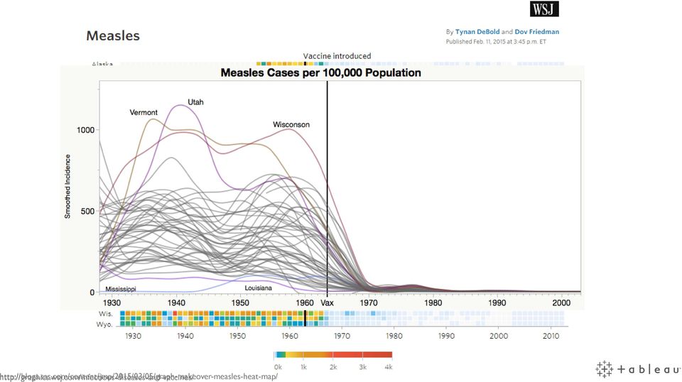
12 Never use 3D This, this just no!

13 Never use 3D Here careful use of 3D highlights complex highs and lows of the market

14 Axis must start at zero. Axis need to make sense, and sometimes that means not starting at zero

15 Axis must start at zero Not starting your axis at zero can misrepresent your data and mislead your audience. and
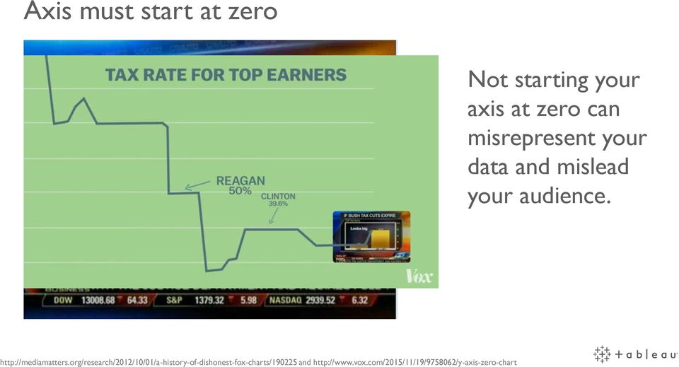
16 Axis must start at zero Axis don t have to start at zero if it doesn t make sense for the data.


17 Axis Aside: Don t deliberately mislead with your axis This chart maps these two datasets using completely different axis that mislead what the data is showing. Don t lie with your axis - Use properly scaled axis -

18 Time should be plotted on a line chart, and geographic data mapped. While these are great rules of thumb, they don t always apply.

19 The only way to graph this and that Using an unconventional way to plot time adds to this graph s appeal.


20 The only way to graph this and that In this case, using a scatter plot instead of a map makes comparisons easier. Use whatever graph type best answers your question.

21 Only use two colours. More than two colours is ok. However, consider using multiple colour hues.
22 Only use two colours Too many colours can be confusing. Humans can only distinguish around 8 different colours at a time in a viz. Use fewer colours but you can use more than two!
23 Only use two colours This graph uses six colours, but it is still immediately understandable.
24 Only use two colours This graph uses a two-colour diverging palette. This uses different hues of the two colours to show a change in values.
25 Colour Aside: Colour blindness Using colour palettes with differing levels of brightness, hue and saturation is best to make your viz colour blind friendly.
26 Don t add frills to your charts. Frills can add interest. However great design doesn t obscure facts with frills.


27 Don t add frills Adding icons and slanting the graph edges makes this chart bewildering. This frill-less remake is much easier to understand.
28 Don t add frills Frills can add interest and intrigue to your viz. In this case careful use of bear images make this viz memorable without overwhelming the viz.
29 Best Practices 1. Know your data 2. Know the question you re trying to answer 3. Design with the audience in mind 4. No exploding 3D pie charts

30 Thank you
Expert Color Choices for Presenting Data
 Expert Color Choices for Presenting Data Maureen Stone, StoneSoup Consulting The problem of choosing colors for data visualization is expressed by this quote from information visualization guru Edward
Choosing Colors for Data Visualization Maureen Stone January 17, 2006
 Choosing Colors for Data Visualization Maureen Stone January 17, 2006 The problem of choosing colors for data visualization is expressed by this quote from information visualization guru Edward Tufte:
CSU, Fresno - Institutional Research, Assessment and Planning - Dmitri Rogulkin
 My presentation is about data visualization. How to use visual graphs and charts in order to explore data, discover meaning and report findings. The goal is to show that visual displays can be very effective
Simple Data Analysis Techniques
 Simple Data Analysis Techniques Three of the most common charts used for data analysis are pie, Pareto and trend charts. These are often linked together in a data trail. Pie Charts Pie charts provide a
Data Visualization. BUS 230: Business and Economic Research and Communication
 Data Visualization BUS 230: Business and Economic Research and Communication Data Visualization 1/ 16 Purpose of graphs and charts is to show a picture that can enhance a message, or quickly communicate
This file contains 2 years of our interlibrary loan transactions downloaded from ILLiad. 70,000+ rows, multiple fields = an ideal file for pivot
 Presented at the Southeastern Library Assessment Conference, October 22, 2013 1 2 3 This file contains 2 years of our interlibrary loan transactions downloaded from ILLiad. 70,000+ rows, multiple fields
Data Visualization Handbook
 SAP Lumira Data Visualization Handbook www.saplumira.com 1 Table of Content 3 Introduction 20 Ranking 4 Know Your Purpose 23 Part-to-Whole 5 Know Your Data 25 Distribution 9 Crafting Your Message 29 Correlation
HOW TO USE DATA VISUALIZATION TO WIN OVER YOUR AUDIENCE
 HOW TO USE DATA VISUALIZATION TO WIN OVER YOUR AUDIENCE + TABLE OF CONTENTS HOW DATA SUPPORTS YOUR MESSAGE 1 Benefits of Data Visualization WHEN TO USE DATA VISUALIZATION HOW TO FIND THE STORY IN YOUR
MARS STUDENT IMAGING PROJECT
 MARS STUDENT IMAGING PROJECT Data Analysis Practice Guide Mars Education Program Arizona State University Data Analysis Practice Guide This set of activities is designed to help you organize data you collect
Visualization Quick Guide
 Visualization Quick Guide A best practice guide to help you find the right visualization for your data WHAT IS DOMO? Domo is a new form of business intelligence (BI) unlike anything before an executive
Demographics of Atlanta, Georgia:
 Demographics of Atlanta, Georgia: A Visual Analysis of the 2000 and 2010 Census Data 36-315 Final Project Rachel Cohen, Kathryn McKeough, Minnar Xie & David Zimmerman Ethnicities of Atlanta Figure 1: From
2.0 COMMON FORMS OF DATA VISUALIZATION
 The Importance of Data Visualization to Business Decision Making by Rebeckah Blewett, Product Manager, Dundas Data Visualization, Inc.Sunday, June 12, 2011 1.0 INTRODUCTION Informed decision making is
Data Visualization Basics for Students
 Data Visualization Basics for Students Dionisia de la Cerda Think about Your Message You want your audience to understand your message. This takes time. Think about your audience and plan your message.
Get The Picture: Visualizing Financial Data part 1
 Get The Picture: Visualizing Financial Data part 1 by Jeremy Walton Turning numbers into pictures is usually the easiest way of finding out what they mean. We're all familiar with the display of for example
Data Visualization Techniques
 Data Visualization Techniques From Basics to Big Data with SAS Visual Analytics WHITE PAPER SAS White Paper Table of Contents Introduction.... 1 Generating the Best Visualizations for Your Data... 2 The
DATA VISUALISATION. A practical guide to producing effective visualisations for research communication
 DATA VISUALISATION A practical guide to producing effective visualisations for research communication Rebecca Wolfe, 2014 Research Uptake Manager, RESYST Consortium London School of Hygiene & Tropical
Table of Contents Find the story within your data
 Visualizations 101 Table of Contents Find the story within your data Introduction 2 Types of Visualizations 3 Static vs. Animated Charts 6 Drilldowns and Drillthroughs 6 About Logi Analytics 7 1 For centuries,
visualization pitfalls (and how to avoid them)
") 5data visualization pitfalls (and how to avoid them) We ve been using charts to help us understand business data for decades. But even when the data was different, the charts were basically the same. Now,
5data visualization pitfalls (and how to avoid them) We ve been using charts to help us understand business data for decades. But even when the data was different, the charts were basically the same. Now,
Data Visualization Techniques
 Data Visualization Techniques From Basics to Big Data with SAS Visual Analytics WHITE PAPER SAS White Paper Table of Contents Introduction.... 1 Generating the Best Visualizations for Your Data... 2 The
A Picture Really Is Worth a Thousand Words
 4 A Picture Really Is Worth a Thousand Words Difficulty Scale (pretty easy, but not a cinch) What you ll learn about in this chapter Why a picture is really worth a thousand words How to create a histogram
Best Practices in Data Visualizations. Vihao Pham 2014
 Best Practices in Data Visualizations Vihao Pham 2014 Agenda Best Practices in Data Visualizations Why We Visualize Understanding Data Visualizations Enhancing Visualizations Visualization Considerations
Using Excel for descriptive statistics
 FACT SHEET Using Excel for descriptive statistics Introduction Biologists no longer routinely plot graphs by hand or rely on calculators to carry out difficult and tedious statistical calculations. These
Best Practices in Data Visualizations. Vihao Pham January 29, 2014
 Best Practices in Data Visualizations Vihao Pham January 29, 2014 Agenda Best Practices in Data Visualizations Why We Visualize Understanding Data Visualizations Enhancing Visualizations Visualization
Creating a Network Graph with Gephi
 Creating a Network Graph with Gephi Gephi is a powerful tool for network analysis, but it can be intimidating. It has a lot of tools for statistical analysis of network data most of which you won't be
an introduction to VISUALIZING DATA by joel laumans
 an introduction to VISUALIZING DATA by joel laumans an introduction to VISUALIZING DATA iii AN INTRODUCTION TO VISUALIZING DATA by Joel Laumans Table of Contents 1 Introduction 1 Definition Purpose 2 Data
Updates to Graphing with Excel
 Updates to Graphing with Excel NCC has recently upgraded to a new version of the Microsoft Office suite of programs. As such, many of the directions in the Biology Student Handbook for how to graph with
A Capability Model for Business Analytics: Part 3 Using the Capability Assessment
 A Capability Model for Business Analytics: Part 3 Using the Capability Assessment The first article of this series presents a capability model for business analytics, and the second article describes a
The basics of storytelling through numbers
 Data Visualizations 101 The basics of storytelling through numbers C olleges and universities have a lot of stories to tell to a lot of different people. Prospective students and parents want to know if
a. First Drag Position from Measures to Dimensions b. Drag Position into Rows c. Drag Candidate into Columns
 Text Analytics using Tableau The following tutorial will show you how to perform text analysis in Tableau 8.2. To get started, you will need the following: Tableau version 8.2 Data: Political Speeches.xlsx
Bar Charts, Histograms, Line Graphs & Pie Charts
 Bar Charts and Histograms Bar charts and histograms are commonly used to represent data since they allow quick assimilation and immediate comparison of information. Normally the bars are vertical, but
DATA VISUALIZATION 101: HOW TO DESIGN CHARTS AND GRAPHS
 DATA VISUALIZATION 101: HOW TO DESIGN CHARTS AND GRAPHS + TABLE OF CONTENTS INTRO 1 FINDING THE STORY IN YOUR DATA 2 KNOW YOUR DATA 3 GUIDE TO CHART TYPES 5 Bar Chart Pie Chart Line Chart Area Chart Scatter
Data Visualization & Dashboard Projects. Quickstart Guide
 Data Visualization & Dashboard Projects Quickstart Guide Introduction So, you re launching a data visualization and dashboards project? Not to worry, this quick guide will help you understand the best
Visibility optimization for data visualization: A Survey of Issues and Techniques
 Visibility optimization for data visualization: A Survey of Issues and Techniques Ch Harika, Dr.Supreethi K.P Student, M.Tech, Assistant Professor College of Engineering, Jawaharlal Nehru Technological
Plots, Curve-Fitting, and Data Modeling in Microsoft Excel
 Plots, Curve-Fitting, and Data Modeling in Microsoft Excel This handout offers some tips on making nice plots of data collected in your lab experiments, as well as instruction on how to use the built-in
Introduction to Geographical Data Visualization
 perceptual edge Introduction to Geographical Data Visualization Stephen Few, Perceptual Edge Visual Business Intelligence Newsletter March/April 2009 The important stories that numbers have to tell often
Good Scientific Visualization Practices + Python
 Good Scientific Visualization Practices + Python Kristen Thyng Python in Geosciences September 19, 2013 Kristen Thyng (Texas A&M) Visualization September 19, 2013 1 / 29 Outline Overview of Bad Plotting
Graphing Parabolas With Microsoft Excel
 Graphing Parabolas With Microsoft Excel Mr. Clausen Algebra 2 California State Standard for Algebra 2 #10.0: Students graph quadratic functions and determine the maxima, minima, and zeros of the function.
Northumberland Knowledge
 Northumberland Knowledge Know Guide How to Analyse Data - November 2012 - This page has been left blank 2 About this guide The Know Guides are a suite of documents that provide useful information about
Information visualization examples
 Information visualization examples 350102: GenICT II 37 Information visualization examples 350102: GenICT II 38 Information visualization examples 350102: GenICT II 39 Information visualization examples
Dashboard Design for Rich and Rapid Monitoring
 Dashboard Design for Rich and Rapid Monitoring Stephen Few Visual Business Intelligence Newsletter November 2006 This article is the fourth in a five-part series that features the winning solutions to
TABLEAU COURSE CONTENT. Presented By 3S Business Corporation Inc www.3sbc.com Call us at : 281-823-9222 Mail us at : [email protected]
 TABLEAU COURSE CONTENT Presented By 3S Business Corporation Inc www.3sbc.com Call us at : 281-823-9222 Mail us at : [email protected] Introduction and Overview Why Tableau? Why Visualization? Level Setting
Principles of Data Visualization for Exploratory Data Analysis. Renee M. P. Teate. SYS 6023 Cognitive Systems Engineering April 28, 2015
 Principles of Data Visualization for Exploratory Data Analysis Renee M. P. Teate SYS 6023 Cognitive Systems Engineering April 28, 2015 Introduction Exploratory Data Analysis (EDA) is the phase of analysis
All Visualizations Documentation
 All Visualizations Documentation All Visualizations Documentation 2 Copyright and Trademarks Licensed Materials - Property of IBM. Copyright IBM Corp. 2013 IBM, the IBM logo, and Cognos are trademarks
A Guide to Using Excel in Physics Lab
 A Guide to Using Excel in Physics Lab Excel has the potential to be a very useful program that will save you lots of time. Excel is especially useful for making repetitious calculations on large data sets.
Variable: characteristic that varies from one individual to another in the population
 Goals: Recognize variables as: Qualitative or Quantitative Discrete Continuous Study Ch. 2.1, # 1 13 : Prof. G. Battaly, Westchester Community College, NY Study Ch. 2.1, # 1 13 Variable: characteristic
MicroStrategy Desktop
 MicroStrategy Desktop Quick Start Guide MicroStrategy Desktop is designed to enable business professionals like you to explore data, simply and without needing direct support from IT. 1 Import data from
Petrel TIPS&TRICKS from SCM
 Petrel TIPS&TRICKS from SCM Knowledge Worth Sharing Pie Charts or Bubble Maps This TIPS&TRICKS is intended to aid a person working in Petrel who needs to make a display showing the relative proportion
Visualization and descriptive statistics. D.A. Forsyth
 Visualization and descriptive statistics D.A. Forsyth What s going on here? Most important, most creative scientific question Getting answers Make helpful pictures and look at them Compute numbers in support
Part 1: Background - Graphing
 Department of Physics and Geology Graphing Astronomy 1401 Equipment Needed Qty Computer with Data Studio Software 1 1.1 Graphing Part 1: Background - Graphing In science it is very important to find and
POPULAR DATA VISUALIZATION INTUITIVE AND UNINTUITIVE
 POPULAR DATA VISUALIZATION INTUITIVE AND UNINTUITIVE Common Practices and Best Practices QlikView Technical Brief Apeksha Pathak UI Designer Demo and Best Practices QlikTech, Radnor Contents ABSTRACT...
Everything you wanted to know about using Hexadecimal and Octal Numbers in Visual Basic 6
 Everything you wanted to know about using Hexadecimal and Octal Numbers in Visual Basic 6 Number Systems No course on programming would be complete without a discussion of the Hexadecimal (Hex) number
Introduction to Data Tables. Data Table Exercises
 Tools for Excel Modeling Introduction to Data Tables and Data Table Exercises EXCEL REVIEW 2000-2001 Data Tables are among the most useful of Excel s tools for analyzing data in spreadsheet models. Some
Data representation and analysis in Excel
 Page 1 Data representation and analysis in Excel Let s Get Started! This course will teach you how to analyze data and make charts in Excel so that the data may be represented in a visual way that reflects
White Paper. Data Visualization Techniques. From Basics to Big Data With SAS Visual Analytics
 White Paper Data Visualization Techniques From Basics to Big Data With SAS Visual Analytics Contents Introduction... 1 Tips to Get Started... 1 The Basics: Charting 101... 2 Line Graphs...2 Bar Charts...3
Visualization. For Novices. ( Ted Hall ) University of Michigan 3D Lab Digital Media Commons, Library http://um3d.dc.umich.edu
 University of Michigan 3D Lab Digital Media Commons, Library http://um3d.dc.umich.edu") Visualization For Novices ( Ted Hall ) University of Michigan 3D Lab Digital Media Commons, Library http://um3d.dc.umich.edu Data Visualization Data visualization deals with communicating information about
Visualization For Novices ( Ted Hall ) University of Michigan 3D Lab Digital Media Commons, Library http://um3d.dc.umich.edu Data Visualization Data visualization deals with communicating information about
A Simple Guide to. What makes a good website design? (by good, I mean a return on your investment)
") A Simple Guide to What makes a good website design? (by good, I mean a return on your investment) Hello and welcome, My name is Katherine Kelleher and I have written this e-book to help you develop an
A Simple Guide to What makes a good website design? (by good, I mean a return on your investment) Hello and welcome, My name is Katherine Kelleher and I have written this e-book to help you develop an
Data Mining and Visualization
 Data Mining and Visualization Jeremy Walton NAG Ltd, Oxford Overview Data mining components Functionality Example application Quality control Visualization Use of 3D Example application Market research
Summary of important mathematical operations and formulas (from first tutorial):
:") EXCEL Intermediate Tutorial Summary of important mathematical operations and formulas (from first tutorial): Operation Key Addition + Subtraction - Multiplication * Division / Exponential ^ To enter a
EXCEL Intermediate Tutorial Summary of important mathematical operations and formulas (from first tutorial): Operation Key Addition + Subtraction - Multiplication * Division / Exponential ^ To enter a
Spreadsheets and Laboratory Data Analysis: Excel 2003 Version (Excel 2007 is only slightly different)
") Spreadsheets and Laboratory Data Analysis: Excel 2003 Version (Excel 2007 is only slightly different) Spreadsheets are computer programs that allow the user to enter and manipulate numbers. They are capable
Spreadsheets and Laboratory Data Analysis: Excel 2003 Version (Excel 2007 is only slightly different) Spreadsheets are computer programs that allow the user to enter and manipulate numbers. They are capable
5 Tips for Creating Compelling Dashboards
 5 Tips for Creating Compelling Dashboards The trend toward deeper and deeper analytics to measure business performance has resulted in a slew of tools for creating dashboards. Many of these tools are quite
CS171 Visualization. The Visualization Alphabet: Marks and Channels. Alexander Lex [email protected]. [xkcd]
![CS171 Visualization. The Visualization Alphabet: Marks and Channels. Alexander Lex alex@seas.harvard.edu. [xkcd]](/thumbs/39/19465011.jpg "CS171 Visualization. The Visualization Alphabet: Marks and Channels. Alexander Lex alex@seas.harvard.edu. [xkcd]") CS171 Visualization Alexander Lex [email protected] The Visualization Alphabet: Marks and Channels [xkcd] This Week Thursday: Task Abstraction, Validation Homework 1 due on Friday! Any more problems
CS171 Visualization Alexander Lex [email protected] The Visualization Alphabet: Marks and Channels [xkcd] This Week Thursday: Task Abstraction, Validation Homework 1 due on Friday! Any more problems
Understanding Data: A Comparison of Information Visualization Tools and Techniques
 Understanding Data: A Comparison of Information Visualization Tools and Techniques Prashanth Vajjhala Abstract - This paper seeks to evaluate data analysis from an information visualization point of view.
Create Cool Lumira Visualization Extensions with SAP Web IDE Dong Pan SAP PM and RIG Analytics Henry Kam Senior Product Manager, Developer Ecosystem
 Create Cool Lumira Visualization Extensions with SAP Web IDE Dong Pan SAP PM and RIG Analytics Henry Kam Senior Product Manager, Developer Ecosystem 2015 SAP SE or an SAP affiliate company. All rights
Quantitative Displays for Combining Time-Series and Part-to-Whole Relationships
 Quantitative Displays for Combining Time-Series and Part-to-Whole Relationships Stephen Few, Perceptual Edge Visual Business Intelligence Newsletter January, February, and March 211 Graphical displays
"Excel with Excel 2013: Pivoting with Pivot Tables" by Venu Gopalakrishna Remani. October 28, 2014
 Teaching Excellence and Innovation 1 Pivot table Pivot table does calculations with criteria Data should be arranged as : Field names in the first rows, records in rows No blank rows or blank columns should
Chapter 4 Creating Charts and Graphs
 Calc Guide Chapter 4 OpenOffice.org Copyright This document is Copyright 2006 by its contributors as listed in the section titled Authors. You can distribute it and/or modify it under the terms of either
Intro to Excel spreadsheets
 Intro to Excel spreadsheets What are the objectives of this document? The objectives of document are: 1. Familiarize you with what a spreadsheet is, how it works, and what its capabilities are; 2. Using
Basic Quantitative Analysis: Using Excel to Analyze Your Data
 Basic Quantitative Analysis: Using Excel to Analyze Your Data Kimberly Yousey, PhD. Associate Director, Assessment Programs StudentVoice 716-652-9400 press 1 [email protected] Defining Quantitative
3D Data Visualization / Casey Reas
 3D Data Visualization / Casey Reas Large scale data visualization offers the ability to see many data points at once. By providing more of the raw data for the viewer to consume, visualization hopes to
31 Misleading Graphs and Statistics
 31 Misleading Graphs and Statistics It is a well known fact that statistics can be misleading. They are often used to prove a point, and can easily be twisted in favour of that point! The purpose of this
A synonym is a word that has the same or almost the same definition of
 Slope-Intercept Form Determining the Rate of Change and y-intercept Learning Goals In this lesson, you will: Graph lines using the slope and y-intercept. Calculate the y-intercept of a line when given
Creating Bar Charts and Pie Charts Excel 2010 Tutorial (small revisions 1/20/14)
") Creating Bar Charts and Pie Charts Excel 2010 Tutorial (small revisions 1/20/14) Excel file for use with this tutorial GraphTutorData.xlsx File Location http://faculty.ung.edu/kmelton/data/graphtutordata.xlsx
Creating Bar Charts and Pie Charts Excel 2010 Tutorial (small revisions 1/20/14) Excel file for use with this tutorial GraphTutorData.xlsx File Location http://faculty.ung.edu/kmelton/data/graphtutordata.xlsx
Microsoft Business Intelligence Visualization Comparisons by Tool
 Microsoft Business Intelligence Visualization Comparisons by Tool Version 3: 10/29/2012 Purpose: Purpose of this document is to provide a quick reference of visualization options available in each tool.

Figure 1. An embedded chart on a worksheet.
 8. Excel Charts and Analysis ToolPak Charts, also known as graphs, have been an integral part of spreadsheets since the early days of Lotus 1-2-3. Charting features have improved significantly over the
Formula for linear models. Prediction, extrapolation, significance test against zero slope.
 Formula for linear models. Prediction, extrapolation, significance test against zero slope. Last time, we looked the linear regression formula. It s the line that fits the data best. The Pearson correlation
AN ANALYSIS OF INSURANCE COMPLAINT RATIOS
 AN ANALYSIS OF INSURANCE COMPLAINT RATIOS Richard L. Morris, College of Business, Winthrop University, Rock Hill, SC 29733, (803) 323-2684, [email protected], Glenn L. Wood, College of Business, Winthrop
3 hours One paper 70 Marks. Areas of Learning Theory
 GRAPHIC DESIGN CODE NO. 071 Class XII DESIGN OF THE QUESTION PAPER 3 hours One paper 70 Marks Section-wise Weightage of the Theory Areas of Learning Theory Section A (Reader) Section B Application of Design
CHARTS AND GRAPHS INTRODUCTION USING SPSS TO DRAW GRAPHS SPSS GRAPH OPTIONS CAG08
 CHARTS AND GRAPHS INTRODUCTION SPSS and Excel each contain a number of options for producing what are sometimes known as business graphics - i.e. statistical charts and diagrams. This handout explores
Choosing a successful structure for your visualization
 IBM Software Business Analytics Visualization Choosing a successful structure for your visualization By Noah Iliinsky, IBM Visualization Expert 2 Choosing a successful structure for your visualization
Creating Charts in Microsoft Excel A supplement to Chapter 5 of Quantitative Approaches in Business Studies
 Creating Charts in Microsoft Excel A supplement to Chapter 5 of Quantitative Approaches in Business Studies Components of a Chart 1 Chart types 2 Data tables 4 The Chart Wizard 5 Column Charts 7 Line charts
How To: Analyse & Present Data
 INTRODUCTION The aim of this How To guide is to provide advice on how to analyse your data and how to present it. If you require any help with your data analysis please discuss with your divisional Clinical
Math 132. Population Growth: the World
 Math 132 Population Growth: the World S. R. Lubkin Application If you think growth in Raleigh is a problem, think a little bigger. The population of the world has been growing spectacularly fast in the
and BI Services Overview CONTACT W: www.qualia.hr E: [email protected] M: +385 (91) 2010 075 A: Lastovska 23, 10000 Zagreb, Croatia
 2010 075 A: Lastovska 23, 10000 Zagreb, Croatia") and BI Services Overview CONTACT W: www.qualia.hr E: [email protected] M: +385 (91) 2010 075 A: Lastovska 23, 10000 Zagreb, Croatia Reports *web business intelligence software Easy to use, easy to deploy.
and BI Services Overview CONTACT W: www.qualia.hr E: [email protected] M: +385 (91) 2010 075 A: Lastovska 23, 10000 Zagreb, Croatia Reports *web business intelligence software Easy to use, easy to deploy.
" Y. Notation and Equations for Regression Lecture 11/4. Notation:
 Notation: Notation and Equations for Regression Lecture 11/4 m: The number of predictor variables in a regression Xi: One of multiple predictor variables. The subscript i represents any number from 1 through
Briefing document: How to create a Gantt chart using a spreadsheet
 Briefing document: How to create a Gantt chart using a spreadsheet A Gantt chart is a popular way of using a bar-type chart to show the schedule for a project. It is named after Henry Gantt who created
Top 5 best practices for creating effective dashboards. and the 7 mistakes you don t want to make
 Top 5 best practices for creating effective dashboards and the 7 mistakes you don t want to make p2 Financial services professionals are buried in data that measure and track: relationships and processes,
Excel -- Creating Charts
 Excel -- Creating Charts The saying goes, A picture is worth a thousand words, and so true. Professional looking charts give visual enhancement to your statistics, fiscal reports or presentation. Excel
Scatter Plots with Error Bars
 Chapter 165 Scatter Plots with Error Bars Introduction The procedure extends the capability of the basic scatter plot by allowing you to plot the variability in Y and X corresponding to each point. Each
Escaping RGBland: Selecting Colors for Statistical Graphics
 Escaping RGBland: Selecting Colors for Statistical Graphics Achim Zeileis, Kurt Hornik, Paul Murrell http://statmath.wu.ac.at/~zeileis/ Overview Motivation Color in statistical graphics Challenges Illustrations