Cardiff University User Experience Style Guide
|
|
|
- Ross Richardson
- 10 years ago
- Views:
Transcription
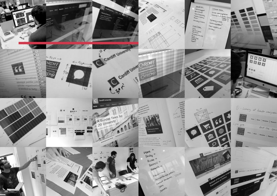
1 Page 1 Cardiff University User Experience Style Guide cardiff.ac.uk/ux V2 : 04/06/2013

2 Page 2
3 Contents Page 3 Page 4 Page 17 Page 35 Page 52 About Type Sizes Iconography Welsh Page 5 Page 18 Page 41 Page 53 Logo Links Using Icons User Experience Style Guide Roadmap Page 6 Page 19 Page 44 Digital Icon Type & Links Examples Buttons & Other Elements Page 8 Page 20 Page 45 Primary Colour Palette Global Header Images Page 10 Page 26 Page 47 Secondary Colour Palette Site Header Photo / Media Gallery Page 11 Page 29 Page 49 Grid Structure Navigation Quick Link Module Examples Page 15 Page 34 Page 50 Typography Footer Slideshow Tile

4 About Page 4 The UX Style Guide has been produced as a quick reference to Cardiff University s online visual language. The guide profiles typography, our global header, common design patterns and what the University requires from all web productions created in the house style.most site producers will experience the new house style in the Squiz Matrix CMS or the University s approved Wordpress theme. For projects approved to carry the house style outside of those systems, the UX Style Guide provides an at-a-glance reference for how things should look and feel. This document is available to download from the University s Web & UX Guidelines website, along with our UI kit, which provides code, sample pages, CSS and more for application and site producers to refer to. Web Producers from the University are also invited to contribute and collaborate over the Web & UX Guidelines website. The Web & UX Guidelines website will be available in July/August 2013.

5 Logo Page 5 Cardiff University logo 100 x 100px The electronic version of the Cardiff University logo is a square as this reproduces more precisely on screen and will align with the grid used for the website. The print version of the logo is available in CMYK, spot and monochrome versions to suit the print processes. To download the version of the logo for use in printed material and view guidelines for use visit:

6 Digital Icon Page 6 The Digital Icon is an abstraction of the full Cardiff University logo, created for use in small digital spaces where the full logo Cardiff University Digital Icon 50 x 50px - standard header size may become illegible or cumbersome. It is categorically not for use in print, and should only be used digitally in 4 contexts: Cardiff University Favicon 16 x 16px - favicon size Across the website global headers as per house style. As a favicon showing in browser tabs and bookmarks. On social media avatars and mobile app icons in a fixed position (see diagram) On mobile app icons in a fixed position (see diagram) The print version of the logo is available in CMYK, spot and monochrome versions to suit the print processes. Cardiff University Avatar A digital logo placed onto a background image of your choosing The digital logo is 1/3 of the total avatar width Placement of the digital logo is always aligned to the top and 1/12th of total avatar width from the left hand edge of the avatar 180 x 180px minimum dimensions Services will resize the avatar on upload A Photoshop template file will be made available at cardiff.ac.uk/ux

7 Digital Icon Page 7 For web use, the full logo University should always feature on the same page as the digital icon. In the case of most web pages, this will be Cardiff University Digital Icon 50 x 50px - standard header size in the house style footer. For non-house style websites, the designer may use their discretion if they use the digital icon and full logo or just the full logo. Cardiff University Favicon 16 x 16px - favicon size For social media avatar and mobile app icon use, the digital logo should be placed according to the divisions noted in the diagram. Cardiff University Avatar A digital logo placed onto a background image of your choosing The digital logo is 1/3 of the total avatar width Placement of the digital logo is always aligned to the top and 1/12th of total avatar width from the left hand edge of the avatar 180 x 180px minimum dimensions Services will resize the avatar on upload A Photoshop template file will be made available at cardiff.ac.uk/ux

8 Primary Colour Palette 1/2 Page 8 The primary Cardiff University Primary colour palette should be used consistently throughout it s application of the User Experience Style Guidelines. Whilst the University transitions to the palette and guidelines noted in this document, you may still see use of #990033, a web-safe darker Cardiff University Red. This is now deprecated. Swap it for the one noted on this page wherever possible. Hex: #d3374a R:211 G:55 B:74 Hex: #d3d3d2 R:211 G:211 B:210 Hex: #22211f R:34 G:33 B:31 Hex: #ffffff R:255 G:255 B:255

9 Primary Colour Palette 2/2 Page 9 The primary Cardiff University Tints colour palette contains a spectrum of tints from light to dark grey. These can be used mainly as graphical backgrounds, button #e9e9e9 R:233 G:233 B:233 #d0d0cf R:208 G:208 B:207 #bcbbbb R:188 G:187 B:187 overstates etc. #91908f R:145 G:144 B:143 #7a7978 R:122 G:121 B:120 # R:102 G:101 B:100 # R:55 G:55 B:54 #22211f R:34 G:33 B:31

10 Secondary Colour Palette Examples 1/2 Page 10 The secondary Cardiff University Example 1 colour palette will be used when deviating from the main site into different subsites and areas. The rule is open on colour choice but the chosen palette needs to contain 3 tints of the same colour, Example 2 to allow for backgrounds, button overstates etc. For most websites, the Web & User Experience team will work with you to come up with a colour scheme that is both appealing and Example 3 functional. Colour is used on the University site for wayfinding as well as to improve contrast and visibility of content.

11 Grid Structure 1/4 Page 11 The grid structure is made up of different layers to help us align content and make the transition between different devices easier. 10px Vertical Grid 10px The first layer is a 10px vertical grid that helps define the detail.

12 Grid Structure 2/4 Page 12 The 60px vertical columns help align content areas, creating a visual hierarchy on the page. 60px Vertical Columns 60px 20px

13 Grid Structure Page 13 The 320px vertical columns help align content that will flow nicely between devices. 320px Vertical Columns 320px 20px Mobile Widescreen

14 Grid Structure Page 14 The 10px baseline helps align content horizontally. 10px 10px Horizontal Baseline

15 Typography 1/2 Page 15 The only three typefaces to be used in the application of the User Experience guidelines are: Franklin Gothic Medium Georgia Italic Arial (Regular and Bold) For Unicode and international Franklin Gothic Medium a b c d e f g h i j k l m n o p q r s t u v w x y z A B C D E F G H I J K L M N O P Q R S T U V W X Y Z ! % &? ~ " # $ % & ' ( ) * + / \ ^ _ { } ¼ ½ ¾,. script requirements, including display of Chinese and other script systems, authors are free to use their own fonts. However, the 3 main typefaces should always be the primary typefaces. Georgia Italic a b c d e f g h i j k l m n o p q r s t u v w x y z A B C D E F G H I J K L M N O P Q R S T U V W X Y Z ! % &? ~ " # $ % & ' ( ) * + / \ ^ _ { } ¼ ½ ¾,.

16 Typography 2/2 Page 16 Arial and Georgia are system fonts on many computers, while Franklin Gothic has been purchased as a web font. Details on the use of the Franklin Gothic web font are contained in the UI Kit. Arial Regular a b c d e f g h i j k l m n o p q r s t u v w x y z A B C D E F G H I J K L M N O P Q R S T U V W X Y Z % &? ~ " # $ % & ' ( ) * + / \ ^ _ { } ¼ ½ ¾,. Arial Bold a b c d e f g h i j k l m n o p q r s t u v w x y z A B C D E F G H I J K L M N O P Q R S T U V W X Y Z ! % &? ~ " # $ % & ' ( ) * + / \ ^ _ { } ¼ ½ ¾,.
 * + / \ ^ _ { } ¼ ½ ¾,.")
17 Type Sizes Page 17 H1 Franklin Gothic Medium 44px 50px leading / 10px tracking H2 Franklin Gothic Medium 34px 40px leading / 10px tracking H3 Georgia Italic 24px 30px leading / 10px tracking H4 Franklin Gothic Medium 24px 30px leading / 10px tracking H5 Georgia Italic 20px 30px leading / 10px tracking Introduction Body Copy Arial 16px 30px leading / 10px tracking Body Copy Arial 14px 20px leading / 10px tracking Article Links Georgia Italic 16px 30px leading / 10px tracking Caption Text Georgia Italic 14px 20px leading / 10px tracking Caption Text Links Georgia Italic 14px 20px leading / 10px tracking H6 Franklin Gothic Medium 20px 30px leading / 10px tracking H7 Georgia Italic 16px 30px leading / 10px tracking

18 Links Page 18 Consistency of colour and application of the link styling is paramount to the user experience. To provide inline navigation where expected by users, page titles (when listed on a page), images closely connected to page titles or headings, and calls to action (e.g. Read more, Book tickets, Contact us) should all be rendered as links and use the standard link styling. See the Iconography section for optional icons. Link colour should only deviate from the standard colours when mounted on a tinted background, photo or video. In these cases, high contrast and complimentary colour choice should influence the choice of link colour. Lorem ipsum dolor sit amet, consectetur adipiscing elit. Praesent mollis est vel massa hendrerit sed suscipit magna interdum. Proin leo mauris, facilisis eu... Inline link style (inherits all paragraph typographic styles but applies link colour and hover state underlining) Lorem ipsum dolor sit amet, consectetur adipiscing elit. Inline link style (bold) Proin leo mauris Link with icon Arial 14px, 20px leading / 10px tracking (alternative icons for external links and document types etc. will be specified separately) Lorem ipsum dolor sit Amet consectetur Related links /sidebar style (Georgia Italic, 16px, unstyled list with icons) H4 heading with a link Heading with a link e.g. H4. Inherit all heading styles, apply standard link colour and hover underlining Links can also be enhanced by link icons. For link icon information, see the Iconography section. Cardiff University Standard link colour: #045bc6 (rgb 4, 91, 198) Hover state (including visited hover): #022d62 (rgb 2, 45, 98) underlined

19 Typography & Links Example Page 19 H2 Franklin Gothic Medium 34px 40px leading / 10px tracking H3 Georgia Italic 24px 30px leading / 10px tracking Introduction Body Copy Arial 16px 30px leading / 10px tracking Body Copy Arial 14px 20px leading / 10px tracking H4 heading with link Arial 24px 30px leading / 10px tracking H7 Georgia Italic 16px 30px leading / 10px tracking

20 Global Header (Public Website) 1/4 Page 20 The digital logo also acts as a link to the home page. Users can switch between the main public site and the Intranet using this link. The Global Header is the keystone of the Cardiff University web experience. Along with the Global Footer, it should appear on all core and standard Cardiff University websites. The Global header is supplied as part of the templates used in Squiz CMS or Wordpress corporate theme. If you are producing a website which uses a local or dead copy action header update notifications from the Web & User Experience team. This also applies to the footer. The design and content of the header must not be modified in either style or functionality. The Search box must always use the main website search and should never be modified with extra controls. of the header you must have the ability to update the header rapidly to ensure that it is consistent with the links available on the central website. You must also ensure you

21 Global Header (Public Website) 2/4 Page 21
22 Global Header (Public Website) 3/4 Page 22 Drop down menu will become visible on hover. The drop down menus should be flexible allowing content to grow. This menu content will be defined and managed centrally. If sites feature a local or dead copy of the global header, the site owner must undertake to update the header within 2 working weeks when requests are made centrally to do so.
23 Global Header (Public Website) 4/4 Page 23 On click of the Search box, an option will appear allowing the user to choose between Website and Course search. The Course search results page will allow the user to toggle between Undergraduate and Postgraduate courses.
24 Global Header (Intranet) Page 24 Link to the homepage of the public website The header for the Intranet uses the same layout and grid as the external site, but will use a near inverse colour scheme to the public website. Lighter colour tints will allow staff and students to instantly recognise an internal page or Intranet serivce. As with the public website header, the Intranet header should not be edited or changed by site owners and must remain consistent throughout the Intranet user experience. If there is no Welsh equivalent available for the current page or section in the Intranet the Cymraeg link will be disabled and displayed as a lower contrast link The header is labelled Cardiff University Intranet (which is also a link to the Intranet homepage) and the toggle at the far right allows the user to switch to the public website. In Intranet mode, Search will search documents, blogs, and other Intranet services.
25 Global Header (Applications) Page 25 Link to the homepage of the application follow the intranet homepage name and link, the > separator indicates that this is a service within the intranet. This indicator should not be more than one level deep. It is not to be used as a breadcrumb. A number of Intranet services run on third party applications. Examples are Learning Central (Blackboard) and Office 365 ( and calendar system). Third party services can be difficult or costly to make look and feel exactly like our Intranet, often for little user experience gain. For services that offer little customisation, a single strip version of the Intranet header it is not appropriate to use the full Intranet header. The user will still see a clear label of where they are, how to get back to the Intranet homepage and how to switch to the public website. The single strip header should only be built into your service after consultation, as a review of your service may be required to ensure no usability problems may be encountered. may be applied. This should only be used when
26 Site Header Page 26 The site header The Site Header is a persistent area that is the masthead of each University website. Tailored and unique for each site, but to a design pattern, the Site Header appears between the global header and the site s horizontal navigation bar. Background Site owners should choose a colour and/or image to fill this space. We recommend solid colours, textures and abstract imagery, as photographs of buildings or people may be obscured by the site s title. Remember that this block of imagery helps users identify that they are on your website. Do not put any text in your background image and try and keep detail to a minimum. If you use colours or there is a colour theme to your backround image, you may wish to use a palette selection from our styles to accent the rest of your site and content colour to match it. The University s Web & User Experience team are able to help you with site header background designs and may contact you if there is room for improvement with one you have produced. Depth of header The depth of the header is defined for the entire site with the exception being the central homepage. The height for all pages (excluding navigation below) is 250px. Wayfinding It is important that your site is recognisably distinctive to help users with wayfinding. Wayfinding gives our users visual clues that they are on a particular part of our website. Their expectations on available options, navigation and content are informed by these clues. Make your banner distinct to other sites of a similar topic where possible. Flexible slot The far right of the site header contains a space you may wish to use for a persistent piece of site content or functionality. If you have social media or service profiles that compliment your website, we d recommend using the flexible slot to promote these. You may also wish to promote an event or a news story. If your site is single purpose, such as to promote a survey, this is the perfect area to promote it. Remember that this piece of content will be shown to all users on all of your pages; keep the content fairly muted and remember to review it if it is date specific.
27 Site Header Examples 1/2 Page 27 Home page carousel banner
28 Site Header Examples 2/2 Page 28
29 Navigation 1/5 Page 29 Horizontal navigation The site navigation will follow the chosen colour palette for that section. The dropdown navigation must show only one level of navigation depth. Selected category (Drop Down Menu)
30 Navigation 2/5 Page 30 Breadcrumb An example of another extension to the site navigation are breadcrumbs. Breadcrumbs are not part of our core navigation structure, but may be suitable for some types of website. If you do require breadcrumbs, you should make sure your website does not have a left menu, as both together will clutter and reduce the quality of the user experience.
31 Navigation 3/5 Page 31 The horizontal navigation can be extended on sites that have a specific navigation need that is not met by the vailable options. This may be of particular value to a single-task website such as Search or to support logged in member services links. Extensions to the Site Navigation are rarely required, and all instances of their use should be agreed with the Web & User Experience Team prior to development.
32 Navigation 4/5 Page 32 Left menu The left menu should never be used as a substitute for well produced Left menu at three navigation items deep First Level Second Level content with inline or task related links. The left menu should also never be directly referenced in your content, as it will not always appear to the user (e.g. if they Second Level Selected Third Level are using a mobile phone or if the content is reused on a website that does not feature a left menu). Third Level Selected
33 Navigation 5/5 Page 33 Left menu Left menu at three navigation items deep Left menu sample demonstrating, from left to right, a users progression through the structure of the site.
34 Footer Page 34 The Cardiff University footer will contain social media links, the large version of the brand mark and any other secondary information. The social media links featured in the footer must link to the Cardiff University accounts and not school or section specific accounts. The footer must not be altered or styled differently to the footer used on the main website. As with the global navigation, if the footer is a local copy you must be able to enact changes requested by the Web Teams in a timely manner.
35 Iconography Page x 100px #22211f mount 20px Padding Final icon Icon sizes have been adopted from the Cardiff University logos. These icons work well with the chosen grid and are shown in two sizes. 100px square icons are used for page title icons, e.g. news item 50px square icons are used to indicate content type items within a page, e.g. quote panel or channel content. 20px inline icons are used for 50 x 50px #22211f mount 10px Padding Final icon titling - further details in their use will be in the UI kit. 20px square with 10px padding 16px inline icons for use when linking to documents e.g..pdf or for indicating external links are also available, refer to the UI kit for details.
36 Iconography (Content Icons) 1/3 Page 36 A selection of icons have been Large Icons 100 x 100px created to work throughout the site at various points. The code for their use will be made available in the UI Kit. Icon background colour is #22211f (R:34 G:33 B:31) and the icon is #ffffff (R:255 G:255 B:255). This rule should run throughout the sites creating global consistency. Icons are referred to by a name specific to its use e.g icon-map and they should not be used to refer to indicate any other use. For example icon-camera should not be used for video content Icons are supplied as a set of typefaces and css - refer to the UI kit for details Icons will be used on the standard #22211f mount but can be mounted on dark tints for school use by prioir agreement with SRWEB
37 Iconography (Content Icons) 2/3 Page 37 Small icons should be 50 x Sample Small Icons 50 x 50px 50px in size with 10px inner padding to allow the icon image to sit comfortably in the centre of the square with enough breathing space.
38 Iconography (Content Icons) 3/3 Page 38 These should only be used in Small Content Icons 20px Height (No Background) exceptional cases. Note that these icons should not be used to accompany text links as they will affect the line height of the link. They can be used as part of buttons and controls (such as slideshow controls).
39 Iconography (Link Icons) Page 39 These icons are used to accompany Link Icons 16px Height (No Background) links to indicate the type of action related to the link. For example download a file, indicate that the user is being directed to an external website or that the target requires the user to log in.
40 Iconography (Service Icons) Page 40 Service icons link to social media Service Icons 16px Height (No Background) accounts and profiles and thirdparty services that may be connected to a University website or content page. An example use of service icons is to link to a School s Facebook and Twitter pages, link to a blog for a division website or to link through to a range of social media accounts for student recruitment. A range of social media icons are provided and will be maintained along with our user interface design. The icons include all major social networks, generic icons for services such as blogs as well as a few Cardiff University- specific icons for services such as our Intranet and Connections. A number of country or region specific social networks are also catered for, including a number of Chinese social networks. For a full list of icons, and to suggest amendments or additions to the icon set, visit the Web & UX Guidelines website (live July/ August 2013). Mono in white (16 and 20px) Mono in black (16 and 20px) Colour (16 and 20px) These are sample icons for services and do not indicate endorsement of any services featured.
41 Using Content Icons 1/3 Page 41 20px Padding When creating a list using icons, they should sit to the left and the text accompanying the icon should be vertically centred to the icon (where possible). 20px padding between icon and text is recommended.
42 Using Content Icons 2/3 Page 42 30px Padding Offset 5px The small icons (50 x 50px) work well with the quick link modules and images. The icon is offset by 5px to allow it to stand out and should be relevant to the content. The icons are referenced via CSS names that refer to their intended use e.g. icon-quote or icon-twitter to maintain consistent application throughout the website. Full instructions for the use of iconography will be available in the UI Kit.
43 Using Content Icons 3/3 Page 43 Large icons are also used in an article header. The icon sits proudly in the top right hand side giving an indication as to what the user is reading.
44 Other Icons & Elements Page 44 Home Page Feed Buttons Inactive Overstate Carousel Buttons Inactive Overstate Carousel Markers Inactive Overstate Social Buttons (Footer) Inactive Overstate View More Button Inactive Overstate
45 Images 1/2 Page 45 All imagery should follow a 16:9 Image aspect ratio ratio allowing a variety of sizes to be used, as long as the size sticks to the ratio and the grid, it is correct.
46 Images 2/2 Page 46 A large image would be contained 16:9 620 x 350px within a news article or blog post. The option is available to have a caption below the image, this should be no longer than two lines of copy. 620 x 70px
47 Photo / Media Gallery 1/2 Page x 350px The Photo / Media gallery can be used by selecting a thumbnail to view the media in a larger window above. A caption can be added to the media if needed. If there is more than 5 content items the user can scroll through the thumbnails using the right and left buttons. 620 x 70px
48 Photo / Media Gallery 2/2 Page x 350px The thumbnail shows an overstate of what the content is when the user hovers over it. Images, Video, and animation can be shown here. 620 x 70px
49 Quick Link Module Examples Page px Width 20px Gutter Quick link modules are what make up the home pages of the main Cardiff University site, school sites and Intranet. The modules should contain snippets of information linking to more on the same subject. Photographic images, illustration and plain text can all be used. The colours used in the modules should relate to the colours used in the site that the content is coming from.
50 Slideshow Tile Page px Width The Live Tile will contain up to date information, messages, breaking news, current offers etc. The tiles can be viewed using the carousel buttons.
51 Advert / Promotion Module Page px Width The adverts / promotional boxes follow the 16:9 rule. These allow adverts containing images, text and hyperlinks to appear throughout the Cardiff University website. Wherever possible these should be presented as text to allow for translations and scaling to content for different device resolutions.
52 Welsh Page 52 Welsh version of the global header. Language toggle available to the user as a directly equivalent page/resource is available Language toggle disabled as no equivalent content exists. On hover the disabled link will display a tooltip with a message for the user directing them to relevant information
53 Roadmap Page 53 The User Experience Style Guide is an evolving document to reflect the feedback from users and the development of the components of the UI Kit. v.2 Document published for internal review. v.3 Updated to reflect feedback and changes from UI Kit development. Includes updated navigation description.
54 Page 54 For help using these guidelines please contact: For Photoshop design elements please refer to the Cardiff University UI Kit. Copyright Cardiff University
1.1. Design elements
 1.1 Design elements 1 The fundamental design elements, color, typography, structure and imagery contribute to an optimal user experience. The following section details the specifics of these elements.
Aviva. Mobile Style guidelines v1.0
 Aviva Mobile Style guidelines v1.0 Logo The Aviva logo represents our business to the wider world and is the most recognisable part of our brand identity. 1. Aviva landscape logo The Aviva logo is available
Online Brand Guide JANUARY 2013
 Online Brand Guide JANUARY 2013 Hello! This is a guide to the basic elements of the Sacred Heart University website. For General Usage questions, please contact: Nancy Boudreau Director of Web Content
Website Builder Manual
 Fasthosts Customer Support Website Builder Manual This is a designed as a definitive guide to all the features and tools available within Website Builder. Contents Introduction... 4 Adding Content... 5
Mobile Web Site Style Guide
 YoRk University Mobile Web Site Style Guide Table of Contents This document outlines the graphic standards for the mobile view of my.yorku.ca. It is intended to be used as a guide for all York University
Website Style Guide 2014
 Website Style Guide 2014 Contents 3 Color / Pallette 29-30 Images / Tablet & Mobile Icons 4 Page Templates / List 31 Images / What Not to Do 5 Typography / Fonts 32 Portal / Image Specifications 6-7 Typography
How To Design A Website For The Decs
 ONLINE COMMUNICATION SERVICES FACTSHEET - DESIGN Created by: Mark Selan Version 1.1 Date Last Modified: April 2008 DESIGN GUIDELINES FOR GENER8 WEBSITES The purpose of this document is to provide Online
QUICK START GUIDE FOR CLUB WEBSITES
 QUICK START GUIDE FOR CLUB WEBSITES Introduction Quick Start Guide for Club Websites For more than 100 years, Rotary has united leaders committed to applying their expertise to better their communities.
How To Change Your Site On Drupal Cloud On A Pcode On A Microsoft Powerstone On A Macbook Or Ipad (For Free) On A Freebie (For A Free Download) On An Ipad Or Ipa (For
 On A Freebie (For A Free Download) On An Ipad Or Ipa (For") How-to Guide: MIT DLC Drupal Cloud Theme This guide will show you how to take your initial Drupal Cloud site... and turn it into something more like this, using the MIT DLC Drupal Cloud theme. See this
How-to Guide: MIT DLC Drupal Cloud Theme This guide will show you how to take your initial Drupal Cloud site... and turn it into something more like this, using the MIT DLC Drupal Cloud theme. See this
Virtual Exhibit 5.0 requires that you have PastPerfect version 5.0 or higher with the MultiMedia and Virtual Exhibit Upgrades.
 28 VIRTUAL EXHIBIT Virtual Exhibit (VE) is the instant Web exhibit creation tool for PastPerfect Museum Software. Virtual Exhibit converts selected collection records and images from PastPerfect to HTML
Guide To Creating Academic Posters Using Microsoft PowerPoint 2010
 Guide To Creating Academic Posters Using Microsoft PowerPoint 2010 INFORMATION SERVICES Version 3.0 July 2011 Table of Contents Section 1 - Introduction... 1 Section 2 - Initial Preparation... 2 2.1 Overall
Official JSN Dome v1 Quick Start Guide
 Official JSN Dome v1 Quick Start Guide This documentation is release under Creative Commons Attribution-Non-Commercial-Share Alike 3 Unported Licence. You are free to print this document for convenient
Message from Marketing & Creative Services
 Web Style Guide September 2013 Message from Marketing & Creative Services 2 Campus Community Members: The University of West Florida web presence is one of the most valuable assets we have as an institution.
Digital Commons Design Customization Guide
 bepress Digital Commons Digital Commons Reference Material and User Guides 6-2016 Digital Commons Design Customization Guide bepress Follow this and additional works at: http://digitalcommons.bepress.com/reference
Creating a Restaurant Website
 11 Creating a Restaurant Website In This Lesson This lesson looks at the process of creating a small business website, in this case for a restaurant. Starting from a needs analysis, this lesson shows you
RADFORD UNIVERSITY. Radford.edu. Content Administrator s Guide
 RADFORD UNIVERSITY Radford.edu Content Administrator s Guide Contents Getting Started... 2 Accessing Content Administration Tools... 2 Logging In... 2... 2 Getting Around... 2 Logging Out... 3 Adding and
Transport for London DESIGN STYLE GUIDE
 Transport for London DESIGN STYLE GUIDE PURPOSE The Design style guide for tfl.gov.uk has been created to define the interactive visual language of TfL s website and digital services. It is a reference
Style Guide Provided courtesy of Innovative Emergency Management Inc.
 Style Guide 1. Introduction Louisiana.gov is an enterprise approach for state agencies to work together to provide citizen-centric digital government services and information. Key to achieving this goal
Ingeniux 8 CMS Web Management System ICIT Technology Training and Advancement ([email protected])
") Ingeniux 8 CMS Web Management System ICIT Technology Training and Advancement ([email protected]) Updated on 10/17/2014 Table of Contents About... 4 Who Can Use It... 4 Log into Ingeniux... 4 Using Ingeniux
Ingeniux 8 CMS Web Management System ICIT Technology Training and Advancement ([email protected]) Updated on 10/17/2014 Table of Contents About... 4 Who Can Use It... 4 Log into Ingeniux... 4 Using Ingeniux
Table of Contents. What is ProSite? What is Behance? How do ProSite & Behance work together? Get Started in 6 Easy Steps.
 The Beginners Guide Table of Contents 03 04 05 06 34 35 What is ProSite? What is Behance? How do ProSite & Behance work together? Get Started in 6 Easy Steps See Live Examples Need More Help? What is ProSite?
Creating an Email with Constant Contact. A step-by-step guide
 Creating an Email with Constant Contact A step-by-step guide About this Manual Once your Constant Contact account is established, use this manual as a guide to help you create your email campaign Here
Using the Adventist Framework with your netadventist Site
 Using the Adventist Framework with your netadventist Site Introduction: The Adventist framework is available for everyone with a netadventist web site. Sites using this framework will visually identify
ADOBE MUSE. Building your first website
 ADOBE MUSE Building your first website Contents Chapter 1... 1 Chapter 2... 11 Chapter 3... 20 Chapter 4... 30 Chapter 5... 38 Chapter 6... 48 Chapter 1 Installing the software and setting up the sample
FAQs. How do I remove the search bar completely?
 FAQs Company Logo How do I change the logo? Can I make the logo larger or smaller? How do I add change or remove the logo in the footer? Can I add a favicon? Navigation Menu How do I change my navigation
+ Create, and maintain your site
 T4 Basics Version 1.0 + Create, and maintain your site With T4, you are in control of the content of your website. Feel free to be creative, and keep your site up to date. Few of T4 Features Media Library
WordPress websites themes and configuration user s guide v. 1.6
 WordPress websites themes and configuration user s guide v. 1.6 Congratulations on your new website! Northeastern has developed two WordPress themes that are flexible, customizable, and designed to work
Terminal Four (T4) Site Manager
 Site Manager") Terminal Four (T4) Site Manager Contents Terminal Four (T4) Site Manager... 1 Contents... 1 Login... 2 The Toolbar... 3 An example of a University of Exeter page... 5 Add a section... 6 Add content to
Terminal Four (T4) Site Manager Contents Terminal Four (T4) Site Manager... 1 Contents... 1 Login... 2 The Toolbar... 3 An example of a University of Exeter page... 5 Add a section... 6 Add content to
Joomla! template Blendvision v 1.0 Customization Manual
 Joomla! template Blendvision v 1.0 Customization Manual Blendvision template requires Helix II system plugin installed and enabled Download from: http://www.joomshaper.com/joomla-templates/helix-ii Don
ireview Template Manual
 ireview Template Manual Contents Template Overview... 2 Main features... 2 Template Installation... 3 Installation Steps... 3 Upgrading ireview... 3 Template Parameters... 4 Module Positions... 6 Module
Managing your Joomla! 3 Content Management System (CMS) Website Websites For Small Business
 Website Websites For Small Business") 2015 Managing your Joomla! 3 Content Management System (CMS) Website Websites For Small Business This manual will take you through all the areas that you are likely to use in order to maintain, update
2015 Managing your Joomla! 3 Content Management System (CMS) Website Websites For Small Business This manual will take you through all the areas that you are likely to use in order to maintain, update
University of East Anglia Liferay Training Admissions, Recruitment and Marketing Department
 University of East Anglia Liferay Training Admissions, Recruitment and Marketing Department i Version 3.4 Contents Overview...iii Introducing Liferay... iv 1. Logging in and accessing your site... 1 2.
Your Blueprint websites Content Management System (CMS).
.") Your Blueprint websites Content Management System (CMS). Your Blueprint website comes with its own content management system (CMS) so that you can make your site your own. It is simple to use and allows
Your Blueprint websites Content Management System (CMS). Your Blueprint website comes with its own content management system (CMS) so that you can make your site your own. It is simple to use and allows
The AA Style Guide VC501 Historical and Contextual Studies Tyrone Duke
 The AA Style Guide VC501 Historical and Contextual Studies Tyrone Duke For the road ahead Logo The AA logo is one of the most recognised logos in the UK. Modern style requirements have updated it, but
Graphic Design Basics. Shannon B. Neely. Pacific Northwest National Laboratory Graphics and Multimedia Design Group
 Graphic Design Basics Shannon B. Neely Pacific Northwest National Laboratory Graphics and Multimedia Design Group The Design Grid What is a Design Grid? A series of horizontal and vertical lines that evenly
The Logo 3. Fiksu Logo
 Brand Guidelines 2 Contents 3 Fiksu Logo 8 miq Logo 10 Brand Architecture 14 Color Palette 15 Image Treatment 16 Data Pattern 17 Typography 18 Applications 20 Email Signature The Logo 3 Fiksu Logo The
Web Standards Guide The Warren Alpert Medical School of Brown University
 Web Standards Guide The Warren Alpert Medical School of Brown University 1 Alpert Medical School Homepage Structure and Components The Alpert Medical School homepage consists of 7 parts: 1. audience gateways,
Creating an Email with Constant Contact. A step-by-step guide
 Creating an Email with Constant Contact A step-by-step guide About this Manual Once your Constant Contact account is established, use this manual as a guide to help you create your email campaign Here
<Insert Picture Here>
 Designing the Oracle Store with Oracle Application Express Marc Sewtz Software Development Manager Oracle Application Express Oracle USA Inc. 540 Madison Avenue,
Traffic Management App. User Guide
 Traffic Management App User Guide content section one Introduction 2 Logging In 2 section two Creating a new Traffic Management Plan 4 Identifying the location 4 Associating with a non-streetworks or unplanned
darlingharbour.com Content Management System Tenant User Guide
 darlingharbour.com Content Management System Tenant User Guide August 2014 Table of Contents 1 Introduction... 1 2 Getting started... 1 2.1 Requirements...1 2.2 Logging in...1 2.3 Change your Password...2
On the Email Marketing home page, click the arrow to expand the Admin Tools area. Admin Tools
 Email Marketing How-To Document November 2010 Email Marketing Admin Tools On the Email Marketing home page, click the arrow to expand the Admin Tools area. Admin Tools Global Email Settings Design Templates
Where do I start? DIGICATION E-PORTFOLIO HELP GUIDE. Log in to Digication
 You will be directed to the "Portfolio Settings! page. On this page you will fill out basic DIGICATION E-PORTFOLIO HELP GUIDE Where do I start? Log in to Digication Go to your school!s Digication login
Google Sites: Creating, editing, and sharing a site
 Google Sites: Creating, editing, and sharing a site Google Sites is an application that makes building a website for your organization as easy as editing a document. With Google Sites, teams can quickly
RSW. Responsive Fullscreen WordPress Theme
 RSW Responsive Fullscreen WordPress Theme Thank you for purchasing this theme. This document covers the installation and Setting up of the theme. Please read through this Help Guide if you experience any
USER S MANUAL JOOMLA! GOVERNMENT WEB TEMPLATE
 USER S MANUAL JOOMLA! GOVERNMENT WEB TEMPLATE 1 TABLE OF CONTENTS Introduction 3 Parts of the Government Web Template (GWT) 4 Logging In and Getting Started 5 GWT Joomla! Module Map 8 Editing the Top Bar
User Guide. Chapter 6. Teacher Pages
 User Guide Chapter 6 s Table of Contents 1. Introduction... 4 I. Enhancements... 5 II. Tips... 6 2. Key Information... 7 3. How to Add a... 8 4. How to Edit... 10 I. SharpSchool s WYSIWYG Editor... 11
JOOMLA 2.5 MANUAL WEBSITEDESIGN.CO.ZA
 JOOMLA 2.5 MANUAL WEBSITEDESIGN.CO.ZA All information presented in the document has been acquired from http://docs.joomla.org to assist you with your website 1 JOOMLA 2.5 MANUAL WEBSITEDESIGN.CO.ZA BACK
CWU Content Management System (CMS) User Guide
 User Guide") CWU Content Management System (CMS) User Guide Last Revision: July 14, 2014 Version: 1.7 CWU Content management System (CMS) User Guide 2 Table of Contents NOTE: Copyright Guidelines... 4 What is a content
CWU Content Management System (CMS) User Guide Last Revision: July 14, 2014 Version: 1.7 CWU Content management System (CMS) User Guide 2 Table of Contents NOTE: Copyright Guidelines... 4 What is a content
Microsoft PowerPoint 2010 Templates and Slide Masters (Level 3)
") IT Services Microsoft PowerPoint 2010 Templates and Slide Masters (Level 3) Contents Introduction... 1 Installed Templates and Themes... 2 University of Reading Templates... 3 Further Templates and Presentations...
IT Services Microsoft PowerPoint 2010 Templates and Slide Masters (Level 3) Contents Introduction... 1 Installed Templates and Themes... 2 University of Reading Templates... 3 Further Templates and Presentations...
TABLE OF CONTENTS. SECTION ONE: OVERVIEW... 4 Who are these guidelines for?... 4 What is a visual identity guideline?... 4
 VISUAL IDENTITY TABLE OF CONTENTS SECTION ONE: OVERVIEW... 4 Who are these guidelines for?... 4 What is a visual identity guideline?... 4 SECTION TWO: VISUAL IDENTITY GUIDLINES... 5 Corporate identity
css href title software blog domain HTML div style address img h2 tag maintainingwebpages browser technology login network multimedia font-family
 technology software href browser communication public login address img links social network HTML div style font-family url media h2 tag handbook: id domain TextEdit blog title PORT JERVIS CENTRAL SCHOOL
Word Press Theme Video Stream Apptha
 Word Press Theme Video Stream Apptha Steps for Installation: Extract the downloaded UNZIP_THIS_FIRST_videostream.zip file. Once you have extract, follow the below steps: Go to Admin Appearance Themes Install
Table of Contents. Creating a Newsletter. Loading a Video or Slideshow. Distributing a Newsletter through Exact Target
 Indiana University Copenhagen Publishing System University Communications Newsletter User Manual Last Updated: March 1, 2009 [email protected] Table of Contents Creating a Newsletter Loading a Video or
Creating Web Pages with Microsoft FrontPage
 Creating Web Pages with Microsoft FrontPage 1. Page Properties 1.1 Basic page information Choose File Properties. Type the name of the Title of the page, for example Template. And then click OK. Short
Introduction 3. Getting Familiar With Presence Builder... 4. Creating and Editing Websites 6
 Contents Introduction 3 Getting Familiar With Presence Builder... 4 Creating and Editing Websites 6 Importing Sites from SiteBuilder 4.5... 7 Editing Websites... 9 Structure: Pages and Navigation... 9
NDSU Technology Learning & Media Center. Introduction to Google Sites
 NDSU Technology Learning & Media Center QBB 150C 231-5130 www.ndsu.edu/its/tlmc Introduction to Google Sites Get Help at the TLMC 1. Get help with class projects on a walk-in basis; student learning assistants
User Guide. User Guide Title Page Page i
 User Guide User Guide Title Page Page i Table of Contents Welcome 1 Welcome to Avvo Websites 1 Getting Started 2 Accessing your Avvo Website Dashboard 2 Dashboard Features 3 Screen Options 4 Submitting
Parallels Panel. User s Guide to Parallels Presence Builder 12.0. Revision 1.0
 Parallels Panel User s Guide to Parallels Presence Builder 12.0 Revision 1.0 Contents Introduction 3 Getting Familiar With Presence Builder... 4 Creating and Editing Websites 6 Importing Sites from SiteBuilder
Website Creation Service: User s Guide
 Service: User s Guide 1 Table of Contents 1) Connecting to Your Online Interface 2) Start Creating Your Website 3) Managing Website Pages 4) Managing Website Content 5) Integrating Widgets and Other Content
Smartphones and tablets: If you have a data plan, use the SMTP server setting for the company that provides this service.
 ARTSPHERE USER MANUAL Hosting for versions 5.0 and 5.1 The hosting control panel is where your website is located. We refer to this as the cpanel. To access the cpanel add /cpanel to your domain name (for
UCL INFORMATION SERVICES DIVISION INFORMATION SYSTEMS. Silva. Introduction to Silva. Document No. IS-130
 UCL INFORMATION SERVICES DIVISION INFORMATION SYSTEMS Silva Introduction to Silva Document No. IS-130 Contents What is Silva?... 1 Requesting a website / Web page(s) in Silva 1 Building the site and making
SmallBiz Dynamic Theme User Guide
 SmallBiz Dynamic Theme User Guide Table of Contents Introduction... 3 Create Your Website in Just 5 Minutes... 3 Before Your Installation Begins... 4 Installing the Small Biz Theme... 4 Customizing the
Brock University Content Management System Training Guide
 Brock University Content Management System Training Guide Table of Contents Brock University Content Management System Training Guide...1 Logging In...2 User Permissions...3 Content Editors...3 Section
ART Blue Responsive Magento Theme
 ART Blue Responsive Magento Theme User Documentation (Version 1.0) Thank you for purchasing our theme. If you have any questions that are beyond the scope of this document, please feel free to send your
Create your own teacher or class website using Google Sites
 Create your own teacher or class website using Google Sites To create a site in Google Sites, you must first login to your school Google Apps account. 1. In the top-right corner of any apps, you can click
Web Ambassador Training on the CMS
 Web Ambassador Training on the CMS Learning Objectives Upon completion of this training, participants will be able to: Describe what is a CMS and how to login Upload files and images Organize content Create
SoftChalk. Level 1. University Information Technology Services. Training, SoftChalk Level Outreach, 1 Learning Technologies and Video Production
 SoftChalk Level 1 University Information Technology Services Training, SoftChalk Level Outreach, 1 Learning Technologies and Video Production Page 1 of 49 Copyright 2013 KSU Department of University Information
SPELL Tabs Evaluation Version
 SPELL Tabs Evaluation Version Inline Navigation for SharePoint Pages SPELL Tabs v 0.9.2 Evaluation Version May 2013 Author: Christophe HUMBERT User Managed Solutions LLC Table of Contents About the SPELL
Terminal 4 Content Types. Need help? Call the ITD Lab, x7471
 Terminal 4 Content Types Need help? Call the ITD Lab, x7471 1 Terminal 4 Content Types Contents Introduction...2 Terminology...2 Content Types...3 Ad Banner...4 Ad Banner Full...5 Alert Text...6 Banner
Web Design. www.ltscotland.org.uk/sustainabledevelopment/climatechange
 Web Design www.ltscotland.org.uk/sustainabledevelopment/climatechange Web Design Personnel Web design involves a range of skills. Everyone in the class can be involved in planning the website structure
Building a Horizontal Menu in Dreamweaver CS3 Using Spry R. Berdan
 Building a Horizontal Menu in Dreamweaver CS3 Using Spry R. Berdan In earlier versions of dreamweaver web developers attach drop down menus to graphics or hyperlinks by using the behavior box. Dreamweaver
Magenta CMS Training: RAF Station/ RAF Sport websites
 Magenta CMS Training: RAF Station/ RAF Sport websites [email protected] 0207 490 1010 Introduction What is a website content management system? The content management system, or CMS, is software
NEPA/DO-12 Web Based Training Design Document
 NEPA/DO-12 Web Based Training Design Document October 10, 2004 Lisa Bradshaw, Annie Persson, Keith Regensburger Prototype URL http://clem.mscd.edu/~bradshaw/it6960/npsprototypemain.htm Prototype Pages
SMU Student Affairs Style Guide
 SMU Student Affairs Style Guide 1 Strengthening Our Visual Communications 1 SMU Student Affairs is dedicated to creating a cohesive learning environment for SMU students. To do this, we must ensure that
JMS Gift - Prestashop Responsive Theme
 JMS Gift - Prestashop Responsive Theme Compatible with: Prestashop 1.6.x created: 7/12/2014 latest update: 18/12/2014 by: Joommasters.com email: [email protected] skype: tungpscnc or nguyenngochai84
Building Your First Drupal 8 Company Site
 Building Websites with Drupal: Learn from the Experts Article Series Building Your First Drupal 8 Company Site by Todd Tomlinson July, 2014 Unicon is a Registered Trademark of Unicon, Inc. All other product
Dreamweaver Domain 2: Planning Site Design and Page Layout
 Dreamweaver Domain 2: Planning Site Design and Page Layout Adobe Creative Suite 5 ACA Certification Preparation: Featuring Dreamweaver, Flash, and Photoshop 1 Objectives Identify best practices for designing
SWMS. Simple Website Management System. Martyn Bampton September 2008. A fast and friendly way to build and maintain Websites
 SWMS Simple Website Management System A fast and friendly way to build and maintain Websites Martyn Bampton September 2008 Page 1 Contents 1. Introduction 1.1 1.2 1.3 1.4 1.5 - What is SWMS? - Who should
A set-up guide and general information to help you get the most out of your new theme.
 Blox. A set-up guide and general information to help you get the most out of your new theme. This document covers the installation, set up, and use of this theme and provides answers and solutions to common
ECDC CORPORATE. Web design guidelines. Draft v0.3. www.ecdc.europa.eu
 ECDC CORPORATE Web design guidelines Draft v0.3 www.ecdc.europa.eu CORPORATE REPORT Web design guidelines Introduction Part of a whole design project which includes: Web portal Extranet Intranet Sub-branded
Themes and Templates Manual FOR ADVANCED USERS
 Manual FOR ADVANCED USERS Table of Contents Introduction... 3 Key Information... 3 Portal Structure... 4 Portal Structure: Template... 5 Overview... 5 1) Editing a Portal Template... 6 2) Adding a Portal
introduces the subject matter, presents clear navigation, is easy to visually scan, and leads to more in-depth content. Additional Resources 10
 STYLE GUIDE Style Guide for Course Design Think of your Moodle course page as the homepage of a website. An effective homepage: introduces the subject matter, presents clear navigation, is easy to visually
How to Build a SharePoint Website
 How to Build a SharePoint Website Beginners Guide to SharePoint Overview: 1. Introduction 2. Access your SharePoint Site 3. Edit Your Home Page 4. Working With Text 5. Inserting Pictures 6. Making Tables
Garfield Public Schools Fine & Practical Arts Curriculum Web Design
 Garfield Public Schools Fine & Practical Arts Curriculum Web Design (Half-Year) 2.5 Credits Course Description This course provides students with basic knowledge of HTML and CSS to create websites and
Citywide User Experience Design Guidelines: NYC.gov Style Guide. Final 1.2 - Public 11/8/2013
 CITYWIDE GUIDELINES Citywide User Experience Design Guidelines: NYC.gov Style Guide 1.0 Overview Final 1.2 - Public 11/8/2013 City of New York Department of Information Technology and Telecommunications
Sage Accountants Business Cloud EasyEditor Quick Start Guide
 Sage Accountants Business Cloud EasyEditor Quick Start Guide VERSION 1.0 September 2013 Contents Introduction 3 Overview of the interface 4 Working with elements 6 Adding and moving elements 7 Resizing
Contents. SiteBuilder User Manual
 Contents Chapter 1... 3 Getting Started with SiteBuilder... 3 What is SiteBuilder?... 3 How should I use this manual?... 3 How can I get help if I m stuck?... 3 Chapter 2... 5 Creating Your Website...
Fireworks CS4 Tutorial Part 1: Intro
 Fireworks CS4 Tutorial Part 1: Intro This Adobe Fireworks CS4 Tutorial will help you familiarize yourself with this image editing software and help you create a layout for a website. Fireworks CS4 is the
How To Create A Website In Drupal 2.3.3
 www.webprophets.com.au PO Box 2007 St Kilda West Victoria Australia 3182 Phone +61 3 9534 1800 Fax +61 3 9534 1100 Email [email protected] Web www.webprophets.com.au Welcome to the Drupal How to
Weebly.com First Steps
 Weebly.com First Steps Weebly is the easiest way to build your own website. The first thing you need to do is go to www.weebly.com to create an account. Then you will begin with the next steps. The Site
Create a Google Site in DonsApp
 Create a Google Site in DonsApp 1 Google Web Site Interactive. Constructivist. Collaborative. Communities. WHAT IS GOOGLE SITE? With one single click, you can create a website without any knowledge of
UNIVERSITY COLLEGE CORK CMS. Content Management System
 UNIVERSITY COLLEGE CORK CMS Content Management System Table of Contents 1 Introduction... 1 2 Planning your Website... 1 2.1 New Sites... 1 2.2 Migrating an Existing CMS Site... 2 3 Accessing the Content
VISUAL BRAND GUIDELINES
 VISUAL BRAND GUIDELINES When creating Toastmasters materials for your club or district, please visit www.toastmasters.org/creatingmaterials for more information before your design is printed or distributed.