Principles of Web Design 6 th Edition. Chapter 12 Responsive Web Design
|
|
|
- Norah Stephens
- 9 years ago
- Views:
Transcription
1 Principles of Web Design 6 th Edition Chapter 12 Responsive Web Design

2 Objectives Recognize the need for responsive web design Use media queries to apply conditional styles Build a basic media query Create flexible responsive layouts Create responsive navigation schemes Use responsive images Build a responsive web page design for desktops, tablets, and smartphones 2

3 Recognizing the Need for Responsive Web Design 3

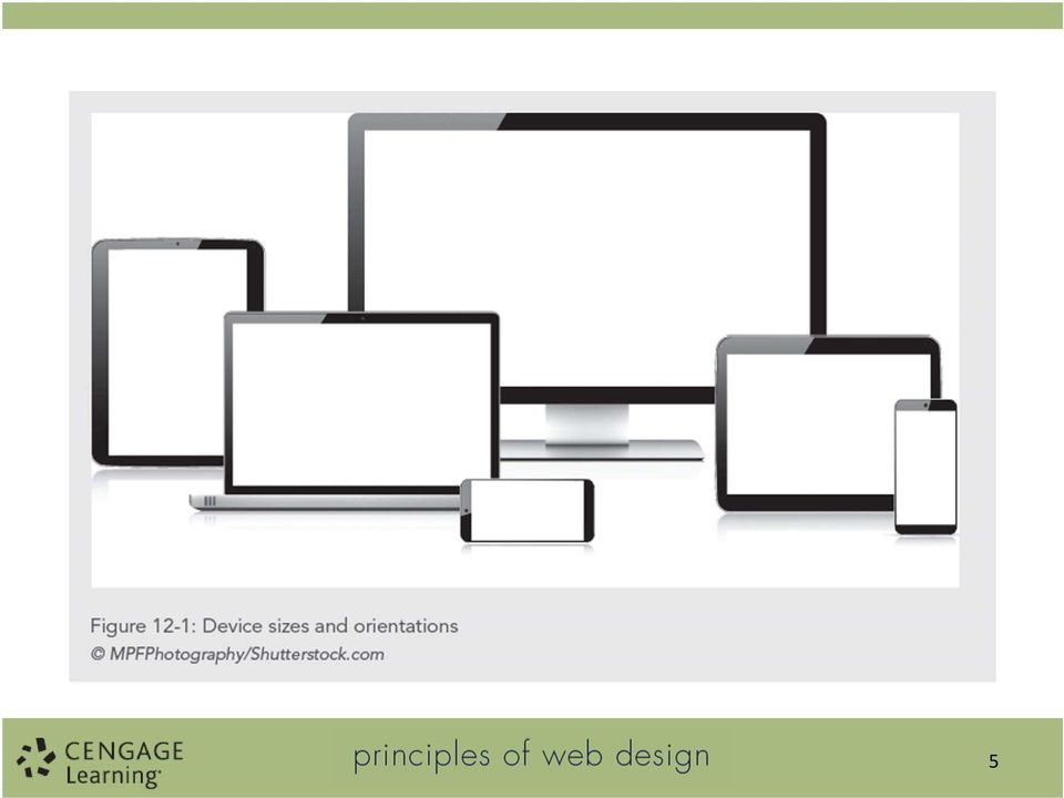
4 Recognizing the Need for Responsive Web Design Tablets and smartphones add to web design challenge More device sizes, screen orientations, and screen resolutions Design responsively rather than for specific devices 4

5 5
6 Recognizing the Need for Responsive Web Design Traditional web design techniques do not adapt well to mobile devices Legibility and navigation are challenges Responsive design lets you build a more flexible type of web page that responds to the varying size of mobile displays 6

7 Recognizing the Need for Responsive Web Design Three main elements of responsive design: CSS media queries Using these expressions, you can apply styles based on display device characteristics Flexible images These images adapt to the parameters of the user s screen size Flexible layouts These layouts realign elements of your content structure based on the display device 7

8 Recognizing the Need for Responsive Web Design Figure 12 2 shows the responsive design of the World Wildlife Fund web site at five screen resolutions Both page designs are flexible to adapt to sizes above or below the 768 pixel threshold This threshold is called the breakpoint the point at which design layouts change in responsive design schemes 8

9 9

10 Recognizing the Need for Responsive Web Design Use CSS style rules to change the order, positioning, and other display characteristics of your page elements Build one basic layout and then use style rules targeted to different screen sizes 10

11 Recognizing the Need for Responsive Web Design Figure 12 3 shows the range of sizes and the breakpoint used in the style of the World Wildlife site The web site design adapts to larger screen sizes, expanding and adding more content and navigation as the browser widths increase In this example, the breakpoint is set to 768 pixels 11

12 12
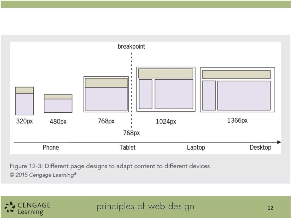
13 Recognizing the Need for Responsive Web Design Choose a breakpoint and then design for the devices above and below that point Adapt your design for optimal viewing in each range of screen sizes Content, not the device needs, should dictate when you choose breakpoints 13

14 Recognizing the Need for Responsive Web Design You can control style characteristics including: Adding and removing entire columns Changing navigation Stacking columns on top of each other 14

15 15

16 16

17 Content First Design Think carefully about your content and users needs when building responsive designs Which content is valuable to the user of a smaller device? How much content can be used effectively on each device? Will you have to edit or restructure content? 17

18 Measurement Units in Responsive Design Breakpoints are best measured in ems Ems are better than pixels because they are flexible It is easier to design in pixels, so convert pixels to ems 1 em equals 16 px 18

19 Using Media Queries to Apply Conditional Styles 19

20 Using Media Queries to Apply Conditional Styles Media queries let you create precise rules for destination media. A media query contains both a media type and optional expressions that check conditions called media features Media features include variables such as the width or height of the destination device 20

21 Using Media Queries to Apply Conditional Styles Figure 12 5: The media type is screen and the media feature is max width. The max width value is 480 pixels. 21
22 Using Media Queries to Apply Conditional Styles With the addition of the following style rule, the browser will detect the maximum width of the screen. If it is 480 pixels or less, the header element will have a width of screen and (max-width: 480px) { header {width: 90%;} } 22
23 Using Media Queries to Apply Conditional Styles You can add multiple media features with the and screen and (min-width: 480px) and (max-width: 768px) 23
24 Applying Media Queries You have three options for applying media queries to specify style rules In the following three examples, the styles are applied if the device screen has a maximum width of 480 pixels 24
25 Applying Media Queries In the first example, the link element applies an external style sheet named mobiledevice.css if the device screen has a maximum width of 480 pixels: <link rel="stylesheet" media="screen and (maxwidth: 480px) href="mobiledevice.css"> 25
26 Applying Media Queries The second example uses rule to apply an external style sheet named mobiledevice.css if the device has a screen with a maximum width of 480 url("mobiledevice.css") screen and (max-width: 480px); 26
27 Applying Media Queries The third example uses rule within a <style> element: screen and (max-width: 480px) { style rules here } </style> 27
28 Multiple Style Rules for Three Breakpoints /* smaller than 1024 pixels screen and (max-width: 1024px) { style rules here } /* smaller than 768 pixels screen and (max-width: 768px) { style rules here } /* smaller than 480 pixels screen and (max-width: 480px) { style rules here } 28
29 Media Types 29
30 Setting the Viewport Scale The viewport is equal to the size of the browser window The viewport on handheld devices is much narrower than a desktop browser window The narrower viewport causes problems with responsive web pages. Include this meta tag to set the viewport: <meta name="viewport" content="width=device-width, initialscale=1.0"> 30
31 Creating Flexible Responsive Layouts 31
32 Creating Flexible Responsive Layouts Combine flexible layout techniques with media queries to extend the use of flexible layouts to adapt to any device size In the following example, the flexible layout works well over 750 pixels wide Under 750 pixels, the user must scroll horizontally 32
33 33
34 Creating Flexible Responsive Layouts To solve this problem, the layout s flexibility must be extended to include all screen sizes from smartphones to desktop displays, as shown in Figure
35 35
36 Creating Flexible Responsive Layouts This proposed layout works well at any width between the smallest device and 780 pixels Once the design is expanded past 780 pixels, the content is spread too widely across the page The page design can change to take advantage of the larger screen size 36
37 37
38 Creating Flexible Responsive Layouts The mockup in Figure shows how the page design can adapt to different sizes within the ranges specified by the media queries 38
39 39
40 Creating Flexible Responsive Layouts The display property can be used to remove or add content as needed Figure shows an example of hiding or displaying content based on the browser width The larger page design takes advantage of expanded screen space, while the smaller mobile design focuses on user navigation and content access 40
41 41
42 Creating Responsive Navigation Screens 42
43 Creating Responsive Navigation Screens When readers access on a smartphone, they have different navigation motives than when using a larger screen Mobile sites should offer the most popular links readily available on the first page Navigating on a small device is much easier when the navigation is direct and accessible 43
44 44
45 Using Responsive Images 45
46 Using Responsive Images When building responsive layouts, consider the behavior of images and how they react to different device sizes You can let images adjust to the browser size or have a fixed size 46
47 Using Responsive Images Flexible Fixed 47
48 Using Responsive Images Set the image s height to auto to maintain the aspect ratio when the image is scaled: img { max-width: 100%; height: auto; } 48
49 Using Responsive Images With a style rule, you can choose to set a minimum fixed width for the image if necessary: img { min-width: 240px; } 49
50 50
51 Using Responsive Images You can wrap text around an image in a responsive column Float the image and set a width for the image that is a percentage of the containing column The image style rule sets the width at 40%, down to a minimum width of 200 pixels 51
52 Using Responsive Images The image style rule sets the width at 40%, down to a minimum width of 200 pixels: img { float: left; width: 40%; height: auto; min-width: 200px; margin: 0 1em 1em 0; } 52
53 53
54 Chapter Activity: Building a Responsive Design 54
55 Activity Objectives Adapt a typical web page design to a responsive web design Determine breakpoints in the content Determine the best responsive content layouts Use media queries to build a set of style rules for the two content breakpoints 55
56 56
57 57
58 58
59 59
60 Summary Media queries let you apply conditional styles based on different device properties Responsive web page designs let you create one source of content and use style sheets and media queries to adapt the page design to different devices Design for the needs of the content, not the device Remove or add content as necessary to provide the best experience for the user Use the fewest breakpoints possible, and determine the breakpoints by examining how the content behaves at different browser widths 60
Responsive Web Design: Media Types/Media Queries/Fluid Images
 HTML Media Types Responsive Web Design: Media Types/Media Queries/Fluid Images Mr Kruyer s list of HTML Media Types to deliver CSS to different devices. Important note: Only the first three are well supported.
Responsive Web Design (RWD) Best Practices Guide Version: 2013.11.20
 Best Practices Guide Version: 2013.11.20") Responsive Web Design (RWD) Best Practices Guide Version: 2013.11.20 This document includes best practices around responsive web design (RWD) when developing hybrid applications. Details on each checklist
Responsive Web Design (RWD) Best Practices Guide Version: 2013.11.20 This document includes best practices around responsive web design (RWD) when developing hybrid applications. Details on each checklist
Recommendations for Websites Optimization for Mobile Devices Using Mobile Centric CSS. February 2014 Update
 Recommendations for Websites Optimization for Mobile Devices Using Mobile Centric CSS February 2014 Update Is Mobile SEO Required Now? In a Google Smartphone User study, mobile searches will make up 25%
Going Beyond SAP ITS Mobile Apps to a Responsive Design Mobile Apps. JK (JayaKumar Pedapudi) Principal Consultant NTT DATA, Inc.
 Principal Consultant NTT DATA, Inc.") Going Beyond SAP ITS Mobile Apps to a Responsive Design Mobile Apps JK (JayaKumar Pedapudi) Principal Consultant NTT DATA, Inc. Introduction. Learning Points. What is Responsive Design and its Role? Design
Going Beyond SAP ITS Mobile Apps to a Responsive Design Mobile Apps JK (JayaKumar Pedapudi) Principal Consultant NTT DATA, Inc. Introduction. Learning Points. What is Responsive Design and its Role? Design
CREATING RESPONSIVE UI FOR WEB STORE USING CSS
 CREATING RESPONSIVE UI FOR WEB STORE USING CSS Magdalena Wiciak Bachelor s Thesis May 2014 Degree Programme in Information Technology Technology, communication and transport DESCRIPTION Author(s) WICIAK,
Responsive Web Design. birds of feather
 Responsive Web Design birds of feather Approaches to Mobile Development 1. No Mobile Approach 2. Native Mobile Applications 3. Mobile Websites 4. Responsive (universal) design No Mobile Approach Website
This document will describe how you can create your own, fully responsive. drag and drop email template to use in the email creator.
 1 Introduction This document will describe how you can create your own, fully responsive drag and drop email template to use in the email creator. It includes ready-made HTML code that will allow you to
You can use percentages for both page elements and text. Ems are used for text,
 By Megan Doutt Speaking broadly, responsive web design is about starting from a reference resolution, and using media queries to adapt it to other contexts. - Ethan Marcotte (creator of the term Responsive
Responsive Web Design in Application Express
 Insert Information Protection Policy Classification from Slide 13 1 Responsive Web Design in Application Express using HTML5 and CSS3 Shakeeb Rahman @shakeeb Principal Member of Technical Staff Oracle
RESPONSIVE DESIGN FOR MOBILE RENDERING
 WHITEPAPER RESPONSIVE DESIGN FOR MOBILE RENDERING DELIVER MOBILE-SPECIFIC CONTENT USING MEDIA QUERIES EXECUTIVE SUMMARY With the widespread adoption of smartphones and tablets, proper email rendering in
Responsive Design How to get started
 Responsive Design How to get started Website traffic from mobile devices has grown significantly year over year prompting marketers to include responsive website design into their digital marketing strategy.
Chapter 8 More on Links, Layout, and Mobile Key Concepts. Copyright 2013 Terry Ann Morris, Ed.D
 Chapter 8 More on Links, Layout, and Mobile Key Concepts Copyright 2013 Terry Ann Morris, Ed.D 1 Learning Outcomes Code relative hyperlinks to web pages in folders within a website Configure a hyperlink
The Essential Guide to HTML Email Design
 The Essential Guide to HTML Email Design Index Introduction... 3 Layout... 4 Best Practice HTML Email Example... 5 Images... 6 CSS (Cascading Style Sheets)... 7 Animation and Scripting... 8 How Spam Filters
Building Responsive Websites with the Bootstrap 3 Framework
 Building Responsive Websites with the Bootstrap 3 Framework Michael Slater and Charity Grace Kirk [email protected] 888.670.6793 1 Today s Presenters Michael Slater President and Cofounder of Webvanta
IBM Worklight: Responsive Design for Mul8- Channel Applica8on Development
 IBM Worklight: Responsive Design for Mul8- Channel Applica8on Development Please Note IBM s statements regarding its plans, directions, and intent are subject to change or withdrawal without notice at
Treble: One Page Website. Step 8 - Responsive Web Design
 Step 8 - Responsive Web Design 29 WHAT IS RESPONSIVE WEB DESIGN? Back in the earlier days of web design the only way to access the internet was using your desktop computer. Although monitor sizes changed
Responsive Web Design (RWD) Building a single web site for the desktop, tablet and smartphone
 Building a single web site for the desktop, tablet and smartphone") Responsive Web Design (RWD) Building a single web site for the desktop, tablet and smartphone An Infopeople Webinar November 13, 2013 Jason Clark Head of Digital Access & Web Services Montana State University
Responsive Web Design (RWD) Building a single web site for the desktop, tablet and smartphone An Infopeople Webinar November 13, 2013 Jason Clark Head of Digital Access & Web Services Montana State University
GUIDE TO CODE KILLER RESPONSIVE EMAILS
 GUIDE TO CODE KILLER RESPONSIVE EMAILS THAT WILL MAKE YOUR EMAILS BEAUTIFUL 3 Create flawless emails with the proper use of HTML, CSS, and Media Queries. But this is only possible if you keep attention
Responsive Web Design for Teachers. Exercise: Building a Responsive Page with the Fluid Grid Layout Feature
 Exercise: Building a Responsive Page with the Fluid Grid Layout Feature Now that you know the basic principles of responsive web design CSS3 Media Queries, fluid images and media, and fluid grids, you
White Paper Using PHP Site Assistant to create sites for mobile devices
 White Paper Using PHP Site Assistant to create sites for mobile devices Overview In the last few years, a major shift has occurred in the number and capabilities of mobile devices. Improvements in processor
Building Responsive Layouts
 Building Responsive Layouts by Zoe Mickley Gillenwater @zomigi August 28, 2012 Responsive Web Design Summit What I do Books Stunning CSS3: A Project-based Guide to the Latest in CSS www.stunningcss3.com
RESPONSIVE EMAIL DESIGN BY COMMUNIGATOR
 RESPONSIVE EMAIL DESIGN BY COMMUNIGATOR RESPONSIVE EMAIL DESIGN According to stats from Litmus, in 2014 at least 53% of emails were opened on a mobile device. That is a huge increase from 2011 when the
Let's Dig Into the Omega Theme October 27, 2012. http://bit.ly/omega-training http://bit.ly/omega-tips
 Let's Dig Into the Omega Theme October 27, 2012 http://bit.ly/omega-training http://bit.ly/omega-tips brought to you by Kendall Totten Bachelors in Communication Technology & Graphic Design from Eastern
SellerDeck 2014 Responsive Design Guide
 SellerDeck 2014 Responsive Design Guide Version: 1.0.0 SellerDeck 2014 Responsive Design 1 Contents Introduction...3 Themes and Wireframe...4 Classic Theme...4 Smart Theme...5 Wireframe...6 How the Responsive
Using Style Sheets for Consistency
 Cascading Style Sheets enable you to easily maintain a consistent look across all the pages of a web site. In addition, they extend the power of HTML. For example, style sheets permit specifying point
DESIGNING MOBILE FRIENDLY EMAILS
 DESIGNING MOBILE FRIENDLY EMAILS MAKING MOBILE EMAILERS SELECT PLAN CONTEXT CONTENT DESIGN DELIVERY Before you go mobile For optimal usage PICTURES OF DESKTOP VS MOBILE SAME SAME BUT DIFFERENT EMAIL CLIENTS
Responsive Email Design
 Responsive Email Design For the Hospitality Industry By Arek Klauza, Linda Tran & Carrie Messmore February 2013 Responsive Email Design There has been a lot of chatter in recent months in regards to Responsive
DESIGN RESPONSIVELY 2012-08-18 DRUPAL CAMP CT RESPONSIVE WEB DESIGN AND DRUPAL PROJECT. Monday, August 27, 12
 PROJECT DESIGN RESPONSIVELY RESPONSIVE WEB DESIGN AND DRUPAL DATE CLIENT 2012-08-18 DRUPAL CAMP CT SHAUN GORNEAU WEB STRATEGIST WEB SITE DESIGNER + DEVELOPER DRUPAL: THEMER, ARCHITECT + DEVELOPER SHAUN
Web layout guidelines for daughter sites of Scotland s Environment
 Web layout guidelines for daughter sites of Scotland s Environment Current homepage layout of Scotland s Aquaculture and Scotland s Soils (September 2014) Design styles A daughter site of Scotland s Environment
Magento Responsive Theme Design
 Magento Responsive Theme Design Richard Carter Chapter No. 2 "Making Your Store Responsive" In this package, you will find: A Biography of the author of the book A preview chapter from the book, Chapter
RESPONSIVE EMAIL DESIGN
 RESPONSIVE EMAIL DESIGN SELLIGENT The contents of this manual cover material copyrighted by Selligent. This manual cannot be reproduced, in part or in whole, or distributed or transferred by means electronic
Putting the Design in Responsive Design Best Practices Guide
 Putting the Design in Responsive Design Best Practices Guide Putting the Design in Responsive Design Best Practices Table of Contents Introduction....3 Understanding Responsive Website Design....4 User
How To Design A Website For The Decs
 ONLINE COMMUNICATION SERVICES FACTSHEET - DESIGN Created by: Mark Selan Version 1.1 Date Last Modified: April 2008 DESIGN GUIDELINES FOR GENER8 WEBSITES The purpose of this document is to provide Online
Responsive website design for higher education utilizing mobile centric features
 Responsive website design for higher education utilizing mobile centric features Deanna Klein, Minot State University, [email protected] Aleksandar Gubic, [email protected] Abstract
Style & Layout in the web: CSS and Bootstrap
 Style & Layout in the web: CSS and Bootstrap Ambient intelligence: technology and design Fulvio Corno Politecnico di Torino, 2014/2015 Goal Styling web content Advanced layout in web pages Responsive layouts
CSS for Page Layout. Key Concepts
 CSS for Page Layout Key Concepts CSS Page Layout Advantages Greater typography control Style is separate from structure Potentially smaller documents Easier site maintenance Increased page layout control
Web Design Basics. Cindy Royal, Ph.D. Associate Professor Texas State University
 Web Design Basics Cindy Royal, Ph.D. Associate Professor Texas State University HTML and CSS HTML stands for Hypertext Markup Language. It is the main language of the Web. While there are other languages
THE SAS OUTPUT DELIVERY SYSTEM: BOLDLY TAKE YOUR WEB PAGES WHERE THEY HAVE NEVER GONE BEFORE! CHEVELL PARKER, SAS INSTITUTE INC.
 THE SAS OUTPUT DELIVERY SYSTEM: BOLDLY TAKE YOUR WEB PAGES WHERE THEY HAVE NEVER GONE BEFORE! CHEVELL PARKER, SAS INSTITUTE INC. Copyright 2012, SAS Institute Inc. All rights reserved. Overview Mobile
Coding HTML Email: Tips, Tricks and Best Practices
 Before you begin reading PRINT the report out on paper. I assure you that you ll receive much more benefit from studying over the information, rather than simply browsing through it on your computer screen.
Responsive Web Design for Drupal
 Responsive Web Design for Drupal www.responsivewebdesignguild.com @emmajanedotnet [email protected] I am IAM Sorry A boot eh? Drupal drupal.org/user/1773 Photo: morten.dk Legs: walkah Author / Trainer
Madison Area Technical College. MATC Web Style Guide
 Madison Area Technical College MATC Web Style Guide July 27, 2005 Table of Contents Topic Page Introduction/Purpose 3 Overview 4 Requests for Adding Content to the Web Server 3 The MATC Public Web Template
CSS 101. CSS CODE The code in a style sheet is made up of rules of the following types
 CSS 101 WHY CSS? A consistent system was needed to apply stylistic values to HTML elements. What CSS does is provide a way to attach styling like color:red to HTML elements like . It does this by defining
Responsive Design Best Practices
 Responsive Design Best Practices Heather Shore Account Director Silverpop Harlan Cayetano Sr. Email Specialist Silverpop Yin Mac Program Manager Silverpop Andrea Shyrock Production Manager Alchemy Worx
Creative Guidelines for Emails
 Version 2.1 Contents 1 Introduction... 3 1.1 Document Aim and Target Audience... 3 1.2 WYSIWYG editors... 3 1.3 Outlook Overview... 3 2 Quick Reference... 4 3 CSS and Styling... 5 3.1 Positioning... 5
CST 150 Web Design I CSS Review - In-Class Lab
 CST 150 Web Design I CSS Review - In-Class Lab The purpose of this lab assignment is to review utilizing Cascading Style Sheets (CSS) to enhance the layout and formatting of web pages. For Parts 1 and
Responsive web design Are we ready for the new age?
 Responsive web design Are we ready for the new age? Nataša Subić, The Higher Education Technical School of Professional Studies in Novi Sad, Serbia, [email protected] Tanja Krunić, The Higher Education
Responsive Web Design: Single Design for multiple devices - A case with UNISWA Library website. John Paul Anbu K.
 Responsive Web Design: Single Design for multiple devices - A case with UNISWA Library website John Paul Anbu K. Introduction Proliferation of different devices to access internet Desktops Tablets Smart
Outline of CSS: Cascading Style Sheets
 Outline of CSS: Cascading Style Sheets nigelbuckner 2014 This is an introduction to CSS showing how styles are written, types of style sheets, CSS selectors, the cascade, grouping styles and how styles
PaperlessPrinter. Version 3.0. User s Manual
 Version 3.0 User s Manual The User s Manual is Copyright 2003 RAREFIND ENGINEERING INNOVATIONS All Rights Reserved. 1 of 77 Table of Contents 1. 2. 3. 4. 5. Overview...3 Introduction...3 Installation...4
Responsive Email Design Guide. The fundamentals of designing and building mobile optimized email
 Responsive Email Design Guide The fundamentals of designing and building mobile optimized email With the rapid increase of smartphone and tablet adoption, mobile email opens are growing exponentially every
Responsive Design: Ben Callahan
 Responsive Design: Ben Callahan (Video: 0_Introduction.mp4): Introduction 00:00:0000:08:15: Ben describes a moment that changed his life. Receiving his first iphone and coming to the realization the web
Looking Good! Troubleshooting Email Display Problems
 E-mail Direct Mail Digital Marketing Sales Tools Funding Data Creative Services Looking Good! Troubleshooting Email Display Problems November 19, 2014 Today s Speaker Geoff Phillips Senior Editor & Email
Purdue University Writing Lab Indiana Department of Transportation Workshop Series Dr. David Blakesley, Allen Brizee
 Designing Research Posters This handout explains how to use effective design strategies to compose research posters. Research Posters Catch Reader s Attention and Make Key Information Understandable Research
A GUIDE TO MOBILE EMAIL
 A GUIDE TO MOBILE EMAIL UNDERSTANDING THE WHAT, HOW & WHY TABLE OF CONTENTS EMAILS OPENED ON MOBILE? 1 Email open market share 2011-2013 WHAT DOES THIS MEAN? 2 FIRST THINGS FIRST 2 From and Subject Lines
HOW Interactive Design Conference 2013
 HOW Interactive Design Conference 2013 Photoshop to HTML Chris Converse Use this QR code to get the mobile schedule for this conference. Get session and speaker info, lunch ideas, and links for getting
Creating Web Pages with Microsoft FrontPage
 Creating Web Pages with Microsoft FrontPage 1. Page Properties 1.1 Basic page information Choose File Properties. Type the name of the Title of the page, for example Template. And then click OK. Short
Email Creator Coding Guidelines Toolbox
 Email Creator Coding Guidelines Toolbox The following information is needed when coding your own template from html to be imported into the Email Creator. You will need basic html and css knowledge for
Informz for Mobile Devices: Making Your Emails PDA and Phone-Friendly
 Informz for Mobile Devices: Making Your Emails PDA and Phone-Friendly The use of personal digital assistants (PDAs) has increased exponentially since the early days of rudimentary Palm Pilots and similar
Mobile Web Site Style Guide
 YoRk University Mobile Web Site Style Guide Table of Contents This document outlines the graphic standards for the mobile view of my.yorku.ca. It is intended to be used as a guide for all York University
Web Design for Programmers. Brian Hogan NAPCS Slides and content 2008 Brian P. Hogan Do not reproduce in any form without permission
 Web Design for Programmers Brian Hogan NAPCS Slides and content 2008 Brian P. Hogan Do not reproduce in any form without permission Quick Disclaimers This is a crash course! Many topics are simplified
JJY s Joomla 1.5 Template Design Tutorial:
 JJY s Joomla 1.5 Template Design Tutorial: Joomla 1.5 templates are relatively simple to construct, once you know a few details on how Joomla manages them. This tutorial assumes that you have a good understanding
Dreamweaver Domain 2: Planning Site Design and Page Layout
 Dreamweaver Domain 2: Planning Site Design and Page Layout Adobe Creative Suite 5 ACA Certification Preparation: Featuring Dreamweaver, Flash, and Photoshop 1 Objectives Identify best practices for designing
Responsive Web Design
 Rogatnev Nikita Responsive Web Design Bachelor s Thesis Information Technology May 2015 DESCRIPTION Date of the bachelor's thesis 28.05.2015 Author(s) Rogatnev Nikita Degree programme and option Technology,
HTML CSS Basic Structure. HTML Structure [Source Code] CSS Structure [Cascading Styles] DIV or ID Tags and Classes. The BOX MODEL
![HTML CSS Basic Structure. HTML Structure [Source Code] CSS Structure [Cascading Styles] DIV or ID Tags and Classes. The BOX MODEL](/thumbs/40/20611446.jpg "HTML CSS Basic Structure. HTML Structure [Source Code] CSS Structure [Cascading Styles] DIV or ID Tags and Classes. The BOX MODEL") HTML CSS Basic Structure HTML [Hypertext Markup Language] is the code read by a browser and defines the overall page structure. The HTML file or web page [.html] is made up of a head and a body. The head
HTML CSS Basic Structure HTML [Hypertext Markup Language] is the code read by a browser and defines the overall page structure. The HTML file or web page [.html] is made up of a head and a body. The head
Fundamentals of Web Design (One Semester)
") Fundamentals of Web Design (One Semester) In this course students are introduced to the basics of web page design. Topics include information about the World Wide Web, copyright and e Commerce as well
Fundamentals of Web Design (One Semester) In this course students are introduced to the basics of web page design. Topics include information about the World Wide Web, copyright and e Commerce as well
Web Designing with UI Designing
 Dear Student, Based upon your enquiry we are pleased to send you the course curriculum for Web Designing Given below is the brief description for the course you are looking for: Web Designing with UI Designing
The Essential Guide to HTML Email Design
 The Essential Guide to HTML Email Design Emailmovers Limited, Pindar House, Thornburgh Road Scarborough, North Yorkshire, YO11 3UY Tel: 0845 226 7181 Fax: 0845 226 7183 Email: [email protected]
Web Design I. Spring 2009 Kevin Cole Gallaudet University 2009.03.05
 Web Design I Spring 2009 Kevin Cole Gallaudet University 2009.03.05 Layout Page banner, sidebar, main content, footer Old method: Use , , New method: and "float" CSS property Think
Web Design & Development - Tutorial 04
 Table of Contents Web Design & Development - Tutorial 04... 1 CSS Positioning and Layout... 1 Conventions... 2 What you need for this tutorial... 2 Common Terminology... 2 Layout with CSS... 3 Review the
Microsoft Publisher 2010 What s New!
 Microsoft Publisher 2010 What s New! INTRODUCTION Microsoft Publisher 2010 is a desktop publishing program used to create professional looking publications and communication materials for print. A new
Designing HTML emailers
 24 SEPTEMBER 2015 Designing a beautiful but functional HTML emailer can be challenging for the most experienced designer, especially if you don t have a lot of experience working with code. This guide