Avoiding the 5 Most Common Mistakes in Responsive Design
|
|
|
- Clarence Davis
- 7 years ago
- Views:
Transcription
1 Avoiding the 5 Most Common Mistakes in Responsive Design Ira Horowitz, Cornershop Creative Blake Groves, Salsa Labs March 5, 2015 #15NTC #15NTC design

2 Avoiding the 5 Most Common Mistakes in Responsive Design

3 About Cornershop Creative Online services company that provides excellent design, expert web development, and innovative online strategy for nonprofits and small businesses

4 About Salsa Labs Software and education for nonprofits all in one place Raise funds Affect change Grow your list Engage supporters

5 ARE YOU WORKING HARD TO GROW YOUR LIST?

6

7 We re working hard to fill a leaky bucket. Attrition Change of Address Fatigue Unsubs

8 Why shoot yourself in the foot? Opens Deletes 29% Mobile Desktop Nonmobile Desktop 71%

9 Simple Math 50,000 targeted list Assume half on mobile 25,000 71% of 25,000 = 17,750 Net list 32,250 BEFORE bounces, opens, etc.

10 Are you currently mobile friendly Yes from top to bottom For most areas, but not all Only in a few areas Barely Not at all

11 WHAT IS RESPONSIVE DESIGN?

12 Responsive Design Approach to web design aimed at providing an optimal viewing experience, regardless of screen size or device Allowing for easy reading, without pinching, zooming, resizing, panning or scrolling

13 Responsive Design Can be used in coding websites or You can target specific screen widths or devices and have an unlimited number of break points

14

15
16

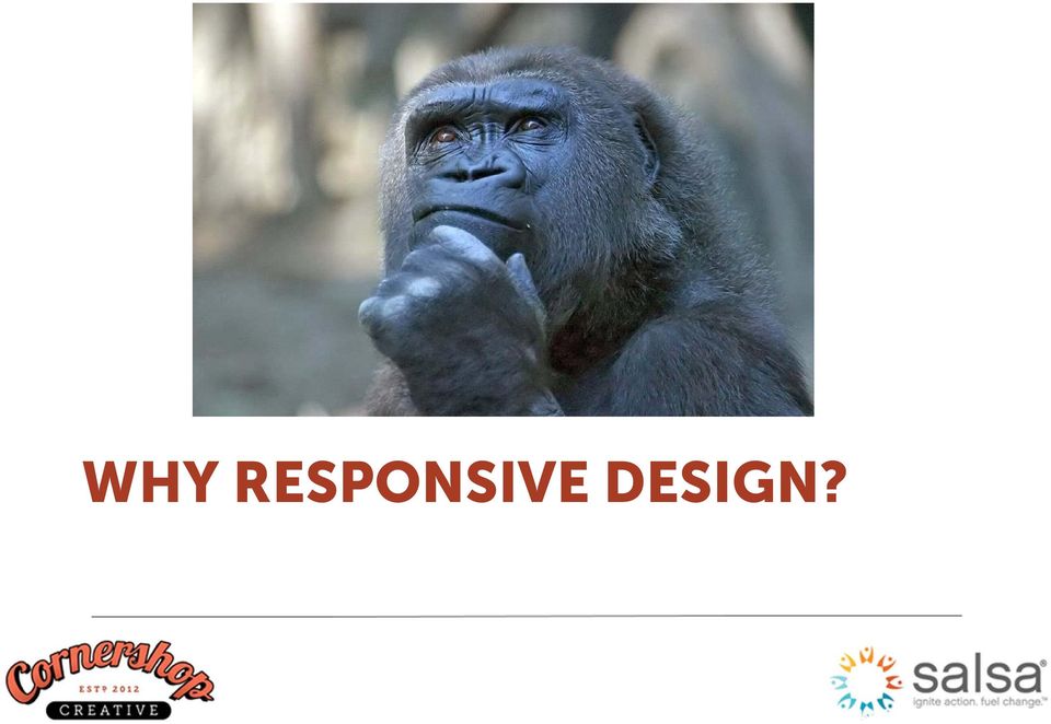
17 WHY RESPONSIVE DESIGN?
18 DO YOU KNOW HOW YOUR SUPPORTERS OPEN YOUR MAIL?

19
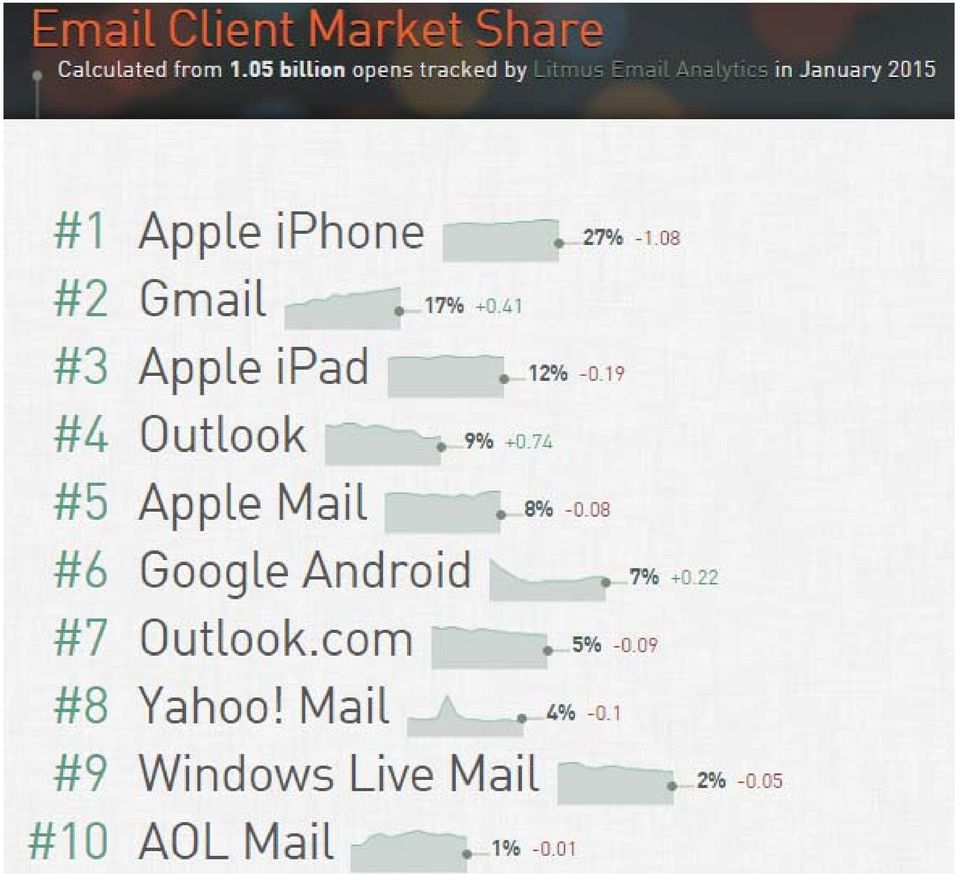
20 53% of total opens occur on mobile devices

21 Responsive design results in 15% increase in clicks
22 Mobile usage is expected to grow by 23% in 2015 and 22% in 2016
23 The first link in a responsive has a 30% higher click rate than non-responsive s
24 USING RESPONSIVE DESIGN IN
25 WHAT IS YOUR BIGGEST CHALLENGE WITH MOBILE?
26 What s holding you back? Lack of technological approach Lack of time/resources Not a priority Other
27 Start with a Template
28
29
30 Common Break Points Screen Size XL Screen Desktop & Laptops Tablets Smartphones Breakpoints > 1920px 1024px 768px 1024px 320px 480px However, there are an infinite number of possible breakpoints. Here s a list of more than 30 options:
31 Responsive Coding The following must be included in the <head> to tell browsers and clients to size the content to the browser width: <meta name="viewport" content="width=device-width" />
32 Media Queries /* Screens Smaller than 640px only screen and (max-width: 640px) { img[id= header ] { max-width: 600px; } table[id= outer ] { max-width: 600px; width= 100% } td[class= content ] { font-size: 16px; } }
33 Media Queries /* Smartphones (portrait) only screen and (max-width : 320px) { img { max-width: 320px; width= 100%; } td[class= content ] { font-size: 18px; } }
34 Media Queries /* ipads (portrait) only screen and (min-devicewidth : 768px) and (max-device-width : 1024px) and (orientation : portrait) { /* Specific ipad styles }
35 Tips Don t define fixed width Use percentages and max-width Increase font size for smaller screens
36 AVOIDING COMMON MISTAKES
37 #1. If it isn t broke, don t fix it Once you spend the time working on the template, don t change it. Create a template that works for multiple uses and replicate it
38
39
40
41 #2. No substitute for good content If a message didn t work on standard platform, then it won t work on mobile Use A/B testing to watch performance rates for both desktop and mobile users
42
43
44 #3. Short & to the Point Avoid long paragraphs Let people skim and understand at the top what they should do next Test on all platforms
45
46
47
48 #4. Watch Your Images Images are nemesis of responsive design Images can break the layout, if too wide Images with text can be unreadable on small devices
49
50
51
52
53
54 #5. Think it through to the end If you send an effective , people will click on your links Make sure you landing pages and forms are mobile responsive as well Create consistency between your and the pages you re directing them to
55
56
57
58
59
60
61 Conclusion Code for mobile devices Keep it simple Avoid text in images Avoid long paragraphs Make your forms and landing pages responsive too
62
63 Notes: Evaluation:
64 Get In Touch Ira Horowitz, Cornershop Creative Blake Groves, Salsa Labs
Mobile Optimise your Emails. Code & examples to make your email campaigns mobile friendly
 Mobile Optimise your Emails Code & examples to make your email campaigns mobile friendly Email Marketing Guide June 2013 CONTENTS Introduction...01 The Growing Importance of Mobile...02 Key Mobile Devices...03
Principles of Web Design 6 th Edition. Chapter 12 Responsive Web Design
 Principles of Web Design 6 th Edition Chapter 12 Responsive Web Design Objectives Recognize the need for responsive web design Use media queries to apply conditional styles Build a basic media query Create
Responsive Design How to get started
 Responsive Design How to get started Website traffic from mobile devices has grown significantly year over year prompting marketers to include responsive website design into their digital marketing strategy.
Responsive Email Design Guide. The fundamentals of designing and building mobile optimized email
 Responsive Email Design Guide The fundamentals of designing and building mobile optimized email With the rapid increase of smartphone and tablet adoption, mobile email opens are growing exponentially every
Viewports. Peter-Paul Koch http://quirksmode.org http://twitter.com/ppk jquery EU, 28 February 2014
 Viewports Peter-Paul Koch http://quirksmode.org http://twitter.com/ppk jquery EU, 28 February 2014 or: Why responsive design works Peter-Paul Koch http://quirksmode.org http://twitter.com/ppk jquery EU,
Responsive and Adaptive Web Design. Responsive & Adaptive websites-respond to the user s device by showing an optimized view.
 Responsive and Adaptive Web Design Responsive & Adaptive websites-respond to the user s device by showing an optimized view. Web Design Assumptions Are Changing Rapidly Making a desktop layout small is
Putting the Design in Responsive Design Best Practices Guide
 Putting the Design in Responsive Design Best Practices Guide Putting the Design in Responsive Design Best Practices Table of Contents Introduction....3 Understanding Responsive Website Design....4 User
GUIDE TO CODE KILLER RESPONSIVE EMAILS
 GUIDE TO CODE KILLER RESPONSIVE EMAILS THAT WILL MAKE YOUR EMAILS BEAUTIFUL 3 Create flawless emails with the proper use of HTML, CSS, and Media Queries. But this is only possible if you keep attention
Responsive Design How to get started
 Best Practices Guide Responsive Design How to get started oho.com 617 499 4900 @ohointeractive Website traffic from mobile devices has grown significantly year over year prompting marketers to include
Mobile Friendly Email Design
 Mobile Friendly Email Design Create emails that look good on every device. A guide by Mobile friendly email design Contents Why Design for Mobiles?...3 You Must Optimise for Mobiles...4 Mobile User s Behvaiour...5
RESPONSIVE EMAIL DESIGN BY COMMUNIGATOR
 RESPONSIVE EMAIL DESIGN BY COMMUNIGATOR RESPONSIVE EMAIL DESIGN According to stats from Litmus, in 2014 at least 53% of emails were opened on a mobile device. That is a huge increase from 2011 when the
Let's Dig Into the Omega Theme October 27, 2012. http://bit.ly/omega-training http://bit.ly/omega-tips
 Let's Dig Into the Omega Theme October 27, 2012 http://bit.ly/omega-training http://bit.ly/omega-tips brought to you by Kendall Totten Bachelors in Communication Technology & Graphic Design from Eastern
RESPONSIVE DESIGN FOR MOBILE RENDERING
 WHITEPAPER RESPONSIVE DESIGN FOR MOBILE RENDERING DELIVER MOBILE-SPECIFIC CONTENT USING MEDIA QUERIES EXECUTIVE SUMMARY With the widespread adoption of smartphones and tablets, proper email rendering in
Responsive Web Design. birds of feather
 Responsive Web Design birds of feather Approaches to Mobile Development 1. No Mobile Approach 2. Native Mobile Applications 3. Mobile Websites 4. Responsive (universal) design No Mobile Approach Website
Responsive Web Design (RWD) Best Practices Guide Version: 2013.11.20
 Best Practices Guide Version: 2013.11.20") Responsive Web Design (RWD) Best Practices Guide Version: 2013.11.20 This document includes best practices around responsive web design (RWD) when developing hybrid applications. Details on each checklist
Responsive Web Design (RWD) Best Practices Guide Version: 2013.11.20 This document includes best practices around responsive web design (RWD) when developing hybrid applications. Details on each checklist
This document will describe how you can create your own, fully responsive. drag and drop email template to use in the email creator.
 1 Introduction This document will describe how you can create your own, fully responsive drag and drop email template to use in the email creator. It includes ready-made HTML code that will allow you to
The Essential Guide to HTML Email Design
 The Essential Guide to HTML Email Design Index Introduction... 3 Layout... 4 Best Practice HTML Email Example... 5 Images... 6 CSS (Cascading Style Sheets)... 7 Animation and Scripting... 8 How Spam Filters
Responsive Web Design: Media Types/Media Queries/Fluid Images
 HTML Media Types Responsive Web Design: Media Types/Media Queries/Fluid Images Mr Kruyer s list of HTML Media Types to deliver CSS to different devices. Important note: Only the first three are well supported.
A GUIDE TO MOBILE EMAIL
 A GUIDE TO MOBILE EMAIL UNDERSTANDING THE WHAT, HOW & WHY TABLE OF CONTENTS EMAILS OPENED ON MOBILE? 1 Email open market share 2011-2013 WHAT DOES THIS MEAN? 2 FIRST THINGS FIRST 2 From and Subject Lines
Word 2010 to Office 365 for business
 Word 2010 to Office 365 for business Make the switch Microsoft Word 2013 desktop looks different from previous versions, so here s a brief overview of new features and important changes. Quick Access Toolbar
Veterinary Mobile Wellness
 Veterinary Mobile Wellness WWW.LIFELEARN.COM Introduction: Executive Summary We asked our LifeLearn Update email newsletter readers, who are veterinarians, practice managers and other practice team members:
How-to Guide: Creating a Mobile Website Using bmobilized
 Mobile Websites How-to Guide: Creating a Mobile Website Using Content Provided by Mobile Websites Content 1. What is a mobile website? 2. Why you need a mobile website? 3. Who is? 4. How to create a mobile
Responsive HTML email and Drupal
 Responsive HTML email and Drupal Mobile + Email + Drupal Drew Gorton Drew Gorton Founder gortonstudios.com Responsive HTML email Why? ~19% of email messages are read on smartphones or tablets. Source:
Going Beyond SAP ITS Mobile Apps to a Responsive Design Mobile Apps. JK (JayaKumar Pedapudi) Principal Consultant NTT DATA, Inc.
 Principal Consultant NTT DATA, Inc.") Going Beyond SAP ITS Mobile Apps to a Responsive Design Mobile Apps JK (JayaKumar Pedapudi) Principal Consultant NTT DATA, Inc. Introduction. Learning Points. What is Responsive Design and its Role? Design
Going Beyond SAP ITS Mobile Apps to a Responsive Design Mobile Apps JK (JayaKumar Pedapudi) Principal Consultant NTT DATA, Inc. Introduction. Learning Points. What is Responsive Design and its Role? Design
Responsive Web Design for Drupal
 Responsive Web Design for Drupal www.responsivewebdesignguild.com @emmajanedotnet emma@designtotheme.com I am IAM Sorry A boot eh? Drupal drupal.org/user/1773 Photo: morten.dk Legs: walkah Author / Trainer
Responsive Email Design
 Responsive Email Design For the Hospitality Industry By Arek Klauza, Linda Tran & Carrie Messmore February 2013 Responsive Email Design There has been a lot of chatter in recent months in regards to Responsive
Examples and Best Practices in Responsive Web Design
 Examples and Best Practices in Responsive Web Design WHAT IS RESPONSIVE DESIGN? What is Responsive Design? fluid grid flexible images media queries Ethan Marcotte, 2010 What is Responsive Design? Responsive
RESPONSIVE WEB DESIGN
 RESPONSIVE WEB DESIGN CONTENT Introduction... A look back... A new era... Mobile-first... The concept... Benefits of responsive design... The technical part... The downside... User-centred design... A
Mobile Email Design: Marketing Fit for the Small Screen
 Mobile Email Design: Marketing Fit for the Small Screen We live in an always on, always connected world. And there is no turning back. 1 2 3 4 5 6 7 8 9 10 11 12 13 14 15 16 17 18 19 Introduction GO! GO!
RESPONSIVE EMAIL DESIGN
 RESPONSIVE EMAIL DESIGN SELLIGENT The contents of this manual cover material copyrighted by Selligent. This manual cannot be reproduced, in part or in whole, or distributed or transferred by means electronic
Airangel s WiFi Portal Best Practice Guidelines Get the most out of your WiFi infrastructure
 CONTROL PERSONALISE SOCIALISE www.airangel.com Airangel s WiFi Portal Best Practice Guidelines Get the most out of your WiFi infrastructure Contents Why is my portal design so important? Page 03 - You
Responsive Email Design Guide
 Tips for email optimization in the mobile era. 1 The world is going mobile no doubt about it. But whether you accept this, adapt your approach, and stay in the game is a different story. To follow new
Recommendations for Websites Optimization for Mobile Devices Using Mobile Centric CSS. February 2014 Update
 Recommendations for Websites Optimization for Mobile Devices Using Mobile Centric CSS February 2014 Update Is Mobile SEO Required Now? In a Google Smartphone User study, mobile searches will make up 25%
Create and Print Your Own Greeting Cards
 Create and Print Your Own Greeting Cards Photo Album contains Greeting Card templates that you can use to create special cards that contain your own photos and greetings. Just select a card style, page
Web Publishers Group. Tuesday 13 March 2012
 Web Publishers Group Tuesday 13 March 2012 Responsive Web Design Mobilising the Internet Scott O Brien Technical Web Coordinator ANU Marketing Office 3 Responsive web design Designing a website in a manner
Chapter 8 More on Links, Layout, and Mobile Key Concepts. Copyright 2013 Terry Ann Morris, Ed.D
 Chapter 8 More on Links, Layout, and Mobile Key Concepts Copyright 2013 Terry Ann Morris, Ed.D 1 Learning Outcomes Code relative hyperlinks to web pages in folders within a website Configure a hyperlink
Responsive Web Design in Application Express
 Insert Information Protection Policy Classification from Slide 13 1 Responsive Web Design in Application Express using HTML5 and CSS3 Shakeeb Rahman @shakeeb Principal Member of Technical Staff Oracle
CREATING RESPONSIVE UI FOR WEB STORE USING CSS
 CREATING RESPONSIVE UI FOR WEB STORE USING CSS Magdalena Wiciak Bachelor s Thesis May 2014 Degree Programme in Information Technology Technology, communication and transport DESCRIPTION Author(s) WICIAK,
Email Marketing Best Practices in a Mobile World. Ruth Presslaff President ruth@presslaff.com
 Email Marketing Best Practices in a Mobile World Ruth Presslaff President ruth@presslaff.com Presslaff Interactive Revenue Help publishers build and execute vibrant, engaged email marketing campaigns.
Ask the Right Questions Before Choosing Your Website Provider. Look for Strategic Advice and a Solid Design Process
 Ask the Right Questions Before Choosing Your Website Provider When building a website for your business, your first priority should be to hire the right web partner. After that, everything else will fall
Responsive Design for Email
 Good to Know Guide: Responsive Design for Email INSIDE YOU LL FIND... Responsive Design Overview Media Queries Explained Best Practices How It Works Samples of Design Approach Responsive vs. Predictive
Get Better Conversion Rates On Your Mobile Responsive Landing Pages
 Get Better Conversion Rates On Your Mobile Responsive Landing Pages It s Great to Meet You! Princess Cornelio Marketing Educator, Unbounce princess@unbounce.com Join the discussion! community.unbounce.com
Making Responsive Emails
 Making Responsive Emails Who Am I? Justine Jordan Wearer of Many Hats, Litmus @meladorri @litmusapp #CSSsummit litmus.com/lp/csssummit Sample HTML, slides, templates, frameworks, and other goodies. Disclaimer:
How to craft a modern, mobile-optimized HTML email template. Jason Samuels, NCFR IT Manager DrupalCamp Twin Cities May 2012
 How to craft a modern, mobile-optimized HTML email template Jason Samuels, NCFR IT Manager DrupalCamp Twin Cities May 2012 Our old email template Pros Simple Lightweight Worked as plain-text Rendered OK
Designing a Marketing Email That Works
 Designing a Marketing Email That Works Tips for designing marketing emails that get opened and help your business grow. 2013 Copyright Constant Contact, Inc. 13-3450 2013 Copyright Constant Contact, Inc.
Page Formatting In Microsoft Word XP
 INFORMATION SYSTEMS SERVICES Page Formatting In Microsoft Word XP This document contains a series of exercises in changing the appearance of a page in Microsoft Word XP. AUTHOR: Information Systems Services,
TheImportance ofa MOBILEFRIENDLY WEBSITE
 TheImportance ofa MOBILEFRIENDLY WEBSITE Copyright Notice The Importance of a Mobile Friendly Website NOTICE: You DO NOT Have the Right to Reprint or Resell this Report! You Also May NOT Give Away, Sell,
White Paper Using PHP Site Assistant to create sites for mobile devices
 White Paper Using PHP Site Assistant to create sites for mobile devices Overview In the last few years, a major shift has occurred in the number and capabilities of mobile devices. Improvements in processor
UNDERSTANDING RESPONSIVE DESIGN A SOLUTION FOR PUBLISHERS AND ADVERTISERS IN A MULTI-SCREEN WORLD. standout brand experiences
 UNDERSTANDING RESPONSIVE DESIGN A SOLUTION FOR PUBLISHERS AND ADVERTISERS IN A MULTI-SCREEN WORLD INTRODUCTION As the penetration and use of mobile devices continues to increase, publishers and advertisers
Responsive Web Design
 Responsive Web Design Version of 06 Dec 2011 Eva Harb, Paul Kapellari, Steven Luong, Norbert Spot Abstract Nowadays, a large range of different devices exist to visit websites and each of them has a different
Madison Area Technical College. MATC Web Style Guide
 Madison Area Technical College MATC Web Style Guide July 27, 2005 Table of Contents Topic Page Introduction/Purpose 3 Overview 4 Requests for Adding Content to the Web Server 3 The MATC Public Web Template
Microsoft Word 2011: Create a Table of Contents
 Microsoft Word 2011: Create a Table of Contents Creating a Table of Contents for a document can be updated quickly any time you need to add or remove details for it will update page numbers for you. A
Informz for Mobile Devices: Making Your Emails PDA and Phone-Friendly
 Informz for Mobile Devices: Making Your Emails PDA and Phone-Friendly The use of personal digital assistants (PDAs) has increased exponentially since the early days of rudimentary Palm Pilots and similar
Responsive Landing Page Design Guide RESPONSIVE LANDING PAGE. Design Guide. 1 Share this guide:
 Responsive Landing Page Design Guide RESPONSIVE LANDING PAGE Content Marketing Design Guide 1 Share this guide: Table of Contents Introduction 3 Designing landing pages for mobile 4 What is a landing page?
Designing for Mobile Devices
 Designing for Mobile Devices October 2010 Pawel Zareba Table of Contents Mobile market overview... 3 Smartphone penetration... 3 Mobile browsers:... 9 Browser detect techniques... 11 Progressive enhancement:...
The Birth of Responsive Email Templates
 The Birth of Responsive Email Templates The Birth of Responsive Email Templates The adoption of mobility solution at the enterprise level is simply becoming more relentless in order to engage more and
Working with the new enudge responsive email styles
 Working with the new enudge responsive email styles This tutorial assumes that you have added one of the mobile responsive colour styles to your email campaign contents. To add an enudge email style to
Recreate your Newsletter Content and Layout within Informz (Workshop) Monica Capogna and Dan Reade. Exercise: Creating two types of Story Layouts
 Monica Capogna and Dan Reade. Exercise: Creating two types of Story Layouts") Recreate your Newsletter Content and Layout within Informz (Workshop) Monica Capogna and Dan Reade Exercise: Creating two types of Story Layouts 1. Creating a basic story layout (with title and content)
Recreate your Newsletter Content and Layout within Informz (Workshop) Monica Capogna and Dan Reade Exercise: Creating two types of Story Layouts 1. Creating a basic story layout (with title and content)
Webinar: EMAIL Campaigns That Bring In BIG Bucks!
 AllianceForNevadaNonprofits.org EMAIL Campaigns That Bring In BIG Bucks! Stacey Wedding Phil Johncock PowerPoint Slides, Replay Video & Links: goo.gl/jm583i Agenda Poll: What region of the state do you
1. About the Denver LAMP meetup group. 2. The purpose of Denver LAMP meetups. 3. Volunteers needed for several positions
 1. About the Denver LAMP meetup group 1.Host a presentation every 1-3 months 2.Cover 1-3 related topics per meeting 3.Goal is to provide high quality education and networking, for free 2. The purpose of
Microsoft Expression Web Quickstart Guide
 Microsoft Expression Web Quickstart Guide Expression Web Quickstart Guide (20-Minute Training) Welcome to Expression Web. When you first launch the program, you ll find a number of task panes, toolbars,
IBM Worklight: Responsive Design for Mul8- Channel Applica8on Development
 IBM Worklight: Responsive Design for Mul8- Channel Applica8on Development Please Note IBM s statements regarding its plans, directions, and intent are subject to change or withdrawal without notice at
Responsive Email Design. Our guide to helping you get started. August 2012 Version 0.2
 Responsive Email Design Our guide to helping you get started August 2012 Version 0.2 Contents Introduction... 3 What is Responsive Design?... 4 What about email?... 5 So what are the pros and cons?...
Responsive Design. for Landing Pages. Simplifying & optimizing for every device in Google Enhanced campaigns and everywhere else.
 white paper Responsive Design for Landing Pages Simplifying & optimizing for every device in Google Enhanced campaigns and everywhere else. Turning click throughs into breakthroughs. Gone are the days
Iceberg Web Design AN INTRODUCTION TO WEBSITE MOBILITY
 Iceberg Web Design AN INTRODUCTION TO WEBSITE MOBILITY On April 21, 2015 Google rolled out what is being called the biggest search engine algorithm yet. In short: Google is now using mobile-friendliness
Optimizing your E-Business Suite for Mobile and Tablet
 Optimizing your E-Business Suite for Mobile and Tablet - Using existing EBS Functionality to transform your User Experience (UX) 08 th December 2014 Michael West UX Hero / Director T: 07884218111 E: michael.west@appsynx
Responsible Web Design A Pragmatic Approach to Website Design for Multiple Devices
 Responsible Web Design A Pragmatic Approach to Website Design for Multiple Devices www..com 2 Responsible Web Design A Pragmatic Approach to Website Design for Multiple Devices Executive Summary There
SUCCESSFUL, EASY MOBILE EMAIL DESIGN HOW TO CREATE MOBILE-READY EMAIL. brought to you by Campaigner
 SUCCESSFUL, EASY MOBILE EMAIL DESIGN HOW TO CREATE MOBILE-READY EMAIL brought to you by Campaigner The Mobile Puzzle For email marketers, smartphones present a puzzle. The devices are widely used to read
Responsive Web Design
 Responsive Web Design FAQ: What You Need to Know About Going Responsive FAQ Introduction More than half of American adults own a smartphone and 63 percent of all cell phone owners use their phone to access
Inspiration can help you to structure your essays. It can be useful for brainstorming or revising a topic
 Inspiration can help you to structure your essays It can be useful for brainstorming or revising a topic Similar to a paper based spider diagrams, but they are much more flexible You can copy and paste
Message from Marketing & Creative Services
 Web Style Guide September 2013 Message from Marketing & Creative Services 2 Campus Community Members: The University of West Florida web presence is one of the most valuable assets we have as an institution.
With 30% 60% of website traffic coming from a mobile device, it s a given
 Responsive vs. adaptive vs. device-specific: The best mobile strategy for your site BY JUSTIN MORELLI, UX DESIGNER POINT OF VIEW With 30% 60% of website traffic coming from a mobile device, it s a given
How To Use Templates. a MailChimp guide
 How To Use Templates a MailChimp guide 1 Hello. If you re designing emails in MailChimp, you need to know how to work with a template it s the backbone of every campaign. This guide will teach you how
Mobile Optimisation 2014
 IAB Email Marketing Series 2014 Ryan Hickling, Head of Email, TMW Landscape Over the past two to three years we ve seen a massive change in the way consumers interact with brands digitally. As technology
Mobile Strategy and Design
 Mobile Strategy and Design A Guide for Publishers December 5, 2011 www.xtenit.com US: 01.877.XTENIT.1 International: 01.212.646.9070 Overview This paper outlines mobile strategies and deployment guidelines
Responsive Web Design for Teachers. Exercise: Building a Responsive Page with the Fluid Grid Layout Feature
 Exercise: Building a Responsive Page with the Fluid Grid Layout Feature Now that you know the basic principles of responsive web design CSS3 Media Queries, fluid images and media, and fluid grids, you
PowerPoint 2013 Basics of Creating a PowerPoint Presentation
 Revision 4 (01-31-2014) PowerPoint 2013 Basics of Creating a PowerPoint Presentation MICROSOFT POWERPOINT PowerPoint is software that lets you create visual presentations. PowerPoint presentations are
MAGENTO THEME SHOE STORE
 MAGENTO THEME SHOE STORE Developer: BSEtec Email: support@bsetec.com Website: www.bsetec.com Facebook Profile: License: GPLv3 or later License URL: http://www.gnu.org/licenses/gpl-3.0-standalone.html 1
MOBILE SEO TECHNIQUES
 MOBILE SEO TECHNIQUES http://www.tutorialspoint.com/seo/mobile-seo-techniques.htm Copyright tutorialspoint.com Millions of users these days access the web using smartphones running on Android, ios, or
How do you use word processing software (MS Word)?
?") How do you use word processing software (MS Word)? Page 1 How do you use word processing software (MS Word)? Lesson Length: 2 hours Lesson Plan: The following text will lead you (the instructor) through
How do you use word processing software (MS Word)? Page 1 How do you use word processing software (MS Word)? Lesson Length: 2 hours Lesson Plan: The following text will lead you (the instructor) through
8 STEPS TO CODE KILLER RESPONSIVE EMAILS
 8 STEPS TO CODE KILLER RESPONSIVE EMAILS THAT WILL MAKE YOUR EMAILS BEAUTIFUL 3 BUILD RESPONSIVE EMAIL STEP BY STEP Steps to create a simple responsive email template. (fluid image, main content, two
Email Marketing Best Practices - Top 10 tips
 Email Marketing Best Practices - Top 10 tips Contents 1. Make a good first impression... 2 2. Above the fold... 3 3. Keep it short and to the point.... 3 4. Send what your customer wants not what you want
Planning a Responsive Website
 Planning a Responsive Website Planning a website is important for both web designers and website owners. Planning your website before you start building it can save you time, keep your site code more accurate
SellerDeck 2014 Responsive Design Guide
 SellerDeck 2014 Responsive Design Guide Version: 1.0.0 SellerDeck 2014 Responsive Design 1 Contents Introduction...3 Themes and Wireframe...4 Classic Theme...4 Smart Theme...5 Wireframe...6 How the Responsive
Understanding Responsive Web Design (RWD) & Environment Aware Component Design Version: 2013.11.21
 & Environment Aware Component Design Version: 2013.11.21") Understanding Responsive Web Design (RWD) & Environment Aware Component Design Version: 2013.11.21 Contents Contents Checklist Planning Responsive Web Design Overview What is responsive design? When should
Understanding Responsive Web Design (RWD) & Environment Aware Component Design Version: 2013.11.21 Contents Contents Checklist Planning Responsive Web Design Overview What is responsive design? When should
Introduction. If you have any questions along the way, feel free to contact our support team at mailchimp.com/support. Now, let s get started.
 Introduction If you re designing emails in MailChimp, you need to know how to work with a template it s the backbone of every campaign. This guide will teach you how to use our template options and create
Decreases the magnification of your chart. Changes the magnification of the displayed chart.
 OrgPlus Guide 1) Logging In 2) Icon Key 3) Views a. Org Chart b. Salary Org Chart c. Head Count/Span of Control 4) Viewing Profile/Explore/Bookmarks Panels a. Creating Bookmarks 5) Searching a. From the
RESPONSIVE DESIGN: OPTIMIZING THE CUSTOMER WEB EXPERIENCE ACROSS DEVICES
 RESPONSIVE DESIGN: OPTIMIZING THE CUSTOMER WEB EXPERIENCE ACROSS DEVICES FORESEE RESPONSIVE DESIGN REPORT Author: Bruce Shields, Usability, ForeSee 2012 ForeSee FORESEE RESPONSIVE DESIGN REPORT 2 Just
Florence School District #1
 Florence School District #1 Module 2: SMART Board Basics and Beyond 1 SMART Board Software and Beyond In SMART Notebook software, you can create or open SMART Notebook software (.notebook) files. After
Introduction to Microsoft
 Introduction to Microsoft Word 2013 W Word 2013 Fotowerk / Fotolia Word 2013: Introduction Content! Defined by Merriam-Webster s online dictionary as the topic or matter treated in a written work and also
Why do we need a theme?
 2009-2010 Yearbook What is a yearbook? A memory book A reference book Make sure we have EVERYONE at LEAST once in the book. Check spelling of the name multiple times A history book Remember, we are history
Microsoft Migrating to Word 2010 from Word 2003
 In This Guide Microsoft Word 2010 looks very different, so we created this guide to help you minimize the learning curve. Read on to learn key parts of the new interface, discover free Word 2010 training,
GalleryAholic Documentation
 GalleryAholic Documentation After a successful install click onto the module called GalleryAholic. The first drop-down option you will have is asking, where do you want to get your photos from. Your selections
Quick Guide. Passports in Microsoft PowerPoint. Getting Started with PowerPoint. Locating the PowerPoint Folder (PC) Locating PowerPoint (Mac)
 Locating PowerPoint (Mac)") Passports in Microsoft PowerPoint Quick Guide Created Updated PowerPoint is a very versatile tool. It is usually used to create multimedia presentations and printed handouts but it is an almost perfect
Passports in Microsoft PowerPoint Quick Guide Created Updated PowerPoint is a very versatile tool. It is usually used to create multimedia presentations and printed handouts but it is an almost perfect
Treble: One Page Website. Step 8 - Responsive Web Design
 Step 8 - Responsive Web Design 29 WHAT IS RESPONSIVE WEB DESIGN? Back in the earlier days of web design the only way to access the internet was using your desktop computer. Although monitor sizes changed
Email Campaign Guidelines and Best Practices
 epromo Guidelines HTML Maximum width 700px (length = N/A) Maximum total file size, including all images = 200KB Only use inline CSS, no stylesheets Use tables, rather than layout Use more TEXT instead
I WISH I COULD FIND THE TIME!
 Ping A Tier4Tech Publication Vol. 1/Issue 1 I WISH I COULD FIND THE TIME! A dentist discovers the value of a trusted partner when updating his website YOUR WEBSITE WILL BE OBSOLETE IN 18 MONTHS New technology
Responsive Versus Adaptive Web Design
 White Paper Responsive Versus Adaptive Web Design A development approach comparison Authors Sriram Ramanathan, Chief Technology Officer Matthew Trevathan, Director of Product Platform Development Amit
Law School Computing Services User Memo
 Law School Computing Services User Memo Accessing and Using Shared No. 37 7/28/2015 Email Accounts in Outlook Overview: Many Law School departments and organizations use shared email accounts. Shared email
The Essential Guide to HTML Email Design
 The Essential Guide to HTML Email Design Emailmovers Limited, Pindar House, Thornburgh Road Scarborough, North Yorkshire, YO11 3UY Tel: 0845 226 7181 Fax: 0845 226 7183 Email: enquiries@emailmovers.com