Solutions from SAP. SAP Business One 2005 SP01. User Interface. Standards and Guidelines. January 2006
|
|
|
- Adrian Floyd
- 7 years ago
- Views:
Transcription
1 Solutions from SAP SAP Business One 2005 SP01 User Interface Standards and Guidelines January 2006

2 Table of Contents Icons... 5 Typographic Conventions Overview General Issues About SAP Business One About This Document SAP Business One Structure The Main Window SAP Business One Main Menu GUI Controls Control Overview Basic Data Controls Text Field Basic Selection Controls Check Box Checkbox with Three States Radio Button List Box Choose from List (List of <list type>) Choose From Tree Buttons Command Button Back Arrow Icon Graph Icon Image Browse Icon Link Arrow Icon Complex Data Controls Table Hierarchical Table Row Types Tree Control Tree-Table Control Advanced Selection Controls Account Selector Business Partners Selector Date Range Selector Extended Checkbox Item Selector January

3 4.6.6 Properties Selection Field View Controls Tabstrip Nested Tabstrip Drawers View Selector Window Controls Window Title Bar Menu Bar and Drop-Down Menus Context Menu (Right-Click Menu) Toolbar Window Scroll Bar Tool Tip Status Bar Graphic Design Guidelines Screen Resolution Fonts Colors Window Layout Terminology Labeling Conventions Command Buttons Arranging the Information in a Window Typical Screens Add/Find Window Choose from List Window (List of <List Type>) Choose from Tree Window Filter Table Window Sort Table Window Setup Window (NOE = New Object Entry) Form Settings Row Details Message Window Print Options Messages Property Selection Window Report Window Hierarchical Reports Selection Criteria Window Wizard General Considerations January
... 129 6.3 Choose from Tree Window.")
4 7.1 Adding a New Feature System Messages January

5 Icons Icon Meaning Caution Example Note Recommendation Syntax Typographic Conventions Type Style Example text Example text EXAMPLE TEXT Example text EXAMPLE TEXT Example text <Example text> Description Words or characters that appear on the screen. These include field names, screen titles, pushbuttons as well as menu names, paths and options. Cross-references to other documentation. Emphasized words or phrases in body text, titles of graphics and tables. Names of elements in the system. These include report names, program names, transaction codes, table names, and individual key words of a programming language, when surrounded by body text, for example, SELECT and INCLUDE. Screen output. This includes file and directory names and their paths, messages, source code, names of variables and parameters as well as names of installation, upgrade and database tools. Keys on the keyboard, for example, function keys (such as F2) or the ENTER key. Exact user entry. These are words or characters that you enter in the system exactly as they appear in the documentation. Variable user entry. Pointed brackets indicate that you replace these words and characters with appropriate entries. January

6 1. Overview The User Interface Standards and Guidelines provide best practices for designing the SAP Business One interface. This document describes the structure and look of the interface and the rules used to execute the actions that affect the system. By following these guidelines, developers, partners and product managers can improve the quality and consistency of the application. The document includes the most updated and advanced GUI design rules and recommendations. It also includes a host of relevant GUI information, including a glossary, case studies, re-usable components, and international support standards. To achieve the desired level of consistency, usability, and functionality, it is necessary that all the relevant aspects described in this document are taken into account to maintain a high level of quality in the product. 2. General Issues 2.1 About SAP Business One SAP Business One application has a default font. The user may select another font size and style. All text, including text controls, will change automatically to the new font selected by the user. If the font selected by the user is larger than the default font, the control s size may change accordingly. Many controls can be accessed via a mnemonic. The mnemonic is implemented by underlying one of the letters in the control s label. Clicking Alt+<mnemonic> is equal to clicking the control. The mnemonic should be unique within the window. There are more functions which need mnemonics than there are keys on the keyboard. Therefore, some of the functions are not implemented in the application. Each control should be assigned with two information types: Description Text displayed in the status bar when the mouse cursor is placed over the control. The Description Text should be informative and describe the meaning of the control shortly. System Information (formerly known as Debug Information) additional internal information that is also displayed in the status bar, if the View System Information option is turned on. 2.2 About This Document This document represents the desirable guidelines. Some of the recommendations are still not fully implemented in the application. All fonts mentioned in this document are the SAP Business One default fonts. The user may change font style and size. All sizes mentioned in this document refer to the default font size. If the user chooses a different font size, all controls will be resized accordingly. Position and direction guidelines in this document refer to left-to-right languages. If a right-to-left language is used, directions are inverted. January

7 3. SAP Business One Structure SAP Business One is structured with three basic types of windows: The main window Primary and subordinate windows (forms) Message Boxes The SAP Business One Main Window contains all main functions of the application. It is the central place from where the user initiates activity for working with SAP Business One. In other primary windows (forms), the user may enter additional data, make choices or perform actions. The user is also informed of errors or consequences of actions. The control elements are placed into the work area of the various windows to perform specific tasks or functions. Some elements serve basic window handling properties, and some of them are specific to SAP Business One. Subordinate windows appear as a result of the user's actions or to supplement a primary window. There may be simultaneous subordinate windows open, but actions can only be performed in one window at any given time. January

8 3.1 The Main Window The Main window opens automatically upon opening SAP Business One. The following components appear exclusively on the SAP Business One Main Window upon opening the application: Main menu Menu bar Toolbar Pull-down menus Status bars The following components appear in the SAP Business One Main Window when working with the application: Main Menu Menu options Submenus Sub windows (Forms) January

9 January
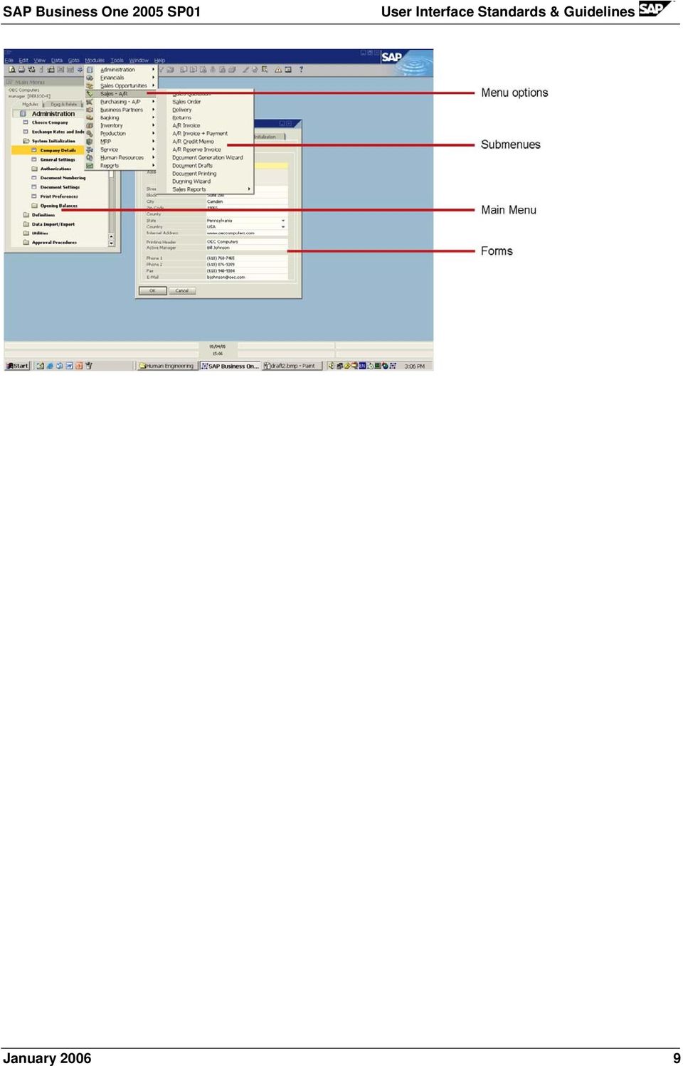
10 3.2 SAP Business One Main Menu The Main Menu, previously referred to as the command center, offers three principal modes to work with the application. Each of these modes is located on its own tab: Modules Drag & Relate User Menu Visual Specifications Main Menu The Main Menu can also be accessed by clicking the window pull-down menu and choosing Main Menu, or by using the shortcut CTRL + O. January

11 Main Module The module items are left aligned. Each module is framed by a gray line (RGB = 173, 173, 140). The frame size is: 326 x 20 pixels. Background color of the module is off-white (RGB = 239, 239, 222). Each module has a related icon. Icons are centered one above the other. The maximum icon s height is 18 pixels. The look of each module depends on its state: State Specification Example Regular Font color black Font & size Arial Bold 10 Rollover Font color black Font & size Arial Bold 10 The strip is colored in dark gray (RGB = 173, 173, 140) January

12 Selected Module Font color black Font & size Arial Bold 10 The frame is colored in dark yellow (RGB = 255, 204, 0) The look of each sub-menu depends on its state: State Specification Example Regular Font color black Font & size Arial Bold 7 Opened Rollover Font color black Font & size Arial Bold 7 Icon is changed to Font color black Font & size Arial Bold 7 The frame is colored in dark yellow (RGB = 173, 173, 140) The look of each menu item depends on its state: State Specification Example Regular Font color black Font & size Arial Bold 7 Rollover Selected Item Font color black Font & size Arial Bold 7 The strip is colored in dark yellow (RGB = 173, 173, 140) Font color black Font & size Arial Bold 7 The strip is colored in dark yellow (RGB = 173, 173, 140) Guidelines for Adding Menu Items Place items according to the hierarchic structure within a respective module. Position the menu item considering its usage: How frequently is it used? Where is it used in the work flow? January
 Font color black Font & size Arial Bold 7 The strip is colored in dark yellow (RGB = 173, 173, 140) Guidelines for Adding")
13 Frequently used items should be placed before less frequent items. Items that are logically successive to other items should be placed directly below them. Setup windows are located in the Administration module, in the Setup subfolder of each relevant module. Every module contains its respective reports. In addition, all reports are also located in the Reports module. Note that the Main Menu appears in a closely related form, in the Modules pull-down menu, Authorizations window, Drag and Relate menu and the Manage User Fields window. For details regarding the main window components, see: Toolbar Status Bar Menu Bar and Drop-down menus January

14 4. GUI Controls 4.1 Control Overview The controls in this chapter are organized according to their function: Basic Data Controls Basic Selection Controls Buttons Complex Data Controls Advanced Selection Controls View Controls Window Controls Text Field Check Box Check Box with 3 States Radio Button List Box Choose from List (List of <type>) Choose From Tree Command Button Back Arrow Button Graph Button Image Browse Button Link Arrow Button Table Table Hierarchical Table Row Types Tree Control Tree-Table control Account Selector Business Partners Selector Date Range Selector Extended Checkbox Item Selector Properties Selection Field Tabstrip Nested Tabstrip Drawers View Selector Window Title Bar Window Scroll Bar Menu Bar and Drop-Down Menu Context Menu (Right-Click Menu) Toolbar Tool Tip Status Bar January

15 January

16 4.2 Basic Data Controls Text Field General Description Visual Specifications GUI Attributes Functional Specifications Usage Example: Business Partners > Business Partners Master Data When to use? Text fields are used when a single value is to be displayed or entered by the user. General Description A text field is used for data entry of a single value. The format of the data value may be textual, numeric, currency, and so on. A text field may be in one of two modes: Enabled: Allows the user to type in a value. Disabled: Used to display a value, but with no user entry. When the user moves to the next field, validity checks are performed. The entered value is checked against the required format of the field, in addition to any other specific constraints that may exist for this field. Text field labels are part of the control. Text field must have a label, which helps identify the purpose of the text field and provides a means of indicating when the field is disabled. If the field contains text that is longer than the field s length, a Tool Tip is dynamically added to the field, displaying the full text. Visual Specifications Field Shape: Rectangular box, with a single-row (1-pixel wide) frame. Field size: Height = 14 pixels. Width depends on the field s content and the size of an adjacent field (see more on field sizes in Window Layout). A white row connects the label to the field (see more on labels, in Labeling Conventions). Color Specifications: Mode Normal (Write enabled) Read only Specification Box color: off-white (RGB = 253,253,243), Frame color white. Box color: gray (RGB = 239,235,222), Frame color - white. January

17 Field in focus Box color and frame: yellow (RGB = 255,247,156) The text color is black. When selected, the text color is white, with windows selection color as background. The description text of every field should contain a short description of the field, and any additional information, such as format or constraints. Examples: Discount (Numeric 19.6): Specifies the number of digits, and number of decimal points. Customer Code (15 characters) Document Number (Number between 1 and 1000) Document Date (Date) Text alignment within the field should be adjusted to the field type. Textual data should be left-aligned, while numerical fields should be right-aligned. Note: Numerical fields may contain non-numeric characters (for example, price field contains the currency, such as USD ), but they are still considered as numbers and should be right-aligned. GUI Attributes The following attributes should be considered when creating a Text Field: Label Data format (text, numeric, date, currency, so on) Alignment: left or right Functionality: read or read + write Constraints (optional, for example: numeric, alpha-numeric) Maximal input length Default value (optional) Description text System information ToolTip (added dynamically) Functional Specifications Operation Procedure User Action Rollover (mouse cursor is over the field) Click in field System Response The field s Description Text is displayed in the status bar. If the field is shorter than the text it contains, a ToolTip is displayed to show the full text. The field color changes to yellow. The Description Text is displayed in the Status Bar. If the field is empty, the text cursor is placed at the beginning of the field. If the field already contains text, the text is selected (displayed as white text over dark-blue background). January
 Document Number (Number between 1 and 1000) Document Date (Date) Text alignment within the field should be adjusted to the field type.")
18 User Action Double-click in a field Type in field Exit field System Response Selects the word at the mouse position. If the text is selected, typing replaces the selected text. If no text is selected, typed characters are inserted at the cursor position. If the typed-in text is longer than the visual field, the field s text is scrolled to the left, so that the current entry point is visible. In case of a long text, a Tool Tip is dynamically added to the field, displaying the full text of the field. If the text length reaches the maximal input length, no typing is allowed (no response to typed-in keys). In this case, an error message is displayed in the status bar. A validity check is performed, comparing the field data with the required format and constraints. If errors are found, a message is displayed in the Status Bar. The cursor remains in the field. If no errors are found, the field color goes back to normal. Keyboard Shortcuts The field conforms to standard Windows text entry conventions: Backspace and Delete erase one character to the left or to the right of the cursor position. Left/Right Arrow keys move the cursor one position to the left/right. If the text length is longer than the visual field, clicking the left/right arrow at the left/right edge of the field scrolls the text to the required direction. Shift + Left/Right arrow selects the text along the cursor movement. Home/End moves the cursor to the beginning or to the end of the text respectively. January

19 4.3 Basic Selection Controls Check Box General Description Visual Specifications GUI Attributes Functional Specifications Usage Example: Business Partners > Activity When to use? Checkboxes support options that are either ON or OFF. Checkboxes are used only when both states of the choice are clearly opposite and unambiguous. More than one checkbox is used when multiple selections are required. General Description Checkboxes support options that are either ON or OFF. A checkbox may be in one of two modes: Selected (ON): Allows the user to select a value or operation. Deselected (OFF): Used to display a value or operation, but with no user selection. When the checkbox is selected, a check mark appears in the box. When it is not selected, the checkbox is empty. A checkbox appears as a square box with an accompanying label. A group of checkboxes enables the user to select several options. Unlike a radio button, more than one checkbox can be selected at the same time, permitting multiple selections. Visual Specifications Use this shape: - Selected - Deselected Size: 14x14 pixels The label is placed 4 pixels to the right of the box. (For more information about labels, see Labeling Conventions). One of the letters in the label is underlined. This letter is used as a mnemonic for this checkbox. Typing Alt+<mnemonic> is equal to clinking on the checkbox. The mnemonic should be unique within the window. For more information about labels, see Labeling Conventions. Colors: State Specification January
: Allows the user to select a value or operation. Deselected (OFF): Used to display a value or operation, but with no user selection.")
20 State Specification Enabled Text color dark gray (RGB = 74, 77, 74) Disabled GUI Attributes The following attributes should be considered when creating a checkbox: Label Mnemonic Functionality: read or read + write Default value (optional) Description text System information Functional Specifications Operation Procedure User Action Rollover (mouse cursor is over the checkbox) Click the checkbox Click the checkbox s label System Response The checkbox s Description Text is displayed in the status bar. The checkbox toggles its state. The checkbox toggles its state. Keyboard Shortcuts Alt + <underlined letter> toggles the checkbox state, just like clicking the checkbox. January

21 4.3.2 Checkbox with Three States General Description Visual Specifications GUI Attributes Functional Specifications Usage Example: In the Print Layout Designer, when you select multiple fields, the Properties window will show the 3 rd (ambiguous) state, in case not all selected fields have the same value for a specific checkbox. Note: This control is not available in the User Interface API, Version When to use? Check boxes with 3-state support options that are either ON, OFF, or Ambiguous. Use this control instead of a regular checkbox, when you need to support a third, Ambiguous state. An Ambiguous state results when the checkbox represents a collection of objects, some of which are ON, others are OFF. The mutual checkbox is therefore ambiguous. General Description In case a checkbox represents the state of several objects, where some of them are ON and some are OFF, the third state of the checkbox is Ambiguous. This situation defines a third state Ambiguous. When a checkbox in the ambiguous state is clicked, it toggles between two states: ON and OFF. In this situation, we recommend that the checkbox will toggle between the three states: ON, OFF and then back to Ambiguous. Visual Specifications Use this shape: - Selected - Deselected - Ambiguous For all other visual specifications, see Checkbox (pg. 19) GUI Attributes Label Mnemonic Functionality: read or read + write Default value (optional) Description text System information January
22 Functional Specifications Operation Procedure User Action Rollover (mouse cursor is over the checkbox) Click the checkbox in the ON or OFF state Click the checkbox in the Ambiguous state Click the checkbox s label System Response The checkbox s Description Text is displayed in the status bar. The checkbox toggles its state from ON to OFF and vice versa. The checkbox toggles its state from ON to OFF and vice versa. (The checkbox should toggle between the three states: ON, OFF and then back to Ambiguous). Same as clicking the checkbox image Keyboard Shortcuts Alt + <underlined letter> toggles the checkbox state, just like clicking the checkbox. January
23 4.3.3 Radio Button General Description Visual Specifications GUI Attributes Functional Specifications Usage Example: Sales A/R > Sales Reports > Sales Analysis When to use? When representing a set of choices for a particular property, only one of these choices may be selected at any time. Note: To allow selection of multiple options, use a Checkbox instead. General Description A radio button represents a single choice within a group of radio buttons (at least 2 radio buttons). Only one option in the group can be set. Radio buttons appear as a set of small circles. When a radio button is selected, a dot appears in the middle of the circle. When the choice is not the current setting, the circle is empty. The user clicks one of the radio buttons to select it and deselect other radio buttons in the group. A radio button may be in one of two modes: Selected: Shows the selected value or operation. Deselected: Used only to display the deselected value or operation. Note: A List Box may be used as an alternative to Radio Buttons, especially when the space is limited. Visual Specifications Use this shape: Selected Deselected Button size: 14x14 pixels The label is placed 4 pixels to the right of the box. (For more information about labels, see Labeling Conventions). One of the letters in the label is underlined. This letter is used as a mnemonic for this radio button. Typing Alt+<mnemonic> is equal to clinking the radio button. The mnemonic should be unique within the window. Group Label: A group label may be added to the radio buttons to add a general explanation of the purpose of the radio buttons. The group label should be placed to the left of the uppermost radio button: January
24 The radio buttons can be arranged vertically (one below the other) or horizontally (one next to the other). The vertical arrangement is preferred. Use a horizontal arrangement only when there is no room for vertical arrangement, and when only two radio buttons are in the group. GUI Attributes The following attributes should be considered when creating a radio button: Label for each button Mnemonic for each button Group label Default value. Note that one of the buttons in the group should be selected by default. Description text for each button System information for each button Functional Specifications Operation Procedure User Action Rollover (mouse cursor is over the radio button) Click the radio button Click the radio button s label System Response The radio button's description text is displayed in the status bar. The radio button is selected. All other radio buttons in the group are deselected. A dot appears in the circle. The label is displayed in the status bar (see Status Bar). The radio button is selected. All other radio buttons in the group are deselected. A dot appears in the circle. The label is displayed in the status bar (see Status Bar). Keyboard Shortcuts Alt + <underlined letter> selects the radio button and deselects all other radio buttons in its group. January
25 4.3.4 List Box General Description Visual Specifications GUI Attributes Functional Specifications Usage Example: Inventory > Item Master Data When to use? When the user needs to select one value from the list. When the potential value list is short, usually up to 20 items. When the user selection can be based on the item s name alone. See also: Choose from List. General Description A List Box displays large numbers of choices that vary in number or content. It allows the user to select one value from a list of values. When the field is enabled, the user clicks the field to display a drop-down list of values, and then selects one of these values to enter it into the field. Some lists may be defined or extended by the user, to permit the user to add items to the list. Such a list will have a Define New item, allowing the user to define additional items. Entering data is not allowed in this field. If the field contains text that is longer than the field s length, a Tool Tip is dynamically added to the field, displaying the full text. Visual Specifications Field Shape: Same as Text Field, plus a symbol to the right of the field. Field Size: Height = 14 pixels. Width depends on the field s content and the size of adjacent field (see more on field sizes in Window Layout). A white row connects the label to the field. For more information about labels, see Labeling Conventions). Field Color: Mode Normal (enabled) Specification Box color: Off-white (RGB = 253,253,243) Frame color: white. Read Only Box color: gray (RGB = 239,235,222), Frame color: white. The list symbol does not appear when the field is disabled. January
26 Mode Specification Field in focus Box and frame color: Yellow (RGB = 255,247,156) When text is selected, the text color is white over MS Window s selection color. List is open The value list is displayed under the field. The list background color is Off-white (RGB=253,253,243) The list border is black, 1-pixel wide. Each item in the list occupies a strip of 16 pixels high. The strip of a highlighted item is dark yellow (RGB=255, 207, 49). If the list is longer than 10 items, a scrollbar is added at the right side of the list. Text color is black. When selected, the text color is white, with the Windows selection color in the background. If the field does not have a default value, the first item in the list will be an empty row. If the list can be defined by the user, an additional item is added at the end of the list: Define New. Selecting this item opens a window to define the list items. GUI Attributes The following attributes should be considered when creating a list box: Label List of values Alignment (left/right) Functionality: read or read + write Can the list be defined by the user: Yes/No Default value (optional) Description text System information ToolTip text (added dynamically) January
27 Functional Specifications Operation Procedure User Action Rollover (mouse cursor is over the field) Click the field Click the the field when the list is displayed Click an item in the list Click an empty row in the list. Type a letter when the list is open Click Define New in the list Exit field System Response The list box s description text is displayed in the status bar. If the list box is shorter than the text it contains, a ToolTip is displayed to show the full text. The field color changes to yellow. The list is displayed. If the field already contains a value, this value is highlighted; otherwise, the first item is highlighted in the list. The field is closed. The list is closed. The clicked item is entered in the field. The list is closed. The field is cleared. The list is scrolled to the first item starting with this letter. The list is closed. A Setup window is displayed. After adding the new item, the newly added item is written in the field. The field color goes back to normal. Keyboard Shortcuts Down arrow opens the list. Up/Down arrows: When the list is open, highlights the next/previous item in the list. Enter closes the list and copies the highlighted item to the field. January
28 4.3.5 Choose from List (List of <list type>) General Description Visual Specifications GUI Attributes Functional Specifications Usage Example: Sales A/R > Sales Quotation This control is built from multiple controls. When to use? When the user must select one value from a list. When the potential value list is long, more than 20 items. When the user selection requires additional information (other than the item s name). When the potential value list is short, it is recommended to use a List Box. Note: In certain situations it may be preferable to create a combination of a List Box and a Choose from List: Use this combination when the potential number of items in the list may change. For example, a list defined by the user may be small at first, but it grows significantly over time. General Description The control allows the user to select a value from a list of values that appears in a different window. This control is a combination of a text field and the Choose from List icon. The user may also type a value in the field, or click the icon to display the Choose from List window. The caption of the window is List of <list type>, according to the chosen list type (Business Partners, Item, so on). In case you want to avoid free text input by the user, make the field disabled and provide the Choose from List icon to allow only selection from a list of values. Some lists can be defined or extended by the user and the user may add items to the list. For such a list, the user is allowed to add additional items to the list from the Choose from List window. Visual Specifications Field Shape: Same as Text field, plus an icon attached to the right side of the field. Field size: Height = 14 pixels. Width varies, depending on the field s content and the size of adjacent field (see more on field sizes in Window Layout). A white line connects the label to the field (see more on labels, in Labeling Conventions). Colors: Mode Normal (enabled) Specification Box color - Off-white (RGB = 253,253,243), Frame color white. January
29 Select Only Box color gray (RGB = 239,235,222), Frame color - white. Field in focus Box and frame color Yellow (RGB = 255,247,156) List button is selected The button graphics changes to look selected Text color is black. When selected, the text color is white, with Windows selection color in the background. A Tool Tip is attached to the icon (see more on Tool Tip content in Tool Tip). The Tool Tip should display: Row 1 Static Tool Tip: Choose from List Row 2 Target Tool Tip: Name of A list form that will be opened by this button (Dynamic Name) Example: GUI Attributes The following attributes should be considered when creating a Choose from List Control: Label List of values Alignment (left/right) Functionality: read or read + write Is the field editable: Yes/No Can the list be defined by the user: Yes/No Default value (optional) Description text System information Static ToolTip text Target ToolTip text Functional Specifications Operation Procedure User Action System Response January
30 User Action Rollover (mouse cursor is over the field) Icon Rollover (mouse cursor is over the icon) Click the field Click the List icon Move to the next field when the field is empty Move to the next field when the field is being typed in System Response The description text is displayed in the status bar. A ToolTip is displayed. The field color changes to yellow. The icon changes to the chosen display. The Choose from List window is displayed. After the user selects a value in the window, the window closes and the selected value is displayed in the field. The Choose from List window is displayed. After the user selects a value in the window, the window closes and the selected value is displayed in the field. A validity check is performed to check that the value in the field is one of the values in the list. Yes: the field changes back to normal and the focus moves to another field. No: An error message is displayed in the Status Bar, and the Select from List window is displayed. Note: The Tab key is interpreted as an attempt to move to another field. A quick way to display the list is to place the cursor in the field, then press Tab to display the list. Keyboard Shortcuts All keys used to edit a Text Field are valid here too. When Tab is pressed in an empty field, it displays the Choose from List window. January
31 4.3.6 Choose From Tree General Description Visual Specifications GUI Attributes Functional Specifications Usage Example: Business Partners > Business Partners Master Data > Payment System tab. Note: This control is built from multiple controls. Some of these controls are not available in the User Interface API, Version When to use? When a group of fields is related to each other in a hierarchical relation. When the user is allowed to fill each field individually, but a shortcut for selecting the whole group at once is required. General Description This control is implemented by a group of fields. Each field is either a Text Field or a List Box control. The fields are organized from top - down, indicating the hierarchical relations between them (An example of hierarchical fields: Country > Bank > Branch > Account No). Choosing a value for a field narrows down the available options for the field below it, as only values that match the hierarchy may be chosen (For example: after choosing a bank, the branch list box will contain only branches that belong to this bank). The Choose from Tree icon is used to display the Choose from Tree window, in which the user can see the whole hierarchical structure and pick a node. After selecting a node from the tree, the relevant field is filled with the chosen value, and all its ancestors are filled in accordingly (for example, after selecting a branch, the bank and country fields are also filled automatically to match the bank and country to which the branch belongs). Visual Specifications Each field, depending on its type, has the attributes of a Text Field or a List Box control. In addition, the Choose from Tree icon is located to the right of the uppermost field: A Tool Tip appears together with the icon (for more information on Tool Tip, see Tool Tip). The Tool Tip should dispaly: Row 1 Static Tool Tip: Choose From Tree Row 2 Target Tool Tip: Name of form that will be opened by clicking the icon (dynamic name) January
32 GUI Attributes Depending on the field type, it has the attributes of a Text Field or a List Box control. Text Field attributes include: Label Data format (text, numeric, date, currency, and so on) Alignment: left/right Functionality: read or read + write Constraints (optional, for example: numeric, alpha-numeric) Maximal input length Default value (optional) Description text System information ToolTip (added dynamically) List Box attributes include: Label List of values Alignment (left/right) Functionality: read or read + write Can the list be defined by the user: Yes/No Default value (optional) Description text System information Tool Tip text (added dynamically) Additional Attributes: Tool Tip text on the Choose from Tree icon Functional Specifications Operation Procedure In addition to the operational procedure of each individual field (see Text Field or List Box): User Action System Response Selection of a value in a field The list of potential values in lower fields is narrowed down to conform the hierarchical relations. Rollover (mouse cursor is over the Choose from Tree icon) A Tool Tip is displayed January
33 Click the Choose from Tree icon While the left mouse button is pressed, the button changes shape to a selected look. Then the Choose from Tree window is displayed. When a value is chosen in the window, this value defines a path of values, starting from the root of the tree down to the leaf. These values are displayed in the corresponding fields. Keyboard Shortcuts None January
34 4.4 Buttons Command Button General Description Visual Specifications GUI Attributes Functional Specifications When to use? To perform user actions, such as opening a window, closing a window, save data, display additional information, perform a calculation, and so on. General Description A command button is a rectangular control with a label that represents the action the button triggers. The user clicks the button to perform the action. When the user presses the mouse button, the input focus moves to the command button, the button display changes to its selected appearance. If the user moves the mouse pointer off the command button while the mouse button remains pressed, the command button returns to its original display. A command button may be in one of two modes: Enabled: Allows the user to click the button. Disabled: Used to display a non-selected action, with no option to perform it. A command button is disabled when an action in the same screen should activate it (for example: the Next button in a wizard will be disabled until all the actions in the screen are completed). For more information about command buttons usage and placement, see Graphic Design Guidelines Command Buttons. Visual Specifications Shape The button shape is rectangular. The inside of the rectangle is in a shape of a three-dimensional raised cylinder. Button Height: 19 pixels. Button Width: Depends on the length of its label. See more on button widths in Graphic Design Guidelines Command Buttons. One of the buttons in the window may be defined as the default button. This button is activated by choosing Enter. The default button is surrounded by a 1-pixel black frame: When clicked, the button looks selected Label The button should have a short and meaningful label, preferably one word. The label is written in black and its alignment is centered. One of the letters in the label is underlined. This letter is used as a mnemonic for this button. Typing Alt+<mnemonic> is equal to clicking the button. The mnemonic should be unique within the window. January
35 Note: not all buttons have mnemonics. The main buttons of the window, such as OK and Cancel, do not have mnemonics. Tool Tip Usually, a button should not have a Tool Tip. A button may have, however, one or both of the following Tool Tips: Static Tool Tip (optional) - Full button name: If the button label is very long (potentially after translation), the button label is cut and appended with ellipsis. The full button label is dynamically added as Tool Tip. For example: Description (optional): A button may have, in addition to the label, a Description attribute: If the button operation is very complex and cannot be easily explained in a short label, the planner can decide to create a shorter label and add a description which will better explain what the button does. Example: Instead of these long buttons: Use shorter labels, and add the full text as Tool Tip: It is possible that a button s Tool Tip will contain both the button s full name and a description. In this case, the Tool Tip will span 2 lines. GUI Attributes The following attributes should be considered when creating a command button: Label Mnemonic Is it a default button (yes/no) Tool Tip text (optional) Tool Tip Description text (optional) System Information Functional Specifications Operation Procedure User Action Rollover (mouse cursor is over the checkbox) Click the button System Response The button s label/description is displayed in the status bar. The button changes its look momentarily to selected while the mouse is pressed. Then it goes back to its normal state. The button's designated action is performed. January
36 Keyboard Shortcuts Alt + <underlined letter> activates the appropriate button. Enter activates the default button, if one is present. January
37 4.4.2 Back Arrow Icon General Description Visual Specifications GUI Attributes Functional Specifications Usage Example: Reports > Inventory > Items List When to use? When a window opens a subordinate window, the back arrow allows the user to return to the parent window. For example, in a selection criteria window, the parent is the selection criteria window from which the user defines the filters that open a report window. The back arrow is located in the results window and is used to return to the selection criteria window to redefine the selection criteria filters. January
38 General Description A button located on a subordinate window is used to navigate back to the primary parent window. Usage Example: Inventory > Inventory Reports > Items List Visual Specifications Use this icon: Icon Size: 22x20 pixels Locate the icon on the lower-left corner of the subordinate window: January
39 The Back Arrow icon is accompanied by additional OK button. The OK button closes the report and the selection criteria windows and saves any changes to the report. The Back Arrow and OK could be accompanied by additional Cancel button only on editable forms. The Cancel button cancels any changes in the results window, closes the window and puts the selection criteria window in focus. A Tool Tip is attached to the button, saying: Back to Selection Criteria (see more on Tool Tip content in Tool Tip). GUI Attributes The following attributes should be considered when creating the Back Arrow icon: Tool Tip text System information Functional Specifications Operation Procedure User Action Rollover (mouse cursor is over the icon) Click the Back Arrow icon Click OK Click Cancel System Response A Tool Tip is displayed: Back to Selection Criteria" The back arrow moves down. Closes the window. Puts the parent Selection Criteria window in focus. Closes the report and the Selections Criteria window as well. If any changes were made to the report, they are saved. Closes the window. Puts the parent Selection Criteria window in focus. If any changes were made to the form, they are discarded. Keyboard Shortcuts None January
40 4.4.3 Graph Icon General Description Visual Specifications GUI Attributes Functional Specifications Usage Example: Business Partners > Business Partner Master Data. When to use? To display additional data in a graph format. The graph may be related to a field (or field group), or to the whole window. General Description If the graph icon is related to a specific field (or field group), it is placed next to that field. If it is related to the whole window, it is located at the lower-right corner of the window. Clicking the graph icon opens a separate window containing additional information and a graph related to the specific field or to the whole window. January
41 Visual Specifications Use this icon: Icon Size: 12x12 pixels Icon position: o If the graph relates to a field (or field group) it is positioned to the right of the field or field group: o If the graph relates to the whole window, it is located at the bottom-right corner of the window, 8 pixels from the window s edges: January
42 A Tool Tip is attached to the icon (see more on Tool Tip content in Tool Tip). The Tool Tip should say: Row 1 Static Tool Tip: Show Graph Row 2 Target Tool Tip: Name of Graph (Dynamic Name) GUI Attributes Static Tool Tip text Target Tool Tip Text System Information Functional Specifications Operation Procedure User Action Rollover (mouse cursor is over the graph icon) Click the icon System Response A Tool Tip is displayed. When the mouse button is pressed, the graph color changes to. A graph window is displayed. Keyboard Shortcuts None January
43 4.4.4 Image Browse Icon General Description Visual Specifications GUI Attributes Functional Specifications Usage Example: Human Resources > Employee Master Data window. When to use? To let the user load an image into a window, use the Image Browse icon to browse for the image. General Description The Image Browse icon is used to load an image into a designated area in a form. The icon opens a Browse File Open window. The images to be loaded must be placed under a pre-defined folder (this folder is defined by the Picture Folder in the General Settings). After an image is selected, it is loaded and displayed in the designated area. A Clear Image icon is added, to let the user delete the image. Visual Specifications To load an image, use this icon: After image is loaded, a Clear Image icon is added:. This icon does not appear until an image is loaded. Icon Size: 16x16 pixels Icon position: A Tool Tip is attached to each icon (see more on Tool Tip content in Tool Tip). The Tool Tip of the Image Browse icon should say Browse for Image. The Tool Tip of the Clear Image icon should say Clear Image. GUI Attributes Tool Tip text January
44 System information Functional Specifications Operation Procedure User Action Rollover (mouse cursor is over an icon) Click Image Browse icon Image selected in the Browse window Click Clear Image icon System Response A Tool Tip is displayed. A Browse window is displayed, located at the folder defined for pictures in general settings. If no picture folder was defined, an error message is issued. The image is displayed in the designated area. A Clear Image icon is displayed above the Image Browse icon. Image is removed from the window. Keyboard Shortcuts None January
45 4.4.5 Link Arrow Icon General Description Visual Specifications GUI Attributes Functional Specifications Usage Example: Sales A/R > Sales Quotation When to use? When a field contains a reference to an object. Permits drilling down for more information about this object. General Description The Link Arrow icon accompanies a field containing an object reference. The field can be text field, list box, a cell within a table and so on. The link refers to the text displayed in the corresponding field. Upon clicking the dark yellow Link Arrow icon, a subordinate window opens with additional information relevant to the text. In the examples below, after clicking the Link Arrow icon, additional information appears in a new, subordinate window: January
46 Visual Specifications Use this icon: Link Arrow icon size: 12x9 pixels. When the Link Arrow icon is attached to a field: A Tool Tip is attached to the Link Arrow icon (see more on Tool Tip content in Tool Tip).The Tool Tip should say: Row 1 Static Tool Tip: Link to Row 2 Target Tool Tip: Name of Object to be displayed (Dynamic Name) Example: When the Link Arrow icon is attached to a cell in a table: When the Link Arrow icon is pressed, its shape changes to selected arrow: January
47 GUI Attributes Static Tool Tip text Target Tool Tip text System information Functional Specifications Operation Procedure User Action Rollover (mouse cursor is over the Link Arrow icon Click the Link Arrow icon System Response A Tool Tip should be displayed While mouse button is pressed, the Link Arrow icon shape looks selected. An additional window is displayed, showing more information about the object referenced in the field. Keyboard Shortcuts None January
48 4.5 Complex Data Controls Table Table Hierarchical Table Row Types General Description Visual Specifications GUI Attributes Functional Specifications When to use? When there is a limited number of records to be displayed simultaneously. To be able to see the details of the records, or to select one of them for further investigation or operation. When item names and other details of an item are to be displayed. To display a large amount of data in an organized manner in a relatively small space. General Description Tables are used to enter large amounts of data. A table has a layout similar to a spreadsheet table like Excel. A table is made of columns and rows. All cells in a column contain data of the same type, and each row is a data structure of the same type. For example, a row may represent a business partner, and the columns represent fields of the business partners. Each table has the following elements: The Header contains a name of the table (not necessarily header of the form) The column headers define the content of each column and are used for sorting as well. A selection button column selects a whole row. The selection column, if exists, is always the first one to the left. This column can also be used as a row numbering column. Row numbers usually correspond to one of the following: IDs in the database, OR: Sequential row number in the table (1 N) January
49 The actual "table" or data area. Scroll bars vertical or horizontal (if necessary) Note: We highly recommend that the initial width of the table will be such that all columns will be visible without a horizontal scroll bar. For this purpose, you may ignore the requirement to leave extra 30% for each column title. Sorting A table can be sorted by one of its columns. An arrow sign ( or ) appears on the corner of the sorting column, to indicate an ascending or descending sort order. The user can sort the table by double-clicking any of the column headers. When the table is initially displayed, it should have a default sorting. Row numbers are necessary for any table where the sort order can be changed so that if a user sorts by Name, or some other column, then the user can restore the original sort order by sorting a row number. Table Cells Cells in a table may be editable or read-only. Rows can be added, deleted or duplicated. The commands to perform these actions are located in the Data menu, and in the Context menu. Typically, table cells contain numeric or alphanumeric text. However, there are more cell types available: Text: Text cell in an input table - the text can be edited. In an output table or lists the text is in a read-only mode and the user can only sort or filter it. Image: The cell displays an icon or image Link: The cell contains a link Button: The cell contains a button Input: The cell can be edited Dropdown list box: The cell contains a dropdown list box Checkbox: cell contains a checkbox. A table can be associated with the Row Details window, which contains detailed information on a row in a table and allows editing of row fields in a form. The user can customize the structure of each table, using the Form Settings associated with the window containing the table. There are several menu commands which are related to table handling: The Data menu contains row manipulation commands (add, delete, duplicate). The Data>Advanced sub-menu contains commands for specific windows (not all windows have commands in this sub-menu). The Goto menu contains the Row Details command. Cursor Position The cursor position always reflects the place which the user activated. January
Excel 2007 Basic knowledge
 Ribbon menu The Ribbon menu system with tabs for various Excel commands. This Ribbon system replaces the traditional menus used with Excel 2003. Above the Ribbon in the upper-left corner is the Microsoft
Basic Excel Handbook
 2 5 2 7 1 1 0 4 3 9 8 1 Basic Excel Handbook Version 3.6 May 6, 2008 Contents Contents... 1 Part I: Background Information...3 About This Handbook... 4 Excel Terminology... 5 Excel Terminology (cont.)...
MS Word 2007 practical notes
 MS Word 2007 practical notes Contents Opening Microsoft Word 2007 in the practical room... 4 Screen Layout... 4 The Microsoft Office Button... 4 The Ribbon... 5 Quick Access Toolbar... 5 Moving in the
Microsoft Access 2010 Part 1: Introduction to Access
 CALIFORNIA STATE UNIVERSITY, LOS ANGELES INFORMATION TECHNOLOGY SERVICES Microsoft Access 2010 Part 1: Introduction to Access Fall 2014, Version 1.2 Table of Contents Introduction...3 Starting Access...3
Microsoft Excel 2010 Part 3: Advanced Excel
 CALIFORNIA STATE UNIVERSITY, LOS ANGELES INFORMATION TECHNOLOGY SERVICES Microsoft Excel 2010 Part 3: Advanced Excel Winter 2015, Version 1.0 Table of Contents Introduction...2 Sorting Data...2 Sorting
Microsoft Access 2010 Overview of Basics
 Opening Screen Access 2010 launches with a window allowing you to: create a new database from a template; create a new template from scratch; or open an existing database. Open existing Templates Create
Microsoft Excel 2010 Tutorial
 1 Microsoft Excel 2010 Tutorial Excel is a spreadsheet program in the Microsoft Office system. You can use Excel to create and format workbooks (a collection of spreadsheets) in order to analyze data and
Excel 2003 A Beginners Guide
 Excel 2003 A Beginners Guide Beginner Introduction The aim of this document is to introduce some basic techniques for using Excel to enter data, perform calculations and produce simple charts based on
Intro to Excel spreadsheets
 Intro to Excel spreadsheets What are the objectives of this document? The objectives of document are: 1. Familiarize you with what a spreadsheet is, how it works, and what its capabilities are; 2. Using
Microsoft Access 2010 handout
 Microsoft Access 2010 handout Access 2010 is a relational database program you can use to create and manage large quantities of data. You can use Access to manage anything from a home inventory to a giant
In this session, we will explain some of the basics of word processing. 1. Start Microsoft Word 11. Edit the Document cut & move
 WORD PROCESSING In this session, we will explain some of the basics of word processing. The following are the outlines: 1. Start Microsoft Word 11. Edit the Document cut & move 2. Describe the Word Screen
Excel 2007 A Beginners Guide
 Excel 2007 A Beginners Guide Beginner Introduction The aim of this document is to introduce some basic techniques for using Excel to enter data, perform calculations and produce simple charts based on
Excel 2003 Tutorial I
 This tutorial was adapted from a tutorial by see its complete version at http://www.fgcu.edu/support/office2000/excel/index.html Excel 2003 Tutorial I Spreadsheet Basics Screen Layout Title bar Menu bar
Introduction to Microsoft Excel 2010
 Introduction to Microsoft Excel 2010 Screen Elements Quick Access Toolbar The Ribbon Formula Bar Expand Formula Bar Button File Menu Vertical Scroll Worksheet Navigation Tabs Horizontal Scroll Bar Zoom
TUTORIAL 4 Building a Navigation Bar with Fireworks
 TUTORIAL 4 Building a Navigation Bar with Fireworks This tutorial shows you how to build a Macromedia Fireworks MX 2004 navigation bar that you can use on multiple pages of your website. A navigation bar
AFN-FixedAssets-062502
 062502 2002 Blackbaud, Inc. This publication, or any part thereof, may not be reproduced or transmitted in any form or by any means, electronic, or mechanical, including photocopying, recording, storage
PowerPoint 2007 Basics Website: http://etc.usf.edu/te/
 Website: http://etc.usf.edu/te/ PowerPoint is the presentation program included in the Microsoft Office suite. With PowerPoint, you can create engaging presentations that can be presented in person, online,
Excel. Microsoft Office s spreadsheet application can be used to track. and analyze numerical data for display on screen or in printed
 Excel Microsoft Office s spreadsheet application can be used to track and analyze numerical data for display on screen or in printed format. Excel is designed to help you record and calculate data, and
Sample Table. Columns. Column 1 Column 2 Column 3 Row 1 Cell 1 Cell 2 Cell 3 Row 2 Cell 4 Cell 5 Cell 6 Row 3 Cell 7 Cell 8 Cell 9.
 Working with Tables in Microsoft Word The purpose of this document is to lead you through the steps of creating, editing and deleting tables and parts of tables. This document follows a tutorial format
Introduction to MS WINDOWS XP
 Introduction to MS WINDOWS XP Mouse Desktop Windows Applications File handling Introduction to MS Windows XP 2 Table of Contents What is Windows XP?... 3 Windows within Windows... 3 The Desktop... 3 The
Excel 2007: Basics Learning Guide
 Excel 2007: Basics Learning Guide Exploring Excel At first glance, the new Excel 2007 interface may seem a bit unsettling, with fat bands called Ribbons replacing cascading text menus and task bars. This
How to Create User-Defined Fields and Tables
 SAP Business One How-To Guide PUBLIC How to Create User-Defined Fields and Tables Applicable Release: SAP Business One 8.8 All Countries English July 2009 Table of Contents Creating User-Defined Fields
Microsoft Excel 2010. Understanding the Basics
 Microsoft Excel 2010 Understanding the Basics Table of Contents Opening Excel 2010 2 Components of Excel 2 The Ribbon 3 o Contextual Tabs 3 o Dialog Box Launcher 4 o Quick Access Toolbar 4 Key Tips 5 The
Handout: Word 2010 Tips and Shortcuts
 Word 2010: Tips and Shortcuts Table of Contents EXPORT A CUSTOMIZED QUICK ACCESS TOOLBAR... 2 IMPORT A CUSTOMIZED QUICK ACCESS TOOLBAR... 2 USE THE FORMAT PAINTER... 3 REPEAT THE LAST ACTION... 3 SHOW
Data Visualization. Brief Overview of ArcMap
 Data Visualization Prepared by Francisco Olivera, Ph.D., P.E., Srikanth Koka and Lauren Walker Department of Civil Engineering September 13, 2006 Contents: Brief Overview of ArcMap Goals of the Exercise
Excel basics. Before you begin. What you'll learn. Requirements. Estimated time to complete:
 Excel basics Excel is a powerful spreadsheet and data analysis application, but to use it most effectively, you first have to understand the basics. This tutorial introduces some of the tasks and features
6. If you want to enter specific formats, click the Format Tab to auto format the information that is entered into the field.
 Adobe Acrobat Professional X Part 3 - Creating Fillable Forms Preparing the Form Create the form in Word, including underlines, images and any other text you would like showing on the form. Convert the
Creating Custom Crystal Reports Tutorial
 Creating Custom Crystal Reports Tutorial 020812 2012 Blackbaud, Inc. This publication, or any part thereof, may not be reproduced or transmitted in any form or by any means, electronic, or mechanical,
Using Microsoft Word. Working With Objects
 Using Microsoft Word Many Word documents will require elements that were created in programs other than Word, such as the picture to the right. Nontext elements in a document are referred to as Objects
BIGPOND ONLINE STORAGE USER GUIDE Issue 1.1.0-18 August 2005
 BIGPOND ONLINE STORAGE USER GUIDE Issue 1.1.0-18 August 2005 PLEASE NOTE: The contents of this publication, and any associated documentation provided to you, must not be disclosed to any third party without
Writer Guide. Chapter 15 Using Forms in Writer
 Writer Guide Chapter 15 Using Forms in Writer Copyright This document is Copyright 2005 2008 by its contributors as listed in the section titled Authors. You may distribute it and/or modify it under the
Custom Reporting System User Guide
 Citibank Custom Reporting System User Guide April 2012 Version 8.1.1 Transaction Services Citibank Custom Reporting System User Guide Table of Contents Table of Contents User Guide Overview...2 Subscribe
Creating Interactive PDF Forms
 Creating Interactive PDF Forms Using Adobe Acrobat X Pro Information Technology Services Outreach and Distance Learning Technologies Copyright 2012 KSU Department of Information Technology Services This
Macros in Word & Excel
 Macros in Word & Excel Description: If you perform a task repeatedly in Word or Excel, you can automate the task by using a macro. A macro is a series of steps that is grouped together as a single step
TheFinancialEdge. Crystal Reports Tutorial
 TheFinancialEdge Crystal Reports Tutorial 101911 2011 Blackbaud, Inc. This publication, or any part thereof, may not be reproduced or transmitted in any form or by any means, electronic, or mechanical,
Umbraco v4 Editors Manual
 Umbraco v4 Editors Manual Produced by the Umbraco Community Umbraco // The Friendly CMS Contents 1 Introduction... 3 2 Getting Started with Umbraco... 4 2.1 Logging On... 4 2.2 The Edit Mode Interface...
Exercise 4 - Practice Creating Text Documents Using WordPad
 Exercise 4 - Practice Creating Text Documents Using WordPad 1. Open and use WordPad by doing the following: A. Click on the Start button on the left side of the taskbar to open the Start window. B. Click
ACS Version 10.6 - Check Layout Design
 ACS Version 10.6 - Check Layout Design Table Of Contents 1. Check Designer... 1 About the Check Design Feature... 1 Selecting a Check Template... 2 Adding a Check Template... 2 Modify a Check Template...
Chapter 15 Using Forms in Writer
 Writer Guide Chapter 15 Using Forms in Writer OpenOffice.org Copyright This document is Copyright 2005 2006 by its contributors as listed in the section titled Authors. You can distribute it and/or modify
Word Processing. with. OpenOffice Writer
 Word Processing with OpenOffice Writer W o r d P r o c e s s i n g w i t h O p e n O f f i c e W r i t e r P a r t 1 Part I: Introduction to OpenOffice Writer OpenOffice Writer is an open-source free software
Introduction to MS EXCEL 2007 Data entry & formatting Using formulas & functions Presenting data with charts Database features in Excel
 Introduction to MS EXCEL 2007 Data entry & formatting Using formulas & functions Presenting data with charts Database features in Excel Introduction to MS Excel 2007 2 Table of Contents Getting started
2. Building Cross-Tabs in Your Reports Create a Cross-Tab Create a Specified Group Order Filter Cross-Tab by Group Keep Groups Together
 Crystal Reports Level 2 Computer Training Solutions Course Outline 1. Creating Running Totals Create a Running Total Field Modify a Running Total Field Create a Manual Running Total on Either Detail Data
Chapter 1. Creating Sketches in. the Sketch Mode-I. Evaluation chapter. Logon to www.cadcim.com for more details. Learning Objectives
 Chapter 1 Creating Sketches in Learning Objectives the Sketch Mode-I After completing this chapter you will be able to: Use various tools to create a geometry. Dimension a sketch. Apply constraints to
To launch the Microsoft Excel program, locate the Microsoft Excel icon, and double click.
 EDIT202 Spreadsheet Lab Assignment Guidelines Getting Started 1. For this lab you will modify a sample spreadsheet file named Starter- Spreadsheet.xls which is available for download from the Spreadsheet
Microsoft Word 2010. Quick Reference Guide. Union Institute & University
 Microsoft Word 2010 Quick Reference Guide Union Institute & University Contents Using Word Help (F1)... 4 Window Contents:... 4 File tab... 4 Quick Access Toolbar... 5 Backstage View... 5 The Ribbon...
Basic Microsoft Excel 2007
 Basic Microsoft Excel 2007 The biggest difference between Excel 2007 and its predecessors is the new layout. All of the old functions are still there (with some new additions), but they are now located
Access 2007 Creating Forms Table of Contents
 Access 2007 Creating Forms Table of Contents CREATING FORMS IN ACCESS 2007... 3 UNDERSTAND LAYOUT VIEW AND DESIGN VIEW... 3 LAYOUT VIEW... 3 DESIGN VIEW... 3 UNDERSTAND CONTROLS... 4 BOUND CONTROL... 4
7 th Annual LiveText Collaboration Conference. Advanced Document Authoring
 7 th Annual LiveText Collaboration Conference Advanced Document Authoring Page of S. La Grange Road, nd Floor, La Grange, IL 6055-455 -866-LiveText (-866-548-3839) edu-solutions@livetext.com Page 3 of
FastTrack Schedule 10. Tutorials Manual. Copyright 2010, AEC Software, Inc. All rights reserved.
 FastTrack Schedule 10 Tutorials Manual FastTrack Schedule Documentation Version 10.0.0 by Carol S. Williamson AEC Software, Inc. With FastTrack Schedule 10, the new version of the award-winning project
Welcome to CorelDRAW, a comprehensive vector-based drawing and graphic-design program for the graphics professional.
 Working with layout Welcome to CorelDRAW, a comprehensive vector-based drawing and graphic-design program for the graphics professional. In this tutorial, you will create a poster for an imaginary coffee
WHAT S NEW IN WORD 2010 & HOW TO CUSTOMIZE IT
 WHAT S NEW IN WORD 2010 & HOW TO CUSTOMIZE IT The Ribbon... 2 Default Tabs... 2 Contextual Tabs... 2 Minimizing and Restoring the Ribbon... 3 Customizing the Ribbon... 3 A New Graphic Interface... 5 Live
Getting Started with Excel 2008. Table of Contents
 Table of Contents Elements of An Excel Document... 2 Resizing and Hiding Columns and Rows... 3 Using Panes to Create Spreadsheet Headers... 3 Using the AutoFill Command... 4 Using AutoFill for Sequences...
Access 2007. Using Access
 Access 2007 Using Access 1 Contents Introduction to Microsoft Access 2007... 3 Microsoft Access 2007 features 3 Opening a database 4 Database objects 5 Opening objects 6 Working with objects 6 Saving in
Asset Track Getting Started Guide. An Introduction to Asset Track
 Asset Track Getting Started Guide An Introduction to Asset Track Contents Introducing Asset Track... 3 Overview... 3 A Quick Start... 6 Quick Start Option 1... 6 Getting to Configuration... 7 Changing
WYSIWYG Editor in Detail
 WYSIWYG Editor in Detail 1. Print prints contents of the Content window 2. Find And Replace opens the Find and Replace dialogue box 3. Cut removes selected content to clipboard (requires a selection) 4.
NiceLabel Designer Standard User Guide
 NiceLabel Designer Standard User Guide English Edition Rev-1112 2012 Euro Plus d.o.o. All rights reserved. Euro Plus d.o.o. Poslovna cona A 2 SI-4208 Šenčur, Slovenia tel.: +386 4 280 50 00 fax: +386 4
Access I 2010. Tables, Queries, Forms, Reports. Lourdes Day, Technology Specialist, FDLRS Sunrise
 Access I 2010 Tables, Queries, Forms, Reports Lourdes Day, Technology Specialist, FDLRS Sunrise Objectives Participants will 1. create and edit a table 2. create queries with criteria 3. create and edit
Acrobat PDF Forms - Part 2
 Acrobat PDF Forms - Part 2 PDF Form Fields In this lesson, you will be given a file named Information Request Form that can be used in either Word 2003 or Word 2007. This lesson will guide you through
Microsoft Excel Basics
 COMMUNITY TECHNICAL SUPPORT Microsoft Excel Basics Introduction to Excel Click on the program icon in Launcher or the Microsoft Office Shortcut Bar. A worksheet is a grid, made up of columns, which are
Microsoft Office 2010: Introductory Q&As PowerPoint Chapter 1
 Microsoft Office 2010: Introductory Q&As PowerPoint Chapter 1 Are the themes displayed in a specific order? (PPT 6) Yes. They are arranged in alphabetical order running from left to right. If you point
MS Access Lab 2. Topic: Tables
 MS Access Lab 2 Topic: Tables Summary Introduction: Tables, Start to build a new database Creating Tables: Datasheet View, Design View Working with Data: Sorting, Filtering Help on Tables Introduction
Ohio University Computer Services Center August, 2002 Crystal Reports Introduction Quick Reference Guide
 Open Crystal Reports From the Windows Start menu choose Programs and then Crystal Reports. Creating a Blank Report Ohio University Computer Services Center August, 2002 Crystal Reports Introduction Quick
Microsoft PowerPoint 2010 Handout
 Microsoft PowerPoint 2010 Handout PowerPoint is a presentation software program that is part of the Microsoft Office package. This program helps you to enhance your oral presentation and keep the audience
KEYBOARD SHORTCUTS. Note: Keyboard shortcuts may be different for the same icon depending upon the SAP screen you are in.
 KEYBOARD SHORTCUTS Instead of an SAP icon button, you can use a keyboard shortcut. A keyboard shortcut is a key or combination of keys that you can use to access icon button functions while you are working
Google Docs Basics Website: http://etc.usf.edu/te/
 Website: http://etc.usf.edu/te/ Google Docs is a free web-based office suite that allows you to store documents online so you can access them from any computer with an internet connection. With Google
OX Spreadsheet Product Guide
 OX Spreadsheet Product Guide Open-Xchange February 2014 2014 Copyright Open-Xchange Inc. OX Spreadsheet Product Guide This document is the intellectual property of Open-Xchange Inc. The document may be
Basic Navigation. User Guide
 Basic Navigation User Guide Campus Management Corporation Web Site http://www.campusmanagement.com/ E-mail Information: Support: E-mail Form on Web Site support@campusmgmt.com Phone Sales/Support: 561.999.9904
Creating tables in Microsoft Access 2007
 Platform: Windows PC Ref no: USER 164 Date: 25 th October 2007 Version: 1 Authors: D.R.Sheward, C.L.Napier Creating tables in Microsoft Access 2007 The aim of this guide is to provide information on using
Ingeniux 8 CMS Web Management System ICIT Technology Training and Advancement (training@uww.edu)
") Ingeniux 8 CMS Web Management System ICIT Technology Training and Advancement (training@uww.edu) Updated on 10/17/2014 Table of Contents About... 4 Who Can Use It... 4 Log into Ingeniux... 4 Using Ingeniux
Ingeniux 8 CMS Web Management System ICIT Technology Training and Advancement (training@uww.edu) Updated on 10/17/2014 Table of Contents About... 4 Who Can Use It... 4 Log into Ingeniux... 4 Using Ingeniux
Communicate: In Print
 Communicate: In Print A simple guide Work areas Communicate: In Print has two different modes in which to edit your documents: Create and Adjust modes. These are easily interchangeable and the toolbars
Microsoft PowerPoint 2010
 Microsoft PowerPoint 2010 Starting PowerPoint... 2 PowerPoint Window Properties... 2 The Ribbon... 3 Default Tabs... 3 Contextual Tabs... 3 Minimizing and Restoring the Ribbon... 4 The Backstage View...
Microsoft Excel 2007 Level 2
 Information Technology Services Kennesaw State University Microsoft Excel 2007 Level 2 Copyright 2008 KSU Dept. of Information Technology Services This document may be downloaded, printed or copied for
Introduction To Microsoft Office PowerPoint 2007. Bob Booth July 2008 AP-PPT5
 Introduction To Microsoft Office PowerPoint 2007. Bob Booth July 2008 AP-PPT5 University of Sheffield Contents 1. INTRODUCTION... 3 2. GETTING STARTED... 4 2.1 STARTING POWERPOINT... 4 3. THE USER INTERFACE...
Data Visualization. Prepared by Francisco Olivera, Ph.D., Srikanth Koka Department of Civil Engineering Texas A&M University February 2004
 Data Visualization Prepared by Francisco Olivera, Ph.D., Srikanth Koka Department of Civil Engineering Texas A&M University February 2004 Contents Brief Overview of ArcMap Goals of the Exercise Computer
Merging Labels, Letters, and Envelopes Word 2013
 Merging Labels, Letters, and Envelopes Word 2013 Merging... 1 Types of Merges... 1 The Merging Process... 2 Labels - A Page of the Same... 2 Labels - A Blank Page... 3 Creating Custom Labels... 3 Merged
Paragraph Formatting 4
 Paragraph Formatting 4 LESSON SKILL MATRIX Skill Exam Objective Objective Number Formatting Paragraphs Set indentation. 2.2.7 Setting Line Spacing in Text and Between Paragraphs Creating and Formatting
ArcGIS. Tips and Shortcuts. for Desktop
 ArcGIS Tips and Shortcuts for Desktop Map Navigation Refresh and redraw the display. F5 Suspend the map s drawing. F9 Zoom in and out. Center map. Roll the mouse wheel backward and forward. Hold down Ctrl
Customizing forms and writing QuickBooks Letters
 LESSON 15 Customizing forms and writing QuickBooks Letters 15 Lesson objectives, 398 Supporting materials, 398 Instructor preparation, 398 To start this lesson, 398 About QuickBooks forms, 399 Customizing
EXCEL PIVOT TABLE David Geffen School of Medicine, UCLA Dean s Office Oct 2002
 EXCEL PIVOT TABLE David Geffen School of Medicine, UCLA Dean s Office Oct 2002 Table of Contents Part I Creating a Pivot Table Excel Database......3 What is a Pivot Table...... 3 Creating Pivot Tables
Computer Training Centre University College Cork. Excel 2013 Level 1
 Computer Training Centre University College Cork Excel 2013 Level 1 Table of Contents Introduction... 1 Opening Excel... 1 Using Windows 7... 1 Using Windows 8... 1 Getting Started with Excel 2013... 2
Creating Web Pages with Microsoft FrontPage
 Creating Web Pages with Microsoft FrontPage 1. Page Properties 1.1 Basic page information Choose File Properties. Type the name of the Title of the page, for example Template. And then click OK. Short
Avaya Network Configuration Manager User Guide
 Avaya Network Configuration Manager User Guide May 2004 Avaya Network Configuration Manager User Guide Copyright Avaya Inc. 2004 ALL RIGHTS RESERVED The products, specifications, and other technical information
Creating tables of contents and figures in Word 2013
 Creating tables of contents and figures in Word 2013 Information Services Creating tables of contents and figures in Word 2013 This note shows you how to create a table of contents or a table of figures
Plotting: Customizing the Graph
 Plotting: Customizing the Graph Data Plots: General Tips Making a Data Plot Active Within a graph layer, only one data plot can be active. A data plot must be set active before you can use the Data Selector
Education Solutions Development, Inc. APECS Navigation: Business Systems Getting Started Reference Guide
 Education Solutions Development, Inc. APECS Navigation: Business Systems Getting Started Reference Guide March 2013 Education Solutions Development, Inc. What s Inside The information in this reference
Lab 2: MS ACCESS Tables
 Lab 2: MS ACCESS Tables Summary Introduction to Tables and How to Build a New Database Creating Tables in Datasheet View and Design View Working with Data on Sorting and Filtering 1. Introduction Creating
Word basics. Before you begin. What you'll learn. Requirements. Estimated time to complete:
 Word basics Word is a powerful word processing and layout application, but to use it most effectively, you first have to understand the basics. This tutorial introduces some of the tasks and features that
Excel 2007/2010 for Researchers. Jamie DeCoster Institute for Social Science Research University of Alabama. September 7, 2010
 Excel 2007/2010 for Researchers Jamie DeCoster Institute for Social Science Research University of Alabama September 7, 2010 I d like to thank Joe Chandler for comments made on an earlier version of these
COBOL FormPrint Windows Form Printing for COBOL Version 4.1 User Guide
 COBOL FormPrint Windows Form Printing for COBOL Version 4.1 User Guide Flexus Voice: 610-588-9400 P.O. Box 640 Fax: 610-588-9475 Bangor PA 18013-0640 E-Mail: info@flexus.com U.S.A. WWW: http://www.flexus.com
Using Adobe Dreamweaver CS4 (10.0)
") Getting Started Before you begin create a folder on your desktop called DreamweaverTraining This is where you will save your pages. Inside of the DreamweaverTraining folder, create another folder called
Getting Started Before you begin create a folder on your desktop called DreamweaverTraining This is where you will save your pages. Inside of the DreamweaverTraining folder, create another folder called
Working with Tables: How to use tables in OpenOffice.org Writer
 Working with Tables: How to use tables in OpenOffice.org Writer Title: Working with Tables: How to use tables in OpenOffice.org Writer Version: 1.0 First edition: January 2005 First English edition: January
CATIA Basic Concepts TABLE OF CONTENTS
 TABLE OF CONTENTS Introduction...1 Manual Format...2 Log on/off procedures for Windows...3 To log on...3 To logoff...7 Assembly Design Screen...8 Part Design Screen...9 Pull-down Menus...10 Start...10
How to Use Excel 2007
 How to Use Excel 2007 Table of Contents THE EXCEL ENVIRONMENT... 4 MOVE OR SCROLL THROUGH A WORKSHEET... 5 USE THE SCROLL BARS TO MOVE THROUGH A WORKSHEET... 5 USE THE ARROW KEYS TO MOVE THROUGH A WORKSHEET...
Introduction to. Microsoft Access 2000. Practicals
 Introduction to Microsoft Access 2000 Practicals 1 Contents Practical 1..1 Introduction to Access basics. Getting help in Access. Creating databases and tables. Practical 2 13 More on creating, editing
The Basics of Microsoft Excel
 The Basics of Microsoft Excel Theresa A Scott, MS Biostatistician III Department of Biostatistics Vanderbilt University theresa.scott@vanderbilt.edu Table of Contents 1 Introduction 1 1.1 Spreadsheet Basics..........................................
SiteBuilder 2.1 Manual
 SiteBuilder 2.1 Manual Copyright 2004 Yahoo! Inc. All rights reserved. Yahoo! SiteBuilder About This Guide With Yahoo! SiteBuilder, you can build a great web site without even knowing HTML. If you can
Choose a topic from the left to get help for CmapTools.
 Using CmapTools Create a Cmap Add a Concept Create a Proposition from One Concept Create a Proposition from Existing Concepts Save a Cmap Open a Cmap Create a Folder Drag in Resources Import Resources
How to Customize Printing Layouts with the Print Layout Designer
 SAP Business One How-To Guide PUBLIC How to Customize Printing Layouts with the Print Layout Designer Applicable Release: SAP Business One 8.8 All Countries English August 2009 Table of Contents Introduction...
If you know exactly how you want your business forms to look and don t mind
 appendix e Advanced Form Customization If you know exactly how you want your business forms to look and don t mind detail work, you can configure QuickBooks forms however you want. With QuickBooks Layout