Getting Started with Statistics. Out of Control! ID: 10137
|
|
|
- Lorraine Hamilton
- 3 years ago
- Views:
From this document you will learn the answers to the following questions:
What does this activity do?
What is the Activity Overview?
What is the statistically what a manufacturing process is?
Transcription
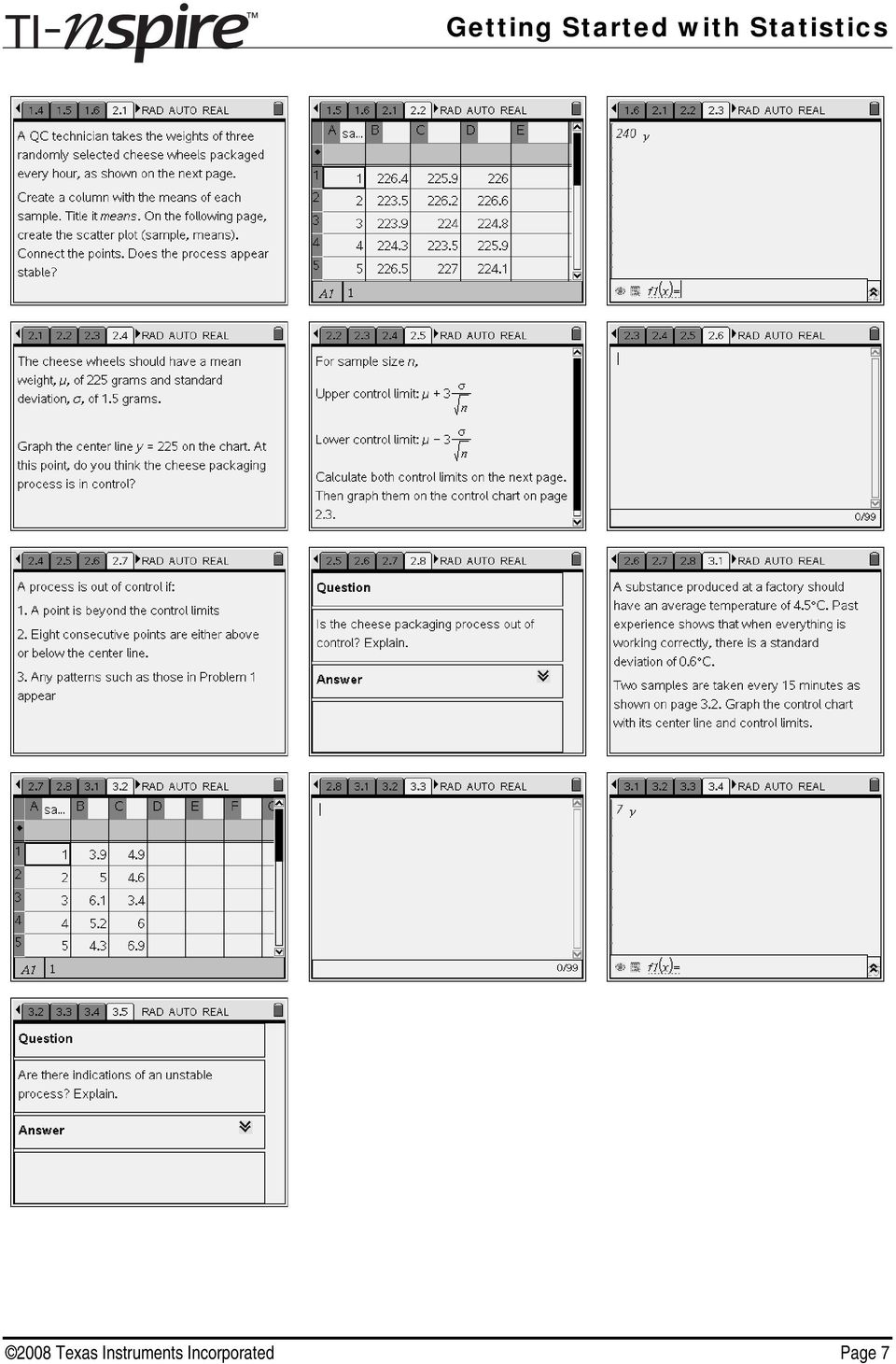
1 Out of Control! ID: By Michele Patrick Time required 35 minutes Activity Overview In this activity, students make XY Line Plots and scatter plots to create run charts and control charts (types of time plots) to determine if a manufacturing process is statistically stable. Students begin by looking for any unusual patterns or trends in variation and then calculate sample means and upper and lower control limits to create control charts which they then interpret. Concepts Run charts and control charts Sample means Upper and lower control limits Teacher Preparation This activity is designed to be used for students studying Statistics and Probability. This activity assumes students are familiar with means, standard deviations, and scatter plots. If it has already been introduced, review the rule for normal distributions. This will help students better understand the placement of the upper and lower control limits in the control charts. You may wish to mention that although widely used in manufacturing, control charts can also be used in other situations, such as monitoring a person s heart rate. The screenshots on pages 2 6 (top) demonstrate expected student results. Refer to the screenshots on pages 6 (bottom) and 7 for a preview of the student TI-Nspire document (.tns file). To download the student.tns file and student worksheet, go to education.ti.com/exchange and enter in the quick search box. Classroom Management This activity is intended to be mainly teacher-led, with breaks for individual student work. Use the following pages to present the material to the class and encourage discussion. Students will follow along using their handhelds. The student worksheet helps guide students through the activity and provides a place for students to record their answers. The TI-Nspire solution document StatAct33_OutOfControl_Soln_EN.tns shows the expected results of working through the activity. TI-Nspire Applications Calculator, Graphs & Geometry, Lists & Spreadsheet, Notes, Data & Statistics 2008 Texas Instruments Incorporated Page 1

2 Problem 1 Run Charts Introduce the concept of quality control and how it is used in business, specifically in manufacturing, via random sampling at regular intervals. It is important to track changes both at regular intervals and over a period of time, not just at the beginning or end of the work day or work week. In Problem 1, bottles filled at a factory are supposed to each get 22 ounces of juice. Even if the machinery does not have problems, it is unlikely that each bottle will get precisely 22 ounces. There will be some variation. But when is variation normal and when is it out of control? Have students move to page 1.3 to see the data for the first assembly line. Have students glance at the volumes and ask if the variation appears acceptable. They will probably have a difficult time answering by just looking at the values. This is why a graph is so much more effective. Have students highlight both columns. To select a column, press MENU > Actions > Select > Select Column or press the up arrow when the title cell is active. Once one column is highlighted, hold down the SHIFT key (g) and use the arrows to select the second column. Instruct students to press MENU > Data > Quick Graph and then MENU > Plot Type > XY Line Plot. Explain that this time plot is called a run chart. To better see it, have students extend the graph to the left by selecting Tools > Page Layout > Custom Split. Press the left arrow to move the vertical dividing line to the left Texas Instruments Incorporated Page 2

3 Ask students to describe any patterns or trends they see in the data. They should notice that there is a downward trend. We don t know what acceptable deviations from the mean are, but something on the assembly line, possibly due to wear and tear, is having an affect on the amount of juice it is dispensing. We will later see how to determine if a value is too high or too low. For now, just discuss that this type of trend indicates variation that is not random. Getting Started with Statistics Have students work independently to create run charts for the second, third, and fourth assembly lines, noting any suspicious patterns or trends. When everyone has finished, discuss their conclusions. The second control chart shows increasing variation; the third shows an upward shift, and the fourth shows an unusually low value. All of these are signals that something unusual is happening with the process and should be looked into. Another type of trend that signals instability in a process is a cyclical pattern. High values followed by low values followed by high values and so on. Problem 2 Control Charts: Weights In Problem 2, three items are randomly taken at a time and the means of the samples are plotted. Introduce the scenario on page Texas Instruments Incorporated Page 3

4 Instruct students to find the sample means on page 2.2. One way to do this is to type the formula =mean(b1:d1) in cell E2 and then copy the formula down through cell E20 (MENU > Data > Fill Down). To be able to make a scatter plot on the next page, be sure students title the column. The title of means is suggested. Have students create the scatter plot on page 2.3. To do this, they must first define the graph type by pressing MENU > Graph Type > Scatter Plot. Then select sample for the x-variable and means for the y-variable. Once the scatter plot is graphed, press MENU > Actions > Attributes to connect the points. The label (sample, means) can be moved out of the way, hidden, or deleted. Ask students if they see any suspicious patterns in variation. (no) Tell students that the mean weight of the cheese wheels is supposed to be 225 grams with a standard deviation of 1.5 grams. To see if the points in the chart are around where they should be, have them graph the function, y = target mean, which is y = 225. This horizontal line is called the center line. To graph the function, students will need to change the Graph Type to Function. Based on this diagram, ask students if they think the cheese packaging process is in control. Some may say yes because some points are above the line and some are below. Others may still question how far away from the line a point can be. Explain that the last items we need to graph are the upper and lower control limits. The formulas are given on page 2.5. Depending on the background knowledge of your students, you can discuss how the formulas use the Central Limit Theorem and are analogous to finding confidence intervals Texas Instruments Incorporated Page 4
 can be moved out of the way, hidden, or deleted.")
5 The upper and lower limits are and respectively. Have students graph the functions y = upper control limit and y = lower control limit on their chart. They can either retype the values in the function rule, or, store them as variables in the Calculator application and then type those variable names in the function rule. To store a value, press / + h and then the variable name. Here, ucl and lcl are used. To better distinguish among the lines, students can make the upper and lower limits dashed (MENU > Actions > Attributes). Explain that this chart is called a control chart. Because other sample characteristics can be graphed with center lines and upper and lower limits (such as ranges, proportions, and standard deviations), it is also known as the x chart. Use page 2.7 to begin a discussion on signals that show that a process is out of control. These are the most standard criteria used. Some companies may look for additional criteria, such as a certain number of consecutive points increasing (or decreasing). Mention the risk of type I and II errors while determining if a process is out of control. These criteria may need to be tweaked for the specific process being studied depending on the possible sources of error. Ask students if their control chart indicates statistical instability based on these criteria. They should say yes, as there is a sample mean above the upper control limit Texas Instruments Incorporated Page 5
. Explain that this chart is called a control chart.")
6 Problem 3 Control Charts: Temperature Introduce the scenario on page 3.1 and then allow students to work on creating the control chart independently. As before, they will need to find the sample means and calculate the upper and lower limits. Walk around and assist students as needed. Students should conclude that the process is not stable because of the unusual number of consecutive points above the center line. Also, the points appear to be the start of a cyclical up and down cycle. Out of Control! ID: (Student)TI-Nspire File: StatAct33_OutOfControl_EN.tns 2008 Texas Instruments Incorporated Page 6
TI-Nspire File: StatAct33_OutOfControl_EN.")
7 2008 Texas Instruments Incorporated Page 7
TIphysics.com. Physics. Bell Ringer: Mechanical Advantage of a Single Fixed Pulley ID: 13507
 Bell Ringer: Mechanical Advantage of a Single Fixed Pulley ID: 13507 Based on an activity by Irina Lyublinskaya Time required 15 minutes Topic: Work and Energy Calculate the mechanical advantages and efficiencies
TImath.com. Statistics. Areas in Intervals
 Areas in Intervals ID: 9472 TImath.com Time required 30 minutes Activity Overview In this activity, students use several methods to determine the probability of a given normally distributed value being
TImath.com. F Distributions. Statistics
 F Distributions ID: 9780 Time required 30 minutes Activity Overview In this activity, students study the characteristics of the F distribution and discuss why the distribution is not symmetric (skewed
Concepts Sectors, arcs, circumference, areas of circles and properties of cones.
 Making Witches Hats from Cones ID: XXXX Time required 45 minutes Activity Overview In this activity, students make cones from circles, exploring the relationship between the size of the sector cut from
TIgeometry.com. Geometry. Angle Bisectors in a Triangle
 Angle Bisectors in a Triangle ID: 8892 Time required 40 minutes Topic: Triangles and Their Centers Use inductive reasoning to postulate a relationship between an angle bisector and the arms of the angle.
Dealing with Data in Excel 2010
 Dealing with Data in Excel 2010 Excel provides the ability to do computations and graphing of data. Here we provide the basics and some advanced capabilities available in Excel that are useful for dealing
TImath.com Algebra 1. Absolutely!
 Absolutely! ID: 8791 Time required 45 minutes Activity Overview In this activity, students first solve linear absolute value equations in a single variable using the definition of absolute value to write
Precalculus. What s My Locus? ID: 8255
 What s My Locus? ID: 855 By Lewis Lum Time required 45 minutes Activity Overview In this activity, students will eplore the focus/directri and reflection properties of parabolas. They are led to conjecture
TImath.com. Geometry. Points on a Perpendicular Bisector
 Points on a Perpendicular Bisector ID: 8868 Time required 40 minutes Activity Overview In this activity, students will explore the relationship between a line segment and its perpendicular bisector. Once
EXCEL Tutorial: How to use EXCEL for Graphs and Calculations.
 EXCEL Tutorial: How to use EXCEL for Graphs and Calculations. Excel is powerful tool and can make your life easier if you are proficient in using it. You will need to use Excel to complete most of your
Grade level: secondary Subject: mathematics Time required: 45 to 90 minutes
 TI-Nspire Activity: Paint Can Dimensions By: Patsy Fagan and Angela Halsted Activity Overview Problem 1 explores the relationship between height and volume of a right cylinder, the height and surface area,
Probability Distributions
 CHAPTER 5 Probability Distributions CHAPTER OUTLINE 5.1 Probability Distribution of a Discrete Random Variable 5.2 Mean and Standard Deviation of a Probability Distribution 5.3 The Binomial Distribution
Introduction to the TI-Nspire CX
 Introduction to the TI-Nspire CX Activity Overview: In this activity, you will become familiar with the layout of the TI-Nspire CX. Step 1: Locate the Touchpad. The Touchpad is used to navigate the cursor
Using Excel for descriptive statistics
 FACT SHEET Using Excel for descriptive statistics Introduction Biologists no longer routinely plot graphs by hand or rely on calculators to carry out difficult and tedious statistical calculations. These
Building Concepts: Dividing a Fraction by a Whole Number
 Lesson Overview This TI-Nspire lesson uses a unit square to explore division of a unit fraction and a fraction in general by a whole number. The concept of dividing a quantity by a whole number, n, can
Step 3: Go to Column C. Use the function AVERAGE to calculate the mean values of n = 5. Column C is the column of the means.
 EXAMPLES - SAMPLING DISTRIBUTION EXCEL INSTRUCTIONS This exercise illustrates the process of the sampling distribution as stated in the Central Limit Theorem. Enter the actual data in Column A in MICROSOFT
This activity will show you how to draw graphs of algebraic functions in Excel.
 This activity will show you how to draw graphs of algebraic functions in Excel. Open a new Excel workbook. This is Excel in Office 2007. You may not have used this version before but it is very much the
Confidence Intervals for Cpk
 Chapter 297 Confidence Intervals for Cpk Introduction This routine calculates the sample size needed to obtain a specified width of a Cpk confidence interval at a stated confidence level. Cpk is a process
Updates to Graphing with Excel
 Updates to Graphing with Excel NCC has recently upgraded to a new version of the Microsoft Office suite of programs. As such, many of the directions in the Biology Student Handbook for how to graph with
Using Excel for Handling, Graphing, and Analyzing Scientific Data:
 Using Excel for Handling, Graphing, and Analyzing Scientific Data: A Resource for Science and Mathematics Students Scott A. Sinex Barbara A. Gage Department of Physical Sciences and Engineering Prince
Excel Tutorial. Bio 150B Excel Tutorial 1
 Bio 15B Excel Tutorial 1 Excel Tutorial As part of your laboratory write-ups and reports during this semester you will be required to collect and present data in an appropriate format. To organize and
Excel 2003 A Beginners Guide
 Excel 2003 A Beginners Guide Beginner Introduction The aim of this document is to introduce some basic techniques for using Excel to enter data, perform calculations and produce simple charts based on
How to Make the Most of Excel Spreadsheets
 How to Make the Most of Excel Spreadsheets Analyzing data is often easier when it s in an Excel spreadsheet rather than a PDF for example, you can filter to view just a particular grade, sort to view which
Spreadsheets and Laboratory Data Analysis: Excel 2003 Version (Excel 2007 is only slightly different)
") Spreadsheets and Laboratory Data Analysis: Excel 2003 Version (Excel 2007 is only slightly different) Spreadsheets are computer programs that allow the user to enter and manipulate numbers. They are capable
Spreadsheets and Laboratory Data Analysis: Excel 2003 Version (Excel 2007 is only slightly different) Spreadsheets are computer programs that allow the user to enter and manipulate numbers. They are capable
Excel -- Creating Charts
 Excel -- Creating Charts The saying goes, A picture is worth a thousand words, and so true. Professional looking charts give visual enhancement to your statistics, fiscal reports or presentation. Excel
Creating an Excel XY (Scatter) Plot
 Plot") Creating an Excel XY (Scatter) Plot EXCEL REVIEW 21-22 1 What is an XY or Scatter Plot? An XY or scatter plot either shows the relationships among the numeric values in several data series or plots two
Creating an Excel XY (Scatter) Plot EXCEL REVIEW 21-22 1 What is an XY or Scatter Plot? An XY or scatter plot either shows the relationships among the numeric values in several data series or plots two
CALCULATIONS & STATISTICS
 CALCULATIONS & STATISTICS CALCULATION OF SCORES Conversion of 1-5 scale to 0-100 scores When you look at your report, you will notice that the scores are reported on a 0-100 scale, even though respondents
Years after 2000. US Student to Teacher Ratio 0 16.048 1 15.893 2 15.900 3 15.900 4 15.800 5 15.657 6 15.540
 To complete this technology assignment, you should already have created a scatter plot for your data on your calculator and/or in Excel. You could do this with any two columns of data, but for demonstration
Instruction Manual for SPC for MS Excel V3.0
 Frequency Business Process Improvement 281-304-9504 20314 Lakeland Falls www.spcforexcel.com Cypress, TX 77433 Instruction Manual for SPC for MS Excel V3.0 35 30 25 LSL=60 Nominal=70 Capability Analysis
Scientific Graphing in Excel 2010
 Scientific Graphing in Excel 2010 When you start Excel, you will see the screen below. Various parts of the display are labelled in red, with arrows, to define the terms used in the remainder of this overview.
Using Excel (Microsoft Office 2007 Version) for Graphical Analysis of Data
 for Graphical Analysis of Data") Using Excel (Microsoft Office 2007 Version) for Graphical Analysis of Data Introduction In several upcoming labs, a primary goal will be to determine the mathematical relationship between two variable
Using Excel (Microsoft Office 2007 Version) for Graphical Analysis of Data Introduction In several upcoming labs, a primary goal will be to determine the mathematical relationship between two variable
Intermediate PowerPoint
 Intermediate PowerPoint Charts and Templates By: Jim Waddell Last modified: January 2002 Topics to be covered: Creating Charts 2 Creating the chart. 2 Line Charts and Scatter Plots 4 Making a Line Chart.
Excel 2007 A Beginners Guide
 Excel 2007 A Beginners Guide Beginner Introduction The aim of this document is to introduce some basic techniques for using Excel to enter data, perform calculations and produce simple charts based on
Mail Merge Creating Mailing Labels 3/23/2011
 Creating Mailing Labels in Microsoft Word Address data in a Microsoft Excel file can be turned into mailing labels in Microsoft Word through a mail merge process. First, obtain or create an Excel spreadsheet
Bowerman, O'Connell, Aitken Schermer, & Adcock, Business Statistics in Practice, Canadian edition
 Bowerman, O'Connell, Aitken Schermer, & Adcock, Business Statistics in Practice, Canadian edition Online Learning Centre Technology Step-by-Step - Excel Microsoft Excel is a spreadsheet software application
Confidence Intervals for Cp
 Chapter 296 Confidence Intervals for Cp Introduction This routine calculates the sample size needed to obtain a specified width of a Cp confidence interval at a stated confidence level. Cp is a process
Scatter Plots with Error Bars
 Chapter 165 Scatter Plots with Error Bars Introduction The procedure extends the capability of the basic scatter plot by allowing you to plot the variability in Y and X corresponding to each point. Each
How to make a line graph using Excel 2007
 How to make a line graph using Excel 2007 Format your data sheet Make sure you have a title and each column of data has a title. If you are entering data by hand, use time or the independent variable in
Chapter 10. Key Ideas Correlation, Correlation Coefficient (r),
,") Chapter 0 Key Ideas Correlation, Correlation Coefficient (r), Section 0-: Overview We have already explored the basics of describing single variable data sets. However, when two quantitative variables
Chapter 0 Key Ideas Correlation, Correlation Coefficient (r), Section 0-: Overview We have already explored the basics of describing single variable data sets. However, when two quantitative variables
Excel Math Project for 8th Grade Identifying Patterns
 There are several terms that we will use to describe your spreadsheet: Workbook, worksheet, row, column, cell, cursor, name box, formula bar. Today you are going to create a spreadsheet to investigate
Working with Spreadsheets
 osborne books Working with Spreadsheets UPDATE SUPPLEMENT 2015 The AAT has recently updated its Study and Assessment Guide for the Spreadsheet Software Unit with some minor additions and clarifications.
Formulas, Functions and Charts
 Formulas, Functions and Charts :: 167 8 Formulas, Functions and Charts 8.1 INTRODUCTION In this leson you can enter formula and functions and perform mathematical calcualtions. You will also be able to
The River of Life TEACHER NOTES SCIENCE NSPIRED. Science Objectives. Math Objectives. Materials Needed. Vocabulary.
 Science Objectives Students will calculate the volume of blood in their own bodies. Students will analyze and quantify some of the components of their blood. Math Objectives Students will use tabular data
Intro to Excel spreadsheets
 Intro to Excel spreadsheets What are the objectives of this document? The objectives of document are: 1. Familiarize you with what a spreadsheet is, how it works, and what its capabilities are; 2. Using
Spreadsheet - Introduction
 CSCA0102 IT and Business Applications Chapter 6 Spreadsheet - Introduction Spreadsheet A spreadsheet (or spreadsheet program) is software that permits numerical data to be used and to perform automatic
Advanced Microsoft Excel 2010
 Advanced Microsoft Excel 2010 Table of Contents THE PASTE SPECIAL FUNCTION... 2 Paste Special Options... 2 Using the Paste Special Function... 3 ORGANIZING DATA... 4 Multiple-Level Sorting... 4 Subtotaling
Calculator Notes for the TI-Nspire and TI-Nspire CAS
 CHAPTER 11 Calculator Notes for the Note 11A: Entering e In any application, press u to display the value e. Press. after you press u to display the value of e without an exponent. Note 11B: Normal Graphs
The Center for Teaching, Learning, & Technology
 The Center for Teaching, Learning, & Technology Instructional Technology Workshops Microsoft Excel 2010 Formulas and Charts Albert Robinson / Delwar Sayeed Faculty and Staff Development Programs Colston
Tools for Excel Modeling. Introduction to Excel2007 Data Tables and Data Table Exercises
 Tools for Excel Modeling Introduction to Excel2007 Data Tables and Data Table Exercises EXCEL REVIEW 2009-2010 Preface Data Tables are among the most useful of Excel s tools for analyzing data in spreadsheet
Creating Bar Charts and Pie Charts Excel 2010 Tutorial (small revisions 1/20/14)
") Creating Bar Charts and Pie Charts Excel 2010 Tutorial (small revisions 1/20/14) Excel file for use with this tutorial GraphTutorData.xlsx File Location http://faculty.ung.edu/kmelton/data/graphtutordata.xlsx
Creating Bar Charts and Pie Charts Excel 2010 Tutorial (small revisions 1/20/14) Excel file for use with this tutorial GraphTutorData.xlsx File Location http://faculty.ung.edu/kmelton/data/graphtutordata.xlsx
1. What is the critical value for this 95% confidence interval? CV = z.025 = invnorm(0.025) = 1.96
 = 1.96") 1 Final Review 2 Review 2.1 CI 1-propZint Scenario 1 A TV manufacturer claims in its warranty brochure that in the past not more than 10 percent of its TV sets needed any repair during the first two years
1 Final Review 2 Review 2.1 CI 1-propZint Scenario 1 A TV manufacturer claims in its warranty brochure that in the past not more than 10 percent of its TV sets needed any repair during the first two years
Introduction to Data Tables. Data Table Exercises
 Tools for Excel Modeling Introduction to Data Tables and Data Table Exercises EXCEL REVIEW 2000-2001 Data Tables are among the most useful of Excel s tools for analyzing data in spreadsheet models. Some
Linear Equations. 5- Day Lesson Plan Unit: Linear Equations Grade Level: Grade 9 Time Span: 50 minute class periods By: Richard Weber
 Linear Equations 5- Day Lesson Plan Unit: Linear Equations Grade Level: Grade 9 Time Span: 50 minute class periods By: Richard Weber Tools: Geometer s Sketchpad Software Overhead projector with TI- 83
Basic Pivot Tables. To begin your pivot table, choose Data, Pivot Table and Pivot Chart Report. 1 of 18
 Basic Pivot Tables Pivot tables summarize data in a quick and easy way. In your job, you could use pivot tables to summarize actual expenses by fund type by object or total amounts. Make sure you do not
Drawing a histogram using Excel
 Drawing a histogram using Excel STEP 1: Examine the data to decide how many class intervals you need and what the class boundaries should be. (In an assignment you may be told what class boundaries to
Chapter 4 Creating Charts and Graphs
 Calc Guide Chapter 4 OpenOffice.org Copyright This document is Copyright 2006 by its contributors as listed in the section titled Authors. You can distribute it and/or modify it under the terms of either
FirstClass FAQ's An item is missing from my FirstClass desktop
 FirstClass FAQ's An item is missing from my FirstClass desktop Deleted item: If you put a item on your desktop, you can delete it. To determine what kind of item (conference-original, conference-alias,
A Guide to Using Excel in Physics Lab
 A Guide to Using Excel in Physics Lab Excel has the potential to be a very useful program that will save you lots of time. Excel is especially useful for making repetitious calculations on large data sets.
Using Excel to find Perimeter, Area & Volume
 Using Excel to find Perimeter, Area & Volume Level: LBS 4 V = lwh Goal: To become familiar with Microsoft Excel by entering formulas into a spreadsheet in order to calculate the perimeter, area and volume
Lab 1: The metric system measurement of length and weight
 Lab 1: The metric system measurement of length and weight Introduction The scientific community and the majority of nations throughout the world use the metric system to record quantities such as length,
Creating a Gradebook in Excel
 Creating a Spreadsheet Gradebook 1 Creating a Gradebook in Excel Spreadsheets are a great tool for creating gradebooks. With a little bit of work, you can create a customized gradebook that will provide
Quickstart for Desktop Version
 Quickstart for Desktop Version What is GeoGebra? Dynamic Mathematics Software in one easy-to-use package For learning and teaching at all levels of education Joins interactive 2D and 3D geometry, algebra,
Tips and Tricks for Printing an Excel Spreadsheet
 Tips and Tricks for Printing an Excel Spreadsheet Microsoft Excel provides the following ways to view your spreadsheet and adjust how it will look printed: Normal view This is the default view and is best
TIPS FOR DOING STATISTICS IN EXCEL
 TIPS FOR DOING STATISTICS IN EXCEL Before you begin, make sure that you have the DATA ANALYSIS pack running on your machine. It comes with Excel. Here s how to check if you have it, and what to do if you
Plot the following two points on a graph and draw the line that passes through those two points. Find the rise, run and slope of that line.
 Objective # 6 Finding the slope of a line Material: page 117 to 121 Homework: worksheet NOTE: When we say line... we mean straight line! Slope of a line: It is a number that represents the slant of a line
CHARTS AND GRAPHS INTRODUCTION USING SPSS TO DRAW GRAPHS SPSS GRAPH OPTIONS CAG08
 CHARTS AND GRAPHS INTRODUCTION SPSS and Excel each contain a number of options for producing what are sometimes known as business graphics - i.e. statistical charts and diagrams. This handout explores
Excel 2007 Basic knowledge
 Ribbon menu The Ribbon menu system with tabs for various Excel commands. This Ribbon system replaces the traditional menus used with Excel 2003. Above the Ribbon in the upper-left corner is the Microsoft
Session 7 Bivariate Data and Analysis
 Session 7 Bivariate Data and Analysis Key Terms for This Session Previously Introduced mean standard deviation New in This Session association bivariate analysis contingency table co-variation least squares
Learning Objectives. Understand how to select the correct control chart for an application. Know how to fill out and maintain a control chart.
 CONTROL CHARTS Learning Objectives Understand how to select the correct control chart for an application. Know how to fill out and maintain a control chart. Know how to interpret a control chart to determine
SECTION 5: Finalizing Your Workbook
 SECTION 5: Finalizing Your Workbook In this section you will learn how to: Protect a workbook Protect a sheet Protect Excel files Unlock cells Use the document inspector Use the compatibility checker Mark
Microsoft Excel Tutorial
 Microsoft Excel Tutorial by Dr. James E. Parks Department of Physics and Astronomy 401 Nielsen Physics Building The University of Tennessee Knoxville, Tennessee 37996-1200 Copyright August, 2000 by James
Relationships Between Two Variables: Scatterplots and Correlation
 Relationships Between Two Variables: Scatterplots and Correlation Example: Consider the population of cars manufactured in the U.S. What is the relationship (1) between engine size and horsepower? (2)
Teaching & Learning Plans. Plan 1: Introduction to Probability. Junior Certificate Syllabus Leaving Certificate Syllabus
 Teaching & Learning Plans Plan 1: Introduction to Probability Junior Certificate Syllabus Leaving Certificate Syllabus The Teaching & Learning Plans are structured as follows: Aims outline what the lesson,
Using Microsoft Excel to Plot and Analyze Kinetic Data
 Entering and Formatting Data Using Microsoft Excel to Plot and Analyze Kinetic Data Open Excel. Set up the spreadsheet page (Sheet 1) so that anyone who reads it will understand the page (Figure 1). Type
APPLYING BENFORD'S LAW This PDF contains step-by-step instructions on how to apply Benford's law using Microsoft Excel, which is commonly used by
 APPLYING BENFORD'S LAW This PDF contains step-by-step instructions on how to apply Benford's law using Microsoft Excel, which is commonly used by internal auditors around the world in their day-to-day
Tutorial on Using Excel Solver to Analyze Spin-Lattice Relaxation Time Data
 Tutorial on Using Excel Solver to Analyze Spin-Lattice Relaxation Time Data In the measurement of the Spin-Lattice Relaxation time T 1, a 180 o pulse is followed after a delay time of t with a 90 o pulse,
STC: Descriptive Statistics in Excel 2013. Running Descriptive and Correlational Analysis in Excel 2013
 Running Descriptive and Correlational Analysis in Excel 2013 Tips for coding a survey Use short phrases for your data table headers to keep your worksheet neat, you can always edit the labels in tables
CHAPTER 1: SPREADSHEET BASICS. AMZN Stock Prices Date Price 2003 54.43 2004 34.13 2005 39.86 2006 38.09 2007 89.15 2008 69.58
 1. Suppose that at the beginning of October 2003 you purchased shares in Amazon.com (NASDAQ: AMZN). It is now five years later and you decide to evaluate your holdings to see if you have done well with
STATISTICAL REASON FOR THE 1.5σ SHIFT Davis R. Bothe
 STATISTICAL REASON FOR THE 1.5σ SHIFT Davis R. Bothe INTRODUCTION Motorola Inc. introduced its 6σ quality initiative to the world in the 1980s. Almost since that time quality practitioners have questioned
Module 3: Correlation and Covariance
 Using Statistical Data to Make Decisions Module 3: Correlation and Covariance Tom Ilvento Dr. Mugdim Pašiƒ University of Delaware Sarajevo Graduate School of Business O ften our interest in data analysis
TEACHER NOTES MATH NSPIRED
 Math Objectives Students will understand that normal distributions can be used to approximate binomial distributions whenever both np and n(1 p) are sufficiently large. Students will understand that when
Sample Table. Columns. Column 1 Column 2 Column 3 Row 1 Cell 1 Cell 2 Cell 3 Row 2 Cell 4 Cell 5 Cell 6 Row 3 Cell 7 Cell 8 Cell 9.
 Working with Tables in Microsoft Word The purpose of this document is to lead you through the steps of creating, editing and deleting tables and parts of tables. This document follows a tutorial format
Common Tools for Displaying and Communicating Data for Process Improvement
 Common Tools for Displaying and Communicating Data for Process Improvement Packet includes: Tool Use Page # Box and Whisker Plot Check Sheet Control Chart Histogram Pareto Diagram Run Chart Scatter Plot
Microsoft Excel 2007. Introduction to Microsoft Excel 2007
 Microsoft Excel 2007 Introduction to Microsoft Excel 2007 Excel is an electronic spreadsheet to organize your data into rows and columns. One can use it to perform basic to advanced level mathematical
Microsoft Excel 2010 Part 3: Advanced Excel
 CALIFORNIA STATE UNIVERSITY, LOS ANGELES INFORMATION TECHNOLOGY SERVICES Microsoft Excel 2010 Part 3: Advanced Excel Winter 2015, Version 1.0 Table of Contents Introduction...2 Sorting Data...2 Sorting
Acceleration of Gravity Lab Basic Version
 Acceleration of Gravity Lab Basic Version In this lab you will explore the motion of falling objects. As an object begins to fall, it moves faster and faster (its velocity increases) due to the acceleration
Activity 5. Two Hot, Two Cold. Introduction. Equipment Required. Collecting the Data
 . Activity 5 Two Hot, Two Cold How do we measure temperatures? In almost all countries of the world, the Celsius scale (formerly called the centigrade scale) is used in everyday life and in science and
Using Microsoft Project 2000
 Using MS Project Personal Computer Fundamentals 1 of 45 Using Microsoft Project 2000 General Conventions All text highlighted in bold refers to menu selections. Examples would be File and Analysis. ALL
Data exploration with Microsoft Excel: analysing more than one variable
 Data exploration with Microsoft Excel: analysing more than one variable Contents 1 Introduction... 1 2 Comparing different groups or different variables... 2 3 Exploring the association between categorical
Appendix 2.1 Tabular and Graphical Methods Using Excel
 Appendix 2.1 Tabular and Graphical Methods Using Excel 1 Appendix 2.1 Tabular and Graphical Methods Using Excel The instructions in this section begin by describing the entry of data into an Excel spreadsheet.
Merging Labels, Letters, and Envelopes Word 2013
 Merging Labels, Letters, and Envelopes Word 2013 Merging... 1 Types of Merges... 1 The Merging Process... 2 Labels - A Page of the Same... 2 Labels - A Blank Page... 3 Creating Custom Labels... 3 Merged
Mail Merge: Create Mailing Labels Using Excel Data and Filtering the Contents in the Data
 Mail Merge: Create Mailing Labels Using Excel Data and Filtering the Contents in the Data Prior to starting this, please save the.csv file that you exported as an excel file (example: xxxx.csv will now
Lab 11. Simulations. The Concept
 Lab 11 Simulations In this lab you ll learn how to create simulations to provide approximate answers to probability questions. We ll make use of a particular kind of structure, called a box model, that
In this article, learn how to create and manipulate masks through both the worksheet and graph window.
 Masking Data In this article, learn how to create and manipulate masks through both the worksheet and graph window. The article is split up into four main sections: The Mask toolbar The Mask Toolbar Buttons
Departmental Reporting in Microsoft Excel for Sage 50 Accounts
 al Reporting in Microsoft Excel for Sage 50 Accounts 1 Introduction Whilst Sage 50 Accounts does already offer integrated Excel reporting functionality, we found that it was often missing the flexibility
The Normal Distribution
 Chapter 6 The Normal Distribution 6.1 The Normal Distribution 1 6.1.1 Student Learning Objectives By the end of this chapter, the student should be able to: Recognize the normal probability distribution
STATISTICAL QUALITY CONTROL (SQC)
") Statistical Quality Control 1 SQC consists of two major areas: STATISTICAL QUALITY CONTOL (SQC) - Acceptance Sampling - Process Control or Control Charts Both of these statistical techniques may be applied
Statistical Quality Control 1 SQC consists of two major areas: STATISTICAL QUALITY CONTOL (SQC) - Acceptance Sampling - Process Control or Control Charts Both of these statistical techniques may be applied
How To Run Statistical Tests in Excel
 How To Run Statistical Tests in Excel Microsoft Excel is your best tool for storing and manipulating data, calculating basic descriptive statistics such as means and standard deviations, and conducting
Draw pie charts in Excel
 This activity shows how to draw pie charts in Excel 2007. Open a new Excel workbook. Enter some data you can use your own data if you wish. This table gives the % of European holidays sold by a travel
Bar Graphs with Intervals Grade Three
 Bar Graphs with Intervals Grade Three Ohio Standards Connection Data Analysis and Probability Benchmark D Read, interpret and construct graphs in which icons represent more than a single unit or intervals