One Page Everywhere. Fluid, Responsive Design with Semantic.gs
|
|
|
- Berenice Cummings
- 10 years ago
- Views:
Transcription
1 One Page Everywhere Fluid, Responsive Design with Semantic.gs

2 The Semantic Grid System Grid System Fluid or Fixed Responsive Semantic Sass or LESS


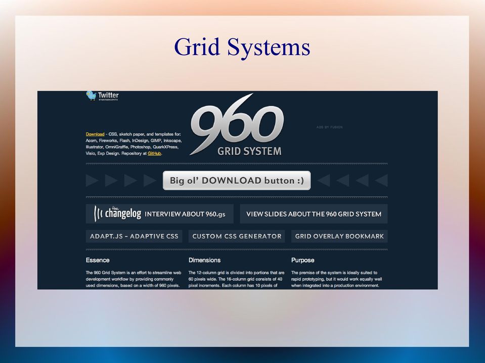
3 Grid Systems
4 Grid System Fixed Size

5 Grid System Fixed Size

6 Semantic.gs: Fixed or Fluid // Specify the number of columns and set column and gutter widths $columns: 12; $column-width: 60; $gutter-width: 20; // Remove the definition below for a pixel-based layout $total-width: 100%;

7 Grid System Clutter <body> <div class="container_12"> <h1 class="grid_4 push_4"> 960 Grid System </h1> <!-- end.grid_4.push_4 --> <p id="description" class="grid_4 pull_4">... </p> <!-- end #description.grid_4.pull_4 -->

8 Semantic.gs: Layout in Stylesheets <body> #banner { <div column(12); <header id="banner"> padding-top: 3em; } <h1> </h1> </header> <section id="history"> #history column(6); } <h2>history</h2> <p> </p> </section> #contact column(6); }
;")
9 Semantic.gs: Responsive (iphone)

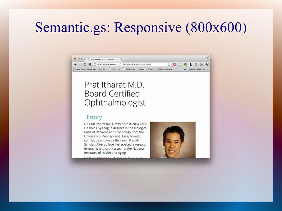
10 Semantic.gs: Responsive (800x600)
11 Semantic.gs: Responsive (ipad)

12 Semantic.gs: Responsive (1920x1080)

13 Project Walk-through File locations semantic_gs files

14 HTML Walk-through Single stylesheet IE fixes Semantic elements Few layout divs

15 SCSS Walkthrough Imports Variables Columns and Columns Few sizes in pixels, all % and em

16

17 Fixes for Old Internet Explorers Html5shiv Respond.js

18 Things to Watch Out For Right and left padding and margins on grid elements can be finicky. Best to just wrap them with a div. Image sizing: small screens get large images and have to scale the images down. Can't really re-order sections.

19 Choosing Media Query Breakpoints 1. Start big and go to small 2. Shrink window until something looks funky 3. Create a breakpoint, fix what looks funky 4. Repeat from #2 5. No need to worry about specific devices!

20 Credits The Semantic Grid System iphone screenshots simulated using iphony ipad screenshots simulated using ipad Peek Some slides from

21 Some Useful Utilities Chrome Window Resizer Extension HTML5 Shiv Respond.js
22 Contact Me Meatspace: Ben Rousch Google+:
23 One Page Everywhere Fluid, Responsive Design with Semantic.gs Greeting
24 The Semantic Grid System Grid System Fluid or Fixed Responsive Semantic Sass or LESS We're going to transform this one page, static website into a fluid, responsive website using The Semantic Grid System. Semantic.gs is: 12 column, 960 pixel grid system Which can be fluid or fixed It is responsive It is semantic It uses Sass or LESS We'll talk about a few of these terms as we go on.
25 Grid Systems CSS grid systems have been around for a while now. I've used Blueprint in the past, but there are many others available. How many of you have used a grid system at some point? the idea is that the grid system gives you a framework of columns and gutters, the space in between columns, that let you line things up nicely on your page. Because keeping things lined up in CSS is hard,

26 Grid System Fixed Size But there are a couple of problems with grid systems: 1. They are usually a fixed width. Often 960 pixels. This does not lend itself well to responsive design, which needs to adapt to many different screen sizes. Here is the 960 grid on a 1080p monitor. The empty areas on the side are pretty excessive.
27 Grid System Fixed Size Here is the same site on an iphone. I don't think I need to say anything.
28 Semantic.gs: Fixed or Fluid // Specify the number of columns and set column and gutter widths $columns: 12; $column-width: 60; $gutter-width: 20; // Remove the definition below for a pixel-based layout $total-width: 100%; The Semantic Grid System lets you use a fixed size if you want to, but it can also provide a fluid grid for you. Fluid means that the sizes of elements change for different screen sizes. You use percentages and ems to lay things out instead of pixels. * Compare fixed DrI to fluid * We'll be using the fluid grid today. And I think once you go fluid you won't want to go back to fixed.
29 Grid System Clutter <body> <div class="container_12"> <h1 class="grid_4 push_4"> 960 Grid System </h1> <!-- end.grid_4.push_4 --> <p id="description" class="grid_4 pull_4">... </p> <!-- end #description.grid_4.pull_4 --> Another problem with typical grid systems is they clutter up your HTML with extra divs and span or grid properties. Here's some of the HTML from that 960Grid page we just saw. This is layout stuff. It really doesn't belong in your HTML. It belongs in your stylesheets. And that's where The Semantic Grid System puts it.
30 Semantic.gs: Layout in Stylesheets <body> #banner { <div column(12); <header id="banner"> padding-top: 3em; } <h1> </h1> </header> <section id="history"> #history column(6); } <h2>history</h2> <p> </p> </section> #contact column(6); } This is a snippet from the final HTML and stylesheet we'll create today. You can see the column information is in the CSS. There's no sign of it in the HTML.
31 Semantic.gs: Responsive (iphone) Responsive refers to a website's ability to adapt to different resolutions, screen sizes, and devices.
32 Semantic.gs: Responsive (800x600) A typical grid system works well for a typical sized desktop or laptop screen, but it's doesn't work well for very large screens or smartphones.
33 Semantic.gs: Responsive (ipad) This is partly because the grid is defined in the HTML, which means you can't change it on the fly without resorting to Javascript or different versions of the page for different sized screens..
34 Semantic.gs: Responsive (1920x1080) These are screenshots of our finished website on an iphone, at 800x600 resolution, on an ipad, and at 1920x1080 resolution. Let's see them again.
35 Project Walk-through File locations semantic_gs files
36 HTML Walk-through Single stylesheet IE fixes Semantic elements Few layout divs
37 SCSS Walkthrough Imports Variables Columns and Columns Few sizes in pixels, all % and em
38 Media queries don't work on these crusty old browsers. So do we just say forget those guys? Of course not. Much of Dr I's audience is likely to be old people still running Windows XP.
39 Fixes for Old Internet Explorers Html5shiv Respond.js Luckily I found an easy fix.
40 Things to Watch Out For Right and left padding and margins on grid elements can be finicky. Best to just wrap them with a div. Image sizing: small screens get large images and have to scale the images down. Can't really re-order sections. There a few things you need to watch out for as you design your site using The Semantic Grid System.
41 Choosing Media Query Breakpoints 1. Start big and go to small 2. Shrink window until something looks funky 3. Create a breakpoint, fix what looks funky 4. Repeat from #2 5. No need to worry about specific devices! With a pre-existing site, like to start with the largest version of the website and shrink it. Other people like to go mobile first and make media query breakpoints as the site gets bigger. Try them both, see what you like.
42 Credits The Semantic Grid System iphone screenshots simulated using iphony ipad screenshots simulated using ipad Peek Some slides from
43 Some Useful Utilities Chrome Window Resizer Extension HTML5 Shiv Respond.js
44 Contact Me Meatspace: Ben Rousch Google+:
Responsive Web Design. birds of feather
 Responsive Web Design birds of feather Approaches to Mobile Development 1. No Mobile Approach 2. Native Mobile Applications 3. Mobile Websites 4. Responsive (universal) design No Mobile Approach Website
Building Responsive Websites with the Bootstrap 3 Framework
 Building Responsive Websites with the Bootstrap 3 Framework Michael Slater and Charity Grace Kirk [email protected] 888.670.6793 1 Today s Presenters Michael Slater President and Cofounder of Webvanta
You can use percentages for both page elements and text. Ems are used for text,
 By Megan Doutt Speaking broadly, responsive web design is about starting from a reference resolution, and using media queries to adapt it to other contexts. - Ethan Marcotte (creator of the term Responsive
Last week we talked about creating your own tags: div tags and span tags. A div tag goes around other tags, e.g.,:
 CSS Tutorial Part 2: Last week we talked about creating your own tags: div tags and span tags. A div tag goes around other tags, e.g.,: animals A paragraph about animals goes here
Airangel s WiFi Portal Best Practice Guidelines Get the most out of your WiFi infrastructure
 CONTROL PERSONALISE SOCIALISE www.airangel.com Airangel s WiFi Portal Best Practice Guidelines Get the most out of your WiFi infrastructure Contents Why is my portal design so important? Page 03 - You
A send-a-friend application with ASP Smart Mailer
 A send-a-friend application with ASP Smart Mailer Every site likes more visitors. One of the ways that big sites do this is using a simple form that allows people to send their friends a quick email about
MAGENTO THEME SHOE STORE
 MAGENTO THEME SHOE STORE Developer: BSEtec Email: [email protected] Website: www.bsetec.com Facebook Profile: License: GPLv3 or later License URL: http://www.gnu.org/licenses/gpl-3.0-standalone.html 1
Responsive Web Design (RWD) Best Practices Guide Version: 2013.11.20
 Best Practices Guide Version: 2013.11.20") Responsive Web Design (RWD) Best Practices Guide Version: 2013.11.20 This document includes best practices around responsive web design (RWD) when developing hybrid applications. Details on each checklist
Responsive Web Design (RWD) Best Practices Guide Version: 2013.11.20 This document includes best practices around responsive web design (RWD) when developing hybrid applications. Details on each checklist
Responsive Web Design in Application Express
 Insert Information Protection Policy Classification from Slide 13 1 Responsive Web Design in Application Express using HTML5 and CSS3 Shakeeb Rahman @shakeeb Principal Member of Technical Staff Oracle
Joostrap RWD Bootstrap Template
 Joostrap RWD Bootstrap Template Step by Step Guide to Installing & Set-up Updated 17 th November 2012 Prepared by Philip Locke What is Joostrap?...3 JooStrap & The Basics...3 The Past & How Templating
Going Beyond SAP ITS Mobile Apps to a Responsive Design Mobile Apps. JK (JayaKumar Pedapudi) Principal Consultant NTT DATA, Inc.
 Principal Consultant NTT DATA, Inc.") Going Beyond SAP ITS Mobile Apps to a Responsive Design Mobile Apps JK (JayaKumar Pedapudi) Principal Consultant NTT DATA, Inc. Introduction. Learning Points. What is Responsive Design and its Role? Design
Going Beyond SAP ITS Mobile Apps to a Responsive Design Mobile Apps JK (JayaKumar Pedapudi) Principal Consultant NTT DATA, Inc. Introduction. Learning Points. What is Responsive Design and its Role? Design
RESPONSIVE EMAIL DESIGN BY COMMUNIGATOR
 RESPONSIVE EMAIL DESIGN BY COMMUNIGATOR RESPONSIVE EMAIL DESIGN According to stats from Litmus, in 2014 at least 53% of emails were opened on a mobile device. That is a huge increase from 2011 when the
GUIDE TO CODE KILLER RESPONSIVE EMAILS
 GUIDE TO CODE KILLER RESPONSIVE EMAILS THAT WILL MAKE YOUR EMAILS BEAUTIFUL 3 Create flawless emails with the proper use of HTML, CSS, and Media Queries. But this is only possible if you keep attention
Principles of Web Design 6 th Edition. Chapter 12 Responsive Web Design
 Principles of Web Design 6 th Edition Chapter 12 Responsive Web Design Objectives Recognize the need for responsive web design Use media queries to apply conditional styles Build a basic media query Create
Magento 1.4 Theming Cookbook
 P U B L I S H I N G community experience distilled Magento 1.4 Theming Cookbook Jose Argudo Blanco Chapter No. 5 "Going Further Making Our Theme Shine" In this package, you will find: A Biography of the
Web Design Basics. Cindy Royal, Ph.D. Associate Professor Texas State University
 Web Design Basics Cindy Royal, Ph.D. Associate Professor Texas State University HTML and CSS HTML stands for Hypertext Markup Language. It is the main language of the Web. While there are other languages
Intro to Web Design. ACM Webmonkeys @ UIUC
 Intro to Web Design ACM Webmonkeys @ UIUC How do websites work? Note that a similar procedure is used to load images, etc. What is HTML? An HTML file is just a plain text file. You can write all your HTML
Fortis Theme. User Guide. v1.0.0. Magento theme by Infortis. Copyright 2012 Infortis
 Fortis Theme v1.0.0 Magento theme by Infortis User Guide Copyright 2012 Infortis 1 Table of Contents 1. Introduction...3 2. Installation...4 3. Basic Configuration...5 3.1 Enable Fortis Theme...5 3.2 Enable
Using Style Sheets for Consistency
 Cascading Style Sheets enable you to easily maintain a consistent look across all the pages of a web site. In addition, they extend the power of HTML. For example, style sheets permit specifying point
Magento Responsive Theme Design
 Magento Responsive Theme Design Richard Carter Chapter No. 2 "Making Your Store Responsive" In this package, you will find: A Biography of the author of the book A preview chapter from the book, Chapter
Email Campaign Guidelines and Best Practices
 epromo Guidelines HTML Maximum width 700px (length = N/A) Maximum total file size, including all images = 200KB Only use inline CSS, no stylesheets Use tables, rather than layout Use more TEXT instead
Responsive Email Design
 Responsive Email Design For the Hospitality Industry By Arek Klauza, Linda Tran & Carrie Messmore February 2013 Responsive Email Design There has been a lot of chatter in recent months in regards to Responsive
Responsive Design How to get started
 Responsive Design How to get started Website traffic from mobile devices has grown significantly year over year prompting marketers to include responsive website design into their digital marketing strategy.
How to Properly Compose E-Mail HTML Code : 1
 How to Properly Compose E-Mail HTML Code : 1 For any successful business, creating and sending great looking e-mail is essential to project a professional image. With the proliferation of numerous e-mail
Responsive Web Design (RWD) Building a single web site for the desktop, tablet and smartphone
 Building a single web site for the desktop, tablet and smartphone") Responsive Web Design (RWD) Building a single web site for the desktop, tablet and smartphone An Infopeople Webinar November 13, 2013 Jason Clark Head of Digital Access & Web Services Montana State University
Responsive Web Design (RWD) Building a single web site for the desktop, tablet and smartphone An Infopeople Webinar November 13, 2013 Jason Clark Head of Digital Access & Web Services Montana State University
Outline of CSS: Cascading Style Sheets
 Outline of CSS: Cascading Style Sheets nigelbuckner 2014 This is an introduction to CSS showing how styles are written, types of style sheets, CSS selectors, the cascade, grouping styles and how styles
Responsive Web Design: Media Types/Media Queries/Fluid Images
 HTML Media Types Responsive Web Design: Media Types/Media Queries/Fluid Images Mr Kruyer s list of HTML Media Types to deliver CSS to different devices. Important note: Only the first three are well supported.
Looking Good! Troubleshooting Email Display Problems
 E-mail Direct Mail Digital Marketing Sales Tools Funding Data Creative Services Looking Good! Troubleshooting Email Display Problems November 19, 2014 Today s Speaker Geoff Phillips Senior Editor & Email
Designing HTML emailers
 24 SEPTEMBER 2015 Designing a beautiful but functional HTML emailer can be challenging for the most experienced designer, especially if you don t have a lot of experience working with code. This guide
Treble: One Page Website. Step 8 - Responsive Web Design
 Step 8 - Responsive Web Design 29 WHAT IS RESPONSIVE WEB DESIGN? Back in the earlier days of web design the only way to access the internet was using your desktop computer. Although monitor sizes changed
Coding HTML Email: Tips, Tricks and Best Practices
 Before you begin reading PRINT the report out on paper. I assure you that you ll receive much more benefit from studying over the information, rather than simply browsing through it on your computer screen.
Style & Layout in the web: CSS and Bootstrap
 Style & Layout in the web: CSS and Bootstrap Ambient intelligence: technology and design Fulvio Corno Politecnico di Torino, 2014/2015 Goal Styling web content Advanced layout in web pages Responsive layouts
Responsive Versus Adaptive Web Design
 White Paper Responsive Versus Adaptive Web Design A development approach comparison Authors Sriram Ramanathan, Chief Technology Officer Matthew Trevathan, Director of Product Platform Development Amit
Making Content Editable. Create re-usable email templates with total control over the sections you can (and more importantly can't) change.
 change.") Making Content Editable Create re-usable email templates with total control over the sections you can (and more importantly can't) change. Single Line Outputs a string you can modify in the
Making Content Editable Create re-usable email templates with total control over the sections you can (and more importantly can't) change. Single Line Outputs a string you can modify in the
RESPONSIVE DESIGN FOR MOBILE RENDERING
 WHITEPAPER RESPONSIVE DESIGN FOR MOBILE RENDERING DELIVER MOBILE-SPECIFIC CONTENT USING MEDIA QUERIES EXECUTIVE SUMMARY With the widespread adoption of smartphones and tablets, proper email rendering in
We automatically generate the HTML for this as seen below. Provide the above components for the teaser.txt file.
 Creative Specs Gmail Sponsored Promotions Overview The GSP creative asset will be a ZIP folder, containing four components: 1. Teaser text file 2. Teaser logo image 3. HTML file with the fully expanded
Kentico CMS, 2011 Kentico Software. Contents. Mobile Development using Kentico CMS 6 2 Exploring the Mobile Environment 1
 Contents Mobile Development using Kentico CMS 6 2 Exploring the Mobile Environment 1 Time for action - Viewing the mobile sample site 2 What just happened 4 Time for Action - Mobile device redirection
Web Design for Programmers. Brian Hogan NAPCS Slides and content 2008 Brian P. Hogan Do not reproduce in any form without permission
 Web Design for Programmers Brian Hogan NAPCS Slides and content 2008 Brian P. Hogan Do not reproduce in any form without permission Quick Disclaimers This is a crash course! Many topics are simplified
 Additional information >>> HERE
 IBM Worklight: Responsive Design for Mul8- Channel Applica8on Development
 IBM Worklight: Responsive Design for Mul8- Channel Applica8on Development Please Note IBM s statements regarding its plans, directions, and intent are subject to change or withdrawal without notice at
CREATING RESPONSIVE UI FOR WEB STORE USING CSS
 CREATING RESPONSIVE UI FOR WEB STORE USING CSS Magdalena Wiciak Bachelor s Thesis May 2014 Degree Programme in Information Technology Technology, communication and transport DESCRIPTION Author(s) WICIAK,
CS193C Summer 2015, Young
 Assignment #2 JavaScript CS193C Summer 2015, Young In this assignment we get a chance to work with JavaScript. Thursday, July 16th at 3:15pm. This assignment is due For this assignment, you are not allowed
Magic Liquidizer Documentation
 Magic Liquidizer helps many web developers and website owners to instantly make their websites adaptable to mobile screens such as tablets and smartphones. Magic Liquidizer Documentation A complete solution
Website Planning Checklist
 Website Planning Checklist The following checklist will help clarify your needs and goals when creating a website you ll be surprised at how many decisions must be made before any production begins! Even
This document will describe how you can create your own, fully responsive. drag and drop email template to use in the email creator.
 1 Introduction This document will describe how you can create your own, fully responsive drag and drop email template to use in the email creator. It includes ready-made HTML code that will allow you to
Putting the Design in Responsive Design Best Practices Guide
 Putting the Design in Responsive Design Best Practices Guide Putting the Design in Responsive Design Best Practices Table of Contents Introduction....3 Understanding Responsive Website Design....4 User
Responsive Design: Ben Callahan
 Responsive Design: Ben Callahan (Video: 0_Introduction.mp4): Introduction 00:00:0000:08:15: Ben describes a moment that changed his life. Receiving his first iphone and coming to the realization the web
A "content-first" approach to designing responsive Drupal layouts using Twitter Bootstrap
 A "content-first" approach to designing responsive Drupal layouts using Twitter Bootstrap Megan Miller & Brian Young Stanford University BAD Camp 2012 November 4, 2012 Megan Miller Web Designer Stanford
Responsive Web Design: Single Design for multiple devices - A case with UNISWA Library website. John Paul Anbu K.
 Responsive Web Design: Single Design for multiple devices - A case with UNISWA Library website John Paul Anbu K. Introduction Proliferation of different devices to access internet Desktops Tablets Smart
DESIGNING MOBILE FRIENDLY EMAILS
 DESIGNING MOBILE FRIENDLY EMAILS MAKING MOBILE EMAILERS SELECT PLAN CONTEXT CONTENT DESIGN DELIVERY Before you go mobile For optimal usage PICTURES OF DESKTOP VS MOBILE SAME SAME BUT DIFFERENT EMAIL CLIENTS
Embedding a Data View dynamic report into an existing web-page
 Embedding a Data View dynamic report into an existing web-page Author: GeoWise User Support Released: 23/11/2011 Version: 6.4.4 Embedding a Data View dynamic report into an existing web-page Table of Contents
Web Development 1 A4 Project Description Web Architecture
 Web Development 1 Introduction to A4, Architecture, Core Technologies A4 Project Description 2 Web Architecture 3 Web Service Web Service Web Service Browser Javascript Database Javascript Other Stuff:
Timeline for Microsoft Dynamics CRM
 Timeline for Microsoft Dynamics CRM A beautiful and intuitive way to view activity or record history for CRM entities Version 2 Contents Why a timeline?... 3 What does the timeline do?... 3 Default entities
Responsive Web Design with HTML5 and CSS3
 Responsive Web Design with HTML5 and CSS3 Ben Frain Chapter No. 3 "Embracing Fluid Layouts" In this package, you will find: A Biography of the author of the book A preview chapter from the book, Chapter
CSS 101. CSS CODE The code in a style sheet is made up of rules of the following types
 CSS 101 WHY CSS? A consistent system was needed to apply stylistic values to HTML elements. What CSS does is provide a way to attach styling like color:red to HTML elements like . It does this by defining
ICE: HTML, CSS, and Validation
 ICE: HTML, CSS, and Validation Formatting a Recipe NAME: Overview Today you will be given an existing HTML page that already has significant content, in this case, a recipe. Your tasks are to: mark it
Microsoft Expression Web Quickstart Guide
 Microsoft Expression Web Quickstart Guide Expression Web Quickstart Guide (20-Minute Training) Welcome to Expression Web. When you first launch the program, you ll find a number of task panes, toolbars,
Creative Guidelines for Emails
 Version 2.1 Contents 1 Introduction... 3 1.1 Document Aim and Target Audience... 3 1.2 WYSIWYG editors... 3 1.3 Outlook Overview... 3 2 Quick Reference... 4 3 CSS and Styling... 5 3.1 Positioning... 5
Designing HTML Emails for Use in the Advanced Editor
 Designing HTML Emails for Use in the Advanced Editor For years, we at Swiftpage have heard a recurring request from our customers: wouldn t it be great if you could create an HTML document, import it into
Google Drive lets you store and share all your stuff, including documents, videos, images and other files that are important to
 What are Docs & Drive? Docs Use Google Docs, Sheets and Slides for document editing anywhere, anytime. Google Docs is an online word processor that lets you create and format text documents and collaborate
Recommendations for Websites Optimization for Mobile Devices Using Mobile Centric CSS. February 2014 Update
 Recommendations for Websites Optimization for Mobile Devices Using Mobile Centric CSS February 2014 Update Is Mobile SEO Required Now? In a Google Smartphone User study, mobile searches will make up 25%
Responsive Web Design for Drupal
 Responsive Web Design for Drupal www.responsivewebdesignguild.com @emmajanedotnet [email protected] I am IAM Sorry A boot eh? Drupal drupal.org/user/1773 Photo: morten.dk Legs: walkah Author / Trainer
Slick - responsive Carousel Slider
 Slick carousel slider by Ken Wheeler. Fully responsive. Scales with its container. Separate settings per breakpoint. Swipe, desktop mouse dragging, infinite looping among others. Slick is ready-for-use
GalleryAholic Documentation
 GalleryAholic Documentation After a successful install click onto the module called GalleryAholic. The first drop-down option you will have is asking, where do you want to get your photos from. Your selections
So we're set? Have your text-editor ready. Be sure you use NotePad, NOT Word or even WordPad. Great, let's get going.
 Web Design 1A First Website Intro to Basic HTML So we're set? Have your text-editor ready. Be sure you use NotePad, NOT Word or even WordPad. Great, let's get going. Ok, let's just go through the steps
Sizmek Formats. IAB Mobile Pull. Build Guide
 Sizmek Formats IAB Mobile Pull Build Guide Table of Contents Overview...3 Supported Platforms... 6 Demos/Downloads... 6 Known Issues... 6 Implementing a IAB Mobile Pull Format...6 Included Template Files...
Web Development CSE2WD Final Examination June 2012. (a) Which organisation is primarily responsible for HTML, CSS and DOM standards?
 Which organisation is primarily responsible for HTML, CSS and DOM standards?") Question 1. (a) Which organisation is primarily responsible for HTML, CSS and DOM standards? (b) Briefly identify the primary purpose of the flowing inside the body section of an HTML document: (i) HTML
Question 1. (a) Which organisation is primarily responsible for HTML, CSS and DOM standards? (b) Briefly identify the primary purpose of the flowing inside the body section of an HTML document: (i) HTML
Web Design and Development ACS-1809. Chapter 9. Page Structure
 Web Design and Development ACS-1809 Chapter 9 Page Structure 1 Chapter 9: Page Structure Organize Sections of Text Format Paragraphs and Page Elements 2 Identifying Natural Divisions It is normal for a
Caldes CM12: Content Management Software Introduction v1.9
 Caldes CM12: Content Management Software Introduction v1.9 Enterprise Version: If you are using Express, please contact us. Background Information This manual assumes that you have some basic knowledge
Web Design & Development - Tutorial 04
 Table of Contents Web Design & Development - Tutorial 04... 1 CSS Positioning and Layout... 1 Conventions... 2 What you need for this tutorial... 2 Common Terminology... 2 Layout with CSS... 3 Review the
ultimo theme Update Guide Copyright 2012-2014 Infortis All rights reserved
 ultimo theme Update Guide Copyright 2012-2014 Infortis All rights reserved 1 1. Important changes Here you can find description of the most important changes in selected versions. List of all changes in
Web App Development Session 1 - Getting Started. Presented by Charles Armour and Ryan Knee for Coder Dojo Pensacola
 Web App Development Session 1 - Getting Started Presented by Charles Armour and Ryan Knee for Coder Dojo Pensacola Tools We Use Application Framework - Compiles and Runs Web App Meteor (install from https://www.meteor.com/)
8 STEPS TO CODE KILLER RESPONSIVE EMAILS
 8 STEPS TO CODE KILLER RESPONSIVE EMAILS THAT WILL MAKE YOUR EMAILS BEAUTIFUL 3 BUILD RESPONSIVE EMAIL STEP BY STEP Steps to create a simple responsive email template. (fluid image, main content, two
01/42. Lecture notes. html and css
 web design and applications Web Design and Applications involve the standards for building and Rendering Web pages, including HTML, CSS, SVG, Ajax, and other technologies for Web Applications ( WebApps
Chapter 8 More on Links, Layout, and Mobile Key Concepts. Copyright 2013 Terry Ann Morris, Ed.D
 Chapter 8 More on Links, Layout, and Mobile Key Concepts Copyright 2013 Terry Ann Morris, Ed.D 1 Learning Outcomes Code relative hyperlinks to web pages in folders within a website Configure a hyperlink
Web Development I & II*
 Web Development I & II* Career Cluster Information Technology Course Code 10161 Prerequisite(s) Computer Applications Introduction to Information Technology (recommended) Computer Information Technology