T H E V IG N E LLI CA N O N
|
|
|
- Kenneth Bryant
- 11 years ago
- Views:
Transcription
1 THE VIGNELLI CANON

2 Massimo Vignelli THE VIGNELLI CANON

3 We thank our friend Sheila Hicks for her assistance in editing of the text. Book design: Massimo Vignelli with Beatriz Cifuentes This book is affectionately dedicated to Lella, my wife and professional partner. Together we shared our intellectual experiences and growing process from the very beginning of our professional lives. Her creative intuition and sharp criticism have enriched my life and have been the structural strength of our collaboration, without which my work would have been worth much less. 4


4 Josheph Müller-Brockmann Alan Fletcher Introduction At the request of the publisher of this book I started to look in to the meaning of such a publication and recognized that it could become a useful instrument for a better understanding of typography in Graphic Design. This little book reveals our guidelines - those set by ourselves for ourselves. In several teaching situations I remarked the lack of some basic typographic principles in young designers. I thought that it might be useful to pass some of my professional knowledge around, with the hope of improving their design skills. Creativity needs the support of knowledge to be able to perform at its best. It is not the intention of this little book to stifle creativity or to reduce it to a bunch of rules. It is not the formula that prevents good design from happening but lack of knowledge of the complexity of the Design profession. It s up to the brain to use the proper formula to achieve the desired result. With great pleasure I look back to all the moments when I learned something new in typography, either from a Master or from fellow practitioners. To have learned about disciplined design from my Swiss fellows, to have learned about the white space from my American fellows, to have learned about the forceful impact of type from my German fellows, to have learned about wit from my English fellows, and then even more from fellows everywhere. That beautiful feeling of enrichment that comes from new discoveries, new ways of doing the same thing better than before. It is my hope that this book may provide that feeling, or in any case confirm and reaffirm those guidelines that we designers love to set for ourselves. Willy Fleckhaus Alan Fletcher Gene Federico 6

5 Part One The Intangibles Semantics Syntactics Pragmatics Discipline Appropriateness Ambiguity Design is One Visual Power Intellectual Elegance Timelessness Responsibility Equity 8

6 Semantics 10 I have always said that there are three aspects in Design that are important to me: Semantic, Syntactic and Pragmatic. Let s examine them one at the time. Semantics, for me, is the search of the meaning of whatever we have to design. The very first thing that I do whenever I start a new assignment in any form of design, graphic, product, exhibition or interior is to search for the meaning of it. That may start with research on the history of the subject to better understand the nature of the project and to find the most appropriate direction for the development of a new design. Depending on the subject the search can take many directions. It could be a search for more information about the Company, the Product, the Market Position of the subject, the Competition, its Destination, the final user, or indeed, about the real meaning of the subject and its semantic roots. It is extremely important for a satisfactory result of any design to spend time on the search of the accurate and essential meanings, investigate their complexities, learn about their ambiguities, understand the context of use to better define the parameters within which we will have to operate. In addition to that it is useful to follow our intuition and our diagnostic ability to funnel the research and arrive to a rather conscious definition of the problem at hand. Semantics are what will provide the real bases for a correct inception of projects, regardless of what they may be. Semantics eventually become an essential part of the designer s being, a crucial component of the natural process of design, and the obvious point of departure for designing. Semantics will also indicate the most appropriate form for that particular subject that we can interpret or transform according to our intentions. However, it is important to distill the essence of the semantic search through a complex process, most of which is intuitive, to infuse the design with all the required cognitive inputs, effortlessly and in the most natural way possible. It is as in music, when we hear the final sound, without knowing all the processes through which the composer has gone before reaching the final result. Design without semantics is shallow and meaningless but, unfortunately it is also ubiquitous, and that is why it is so important that young designers train themselves to start the design process in the correct way- the only way that can most enrich their design. Semantics, in design, means to understand the subject in all its aspects; to relate the subject to the sender and the receiver in such a way that it makes sense to both. It means to design something that has a meaning, that is not arbitrary, that has a reason for being, something in which every detail carries the meaning or has a precise purpose aimed at a precise target. How often we see design that has no meaning: stripes and swash of color splashed across pages for no reason whatsoever. Well, they are either meaningless or incredibly vulgar or criminal when done on purpose. Unfortunately, there are designers and marketing people who intentionally look down on the consumer with the notion that vulgarity has a definite appeal to the masses, and therefore they supply the market with a continuos flow of crude and vulgar design. I consider this action criminal since it is producing visual pollution that is degrading our environment just like all other types of pollution. Not all forms of vernacular communication are necessarily vulgar, although very often that is the case. Vulgarity implies a blatant intention of a form of expression that purposely ignores and bypasses any form of established culture. In our contemporary world it becomes increasingly more difficult to find honest forms of vernacular communication as once existed in the pre-industrial world.

7 2 E 2 2 E 2 E W R E N How to use this Diagram W Free Transfer Station This diagram represents all lines and stations of the New York City Subway system. R It is not a geographical map: relative distances have been altered in favor of better legibility. N However, attention has been given to preserve the relative position of each station. Each route is represented by a colored line labeled with a letter or number at either end, Pedestrian Link and at intervals in between. 2 Stations on each line are indicated by dots. Free transfers can be made between E adjacent dots at the same station or between stations connected by pedestrian links. F G Local lines show dots at all stations; express lines show dots only at express stations. F G Terminal Station A solid dot indicates that trains will always stop; no dot indicates that trains will never stop; F G 2 a hollow dot indicates that trains will only stop outside of rush hours. F G E This diagram is not an official publication of the Metropolitan Transit Authority. P a r t T i m e S e r v i c e Stop is skipped during rush hours, peak direction only P a r t T i m e E x t e n s i o n Line is extended during certain hours 51 St Lex 51 St Ave Local Station Lex Ave51 St L i g h t t y p e 51 Lex St Ave FLex G Ave 51 St 42 St Lex Express Ave Station 6 42 Ave St Ave B o l d t y p e 42 St 426 St Ave 6 Ave 42 Wheelchair St Accessible Station 6 Ave F G Wheelchair Accessible Station Access downtown or uptown only Inwood 207 St - A Dyckman St 190 St Ft Wash Ave 181 St Ft Wash Ave 175 St Ft Wash Ave Tottenville 168 St St 145 St 137 St City College 125 St 116 St Columbia Univ 110 St Cathedral Pkwy 103 St Atlantic 96 St 86 St 79 St Nassau 242 St 1 Van Cortland Park 238 St 231 St Marble Hill-225 St 215 St 10 Ave 207 St 10 Ave Dyckman St Nagle Ave 181 St St Nicholas Ave 72 St 191 St St Nicholas Ave St St Nicholas Ave 66 St Lincoln Center 163 St Amsterdam Ave 145 St St Nicholas Ave A C B D 135 St St Nicholas Ave 125 St St Nicholas Ave A C B D 116 St 8 Ave 110 St Cathedral Pkwy CPW 103 St CPW 96 St CPW 86 St CPW 81 St Museum of Natural History 72 St CPW 1 59 St Columbus A C B D Circle 23 St 8 Ave 14 St L 8 Ave A C E 155 St 8 Ave 42 St Times Sq 3 Harlem 148 St 145 St Lenox Ave 135 St Lenox Ave St Lenox Ave 116 St Lenox Ave 110 St Central Park North Malcolm X Blvd St 7 Ave 57 St 7 Ave 49 St 7 Ave 34 St 34 St 34 St Penn Station A C E Penn Herald Sq B D F V 8 Ave Station 28 St 7 Ave Huguenot Prince s Bay Pleasant Plains Richmond Valley Annadale 50 St 8 Ave 50 St 42 St Port Authority A C E Eltingville 23 St 7 Ave 18 St 7 Ave Christopher St Sheridan Sq Houston St Varick St Canal St Varick St Franklin St Varick St Chambers St W Great Kills Bay Terrace 53 St 7 Ave W R N New Dorp W R N Q Grant City Oakwood Heights Rector St Greenwich St 5 Ave 59 St 53 St 5 Ave Sts Rockefeller Ctr B D F V 42 St 42 St 6 Ave Bryant Park 14 St 6 Ave West 4 St-6 Ave A C E B D F V Washington Sq Spring St 6 Ave Canal St A C E 6 Ave Park Pl World Trade Center 3 2 E Cortlandt St Church St Stadium Regular service: 9:30 am 3:30 pm, Monday Friday R u s h H o u r s : 6 :3 0 a m 9:30 am, 3:30 pm 8:00 pm, Monday Friday 51 Evenings: St 8:00 pm 12:00 am, Monday Friday Lex Ave L a t e N i g h t s : 12 :0 0 a m 6:30 am, Every day Weekends: 6:30 am 12 am, Saturday Sunday 42 St 6 Ave 51 St Lex Ave 63 St Lexington Ave Woodlawn Jerome Ave Mosholu Pkwy Jerome Ave Bedford Park Blvd Bedford Park Blvd Jerome Ave B Grand Concourse Lehman College Kingsbridge Rd Jerome Ave Fordham Rd Jerome Ave 183 St Jerome Ave Burnside Ave Jerome Ave NYU 176 St Jerome Ave Mt Eden Ave Jerome Ave 170 St Jerome Ave 167 St River Ave 125 St Lexington Ave 116 St Lexington Ave 110 St Lexington Ave 103 St Lexington Ave 96 St Lexington Ave 77 St Lexington Ave 68 St Hunter College D Norwood 205 St Kingsbridge Rd Grand Concourse Fordham Rd Grand Concourse Sts Grand Concourse Tremont Ave Grand Concourse Sts Grand Concourse 170 St Grand Concourse 167 St Grand Concourse B D St Yankee Stadium 149 St 3 Ave Grand Concourse 149 St St 3 Ave Grand Concourse E 138 St 86 St Lexington Ave L W R N Q St 3 Ave Union Sq 14 St 8 St Astor Place 4 Ave Prince St Chambers St A C Church St City Hall Old Town Dongan Hills Jefferson Ave W R N W 4 W 5R 6 RN W N 4 R N St 6 Ave 23 St 6 Ave St George Tompkinsville Stapleton Clifton Grasmere 28 St Rector St Trinity Pl 1 South Ferry 23 St 42 St 6 Ave Canal St W R N Q St Lexington Ave V E Lex Ave 51 St 53 St Lexington Ave S St Grand Central St Park Ave S 28 St Park Ave S 23 St Park Ave S Bleecker St Lafayette St V F D B -Lafayette Spring St Lafayette S t Bowery Delancey St Canal St Canal St M J Z Centre St Lafayette S t Chambers St Centre St C A 4 5 Fulton St M J Z 2 3 Fulton St Broadway- Nassau Wall St Broad St Wall St J Z Wall St William St Bowling Green- W Whitehall St South Ferry 1 Ave 14 St 2 Ave Lower East Side V F B D Wakefield-241 St White Plains Rd 2 Nereid Ave-238 St White Plains Rd St 233 St White Plains Rd 225 St White Plains Rd 219 St White Plains Rd Gun Hill Rd White Plains Rd Burke Ave White Plains Rd Allerton Ave White Plains Rd Pellham Pkwy White Plains Rd Bronx Park East White Plains Rd E 180 St Morris Park Ave West Farms Sq Boston Rd East Tremont Ave 174 St Southern Blvd Jackson Ave Weschester Ave Brook Ave E 138 St Grand St Chrystie St Freeman St Southern Blvd Simpson St Weschester Ave Intervale Ave Weschester Ave Prospect Ave Weschester Ave Delancey St Essex St Clark St Bklyn Hgts East Canal St Cypress Ave E 138 St Morris Park Esplanade Astoria Blvd 31 St Broadway 31 St Long Is. City Court Sq Hunters Point Ave 21 St Greenpoint Ave Manhattan Ave York St Jay St Eastchester Dyre Ave Baychester Ave Tolliston Ave Gun Hill Rd Seymour Ave Pelham Pkwy Williamsbridge Rd 30 Ave 31 St Parkchester Westchester Ave St Lawrence Ave Westchester Ave Morrison/Sound View Aves Westchester Ave Elder Ave Westchester Ave Whitlock Ave Westchester Ave Hunts Point Ave Southern Blvd Longwood Ave Southern Blvd E 149 St Southern Blvd E 143 St St Mary s St Astoria Ditmars Blvd W N 36 Ave 31 St 39 Ave Roosevelt Island 21 St 31 St Main St Queensbridge F Queensboro Plaza 21 St Jackson Ave Vernon Blvd Jackson Ave V E 23 St Ely Ave 7 45 Rd Court House Sq Bedford Ave N 7 St Nassau Ave Manhattan Ave Lorimer St Metropolitan Ave C A High St Brooklyn Bridge Jay St Borough Hall F A C Court St Lawrence St Montague St Willoughby St Borough Hall Joralemon St F G F G Hoyt St Fulton Mall I n w o o d /2 07 S t, M a n h a t t a n to O z o n e P k-l e f f e r t s B l v d o r F a r R o c k a w a y, Q u e e n s Express in Manhattan and Brooklyn; Local in Queens Rush Hours: Serves Rockaway Park, Queens; Late Nights: Local W a s h i n g to n H e i g h t s /16 8 S t, M a n h a t t a n to E u c l i d Av e, B r o o k l y n Local Late Nights: No service J a m a i c a C e n t e r, Q u e e n s to Wo r l d Tr a d e C e n t e r, M a n h a t t a n Express in Queens, Local in Manhattan Late Nights: Local 14 5 S t, M a n h a t t a n to B r i g h to n B e a c h, B r o o k l y n Local in upper Manhattan; Express in midtown Manhattan and Brooklyn R u s h H o u r s : B e d f o r d P a r k B l v d, B r o n x t o B r i g h t o n B e a c h, B r o o k l y n Weeknights after 9 pm and Weekends: No service Norwood-205 St, Bronx to Coney Island, Brooklyn Local in Bronx, Express in Manhattan and Brooklyn Rush Hours: Express in Bronx (peak direction only) Jamaica/179 St, Queens to Coney Island, Brooklyn Local in Manhattan and Brooklyn E x p r e s s, F o r e s t H i l l s /71 Av e to 21 S t /Q u e e n s b r i d g e, Q u e e n s F o r e s t H i l l /71 Av e, Q u e e n s to L o w e r E a s t S i d e /2 Av e, M a n h a t t a n Local Late Nights and Weekends: No service Long Island City/Court Square, Queens to Smith St/9 St, Brooklyn Local Evenings, Late Nights and Weekends: F o r e s t H i l l s /71 A v e, Q u e e n s t o S m i t h S t /9 S t, B r o o k l y n B r o a d C h a n n e l, Q u e e n s to R o c k a w a y P a r k /B e a c h 116 S t, Q u e e n s Local Pelham Bay Park Westchester Ave Buhre Ave Westchester Ave Middletown Rd Westchester Ave Westchester Sq East Tremont Ave Zerega Ave Westchester Ave Castle Hill Ave Westchester Ave DeKalb Ave Flatbush Ave Atlantic Ave Flatbush Ave S Nevins St Flatbush Ave Bergen St Flatbush Ave C 7 Av e Flatbush Ave Hoyt St Schermerhorn St Atlantic Av e Eastern Pkwy R M N D Pacific St Brooklyn Mus Bergen St Smith St Caroll St Smith St Smith St 9 St 36 St Northern Blvd Union St 4 Av e 9 St 4 Av e Prospect Ave 4 Av e 25 St 4 Av e 36 St 4 Ave R M N D 45 St 4 Av e 53 St 4 Av e 59 St 4 Ave Bay Ridge Ave 4 Av e Queens Plaza 77 St 4 Av e 86 St 4 Av e Bay Ridge 95 St R Steinway St 52 St Roosevelt Ave 33 St-Rawson St 40 St-Lowery St 46 St-Bliss St Queens Blvd Queens Blvd Queens Blvd Marcy Ave Hewes St 8 Av e 61 St Fulton St Lafayette Ave Grand Army Plaza 9 Av e 39 St Broadway Union Ave 7 Av e 9 St Lafayette Ave Clinton-Washington Aves Fulton St Fulton St Fort Hamilton Pkwy New Utrecht Ave Fort Hamilton Pkwy 61 St 6 46 St Lorimer St Flushing Ave Myrtle Ave Flushing Ave Marcy Ave Clinton-Washington Aves Lafayette Ave Prospect Park E 15 St 50 St New Utrecht Ave 55 St New Utrecht Ave 74 St Broadway Northern Blvd 65 St Myrtle-Willoughby Aves Marcy Ave Classon Ave Lafayette Ave Franklin Ave Fulton St Park Pl Franklin Ave Franklin Ave Eastern Pkwy Woodside - 61 St Roosevelt Ave Jefferson St Morgan Ave Wyckoff Ave Harrison Pl Graham Ave Grand St Montrose Ave Metropolitan Ave Bushwick Ave Bushwick Ave Botanic Garden S Eastern Pkwy Prospect Park Flatbush Ave F 3 Parkside Ave Ocean Ave Church Ave E 18 St Fort Hamilton Pkwy Ocean Pkwy Church Ave McDonald Ave N 62 St New Utrecht Ave Bedford-Nostrand Aves Lafayette Ave 18 Ave 64 St 71 St New Utrecht Ave E Jackson Hts Roosevelt Ave 69 St Roosevelt Ave DeKalb Ave Wyckoff Ave Central Ave Myrtle Ave Kosciuszko St Gates Ave 7 Nostrand Ave Fulton St Beverly Rd Marlborough Rd Ditmas Ave McDonald Ave 79 St New Utrecht Ave R Knickerbocker Ave Myrtle Ave Cortelyou Rd E 16 St 18 Ave McDonald Ave 20 Ave 64 St 1 8 Av New Utrecht Ave 20 Ave 86 St M Halsey St Kingston Throop Ave Fulton St President St Nostrand Ave Sterling St Nostrand Ave Winthrop St Nostrand Ave Church Ave Nostrand Ave Beverly Rd Nostrand Ave Newkirk Ave Nostrand Ave Newkirk Ave E 16 St 82 St-Jackson Hts Roosevelt Ave L Avenue H E 16 St Avenue I McDonald Ave Elmhurst Ave Bay Pkwy Avenue O Myrtle Ave Wyckoff Ave Utica Ave Fulton St Nostrand Ave Eastern Pkwy Bay Pkwy McDonald Ave Bay Pkwy 86 St 90 St-Elmhurst Ave Roosevelt Ave Seneca Ave Palmetto St Halsey St Wyckoff Ave Chauncey St Kingston Ave Eastern Pkwy Avenue J E 16 St Avenue N McDonald Ave Kings Hwy West 7 St Grand Ave Newtown Avenue M E 16 St Avenue P McDonald Ave Avenue U West 7 St 25 Ave 86 St Forest Ave 67 Ave Wilson Ave Moffat St Broadway Jctn East NY Ave Ralph Ave Fulton St 3 4 Junction Blvd Roosevelt Ave Eastern Pkwy Utica Ave Bushwick Ave Aberdeen St Sutter Ave Rutland Rd Brooklyn College Flatbush Ave Kings Hwy McDonald Ave 86 St West 7 St Bay 50 St 103 St-Corona Plaza Roosevelt Ave Fresh Pond Rd 67 Ave Saratoga Ave Livonia Ave Kings Hwy E 16 St Avenue U McDonald Ave Astoria/Ditmars Blvd, Queens to Whitehall St, Manhattan Local Weeknights after 9pm, Late Nights and Weekends: No service Astoria/Ditmars Blvd, Queens to Coney Island, Brooklyn Local in Queens; Express in Manhattan and Brooklyn Late Nights: Local in Manhattan and Brooklyn Weekends: Local in Manhattan Midtown-57 St/7 Ave, Manhattan to Coney Island, Brooklyn Express in Manhattan; Local in Brooklyn F o r e s t H i l l s /57 Av e, Q u e e n s to B a y R i d g e /9 5 S t, B r o o k l y n Local Late Nights: 36 St to Bay Ridge/95 St, Brooklyn 8 Av e, M a n h a t t a n to C a n a r s i e /R o c k a w a y P a r k w a y, B r o o k l y n Local J a m a i c a C e n t e r, Q u e e n s to B r o a d S t, M a n h a t t a n Local R u s h H o u r s : E x p r e s s M y r t l e A v e t o M a r c y A v e, p e a k d i r e c t i o n o n l y Weekends: Jamaica Center, Queens to Chambers St, Manhattan J a m a i c a C e n t e r, Q u e e n s to B r o a d S t, M a n h a t t a n Local in Manhattan; Express in Queens Service only at Rush Hours Metropolitan Ave, Queens to Chamber St, Manhattan; Local Rush Hours: Metropolitan Ave, Queens to Bay Parkway, Brooklyn Evenings, Late Nights and Weekends: M e t r o p o l i t a n A v e, Q u e e n s t o M y r t l e A v e, B r o o k l y n F r a n k l i n Av e to P r o s p e c t P a r k, B r o o k l y n Local 111 St Roosevelt Ave Middle Village Metropolitan Ave Alabama Ave Fulton St Junius St Livonia Ave Liberty Ave Penn Ave Atlantic Ave East NY Ave Rockaway Ave Fulton St Sutter Ave Van Sinderen Ave Rockaway Ave Livonia Ave Avenue U E 16 St Avenue X McDonald Ave Coney Island Stillwell Ave Willets Point-Shea Stadium Roosevelt Ave Van Siclen Ave Fulton St Neck Rd E 16 St Neptune Ave McDonald Ave Ocean Pkwy Brighton Beach W 8 S t NY Aquarium Flushing-Main St Roosevelt Ave Woodhaven Blvd 63 Dr-Rego Park 67 Ave Queens Blvd Queens Blvd Queens Blvd C A M L D N F Q 7 Cleveland St Fulton St Van Siclen Ave Pitkin Ave Pennsylvania Ave Livonia Ave Van Siclen Ave Livonia Ave Livonia Ave Van Sinderen Ave Norwood Ave Fulton St Shepherd Ave Pitkin Ave New Lots Ave Van Sinderen Ave Sheepshead Bay E 16 St Brighton Beach Brighton 6 St Forest Hills-71 Ave Queens Blvd E 3 Cypress Hills Jamaica Ave Crescent St Fulton St East 105 St Tyndall Ave 75 Ave Queens Blvd 75 St Jamaica Ave Euclid Ave Pitkin Ave New Lots Ave Livonia Ave L Canarsie Rockaway Pkwy Kew Gardens Briarwood Jamaica Union Tpke Van Wyck Blvd Van Wyck Queens Blvd Main St 85 St Forest Parkway Grant Ave Pitkin Ave Woodhaven Blvd Jamaica Ave 80 St Hudson St 104 St Jamaica Ave Sutphin Blvd Hillside Ave Rockaway Blvd Liberty Ave 88 St Boyd Ave 111 St Jamaica Ave Parson Blvd Hillside Ave 104 St-Oxford Ave Liberty Ave F 169 St Hillside Ave 121 St Jamaica Ave 111 St Greenwood Ave Liberty Ave Jamaica-179 St Hillside Ave E Sutphin Blvd-Archer Ave JFK Airtrain Aqueduct North Conduit Ave Ozone Park Lefferts Blvd Aqueduct Racetrack Howard Beach JFK Airtrain Va n C o r t l a n d P a r k /242 S t, B r o n x to S o u t h F e r r y, M a n h a t t a n Local Wakefield/241 St, Bronx to Flatbush Ave, Brooklyn Express in Manhattan; Local in Bronx and Brooklyn Late Nights: Wakefield/241 St, Bronx to Flatbush Ave, Brooklyn Harlem/148 St, Manhattan to New Lots Ave, Brooklyn E x p r e s s i n M a n h a t t a n, L o c a l i n B r o o k l y n Late Nights: No service Wo o d l a w n, B r o n x to C r o w n H e i g h t s /U t i c a Av e, B r o o k l y n Local in Bronx; Express in Manhattan and Brooklyn Late Nights: Woodlawn, Bronx to New Lots Ave Brooklyn, Local Dyre Ave, Bronx to Bowling Green, Manhattan ; Local in Bronx, Express in Manhattan Rush Hours: Nereid Ave or Dyre Ave, Bronx to Flatbush Ave, Brooklyn; Express in Brooklyn; Express in Bronx, peak direction only Late Nights: Dyre Ave. to E180 St, Bronx; Local Pelham Bay Park or Parkchester, Bronx to Brooklyn Bridge, Manhattan Local R u s h H o u r s : E x p r e s s i n B r o n x, t o P e l h a m B a y P a r k, p e a k d i r e c t i o n o n l y Flushing/Main St, Queens to Times Square, Manhattan Local T i m e s S q u a r e to G r a n d C e n t r a l, M a n h a t t a n Local Late Nights: No service Jamaica Center Parsons/Archer A Federal Circle Lefferts Blvd Broad Channel Rockaway Park Beach 116 St 8/9 1 Beach 105 St Seaside 2/3 Beach 98 St Playland 7 JFK Airport Beach 90 St Holland 5/6 4 Beach 67 St Gaston Ave Beach 60 St Straiton Ave Beach 44 St Frank Ave A Beach 36 St Edgemere Beach 25 St Wavecrest Far Rockaway Mott Ave Syntactics Mies, my great mentor said: God is in the details. That is the essence of syntax: the discipline that controls the proper use of grammar in the construction of phrases and the articulation of a language, Design. The syntax of design is provided by many components in the nature of the project. In graphic design, for instance, they are the overall structure, the grid, the typefaces, the text and headlines, the illustrations, etc. The consistency of a design is provided by the appropriate relationship of the various syntactical elements of the project: how type relates to grids and images from page to page throughout the whole project. Or, how type sizes relate to each other. Or, how pictures relate to each other and how the parts relate to the whole. There are ways to achieve all this that are correct, as there are others that are incorrect, and should be avoided. Syntactic consistency is of paramount importance in graphic design as it is in all human endeavors. Grids are one of the several tools helping designers to achieve syntactical consistency in graphic design. New York City Subway Diagram 2008 A C The Bronx Manhattan Q 7S 7 W RN W N 7 R G V E M JZ A C E B D F V G S Queens M JZ G VF J Z W N Q R L J Z M S R G VF J Z C A J Z S J Z S A Hudson River Q B C A S A G A R M Q B Q B C A Brooklyn Atlantic Ocean Staten Island 5 2 M D M D Q B 12


8 Pragmatics Whatever we do, if not understood, fails to communicate and is wasted effort. We design things which we think are semantically correct and syntactically consistent but if, at the point of fruition, no one understands the result, or the meaning of all that effort, the entire work is useless. Sometimes it may need some explanation but it is better when not necessary. Any artifact should stand by itself in all its clarity. Otherwise, something really important has been missed. The final look of anything is the by-product of the clarity (or lack of it) during its design phase. It is important to understand the starting point and all assumptions of any project to fully comprehend the final result and measure its efficiency. Clarity of intent will translate in to clarity of result and that is of paramount importance in Design. Confused, complicated designs reveal an equally confused and complicated mind. We love complexities but hate complications! Having said this, I must add that we like Design to be forceful. We do not like limpy design. We like Design to be intellectually elegant - that means elegance of the mind, not one of manners, elegance that is the opposite of vulgarity. We like Design to be beyond fashionable modes and temporary fads. We like Design to be as timeless as possible. We despise the culture of obsolescence. We feel the moral imperative of designing things that will last for a long time. It is with this set of values that we approach Design everyday, regardless of what it may be: two or three dimensional, large or small, rich or poor. Design is One! 14
 during its design phase.")
9 Discipline The attention to details requires discipline. There is no room for sloppiness, for carelessness, for procrastination. Every detail is important because the end result is the sum of all the details involved in the creative process no matter what we are doing. There are no hierarchies when it comes to quality. Quality is there or is not there, and if is not there we have lost our time. It is a commitment and a continuously painstaking effort of the creative process to which we should abide. That is Discipline and without it there is no good design, regardless of its style. Discipline is a set of self imposed rules, parameters within which we operate. It is a bag of tools that allows us to design in a consistent manner from beginning to end. Discipline is also an attitude that provides us with the capacity of controlling our creative work so that it has continuity of intent throughout rather than fragmentation. Design without discipline is anarchy, an exercise of irresponsibility. 16


10 Appropriateness The notion of appropriateness is consequent to what I have expressed. Once we search the roots of whatever we have to design we are also defining the area of possible solutions that are appropriate - specific to that particular problem. Actually, we can say that appropriateness is the search for the specific of any given problem. To define that prevents us from taking wrong directions, or alternative routes that lead to nowhere or even worse, to wrong solutions. Appropriateness directs us to the right kind of media, the right kind of materials, the right kind of scale, the right kind of expression, color and texture. Appropriateness elicits the enthusiastic approval of the client seeing the solution to his problem. Appropriateness transcends any issue of style - there are many ways of solving a problem, many ways of doing, but the relevant thing is that, no matter what, the solution must be appropriate. I think that we have to listen to what a thing wants to be, rather then contrive it in to an arbitrary confinement. However, sometimes there may be other rules that one must follow to achieve the correct level of continuity. At least for me, this is a relevant issue which very often determines the look of the project to be designed. This issue is one of the fundamental principles of our Canon. During the post-modern time, the verb to be appropriate assumed the meaning of borrowing something and transforming it by placing it in a different context. We could say that this kind of appropriation when appropriate, could be done - just another way of solving a problem or expressing creativity. 18


11 Ambiguity Rather than the negative connotation of ambiguity as a form of vagueness, I have a positive interpretation of ambiguity, intended as a plurality of meanings, or the ability of conferring to an object or a design, the possibility of being read in different ways - each one complementary to the other to enrich the subject and give more depth. We often use this device to enhance the expression of the design and we treasure the end results. However, one has to be cautious in playing with ambiguity because if not well measured it can backfire with unpleasant results. Contradiction can sometimes reinforce ambiguity, but more often it is a sign of discontinuity and lack of control. Ambiguity and contradiction can enrich a project but can equally sink the end results. Therefore, great caution is recommended in using these spices. 20


12 Design Is One The office of the Castiglioni Architects in Milano was the first place, where at the age of 16, I went to work as a draftsman. They were active in the whole field of Design and Architecture following the Adolph Loos dictum that an Architect should be able to design everything from the spoon to the city. They had already designed a very iconic radio, beautiful silver flatware, camping furniture, witty stools, industrial bookshelves, nice houses and an incredible museum. Later they designed restaurants, trade shows, exhibitions, furniture and much more. They became the icons of Italian Design. I strongly recommend to all designers to investigate and study their work. I was tremendously impressed by the diversity of projects and immediately fascinated by the Architect s possibility of working in so many different areas. I discovered that what is important is to master a design discipline to be able to design anything, because that is what is essential and needed on every project. Design is one - it is not many different ones. The discipline of Design is one and can be applied to many different subjects, regardless of style. Design discipline is above and beyond any style. All style requires discipline in order to be expressed. Very often people think that Design is a particular style. Nothing could be more wrong! Design is a discipline, a creative process with its own rules, controlling the consistency of its output toward its objective in the most direct and expressive way. 22 Throughout my life I have hunted opportunities to diversify my design practice: from glass to metal, from wood to pottery to plastics, from printing to packaging, from furniture to interiors, from clothing to costumes, from exhibitions to stage design and more. Everything was, and still is, a tempting challenge to test the interaction between intuition and knowledge, between passion and curiosity, between desire and success.


13 Visual Power We say all the time that we like Design to be visually powerful. We cannot stand Design that is weak in concept, form, color, texture or any or all of them. We think good Design is always an expression of creative strength bringing forward clear concepts expressed in beautiful form and color, where every element expresses the content in the most forceful way. There are infinite possibilities to achieve a powerful expression. In graphic design, for instance, difference of scale within the same page can give a very strong impact. Bold type contrasting with light type creates visually dynamic impressions. We have used this approach successfully in our graphic design. In three dimensional design, manipulating light through different textures and materials gives infinite and effective results. Changing scale and contrasting sizes provide an impressive array of possibilities. It is essential that a design is imbued with visual strength and unique presence to achieve its purpose. Visual strength can be achieved also by using delicate layouts or materials. Visual strength is an expression of intellectual elegance and should never be confused with just visual impact - which, most of the time, is just an expression of visual vulgarity and obtrusiveness. Visual power is, in any event, a subject which deserves great attention to achieve effective design. 24


14 Intellectual Elegance We often talk about Intellectual Elegance, not to be confused with the elegance of manners and mores. For me, intellectual elegance is the sublime level of intelligence which has produced all the masterpieces in the history of mankind. It is the elegance we find in Greek statues, in Renaissance paintings, in the sublime writings of Goethe, and many great creative minds. It is the elegance of Architecture of any period, the Music of all times, the clarity of Science through the ages. It is the thread that guides us to the best solution of whatever we do. It is the definitive goal of our minds - the one beyond compromises. It elevates the most humble artifact to a noble stand. Intellectual elegance is also our civic consciousness, our social responsibility, our sense of decency, our way of conceiving Design, our moral imperative. Again, it is not a design style, but the deepest meaning and the essence of Design. 26


15 Timelessness We are definitively against any fashion of design and any design fashion. We despise the culture of obsolescence, the culture of waste, the cult of the ephemeral. We detest the demand of temporary solutions, the waste of energies and capital for the sake of novelty. We are for a Design that lasts, that responds to people s needs and to people s wants. We are for a Design that is committed to a society that demands long lasting values. A society that earns the benefit of commodities and deserves respect and integrity. We like the use of primary shapes and primary colors because their formal values are timeless. We like a typography that transcends subjectivity and searches for objective values, a typography that is beyond times - that doesn t follow trends, that reflects its content in an appropriate manner. We like economy of design because it avoids wasteful exercises, it respects investment and lasts longer. We strive for a Design that is centered on the message rather than visual titillation. We like Design that is clear, simple and enduring. And that is what timelessness means in Design. 28


16 Responsibility In graphic design the issue of responsibility assumes particular importance as a form of economic awareness toward the most appropriate solution to a given problem. Too often we see printed works produced in a lavish manner just to satisfy the ego of designers or clients. It is important that an economically appropriate solution is used and is one that takes in proper consideration all the facets of the problem. As much as this may seem obvious it is one of the most overlooked issues by both designers and clients. Responsibility is another form of discipline. As designers, we have three levels of responsibility: One - to ourselves, the integrity of the project and all its components. Two - to the Client, to solve the problem in a way that is economically sound and efficient. Three - to the public at large, the consumer, the user of the final design. On each one of these levels we should be ready to commit ourselves to reach the most appropriate solution, the one that solves the problem without compromises for the benefit of everyone. In the end, a design should stand by itself, without excuses, explanations, apologies. It should represent the fulfillment of a successful process in all its beauty. A responsible solution. 30


17 Equity Many times we have been asked to design a logo or a symbol for a Company - often at the request of the marketing department to refresh the Company s position in the marketplace. Although this may be a legitimate request, very often, it is motivated by the desire of change merely for the sake of change, and that is a very wrong motivation. A real Corporate Identity is based on an overall system approach, not just a logo. A logo gradually becomes part of our collective culture; in its modest way it becomes part of all of us. Think of Coca Cola, think of Shell, or, why not, AmericanAirlines. When a logo has been in the public domain for more than fifty years it becomes a classic, a landmark, a respectable entity and there is no reason to throw it away and substitute it with a new concoction, regardless of how well it has been designed. Perhaps, because I grew up in a country where history and vernacular architecture were part of culture of the territory and was protected, I considered established logos something to be equally protected. The notion of a logo equity has been with us from the very beginning of time. When we were asked to design a new logo for the FORD Motor Company, we proposed a light retouch of the old one which could be adjusted for contemporary applications. We did the same for CIGA HOTELS, CINZANO, LANCIA Cars and others. There was no reason to dispose of logos that had seventy years of exposure, and were rooted in people s consciousness with a set of respectable connotations. What is new is NOT a graphic form but a way of thinking, a way of showing respect for history in a context that usually has zero understanding for these values. 32

18 Part Two The Tangibles Paper Sizes Grids, Margins, Columns and Modules A Company Letterhead Grids for Books Typefaces, The Basic Ones Flush left, centered, justified Type Size Relationships Rulers Contrasting Type Sizes Scale Texture Color Layouts Sequence Binding Indentity and Diversity White Space A collection of experiences Conclusion 34

19 Paper Sizes 36 The choice of paper size is one of the first of any given work to be printed. There are two basic paper size systems in the world: the international A sizes, and the American sizes. The international Standard paper sizes, called the A series, is based on a golden rectangle, the divine proportion. It is extremely handsome and practical as well. It is adopted by many countries around the world and is based on the German DIN metric Standards. The United States uses a basic letter size (8 1/2 x 11 ) of ugly proportions, and results in complete chaos with an endless amount of paper sizes. It is a by-product of the culture of free enterprise, competition and waste. Just another example of the misinterpretations of freedom. These are the basic DIN sizes in mm. for : A0, 841x A1, 594x841 - A2, 420x594 - A3, 297x420 - A4, 210x297 - A5, 148x210 - A6, 105 x148 - A7, 74x A8, 52x74 - A9, 37x52 - A10, 26x37. The A4 is the basic size for stationary. Two thirds of it is a square, a nice economical happenstance resulting from the golden rectangle. It is one of the reasons we tend to use as much as possible the DIN sizes: proportions are always leading to other nice proportions. This does not happen with the American basic size which leads to nothing. I counted 28 different standard sizes in USA!. The only reason we use it is because everybody in USA uses it, all stationary in USA is that size, so are manilla folders, files and office equipment! The repercussion of ugliness is endless. The choice of paper in the market place is enormous. However, we tend to use a limited selection of papers, choosing the most appropriate for the job, rich or poor. We are quite conscious about the use of paper and tend to use those which are more ecologically sound, without compromising the end result. For stationary we like to use a heavy paper (100% cotton - sub 28) for executive level, and a regular bond for business level. Same paper for the envelopes, usually with a square flap. Size may vary according to countries. For books, it depends very much on the kind of book. For text books, we use a book paper; for illustrated books we will use a coated, dull or glossy according to the subject, although we tend to prefer dull papers. The quality of reproduction continues to improve, better papers, better inks, better printing presses, better technologies. The field is in continuos motion and we have to keep up with the times. Every technology implies different production costs and we should be aware and work with the suppliers to optimize costs and quality. Not all the countries share the same level of printing quality and we have to try to obtain the best in every situation. Not all papers are available around the world and that sometime poses some quality problems. Whenever possible, we like to use both sides of a sheet of paper, even when we do posters, offering the possibility of increasing and pacing the information on a large piece of paper, rather than wasting one side. The most common poster sizes in Europe are: 50x70, 70x100, 100x140 centimeters. More poster sizes are available in the USA. In designing a book, a brochure, or any other kind of printed matter, the choice of the paper size involves quite a complexity of issues. Sometimes it has to conform to previous related publications, sometimes it has to break a new ground, sometimes the size itself becomes the carrier of a message even before anything is printed on it. The choice of a size is a very important decision. It involves costs and is part of the overall economy of the production process. It is important that
 of ugly proportions, and results in complete chaos with an endless amount of paper sizes.")
20 a designer is fully aware of the printing process and the papers required for the most efficient and economic production of the printed work. The market offerings are wide but indiscriminate, governed more by the rules of competition than by standards. Standardizing paper sizes, and consequently publication sizes, is a conscious contribution to the environment, ultimately saving trees, reducing pollution and waste. The choice of a publication size should be made with an awareness of its consequences, understanding that ethics and aesthetics have a common semantic root that should be respected. It is our professional imperative to see that these issues are respected. We should never forget that our task as designers is to bring dignity to our profession more than luster, and that opportunity is in every detail. A0 A4 A7 A5 A2 A1 A3 38

21 Grids, Margins, Columns and Modules 40 For us Graphic Design is organization of information. There are other types of graphic design more concerned with illustration or of a narrative nature. Nothing could be more useful to reach our intention than the Grid. The grid represents the basic structure of our graphic design, it helps to organize the content, it provides consistency, it gives an orderly look and it projects a level of intellectual elegance that we like to express. There are infinite kinds of grids, but just one - the most appropriate - for any problem. Therefore, it becomes important to know which kind of grid is the most appropriate. The basic understanding is that the smaller the module of the grid the least helpful it could be. We could say that an empty page is a page with an infinitesimal small grid. Therefore, it is equivalent to not being there. Conversely a page with a coarse grid is a very restricting grid offering too few alternatives. The secret is to find the proper kind of grid for the job at hand. Sometimes, in designing a grid we want to have the outside margins small enough to provide a certain tension between the edges of the page and the content. After that we divide the page in a certain number of columns according to the content, three, two, four, five, six, etc. Columns provide only one kind of consistency, but we also need to have an horizontal frame of reference to assure certain levels of continuity throughout the publication. Therefore, we will divide the page from top to bottom in a certain number of Modules, four, six, eight, or more, according to size and need. Once we have structured the page, we will begin to structure the information and place it in the grid in such a way that the clarity of the message will be enhanced by the placement of the text on the grid. There are infinite ways of doing this and that is why the grid is a useful tool, rather than a constricting device. However, one should learn to use it so as to retrieve the most advantageous results.
22 2x4 Grid 5x4 Grid 3x6 Grid 6x6 Grid 4x8 Grid
23 A Company Letterhead 44 After setting the outside margins at 10mm. from the edges of the paper, we will divide the space in three columns, leaving the left one blank for the use of a logo, or names, or just empty space. The remaining two columns will be for the text. The overall asymmetrical layout conveys a feeling of modernity. At the top we will put the name of the Company starting and containing it in the second column, in a way that it will look centered on the page. If we have established a horizontal grid of six modules, we will position the address of the receiver on the second module, second column. The first fold of the letter will be in conjunction with the third module and just below that, the letter will start, typing the text flush left from the second column toward the right margin. Sometimes we will position the logo (or the symbol) on the first column, right below the first fold. Usually, we will place the sender s address at the bottom of the page splitting the information between the second and the third columns. The over all look of the letterhead is accomplished when the letter is typed with the message, and in this example, every component has its proper place, with the proper hierarchy and clarity. The proper choice of a typeface will give the appropriate final look to the stationary. Naturally, this is only one of the many possible combinations for a letterhead, according to our canon. The intention of this example is only to demonstrate the use of a grid in a letterhead. Another typical example of a letterhead is the one with a central axis. For this kind of letterhead we will design a grid of five columns, of which, one is for the left margin, three are for the text and one is for the right margin. We will place the logo at the very top of the letter positioned in the center column. The addressee will be positioned on the second module from the top and flush left with the second ABDIPHARMA Mr. Recepient s name Recepient s Title Recepient s address City, Province Zip code City, Date, Year Dear Mr. Smith, Lorem ipsum dolor sit amet, consectetuer adipiscing elit, sed diam nonummy nibh euismod tincidunt ut laoreet dolore magna aliquam erat volutpat. Ut wisi enim ad minim veniam, quis nostrud exerci tation ullamcorper suscipit lobortis nisl ut aliquip ex ea commodo. Duis autem vel eum iriure dolor in hendrerit in vulputate velit esse molestie consequat, vel illum dolore eu feugiat nulla facilisis at vero eros et accumsan et iusto odio dignissim qui blandit praesent lup tatum zzril delenit augue duis scing elit, sed diam nonummy nibh euismod tincidunt ut laoreet dolore magna aliquam erat volutpat. Ut wisi enim ad minim veniam, quis nostrud exerci tation ullamcorper suscipit dolor in hendrerit in vulputate velit esse molestie consequat, vel illum dolore eu feugiat nulla facilisis at vero eros et accumsan et iusto odio dignissim qui blandit praesent luptatum zzril delenit augue duis dolore te feugait nulla facilisi. Ut laoreet dolore magna aliquam erat volutpat. Ut wisi enim ad minim veniam, quis nostrud exerci tation ullamcorper suscipit lobortis nisl ut aliquip ex ea commodo consequat. Sincerely, Massimo Vignelli Kore Şehitleri Caddesi No: Zincirlikuyu - Istanbul T F Mr. Recepient s name, Recepient s Title Recepient s address City, Province Zip code City, Date, Year Dear Mr. Smith, Lorem ipsum dolor sit amet, consectetuer adipiscing elit, sed diam nonummy nibh euismod tincidunt ut laoreet dolore magna aliquam erat volutpat. Ut wisi enim ad minim veniam, quis nostrud exerci tation ullamcorper suscipit lobortis nisl ut aliquip ex ea commodo. Duis autem vel eum iriure dolor in hendrerit in vulputate velit esse molestie consequat, vel illum dolore eu feugiat nulla facilisis at vero eros et accumsan et iusto odio dignissim qui blandit praesent lup tatum zzril delenit augue duis scing elit, sed diam nonummy nibh euismod tincidunt ut laoreet dolore magna aliquam erat volutpat. Ut wisi enim ad minim veniam, quis nostrud exerci tation ullamcorper suscipit dolor in hendrerit in vulputate velit esse molestie consequat, vel illum dolore eu feugiat nulla facilisis at vero eros et accumsan et iusto odio dignissim qui blandit praesent luptatum zzril delenit augue duis dolore te feugait nulla facilisi. Ut laoreet dolore magna aliquam erat volutpat. Ut wisi enim ad minim veniam, quis nostrud exerci tation ullamcorper suscipit lobortis nisl ut aliquip ex ea commodo consequat. Sincerely, Massimo Vignelli Aziende Agricole Spa Via Filande, 6 Località Pianodardine Avellino T F E. [email protected]
24 column. The letter will then start from the first fold down. At the bottom of the page, the name of the Company and its addresses all set centered. The final look is quite appropriate for more conservative situations. For the envelopes we will place the logo on the front of the envelope centered all the way to the left, and the return address on the square flap of the back of the envelope. Naturally the same approach will be used to design a fax form, or an invoice, or any other piece of stationary. The concept is basically the same. A page is structured by the grid and the information falls in the proper place, which is always somehow connected to the grid. The purpose of the grid is to help to prevent arbitrary, meaningless placements of the information on the printed page. Obviously, there are many ways of doing even that - some more inspired than others. The illustrations provide several examples for stationary layouts. It is just like in music, where five lines and seven notes allow one to make infinite compositions. That is the magic of the grid. Andrew Smith Director of Communication Address information Telephone Fax [email protected] Mr. Recepient s name, Recepient s Title Recepient s address City, Province Zip code City, Date, Year Dear Mr. Smith, Lorem ipsum dolor sit amet, consectetuer adipiscing elit, sed diam nonummy nibh euismod tincidunt ut laoreet dolore magna aliquam erat volutpat. Ut wisi enim ad minim veniam, quis nostrud exerci tation ullamcorper suscipit lobortis nisl ut aliquip ex ea commodo. Duis autem vel eum iriure dolor in hendrerit in vulputate velit esse molestie consequat, vel illum dolore eu feugiat nulla facilisis at vero eros et accumsan et iusto odio dignissim qui blandit praesent lup tatum zzril delenit augue duis scing elit, sed diam nonummy nibh euismod tincidunt ut laoreet dolore magna aliquam erat volutpat. Ut wisi enim ad minim veniam, quis nostrud exerci tation ullamcorper suscipit dolor in hendrerit in vulputate velit esse molestie consequat, vel illum dolore eu feugiat nulla facilisis at vero eros et accumsan et iusto odio dignissim qui blandit praesent luptatum zzril delenit augue duis dolore te feugait nulla facilisi. Ut laoreet dolore magna aliquam erat volutpat. Ut wisi enim ad minim veniam, quis nostrud exerci tation ullamcorper suscipit lobortis nisl ut aliquip ex ea commodo consequat. Sincerely, Massimo Vignelli Rosario Norte 660 Teléfono (56-2) / Las Condes, Santiago Fax (56-2) Chile Fax From To Vignelli D. Fernando Siña Company Fax number CorpVida (56-2) Date N. of pages 11 Octubre Subject Presentación Identidad Corporativa Lorem ipsum dolor sit amet, consectetuer adipiscing elit, sed diam nonummy nibh euismod tincidunt ut laoreet dolore magna aliquam erat volutpat. Ut wisi enim ad minim veniam, quis nostrud exerci tation ullamcorper suscipit lobortis nisl ut aliquip ex ea commodo. Duis autem vel eum iriure dolor in hendrerit in vulputate velit esse molestie consequat, vel illum dolore eu feugiat nulla facilisis at vero eros et accumsan et iusto odio dignissim qui blandit praesent lup tatum zzril delenit augue duis scing elit, sed diam nonummy nibh euismod tincidunt ut laoreet dolore magna aliquam erat volutpat. Sincerely, Massimo Vignelli 46 Rosario Norte 660 Las Condes, Santiago Chile Teléfono (56-2) / Fax (56-2)


25 Grids for Books For the design of a book the grid provides again structure and continuity from cover to cover. In a picture book, according to the content, the grid could have a number of columns and subcolumns to organize the information accordingly. In agreement with the content the size of the book will be the first thing to be determined. A book with square pictures will be square, a book with rectangular pictures will be rectangular or oblong, in accord with the most appropriate way to exhibit the material. The content determines the container - a basic truth also in book design. It is a good practice to relate the grid to the proportion of the majority of pictures, so that there will be the least need for cropping their images. Today photographers are more careful about the composition of their images, so the grid should be devised to take that in proper consideration. By structuring the grid accordingly the book will have a higher level of integrity than otherwise. The illustrations provide several examples of grids for several kinds of books. 48

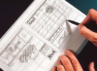

26 50
27 We have designed grids for books, magazines, newspapers, and posters - each one with its own level of specificity - but all following the same basic concept of organizing information. One element of refinement is to plan a grid in such a way that type and illustrations follow the same exact grid. To do that a specific leading should be determined for the type area of each module with the illustration modules coinciding. This gives great elegance of detail to the printed page. It is considered to be good typography as done by the Masters. Depending on the size of the book we like to keep the space between the columns and the modules rather tight - ideally the size of a line of type - which helps to achieve what I said above. One of the great advantages of the computer is in the definition of the grid which can be achieved in a very precise way and much better than before. One can draw a grid based on the leading size, the picture proportions, as well as having overlapping grid for different parts of the content. Naturally, the more complex the grid is, the more complicated the layout becomes, and one has to be very careful about that. Lorem ipsum dolor sit amet Lorem ipsum dolor sit amet, in maecenas pharetra gravida ullamcorper neque. Sed hendrerit proin diam duis eu, cursus odio placerat ultrices adipiscing lectus ornare, ut velit nonummy, quidem vitae turpis enim. Adipiscing a lectus, scelerisque tempus vivamus ac. Arcu fermentum nibh, turpis pharetra gravida urna pellentesque vel, mi sodales, justo congue pretium lectus condimentum, quisque diam consectetur interdum. Ac lorem pellentesque cras, ligula risus integer velit incidunt, luctus nisl iaculis aliquam aenean amet nulla, congue varius, metus donec senectus sed nisi placerat condimentum. Arcu fermentum nibh, turpis pharetra gravida urna pellentesque vel, mi sodales, justo risus integer velit incidunt, luctus nisl congue pretium lectus condimentum. Pellentesque cras, ligula risus integer velit incidunt, luctus nisl iaculis aliquam aenean amet nulla, congue varius, metus donec senectus sed nisi placerat condimentum. Lorem ipsum dolor sit amet Aliquam proin et magnis sit augue, nisl in quos odio eu odio, pellentesque suspendisse nec non pulvinar dui cras, sollicitudin at. Libero cras vel elit iaculis eget. Ultrices orci id egestas at risus sit. Lorem ipsum dolor sit amet, in maecenas pharetra gravida ullamcorper neque. Sed hendrerit proin diam duis eu, scelerisque tempus vivamus ac. Arcu fermentum nibh, pharetra gravida. Urna pellentesque vel, mi sodales, justo congue pretium lectus condimentum, quisque diam consectetur interdum. Ac lorem pellentesque cras, ligula risus integer velit incidunt, luctus nisl iaculis aliquam aenean amet nulla, congue varius, metus donec senectus sed nisi placerat condimentum. Aliquam proin et magnis sit augue, nisl in quos odio eu odio, pellentesque suspendisse nec non pulvinar dui cras, sollicitudin at. Libero cras vel elit iaculis eget. Ultrices orci id egestas at risus sit. Lorem ipsum dolor sit amet, in maecenas pharetra gravida ullamcorper neque. Sed hendrerit proin diam duis eu, cursus odio placerat ultrices adipiscing lectus ornare, ut velit nonummy, quidem vitae turpis enim. Adipiscing a lectus, scelerisque tempus odio, pellentesque suspendisse nec non vivamus ac. 52
28 Typefaces The Basic Ones 54 The advent of the computer generated the phenomena called desktop publishing. This enabled anyone who could type the freedom of using any available typeface and do any kind of distortion. It was a disaster of mega proportions. A cultural pollution of incomparable dimension. As I said, at the time, if all people doing desktop publishing were doctors we would all be dead! Typefaces experienced an incredible explosion. The computer allowed anybody to design new typefaces and that became one of the biggest visual pollution of all times. In order to draw attention to that issue I made an exhibition showing work that we had done over many years by using only four typefaces: Garamond, Bodoni, Century Expanded, and Helvetica. The aim of the exhibition was to show that a large variety of printed matter could be done with an economy of type with great results. In other words, is not the type but what you do with it that counts. The accent was on structure rather than type. I still believe that most typefaces are designed for commercial reasons, just to make money or for identity purposes. In reality the number of good typefaces is rather limited and most of the new ones are elaborations on pre-existing faces. Personally, I can get along well with a half a dozen, to which I can add another half a dozen, but probably no more. Besides those already mentioned, I can add Optima, Futura, Univers (the most advanced design of the century since it comes in 59 variations of the same face), Caslon, Baskerville, and a few other modern cuts. As you can see my list is pretty basic but the great advantage is that it can assure better results. It is also true that in recent years the work of some talented type designers has produced some remarkable results to offset the lack of purpose and quality of most of the other typefaces. One of the most important elements in typography is scale and size relationship. Naturally there are many ways of understanding and expressing typography. I am not interested in describing all the different possibilities as much I am in expressing my point of view and my approach. I see typography as a discipline to organize information in the most objective way possible. I do not like typography intended as an expression of the self, as a pretext for pictorial exercises. I am aware that there is room for that too, but it is not my language and I am not interested in it. I don t believe that when you write dog the type should bark! I prefer a more objective approach: I try to make as clear as possible the different parts of a message by using space, weight, and typographic alignments, such as flush left, centered or justified. There are times when a specific type design may be appropriate, mostly for a logo or a short promotional text, particularly in very ephemeral or promotional contexts. These are not our typical areas of involvement but whenever a brilliant solution is found I appreciate both the intent and the results. I strongly believe that design should never be boring, but I don t think it should be a form of entertainment. Good design is never boring, only bad design is.

29 Garamond, 1532 ABCDEFGHIJKLMNOPQRSTUVWXYZ abcdefghijklmnopqrstuvwxyz Bodoni, 1788 ABCDEFGHIJKLMNOPQRSTUVWXYZ abcdefghijklmnopqrstuvwxyz Century Expanded, 1900 ABCDEFGHIJKLMNOPQRSTUVWXYZ abcdefghijklmnopqrstuvwxyz Futura, 1930 ABCDEFGHIJKLMNOPQRSTUVWXYZ abcdefghijklmnopqrstuvwxyz Times Roman, 1931 ABCDEFGHIJKLMNOPQRSTUVWXYZ abcdefghijklmnopqrstuvwxyz Helvetica, 1957 ABCDEFGHIJKLMNOPQRSTUVWXYZ abcdefghijklmnopqrstuvwxyz


30 58
31 60

32 62


33 Vignelli Associates Designers Segnaletica luminosa di identificazione Stazione Segnaletica Direzionale Vignelli Associates Designers 5mm 1500mm Vignelli Associates Designers 475 Tenth Avenue New York, New York Telephone 212/ Fax 212/ Tenth Avenue New York, New York Telephone 212/ Fax 212/ mm 475 Tenth Avenue New York, New York Telephone 212/ Fax 212/ mm 300mm 5mm Grandi Stazioni S.p.A. 7 Giugno, 1999 Pagina 6 Progetto: Segnaletica delle Stazioni FS Medie e Piccole 25mm 600mm Segnaletica d Informazione Segnaletica di identificazione Stazione sull Edificio Segnaletica Direzionale: Dimensione e modulazione dei pannelli in alluminio verniciato a spruzzo su cui le lettere e i pittogrammi possono essere applicati tramite serigrafia o pellicola adesiva. Scala 1:5 Grandi Stazioni S.p.A. 7 Giugno, 1999 Pagina 79 Progetto: Segnaletica di Identificazione: Segnaletica delle Stazioni FS Tipologie di pannelli in alluminio Medie e Piccole verniciato a spruzzo su cui le lettere e i pittogrammi possono essere applicati tramite serigrafia o pellicola adesiva. Scala 1:5 50mm 150mm 600mm Grandi Stazioni S.p.A. 7 Giugno, 1999 Pagina 912 Progetto: Segnaletica di Identificazione: Segnaletica delle Stazioni FS Pannelli quadrati a doppia faccia Medie e Piccole sporgenti a bandiera dalla parete dell edificio o dai pilastri lungo i binari. Pannelli e supporti in alluminio verniciato a spruzzo su cui pittogrammi e numeri possono essere applicati tramite serigrafia o pellicola adesiva. Scala 1:5 25mm 150mm Vignelli Associates Designers Vignelli Associates Designers 50mm Vignelli Associates Designers 475 Tenth Avenue New York, New York Telephone 212/ Fax 212/ [email protected] Tenth Avenue New York, New York Telephone 212/ Fax 212/ [email protected] Tenth Avenue New York, New York Telephone 212/ Fax 212/ [email protected] Grandi Stazioni S.p.A. 7 Giugno, 1999 Pagina 11 8 Progetto: Segnaletica di Identificazione Segnaletica delle Stazioni FS di Stazione: Medie e Piccole Pannelli in alluminio verniciato a spruzzo con lettere ritagliate e illuminate all interno. Scala 1: mm 100mm 600mm 1500mm Grandi Stazioni S.p.A. 7 Giugnoo, 1999 Pagina 810 Progetto: Segnaletica di Identificazione: Segnaletica delle Stazioni FS Pannelli in alluminio verniciato a Medie e Piccole spruzzo su cui le lettere e i pittogrammi possono essere applicati tramite serigrafia o pellicola adesiva. Scala 1:5 1500mm 50mm 150mm 300mm Grandi Stazioni S.p.A. 7 Giugno, 1999 Pagina Progetto: Segnaletica di Identificazione: Segnaletica delle Stazioni FS Esempi di pannelli in alluminio Medie e Piccole verniciato a spruzzo applicati direttamente sulla parete. Pannelli quadrati e supporti in alluminio verniciato a spruzzo su cui pittogrammi e numeri possono essere applicati tramite serigrafia o pellicola adesiva. Frasc300mm Fras Frascati Uscita 75mm 100mm La sala d'attesa resterá chiusa dalle ore 24,00 alle ore 5,00 Biglietteria Sottopassaggio Ai binari Uscita Vietato attraversare i binari Servirsi del sottopassaggio Biglietteria Uscita Uscita
34 Flush Left, Centered, Justified Most of the time we use flush left. This type of alignment derives from metal composition, particularly in Linotype. Formerly it was faster to keep the alignment on the left side rather then having to kern the slug for every line. It also makes more sense since in our culture we read from left to right and it is better for the eye to go to the next line than having to cope with hyphens all the time. However, it is important to control the shape of the rugged side by shifting sometimes the text from line to line to obtain a better profile. This may be time consuming but aesthetically rewarding. We use centered for lapidary text, invitations, or any rhetorical composition where it may be more appropriate, or for the address at the bottom of a letterhead, and for business cards. Justified is used more for text books, but it is not one of our favorites because it is fundamentally contrived. Lorem ipsum dolor sit amet, in maecenas pharetra gravida ullamcorper neque. Sed hendrerit proin diam duis eu, cursus odio placerat ultrices adipiscing lectus ornare, ut velit nonummy, quidem vitae turpis enim. Adipiscing a lectus, scelerisque tempus vivamus ac. Arcu fermentum nibh, turpis pharetra gravida urna pellentesque vel, mi sodales, justo congue pretium lectus condimentum, quisque diam consectetur interdum. Aliquam proin et magnis sit augue, nisl in quos odio eu odio, pellentesque suspendisse nec non pulvinar dui cras, sollicitudin at. Lorem ipsum dolor sit amet, in maecenas pharetra gravida ullamcorper neque. Sed hendrerit proin diam duis eu, cursus odio placerat ultrices adipiscing lectus ornare, ut velit nonummy, quidem vitae turpis enim. Adipiscing a lectus, scelerisque tempus vivamus ac. Arcu fermentum nibh, turpis pharetra gravida urna pellentesque vel, mi sodales, justo congue pretium lectus condimentum, quisque diam consectetur interdum. Aliquam proin et magnis sit augue, nisl in quos odio eu odio, pellentesque suspendisse nec non pulvinar dui cras, sollicitudin at. 66 Lorem ipsum dolor sit amet, in maecenas pharetra gravida ullamcorper neque. Sed hendrerit proin diam duis eu, cursus odio placerat ultrices adipiscing lectus ornare, ut velit nonummy, quidem vitae turpis enim. Adipiscing a lectus, scelerisque tempus vivamus ac. Arcu fermentum nibh, turpis pharetra gravida urna pellentesque vel, mi sodales, justo congue pretium lectus condimentum, quisque diam consectetur interdum. Aliquam proin et magnis sit augue, nisl in quos odio eu odio, pellentesque suspendisse nec non pulvinar dui cras, sollicitudin at.
35 Type Size Relationship We have some basic rules for typesetting. Choose the proper size of type in relation to the width of the column: 8 on 9, 9 on 10, 10 on 11 pt for columns up to 70 mm. 12 on 13, 14 on 16 for columns up to 140 mm. 16 on 18, 18 on 20, for larger columns. Naturally every situation may require a different ratio. For display reasons we like to set the type much larger or increase the leading to achieve a particular effect. Basically we stick to no more then two type sizes on a printed page, but there are exceptions. We like to play off small type with larger type - usually twice as big (for instance, 10 pt text and 20 pt headings). I prefer to keep the same size for heads and subheads in a text, and just make them in bold, with a line space above and none below, or two line spaces above and one below according to the context. We love type size consistency in a book, which is also more economical since you can set a style page and stick to it. Title Title Lorem ipsum dolor sit amet, in maecenas pharetra gravida ullamcorper neque. Sed hendrerit proin diam duis eu, cursus odio placerat ultrices adipiscing lectus ornare, ut velit nonummy, quidem vitae turpis enim. Adipiscing a lectus, scelerisque tempus vivamus ac. Arcu fermentum nibh, turpis pharetra gravida urna pellentesque vel, mi sodales, justo congue pretium lectus condimentum, quisque diam consectetur interdum. Aliquam proin et magnis sit augue, nisl in quos odio eu odio, pellentesque suspendisse nec non pulvinar dui cras, sollicitudin at. Lorem ipsum dolor sit amet, in maecenas pharetra gravida ullamcorper neque. Sed hendrerit proin diam duis eu, cursus odio placerat ultrices adipiscing lectus ornare, ut velit nonummy, quidem vitae turpis enim. Adipiscing a lectus, scelerisque tempus vivamus ac. Arcu fermentum nibh, turpis pharetra gravida urna pellentesque vel, mi sodales, justo congue pretium lectus condimentum, quisque diam consectetur interdum. Aliquam proin et magnis sit augue, nisl in quos odio eu odio, pellentesque suspendisse nec non pulvinar dui cras, sollicitudin at. We try to achieve a typographic composition that expresses intellectual elegance as opposed to blatant vulgarity by using typographic devices: a proper amount of leading for the context, a proper use of roman or italic type, a regular spacing, a tight kerning, using rulers when appropriate (to separate different parts of the message), and a logical use of bold, regular and light type weights. We do not like the use of type as a decorative element, and we are horrified by any type deformation. There are situations, however, as in packaging design where a more flexible attitude could provide better results. But even there, when used, should be with great moderation. Title Lorem ipsum dolor sit amet, in maecenas pharetra gravida ullamcorper neque. Sed hendrerit proin diam duis eu, cursus odio placerat ultrices adipiscing lectus ornare, ut velit nonummy, quidem vitae turpis enim. Adipiscing a lectus, scelerisque tempus vivamus ac. Arcu fermentum nibh, turpis pharetra gravida urna pellentesque vel, mi sodales, justo congue pretium lectus condimentum, quisque diam consectetur interdum. Aliquam proin et magnis sit augue, nisl in quos odio eu odio, pellentesque suspendisse nec non pulvinar dui cras, sollicitudin at. 68

 will separate major parts of the text, light rulers (1/2 pt or 1 pt) will separate items within each part of the form.")
36 Salotti Fissi o con Letto Stoccolma 1 Codice Articolo Metri Tessuto Tessuto Tessuto Tessuto Tessuto Pelle Tessuto Cliente Cat.B Cat.C-D Cat.E-F Cat. Extra Div Rete Div Rete Div Rete Div Rete Div Rete Div Rete Div Rete Div Rete Div Rete Div Rete Div Rete Stoccolma 2 Codice Articolo Metri Tessuto Tessuto Tessuto Tessuto Tessuto Pelle Tessuto Cliente Cat.B Cat.C-D Cat.E-F Cat. Extra Div Rete Div Rete Div Rete Div Rete Div Rete Div Rete Div Rete Rulers When using rulers I set a hierarchy of weights to clarify the different parts of the text. In a form, for instance, bolder rulers (2 pt) will separate major parts of the text, light rulers (1/2 pt or 1 pt) will separate items within each part of the form. In that situation the type between the rulers will be 8 pt, always set closer to the ruler above. Type should always hang from the ruler, regardless of the size. This is another little but important detail of my Canon. I have a great love and respect for typography and I tried to learn as much as possible from all the great Masters. Most of the things that I have said have been practiced by the Masters of the XX Century. The basic rules of typography have been set long ago but as beautiful scores they have been played in different ways by many talented artists, all making a mark and opening a new way with their interpretations. Stoccolma Fecha de Apertura de Apertura Nombres Apellido Paterno M Ciudad Registro N. Cuenta Apellido Materno Estado Civil 1. Titular Fecha de Nacimiento Teléfono Mas. Fem. Cat. Econ. N. D Profesión o Actividad RUT/C.I. Numero Depto. Comuna Nombres Civil Dirección 2. Segundo Titular Cuenta Bipersonal Apellido Paterno Apellido Materno Fecha de Nacimiento D M Profesión o Actividad Estado Fem. Teléfono Ciudad Cat. Econ. N. Mas. Teléfono RUT/C.I. Numero Depto. Comuna Dirección 3. Datos Adicionales Sólo Personas Jurídicas Nombre Numero Ciudad de la Cuenta Casilla Comuna Dirección Calle N. 4. Aceptación de Condiciones Declaro conocer y aceptar en todas sus Cuenta de ahorro pactada con un máximo de giro(s) partes las condiciones que rigen las cuentas por periodo para reterner derecho a reajuste, para los efectos de considerar de ahorro a plazo de CorpBanca, las que se la cantidad máxima de giros pactados, el primer periodo anual comprende especifican al reverso de este registro, hasta el último día del mes de de 200 fecha en que se efectuará además declaro bajo juramento que los capitalización; los periodos siguientes comprenden 12 meses de calendario sucesivos. hechos consignados por el suscrito(a) son fidesignos. Fecha de de 200 Depto. Firma Firma Titular 2 acto, declaro(amos) recibir contrato En este copia fiel de este Firma Titular 2 70


37 Contrasting Type Sizes One of the most exciting elements of typography for me is the contrast of scale on a printed page. I love the play between a very large type size for headlines versus a much smaller type size for the body text, with proper white space in between. White space for me is a very important element in graphic composition. It is really the white that makes the black sing. White, in typography, is what space is in Architecture. It is the articulation of space that gives Architecture the perfect pitch. Another element is the relationship among type sizes in the same printed page. Our first rule is to stick to one or two type sizes at the most. If necessary, there are other devices such as bold, light, roman and italic to differentiate different parts of a text, but even there, stick to the minimum. Type weights can be used to great advantage when dedicated to a specific function, rather than be used for color purposes or even worse as a phonetic analogy. Some people who talk loud and tend to scream trying to persuade you, love to increase the size and weight of type to make the message louder. That is exactly what I consider intellectual vulgarity - something we try to stay away from. In a world where everybody screams, silence is noticeable. White space provides the silence. That is the essence of our typography. 72


38 Scale The notion of scale is an essential element of the design vocabulary. In the previous paragraph I have given some examples of the meaning of scale in graphic design. Scale is the most appropriate size of an object in its natural context. However, it can be manipulated to achieve particular expression in a particular context - actually by being purposely out of scale. To master the notion of scale is a lifelong search that involves interpretation of functions, both tangible and intangible, physical, and psychological. Scale applies to everything. It can be right or it can be wrong; it can be appropriate or inappropriate; too big or too small for the task at hand. In design the issue of scale is continuously present and we have to master it regardless of the subject because it doesn t allow mistakes. The choice of the proper material, its thickness, its texture, its color, its weight, its sound, its temperature - every detail assails our senses and provokes a response. Therefore, we must be in control of it because by choosing the most appropriate one to convey our message we succeed in our intent. Design means to be in control of every detail and scale is one of the most relevant ones. And so is its opposite, when it is deliberately chosen. An example which comes to mind is the sculptures by Claus Oldenburg where the transformation of scale in a particular context gives power and life to the object. Manipulation of scale implies knowledge and full awareness of the meaning of scale. 74

39 Texture Light is the master of form and texture. It is by mastering light that we can achieve the expression of any artifact. The basic qualities of reflection or absorption of light are the elements to play with in designing any kind of object. A glass will reveal its color when light passes through it, or will be trapped inside of it if the surface has been etched, engraved, or treated with some texture. A silver object, when polished, reflects light and when engraved, will trap the light. Any shiny surface reflects light, any dull surface absorbs light, and this is true for any material including paper. A polished material has completely different and sometimes opposite connotations from a matte surface, a wide spectrum ranging from rich to poor, from opulent to restrained. Texture has an infinite range of tactile or visual experiences and it is essential for designers to sharpen their perception in order to articulate and master the media. It is through the choice of materials and their finishes that we articulate the shape of an object to express its content, to celebrate its appropriateness, to reveal its soul. Texture and color in a mutually supporting dialogue define any creative artifact - anything waiting for us to decode its inner secrets and thereby enrich our perception and transfer it to whatever we choose. 76


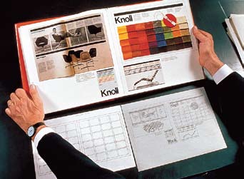
40 Color Most of the time we use color as a Signifier, or as an Identifier. Generally speaking we do not use color in a pictorial manner. Therefore, we tend to prefer a primary palette of Red, Blue, and Yellow. This may seem restrictive. This doesn t mean that we do not like colors or that we are not sensitive to them. It merely means that most of the time we like to use color to convey a specific message, therefore, we tend to use it more as symbol or as an identifier. This is particularly true in Corporate Identity Programs where Chromotype becomes the Identifier along with the Logotype or other devices (morphotypes, phonotypes etc.) We have used the entire spectrum of colors to express moods, feelings, passions, connotations and more. Color is a very important element in the formulation of our projects, but, as we do with typefaces, we have limited and articulated our palette to express the message in the clearest and most understandable way. There are times for strong primary colors and times for subtle pastel colors; there are times for just black and white; and times where rich browns and hearty colors work more appropriately to the task at hand. Appropriateness is one of the rules we use in choosing colors knowing how effective it can be to use the right color at the right time. 78
41 Layouts 80 Any kind of publication has different layout requirements. However, it is inevitable that the layouts reflect the interpretation of the designer. Most publications are composed of text, images and captions and the task of the designer is to sift through the images to select those which best portray the essence of the content and possess the quality of becoming an icon. An icon is an image that expresses its content in the most memorable way. Once again, in designing any kind of publication the most helpful device is the grid. Once the outside margins are established (I tend to like narrow margins to increase the tension) the basic grid should be devised according to the nature of the publication: 2, 3 or 4 columns for a book or a brochure, 6 or more, for a newspaper. Once the number of vertical divisions are decided the next step is horizontal divisions which will provide the number of modules per page. Again 2, 3, 4, 5, 6, 8 or more, according to the variety need of the publication. In defining the grid, one has to keep in mind what kind of visual material will comprise the layout. For square pictures a square grid may be better than a rectangular one, well suited for rectangular images. Or, if the publication has a consistent variety of the two formats, one could design a double grid accommodating both situations. Or, otherwise, when appropriate, crop the picture to follow the grid. It is important to remember that many devices are available to make layouts exciting. The purpose of the grid is to provide consistency to the layouts, but not necessarily excitement - which will be provided by the sum of all the elements in the design. Outlined images, line drawings, and bold initials, can add sparks to the page as a variety of other devices. Great designs can be achieved without the use of the grid, but the grid is a very useful tool to guarantee results. Ultimately the most important device is the management of the white space in the layouts. It is the white space that makes the layout sing. Bad layouts have no space left for breathing - every little space covered by a cacophony of type-sizes, images, and screaming titles. For literary books the margins follow a different set of considerations, ranging from the position of the thumbs - when holding the book - to an overall shape of the text column, or to the need of providing space for side notations (either by the author or by the reader). Some considerations are practical others are aesthetic. We have designed all kind of books covering a variety of needs and situations. It is important that proper attention is given even to small details, such as to design the most appropriate margins for that publication. Every detail is important to achieve the final look of a publication. I have applied these basic rules to an endless list of publications, from brochures to annual reports, from books to encyclopedias, from magazines to newspapers, from programs to posters and I still do it with pretty good results.


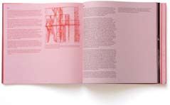


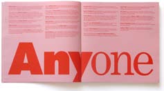

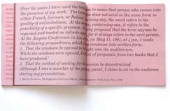
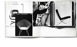


42 82


43 Sequence If sifting the images is the first task in the process of publication, the sequence of layouts is definitively the next one. A publication, whether a magazine, a book, a brochure, or even a tabloid is a cinematic object where turning of the pages is an integral part of the reading experience. A publication is simultaneously the static experience of a spread and the cinematic experience of a sequence of pages. Therefore, we attribute great importance to this detail of the layout process. We like the layouts to be forceful. We do not like limpy layouts with little pictures spreaded around the pages - some bleeding here, some bleeding there in a casual way. We tend to like a form of layout that almost disappears to the eyes of the reader. We would say that if you see the layout, it is probably a bad layout! The book layout we tend to favor is a very simple format of a page of text beside a picture on a full bleed page, followed by a full bleed picture spread, followed by a page with a full bleed picture facing a white page with a picture - either on the center or upper right corner. A simple format gives rewarding results when the basic sequence is articulated in a way that is not repetitive. Actually the nature of the publication will help to overcome the monotony of this approach. We would rather see this sort of neutral approach than the obtrusive assault of many layouts, but, then again, there should be room for everyone in the creative process. 84
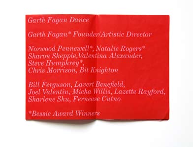
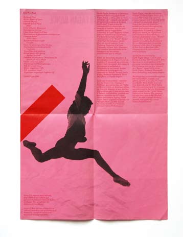

44 86


45 Binding One cannot talk about books without discussing the binding. The binding of a book or a brochure adds the final touch of quality to the product. There are several components in a binding and several choices to make: Cover If the cover is going to be laminated with paper you must recommend a calendered cardboard so that the surface will be smooth. If the cover is going to be laminated with cloth or leather a regular chipboard could be sufficient. Spine The spine could be round or square. We prefer the square because it gives the book a sharper look. Headband This is the finish between the spine and the book. It exist in many variations and we like the plain white most. Endpapers This is the part that connects the book to its binding and it is usually made with a stronger paper than the one of the book. It could be printed in a solid color or have a pattern or an illustration. In the past very fancy endpapers were used for this function. 88 Sandwich Early in my career I developed a type of book binding that I called sandwich. It consists of a panel of chipboard, or any other material, on the front and one at the end of the book glued to the endpapers. The spine is made of cloth, generally white, with the title hot-stamped on it. The final look is that of two gray boards holding a stack of white pages. Hence, the name sandwich binding. Since then it has become common, and sometimes the cover is printed, laminated, and wrapped around the cardboard. The main reason for this binding is to enable the book to open flat - which is particularly convenient in picture books when you have one image across the spread.


46 Identity and Diversity The notion of identity and diversity is a recurrent theme in both two and three dimensional design. In a Corporate Identity Program enough diversity must be provided to avoid sameness and to increase attention. Too much diversity creates fragmentation - a very common disease of badly designed communication. Too much identity generates perceptive redundancy and lack of retention. Therefore, it is necessary to achieve the proper balance between those components, or to offer enough flexibility in any given design solution to overcome those pitfalls. We like to play with those elements. We like to design a strong identity program in which there is enough room to play appropriateness without loosing identity. A typical example would be a book series where the basic identifiers are constant and the specific illustration changes from cover to cover. Also, in the design of furniture, we like to involve the user to define the final look of the object. In some of the tables we have designed, changing the relative position of the elements provides diversity without compromising the identity of the design. Identity and diversity - an essential contraposition to bring life to design. 90


47 White Space I often say that in typography the white space is more important than the black of the type. The white space on the printed page is the correspondent of space in architecture. In both situations space is what qualifies the context. Naturally, the organization of information needs a structure to hold together, but one should not underestimate the importance of white space to better define the hierarchy of every component. White space, non only separates the different parts of the message but helps to position the message in the context of the page. Tight margins establish a tension between text, images and the edges of the page. Wider margins deflate the tension and bring about a certain level of serenity to the page. Tight type setting transforms words into lines just as loose type settings transform words in to dots. Decreasing or increasing the letter spacing (kearning) confers very distinctive character and expression to the words. All this is space manipulation and it is this device that is used in layouts to achieve a desired expression. The relationship between the size of type and the space around it is one of the most delicate and precious elements of a composition. I must say that the masterful handling of white space on a printed page is perhaps the most peculiar attribute of American graphic design. Just like space is the protagonist in Frank Lloyd Wright s architecture. Somehow, it relates to the epic grandeur of the American landscapes. For many artists white space is the essential element of the composition. It is the fundamental qualifier and protagonist of the image. Almost all the great American graphic designers have used white space as the significant silence to better hear their message loud and clear. Such is indeed the power of the white space. 92


48 A collection of experiences Very early on we discovered that modular and standard dimensions offer benefits that are economical from both cost and meaning points of view. The use of standard and modular sizes of paper in the printing industry can achieve considerable savings. The standardization of paper sizes in the project we did for the National Park Service economized million of dollars - something we are proud of. Standardization related to the size of construction materials can bring significant savings in any three dimensional project. Odd sizes imply more labor costs and waste of materials. It is imperative that a designer becomes familiar with all these aspects of design and the realization process. It is part of our ethics as well as our design vocabulary. Costly solutions can never be a product of good design because economy is at the essence of the design expression. Economy doesn t mean cheap design. Economy in design is the most appropriate and lean solution to every problem. Contrived solutions are never good nor long lasting. Quality is not necessarily more expensive than cheap solutions. Good design doesn t cost more than bad design. The opposite is quite true, very often. In the course of a lifetime it s been possible to continuously evaluate details covering the whole spectrum of materials from the diameter of a pipe, to the texture and color of any material. This process of observation and selection has gradually built up an inventory of choices and feelings eventually leading to a personal canon - which becomes a recurrent element of our creative vocabulary. I think that this is quite an important aspect of a modus operandi. There are some basic elements, such as size relationship between parts of a given object, that are governed very often by a modular relationship ranging, for example, from single to double, from one to three, or four or more, but not an odd size in between. Also, a disc within a disc will have a diameter half the size of the larger or a third of it but not an odd, casual size. And that is because there is some universal harmony that demands those choices. This process of sifting and selecting extends to everything around us - colors, textures, materials. It involves every detail, thickness, width, and height. Every sense of our body gets involved but it must be processed, analyzed, evaluated, and finally filed in our memory according to our personal canon, not in an arbitrary way. Freedom of choice can only happen with knowledge and that is an ongoing process that requires structure and determination, not happenstance. 94
49 Conclusion Throughout our creative lives we have sifted through everything to select what we thought best. We sifted through materials to find those for which we have the closest affinity. We sifted through colors, textures, typefaces, images, and gradually we built a vocabulary of materials and experiences that enable us to express our solutions to given problems - our interpretations of reality. It is imperative to develop your own vocabulary of your own language - a language that attempts to be as objective as possible, knowing very well that even objectivity is subjective. I love systems and despise happenstance. I love ambiguity because, for me, ambiguity means plurality of meanings. I love contradiction because it keeps things moving, preventing them from assuming a frozen meaning, or becoming a monument to immobility. As much as I love things in flux, I love them within a frame of reference - a consistent reassurance that at least and at last I am the one responsible for every detail. And that is why I love Design. 96
Every Which Way But Direct!
 A Review of Service Diversion Communication Bronx Service Affected No Bronx-bound (241 St-bound) trains at this station 2 WEEKDAYS 10:45 AM to 3 PM Mon to Fri February 2014 S M T W T F S 2 3 4 5 6 7 8
Longman Communication 3000
 LONGMAN COMMUNICATION 3000 1 Longman Communication 3000 The Longman Communication 3000 is a list of the 3000 most frequent words in both spoken and written English, based on statistical analysis of the
Basic Marketing Research: Volume 1
 Basic Marketing Research: Volume 1 Handbook for Research Professionals Official Training Guide from Qualtrics Scott M. Smith Gerald S. Albaum Copyright 2012, Qualtrics Labs, Inc. ISBN: 978-0-9849328-1-8
As Good As They Give. Providing volunteers with the management they deserve. Workbook Two Attracting and Selecting Volunteers
 As Good As They Give Providing volunteers with the management they deserve Workbook Two Attracting and Selecting Volunteers Volunteering takes many forms - traditional service giving, mutual aid and self-help,
Rich Data, Poor Data Designing Dashboards to Inform
 Rich Data, Poor Data Designing Dashboards to Inform by Stephen Few A note about the author Stephen Few has worked for 24 years as an IT innovator, consultant, and educator. Today, as Principal of the consultancy
Develop Your Personal Leadership Style
 Self-Paced Course In this course you will explore and develop your unique leadership style, and identify what kind of leadership would be most effective for your particular situation. You will create a
IP ASSETS MANAGEMENT SERIES. Successful Technology Licensing
 IP ASSETS MANAGEMENT SERIES 1 Successful Technology Licensing 2 Successful Technology Licensing I. INTRODUCTION II. III. IV. PREPARATION FOR NEGOTIATION KEY TERMS CONDUCTING THE NEGOTIATION V. USING THE
A simple guide to improving services
 NHS CANCER DIAGNOSTICS HEART LUNG STROKE NHS Improvement First steps towards quality improvement: A simple guide to improving services IMPROVEMENT. PEOPLE. QUALITY. STAFF. DATA. STEPS. LEAN. PATIENTS.
Mobility, Economic Opportunity and New York City Neighborhoods
 Mobility, Economic Opportunity and New York City Neighborhoods Sarah M. Kaufman, Mitchell L. Moss, Justin Tyndall and Jorge Hernandez December 2014 with support from Mobililty, Economic Opportunity and
GUIDE TO ACADEMIC WRITING
 GUIDE TO ACADEMIC WRITING University of the Western Cape September 2003 Introduction Compiling a Guide to Academic Writing is a tricky thing to do there is no standard format of academic writing that can
The common base of knowledge and skills
 The common base of knowledge and skills The common base of knowledge and skills The common base of knowledge and skills «All that must be mastered at the end of compulsory education» Decree dated 11 July
So You Want to Be a Consultant!
 AFP S R EADY R EFERENCE S ERIES So You Want to Be a Consultant! PROS AND CONS SERVING YOUR CLIENTS MANAGING YOUR BUSINESS MARKETING AND BRANDING THE ASSOCIATION OF FUNDRAISING PROFESSIONALS (AFP) WHO WE
Considering the economic implications as educational institutions expand online learning initiatives.
 Vviewpoints doi:10.1145/2436256.2436264 Michael A. Cusumano Technology Strategy and Management Are the Costs of Free Too High in Online Education? Considering the economic implications as educational institutions
Foundations of Interpretation Curriculum Content Narrative. Foundational Competencies for All NPS Interpreters
 Foundations of Interpretation Curriculum Content Narrative National Park Service U.S. Department of the Interior Interpretive Development Program Foundational Competencies for All NPS Interpreters This
Standards for Technological Literacy
 Standards for Technological Literacy Content for the Study of Technology Third Edition Standards for Technological Literacy: Content for the Study of Technology Third Edition International Technology
Is that paper really due today? : differences in first-generation and traditional college students understandings of faculty expectations
 DOI 10.1007/s10734-007-9065-5 Is that paper really due today? : differences in first-generation and traditional college students understandings of faculty expectations Peter J. Collier Æ David L. Morgan
THE BEST THAT MONEY CAN T BUY BEYOND POLITICS, POVERTY, & WAR By Jacque Fresco
 Jacque Fresco Page 1 sur 126 THE BEST THAT MONEY CAN T BUY BY JACQUE FRESCO Models Illustrations & Photos JACQUE FRESCO & ROXANNE MEADOWS Model Designs JACQUE FRESCO GLOBAL CYBER-VISIONS VENUS * FLORIDA
About learning. Report of the Learning Working Group
 About learning Report of the Learning Working Group Open access. Some rights reserved. As the publisher of this work, Demos has an open access policy which enables anyone to access our content electronically
Making Smart IT Choices
 Making Smart IT Choices Understanding Value and Risk in Government IT Investments Sharon S. Dawes Theresa A. Pardo Stephanie Simon Anthony M. Cresswell Mark F. LaVigne David F. Andersen Peter A. Bloniarz
The Science of Engagement. An exploration into the true nature of engagement - what it means and what causes it. Grounded in science, not fiction.
 The Science of Engagement An exploration into the true nature of engagement - what it means and what causes it. Grounded in science, not fiction. Foreword For a while now, we at Weber Shandwick have been
Technology for All Americans. A Rationale and Structure for the Study of Technology
 Technology for All Americans A Rationale and Structure for the Study of Technology Technology is human innovation in action Technology for All Americans: A Rationale and Structure for the Study of Technology
How To Write a Good PRD. Martin Cagan Silicon Valley Product Group
 How To Write a Good PRD Martin Cagan Silicon Valley Product Group HOW TO WRITE A GOOD PRD Martin Cagan, Silicon Valley Product Group OVERVIEW The PRD describes the product your company will build. It
Sponsored By. www.tccp.org. Compiled and Edited By Michael True Director, Internship Center Messiah College Grantham, PA 17027 (mtrue@messiah.
 Sponsored By www.tccp.org Compiled and Edited By Michael True Director, Internship Center Messiah College Grantham, PA 17027 ([email protected]) Special thanks to the Pittsburgh Technology Council and
Recognition of learning, focusing on inclusion groups
 Recognition of learning, focusing on inclusion groups Download this booklet for free at www.salto-youth.net/inclusion/ SALTO-YOUTH I N C L U S I O N RESOURCE CENTRE Education and Culture SALTO-YOUTH TRAINING
Your Business. www.nylovessmallbiz.com. A Guide to Owning and Operating a Small Business in New York State
 Your Business www.nylovessmallbiz.com A Guide to Owning and Operating a Small Business in New York State A Guide To Owning and Operating a Small Business in New York State Contents CHAPTER 1: Foundations
Research report May 2014. Leadership Easier said than done
 Research report May 2014 Leadership Easier said than done WORK WORKFORCE WORKPLACE Championing better work and working lives The CIPDs purpose is to champion better work and working lives by improving
Designed by: Lella Vignelli
 Designed by: Lella Vignelli Designed by: Lella Vignelli Acknowledgements My most sincere appreciation to: Jan Conradi, with many thanks for her patience and advice in reading and correcting my English.
Good Research Practice What Is It?
 Good Research Practice What Is It? Explores some of the ethical issues that arise in research, and is intended to provide a basis for reflection and discussion. It is aimed at researchers in every field
JCR or RDBMS why, when, how?
 JCR or RDBMS why, when, how? Bertil Chapuis 12/31/2008 Creative Commons Attribution 2.5 Switzerland License This paper compares java content repositories (JCR) and relational database management systems
Paul Kloosterman. > What do I want/need to learn? > How can I learn it? > When will I learn? > Who can help me learn it?
 30 B1 How to support learning Paul Kloosterman This chapter aims to help you get to grips with the term learning in relation to concrete activities in the Youth in Action Programme. Different methods and