Table of contents. LAZ Parking Shareholding Partner 22. VINCI Park Corporate Logotype 23. LAZ Parking Division/ SILO Logotypes 24
|
|
|
- Nancy Leonard
- 7 years ago
- Views:
Transcription

1 BRAND IDENTITY
2 Table of contents Introduction 4 LAZ Parking Corporate Logotype 7 Introduction 8 Design 9 Colors 10 Monochrome 11 Exclusion Area 13 Clear Space 14 Minimum Size 15 Various Backgrounds 16 Restrictions 18 Partners In Parking TM Tagline 20 LAZ Parking Shareholding Partner 22 VINCI Park Corporate Logotype 23 LAZ Parking Division/ SILO Logotypes 24 LAZ Medical Logotype 25 Design 26 Colors 27 Monochrome 28 Division/SILO Color Theme 30 Exclusion Area 31 Clear Space 32 Minimum Size 33 Various Backgrounds 34 Restrictions 36 Partners In Caring Tagline 38 LAZ Ultimate Hospitality Logotype 40 Design 41 Colors 42 Monochrome 43 Division/SILO Color Theme 45 2
3 Table of contents Exclusion Area 46 Clear Space 47 Minimum Size 48 Various Backgrounds 49 Restrictions 51 Opening Doors To People Tagline 53 LAZ Fly Logotype 55 Colors 56 LAZ Municipal Parking Logotype 57 LAZ Event Parking Logotype 58 LAZ Parking Companies Logotypes 59 Sunset Parking Service 60 Colors 61 Various Backgrounds 62 Ultimate Parking 63 Colors 64 Various Backgrounds 65 Family Of Companies 66 Design 67 Various Backgrounds 68 LAZ Parking Internal Logotypes 69 LAZ Parking Charitable Foundation 70 LAZ Innovation Awards 71 LAZ 30 Years 72 LAZ Parking Typeface 73 Trebuchet Typeface 74 Letter Case 75 LAZ Parking Online Portal 76 Download and Use of Brand Identity Material 77 LAZ Portal Structure 78 3
4 Introduction
5 Introduction The aim of the visual identity for LAZ Parking and its brands is to enable the companies to ensure consistency in their communications and to be easily recognized wherever they communicate and on all the media that they produce. It plays a key role in strengthening our image and forms a strong visual link between each company and its partners, as well as between the brands and their target groups. The graphic guidelines are a tool listing all the layout rules to be observed, with illustrations showing the possible applications on various media. Designed to assert a single, strong image, which will be easily recognizable on all communications media, the visual identity must be adhered to and complied with by all personnel at LAZ. These graphic guidelines concern the visual identity of LAZ Parking. 5
6 Introduction LAZ Parking Division/SILO LAZ Parking Companies LAZ Parking Internal LAZ Municipal Parking LAZ Event Parking 6
7 LAZ Parking Corporate Logotype
8 LAZ Parking Corporate Logotype Introduction This logotype is the fundamental core element of LAZ Parking s visual identity. It must be used in compliance with the rules relating to the following points, which must not be altered: - Design - Colors to be used - Placement (exclusion area & clear space) - Minimum size It is only by strict compliance with these rules that we can guarantee a strong and consistent brand image is transmitted on all media. 8
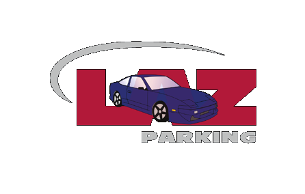
9 LAZ Parking Corporate Logotype Design The LAZ Parking logotype is the brand s signature. It is composed of three inseparable elements: - The name LAZ, in its distinctive typeface - The grey swoosh element - The baseline Parking in its distinctive typeface The three elements of the logotype must always be kept together and the same proportions maintained. 9
10 LAZ Parking Corporate Logotype Colors The color references for the logotype are: - Pantone 201C red for the name LAZ - Pantone Cool Gray 5C for the swoosh and the baseline Parking - Pantone 287C blue for the LAZ blue background Depending on the type of application, the color logotype can be used: - In Pantone or in quadrichrome, for printing purposes - In RGB, for on-screen purposes PANTONE COLORS 201 C Cool Gray 5 C 287 C FOUR-COLOR PROCESS COLORS C : 000 M : 100 Y : 063 K : 029 C : 000 M : 000 Y : 000 K : 029 C : 100 M : 068 Y : 000 K : 012 SCREEN COLORS R : 177 G : 000 B : 053 R : 200 G : 201 B : 202 R : 000 G : 076 B :
11 LAZ Parking Corporate Logotype Monochrome There are two types of monochrome logotype: - The black monochrome logotype is to be used wherever possible (fax, administrative documents). - The grey monochrome logotype may be used for specific (top-end) publishing communications. This logotype is not recommended for use with signage applications. The monochrome logotype may be used in the following ways: - In Pantone or in a four-colour process version for printing - In RGB for screen use PANTONE COLORS Black C FOUR-COLOR PROCESS COLORS C : 085 M : 085 Y : 080 K : 100 SCREEN COLORS R : 000 G : 000 B :
12 LAZ Parking Corporate Logotype PANTONE COLORS Cool Gray 5 C FOUR-COLOR PROCESS COLORS C : 000 M : 000 Y : 000 K : 029 SCREEN COLORS R : 200 G : 201 B :
13 LAZ Parking Corporate Logotype Exclusion Area The exclusion area is an area of non-interference around the logotype upon which no other graphic or textual element may encroach. Its dimensions are determined by the height of the letter Z in the LAZ name. This minimum exclusion area is to be complied with right around the perimeter of the logotype for all types of use. It is proportional in size to the logotype itself. 13
14 LAZ Parking Corporate Logotype Clear Space A clear space is to be left around the logotype when it is used to sign publishing documents. For these purposes, a clear space for the signature equivalent to two letter Z s is to be left around the logotype for greater protection against unwanted encroachment. 14
15 LAZ Parking Corporate Logotype Minimum Size In order to optimize legibility, the logotype must be of the required minimum size. Any use of a logotype that is smaller in size is prohibited. The minimum size may vary depending on the application: inches for printed documents pixels for screen applications inches for embroidery applications PRINT SCREEN EMBROIDERED 0.8 in 100 px 2.5 in 15
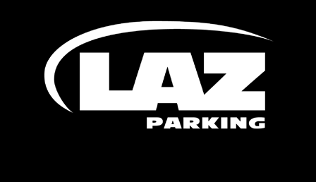
16 LAZ Parking Corporate Logotype Various Backgrounds The logotype may be placed against different backgrounds. Some examples of applications are shown below and on the next page: - On LAZ blue, black and white backgrounds: color logotype - On dark to mid-range backgrounds: white monochrome logotype - On light background: black monochrome logotype It is always essential to ensure that the logotype is as legible as possible. Note: the LAZ full color logotype should be used whenever possible. 16
17 LAZ Parking Corporate Logotype DARK MID-RANGE LIGHT Sample of logotype use on various backgrounds 17
18 LAZ Parking Corporate Logotype Restrictions The illustration on the next page shows a number of ways in which the LAZ logotype must NOT be used. This list is not exhaustive. To avoid errors, the source files available for download from the Logotype section must be used and you must be familiar with the rules governing use of the logotype. Some comments relating to the different illustrated scenarios are listed below: Do NOT: 1: Use another color. 2: Modify an institutional color. 3: Mix the monochrome logotype and the color logotype. 4: Locate the logotype inside a shape. 5: Use a fancy typeface. 6: Use a typeface other than that specified. 7: Redesign the logotype. 8: Change the proportions of any of the elements in the logotype. 9: Locate the logotype inside a block. 10: Distort the logotype. 11: Apply contours. 12: Use one of the elements of the logotype in isolation. 13: Create your own logotype. 14: Use a low resolution resulting in a pixelized logotype. 15: Apply an effect. 16: Fail to observe the exclusion area. 17: Position elements in another way than that specified. 18: Use the logotype for another purpose than intended. 19: Remove one of the elements of the logotype. 20: Position the logotype over an image. 18


19 LAZ Parking Corporate Logotype DONT S 19
20 LAZ Parking Corporate Logotype Partners In Parking TM Tagline The utilization and application of the LAZ tagline, Partners In Parking TM, are subject to guidelines. Its use varies according to the type of communication in which it is included. The tagline may be placed in two different alignments: vertical or horizontal. Partners In Parking TM Partners In Parking TM Horizontal alignment Tagline specifications Font: Georgia Style: Bold Italic 20
21 LAZ Medical Logotype PARTNERS IN PARKING PARTNERS IN PARKING x x Vertical alignment Tagline specifications Font: Trebuchet Style: Bold 21
22 LAZ Parking Shareholding Partner
23 VINCI Park Corporate Logotype Colors The color references for the logotype are: - Pantone 280C blue for the name VINCI Park - Pantone 485C red for the connectors emblem Depending on the type of application, the logotype can be used: - in Pantone or in quadrichrome, for printing purposes - in RGB, for on-screen purposes PANTONE COLORS 280 C 485 C FOUR-COLOR PROCESS COLORS C : 100 M : 072 Y : 000 K : 018 C : 000 M : 100 Y : 091 K : 000 SCREEN COLORS R : 000 G : 068 B : 137 R : 226 G : 000 B :
24 LAZ Parking Division/ SILO Logotypes
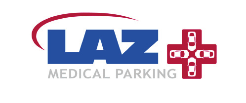
25 LAZ Medical Logotype
26 LAZ Medical Logotype Design The LAZ Medical logotype is composed of four inseparable elements: - The name LAZ, in its distinctive typeface - The grey swoosh element - The baseline Medical Parking, in its distinctive typeface - The blue cross The four elements of the logotype must always be kept together and the same proportions maintained. It is only by strict compliance with these rules that we can guarantee a strong and consistent brand image is transmitted on all media. 26
27 LAZ Medical Logotype Colors The color references for the logotype are: - Pantone 201 C red for the name LAZ and the baseline Medical Parking - Pantone Cool Gray 5C for the swoosh - Pantone 287 C blue for the cross Depending on the type of application, the logotype can be used: - In Pantone or in quadrichrome, for printing purposes - In RGB, for on-screen purposes PANTONE COLORS 201 C Cool Gray 5 C 287 C FOUR-COLOR PROCESS COLORS C : 000 M : 100 Y : 063 K : 029 C : 000 M : 000 Y : 000 K : 029 C : 100 M : 068 Y : 000 K : 012 SCREEN COLORS R : 177 G : 000 B : 053 R : 200 G : 201 B : 202 R : 000 G : 076 B :
28 LAZ Medical Logotype Monochrome There are two types of monochrome logotype: - The black monochrome logotype is to be used wherever possible (fax, administrative documents). - The grey monochrome logotype may be used for specific (top-end) publishing communications. This logotype is not recommended for use with signage applications. The logotype may be used in the following ways: - In Pantone or in a four-color process version for printing. - In RGB for screen use. PANTONE COLORS Black C FOUR-COLOR PROCESS COLORS C : 085 M : 085 Y : 080 K : 100 SCREEN COLORS R : 000 G : 000 B :
29 LAZ Medical Logotype PANTONE COLORS Cool Gray 5 C FOUR-COLOR PROCESS COLORS C : 000 M : 000 Y : 000 K : 029 SCREEN COLORS R : 200 G : 201 B :
30 LAZ Medical Logotype Division/SILO Color Theme LAZ Medical SILO use a dedicated color theme which is consistent with the SILO brochure and inserts as well as the PowerPoint template. The color theme is described below. When using the LAZ Medical color theme, the white monochrome logotype shall be applied. PANTONE COLORS 287C 60% Tint FOUR-COLOR PROCESS COLORS C : 060 M : 041 Y : 000 K : 007 SCREEN COLORS R : 109 G : 135 B :
31 LAZ Medical Logotype Exclusion Area The exclusion area is an area of non-interference around the logotype upon which no other graphic or textual element may encroach. Its dimensions are determined by the height of the letter Z in the LAZ name. This minimum exclusion area is to be complied with right around the perimeter of the logotype for all types of use. It is proportional in size to the logotype itself. 31
32 LAZ Medical Logotype Clear Space A clear space is to be left around the logotype when it is used to sign publishing documents. For these purposes, a clear space for the signature equivalent to two letter Z s is to be left around the logotype for greater protection against unwanted encroachment. 32
33 LAZ Medical Logotype Minimum Size In order to optimize legibility, the logotype must be of the required minimum size. Any use of a logotype that is smaller in size is prohibited. The minimum size may vary depending on the application: inches for printed documents pixels for screen applications inches for embroidery applications PRINT SCREEN EMBROIDERED 1.1 in 140 px 3.6 in 33
34 LAZ Medical Logotype Various Backgrounds The logotype may be placed against different backgrounds. Some examples of applications are shown below and on the next page: - On black and white backgrounds: color logotype - On dark to mid-range backgrounds: white monochrome logotype - On light background: black monochrome logotype It is always essential to ensure that the logotype is as legible as possible. Note: the LAZ Medical full color logotype should be used whenever possible. 34
35 LAZ Medical Logotype DARK MID-RANGE LIGHT Sample of logotype use on various backgrounds 35
36 LAZ Medical Logotype Restrictions The illustration on the next page shows a number of ways in which the LAZ Medical logotype must NOT be used. This list is not exhaustive. To avoid errors, the source files available to download from the Logotype section must be used and you must be familiar with the rules governing use of the logotype. Some comments relating to the different illustrated scenarios are listed below: Do NOT: 1: Use another color. 2: Modify an institutional color. 3: Mix the monochrome logotype and the color logotype. 4: Locate the logotype inside a shape. 5: Use a fancy typeface. 6: Use a typeface other than that specified. 7: Redesign the logotype. 8: Change the proportions of any of the elements in the logotype. 9: Locate the logotype inside a block. 10: Distort the logotype. 11: Apply contours. 12: Use one of the elements of the logotype in isolation. 13: Create your own logotype. 14: Use a low resolution resulting in a pixelized logotype. 15: Apply an effect. 16: Fail to observe the exclusion area. 17: Position elements in another way than that specified. 18: Use the logotype for another purpose than intended. 19: Remove one of the elements of the logotype. 20: Position the logotype over an image. 36


37 LAZ Medical Logotype DONT S 37
38 LAZ Medical Logotype Partners In Caring tagline The utilization and application of the LAZ Medical tagline, Partners In Caring, are subject to guidelines. Its use varies according to the type of communication in which it is included. There are two variations - The tagline is included in the LAZ Medical logotype below the base line. - The tagline is vertically aligned and located above the LAZ Medical logotype (see brochure and PowerPoint template for reference). 38
39 LAZ Medical Logotype PARTNERS IN CARING PARTNERS IN CARING Tagline specifications Font: Trebuchet MS Style: Bold 39
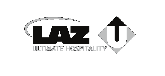
40 LAZ Ultimate Hospitality Logotype
41 LAZ Ultimate Hospitality Logotype Design The LAZ Ultimate Hospitality logotype is composed of four inseparable elements: - The name LAZ, in its distinctive typeface - The grey swoosh element - The in-square U - The baseline Ultimate Hospitality in its distinctive typeface The four elements of the logotype must always be kept together and the same proportions maintained. It is only by strict compliance with these rules that we can guarantee a strong and consistent brand image is transmitted on all media. 41
42 LAZ Ultimate Hospitality Logotype Colors The color references for the logotype are: - Pantone 201 C red for the name LAZ, the three square corners and the baseline - Pantone Cool Gray 5C for the swoosh element - Pantone 116 C yellow for the top corner of the square Depending on the type of application, the logotype can be used: - In Pantone or in quadrichrome, for printing purposes - In RGB, for on-screen purposes PANTONE COLORS 201 C Cool Gray 5 C 116 C FOUR-COLOR PROCESS COLORS C : 000 M : 100 Y : 063 K : 029 C : 000 M : 000 Y : 000 K : 029 C : 000 M : 016 Y : 100 K : 000 SCREEN COLORS R : 177 G : 000 B : 053 R : 200 G : 201 B : 202 R : 255 G : 211 B :
43 LAZ Ultimate Hospitality Logotype Monochrome There are two types of monochrome logotype: - The black monochrome logotype is to be used wherever possible (fax, administrative documents). - The grey monochrome logotype may be used for specific (top-end) publishing communications. This logotype is not recommended for use with signage applications. The logotype may be used in the following ways: - In Pantone or in a four-color process version for printing. - In RGB for screen use. PANTONE COLORS Black C FOUR-COLOR PROCESS COLORS C : 085 M : 085 Y : 080 K : 100 SCREEN COLORS R : 000 G : 000 B :
44 LAZ Ultimate Hospitality Logotype PANTONE COLORS Cool Gray 5 C FOUR-COLOR PROCESS COLORS C : 000 M : 000 Y : 000 K : 029 SCREEN COLORS R : 200 G : 201 B :
45 LAZ Ultimate Hospitality Logotype Division/SILO Color Theme LAZ Ultimate Hospitality SILO use a dedicated color theme which is consistent with the SILO brochure and inserts as well as the PowerPoint template. The color theme is described below. When using the LAZ Ultimate Hospitality color theme, the color logotype shall be applied. PANTONE COLORS Black C FOUR-COLOR PROCESS COLORS C : 085 M : 085 Y : 080 K : 100 SCREEN COLORS R : 000 G : 000 B :
46 LAZ Ultimate Hospitality Logotype Exclusion Area The exclusion area is an area of non-interference around the logotype upon which no other graphic or textual element may encroach. Its dimensions are determined by the height of the letter Z in the LAZ name. This minimum exclusion area is to be complied with right around the perimeter of the logotype for all types of use. It is proportional in size to the logotype itself. 46
47 LAZ Ultimate Hospitality Logotype Clear Space A clear space is to be left around the logotype when it is used to sign publishing documents. For these purposes, a clear space for the signature equivalent to two letter Z s is to be left around the logotype for greater protection against unwanted encroachment. 47
48 LAZ Ultimate Hospitality Logotype Minimum Size In order to optimize legibility, the logotype must be of the required minimum size. Any use of a logotype that is smaller in size is prohibited. The minimum size may vary depending on the application: inches for printed documents pixels for screen applications inches for embroidery applications PRINT SCREEN 1.4 in 170 px EMBROIDERED 3.8 in 48
49 LAZ Ultimate Hospitality Logotype Various Backgrounds Some examples of applications are shown below and on the next page: - On black and white backgrounds: color logotype - On dark to mid-range backgrounds: white monochrome logotype - On light background: black monochrome logotype It is always essential to ensure that the logotype is as legible as possible. Note: the LAZ Ultimate Hospitality full color logotype should be used whenever possible. 49
50 LAZ Ultimate Hospitality Logotype DARK MID-RANGE LIGHT Sample of logotype use on various backgrounds 50
51 LAZ Ultimate Hospitality Logotype Restrictions The illustration on the next page shows a number of ways in which the LAZ Ultimate Hospitality logotype must NOT be used. This list is not exhaustive. To avoid errors, the source files available to download from the Logotype section must be used and you must be familiar with the rules governing use of the logotype. Some comments relating to the different illustrated scenarios are listed below: Do NOT: 1: Use another color. 2: Modify an institutional color. 3: Mix the monochrome logotype and the color logotype. 4: Locate the logotype inside a shape. 5: Use a fancy typeface. 6: Use a typeface other than that specified. 7: Redesign the logotype. 8: Change the proportions of any of the elements in the logotype. 9: Locate the logotype inside a block. 10: Distort the logotype. 11: Apply contours. 12: Use one of the elements of the logotype in isolation. 13: Create your own logotype. 14: Use a low resolution resulting in a pixelized logotype. 15: Apply an effect. 16: Fail to observe the exclusion area. 17: Position elements in another way than that specified. 18: Use the logotype for another purpose than intended. 19: Remove one of the elements of the logotype. 20: Position the logotype over an image. 51


52 LAZ Ultimate Hospitality Logotype DONT S 52
53 LAZ Ultimate Hospitality Logotype Opening Doors For People tagline The utilization and application of the LAZ Ultimate Hospitality tagline, Opening Doors For People, are subject to guidelines. Its use varies according to the type of communication in which it is included. There are two variations - The tagline is included in the LAZ Ultimate Hospitality logotype below the base line. - The tagline is vertically aligned and located above the LAZ Ultimate Hospitality logotype (see brochure and PowerPoint template for reference). 53
54 LAZ Ultimate Hospitality Logotype OPENING DOORS FOR PEOPLE OPENING DOORS FOR PEOPLE Tagline specifications Font: Trebuchet MS Style: Bold 54
55 LAZ Fly Logotype
56 LAZ Fly Logotype Colors The color references for the logotype are: - Pantone 201C red for the name LAZ and the baseline - Pantone Cool Gray 5C for the swoosh and the plane - Pantone 287C blue for the name FLY Depending on the type of application, the logotype can be used: - In Pantone or in quadrichrome, for printing purposes - In RGB, for on-screen purposes PANTONE COLORS 201 C Cool Gray 5 C 287 C FOUR-COLOR PROCESS COLORS C : 000 M : 100 Y : 063 K : 029 C : 000 M : 000 Y : 000 K : 029 C : 100 M : 068 Y : 000 K : 012 SCREEN COLORS R : 177 G : 000 B : 053 R : 200 G : 201 B : 202 R : 000 G : 076 B : 147 Specific to Bradley Airport location 56
57 LAZ Municipal Parking Logotype 57
58 LAZ Event Parking Logotype 58
59 LAZ Parking Companies Logotypes
60 Sunset Parking Service Logotype
61 Sunset Parking Service Logotype Colors The color references for the logotype are: - Pantone 1788C red for the shirt element - Pantone 287C blue as main color Depending on the type of application, the logotype can be used: - In Pantone or in quadrichrome, for printing purposes - In RGB, for on-screen purposes PANTONE COLORS 1788 C 287 C FOUR-COLOR PROCESS COLORS C : 000 M : 084 Y : 088 K : 000 C : 100 M : 068 Y : 000 K : 012 SCREEN COLORS R : 230 G : 071 B : 042 R : 000 G : 076 B :
62 Sunset Parking Service Logotype Various Backgrounds The logotype may be placed against different backgrounds. Some examples of applications are shown below. 62
63 Ultimate Parking Logotype
64 Ultimate Parking Logotype Colors The color references for the logotype are: - Pantone 201 C red for the name Ultimate and the three square corners - Pantone Cool Gray 5C for the baseline Hospitality - Pantone 116 C yellow for the top corner of the square Depending on the type of application, the logotype can be used: - In Pantone or in quadrichrome, for printing purposes - In RGB, for on-screen purposes PANTONE COLORS 201 C Cool Gray 5 C 116 C FOUR-COLOR PROCESS COLORS C : 000 M : 100 Y : 063 K : 029 C : 000 M : 000 Y : 000 K : 029 C : 000 M : 016 Y : 100 K : 000 SCREEN COLORS R : 177 G : 000 B : 053 R : 200 G : 201 B : 202 R : 255 G : 211 B :
65 Ultimate Parking Logotype Various Backgrounds Some examples of applications are shown below: - On black and white backgrounds: color logotype - On dark to mid-range backgrounds: white monochrome logotype - On light background: black monochrome logotype It is always essential to ensure that the logotype is as legible as possible. Note: the Ultimate Parking full color logotype should be used whenever possible. 65
66 Family Of Companies Logotype
67 Family Of Companies Logotype Design The Family Of Companies logotype gathers the three company logotypes: - LAZ Parking - Sunset Parking Service - Ultimate Parking (only the U-square symbol is used). The logotype is declined in two variations: - With the baseline Family Of Companies - Without the baseline Family Of Companies 67
68 Ultimate Parking Logotype Various Backgrounds Some examples of applications are shown below: - On black, blue and white backgrounds: color logotype - On dark to mid-range backgrounds: white monochrome logotype - On light background: black monochrome logotype It is always essential to ensure that the logotype is as legible as possible. Note: the Family of Companies full color logotype should be used whenever possible. 68
69 LAZ Parking Internal Logotypes
70 LAZ Parking Internal Logotypes LAZ Charitable Foundation logotype The color references for the logotype are: - Pantone 201 C red for the name LAZ and the baseline Charitable Foundation - Pantone 287 C blue for the Heart - Pantone Cool Gray 5C for the swoosh PANTONE COLORS 201 C Cool Gray 5 C 287 C FOUR-COLOR PROCESS COLORS C : 000 M : 100 Y : 063 K : 029 C : 000 M : 000 Y : 000 K : 029 C : 100 M : 068 Y : 000 K : 012 SCREEN COLORS R : 177 G : 000 B : 053 R : 200 G : 201 B : 202 R : 000 G : 076 B :
71 LAZ Parking Internal Logotypes LAZ Innovation Awards logotype The color references for the logotype are: - Pantone 201 C red for the name LAZ and the middle arrow - Pantone 287 C blue for the name Innovation Awards and the rounded-corner square - Pantone Cool Gray 5C for the swoosh PANTONE COLORS 201 C Cool Gray 5 C 287 C FOUR-COLOR PROCESS COLORS C : 000 M : 100 Y : 063 K : 029 C : 000 M : 000 Y : 000 K : 029 C : 100 M : 068 Y : 000 K : 012 SCREEN COLORS R : 177 G : 000 B : 053 R : 200 G : 201 B : 202 R : 000 G : 076 B :
72 LAZ Parking Internal Logotypes LAZ 30 Years logotype ON WHITE BACKGROUND The color references for the logotype are: - Pantone 201 C red for the tagline Of Parking Cars - Pantone 287 C blue for the 30-disc and Years ON LAZ-BLUE BACKGROUND - Pantone Cool Gray 5C for the tagline Of Parking Cars PANTONE COLORS 201 C Cool Gray 5 C 287 C FOUR-COLOR PROCESS COLORS C : 000 M : 100 Y : 063 K : 029 C : 000 M : 000 Y : 000 K : 029 C : 100 M : 068 Y : 000 K : 012 SCREEN COLORS R : 177 G : 000 B : 053 R : 200 G : 201 B : 202 R : 000 G : 076 B :
73 LAZ Parking Typeface
74 LAZ Parking Typeface Trebuchet typeface LAZ Parking uses the TREBUCHET typeface. This typeface must be used for all publishing formats. TREBUCHET is available in four different weights: Regular, Italic, Bold & Bold Italic. ARIAL is to be used for office software that does not allow use of the TREBUCHET typeface. TREBUCHET Regular abcdefghijklmnopqrstuvwxyz ABCDEFGHIJKLMNOPQRSTUVWXYZ TREBUCHET Italic abcdefghijklmnopqrstuvwxyz ABCDEFGHIJKLMNOPQRSTUVWXYZ TREBUCHET Bold abcdefghijklmnopqrstuvwxyz ABCDEFGHIJKLMNOPQRSTUVWXYZ TREBUCHET Bold Italic abcdefghijklmnopqrstuvwxyz ABCDEFGHIJKLMNOPQRSTUVWXYZ
75 LAZ Parking Typeface Letter Case The following letter case must be respected for all publishing formats: - The name LAZ is upper case. - Only the first letter P of the name Parking is upper case, other letters are lower case. LAZ Parking DONT S Laz Parking Laz parking LAZ parking laz Parking laz parking laz PARKING LAZ PARKING Laz PARKING 75
76 LAZ Parking Online Portal Use and download of Logotypes/ Brand Identity Material
77 LAZ Parking Online Portal Download The brand identity material is downloadable on the LAZ Parking Portal: Note: Personal Username and password are required to access the portal. Use of the logotype files The logotypes are available in two different file formats: - In.png format (image format, similar to.jpeg), for electronic use in Windows and PC based documents (presentation/memo/proposals etc.). - In.eps format (vector format), for print purposes (uniform vendors / printers, etc.). LAZ Parking Corporate EPS LAZ_parking_COLOR.eps LAZ_parking_Black.eps LAZ_parking_White.eps LAZ_parking_Gray.eps PNG LAZ_parking_COLOR.png LAZ_parking_Black.png LAZ_parking_White.png LAZ_parking_Gray.png Example: LAZ Parking Corporate folder organization 77
78 LAZ Parking Online Portal LAZ Portal Structure LAZ Parking Portal Marketing Marketing Resources Logo and Brand Identity LAZ Parking Corporate LAZ Parking Shareholding Partner VINCI Park Corporate Logotype LAZ Parking Division/ SILO Logotypes LAZ Medical Logotype LAZ Ultimate Hospitality LAZ Fly Logotype LAZ Parking Companies Logotypes Sunset Parking Service Ultimate Parking Family Of Companies LAZ Parking Internal Logotypes LAZ Parking Charitable Foundation LAZ Parking Innovation Awards LAZ Parking 30 Years 78
79 designed by ph graphics 2012
80 Appendix - Clear Space & Exclusion Area Examples Exclusion Area: NO graphical or textual elements may encroach this area wether they are LAZ-related or external elements. Clear Space: - ONLY LAZ-related elements (logotypes, baselines...) are allowed to encroach this space. - Any external element is forbidden. exclusion area clear space 80
81 Appendix - Clear Space & Exclusion Area Examples PARKING SUNSET S E R V I C E External element (not LAZ-related) CAN T encroach any of both areas LAZ-related element - can t encroach Exclusion Area - allowed in Clear Space 81
82 Appendix - Clear Space & Exclusion Area Examples 82
Branding Guidelines POWERHANDZ. Company: 1.0 Introduction 2.0 The Logo Design 2.1 The Logo Usage 3.0 Color Scheme 4.0 Typography 5.
 Branding Guidelines Company: Contents: Date: POWERHANDZ 1.0 Introduction 2.0 The Logo Design 2.1 The Logo Usage 3.0 Color Scheme 4.0 Typography 5.0 Contact Details June 2014 1.0 Introduction Overview The
TABLE OF CONTENTS. SECTION ONE: OVERVIEW... 4 Who are these guidelines for?... 4 What is a visual identity guideline?... 4
 VISUAL IDENTITY TABLE OF CONTENTS SECTION ONE: OVERVIEW... 4 Who are these guidelines for?... 4 What is a visual identity guideline?... 4 SECTION TWO: VISUAL IDENTITY GUIDLINES... 5 Corporate identity
The FIAT Brand. Key Visual Elements and Usage Guidelines
 The FIAT Brand Key Visual Elements and Usage Guidelines Contents Brand Mark Guidelines 3 FIAT Brand Mark / trademark statement 4 exclusion zone 5 Primary FIAT Brand Mark 6 secondary fiat brand mark 7 tertiary
Brand-identity Guidelines
 Brand-identity Guidelines Client: Contents: Date: USA Climbing 1.0 Introduction (page 1) 2.0 The Logo Design (page 3) 2.1 The Logo Usage (page 6) 3.0 Colour Scheme (page 13) 4.0 Typography (page 16) 5.0
Coeliac Society of Ireland. Brand Guidelines for Identity. design
 Coeliac Society of Ireland Brand Guidelines for Identity design The Logo The new Coeliac Society of Ireland logo illustrates its meaning by enlarging and extending the C of Coeliac to create a friendly
BRAND IDENTITY GUIDELINES. May 2016
 BRAND IDENTITY GUIDELINES May 2016 TABLE OF CONTENTS Page 3 Maintaining Our Brand s Integrity Page 4 The Peace Corps Logo Page 5 Logo Options Page 6 Clearance & Sizing Page 7 Color Formats Page 8 What
Brand Standard Guide
 Brand Standard Guide Contents 03 Strategic Brand Strategy 04 itravel2000 identity - The logo 05 Clear Spacing 06 Correct Usage of Logo 07 Corporate Colours 08 Typeface Online & Print 09 Imagery & Visual
Brand Style Guide 2010 v.1
 Brand Style Guide 2010 v.1 Brand Elements The Logo The Expedia logo consists of two main elements: the Expedia symbol and the wordmark. These elements must only be used in the approved relationships and
Forest Stewardship Council
 PART IV: GRAPHIC RULES 10 FSC LABELS FSC FSC Mix FSC Recycled From responsible sources Made from recycled material Color and font 10.1 Positive green is the standard preferred color. Negative green and
Brand Identity Guidelines
 Brand Identity Guidelines For Organisations offering BPAY services and Member Financial Institutions BPAY Brand Identity Guidelines Introduction 2 This guide should be used in conjunction with the BPAY
Symantec Identity Guidelines. Version 3 - March 2012
 Symantec Identity Guidelines Contents The Symantec Identity Guidelines explain how to consistently and effectively apply the most visual elements of the Symantec brand. These elements are designed to convey
McAFEE IDENTITY. October 2011
 McAFEE IDENTITY 4.2 Our logo is one of our most valuable assets. To ensure that it remains a strong representation of our company, we must present it in a consistent and careful manner across all channels
Using this Brand Guide
 Using this Brand Guide This brand and style guide is designed to illustrate the basic requirements for appropriate usage of Blue Highway s logo and design elements in a variety of mediums. All client acquisition
General Rules for Usage of NMEA logo
 General Rules for Usage of NMEA logo 1. The NMEA logo is to be reproduced from approved artwork. To protect the integrity of the logo, no alterations shall be made to the artwork (including colors) or
Athletic Graphic Standards MANUAL
 Athletic Graphic Standards MANUAL Introduction Athletic Logo Design Standards Eastern Connecticut State University is one of four universities within the Connecticut State University System (CSUS). The
Logo files are available for download at Brand.amadeus.com
 Page 21 The concept Amadeus logo The new Amadeus visual identity aims to make our brand more solid, simple and memorable. The Amadeus logo This new design has been evolved for a more modern look. It gives
A Guide to the. LaGrange College Athletics. Visual Identity Program. Publication Date: March 1, 2006 2006 LaGrange College. All rights reserved.
 A Guide to the LaGrange College Athletics Visual Identity Program 2006 LaGrange College. All rights reserved. TC LAGRANGE COLLEGE A thletics Visual Identity Program TABLE OF CONTENTS Introduction...1.1
Office of Creative Services. Tuck Visual Identity. A reference guide to Tuck s logos and visual identification standards
 Office of Creative Services Tuck Visual Identity A reference guide to Tuck s logos and visual identification standards Tuck Visual Identity Guide Table of Contents Introduction.....................................................1
Graphic identity Manual třinecké ŽeleZÁrny, a. s.
 Graphic identity Manual třinecké ŽeleZÁrny, a. s. CONTENTS GRAPHIC ELEMENTS LOGOTYPE / 3 TRADE MARK / 4 SHORTENED VERSION OF LOGOTYPE / 5 ALTERNATIVES LOGOTYPE ALTERNATIVES / 6 TRADE MARK ALTERNATIVES
Guidelines for using The Heritage Council logo March 2008
 Guidelines for using The Heritage Council logo March 2008 These guidelines introduce our new identity and are designed to help you implement our identity consistently. These guidelines introduce The Heritage
AirWatch by VMware. Partner Brand Guide
 AirWatch by VMware Partner Brand Guide AirWatch by VMware Partner Brand Guide Introduction 3 Corporate Logo 4 Logo Specifications 4 Colors and File Formats 4 Print 4 Digital 4 Logo Options 4 Sizing 5 Backgrounds
Graphic Design Basics. Shannon B. Neely. Pacific Northwest National Laboratory Graphics and Multimedia Design Group
 Graphic Design Basics Shannon B. Neely Pacific Northwest National Laboratory Graphics and Multimedia Design Group The Design Grid What is a Design Grid? A series of horizontal and vertical lines that evenly
Brand Guidelines Visual Identity
 Brand Guidelines Visual Identity June 2014 1.2 The Signature Colour version Black Colour reverse Shield alone Reverse Colour reverse on red Our signature system is comprised of two elements; the MUHC wordmark
There are a number of ways to use the Trapeze Networks logo. Here are the guidelines to use that will help strengthen our logo awareness:
 WHAT WE LOOK LIKE Identity Our logo. The Trapeze Networks logo consists of five elements: wording, color, background color, clear space and placement. All of these pieces must be addressed when using the
BRAND GUIDELINES AND STANDARDS
 EMS SOFTWARE BRAND GUIDELINES AND STANDARDS WE HELP PEOPLE CREATE GREAT MEETINGS EMS SOFTWARE BRAND GUIDELINES 2 WHY IS BRAND SO IMPORTANT? This brand guidelines and standards book is a tool designed to
The Logo 3. Fiksu Logo
 Brand Guidelines 2 Contents 3 Fiksu Logo 8 miq Logo 10 Brand Architecture 14 Color Palette 15 Image Treatment 16 Data Pattern 17 Typography 18 Applications 20 Email Signature The Logo 3 Fiksu Logo The
Brand and Identity Guidelines
 Brand and Identity Guidelines Using this Brand Guide This brand and style guide is designed to illustrate the basic requirements for appropriate usage of Prioria Robotics logo and design elements in a
Visual Style Guide April 2015
 Visual Style Guide April 2015 Contents Introduction to the Logo 3 Safe Area and Size 4 Logo and Tagline Usage 5 Incorrect Usage 6 Color Palette 7 Backgrounds and Additional Design Elements 8 Typography
LOGO & SIGNAGE STANDARDS USAGE MANUAL
 LOGO & SIGNAGE STANDARDS USAGE MANUAL Standards, Guidelines and rules for using the Fiesta Auto Insurance and Fiesta Tax Services logo, signage and related materials. Second edition - March 2010 To Fiesta
designed and prepared for california safe routes to school by circle design circledesign.net Graphic Standards
 Graphic Standards Table of Contents introduction...2 General Usage...2 Logo lockups: color...3 LOGO LOCKUPS: GRAYSCALE...4 Minimum Staging Area...5 Minimum Logo Size...6 Type Family...7 Color Palettes...8
Brand Standards Guide
 Brand Standards Guide Last revised: June 7, 2012 Table of Contents Introduction 1 Glossary of Terms 2 A Note About Image Resolution 2 The Seeing Eye Logotype 3 Logotype with Tagline 4 Logotype: Minimum
Logo Standards Guideline
 Logo Standards Guideline TABLE OF CONTENTS Nurturing The Brand 1 Logo Guidelines 2 Correct Usage 2 Color Guidelines 6 How to Use the Provided Logo Files 9 Glossary 10 NURTURING THE BRAND THE FOLLOWING
Graphic Standards Manual
 Graphic Standards Manual Table of Contents Importance and Purpose of Graphic Standards 2 Official Organization Name 2 Official Website 2 Logo Usage 3 Design Elements 3 Logo Configurations 3 Clear Space
STYLE GUIDE From the Office of Marketing and Public Relations
 SAN JUAN COLLEGE STYLE GUIDE From the Office of Marketing and Public Relations San Juan College requires consistent use of SJC s logo. This will help the College speak to its various constituencies in
Brand identity guidelines
 Brand identity guidelines Version 1.1 March 2015 01 Contents 01 Contents 02 Introducing the 03 Who are these guidelines for? 04 The logo 05 Explaining the logo 06 Logo exclusion zone 07 Logo minimum reproduction
REVISED JUNE 2011. PLEASE DISCARD ANY PREVIOUS VERSIONS OF THIS GUIDE. Graphic Style Guide
 REVISED JUNE 2011. PLEASE DISCARD ANY PREVIOUS VERSIONS OF THIS GUIDE. Graphic Style Guide 1 Introduction 2 Logo Fonts 4 Logo Color 6 Logo Size & Clear Space 8 Logo Composition 10 Logo Application 16 Corporate
An International Inner Wheel Campaign. Happier Futures. Branding Guidelines. An International Inner Wheel Campaign
 Inner Wheel Campaign Contents Brand Mark Brand Mark Usage Primary colours Secondary colours Brand Mark Exclusion Zone Brand Mark Size Brand Mark Misuse Backgrounds Primary Typeface Recommended paper stocks
LEAGUE OF WOMEN VOTERS NAME & LOGO GUIDELINES
 Updated 3/15/2013 4:07 PM LEAGUE OF WOMEN VOTERS NAME & LOGO GUIDELINES The League of Women Voters logo, like our name, is our identity. It conveys the full collective power of the LWV mission to the public,
visual identity guidelines
 visual identity guidelines Georgetown University Alumni Association s visual identity looks to the past for inspiration but must remain relevant for the 21st century and be responsive to the varied needs
Safety Zone and Minimum Size (Vertical)
") United Way Centraide Brand Starter Kit, April 2011 The Brandmark 14 and Minimum Size (Vertical) It is important that the logo never feels congested, and that it has a sense of openness. For that reason,
United Way Centraide Brand Starter Kit, April 2011 The Brandmark 14 and Minimum Size (Vertical) It is important that the logo never feels congested, and that it has a sense of openness. For that reason,
SMU Student Affairs Style Guide
 SMU Student Affairs Style Guide 1 Strengthening Our Visual Communications 1 SMU Student Affairs is dedicated to creating a cohesive learning environment for SMU students. To do this, we must ensure that
Oracle PartnerNetwork Brand Guidelines
 Oracle PartnerNetwork Brand Guidelines TABLE OF CONTENTS Oracle PartnerNetwork Program 5 Introduction 6 Branding Opportunities for Partners OPN Program Logos 7 Correct Usage 8 Unacceptable Usage 9 Relationship
Society of Petroleum Engineers Graphic Standards Guide
 Society of Petroleum Engineers Graphic Standards Guide The Society of Petroleum Engineers (SPE) Graphic Standards Guide governs the appearance of the SPE logo, and provides detailed guidelines on the correct
Branding Guidelines. April 2015. www.tabletennisengland.co.uk
 Branding Guidelines April 2015 HOW WE CO-ORDINATE OUR MES SAGE Contents SECTION 1 Introducing the Table Tennis England brand 1.1 Welcome to our brand 1.2 Our vision, values and strategy 1.3 Tone of voice
Graphic Design Promotion (63) Scoring Rubric/Rating Sheet
 Scoring Rubric/Rating Sheet") CONTESTANT NUMBER _ RANKING SHEET COMPLETE ONE PER CONTESTANT PRESENTATION SCORE Judge 1 (100 points) Judge 2 (100 points) Judge 3 (100 points) Total Judges Points Divided by # of judges AVERAGE OF JUDGES
CONTESTANT NUMBER _ RANKING SHEET COMPLETE ONE PER CONTESTANT PRESENTATION SCORE Judge 1 (100 points) Judge 2 (100 points) Judge 3 (100 points) Total Judges Points Divided by # of judges AVERAGE OF JUDGES
size and proportion Graphic Standards Manual Version 1.3 January 2014
 size and proportion To ensure legibility, the Cumberland logo should never be reproduced at sizes smaller than one inch wide. (See Figure K.) The Cumberland logo s proportions should never be altered.
Fireworks CS4 Tutorial Part 1: Intro
 Fireworks CS4 Tutorial Part 1: Intro This Adobe Fireworks CS4 Tutorial will help you familiarize yourself with this image editing software and help you create a layout for a website. Fireworks CS4 is the
Get to know us. Canada Council for the Arts Brand Guidelines
 Get to know us. Canada Council for the Arts Brand Guidelines Canada Council Brand Guidelines This document describes our visual identity guidelines. Following the guidelines is essential in maintaining
Interactive Brand Guidelines Brand Standards 2012
 Brand Guidelines for 2012 Production Specifications Web Page Samples Interactive Brand Guidelines Brand Standards 2012 One of the most valuable advantages an organization has is it s brand - an image based
Fleet Operator Recognition Scheme design standards. Issue 1
 Fleet Operator Recognition Scheme design standards Issue 1 Foreword 1 Basic elements 1.1 FORS logo colour 1.2 FORS logo black and white 1.3 FORS logo variants 1.4 Who can use which logo? 1.5 Unacceptable
BRAND LOGO USAGE GUIDELINES SEPTEMBER 2002
 SEPTEMBER 2002 BRAND LOGO USAGE GUIDELINES This document is subject to periodic revision. Please check with the NKU marketing department to make sure you have the most recent copy. BRAND LOGO INTRODUCTION
VIRGINIA WESLEYAN COLLEGE QUICK GUIDE TO GRAPHIC STANDARDS
 VIRGINIA WESLEYAN COLLEGE QUICK GUIDE TO GRAPHIC STANDARDS All design projects relating to the College such as brochures, posters, photographs, web content, and advertisements, intended T for an external
Periodontology. Digital Art Guidelines JOURNAL OF. Monochrome Combination Halftones (grayscale or color images with text and/or line art)
") JOURNAL OF Periodontology Digital Art Guidelines In order to meet the Journal of Periodontology s quality standards for publication, it is important that authors submit digital art that conforms to the
JOURNAL OF Periodontology Digital Art Guidelines In order to meet the Journal of Periodontology s quality standards for publication, it is important that authors submit digital art that conforms to the
WELCOME TABLE OF CONTENTS
 Branding Manual WELCOME Maintaining a consistent brand is imperative to building an organizational identity. It is the goal of this manual to clearly establish consistency within the Penn GSE brand so
CONTENTS. 3 Introduction. 7 Nuance Corporate Signature. 5 Nuance Corporate Signature Color. Minimum Size and Clearspace Requirements
 NUANCE Interim corporate identity styleguide O C T O B E R 2 0 0 5 CONTENTS 3 Introduction 4 Nuance Corporate Signature 5 Nuance Corporate Signature Color 6 Nuance Corporate Signature Minimum Size and
BRAND GUIDELINES Version 1.0 10.27.15
 BRAND GUIDELINES Version 1.0 10.27.15 CONTENTS 03 Introduction 04 Brand Positioning 05 Logo 17 Tagline 19 Color 22 Typography 25 Photography 27 Applications BRAND GUIDELINES Version 1.0 10.27.15 3 INTRODUCTION
Corporate Identity Quick Reference Guide
 Corporate Identity Quick Reference Guide fedexbrand.com The FedEx brand is more than a famous name. It s a set of values, attributes and artwork that reflects the spirit of our company. Using it consistently
Graphic Standards Guideline. Concrete Reinforcing Steel Institute
 Graphic Standards Guideline CRSI Graphic Standards Guideline DEFINING OUR IDENTITY The CRSI Graphic Standards Design Guideline was developed to help you communicate our CRSI Brand Identity in a way that
Brand Identity Guide
 Brand Identity Guide CONTENTS Introduction 3 The logo 4 Typefaces 9 Tone and style of imagery 10 Promotional products 11 Artwork 12 Frequently asked questions 13 2 of 13 Think Brick Brand Identity Guide
standards graphic standards manual
 standards graphic standards manual 1 introduction To understand the function and value of the Fifth Third Bank identity, it is important to recognize that every organization has a specific public identity
APEC LOGO GUIDELINES Major Revision Notes
 Policy: GUIDELINES Last Update: January 2013 Revised: July 2007 Published: February 2006 Contact: Secretariat Related Policies: Intellectual Property Policy, Publication Guidelines, Website Policy Major
Hawkeye Community College
 Hawkeye Community College Brand and Visual Identity Policy 1.0 Core Brand and Visual Identity The Hawkeye Community College logo is the primary element of the college s visual identity. It is important
How to Use the PTA Logo and Tagline
 How to Use the PTA Logo and Tagline Consistency and Brand Identity -- An Introduction The key to building a recognized name brand and identity is consistency. While the name PTA is recognized widely, many
How To Communicate The Cyber Security Summit Brand To A Large Audience
 STYLE GUIDE Version 2.0b - FOR PUBLIC RELEASE Table of Contents 1.0 Introduction 1.1 Terms + Conditions... 4 1.2 Name Usage... 5 2.0 The Cyber Security Summit Brand 2.1 What Is a Brand?... 7 2.2 Brand
BRAND GUIDELINES NOVEMBER 2015
 BRAND GUIDELINES NOVEMBER 2015 2 TABLE OF CONTENTS The WatchGuard Brand 3 Logo Color Use 4 Logo Clearances 5 Logo Correct & incorrect Uses 6 Tagline ADVANCED NETWORK SECURITY 7 WatchGuardONE Logo Usage
Labour Literature Design Assistant and Guidelines
 Labour Literature Design Assistant and Guidelines Contents Introduction: The Labour brand 5 How to use the Labour Literature Pack 6 A tomorrow where there is bread, but where there are roses too Section
VISUAL IDENTITY STYLE GUIDE. JUNE 23, 2014 VERSION 1.0 QUESTIONS: nyuad.design@nyu.edu
 VISUAL IDENTITY STYLE GUIDE JUNE 23, 2014 VERSION 1.0 QUESTIONS: nyuad.design@nyu.edu PAGE 2 ABOUT THE GUIDELINES The visual presentation used in our communication is more than simply design; it is a reflection
Logo & Brand Identity Guidelines
 Wyvrn Logo & Brand Identity Guidelines Logo & Brand Identity Guidelines Prepared 07/08/15 by Flaming Squirrel Design Andrea Shaver Contents 0.1 0.2 0.3 0.4 0.5 Logo Specifics Typeface Details Color Specifications
Branding & Design Standards
 5.16.2011 TM Branding & Design Standards Standards Are Strictly Enforced FIRST Logo Our logo consists of uniquely configured components, a composite graphic element, the triangle, circle and square, and
Guide To Creating Academic Posters Using Microsoft PowerPoint 2010
 Guide To Creating Academic Posters Using Microsoft PowerPoint 2010 INFORMATION SERVICES Version 3.0 July 2011 Table of Contents Section 1 - Introduction... 1 Section 2 - Initial Preparation... 2 2.1 Overall
Contents. Digital use..18 Presentations..20 Stakeholder Hub..22 Trademarks & Copyright..24 A summary..26
 The Brand. Contents. The AGP Brand..03 Delivering a consistent message..04 Promoting the Brand..06 Development of the Logo..08 The Logo..10 Colours & Backgrounds.11 Typography..12 Logo use on Marketing
Table of Contents Logo Implementation Typography Corporate Stationery Divisional Stationery Collateral Materials Web Site
 Standards Manual Table of Contents Letter from the President II Introduction III Logo Implementation Logo Usage A.1 Colour Usage A.2 Proportion Grid A.3 Clearance Area A.4 Minimum Size A.4 Reverse Treatment
Identity Guide. HHMI Identity Guidelines 09.23.2014 V 1.2 1
 Identity Guide HHMI Identity Guidelines 09.23.2014 V 1.2 1 Contents Introduction pg. 3 Logo pg. 4 Clear Space pg. 5 Scale pg. 6 Design Don ts pg. 7 External Co-Branding pg. 8 Contact pg. 9 HHMI Identity
Logo Use Guidelines and Waiver of Liability Form
 Use Guidelines and Waiver of Liability Form The 20th Anniversary of the Adoption of the United Nations Declaration on the Rights of Persons Belonging to National or Ethnic, Religious and Linguistic Minorities
BRAND + STYLE GUIDELINES
 BRAND + STYLE GUIDELINES the thawte brand Thawte is a globally recognized certificate authority that has been delivering comprehensive trusted services for more than a decade. We enable businesses and
Campaign Guidelines STEP IN. STAND UP.
 Campaign Guidelines STEP IN. STAND UP. Created August 2015 Purpose Purpose of These Guidelines With the launch of the new marketing campaign, it is important to maintain the integrity of communications
I. Purpose. To publish the Navy Medicine organizational logo for Bureau of Medicine and Surgery (BUMED) Headquarters and throughout Navy Medicine.
 Headquarters and throughout Navy Medicine.") DEPARTMENT OF THE NAVY BUREAU OF MEDICINE AND SURGERY 7700 ARLINGTON BOULEVARD FALLS CHURCH, VA 22042 IN REPLY REFER TO BUMEDINST 5030.3 BUMED-MOOP BUMED INSTRUCTION 5030.3 From: Chief, Bureau of Medicine
DEPARTMENT OF THE NAVY BUREAU OF MEDICINE AND SURGERY 7700 ARLINGTON BOULEVARD FALLS CHURCH, VA 22042 IN REPLY REFER TO BUMEDINST 5030.3 BUMED-MOOP BUMED INSTRUCTION 5030.3 From: Chief, Bureau of Medicine
1UNIVERSITY, The Logo STANDARD 2.1
 Basic Standards 2.1 The Logo 2.2 Logo Versions 2.3 Adding Color 2.4 Reverse 2.5 Unacceptable Logo Versions 2.6 University Seal 2.7 University Typography 2.8 Brand Consistency The Logo The elements of the
LXI Consortium Trademark and Logo
 LXI Consortium Trademark and Logo Usage Guidelines June 23, 2006 Updated November 19, 2007 Updated November 25, 2008 www.lxistandard.org/home/ Introduction The intention of this document is to provide
The following guidelines will help ensure that our identity is used properly and effectively.
 Logo Style Guide All uses of the Colleges and Institutes Canada logo must comply with the Identity Style Guide and be approved by Communications and Information Services. Please send a PDF or JPG to the
NAGASE & CO., LTD. Visual Identity Design Manual
 NGSE & CO., LTD. Visual Identity Design Manual The Visual Identity Design Manual summarizes specific method of application of corporate logo and corporate name logo to various design products of NGSE &
CONTENTS TYPOGRAPHY BOILERPLATE COPY. Typography 11. About San Diego Mesa College 04 Vision & Mission 04 Performance Indicators 04 Values 04
 STYLE GUIDELINES CONTENTS 04 05 BOILERPLATE COPY About San Diego Mesa College 04 Vision & Mission 04 Performance Indicators 04 Values 04 LOGO USAGE Mesa College Logos 05 Logo Sizes: Standard Printing
Tips for optimizing your publications for commercial printing
 Tips for optimizing your publications for commercial printing If you need to print a publication in higher quantities or with better quality than you can get on your desktop printer, you will want to take
UNDER REVISION. Appendix I. NCES Graphic Standards for Publication and Other Product Covers, Title Page, and Back of Title Page
 UNDER REVISION Appendix I. NCES Graphic Standards for Publication and Other Product Covers, Title Page, and Back of Title Page National Center for Education Statistics Policy and Procedures Directive No:
Graphic Standards Manual
 Graphic Standards Manual June 2011 TABLE OF CONTENTS LOGO DESIGN AND CORPORATE COLORS FOUR COLOR AND PANTONE: PREFERRED & SECONDARY VERSIONS.......... 3 BLACK & WHITE: PREFERRED & SECONDARY VERSIONS........................4
Mini Brand Guide. Season 2014/15 Edition 01
 Mini Brand Guide Season 2014/15 Edition 01 OFFICIAL Tournament Mark MINI BRAND GUIDE P 02 Usage Full Colour Standard - Contained The Champions Cup Tournament Mark logo is comprised of three distinct brand
Identity Manual Manual de Identidad Manuel d'identité Manual de Identidade
 Identity Manual Manual de Identidad Manuel d'identité Manual de Identidade Identification Guidelines PANTONES Pantone 3005C Pantone 2955C Process color 100c 37m 0y 0k 100c 60m 0y 52k Visual Identity Guidelines
APACHE BRAND GOLD. Standards. Apache. Geogrotesque. Adelle
 Geogrotesque Apache GOLD Adelle The Apache brand is no more and no less than the work we do every single day. WHAT ISN T A BRAND? A brand is not our name. It is not our logo. A brand is shorthand for the
Branding. Packet Contents
 Branding The Anti-Cruelty Society Packet Contents 01. Contents 02. Introduction to Branding 03. The Anti-Cruelty Society Logo 04. Prohibited Logo Usage 05. Logo Sizing 06. Using Color 07. Typography in
Guidelines for GSA Division/Section Logo Revisions 1 May 2011
 Guidelines for GSA Division/Section Logo Revisions 1 May 2011 Background A task force was formed at the October 2010 Section/Division business meetings for the purpose of reviewing the current logo landscape,
The Point Cloud Library Logo
 Identity Guidelines Point Cloud Library Identity Guidelines 1 The Point Cloud Library Logo The Logo The Point Cloud Library logo is a combination of the pointcloudlibrary or pcl wordmark and the cloud
Brand and Identity Guidelines
 Brand and Identity Guidelines Using this Brand Guide This brand and style guide is designed to illustrate the basic requirements for appropriate usage of Sebastian Ferrero Foundation s logo and design
Visa Brand Mark. Protect the Cornerstone of the Visa Brand
 Protect the Cornerstone of the Visa Brand Full of energy and life, the Visa Brand Mark represents the cornerstone of the Visa brand. It should be represented in full colour Visa Blue and Visa Gold whenever
October 15, 2009. Br and Standards Guide
 October 15, 2009 Br and Standards Guide OSG Br and Standards Guide How to Use this Guide The OSG Brand Standards Guide has been developed to promote consistency of our brand across all forms of communications
Graphic Standards Manual
 A guide to branding & corporate identity: Graphic Standards Manual The Bristol Chamber of Commerce 20 Volunteer Parkway, Bristol, TN 37620 423.989.4850 bristolchamber.org Bristol Chamber of Commerce Graphic
Corporate Style Guide
 Corporate Style Guide Contents 3 Communicating the Brand / What is Bee? 4 Bee Yellow Bee Logo & Hexagon Relationship 6 Bee Logo Details 7 Bee Logo Colours Variations 8 Bee Logo Placement 9 Bee Logo Interaction
7.1 Tagline Usage. Tagline Usage
 Tagline Usage Format A- Preferred Format B- Acceptable 2M ht..25m ht. M height 1M ht..50m ht. M height 1M ht..50m ht. 7.1 Tagline Usage Taglines should be created and used in the same way every time. The
TIE Kinetix BRAND GUIDE. Global Marketing
 TIE Kinetix BRAND GUIDE Global Marketing Company Profile Official Typography Logo Usage Official Brand Colors Used Dimensions Video Standards BRAND GUIDE VERSION 1.0-10 October 2013 1. Introduction 3 1.1.
Associate Degree for Transfer. Logo Guidelines. Revised - October 2012
 Associate Degree for Transfer Logo Guidelines Revised - October 2012 Primary Logo Components The primary logo is comprised of 3 parts: 1) logotype, 2) logomark, 3) tagline. These elements should not be
GRAPHICAL GUIDELINES. February 2016. www.eumayors.eu
 GRAPHICAL GUIDELINES February 2016 Logo The logo exists in two positions, vertical or horizontal, in order to fit well every format. Each position is available in 24 different European languages. Colour