WIMBLEDON OFFICIAL SUPPLIER BRAND GUIDELINES
|
|
|
- Nicholas Hill
- 7 years ago
- Views:
Transcription

1 WIMBLEDON OFFICIAL SUPPLIER BRAND GUIDELINES 01
2 WELCOME OUR MISSION OFFICIAL SUPPLIERS This document has been developed to provide anyone using the Wimbledon logo with clear guidelines on how it can be applied correctly. Our brand identity is a valuable asset, and we ask you to read these guidelines carefully to ensure it is applied correctly and consistently. 02
3 WELCOME OUR MISSION OFFICIAL SUPPLIERS After more than 130 years, Wimbledon has become a British sporting institution and equally famous internationally. Royal patronage, the grass courts, the predominantly white rule for competitors, the ticket ballot, and the daily queue of loyal fans have become key attributes of Wimbledon s unique character. 03
4 WELCOME OUR MISSION OFFICIAL SUPPLIERS Official Suppliers to The All England Lawn Tennis Club and The Championships. Wimbledon has remained independent from direct sponsorship, whilst developing long-term associations with a select group of international companies, who provide services essential to the tournament such as tennis balls, time-keeping, soft drinks, information technology and transport among others. The priority of the Club is to maintain its leadership throughout the 21st century, a major part of this objective will be achieved with the help of the Club s Official Suppliers. 04

5 05

6 + + BRAND IDENTITY Our identity is made up of the core elements: the logo, colour palette, graphic stripes, typography and imagery. Our identity will only work effectively when all these elements work together to create a coherent and consistent visual language. THE ABCDE ABCDE ABCDE + = BRAND IDENTITY 06

7 07
8 Sizes Isolation area Application sizes Colour variations What not to do Logotypes The 125 TH logotype Official references Official designation Composite logo definitions Promotions and advertising The Crossed Rackets Logo can be used by Official Suppliers on printed material, signage, web design and in advertising and promotional activities. Other applications must be approved on a case by case basis. Our logo has been re-drawn to reflect a more classic, timeless look. A clean sans-serif typeface has been used to improve legibility across sizes and platforms. N.B. All logo artworks have a built-in white keyline around the edge. 08
9 Sizes Isolation area Application sizes Colour variations What not to do Logotypes The 125 TH logotype Official references Official designation Composite logo definitions Promotions and advertising SMALL USE For use below 20mm diameter REGULAR USE For use above 20mm diameter up to 300mm LARGE USE For use above 300mm diameter To aid legibility and optimise reproduction quality, three sizes of logo have been created. MINIMUM SIZE Minimum recommended usage of the logo is 12mm diameter. 09
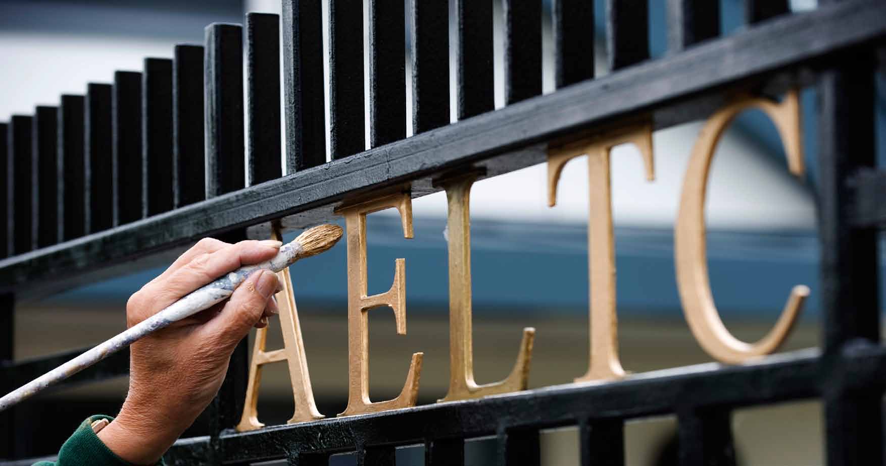
10 Sizes Isolation area Application sizes Colour variations What not to do Logotypes The 125 TH logotype Official references Official designation Composite logo definitions Promotions and advertising X X ISOLATION AREA The Isolation Area is the space around the Crossed Rackets Logo in which no other text, graphic or photographic elements may encroach. The size of the isolation area is the distance of the purple outer band of the logo, marked as x on the illustration to the left. 10
11 Sizes Isolation area Application sizes Colour variations What not to do Logotypes The 125 TH logotype Official references Official designation Composite logo definitions Promotions and advertising 25mm 35mm A3 APPLICATION SIZES For each format there is a recommended logo size. A4 20mm A5/DL 11
12 Sizes Isolation area Application sizes Colour variations What not to do Logotypes The 125 TH logotype Official references Official designation Composite logo definitions Promotions and advertising COLOUR VARIATIONS Where possible, the full colour version of the logo should be used. Because of the built-in white key line it is legible on different backgrounds. Keyline versions of the logo are available; in white and black. These can be used if the colour version is not appropriate or special print finishes are required. Clockwise from top left: Core logo using the core colours on picture background. Core logo using the core colours on a colour background. Where there is only black print available, the Keyline Black logo can be used on any light colour backgrounds. This version can also be used for foil blocking and embossing. There is also a Keyline White (reversed out) version which can be used on colour backgrounds or image. N.B. Ensure the logo is legible on the background. 12
13 Sizes Isolation area Application sizes Colour variations What not to do Logotypes The 125 TH logotype Official references Official designation Composite logo definitions Promotions and advertising x x WHAT NOT TO DO Consistent use of the logo is crucial. Always use the logo as supplied, with the correct colours. It should never be recreated or altered. Do not (clockwise from top left): Flip the core colours of the logo Use the logo at an angle Use the logo in another colour Distort the logo 1 2 x x 13
14 Sizes Isolation area Application sizes Colour variations What not to do Logotypes The 125 TH logotype Official references Official designation Composite logo definitions Promotions and advertising x x WHAT NOT TO DO Consistent use of the logo is crucial. Always use the logo as supplied, with the correct colours. It should never be recreated or altered. Do not (clockwise from top left): Crop the logo Use effects on the logo Key-line the racquet and ball Alter the typeface 1 2 THE CHAMPIONSHIPS THE CHAMPIONSHIPS W I M B L E D O N W I M B L E D O N x x 14
15 Sizes Isolation area Application sizes Colour variations What not to do Logotypes The 125 TH logotype Official references Official designation Composite logo definitions Promotions and advertising WIMBLEDON TYPE A logotype for the Wimbledon name has been drawn for use on applications where it needs to be incorporated with the logo. Official Suppliers can use the word mark however it must always be featured with the core logo. It is scaled proportionally, and follows the same principles as the stand alone mark. 15
16 Sizes Isolation area Application sizes Colour variations What not to do Logotypes The 125 TH logotype Official references Official designation Composite logo definitions Promotions and advertising THE 125 TH CHAMPIONSHIPS WIMBLEDON 2011 THE 125 TH TYPE For the 125 TH Championships a specific logotype has been drawn as a lock-up. This can also be used separately from the logo, as text in titling (e.g. on a leaflet) it should be written as illustrated. 16
17 Sizes Isolation area Application sizes Colour variations What not to do Logotypes The 125 TH logotype Official references Official designation Composite logo definitions Promotions and advertising These are ways of writing the official name references in text: Official Title: The Championships, Wimbledon The Championships Wimbledon Other references: the Fortnight, the Wimbledon Fortnight the Grounds Name of the Club: The All England Lawn Tennis & Croquet Club or The All England Lawn Tennis Club or the All England Club or the Club or AELTC 17
18 Sizes Isolation area Application sizes Colour variations What not to do Logotypes The 125 TH logotype Official references Official designation Composite logo definitions Promotions and advertising OFFICIAL DESIGNATION The All England Club s Official Suppliers are permitted to use the Club s Crossed Rackets Logo in advertising and promotional activities subject to the Club s prior approval. Use of the logo in advertising should always be accompanied by an agreed designation indicating that the company is The Official (product category) Supplier to The Championships or a similarly worded pre-agreed designation. Suppliers are not permitted to use the designations other than those defined in their Wimbledon agreements. Official Supplier designations may appear in three agreed categories as follows: 1. General: Official Supplier to The Championships, Wimbledon 2. Specific: Official Information Technology Supplier 3. Special: The Taste of Wimbledon They should be set in Gotham Book all caps: The logos and designations of other sporting events should never be featured alongside the Wimbledon logo without the Club s approval. Official Supplier stationery, press information releases, invitations to Wimbledon marquees and suites may all feature the Wimbledon logo, the official colours and the Wimbledon designation. Official Supplier to The Championships, Wimbledon Wimbledon is proud to have maintained its independence of sponsorship over its 30 year history and is one of the few sporting events to have done so. Official Suppliers are therefore not permitted to refer to their role at Wimbledon as that of sponsors. The official designation should be used where possible, supported by terminology such as a Wimbledon association or partnership with Wimbledon. Official BALL Supplier Official STILL SOFT DRINK 18
19 Sizes Isolation area Application sizes Colour variations What not to do Logotypes The 125 TH logotype Official references Official designation Composite logo definitions Promotions and advertising Official SUPPLIER Official SUPPLIER COMPOSITE DEFINITIONS The Club permits certain of its Official Suppliers to develop a Wimbledon composite logo which combines the Crossed Rackets Logo and supplier s logo. In developing composite logos for the Club s approval, the supplier s logo should cover a surface area no larger than that of the Crossed Rackets Logo (unless otherwise agreed). The supplier s logo should not appear above the Crossed Rackets Logo. There are several ways of doing this, as shown, but any application must be approved by the Club. Official SUPPLIER When the composite logo is used in print advertising, it must always be accompanied by the Official Supplier designation. Official SUPPLIER Official SUPPLIER Official SUPPLIER 19
20 Sizes Isolation area Application sizes Colour variations What not to do Logotypes The 125 TH logotype Official references Official designation Composite logo definitions Promotions and advertising PROMOTIONS Official Suppliers are permitted to use the Wimbledon association outside the Club s grounds in promotions linked to their product category over the course of the year in which they are contracted as an Official Supplier. Such uses include point of sale stands, brochures, trade shows and exhibitions, display material amongst others. The Club has merchandising agreements with some thirty companies worldwide, who have exclusive rights to the Wimbledon trademarks in agreed product categories and territories. Official Suppliers wishing to develop or purchase merchandise featuring the Wimbledon Logo as premiums for giveaway must do so via one of the Club s official merchandising licensees. The marketing of any Wimbledon merchandise, which is dual branded with the Official Supplier s logo, is subject to the Club s prior approval. ADVERTISING Wimbledon themes and imagery may be used in the print advertising of Official Suppliers and the Club retains a digital photo library to assist Official Suppliers in developing promotional materials. Such advertising should always include the Championships Logo and the Official Designation. Photography of players at Wimbledon may not be used without the specific permission of the players or their managers. All promotional and advertising Wimbledon material should be submitted to the All England Club for the attention of the Commercial Director prior to the development of artwork. 20

21 21
22 Sizes A stripe system has been developed to bring an added optional graphic element to the identity. There are two variations of the stripes: Standard stripes Thin stripes As a preference the green stripe should be to the left of the purple stripe when used vertically, and above the purple stripe when used horizontally. There are however exceptions where the order can change
23 Sizes A stripe system has been developed to bring an added optional graphic element to the identity. There are two variations of the stripes: Standard stripes Thin stripes As a preference the green stripe should be to the left of the purple stripe when used vertically, and above the purple stripe when used horizontally. There are however exceptions where the order can change. 23
24 Sizes REGULAR STRIPES The regular stripe is a holding device for the logo. This can be used for applications where there is sufficient space and to allow the brand identity to be more prominent. The distance the logo sits from the top is determined by the distance of the bottom of the ball to the bottom key-line in the outer roundel. X X X 1 2 Y Y 24
25 Sizes THIN STRIPES This version of the stripes is when they need to be expressed in a more subtle way, or if space won t allow for other stripe variants. Z Z Z

26 26
27 Primary WIMBLEDON GREEN WIMBLEDON PURPLE PRIMARY There are two distinctive colours in our primary colour palette: Wimbledon Green, and Wimbledon Purple. These are a crucial part of the identity. If possible, an element of white should be used alongside the two primary colours to add freshness and modernity. PANTONE 349 C PANTONE 356 U C100 M0 Y91 K42 R0 G102 B51 PANTONE 268 C PANTONE 268 U C82 M100 Y0 K12 R84 G0 B139 27
28 28
29 Cut 1 2 GAME SET MATCH Typography and a consistent use of typeface is a key element in creating a cohesive look across all the Wimbledon identity. The brand typeface is Gotham. This has been chosen because it is clean, legible and classic. Gotham is a sans-serif typeface. It has a family of weights: thin, light, book, medium and bold. Italic versions of these weights can also be used. 29
30 Cut 1 2 Gotham Thin AaBbCcDdEeFfGgHhIiJjKkLlMmNnOoPpQqRrSs TtUuVvWwXxYyZz !?& Gotham Light AaBbCcDdEeFfGgHhIiJjKkLlMmNnOoPpQqRrSs TtUuVvWwXxYyZz !?& Gotham Book AaBbCcDdEeFfGgHhIiJjKkLlMmNnOoPpQqRrSs TtUuVvWwXxYyZz !?& Gotham Medium AaBbCcDdEeFfGgHhIiJjKkLlMmNnOoPpQqRrSs TtUuVvWwXxYyZz !?& Gotham Bold AaBbCcDdEeFfGgHhIiJjKkLlMmNnOoPpQqRrSs TtUuVvWwXxYyZz !?& Typography and a consistent use of typeface is a key element in creating a cohesive look across all the Wimbledon identity. The brand typeface is Gotham. This has been chosen because it is clean, legible and classic. Gotham is a sans-serif typeface. It has a family of weights: thin, light, book, medium and bold. Italic versions of these weights can also be used. 30

31 31

32 The Championships Partners What not to do Use of imagery is a key part of the Wimbledon identity, as it can help communicate the personality and atmosphere of the event. Wimbledon themes and imagery may be used in the print advertising of Official Suppliers and the Club retains a digital photo library to assist Official Suppliers in developing promotional materials. Photography of players at Wimbledon may not be used without the specific permission of the players or their managers. The photography should be inspirational and aspirational: engaging and exciting. Avoid the obvious and clichéd. Cropping a photograph well can have a dramatic effect on its impact, drawing the viewers eye and excluding visual clutter. Photographs should be of the highest possible quality - never use pictures which look slightly out of focus or dull. 32

33 The Championships Partners What not to do OFFICIAL SUPPLIERS & PARTNERS Partner products should ideally be shown in the context of The Championships: e.g. The Rolex clock on the wall of Centre Court, or a ball boy holding a Slazenger ball. 33

34 The Championships Partners What not to do WHAT NOT TO DO Do not (clockwise from top left): Use static, empty imagery Use imagery where your eye is drawn to many elements x x Crop an image badly Use dull, busy imagery where there is no central focus 1 2 x x 34
: Use imagery where the action is")

35 The Championships Partners What not to do WHAT NOT TO DO Do not (clockwise from top left): Use imagery where the action is shown at a distance Use bad quality images in terms of resolution x x Use boring, unimaginative imagery Use clip art 1 2 x x 35

36 36
37 All promotional and advertising Wimbledon material should be submitted to the All England Club for the attention of the Commercial Director prior to the development of artwork. The Club is pleased to assist with any questions on the guidelines in this manual. For further information, please contact Claire Pardew or Jill Thompson: 37
Branding Guidelines. April 2015. www.tabletennisengland.co.uk
 Branding Guidelines April 2015 HOW WE CO-ORDINATE OUR MES SAGE Contents SECTION 1 Introducing the Table Tennis England brand 1.1 Welcome to our brand 1.2 Our vision, values and strategy 1.3 Tone of voice
SMU Student Affairs Style Guide
 SMU Student Affairs Style Guide 1 Strengthening Our Visual Communications 1 SMU Student Affairs is dedicated to creating a cohesive learning environment for SMU students. To do this, we must ensure that
Brand Identity and Style Guide Welcome. welcome. TO the Tottenham hotspur BRAND IDENTITY AND STYLE GUIDE. SUPPORTERS CLUB EDITION Version 2.
 Welcome welcome TO the Tottenham hotspur BRAND IDENTITY AND STYLE GUIDE SUPPORTERS CLUB EDITION Version 2.0 2012 Content content BRAND ELEMENTS In Detail 3 Our Name 4 Badge 5-11 Badge Colours 6 Badge Background
The FIAT Brand. Key Visual Elements and Usage Guidelines
 The FIAT Brand Key Visual Elements and Usage Guidelines Contents Brand Mark Guidelines 3 FIAT Brand Mark / trademark statement 4 exclusion zone 5 Primary FIAT Brand Mark 6 secondary fiat brand mark 7 tertiary
Brand Guidelines Visual Identity
 Brand Guidelines Visual Identity June 2014 1.2 The Signature Colour version Black Colour reverse Shield alone Reverse Colour reverse on red Our signature system is comprised of two elements; the MUHC wordmark
Branding Guidelines POWERHANDZ. Company: 1.0 Introduction 2.0 The Logo Design 2.1 The Logo Usage 3.0 Color Scheme 4.0 Typography 5.
 Branding Guidelines Company: Contents: Date: POWERHANDZ 1.0 Introduction 2.0 The Logo Design 2.1 The Logo Usage 3.0 Color Scheme 4.0 Typography 5.0 Contact Details June 2014 1.0 Introduction Overview The
Using this Brand Guide
 Using this Brand Guide This brand and style guide is designed to illustrate the basic requirements for appropriate usage of Blue Highway s logo and design elements in a variety of mediums. All client acquisition
Plymouth. Britain s Ocean City.
 Brand Guidelines Plymouth. Britain s Ocean City. June 2013 CORE PRINCIPLES 1.1 When and how the guidelines are used 1.2 Usage chart PLYMOUTH IDENTITY 2.1 The signature 2.2 Exclusion zone 2.3 Minimum size
Mini Brand Guide. Season 2014/15 Edition 01
 Mini Brand Guide Season 2014/15 Edition 01 OFFICIAL Tournament Mark MINI BRAND GUIDE P 02 Usage Full Colour Standard - Contained The Champions Cup Tournament Mark logo is comprised of three distinct brand
Spotify Partner Guidelines Logo & Colour + Messaging
 Version 1.4 27.01.15 Spotify Partner Guidelines Logo & Colour + Messaging The Logo The Logo First things first; while Spotify communications are made up of the four elements, the Logo is the focal point
Graphic Design Basics. Shannon B. Neely. Pacific Northwest National Laboratory Graphics and Multimedia Design Group
 Graphic Design Basics Shannon B. Neely Pacific Northwest National Laboratory Graphics and Multimedia Design Group The Design Grid What is a Design Grid? A series of horizontal and vertical lines that evenly
Partners. In Health. Visual Identity Guidelines 08.13
 Partners Visual Identity Guidelines 08.13 Welcome Our identity guidelines visually represent who we are and what we strive for: accompaniment, innovation, transformation, and commitment. They are not meant
Contents. Digital use..18 Presentations..20 Stakeholder Hub..22 Trademarks & Copyright..24 A summary..26
 The Brand. Contents. The AGP Brand..03 Delivering a consistent message..04 Promoting the Brand..06 Development of the Logo..08 The Logo..10 Colours & Backgrounds.11 Typography..12 Logo use on Marketing
Branding. Packet Contents
 Branding The Anti-Cruelty Society Packet Contents 01. Contents 02. Introduction to Branding 03. The Anti-Cruelty Society Logo 04. Prohibited Logo Usage 05. Logo Sizing 06. Using Color 07. Typography in
An International Inner Wheel Campaign. Happier Futures. Branding Guidelines. An International Inner Wheel Campaign
 Inner Wheel Campaign Contents Brand Mark Brand Mark Usage Primary colours Secondary colours Brand Mark Exclusion Zone Brand Mark Size Brand Mark Misuse Backgrounds Primary Typeface Recommended paper stocks
TABLE OF CONTENTS. SECTION ONE: OVERVIEW... 4 Who are these guidelines for?... 4 What is a visual identity guideline?... 4
 VISUAL IDENTITY TABLE OF CONTENTS SECTION ONE: OVERVIEW... 4 Who are these guidelines for?... 4 What is a visual identity guideline?... 4 SECTION TWO: VISUAL IDENTITY GUIDLINES... 5 Corporate identity
Brand-identity Guidelines
 Brand-identity Guidelines Client: Contents: Date: USA Climbing 1.0 Introduction (page 1) 2.0 The Logo Design (page 3) 2.1 The Logo Usage (page 6) 3.0 Colour Scheme (page 13) 4.0 Typography (page 16) 5.0
Interactive Brand Guidelines Brand Standards 2012
 Brand Guidelines for 2012 Production Specifications Web Page Samples Interactive Brand Guidelines Brand Standards 2012 One of the most valuable advantages an organization has is it s brand - an image based
One identity. One CMU. Brand Identity Standards 2014.v1
 One identity One CMU Brand Identity Standards 2014.v1 Graphic Identity Guidelines CMU Wordmark Central Michigan University is represented by the CMU Wordmark and in limited cases, the CMU Action C. The
Brand and Identity Guidelines
 Brand and Identity Guidelines Using this Brand Guide This brand and style guide is designed to illustrate the basic requirements for appropriate usage of Prioria Robotics logo and design elements in a
BRAND IDENTITY GRAPHIC STANDARDS MANUAL
 BRAND IDENTITY GRAPHIC STANDARDS MANUAL TABLE OF CONTENTS Logo Standards 03 12 Core Logo 04 Marketing Logo 05 Corporate Typeface 06 Corporate Colours 07 Positive & Negative Use 09 Safety & Minimum Size
Visual Style Guide April 2015
 Visual Style Guide April 2015 Contents Introduction to the Logo 3 Safe Area and Size 4 Logo and Tagline Usage 5 Incorrect Usage 6 Color Palette 7 Backgrounds and Additional Design Elements 8 Typography
CONTENTS. 2 ASHRAE Logo Guide
 ASHRAE Logo Guide CONTENTS 3 Purpose & Trademarks 4 Our Brand Essence 5 How To Access Logo Files 6 Corporate Logo and Tagline 7 Chapter & Region Signature Guidelines 8 Student Branch Signature Guidelines
Brand identity guidelines
 Brand identity guidelines Version 1.1 March 2015 01 Contents 01 Contents 02 Introducing the 03 Who are these guidelines for? 04 The logo 05 Explaining the logo 06 Logo exclusion zone 07 Logo minimum reproduction
DALHOUSIE BRAND GUIDE AND TOOL KIT 4.0 SHORT FORM LOGO
 4.0 SHORT FORM LOGO 4.01 OVERVIEW 4.02 CLEAR SPACE AND MINIMUM SIZE 4.03 AS A WATERMARK 4.04 RETAIL PRODUCTS 4.05 APPLYING THE SHORT FORM LOGO PROPERLY 4.06 LINK TO DALHOUSIE AUTHORIZED SHORT FORM LOGO
The Pearson brand guidelines SUMMARY LOGO AND COLOUR GUIDELINES
 The Pearson brand guidelines SUMMARY LOGO AND COLOUR GUIDELINES Logo and bar device We ve refined and simplified our logo. It s now represented by the Pearson name inside a bar and we ve removed the arc
How To Design The Scout Association Logo
 WELCOME TO OUR ADVENTURE... A Guide to The Scout Association s Brand and Visual Identity scouts.org.uk/brand WHAT WE STAND FOR... WE BELIEVE THAT THROUGH ADVENTURE WE CHALLENGE INDIVIDUALS SO THAT THEY
BRAND IDENTITY GUIDELINES. May 2016
 BRAND IDENTITY GUIDELINES May 2016 TABLE OF CONTENTS Page 3 Maintaining Our Brand s Integrity Page 4 The Peace Corps Logo Page 5 Logo Options Page 6 Clearance & Sizing Page 7 Color Formats Page 8 What
Table of Contents Logo Implementation Typography Corporate Stationery Divisional Stationery Collateral Materials Web Site
 Standards Manual Table of Contents Letter from the President II Introduction III Logo Implementation Logo Usage A.1 Colour Usage A.2 Proportion Grid A.3 Clearance Area A.4 Minimum Size A.4 Reverse Treatment
Guidelines for using The Heritage Council logo March 2008
 Guidelines for using The Heritage Council logo March 2008 These guidelines introduce our new identity and are designed to help you implement our identity consistently. These guidelines introduce The Heritage
The Point Cloud Library Logo
 Identity Guidelines Point Cloud Library Identity Guidelines 1 The Point Cloud Library Logo The Logo The Point Cloud Library logo is a combination of the pointcloudlibrary or pcl wordmark and the cloud
International Inner Wheel. Branding Guidelines
 Contents Introduction Brand Mark Brand Mark Usage Primary colours Secondary colours Brand Mark Exclusion Zone Brand Mark Size Brand Mark Misuse Backgrounds Primary Typeface Recommended paper stocks Stationery
Print Style Guide. Building Our Future Print Style Guide BUILDING OUR FUTURE. Department of Infrastructure and Regional Development
 Print Style Guide Department of Infrastructure and Regional Development i Background This document sets out the requirements for the display of the Commonwealth Coat of Arms and the Building Our Future
Logo Standards Guideline
 Logo Standards Guideline TABLE OF CONTENTS Nurturing The Brand 1 Logo Guidelines 2 Correct Usage 2 Color Guidelines 6 How to Use the Provided Logo Files 9 Glossary 10 NURTURING THE BRAND THE FOLLOWING
Get to know us. Canada Council for the Arts Brand Guidelines
 Get to know us. Canada Council for the Arts Brand Guidelines Canada Council Brand Guidelines This document describes our visual identity guidelines. Following the guidelines is essential in maintaining
Brand Essentials. Making us all look good. Chapter 1: Our logo
 Brand Essentials Making us all look good Chapter 1: Our logo Why use these guides? The importance and significance of the University s brand is explained in our Brand Book. These guides will help you express
Better Homes and Gardens Real Estate LLC Franchisee Identity Standards Manual
 Better Homes and Gardens Real Estate LLC Franchisee Identity Standards Manual Draft 05.22.09 Better Homes and Gardens Real Estate LLC Table of Contents 1 Table of Contents Introduction to our brand 03
Fleet Operator Recognition Scheme design standards. Issue 1
 Fleet Operator Recognition Scheme design standards Issue 1 Foreword 1 Basic elements 1.1 FORS logo colour 1.2 FORS logo black and white 1.3 FORS logo variants 1.4 Who can use which logo? 1.5 Unacceptable
LOGO GUIDELINES. January 2010
 LOGO GUIDELINES January 2010 CONTENTS WHY GUIDELINES? 2 WHAT IS THE LOGO? 3 THE FULL NAME 4 COLOUR & TYPOGRAPHY 5 CORRECT USAGE 6 10 DIRECTORY OF ARTWORK 11 19 SUB-LOGOS 20 23 WHY GUIDELINES? What s the
There are a number of ways to use the Trapeze Networks logo. Here are the guidelines to use that will help strengthen our logo awareness:
 WHAT WE LOOK LIKE Identity Our logo. The Trapeze Networks logo consists of five elements: wording, color, background color, clear space and placement. All of these pieces must be addressed when using the
DeVry University and Keller Graduate School of Management C O - B R A N D E D GUIDELIN ES
 C O - B R A N D E D GUIDELIN ES 2009 Table of contents Introduction... 1-4 Look and feel... 5-7 Layout examples Vertical... 8-9 Horizontal... 10-11 Brochures and printed materials... 12-13 Web... 14 What
7.1 Tagline Usage. Tagline Usage
 Tagline Usage Format A- Preferred Format B- Acceptable 2M ht..25m ht. M height 1M ht..50m ht. M height 1M ht..50m ht. 7.1 Tagline Usage Taglines should be created and used in the same way every time. The
LXI Consortium Trademark and Logo
 LXI Consortium Trademark and Logo Usage Guidelines June 23, 2006 Updated November 19, 2007 Updated November 25, 2008 www.lxistandard.org/home/ Introduction The intention of this document is to provide
Visa Brand Mark. Protect the Cornerstone of the Visa Brand
 Protect the Cornerstone of the Visa Brand Full of energy and life, the Visa Brand Mark represents the cornerstone of the Visa brand. It should be represented in full colour Visa Blue and Visa Gold whenever
2015 Marketing Guidelines. 2015 Parallels IP Holdings GmbH. All rights reserved. Terms of Use Privacy Policy
 2015 Marketing Guidelines 2015 Parallels IP Holdings GmbH. All rights reserved. Terms of Use Privacy Policy Master Brand Components The Parallels logo is the cornerstone of the Parallels brand. Please
Corporate Identity Quick Reference Guide
 Corporate Identity Quick Reference Guide fedexbrand.com The FedEx brand is more than a famous name. It s a set of values, attributes and artwork that reflects the spirit of our company. Using it consistently
Photography guidelines. www.salford.ac.uk
 www.salford.ac.uk Imagery staff and students Choosing the right imagery for our communications is a critical part of our brand designs. This should be considered alongside the copy writing and design concept
Imperial Oil Foundation
 Signatures and logos Quick Reference Guide 5.9.5.1/E 01/03 Limited Supplement to the Corporate Identity Manual Supplement to the Corporate Identity Manual Quick Reference Guide Introduction This Quick
Symantec Identity Guidelines. Version 3 - March 2012
 Symantec Identity Guidelines Contents The Symantec Identity Guidelines explain how to consistently and effectively apply the most visual elements of the Symantec brand. These elements are designed to convey
Brand Standard Guide
 Brand Standard Guide Contents 03 Strategic Brand Strategy 04 itravel2000 identity - The logo 05 Clear Spacing 06 Correct Usage of Logo 07 Corporate Colours 08 Typeface Online & Print 09 Imagery & Visual
Visual Identity Requirements
 Visual Identity Requirements Introduction Southern Illinois University Edwardsville (SIUE) is intentionally building reputation locally, regionally and nationally. Consistent and coordinated use of the
size and proportion Graphic Standards Manual Version 1.3 January 2014
 size and proportion To ensure legibility, the Cumberland logo should never be reproduced at sizes smaller than one inch wide. (See Figure K.) The Cumberland logo s proportions should never be altered.
BRAND GUIDELINES AND STANDARDS
 EMS SOFTWARE BRAND GUIDELINES AND STANDARDS WE HELP PEOPLE CREATE GREAT MEETINGS EMS SOFTWARE BRAND GUIDELINES 2 WHY IS BRAND SO IMPORTANT? This brand guidelines and standards book is a tool designed to
How To Communicate The Cyber Security Summit Brand To A Large Audience
 STYLE GUIDE Version 2.0b - FOR PUBLIC RELEASE Table of Contents 1.0 Introduction 1.1 Terms + Conditions... 4 1.2 Name Usage... 5 2.0 The Cyber Security Summit Brand 2.1 What Is a Brand?... 7 2.2 Brand
STYLE GUIDE From the Office of Marketing and Public Relations
 SAN JUAN COLLEGE STYLE GUIDE From the Office of Marketing and Public Relations San Juan College requires consistent use of SJC s logo. This will help the College speak to its various constituencies in
2014 TALEND IDENTITY GUIDELINES
 2014 TALEND IDENTITY GUIDELINES INTRODUCTION This document contains the corporate identity guidelines for Talend. The goal of these guidelines is to help inform consistent implementation of the Talend
Graphic Standards Manual
 A guide to branding & corporate identity: Graphic Standards Manual The Bristol Chamber of Commerce 20 Volunteer Parkway, Bristol, TN 37620 423.989.4850 bristolchamber.org Bristol Chamber of Commerce Graphic
GRAPHIC STANDARDS GUIDE
 GRAPHIC STANDARDS GUIDE CONSISTENT GRAPHIC IDENTITY The University of Mount Olive must have a consistent, cohesive graphic identity. In terms of marketing, repetition of an image is vitally important.
The Parker Distributor Brand. Parker s Global Image Specifications for Distributors
 The Parker Distributor Brand Parker s Global Image Specifications for Distributors Building A Strong Brand Together In 2007, we re-engineered one of the company s most valuable assets, the Parker brand.
Graphic Communication Desktop Publishing
 Graphic Communication Desktop Publishing Introduction Desktop Publishing, also known as DTP, is the process of using the computer and specific types of software to combine text and graphics to produce
Adjunct Assistant Professor Gayle Rembold Furbert. Typography II. County College of Morris Graphic Design Degree Program
 Adjunct Assistant Professor Gayle Rembold Furbert Typography II County College of Morris Graphic Design Degree Program Voice of Type As you look at typefaces, analyze their forms, learn their history and
University of Nevada, Las Vegas Alumni Association. Brand Identity Guidelines
 University of Nevada, Las Vegas Alumni Association Brand Identity Guidelines UNLV Alumni Association Identity Guide The UNLV Alumni Association Brand Identity Guide is designed to bring consistency to
The Logo 3. Fiksu Logo
 Brand Guidelines 2 Contents 3 Fiksu Logo 8 miq Logo 10 Brand Architecture 14 Color Palette 15 Image Treatment 16 Data Pattern 17 Typography 18 Applications 20 Email Signature The Logo 3 Fiksu Logo The
americas europe africa asia australasia BNIBRANDING.COM BNI Branding Standards 2011 BNI Changing the Way the World Does Business
 americas europe africa asia australasia 2011 BNI Contents Principal Elements 3 Brand Values 4 Language Style 7 Tone of Voice 8 Core Values 10 Document Formats 11 Corporate Identity 12 Correct Logo Usage
LEHR Brand Guidelines
 LEHR Brand Guidelines Brand Guidelines LEHR LLC. 8922 Ellis Avenue Los Angeles, CA 90034 +1 310 839 9009 +1 866 941 LEHR info@golehr.com www.golehr.com v 1.07 Brand Guidelines 2 LEHR Brand Guidelines Contents
Graphic Standards Manual
 Graphic Standards Manual 1 About This Manual This graphic standards manual was developed to provide general guidelines regarding Golden West College s visual identity. It introduces a new college logo,
Logo files are available for download at Brand.amadeus.com
 Page 21 The concept Amadeus logo The new Amadeus visual identity aims to make our brand more solid, simple and memorable. The Amadeus logo This new design has been evolved for a more modern look. It gives
Logo The Pearson logo
 The Interrobang Invented in the 1960s, the interrobang is a clever solution to a punctuation challenge. To ask a question excitedly, writers often used a question mark ( interrogation point ) followed
Congratulations on becoming a Big Lottery Fund grant recipient
 Congratulations on becoming a Big Lottery Fund grant recipient One of the Big Lottery Fund conditions of your grant agreement is that you acknowledge your award publicly. We have written this booklet to
UNIVERSITY OF LIMERICK BRAND SPECIFICATIONS
 UNIVERSITY OF LIMERICK BRAND SPECIFICATIONS Section Contents Page 1.1 Introduction 3 1.2 Communications Services 4 1.3 Procedure for applying to use the UL Logo 4 2.1 The UL Logo 5 2.2 Standard Logo 6
APEC LOGO GUIDELINES Major Revision Notes
 Policy: GUIDELINES Last Update: January 2013 Revised: July 2007 Published: February 2006 Contact: Secretariat Related Policies: Intellectual Property Policy, Publication Guidelines, Website Policy Major
The logotype for Embassy Suites Hotels is based on Bodoni Old Face Bold typeface.
 CORPORATE FORMATS Logo Configurations There are two approved presentations of the Embassy Suites Hotels corporate logo. These logos are to be used in corporate, non-property specific presentations and
Oracle PartnerNetwork Brand Guidelines
 Oracle PartnerNetwork Brand Guidelines TABLE OF CONTENTS Oracle PartnerNetwork Program 5 Introduction 6 Branding Opportunities for Partners OPN Program Logos 7 Correct Usage 8 Unacceptable Usage 9 Relationship
BRAND GUIDELINES Version 1.0 10.27.15
 BRAND GUIDELINES Version 1.0 10.27.15 CONTENTS 03 Introduction 04 Brand Positioning 05 Logo 17 Tagline 19 Color 22 Typography 25 Photography 27 Applications BRAND GUIDELINES Version 1.0 10.27.15 3 INTRODUCTION
EUROPEAN ATHLETICS Brand Design Manual
 EUROPEAN ATHLETICS Brand Design Manual Chapter 1 Corporate as of August 2007 Dear User Since relocating our offices from Darmstadt to Lausanne a few years ago, European Athletics has experienced a number
Guidelines. June 10, 2013
 Guidelines June 10, 2013 2 Welcome! These guidelines are for Xbox 360 and Kinect for Xbox 360 communications. For brand help and reviews, contact: xboxbrand@microsoft.com For asset help, contact: xboxbrandsup@microsoft.com
DESIGN GUIDELINES VERSION 1.0
 DESIGN GUIDELINES VERSION 1.0 1 Contents INTRODUCTION 3 THE LOGO 4 TYPOGRAPHY 12 COLOUR 13 STATIONERY 15 EXhIBITIONS/SIGNAGE 18 EmailS 19 POWERPOINT 20 merchandise 21 CONTACT 22 MERTON COLLEGE DESIGN GUIDELINES
Logo Usage Guidelines
 Logo Usage Guidelines Table of Contents 100 Years of Anzac 3 Protecting Our Logo 4 The Logo 5 Community Use 6 Community Use 7 Merchandising 8 Logo Improper Use 9 Principal Versions 10 Horizontal Versions
CONTENTS. 3 Introduction. 7 Nuance Corporate Signature. 5 Nuance Corporate Signature Color. Minimum Size and Clearspace Requirements
 NUANCE Interim corporate identity styleguide O C T O B E R 2 0 0 5 CONTENTS 3 Introduction 4 Nuance Corporate Signature 5 Nuance Corporate Signature Color 6 Nuance Corporate Signature Minimum Size and
Brand Standards Guide
 Brand Standards Guide Last revised: June 7, 2012 Table of Contents Introduction 1 Glossary of Terms 2 A Note About Image Resolution 2 The Seeing Eye Logotype 3 Logotype with Tagline 4 Logotype: Minimum
Technical Specifications. Yellow Pages
 Technical Specifications Yellow Pages 2014 Make sure your advertisement measures up What makes a good Yellow Pages directory advertisement? Simple. Its ability to get you more business. And to do that,
Conditions for the use of the Australian Qualifications Framework Logo
 Conditions for the use of the Australian Qualifications Framework Logo 1 The AQF logo The Australian Qualifications Framework (AQF) logo is a distinguishable mark of quality for identifying and promoting
ATHLETICS. Brand Identity Guidelines
 Brand Identity Guidelines TABLE OF CONTENTS The Importance of a Consistent Visual Identity...3 Official UMass Lowell Athletic Colors...4-5 Typography...6-7 Primary Identity...8-9 Secondary Identity...10-13
Advertising Guide. Season 2015
 Advertising Guide Season 2015 Page Two SPONSOR BENEFITS As a BOWLS ENGLAND sponsor, YOUR COMPANY can benefit from the following: Use of your company s name in BOWLS ENGLAND materials including Yearbook,
Labour Literature Design Assistant and Guidelines
 Labour Literature Design Assistant and Guidelines Contents Introduction: The Labour brand 5 How to use the Labour Literature Pack 6 A tomorrow where there is bread, but where there are roses too Section
Identity Manual Manual de Identidad Manuel d'identité Manual de Identidade
 Identity Manual Manual de Identidad Manuel d'identité Manual de Identidade Identification Guidelines PANTONES Pantone 3005C Pantone 2955C Process color 100c 37m 0y 0k 100c 60m 0y 52k Visual Identity Guidelines
Accredited Logos Style Sheet and Usage Guide
 Accredited Logos Style Sheet and Usage Guide INTRODUCTION Congratulations! Your program is now ABET-accredited! We encourage you to use these assets and identity guidelines to promote your accreditation
Communication Plan 2012 - Reviewed 2014
 Communication Plan 2012 - Reviewed 2014 Communication Plan 2012 Endorsed by Council 19 December 2012 Review Endorsed by Council 19 November 2014 Contents Contents... 2 What Is Communication... 4 Background...
PHOTOGRAPHY GUIDELINES
 PHOTOGRAPHY GUIDELINES TABLE OF CONTENTS The UQ brand... 3 The bigger picture... 4 Our imagery styles explained... 5 1. Overview imagery... 5 2. Academic imagery... 5 3. Lifestyle imagery... 5 4. Interactive
September 2011. Cayuga Community College Brand Profile Graphic Standards
 September 2011 Cayuga Community College Brand Profile Graphic Standards Cayuga Community College Brand Profile This information has been designed and presented to ensure that the Cayuga Community College
Subaru Industrial Power Products. Brand Identification Manual
 Subaru Industrial Power Products Brand Identification Manual Welcome This Brand Identity Manual is to be used for all Subaru Print Communications Corporate Employees Subaru employees or consultants directly
BRAND + STYLE GUIDELINES
 BRAND + STYLE GUIDELINES the thawte brand Thawte is a globally recognized certificate authority that has been delivering comprehensive trusted services for more than a decade. We enable businesses and
Graphic Standards Guidelines
 Graphic Standards Guidelines Graphic Guidelines Introduction Looks change as we mature and they reflect, to some degree, our experience and character. This evolution of appearance is as true for institutions
Effective 12.2014. Visual Identity Guide
 Effective 12.2014 Visual Identity Guide VISUAL IDENTITY Fairfield University s ability to carry out its mission can be helped or hindered by the perceptions of the people it seeks to serve. Its visual
How to Use the PTA Logo and Tagline
 How to Use the PTA Logo and Tagline Consistency and Brand Identity -- An Introduction The key to building a recognized name brand and identity is consistency. While the name PTA is recognized widely, many
ABCFP Logo Use Policy
 ABCFP Logo Use Policy Effective Date: April 1, 2005 Updated: September 2007 POLICY Contents The Official Logo 3 Elements 3 Colours 3 Signature 3 Typeface 4 Official Logo Use by MemberS 4 Acceptable Version
McAFEE IDENTITY. October 2011
 McAFEE IDENTITY 4.2 Our logo is one of our most valuable assets. To ensure that it remains a strong representation of our company, we must present it in a consistent and careful manner across all channels
rscds RSCDS corporate identity Detailed design guidance for the logo
 RSCDS corporate identity Detailed design guidance for the logo The Royal Scottish Country Dance Society 12 Coates Cresent, Edinburgh, Scotland, UK. EH3 7AF Tel: +44 (0)131 225 3854 Fax: +44 (0)131 225
A Guide to the. LaGrange College Athletics. Visual Identity Program. Publication Date: March 1, 2006 2006 LaGrange College. All rights reserved.
 A Guide to the LaGrange College Athletics Visual Identity Program 2006 LaGrange College. All rights reserved. TC LAGRANGE COLLEGE A thletics Visual Identity Program TABLE OF CONTENTS Introduction...1.1
BRAND LOGO USAGE GUIDELINES SEPTEMBER 2002
 SEPTEMBER 2002 BRAND LOGO USAGE GUIDELINES This document is subject to periodic revision. Please check with the NKU marketing department to make sure you have the most recent copy. BRAND LOGO INTRODUCTION