Bar graph. Frequency/ Relative Frequency distribution. Qualitative data 2-1. Copyright 2013, 2010 and 2007 Pearson Education, Inc.
|
|
|
- Barry Hensley
- 7 years ago
- Views:
Transcription
1 Qualitative data Frequency/ Relative Frequency distribution Bar graph 2-1
2 Quantitative data DISCRETE with few different values DISCRETE with many different values or CONTINUOUS Classes are the different observations Classes must be created using intervals of numbers Frequency/ Relative Frequency distribution Histogram 2-2
3 Section 2.3 Additional Displays of Quantitative Data
4 Objectives 1. Construct frequency polygons 2. Create cumulative frequency and relative frequency tables 3. Construct frequency and relative frequency ogives 4. Draw time-series graphs 2-4
5 Objective 1 Construct Frequency Polygons 2-5
6 A class midpoint is the sum of consecutive lower class limits divided by 2. A frequency polygon is a graph that uses points, connected by line segments, to represent the frequencies for the classes. It is constructed by plotting a point above each class midpoint on a horizontal axis at a height equal to the frequency of the class. Next, line segments are drawn connecting consecutive points. Two additional line segments are drawn connecting each end of the graph with the horizontal axis. 2-6
7 Image source: 2-7
8 Time between Eruptions (seconds) Class Midpoint Frequency Relative Frequency
9 Frequency Frequency Polygon 12 Time between Eruptions Time (seconds)
10 Frequency Frequency Polygon 12 Time between Eruptions 10 8 Frequencies Midpoints of classes Time (seconds)
11 Frequency Frequency Polygon 12 Time between Eruptions Time (seconds)
12 Relative Frequency 0.3 Frequency Polygon Time between Eruptions Time (seconds)
13 Objective 2 Create Cumulative Frequency and Relative Frequency Tables 2-13
14 A cumulative frequency distribution displays the aggregate frequency of the category. In other words, for discrete data, it displays the total number of observations less than or equal to the category. For continuous data, it displays the total number of observations less than or equal to the upper class limit of a class. 2-14
15 A cumulative relative frequency distribution displays the proportion (or percentage) of observations less than or equal to the category for discrete data and the proportion (or percentage) of observations less than or equal to the upper class limit for continuous data. 2-15
16 Frequency Relative Frequency Cumulative Frequency Cumulative Relative Frequency Time between Eruptions (seconds)
17 Objective 3 Construct Frequency and Relative Frequency Ogives 2-17
18 An ogive (read as oh jive ) is a graph that represents the cumulative frequency or cumulative relative frequency for the class. It is constructed by plotting points whose x- coordinates are the upper class limits and whose y- coordinates are the cumulative frequencies or cumulative relative frequencies of the class. Then line segments are drawn connecting consecutive points. An additional line segment is drawn connecting the first point to the horizontal axis at a location representing the upper limit of the class that would precede the first class (if it existed). 2-18
19 Cumulative Frequency Frequency Ogive 50 Time between Eruptions Time (seconds) 2-19
20 Cumulative Frequency Frequency Ogive 50 Time between Eruptions Cumulative Frequencies Upper class limits Time (seconds) 2-20
21 Cumulative Frequency Frequency Ogive 50 Time between Eruptions Time (seconds) 2-21
22 Cumulative Relative Frequency Relative Frequency Ogive 1.2 Time between Eruptions Time (seconds) 2-22

23 Frequency Polygon Ogive Horizontal Axis Midpoints Upper class limit Vertical Axis Additional line segment(s) Frequency or Relative Frequency Two line segments at either ends Cumulative Frequency or Cumulative Relative Frequency Line segment at the beginning only 2-23
24 Objective 4 Draw Time Series Graphs 2-24
25 If the value of a variable is measured at different points in time, the data are referred to as time series data. A time-series plot is obtained by plotting the time in which a variable is measured on the horizontal axis and the corresponding value of the variable on the vertical axis. Line segments are then drawn connecting the points. 2-25
26 The data to the right shows the closing prices of the Dow Jones Industrial Average for the years Year Closing Value , , , ,
27 Closing Value Dow Jones Industrial Average ( ) Year 2-27
28 Closing Value Dow Jones Industrial Average ( ) Value of the variable Time periods Year 2-28
29 Section 2.4 Graphical Misrepresentations of Data
30 What Can Make a Graph Misleading or Deceptive?? Some of the causes: Scale of the graph Inconsistent scale Misplaced origin 2-30
31 Statistics: The only science that enables different experts using the same figures to draw different conclusions. Evan Esar 2-31
32 EXAMPLE Misrepresentation of Data The data in the table represent the historical life expectancies (in years) of residents of the United States. (a) Construct a misleading time series graph that implies that life expectancies have risen sharply. (b) Construct a time series graph that is not misleading. Year, x Life Expectancy, y Source: National Center for Health Statistics 2-32

33 EXAMPLE Misrepresentation of Data (a) (b) 2-33
34 EXAMPLE Misrepresentation of Data The National Survey of Student Engagement is a survey that (among other things) asked first year students at liberal arts colleges how much time they spend preparing for class each week. The results from the 2007 survey are summarized on the next slide. (a) Construct a pie chart that exaggerates the percentage of students who spend between 6 and 10 hours preparing for class each week. (b) Construct a pie chart that is not misleading. 2-34
35 EXAMPLE Misrepresentation of Data Hours Relative Frequency Source: 07_Annual_Report.pdf
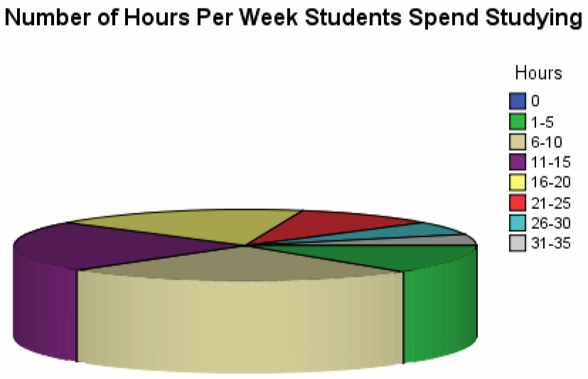
36 (a) 2-36

37 (b) 2-37
38 Guidelines for Constructing Good Graphics Title and label the graphic axes clearly, providing explanations, if needed. Include units of measurement and a data source when appropriate. Avoid distortion. Never lie about the data. Minimize the amount of white space in the graph. Use the available space to let the data stand out. If scales are truncated, be sure to clearly indicate this to the reader. 2-38
39 Guidelines for Constructing Good Graphics Avoid clutter, such as excessive gridlines and unnecessary backgrounds or pictures. Don t distract the reader. Avoid three dimensions. Three-dimensional charts may look nice, but they distract the reader and often lead to misinterpretation of the graphic. 2-39
40 Guidelines for Constructing Good Graphics Do not use more than one design in the same graphic. Sometimes graphs use a different design in one portion of the graph to draw attention to that area. Don t try to force the reader to any specific part of the graph. Let the data speak for themselves. Avoid relative graphs that are devoid of data or scales. 2-40
Chapter 2: Frequency Distributions and Graphs
 Chapter 2: Frequency Distributions and Graphs Learning Objectives Upon completion of Chapter 2, you will be able to: Organize the data into a table or chart (called a frequency distribution) Construct
Summarizing and Displaying Categorical Data
 Summarizing and Displaying Categorical Data Categorical data can be summarized in a frequency distribution which counts the number of cases, or frequency, that fall into each category, or a relative frequency
Visualizing Data. Contents. 1 Visualizing Data. Anthony Tanbakuchi Department of Mathematics Pima Community College. Introductory Statistics Lectures
 Introductory Statistics Lectures Visualizing Data Descriptive Statistics I Department of Mathematics Pima Community College Redistribution of this material is prohibited without written permission of the
Sta 309 (Statistics And Probability for Engineers)
") Instructor: Prof. Mike Nasab Sta 309 (Statistics And Probability for Engineers) Chapter 2 Organizing and Summarizing Data Raw Data: When data are collected in original form, they are called raw data. The
Instructor: Prof. Mike Nasab Sta 309 (Statistics And Probability for Engineers) Chapter 2 Organizing and Summarizing Data Raw Data: When data are collected in original form, they are called raw data. The
Darton College Online Math Center Statistics. Chapter 2: Frequency Distributions and Graphs. Presenting frequency distributions as graphs
 Chapter : Frequency Distributions and Graphs 1 Presenting frequency distributions as graphs In a statistical study, researchers gather data that describe the particular variable under study. To present
MODUL 8 MATEMATIK SPM ENRICHMENT TOPIC : STATISTICS TIME : 2 HOURS
 MODUL 8 MATEMATIK SPM ENRICHMENT TOPIC : STATISTICS TIME : 2 HOURS 1. The data in Diagram 1 shows the body masses, in kg, of 40 children in a kindergarten. 16 24 34 26 30 40 35 30 26 33 18 20 29 31 30
Statistics Revision Sheet Question 6 of Paper 2
 Statistics Revision Sheet Question 6 of Paper The Statistics question is concerned mainly with the following terms. The Mean and the Median and are two ways of measuring the average. sumof values no. of
Diagrams and Graphs of Statistical Data
 Diagrams and Graphs of Statistical Data One of the most effective and interesting alternative way in which a statistical data may be presented is through diagrams and graphs. There are several ways in
Examples of Data Representation using Tables, Graphs and Charts
 Examples of Data Representation using Tables, Graphs and Charts This document discusses how to properly display numerical data. It discusses the differences between tables and graphs and it discusses various
A Picture Really Is Worth a Thousand Words
 4 A Picture Really Is Worth a Thousand Words Difficulty Scale (pretty easy, but not a cinch) What you ll learn about in this chapter Why a picture is really worth a thousand words How to create a histogram
Statistics Chapter 2
 Statistics Chapter 2 Frequency Tables A frequency table organizes quantitative data. partitions data into classes (intervals). shows how many data values are in each class. Test Score Number of Students
Consolidation of Grade 3 EQAO Questions Data Management & Probability
 Consolidation of Grade 3 EQAO Questions Data Management & Probability Compiled by Devika William-Yu (SE2 Math Coach) GRADE THREE EQAO QUESTIONS: Data Management and Probability Overall Expectations DV1
Appendix 2.1 Tabular and Graphical Methods Using Excel
 Appendix 2.1 Tabular and Graphical Methods Using Excel 1 Appendix 2.1 Tabular and Graphical Methods Using Excel The instructions in this section begin by describing the entry of data into an Excel spreadsheet.
31 Misleading Graphs and Statistics
 31 Misleading Graphs and Statistics It is a well known fact that statistics can be misleading. They are often used to prove a point, and can easily be twisted in favour of that point! The purpose of this
Directions for Frequency Tables, Histograms, and Frequency Bar Charts
 Directions for Frequency Tables, Histograms, and Frequency Bar Charts Frequency Distribution Quantitative Ungrouped Data Dataset: Frequency_Distributions_Graphs-Quantitative.sav 1. Open the dataset containing
Graphing Information
 Parts of a Typical Graph Graphing Information In the typical graph used to evaluate behavior, time and behavior are the two variables considered. Each data point on a graph gives two pieces of information:
Describing and presenting data
 Describing and presenting data All epidemiological studies involve the collection of data on the exposures and outcomes of interest. In a well planned study, the raw observations that constitute the data
Variable: characteristic that varies from one individual to another in the population
 Goals: Recognize variables as: Qualitative or Quantitative Discrete Continuous Study Ch. 2.1, # 1 13 : Prof. G. Battaly, Westchester Community College, NY Study Ch. 2.1, # 1 13 Variable: characteristic
MBA 611 STATISTICS AND QUANTITATIVE METHODS
 MBA 611 STATISTICS AND QUANTITATIVE METHODS Part I. Review of Basic Statistics (Chapters 1-11) A. Introduction (Chapter 1) Uncertainty: Decisions are often based on incomplete information from uncertain
Descriptive statistics Statistical inference statistical inference, statistical induction and inferential statistics
 Descriptive statistics is the discipline of quantitatively describing the main features of a collection of data. Descriptive statistics are distinguished from inferential statistics (or inductive statistics),
Graphing in SAS Software
 Graphing in SAS Software Prepared by International SAS Training and Consulting Destiny Corporation 100 Great Meadow Rd Suite 601 - Wethersfield, CT 06109-2379 Phone: (860) 721-1684 - 1-800-7TRAINING Fax:
Unit 9 Describing Relationships in Scatter Plots and Line Graphs
 Unit 9 Describing Relationships in Scatter Plots and Line Graphs Objectives: To construct and interpret a scatter plot or line graph for two quantitative variables To recognize linear relationships, non-linear
Describing, Exploring, and Comparing Data
 24 Chapter 2. Describing, Exploring, and Comparing Data Chapter 2. Describing, Exploring, and Comparing Data There are many tools used in Statistics to visualize, summarize, and describe data. This chapter
Descriptive Statistics
 CHAPTER Descriptive Statistics.1 Distributions and Their Graphs. More Graphs and Displays.3 Measures of Central Tendency. Measures of Variation Case Study. Measures of Position Uses and Abuses Real Statistics
Pie Charts. proportion of ice-cream flavors sold annually by a given brand. AMS-5: Statistics. Cherry. Cherry. Blueberry. Blueberry. Apple.
 Graphical Representations of Data, Mean, Median and Standard Deviation In this class we will consider graphical representations of the distribution of a set of data. The goal is to identify the range of
Data Visualization. BUS 230: Business and Economic Research and Communication
 Data Visualization BUS 230: Business and Economic Research and Communication Data Visualization 1/ 16 Purpose of graphs and charts is to show a picture that can enhance a message, or quickly communicate
The Big Picture. Describing Data: Categorical and Quantitative Variables Population. Descriptive Statistics. Community Coalitions (n = 175)
") Describing Data: Categorical and Quantitative Variables Population The Big Picture Sampling Statistical Inference Sample Exploratory Data Analysis Descriptive Statistics In order to make sense of data,
Describing Data: Categorical and Quantitative Variables Population The Big Picture Sampling Statistical Inference Sample Exploratory Data Analysis Descriptive Statistics In order to make sense of data,
Scatter Plots with Error Bars
 Chapter 165 Scatter Plots with Error Bars Introduction The procedure extends the capability of the basic scatter plot by allowing you to plot the variability in Y and X corresponding to each point. Each
How To: Analyse & Present Data
 INTRODUCTION The aim of this How To guide is to provide advice on how to analyse your data and how to present it. If you require any help with your data analysis please discuss with your divisional Clinical
Part 1: Background - Graphing
 Department of Physics and Geology Graphing Astronomy 1401 Equipment Needed Qty Computer with Data Studio Software 1 1.1 Graphing Part 1: Background - Graphing In science it is very important to find and
Valor Christian High School Mrs. Bogar Biology Graphing Fun with a Paper Towel Lab
 1 Valor Christian High School Mrs. Bogar Biology Graphing Fun with a Paper Towel Lab I m sure you ve wondered about the absorbency of paper towel brands as you ve quickly tried to mop up spilled soda from
Simple Data Analysis Techniques
 Simple Data Analysis Techniques Three of the most common charts used for data analysis are pie, Pareto and trend charts. These are often linked together in a data trail. Pie Charts Pie charts provide a
Principles of Data Visualization
 Principles of Data Visualization by James Bernhard Spring 2012 We begin with some basic ideas about data visualization from Edward Tufte (The Visual Display of Quantitative Information (2nd ed.)) He gives
Northumberland Knowledge
 Northumberland Knowledge Know Guide How to Analyse Data - November 2012 - This page has been left blank 2 About this guide The Know Guides are a suite of documents that provide useful information about
Lesson 2: Constructing Line Graphs and Bar Graphs
 Lesson 2: Constructing Line Graphs and Bar Graphs Selected Content Standards Benchmarks Assessed: D.1 Designing and conducting statistical experiments that involve the collection, representation, and analysis
STA-201-TE. 5. Measures of relationship: correlation (5%) Correlation coefficient; Pearson r; correlation and causation; proportion of common variance
 Correlation coefficient; Pearson r; correlation and causation; proportion of common variance") Principles of Statistics STA-201-TE This TECEP is an introduction to descriptive and inferential statistics. Topics include: measures of central tendency, variability, correlation, regression, hypothesis
Principles of Statistics STA-201-TE This TECEP is an introduction to descriptive and inferential statistics. Topics include: measures of central tendency, variability, correlation, regression, hypothesis
Performance evaluation
 Visualization of experimental data Jean-Marc Vincent MESCAL-INRIA Project Laboratoire d Informatique de Grenoble Universities of Grenoble, France {Jean-Marc.Vincent}@imag.fr This work was partially supported
Bar Charts, Histograms, Line Graphs & Pie Charts
 Bar Charts and Histograms Bar charts and histograms are commonly used to represent data since they allow quick assimilation and immediate comparison of information. Normally the bars are vertical, but
R Graphics Cookbook. Chang O'REILLY. Winston. Tokyo. Beijing Cambridge. Farnham Koln Sebastopol
 R Graphics Cookbook Winston Chang Beijing Cambridge Farnham Koln Sebastopol O'REILLY Tokyo Table of Contents Preface ix 1. R Basics 1 1.1. Installing a Package 1 1.2. Loading a Package 2 1.3. Loading a
Descriptive Statistics
 Y520 Robert S Michael Goal: Learn to calculate indicators and construct graphs that summarize and describe a large quantity of values. Using the textbook readings and other resources listed on the web
Functional Skills Mathematics Level 2 sample assessment
 Functional Skills Mathematics Level sample assessment Marking scheme Sample paper www.cityandguilds.com January 01 Version 1.0 Functional Skills Mathematics Guidance notes for Sample Paper Mark Schemes
Part 2: Data Visualization How to communicate complex ideas with simple, efficient and accurate data graphics
 Part 2: Data Visualization How to communicate complex ideas with simple, efficient and accurate data graphics Why visualize data? The human eye is extremely sensitive to differences in: Pattern Colors
1) Write the following as an algebraic expression using x as the variable: Triple a number subtracted from the number
 Write the following as an algebraic expression using x as the variable: Triple a number subtracted from the number") 1) Write the following as an algebraic expression using x as the variable: Triple a number subtracted from the number A. 3(x - x) B. x 3 x C. 3x - x D. x - 3x 2) Write the following as an algebraic expression
1) Write the following as an algebraic expression using x as the variable: Triple a number subtracted from the number A. 3(x - x) B. x 3 x C. 3x - x D. x - 3x 2) Write the following as an algebraic expression
ITS Training Class Charts and PivotTables Using Excel 2007
 When you have a large amount of data and you need to get summary information and graph it, the PivotTable and PivotChart tools in Microsoft Excel will be the answer. The data does not need to be in one
SECTION 2-1: OVERVIEW SECTION 2-2: FREQUENCY DISTRIBUTIONS
 SECTION 2-1: OVERVIEW Chapter 2 Describing, Exploring and Comparing Data 19 In this chapter, we will use the capabilities of Excel to help us look more carefully at sets of data. We can do this by re-organizing
GRAPHING DATA FOR DECISION-MAKING
 GRAPHING DATA FOR DECISION-MAKING Tibor Tóth, Ph.D. Center for Applied Demography and Survey Research (CADSR) University of Delaware Fall, 2006 TABLE OF CONTENTS Introduction... 3 Use High Information
CHAPTER TWELVE TABLES, CHARTS, AND GRAPHS
 TABLES, CHARTS, AND GRAPHS / 75 CHAPTER TWELVE TABLES, CHARTS, AND GRAPHS Tables, charts, and graphs are frequently used in statistics to visually communicate data. Such illustrations are also a frequent
Using Excel 2003 with Basic Business Statistics
 Using Excel 2003 with Basic Business Statistics Introduction Use this document if you plan to use Excel 2003 with Basic Business Statistics, 12th edition. Instructions specific to Excel 2003 are needed
4. Using Diagrams to Present Data 1
 1 4. Using Diagrams to Present Data 1 CHAPTER OUTLINE In the last chapter we saw how data could be collected. Now we are going to show how these data can be summarized and presented to an audience. There
DESCRIPTIVE STATISTICS. The purpose of statistics is to condense raw data to make it easier to answer specific questions; test hypotheses.
 DESCRIPTIVE STATISTICS The purpose of statistics is to condense raw data to make it easier to answer specific questions; test hypotheses. DESCRIPTIVE VS. INFERENTIAL STATISTICS Descriptive To organize,
This file contains 2 years of our interlibrary loan transactions downloaded from ILLiad. 70,000+ rows, multiple fields = an ideal file for pivot
 Presented at the Southeastern Library Assessment Conference, October 22, 2013 1 2 3 This file contains 2 years of our interlibrary loan transactions downloaded from ILLiad. 70,000+ rows, multiple fields
Chapter 1: Data and Statistics GBS221, Class 20640 January 28, 2013 Notes Compiled by Nicolas C. Rouse, Instructor, Phoenix College
 Chapter Objectives 1. Obtain an appreciation for the breadth of statistical applications in business and economics. 2. Understand the meaning of the terms elements, variables, and observations as they
2 Describing, Exploring, and
 2 Describing, Exploring, and Comparing Data This chapter introduces the graphical plotting and summary statistics capabilities of the TI- 83 Plus. First row keys like \ R (67$73/276 are used to obtain
Chapter 6: Constructing and Interpreting Graphic Displays of Behavioral Data
 Chapter 6: Constructing and Interpreting Graphic Displays of Behavioral Data Chapter Focus Questions What are the benefits of graphic display and visual analysis of behavioral data? What are the fundamental
Module 2: Introduction to Quantitative Data Analysis
 Module 2: Introduction to Quantitative Data Analysis Contents Antony Fielding 1 University of Birmingham & Centre for Multilevel Modelling Rebecca Pillinger Centre for Multilevel Modelling Introduction...
Mathematical goals. Starting points. Materials required. Time needed
 Level S6 of challenge: B/C S6 Interpreting frequency graphs, cumulative cumulative frequency frequency graphs, graphs, box and box whisker and plots whisker plots Mathematical goals Starting points Materials
MTH 140 Statistics Videos
 MTH 140 Statistics Videos Chapter 1 Picturing Distributions with Graphs Individuals and Variables Categorical Variables: Pie Charts and Bar Graphs Categorical Variables: Pie Charts and Bar Graphs Quantitative
Chapter 1: Looking at Data Section 1.1: Displaying Distributions with Graphs
 Types of Variables Chapter 1: Looking at Data Section 1.1: Displaying Distributions with Graphs Quantitative (numerical)variables: take numerical values for which arithmetic operations make sense (addition/averaging)
Bar Graphs and Dot Plots
 CONDENSED L E S S O N 1.1 Bar Graphs and Dot Plots In this lesson you will interpret and create a variety of graphs find some summary values for a data set draw conclusions about a data set based on graphs
1 One Dimensional Horizontal Motion Position vs. time Velocity vs. time
 PHY132 Experiment 1 One Dimensional Horizontal Motion Position vs. time Velocity vs. time One of the most effective methods of describing motion is to plot graphs of distance, velocity, and acceleration
Lecture 2: Descriptive Statistics and Exploratory Data Analysis
 Lecture 2: Descriptive Statistics and Exploratory Data Analysis Further Thoughts on Experimental Design 16 Individuals (8 each from two populations) with replicates Pop 1 Pop 2 Randomly sample 4 individuals
Gestation Period as a function of Lifespan
 This document will show a number of tricks that can be done in Minitab to make attractive graphs. We work first with the file X:\SOR\24\M\ANIMALS.MTP. This first picture was obtained through Graph Plot.
MATH 103/GRACEY PRACTICE EXAM/CHAPTERS 2-3. MULTIPLE CHOICE. Choose the one alternative that best completes the statement or answers the question.
 MATH 3/GRACEY PRACTICE EXAM/CHAPTERS 2-3 Name MULTIPLE CHOICE. Choose the one alternative that best completes the statement or answers the question. Provide an appropriate response. 1) The frequency distribution
Interpreting Data in Normal Distributions
 Interpreting Data in Normal Distributions This curve is kind of a big deal. It shows the distribution of a set of test scores, the results of rolling a die a million times, the heights of people on Earth,
Formulas, Functions and Charts
 Formulas, Functions and Charts :: 167 8 Formulas, Functions and Charts 8.1 INTRODUCTION In this leson you can enter formula and functions and perform mathematical calcualtions. You will also be able to
Iris Sample Data Set. Basic Visualization Techniques: Charts, Graphs and Maps. Summary Statistics. Frequency and Mode
 Iris Sample Data Set Basic Visualization Techniques: Charts, Graphs and Maps CS598 Information Visualization Spring 2010 Many of the exploratory data techniques are illustrated with the Iris Plant data
Chapter 32 Histograms and Bar Charts. Chapter Table of Contents VARIABLES...470 METHOD...471 OUTPUT...472 REFERENCES...474
 Chapter 32 Histograms and Bar Charts Chapter Table of Contents VARIABLES...470 METHOD...471 OUTPUT...472 REFERENCES...474 467 Part 3. Introduction 468 Chapter 32 Histograms and Bar Charts Bar charts are
Visualization Quick Guide
 Visualization Quick Guide A best practice guide to help you find the right visualization for your data WHAT IS DOMO? Domo is a new form of business intelligence (BI) unlike anything before an executive
(1): 50 minutes None Whole Class N/A 03.SC.TE.04 3-5.TE.2.2 Bar Graph, Graph, Line graph, Pie Graph
: 50 minutes None Whole Class N/A 03.SC.TE.04 3-5.TE.2.2 Bar Graph, Graph, Line graph, Pie Graph") 3.G.1 What is a Graph? Creation and interpretation of various graph types Grade Level 3 Sessions Seasonality Instructional Mode(s) Team Size WPS Benchmarks MA Frameworks Key Words (1): 50 minutes Whole
3.G.1 What is a Graph? Creation and interpretation of various graph types Grade Level 3 Sessions Seasonality Instructional Mode(s) Team Size WPS Benchmarks MA Frameworks Key Words (1): 50 minutes Whole
430 Statistics and Financial Mathematics for Business
 Prescription: 430 Statistics and Financial Mathematics for Business Elective prescription Level 4 Credit 20 Version 2 Aim Students will be able to summarise, analyse, interpret and present data, make predictions
VisualCalc AdWords Dashboard Indicator Whitepaper Rev 3.2
 VisualCalc AdWords Dashboard Indicator Whitepaper Rev 3.2 873 Embarcadero Drive, Suite 3 El Dorado Hills, California 95762 916.939.2020 www.visualcalc.com Introduction The VisualCalc AdWords Dashboard
Chapter 5: Working with contours
 Introduction Contoured topographic maps contain a vast amount of information about the three-dimensional geometry of the land surface and the purpose of this chapter is to consider some of the ways in
QUANTITATIVE METHODS. for Decision Makers. Mik Wisniewski. Fifth Edition. FT Prentice Hall
 Fifth Edition QUANTITATIVE METHODS for Decision Makers Mik Wisniewski Senior Research Fellow, Department of Management Science, University of Strathclyde Business School FT Prentice Hall FINANCIAL TIMES
TEXT-FILLED STACKED AREA GRAPHS Martin Kraus
 Martin Kraus Text can add a significant amount of detail and value to an information visualization. In particular, it can integrate more of the data that a visualization is based on, and it can also integrate
with functions, expressions and equations which follow in units 3 and 4.
 Grade 8 Overview View unit yearlong overview here The unit design was created in line with the areas of focus for grade 8 Mathematics as identified by the Common Core State Standards and the PARCC Model
Chapter 4 Creating Charts and Graphs
 Calc Guide Chapter 4 OpenOffice.org Copyright This document is Copyright 2006 by its contributors as listed in the section titled Authors. You can distribute it and/or modify it under the terms of either
DATA VISUALIZATION 101: HOW TO DESIGN CHARTS AND GRAPHS
 DATA VISUALIZATION 101: HOW TO DESIGN CHARTS AND GRAPHS + TABLE OF CONTENTS INTRO 1 FINDING THE STORY IN YOUR DATA 2 KNOW YOUR DATA 3 GUIDE TO CHART TYPES 5 Bar Chart Pie Chart Line Chart Area Chart Scatter
4.1 Exploratory Analysis: Once the data is collected and entered, the first question is: "What do the data look like?"
 Data Analysis Plan The appropriate methods of data analysis are determined by your data types and variables of interest, the actual distribution of the variables, and the number of cases. Different analyses
Regional Drought Decision Support System (RDDSS) Charting Tools Help Documentation
 Charting Tools Help Documentation") Regional Drought Decision Support System (RDDSS) Charting Tools Help Documentation The following help documentation was prepared to give insight to the basic functionality of the charting tools within
Regional Drought Decision Support System (RDDSS) Charting Tools Help Documentation The following help documentation was prepared to give insight to the basic functionality of the charting tools within
Probability Distributions
 CHAPTER 5 Probability Distributions CHAPTER OUTLINE 5.1 Probability Distribution of a Discrete Random Variable 5.2 Mean and Standard Deviation of a Probability Distribution 5.3 The Binomial Distribution
Data Mining Techniques Chapter 5: The Lure of Statistics: Data Mining Using Familiar Tools
 Data Mining Techniques Chapter 5: The Lure of Statistics: Data Mining Using Familiar Tools Occam s razor.......................................................... 2 A look at data I.........................................................
Week 1. Exploratory Data Analysis
 Week 1 Exploratory Data Analysis Practicalities This course ST903 has students from both the MSc in Financial Mathematics and the MSc in Statistics. Two lectures and one seminar/tutorial per week. Exam
Create Charts in Excel
 Create Charts in Excel Table of Contents OVERVIEW OF CHARTING... 1 AVAILABLE CHART TYPES... 2 PIE CHARTS... 2 BAR CHARTS... 3 CREATING CHARTS IN EXCEL... 3 CREATE A CHART... 3 HOW TO CHANGE THE LOCATION
Table of Contents Find the story within your data
 Visualizations 101 Table of Contents Find the story within your data Introduction 2 Types of Visualizations 3 Static vs. Animated Charts 6 Drilldowns and Drillthroughs 6 About Logi Analytics 7 1 For centuries,
Measurement with Ratios
 Grade 6 Mathematics, Quarter 2, Unit 2.1 Measurement with Ratios Overview Number of instructional days: 15 (1 day = 45 minutes) Content to be learned Use ratio reasoning to solve real-world and mathematical
Licensed to: CengageBrain User
 This is an electronic version of the print textbook. Due to electronic rights restrictions, some third party content may be suppressed. Editorial review has deemed that any suppressed content does not
A simple three dimensional Column bar chart can be produced from the following example spreadsheet. Note that cell A1 is left blank.
 Department of Library Services Creating Charts in Excel 2007 www.library.dmu.ac.uk Using the Microsoft Excel 2007 chart creation system you can quickly produce professional looking charts. This help sheet
Intermediate PowerPoint
 Intermediate PowerPoint Charts and Templates By: Jim Waddell Last modified: January 2002 Topics to be covered: Creating Charts 2 Creating the chart. 2 Line Charts and Scatter Plots 4 Making a Line Chart.
Creating Charts in Microsoft Excel A supplement to Chapter 5 of Quantitative Approaches in Business Studies
 Creating Charts in Microsoft Excel A supplement to Chapter 5 of Quantitative Approaches in Business Studies Components of a Chart 1 Chart types 2 Data tables 4 The Chart Wizard 5 Column Charts 7 Line charts
CHAPTER 14 STATISTICS. 14.1 Introduction
 238 MATHEMATICS STATISTICS CHAPTER 14 14.1 Introduction Everyday we come across a lot of information in the form of facts, numerical figures, tables, graphs, etc. These are provided by newspapers, televisions,
Descriptive statistics
 Overview Descriptive statistics 1. Classification of observational values 2. Visualisation methods 3. Guidelines for good visualisation c Maarten Jansen STAT-F-413 Descriptive statistics p.1 1.Classification
AP * Statistics Review. Descriptive Statistics
 AP * Statistics Review Descriptive Statistics Teacher Packet Advanced Placement and AP are registered trademark of the College Entrance Examination Board. The College Board was not involved in the production
How To Graph Data From A Computer To A Graph
 2. Graphing Distributions A. Qualitative Variables B. Quantitative Variables 1. Stem and Leaf Displays 2. Histograms 3. Frequency Polygons 4. Box Plots 5. Bar Charts 6. Line Graphs 7. Dot Plots C. Exercises
Introduction to Statistics for Psychology. Quantitative Methods for Human Sciences
 Introduction to Statistics for Psychology and Quantitative Methods for Human Sciences Jonathan Marchini Course Information There is website devoted to the course at http://www.stats.ox.ac.uk/ marchini/phs.html
TECHNIQUES OF DATA PRESENTATION, INTERPRETATION AND ANALYSIS
 TECHNIQUES OF DATA PRESENTATION, INTERPRETATION AND ANALYSIS BY DR. (MRS) A.T. ALABI DEPARTMENT OF EDUCATIONAL MANAGEMENT, UNIVERSITY OF ILORIN, ILORIN. Introduction In the management of educational institutions
What Does the Normal Distribution Sound Like?
 What Does the Normal Distribution Sound Like? Ananda Jayawardhana Pittsburg State University ananda@pittstate.edu Published: June 2013 Overview of Lesson In this activity, students conduct an investigation
Exploratory data analysis (Chapter 2) Fall 2011
 Fall 2011") Exploratory data analysis (Chapter 2) Fall 2011 Data Examples Example 1: Survey Data 1 Data collected from a Stat 371 class in Fall 2005 2 They answered questions about their: gender, major, year in school,
Exploratory data analysis (Chapter 2) Fall 2011 Data Examples Example 1: Survey Data 1 Data collected from a Stat 371 class in Fall 2005 2 They answered questions about their: gender, major, year in school,
Exercise 1.12 (Pg. 22-23)
") Individuals: The objects that are described by a set of data. They may be people, animals, things, etc. (Also referred to as Cases or Records) Variables: The characteristics recorded about each individual.
Individuals: The objects that are described by a set of data. They may be people, animals, things, etc. (Also referred to as Cases or Records) Variables: The characteristics recorded about each individual.
The right edge of the box is the third quartile, Q 3, which is the median of the data values above the median. Maximum Median
 CONDENSED LESSON 2.1 Box Plots In this lesson you will create and interpret box plots for sets of data use the interquartile range (IQR) to identify potential outliers and graph them on a modified box