CCCR Outreach FAQ and User Manual
|
|
|
- Gwendolyn Manning
- 7 years ago
- Views:
Transcription
1 CCCR Outreach FAQ and User Manual Q.1 What is the CCCR Outreach Application used for? The CCCR Outreach Application is a Web interface for displaying data. The CCCR Outreach Application Access enables you to: - Display maps, diagrams and graphs in color, - Request data to be extracted from the datasets in several different formats, (This function is disable) - Compare different plots over different year and calculate the difference between any four years. - Animation for the particular period available on every datasets. - Calculate basic statistics (such as average, sum, maximum, minimum and variance etc.). Q.2 How to use the CCCR Outreach Application and minimum requirements to run it? 1. Best viewed on Mozilla Firefox 3.5+ (Download from Here) 2. Activate the 'pop up' option in your web browser to enable graphic output. This may not work correctly if pop-ups are blocked. 3. Set your browser preferences to enable Java and JavaScript 4. Requires cookies to be set to keep track of previous plot and subset choices CCCR Outreach Application DOES NOT use persistent cookies -- that is, cookies are NOT SAVED on a user's disk. 5. The cookie is only valid while a user's browser is active. 6. If this Application is not working for you, please check to make sure that Java and JavaScript are enabled in browser and not blocking pop-ups. If the interface still doesn't work, please contact us. (mailto : sarang@tropmet.res.in, ingle@tropmet.res.in, cc : mujum@tropmet.res.in ) Q.3 What are the functions of this application? This section describes the graphical interface and the main functions of the CCCR Outreach Application. The following operations can be performed: Select a dataset from category list by clicking choose dataset, Select a variable from this dataset, Display Maps, Graphs in color, Line Plots and Hovmoller Plot.
2 Choose a spatial or temporal sub-set within the selected dimensions, Choose the way in which data is displayed or retrieved: map, graph, table of figures You should perform these operations in the order in which they are listed above. When this process is completed, the application delivers the desired results. For a graph or a table of figures, the result appears in an internet browser window. In all other cases, the browser downloads the results and prompts you to store them as a file. To return, for more selection either click on Choose Dataset button and choose the dataset and variable you want OR you can also click on this link to return to previous selection. After Clicking on the Choose Dataset button the dataset list will popup. Select the required dataset for the analysis. Keeping track of selected variables - The function appears on different pages in the CCCR Outreach. If you click on i symbol, you can obtain detailed information on a variable, etc. Q.4 How to Use the Map The Map doesn t support unless Javascript is enabled. The geographic selection is only possible via the graphical interface as shown below. Click on the "Maphelp" button if you encounter any difficulty in selecting the geographic area. To pan the map, click the button (which is on by default) and click and drag on the map. To select an area of the map, click the button then click and drag on the map. To modify a selection click the button and click the selected area (it will turn blue). Drag the orange circles to modify it. (Click again when finished). To zoom, click on and buttons. To zoom in to a particular region, hold down the shift key, then click and drag. To re-center and zoom out and keep your selection click on the button. To start over, click the button above the map. To select a named region, click the button and click on the region you want to select.
3 How to use Application? (With screenshot) Home Page of CCCR Outreach Application Click on CCCR Outreach link from left panel The CCCR Outreach Application allows you to download (Download facility is the future enhancement) and visualize data using a simple graphical user interface. It frees data users from the hassle of writing programs to deal with the native format of the data.
4 The Window below will appear after clicking on CCCR Outreach link
5 To begin, click on Choose Dataset button and popup will appear. Select the category from the popup
6 After clicking on Rainfall Dataset (Out of Four Category here you can select as per requirement) the pop will appear.


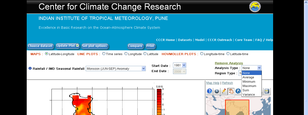
7 Choose the dataset and variable you want, Click on Seasonal Rainfall Dataset.
8 Select any radio button from the list. (Here Monsoon Anomaly is selected)
 are a 2-dimensional plot showing how the value of some quantity varies in space-time; one axis refers to time and the other to spatial location.")
9 Map will appear on the screen. We can choose Maps, Line Plots and Hovmoller Plot. Map is 2-Dimensional (Longitude and Latitude required), Line Plots have the Time Series, Longitude and Latitude. Hovmoller graphs (also known as Hofmuller Plot) are a 2-dimensional plot showing how the value of some quantity varies in space-time; one axis refers to time and the other to spatial location. For example "MAPS (latitude-longitude)" gives spatial gridded or plotted values at a specified time, "LINE PLOTS" gives a time series at a spatial point, and "HOVMOLLER PLOTS" gives you a plot or extract the temperatures for a space and time range.
10 Here also you have options to choose the different variables from the dropdown list
11 Similarly, we can choose different time period.
12 Click on Apply Analysis Button, a window will appear below 1. Choose different seasons Winter, Pre Monsoon, Monsoon and Post Monsoon from Dropdown List 2. The "Start Date" and End Date parameter enables you to choose the date or the period for the selected data you want to display. 3. Chose the Analysis Type and Region Type from Analysis dropdown list.


13 Here, A window will appear for the Analysis for different time period over the time, longitude, latitude and area.
14 See the next screen for more details.
15

16 For the Time Series click on the Time Series radio button from above panel. This is the time series plot for the period (This is a just an example to understand the analysis)

17 Similarly for longitude

18 And lattitude
 over")
19 This is a Hovmoller plot for the period JJAS (1988) over longitude
 over latitude.")
20 This is a Hovmoller plot for the period JJAS (1988) over latitude.
21 We can set plot options of colour bar using Set Plot Option Button. Following window will appear. Any of these parameters can be adjusted. Click on the symbol i to obtain more information on each option. 1. Evaluate expression and Interpolate normal to plot These determine the way in which the data are calculated and extracted from the dataset. They are: "Evaluate expression", "Interpolate data". - Expressing a new variable The LAS enables you to define a new variable based on another variable which already exists. In particular, this enables you to convert units.
22 For example: conversion of temperature from C to F. The expression is as follows: "Evaluate expression = 9.0 * $ / " The existing variable is represented by the $ symbol. - Data interpolation By default, the LAS is installed with Ferret as its analysis and graphic engine. Ferret enables you to interpolate gridded data from the original grid onto another grid. By default, this function is disabled ("No"). If you select a value on an axis which does not correspond to the position of a grid point, Ferret will use the nearest grid point on this axis to generate the requested product. You can activate the interpolation function from the "Output Options" page; Ferret will then use the linear interpolation method to calculate the data for the exact points you have chosen. If you wish to enable the data interpolation function, select "Yes" in the "Interpolate data" option. For example: The LAS has used the interpolation function to calculate a gridded map at a depth. The Ferret visualization tool enables gridded data to be interpolated from the original grid onto another grid. For example, if you select a value on an axis which does not correspond to the position of a grid point, Ferret will use the nearest grid point on this axis to generate the requested product. 2. Image Format The "Image format" option enables you to choose between GIF formats (pixilated image) Select Option, Default image format is GIF 3. Plot Size (Image Size) The "Plot size" option gives a choice of three possible image sizes: Large, Medium and Small 4. Choice of palette of colors: This option enables you to choose the color scale for the graph. A wide choice of palettes is available. The "Colour fill style" option gives a choice of possible fill styles: Fill levels are described using Ferret syntax. The number of levels is approximate, and may be changed as the algorithm rounds off the values. Examples: (0, 100, 10) Bands of color starting at 0, ending at 100, with an
23 interval of 10. This parameter enables you to adjust the fill levels on the color scale. It is based on a complex and powerful syntax (see "Ferret User Manual") which allows all possible choices to be selected. For example: To obtain very detailed color variations around 0 C for example every 2 degrees between -5 and 5 degrees; then less detailed for more extreme values (every 5 degrees); and lastly, more distinction above + 45 or below - 45 degrees (as far as the extreme values possible: either + or 90), you would select the following: Fill levels: (-90) (-45,-5, 5) (-5,5,2) (5,45,5) (90) size By default, the LAS use different colors in the map's background to represent the variations displayed. 5. Choice of Contour Levels You can also choose which contour lines to use, with the "Contour levels" parameter. This is based on the same syntax as the "Fill levels" parameter described earlier. 6. To Plot the trend 1. Margins - Make the plot with or without margins: when no margin is chosen, the axes are at the edges of the plot (WMS-style plots). By default margins are shown. 2. Degrees. Minute axis - Format the labels on plot axes that are in units of degrees longitude or latitude as degrees, minutes rather than degrees and decimal fractions of degrees. For axes with other units, this setting will be ignored. 3. Trend Line - Overlay a trend line. For the option "Trend Line and Detrended", a second panel is added, showing the variable minus mean and variable minus mean and trend. Note that the slope of the trend is computed using the units of the independent axis. A monthly axis may have underlying units of days, so in such a case the slope will be data units/days. 4. Dependent Axis Scale - Set scale on the dependent axis lo, hi [, delta] where [, delta] is optional, units are data units. If a delta is given, it will determine the tic mark intervals. The dependent axis is the vertical axis for most plots; for plots of a variable vs height or depth it is the horizontal axis. If the scale is not set, Ferret determines this from the data.

24 Similar options can be set for the Animation using Animate Button. Palette Style Choose appropriate color from menu. Time Step - Set the time step for animation. It is between 1 and the number of frames being selected. Contour Style - What style of contours to draw Choices are: Default -- let LAS decide Raster -- Fill each grid cell with the appropriate color Color filled -- Fill in between contour lines with color Lines -- Just draw lines Raster and lines -- Fill in each grid cell and draw lines on top
25 Color filled and lines -- Fill in between contour lines with color and draw lines on top Match aspect ratio of plot to aspect ratio of region, Choices are Default -- let LAS decide the aspect ratio Yes -- Force LAS to calculate the aspect ratio of the plot based on the aspect ratio of the geographic region No -- Do not change the aspect ratio based on the region. Land fill style - Style for drawing continents. Only applies to XY plots. Choices are: Default -- let LAS decide None -- don\'t draw continents Outline -- draw continent outlines Filled -- draw filled continents
26 Compare Button The LAS allows you to choose compare plots. By default, the LAS is launched in "single data set" mode. This mode enables you to create graphs or to download data from variables in a single dataset. To switch to comparison mode, click on the "compare" button. Multi- graphs will be appear on new window, Here we can compare four graphs for different year or months or days.
27 Difference mode between more than two years. (Up to 4 years)


28 Print Button We can save the image as GIF or can take print PDF or GIF. Thank you
Latin American and Caribbean Flood and Drought Monitor Tutorial Last Updated: November 2014
 Latin American and Caribbean Flood and Drought Monitor Tutorial Last Updated: November 2014 Introduction: This tutorial examines the main features of the Latin American and Caribbean Flood and Drought
Scatter Plots with Error Bars
 Chapter 165 Scatter Plots with Error Bars Introduction The procedure extends the capability of the basic scatter plot by allowing you to plot the variability in Y and X corresponding to each point. Each
Dealing with Data in Excel 2010
 Dealing with Data in Excel 2010 Excel provides the ability to do computations and graphing of data. Here we provide the basics and some advanced capabilities available in Excel that are useful for dealing
Applying a circular load. Immediate and consolidation settlement. Deformed contours. Query points and query lines. Graph query.
 Quick Start Tutorial 1-1 Quick Start Tutorial This quick start tutorial will cover some of the basic features of Settle3D. A circular load is applied to a single soil layer and settlements are examined.
Interactive Excel Spreadsheets:
 Interactive Excel Spreadsheets: Constructing Visualization Tools to Enhance Your Learner-centered Math and Science Classroom Scott A. Sinex Department of Physical Sciences and Engineering Prince George
Data Visualization. Prepared by Francisco Olivera, Ph.D., Srikanth Koka Department of Civil Engineering Texas A&M University February 2004
 Data Visualization Prepared by Francisco Olivera, Ph.D., Srikanth Koka Department of Civil Engineering Texas A&M University February 2004 Contents Brief Overview of ArcMap Goals of the Exercise Computer
The following is an overview of lessons included in the tutorial.
 Chapter 2 Tutorial Tutorial Introduction This tutorial is designed to introduce you to some of Surfer's basic features. After you have completed the tutorial, you should be able to begin creating your
Geocortex HTML 5 Viewer Manual
 1 FAQ Nothing Happens When I Print? How Do I Search? How Do I Find Feature Information? How Do I Print? How can I Email A Map? How Do I See the Legend? How Do I Find the Coordinates of a Location? How
Omatics User s Guide
 Omatics User s Guide Web Interface V2.1 User s Guide Table of Contents I. Introduction... 2 II. The Omatics Interface... 3 III. Omatics Functionality... 4 A. Launching Omatics... 4 B. Viewing current vehicle
Norwegian Satellite Earth Observation Database for Marine and Polar Research http://normap.nersc.no USE CASES
 Norwegian Satellite Earth Observation Database for Marine and Polar Research http://normap.nersc.no USE CASES The NORMAP Project team has prepared this document to present functionality of the NORMAP portal.
Excel -- Creating Charts
 Excel -- Creating Charts The saying goes, A picture is worth a thousand words, and so true. Professional looking charts give visual enhancement to your statistics, fiscal reports or presentation. Excel
Spotfire v6 New Features. TIBCO Spotfire Delta Training Jumpstart
 Spotfire v6 New Features TIBCO Spotfire Delta Training Jumpstart Map charts New map chart Layers control Navigation control Interaction mode control Scale Web map Creating a map chart Layers are added
Introduction to Microsoft Excel 2007/2010
 to Microsoft Excel 2007/2010 Abstract: Microsoft Excel is one of the most powerful and widely used spreadsheet applications available today. Excel's functionality and popularity have made it an essential
Gestation Period as a function of Lifespan
 This document will show a number of tricks that can be done in Minitab to make attractive graphs. We work first with the file X:\SOR\24\M\ANIMALS.MTP. This first picture was obtained through Graph Plot.
OECD.Stat Web Browser User Guide
 OECD.Stat Web Browser User Guide May 2013 May 2013 1 p.10 Search by keyword across themes and datasets p.31 View and save combined queries p.11 Customise dimensions: select variables, change table layout;
Create a folder on your network drive called DEM. This is where data for the first part of this lesson will be stored.
 In this lesson you will create a Digital Elevation Model (DEM). A DEM is a gridded array of elevations. In its raw form it is an ASCII, or text, file. First, you will interpolate elevations on a topographic
Excel 2007 Basic knowledge
 Ribbon menu The Ribbon menu system with tabs for various Excel commands. This Ribbon system replaces the traditional menus used with Excel 2003. Above the Ribbon in the upper-left corner is the Microsoft
Guide To Creating Academic Posters Using Microsoft PowerPoint 2010
 Guide To Creating Academic Posters Using Microsoft PowerPoint 2010 INFORMATION SERVICES Version 3.0 July 2011 Table of Contents Section 1 - Introduction... 1 Section 2 - Initial Preparation... 2 2.1 Overall
6. If you want to enter specific formats, click the Format Tab to auto format the information that is entered into the field.
 Adobe Acrobat Professional X Part 3 - Creating Fillable Forms Preparing the Form Create the form in Word, including underlines, images and any other text you would like showing on the form. Convert the
Microsoft Excel 2010 Charts and Graphs
 Microsoft Excel 2010 Charts and Graphs Email: training@health.ufl.edu Web Page: http://training.health.ufl.edu Microsoft Excel 2010: Charts and Graphs 2.0 hours Topics include data groupings; creating
Reference Guide for WebCDM Application 2013 CEICData. All rights reserved.
 Reference Guide for WebCDM Application 2013 CEICData. All rights reserved. Version 1.2 Created On February 5, 2007 Last Modified August 27, 2013 Table of Contents 1 SUPPORTED BROWSERS... 3 1.1 INTERNET
Files Used in this Tutorial
 Generate Point Clouds Tutorial This tutorial shows how to generate point clouds from IKONOS satellite stereo imagery. You will view the point clouds in the ENVI LiDAR Viewer. The estimated time to complete
Creating a Network Graph with Gephi
 Creating a Network Graph with Gephi Gephi is a powerful tool for network analysis, but it can be intimidating. It has a lot of tools for statistical analysis of network data most of which you won't be
Chapter 4 Creating Charts and Graphs
 Calc Guide Chapter 4 OpenOffice.org Copyright This document is Copyright 2006 by its contributors as listed in the section titled Authors. You can distribute it and/or modify it under the terms of either
Data Visualization. Brief Overview of ArcMap
 Data Visualization Prepared by Francisco Olivera, Ph.D., P.E., Srikanth Koka and Lauren Walker Department of Civil Engineering September 13, 2006 Contents: Brief Overview of ArcMap Goals of the Exercise
MetroBoston DataCommon Training
 MetroBoston DataCommon Training Whether you are a data novice or an expert researcher, the MetroBoston DataCommon can help you get the information you need to learn more about your community, understand
How to georectify an image in ArcMap 10
 How to georectify an image in ArcMap 10 The University Library has a large collection of historical aerial photos for some North Carolina Counties ( http://www.lib.unc.edu/reference/gis/usda/index.html
Snagit 10. Getting Started Guide. March 2010. 2010 TechSmith Corporation. All rights reserved.
 Snagit 10 Getting Started Guide March 2010 2010 TechSmith Corporation. All rights reserved. Introduction If you have just a few minutes or want to know just the basics, this is the place to start. This
TIBCO Spotfire Business Author Essentials Quick Reference Guide. Table of contents:
 Table of contents: Access Data for Analysis Data file types Format assumptions Data from Excel Information links Add multiple data tables Create & Interpret Visualizations Table Pie Chart Cross Table Treemap
Scientific Graphing in Excel 2010
 Scientific Graphing in Excel 2010 When you start Excel, you will see the screen below. Various parts of the display are labelled in red, with arrows, to define the terms used in the remainder of this overview.
Water Risk Filter USER GUIDE
 Water Risk Filter USER GUIDE Copyright 2014 Prognoz Corporation. All rights reserved. All trademarks are the property of their respective owners. No portion of this user guide may be reproduced or transmitted
Fixplot Instruction Manual. (data plotting program)
") Fixplot Instruction Manual (data plotting program) MANUAL VERSION2 2004 1 1. Introduction The Fixplot program is a component program of Eyenal that allows the user to plot eye position data collected with
Fixplot Instruction Manual (data plotting program) MANUAL VERSION2 2004 1 1. Introduction The Fixplot program is a component program of Eyenal that allows the user to plot eye position data collected with
There are six different windows that can be opened when using SPSS. The following will give a description of each of them.
 SPSS Basics Tutorial 1: SPSS Windows There are six different windows that can be opened when using SPSS. The following will give a description of each of them. The Data Editor The Data Editor is a spreadsheet
Introduction To Microsoft Office PowerPoint 2007. Bob Booth July 2008 AP-PPT5
 Introduction To Microsoft Office PowerPoint 2007. Bob Booth July 2008 AP-PPT5 University of Sheffield Contents 1. INTRODUCTION... 3 2. GETTING STARTED... 4 2.1 STARTING POWERPOINT... 4 3. THE USER INTERFACE...
Formulas, Functions and Charts
 Formulas, Functions and Charts :: 167 8 Formulas, Functions and Charts 8.1 INTRODUCTION In this leson you can enter formula and functions and perform mathematical calcualtions. You will also be able to
STATGRAPHICS Online. Statistical Analysis and Data Visualization System. Revised 6/21/2012. Copyright 2012 by StatPoint Technologies, Inc.
 STATGRAPHICS Online Statistical Analysis and Data Visualization System Revised 6/21/2012 Copyright 2012 by StatPoint Technologies, Inc. All rights reserved. Table of Contents Introduction... 1 Chapter
Embroidery Fonts Plus ( EFP ) Tutorial Guide Version 1.0505
 Tutorial Guide Version 1.0505") Embroidery Fonts Plus ( EFP ) Tutorial Guide Version 1.0505 1 Contents Chapter 1 System Requirements.................. 3 Chapter 2 Quick Start Installation.................. 4 System Requirements................
Embroidery Fonts Plus ( EFP ) Tutorial Guide Version 1.0505 1 Contents Chapter 1 System Requirements.................. 3 Chapter 2 Quick Start Installation.................. 4 System Requirements................
Using the Kendall County GIS Basic GIS Viewer
 Using the Kendall County GIS Basic GIS Viewer Link to Viewer Gallery: http://gis.co.kendall.il.us/gisviewer_gallery.aspx Help and About Initial View Introduction Navigation Identify Tool Search Tool Search
Maple Quick Start. Introduction. Talking to Maple. Using [ENTER] 3 (2.1)
![Maple Quick Start. Introduction. Talking to Maple. Using [ENTER] 3 (2.1)](/thumbs/19/376447.jpg "Maple Quick Start. Introduction. Talking to Maple. Using [ENTER] 3 (2.1)") Introduction Maple Quick Start In this introductory course, you will become familiar with and comfortable in the Maple environment. You will learn how to use context menus, task assistants, and palettes
Introduction Maple Quick Start In this introductory course, you will become familiar with and comfortable in the Maple environment. You will learn how to use context menus, task assistants, and palettes
Regional Drought Decision Support System (RDDSS) Charting Tools Help Documentation
 Charting Tools Help Documentation") Regional Drought Decision Support System (RDDSS) Charting Tools Help Documentation The following help documentation was prepared to give insight to the basic functionality of the charting tools within
Regional Drought Decision Support System (RDDSS) Charting Tools Help Documentation The following help documentation was prepared to give insight to the basic functionality of the charting tools within
ABOUT THIS DOCUMENT ABOUT CHARTS/COMMON TERMINOLOGY
 A. Introduction B. Common Terminology C. Introduction to Chart Types D. Creating a Chart in FileMaker E. About Quick Charts 1. Quick Chart Behavior When Based on Sort Order F. Chart Examples 1. Charting
Document Conventions... 2 Technical Requirements... 2. Logging On... 3 Logging Off... 3. Main Menu Panel... 4 Contents Panel... 4 Document Panel...
 Contents GETTING STARTED... 2 Document Conventions... 2 Technical Requirements... 2 LOGIN AND LOGOFF... 2 Logging On... 3 Logging Off... 3 USP-NF ONLINE HOME PAGE... 3 Main Menu Panel... 4 Contents Panel...
5. Tutorial. Starting FlashCut CNC
 FlashCut CNC Section 5 Tutorial 259 5. Tutorial Starting FlashCut CNC To start FlashCut CNC, click on the Start button, select Programs, select FlashCut CNC 4, then select the FlashCut CNC 4 icon. A dialog
Color Swatches Pro. Magento Extension User Guide. Official extension page: Color Swatches Pro. User Guide: Color Swatches Pro
 Color Swatches Pro Magento Extension User Guide Official extension page: Color Swatches Pro Page 1 Table of contents: 1. How to upload images for attributes... 3 2. General Settings....... 7 3. Category
MicroStrategy Analytics Express User Guide
 MicroStrategy Analytics Express User Guide Analyzing Data with MicroStrategy Analytics Express Version: 4.0 Document Number: 09770040 CONTENTS 1. Getting Started with MicroStrategy Analytics Express Introduction...
SketchUp Instructions
 SketchUp Instructions Every architect needs to know how to use SketchUp! SketchUp is free from Google just Google it and download to your computer. You can do just about anything with it, but it is especially
Tutorial 2: Using Excel in Data Analysis
 Tutorial 2: Using Excel in Data Analysis This tutorial guide addresses several issues particularly relevant in the context of the level 1 Physics lab sessions at Durham: organising your work sheet neatly,
HELCOM Data and Map Service. User Manual
 HELCOM Data and Map Service User Manual Version 2.2 - February 2015 1 Table of contents 1. General Information... 3 1.1 Background... 3 1.2 Technical requirements... 3 1.3 Contact... 3 2. Accessing HELCOM
GelAnalyzer 2010 User s manual. Contents
 GelAnalyzer 2010 User s manual Contents 1. Starting GelAnalyzer... 2 2. The main window... 2 3. Create a new analysis... 2 4. The image window... 3 5. Lanes... 3 5.1 Detect lanes automatically... 3 5.2
Create a Poster Using Publisher
 Contents 1. Introduction 1. Starting Publisher 2. Create a Poster Template 5. Aligning your images and text 7. Apply a background 12. Add text to your poster 14. Add pictures to your poster 17. Add graphs
APPENDICES. Appendix 1 Autodesk MapGuide Viewer R6 Help http://www.mapguide.com/help/ver6/viewer/en/index.htm
 APPENDICES Appendix 1 Autodesk MapGuide Viewer R6 Help http://www.mapguide.com/help/ver6/viewer/en/index.htm Appendix 2 The MapPlace Toolbar and Popup Menu http://www.em.gov.bc.ca/mining/geolsurv/mapplace/menudesc.htm
Tutorial for Tracker and Supporting Software By David Chandler
 Tutorial for Tracker and Supporting Software By David Chandler I use a number of free, open source programs to do video analysis. 1. Avidemux, to exerpt the video clip, read the video properties, and save
How does the Review Program work?
 Welcome Welcome to the Heavy Weather Review application (Review), the essential tool for analysis & visualization. Review works together with Heavy Weather Software and uses the collected data to generate
Internet Explorer 7 for Windows XP: Obtaining MIT Certificates
 Internet Explorer 7 for Windows XP: Obtaining MIT Certificates Overview In order to use secure web services at MIT, you will need to obtain two types of MIT web certificates: MIT Certificate Authority
http://bco-dmo.org Go to: http://usjgofs.whoi.edu/jg/dir/jgofs/ URL: http://usjgofs.whoi.edu/jg/serv/jgofs/arabian/inventory.html0
 http://bco-dmo.org DATA ACCESS TUTORIAL 2012 OCB PI Summer Workshop Data access: catalog browse scenario 1: you are a former US JGOFS or US GLOBEC researcher, and you know what data you are looking for
Summary of important mathematical operations and formulas (from first tutorial):
:") EXCEL Intermediate Tutorial Summary of important mathematical operations and formulas (from first tutorial): Operation Key Addition + Subtraction - Multiplication * Division / Exponential ^ To enter a
EXCEL Intermediate Tutorial Summary of important mathematical operations and formulas (from first tutorial): Operation Key Addition + Subtraction - Multiplication * Division / Exponential ^ To enter a
Introduction to dobe Acrobat XI Pro
 Introduction to dobe Acrobat XI Pro Introduction to Adobe Acrobat XI Pro is licensed under the Creative Commons Attribution-NonCommercial-NoDerivatives 4.0 International License. To view a copy of this
ITS Training Class Charts and PivotTables Using Excel 2007
 When you have a large amount of data and you need to get summary information and graph it, the PivotTable and PivotChart tools in Microsoft Excel will be the answer. The data does not need to be in one
INSTRUCTIONS FOR MAKING 3D,.DWG CONTOUR LINES
 INSTRUCTIONS FOR MAKING 3D,.DWG CONTOUR LINES A TUTORIAL FROM SPATIAL AND NUMERIC DATA SERVICES NICOLE SCHOLTZ AND GEOFF IVERSON Overview... 2 A. Get a Digital Elevation Model (DEM)... 3 B. Open ArcMap,
TIBCO Spotfire Network Analytics 1.1. User s Manual
 TIBCO Spotfire Network Analytics 1.1 User s Manual Revision date: 26 January 2009 Important Information SOME TIBCO SOFTWARE EMBEDS OR BUNDLES OTHER TIBCO SOFTWARE. USE OF SUCH EMBEDDED OR BUNDLED TIBCO
Working with Excel in Origin
 Working with Excel in Origin Limitations When Working with Excel in Origin To plot your workbook data in Origin, you must have Excel version 7 (Microsoft Office 95) or later installed on your computer
Studying Topography, Orographic Rainfall, and Ecosystems (STORE)
") Studying Topography, Orographic Rainfall, and Ecosystems (STORE) Basic Lesson 3: Using Microsoft Excel to Analyze Weather Data: Topography and Temperature Introduction This lesson uses NCDC data to compare
Studying Topography, Orographic Rainfall, and Ecosystems (STORE) Basic Lesson 3: Using Microsoft Excel to Analyze Weather Data: Topography and Temperature Introduction This lesson uses NCDC data to compare
Raster: The Other GIS Data
 04-Raster_Tutorial_Arcgis_93.Doc Page 1 of 11 Raster: The Other GIS Data Objectives Understand the raster format and how it is used to model continuous geographic phenomena Understand how projections &
MODEL ANALYSES AND GUIDANCE (MAG) WEB APPLICATION
 WEB APPLICATION") MODEL ANALYSES AND GUIDANCE (MAG) WEB APPLICATION MAG User s Manual (Documentation Version 3.10) April 2016 Prepared by: Systems Integration Branch/Software Development Team NCEP Central Operations NOAA
MODEL ANALYSES AND GUIDANCE (MAG) WEB APPLICATION MAG User s Manual (Documentation Version 3.10) April 2016 Prepared by: Systems Integration Branch/Software Development Team NCEP Central Operations NOAA
2. Select Point B and rotate it by 15 degrees. A new Point B' appears. 3. Drag each of the three points in turn.
 In this activity you will use Sketchpad s Iterate command (on the Transform menu) to produce a spiral design. You ll also learn how to use parameters, and how to create animation action buttons for parameters.
Blackboard s Collaboration Tool
 Blackboard s Collaboration Tool Using Blackboard s Collaboration Tool, instructors can create and host a course-related chat session or virtual classroom in which students and instructors can interact
Creating Charts in Microsoft Excel A supplement to Chapter 5 of Quantitative Approaches in Business Studies
 Creating Charts in Microsoft Excel A supplement to Chapter 5 of Quantitative Approaches in Business Studies Components of a Chart 1 Chart types 2 Data tables 4 The Chart Wizard 5 Column Charts 7 Line charts
Plotting: Customizing the Graph
 Plotting: Customizing the Graph Data Plots: General Tips Making a Data Plot Active Within a graph layer, only one data plot can be active. A data plot must be set active before you can use the Data Selector
Creating Interactive PDF Forms
 Creating Interactive PDF Forms Using Adobe Acrobat X Pro Information Technology Services Outreach and Distance Learning Technologies Copyright 2012 KSU Department of Information Technology Services This
PISA 2015 MS Online School Questionnaire: User s Manual
 OECD Programme for International Student Assessment 2015 PISA 2015 MS Online School Questionnaire: User s Manual Doc: CY6_CBA_SCQ_MSPrincipalManual.docx September 2014 Produced by ETS, Core 2 Contractor
TABLE OF CONTENTS. INTRODUCTION... 5 Advance Concrete... 5 Where to find information?... 6 INSTALLATION... 7 STARTING ADVANCE CONCRETE...
 Starting Guide TABLE OF CONTENTS INTRODUCTION... 5 Advance Concrete... 5 Where to find information?... 6 INSTALLATION... 7 STARTING ADVANCE CONCRETE... 7 ADVANCE CONCRETE USER INTERFACE... 7 Other important
Essay 5 Tutorial for a Three-Dimensional Heat Conduction Problem Using ANSYS Workbench
 Essay 5 Tutorial for a Three-Dimensional Heat Conduction Problem Using ANSYS Workbench 5.1 Introduction The problem selected to illustrate the use of ANSYS software for a three-dimensional steadystate
SAS VISUAL ANALYTICS AN OVERVIEW OF POWERFUL DISCOVERY, ANALYSIS AND REPORTING
 SAS VISUAL ANALYTICS AN OVERVIEW OF POWERFUL DISCOVERY, ANALYSIS AND REPORTING WELCOME TO SAS VISUAL ANALYTICS SAS Visual Analytics is a high-performance, in-memory solution for exploring massive amounts
Where On Earth Will Three Different Satellites Provide Simultaneous Coverage?
 Where On Earth Will Three Different Satellites Provide Simultaneous Coverage? In this exercise you will use STK/Coverage to model and analyze the quality and quantity of coverage provided by the Earth
NetCDF in QGIS tutorial
 NetCDF in QGIS tutorial Gregory Giuliani University of Geneva - EnviroSPACE http://www.unige.ch/envirospace Geo For All http://www.geoforall.org http://www.osgeo.org/ http://icaci.org/ CONTENT Displaying
Creating an Excel XY (Scatter) Plot
 Plot") Creating an Excel XY (Scatter) Plot EXCEL REVIEW 21-22 1 What is an XY or Scatter Plot? An XY or scatter plot either shows the relationships among the numeric values in several data series or plots two
Creating an Excel XY (Scatter) Plot EXCEL REVIEW 21-22 1 What is an XY or Scatter Plot? An XY or scatter plot either shows the relationships among the numeric values in several data series or plots two
SAS/GRAPH 9.2 ODS Graphics Editor. User s Guide
 SAS/GRAPH 9.2 ODS Graphics Editor User s Guide The correct bibliographic citation for this manual is as follows: SAS Institute Inc. 2009. SAS/GRAPH 9.2: ODS Graphics Editor User's Guide. Cary, NC: SAS
How to make a line graph using Excel 2007
 How to make a line graph using Excel 2007 Format your data sheet Make sure you have a title and each column of data has a title. If you are entering data by hand, use time or the independent variable in
SQL Server 2005: Report Builder
 SQL Server 2005: Report Builder Table of Contents SQL Server 2005: Report Builder...3 Lab Setup...4 Exercise 1 Report Model Projects...5 Exercise 2 Create a Report using Report Builder...9 SQL Server 2005:
Map Navigation Controls. An Interactive, Locally Based Knowledge Resource LivingstonLive.org/maps OR gisapps/livingstonviewerinternal
 Livingston County s Internet Mapping Portal User Guide An Interactive, Locally Based Knowledge Resource LivingstonLive.org/maps OR gisapps/livingstonviewerinternal A vast majority of County government
CREATE A 3D MOVIE IN DIRECTOR
 CREATE A 3D MOVIE IN DIRECTOR 2 Building Your First 3D Movie in Director Welcome to the 3D tutorial for Adobe Director. Director includes the option to create three-dimensional (3D) images, text, and animations.
Market Pricing Override
 Market Pricing Override MARKET PRICING OVERRIDE Market Pricing: Copy Override Market price overrides can be copied from one match year to another Market Price Override can be accessed from the Job Matches
Access 2007 Creating Forms Table of Contents
 Access 2007 Creating Forms Table of Contents CREATING FORMS IN ACCESS 2007... 3 UNDERSTAND LAYOUT VIEW AND DESIGN VIEW... 3 LAYOUT VIEW... 3 DESIGN VIEW... 3 UNDERSTAND CONTROLS... 4 BOUND CONTROL... 4
PowerWorld Simulator
 PowerWorld Simulator Quick Start Guide 2001 South First Street Champaign, Illinois 61820 +1 (217) 384.6330 support@powerworld.com http://www.powerworld.com Purpose This quick start guide is intended to
TestManager Administration Guide
 TestManager Administration Guide RedRat Ltd July 2015 For TestManager Version 4.57-1 - Contents 1. Introduction... 3 2. TestManager Setup Overview... 3 3. TestManager Roles... 4 4. Connection to the TestManager
Guide to Viewing Maps in Google Earth
 Guide to Viewing Maps in Google Earth The BCT made the decision to provide the GIS (Geographic Information System) resources for Bat Groups in the form of Google Earth maps because they do not require
A simple three dimensional Column bar chart can be produced from the following example spreadsheet. Note that cell A1 is left blank.
 Department of Library Services Creating Charts in Excel 2007 www.library.dmu.ac.uk Using the Microsoft Excel 2007 chart creation system you can quickly produce professional looking charts. This help sheet
Using Microsoft Word. Working With Objects
 Using Microsoft Word Many Word documents will require elements that were created in programs other than Word, such as the picture to the right. Nontext elements in a document are referred to as Objects
Layout Tutorial. Chapter 10: Getting Started
 Chapter 10: Layout Tutorial In this tutorial we will create a layout template, send a few views to a layout page, then save this document in PDF format. In this tutorial you will learn about: Creating
How to use PGS: Basic Services Provision Map App
 How to use PGS: Basic Services Provision Map App The PGS: Basic Services Provision Map App The main features of the PGP Basic Services web application includes: Navigation Tools Map Tools Main Map Links
Smoke Density Monitor application documentation
 Smoke Density Monitor application documentation Navigating the User interface Fig. 1 Screen shot of the application layout. Description Graphical Monitor Data Browser Trending Graph Alarm View Create Report
University of Arkansas Libraries ArcGIS Desktop Tutorial. Section 4: Preparing Data for Analysis
 : Preparing Data for Analysis When a user acquires a particular data set of interest, it is rarely in the exact form that is needed during analysis. This tutorial describes how to change the data to make
Registration Instructions. Visual Basic 2010 Express Software
 Registration Instructions for Visual Basic 2010 Express Software Updated January, 2011 Registration of the Visual Basic 2010 Express software is required by Microsoft within 30 days of installation. Registration
Communicate: In Print
 Communicate: In Print A simple guide Work areas Communicate: In Print has two different modes in which to edit your documents: Create and Adjust modes. These are easily interchangeable and the toolbars
TUTORIAL 4 Building a Navigation Bar with Fireworks
 TUTORIAL 4 Building a Navigation Bar with Fireworks This tutorial shows you how to build a Macromedia Fireworks MX 2004 navigation bar that you can use on multiple pages of your website. A navigation bar
INTRODUCTORY LAB: DOING STATISTICS WITH SPSS 21
 INTRODUCTORY LAB: DOING STATISTICS WITH SPSS 21 This section covers the basic structure and commands of SPSS for Windows Release 21. It is not designed to be a comprehensive review of the most important
Excel Pivot Tables. Blue Pecan Computer Training Ltd - Onsite Training Provider www.bluepecantraining.com :: 0800 6124105 :: info@bluepecan.co.
 Excel Pivot Tables 1 Table of Contents Pivot Tables... 3 Preparing Data for a Pivot Table... 3 Creating a Dynamic Range for a Pivot Table... 3 Creating a Pivot Table... 4 Removing a Field... 5 Change the
Basic AutoSketch Manual
 Basic AutoSketch Manual Instruction for students Skf-Manual.doc of 3 Contents BASIC AUTOSKETCH MANUAL... INSTRUCTION FOR STUDENTS... BASIC AUTOSKETCH INSTRUCTION... 3 SCREEN LAYOUT... 3 MENU BAR... 3 FILE
ABAQUS/CAE Tutorial: Analysis of an Aluminum Bracket
 H. Kim FEA Tutorial 1 ABAQUS/CAE Tutorial: Analysis of an Aluminum Bracket Hyonny Kim last updated: August 2004 In this tutorial, you ll learn how to: 1. Sketch 2D geometry & define part. 2. Define material
UTAH DEPARTMENT OF ENVIRONMENTAL QUALITY TIER 2 SUBMISSION PORTAL. And APPLICATION USER S GUIDE
 UTAH DEPARTMENT OF ENVIRONMENTAL QUALITY TIER 2 SUBMISSION PORTAL And APPLICATION USER S GUIDE January 2015 1 Utah DEQ Tier 2 Internet Portal DEQ offers multiple options to assist facility submitters in