3.2 Statistical Analysis Procedures
|
|
|
- Robert Owen
- 8 years ago
- Views:
Transcription
1 3.2 Statistical Analysis Procedures There are many different types of statistical analysis that can be performed on water quality data sets for reporting and interpretation purposes. Many inferences can be made about data from simple statistics such as mean, minimum, maximum, median, range, and standard deviation. Here is a quick review of how these statistics are calculated and how they can be used for analysis of water monitoring data. Also included in this section are some slightly more advance statistics. The following table, derived from the MPCA s Volunteer Surface Water Monitoring Guide, provides some guidance on the particular uses of these statistical methods. Table 1. Suggested Statistical Summaries for General Chemical and Physical Parameters (Adapted from We Have Stream Data, Now What) Statistical Summary Parameter Total Suspended Solids Temperature Dissolved Oxygen Turbidity Nutrients Conductivity ph Alkalinity Chlorophyll-a Flow Water Clarity/Transparency Bacteria Average Median Flow-Weighted Average Range Quartiles Confidence Intervals or Standard Deviation Seasonal Average Seasonal Median Maximum Minimum Geometric Mean

2 3.21 Statistics Median: The median of a data set is the middle value after all the values have been ranked in order of value. The median can easily be picked out in small data sets, or can be calculated with the =MEDIAN() equation in Microsoft Excel for large data sets. Mean: The mean, or average, of a set of samples is one way of finding the center value of a data set. Divide the sum of the results by the number of results. Mean can be automatically calculated using the =AVERAGE() equation in Microsoft Excel. Geometric Mean: A geometric mean can be used to calculate a mean that is not skewed by extreme values. It is one of the calculations used when assessing waters for impairment for the TMDL program, particularly for fecal coliform. Fecal coliform levels can be very low on one day and too numerous to count the next day on some streams. The geometric mean is normally close to the median for positively skewed data sets. Where G represents the geometric mean and the x n values represent a series of numbers in a data set: G (x 1, x 2 ) = (x 1 *x 2 ) = (x 1 *x 2 ) 1/2 ; G (x 1, x 2, x 3,) = (x 1 *x 2 *x 3 ) 1/3 ; And so on... Note that geometric mean takes the product of all the numbers in the data set to the power of one over the number of values in the data set. Geometric mean can also be calculated automatically using a function in Excel: =GEOMEAN(A1:A5), where A1:A5 is the range of cells that contain the data to be analyzed (for the example). The geometric mean cannot be calculated for data sets that include values of zero. Therefore, values that are below the minimum detection limit (represented by <(MDL) in lab reports) must be represented by a positive number such as one-half of the MDL. Trimmed Mean: This is another way to remove the influence of outliers in data sets. To calculate a trimmed mean, calculate the mean of only the data that falls between the 25 th and 75 th percentiles of a data set. Trimmed mean can be automatically calculated in Microsoft Excel by using the equation: =TRIMMEAN(). See the following section on quartiles to learn how to calculate the 25 th and 75 th percentiles. Percentiles and Quartiles: Percentiles are a measure of the relative position of a single value within a data set. They are more valuable when applied to large data sets versus small ones. Percentiles are labeled P 1, P 5, P 25, etc. The subscript number refers to the percentage of the values in the data set that are smaller than the value of the percentile. So, if the P 30 percentile of a data set equals 10, 30% of the measurements are less than 10 and 70% of the measurements are greater than 10. Three particular percentiles are used quite frequently in statistical analysis. These are P 25, P 50, and P 75. These percentiles are also referred to as the 1 st, 2 nd, and 3 rd quartiles or Q 1, Q 2, and Q 3, respectively. Other percentiles that are commonly used include the 5 th and the 95 th percentiles
 equation in Microsoft Excel. Geometric Mean: A geometric mean can be used to calculate a mean that is not skewed by extreme values.")
3 Percentiles and quartiles are another type of statistical analysis that can be performed using Microsoft Excel and other computer programs. Many programs that calculate a set of summary statistics will include the 1 st, 2 nd, and 3 rd quartiles. To perform this calculation using a Microsoft Excel function, simply go to Insert >> Function, click on statistical, and then choose either PERCENTILE or QUARTILE. Choose the PERCENTILE function for percentiles other than the quartiles because you can input the percentile you wish to calculate (between 0 and 1). QUARTILES is a simplified version of the PERCENTILE function. The desired quartile is entered into the Quart field (0 for minimum, 1 for Q1, 2 for Q2, 3 for Q3, and 4 for maximum). Whichever function you choose, a window with two fields will appear. Enter the range of values to be analyzed into the Array field and indicate the desired percentile or quartile in the bottom field. Click OK when the information has been correctly entered into the fields. Loads: Loads are calculated by multiplying concentration by flow volume. Daily average concentrations and/or flows can be used for continuous monitoring programs. Often, however, only one measurement for each will be available for each sampling day. Instantaneous loads can still be calculated with this data. Loads in milligrams (mg) per second (sec) can be calculated by multiplying the concentration in milligrams per liter (mg/l or ppm) by the flow in cubic feet per second (ft 3 /sec or cfs) and then multiplying by a conversion factor of L/1 ft 3. Milligrams per day can be calculated by multiplying the mg/sec result by a conversion factor of 86,400 sec/day. After this, any other conversion factors can be applied. Kilograms per day can be calculated by multiplying the mg/day result by a conversion factor of 1 Kg/1,000,000 mg. Tons per day can be calculating by multiplying the kilograms per day by a conversion factor of 1 ton/ Kg. Flow-Weighted Mean: Calculating the flow-weighted mean concentrations of water quality parameters places more importance to concentrations recorded during higher flows when calculating an average concentration. High flow periods can contribute the majority of the total flow volume for a given year. The concentrations of water quality parameters during periods of high flows can have a greater impact on receiving waters than the concentrations during periods of low flow. Weighted means are calculated by multiplying each individual datum in a data set by a weighting factor, finding the sum of these products, and then dividing this sum by the sum of the weighting factors. In other words, to find flow weighted mean concentrations, first multiply parameter concentration by flow for each sampling event. Find the sum of the products from all sampling events. Finally, divide this sum by the sum of all the flow values. No conversions of concentration or flow should be needed. Any conversion factors added to the equation would need to be applied to both the divisor and the dividend and will, therefore, cancel each other out and will be a waste of time. The following equation will calculate the flow weighted mean using a data set of concentrations (c 1 c 4 ) and flows (f 1 f 4 ): Flow weighted mean = (c 1 *f 1 + c 2 *f 2 + c 3 *f 3 + c 4 *f 4 ) (f 1 + f 2 + f 3 + f 4 )
.")
4 Minimum, maximum, and range: These statistics are self-explanatory. The minimum is the lowest value in the data set. The maximum is the highest value in a data set. Range is the difference between the minimum and the maximum. Minimum and maximum values can easily be found in small data sets, but equations like the MIN and MAX functions in Microsoft Excel can help find these values in a more numerous set of values in a spreadsheet. Standard Deviation: Standard variation is a measure of the amount of variance in a data set. It is equal to the square root of the variance. This calculation can be useful in determining precision for a set of replicate samples, for example. The standard equation for standard deviation is: In the equation above, s = standard deviation, n = the number of values in the data set; X 1 = the first number of the data set, X 2 = the second number, and so on; and = the mean of the data set. Another way to calculate the standard deviation is shown below. s = the square root of ( X 2 ( X) 2 /n) X 2 = Sum of the squares of the values n-1 X = Sum of the values n = Number of values The easiest way to calculate standard deviation, however, is by using the Microsoft Excel equation: =STDEV(A1:A5), where A1:A5 is an example of a range of cells that contain the data to be analyzed

5 3.22 QA/QC Calculations Relative Percent Difference: Calculating the relative percent difference (RPD) between samples and duplicates can be used to measure the precision of water quality measurements. A smaller RPD indicates greater precision. Standards for RPD may be set at the beginning of a monitoring program and included in a quality assurance project plan (QAPP). Acceptable RPD standards range from <20% to <30% in existing quality assurance plans from various agencies and laboratories. The RPD between a sample and its duplicate is calculated by dividing the difference between the two samples by their average. RPD = (Result 1 Result 2)/[(Result 1 + Result 2)/2]*100 Percent Recovery: Percent recovery is a test of the accuracy of laboratory methods. It is essentially a ratio of the measured value versus the expected value. This test can be applied to performance evaluation sample results. Performance evaluation samples are prepared by a third party and have a known concentration. The percent recovery for a set of performance evaluation samples is equal to the measured concentration divided by the actual concentration, then multiplied by 100. Percent recovery calculations can also be used as a method of quality control to determine if there is something in the sample or in the analytical technique that is interfering with the test. A set of duplicate samples is created from the original, real sample. A matrix spike with a known concentration of the target analyte is added to one of the duplicate samples. Both the spiked sample and the unmodified sample are analyzed at the same time. The percent recovery of a matrix spike is calculated by dividing the difference in concentration between the results for the spiked sample and the results for the original sample by the concentration of the spike that was added. Greater values for percent recovery indicate a higher level of accuracy. The lab tests a spiked sample and the non-spiked sample. When the percent recovery is calculated, it should be within the range of 90 to 110 percent. A perfect percent recovery is 100 percent. If the percent recovery is low, there may be something in the sample that is interfering with the test. The percent recovery equation for matrix spikes is shown below. % Recovery = (Conc. of Spiked Sample Conc. of Non-spiked Sample) X 100 Concentration of Spike Added

6 3.23 Conversions Conversions are often necessary when managing and analyzing water quality data. Results from different sources may be in different units. Conversions are nearly always a necessity when working with loads since the units of volume in concentration data are usually milligrams and the units of volume in flow measurements are usually cubic feet. When converting data, knowing conversion factors between units is essential. Lists of conversion factors are available in table form (see below), but they are also very handy when they are in an electronic form. Conversions can be performed with advanced calculators and with computer programs such as Convert. Convert can be downloaded for free at Now that you know, for example, that one Liter equals cubic feet, you still need to be able to conduct conversions based upon these conversion factors. You will need to think back to your chemistry classes. The point of a conversion is to arrive at the desired units. For example, if the average concentration of total suspended solids for a day is 50 milligrams per Liter (mg/l) and the average rate of flow for the day is 500 cubic feet per second (cfs), how many tons per day were going through the monitoring site? The desired units are tons/day. The beginning units are mg/l and ft/sec. Equations can be created in Microsoft Excel to automate these calculations, but first, write out the equation and multiply by conversion factors to cancel out units until the desired units are achieved. In this example, we want to change seconds to days, and milligrams to tons. Liters and cubic feet (ft 3 ) are both measures of volume and will be canceled out of the equation. 50 mg * 500 ft 3 = 50 mg * 500 ft 3 * 1 L * 86,400 sec * 1 kg = 1 L 1 sec 1 L 1 sec ft 3 1 day 100,000 mg 611, kg 1 day 611, kg * 1 ton = tons/day 1 day 907 kg After writing this conversion on paper, it can be translated into a Microsoft Excel equation by noting the multiplication and division factors that are applied to the original values. If the 50 mg/l is in cell A2, the 500 ft/sec value is in cell B2, and you wish to calculate the load in tons/day in cell C2, here is what the equation should look like in cell C2: =(A2*B2*86400)/( *100000*907) or a simplified version: =(A2*B2*86400)/( )
, but they are also very handy when they are in an electronic form.")
7 Table 2. Useful Conversions for Water Quality Data Analysis Common Conversions for the Water Quality Monitor Mass Area 1 gram (g) = 1000 milligrams (mg) 1 township (twp) = 36 sections (sect) 1 ton (tn) = 2000 pounds (lbs) 1 section (sect) = 1 square mile (mi 2 ) 1 kilogram (kg) = 1000 grams (g) 1 township (twp) = 36 square miles (mi 2 ) 1 kilogram (kg) = pounds (lbs) 1 acre (ac) = 43,560 square feet (ft 2 ) 1 pound (lb) = grams (g) 1 square mile (mi 2 ) = 640 acres (ac) Distance 1 square mile (mi 2 ) = square kilometers (km 2 ) 1 mile (mi) = 5280 feet (ft) 1 square foot = 144 square inches (in 2 ) 1 mile (mi) = kilometers (km) 1 square meter (m2) = square feet (ft 2 ) 1 kilometer (km) = 1000 meters (m) 1 hectare (ha) = acres (ac) 1 hectometer (hm) = 100 meters (m) 1 square meter (m 2 ) = square yards (yd 2 ) 1 meter (m) = feet (ft) Computer Terminology 1 meter (m) = inches (in) 1 kilobyte (KB) = 1024 bytes 1 meter (m) = 100 centimeters (cm) 1 megabyte (MB) = 1024 kilobytes (KB) 1 centimeter (cm) = 10 millimeters (mm) 1 gigabyte (GB) = 1024 megabytes (MB) 1 meter (m) = yards (yd) Pressure 1 yard (yd) = 3 feet (ft) 1 inch of mercury = 25.4 millimeters of mercury 1 inch (in) = 25.4 millimeters (mm) 1 inch of mercury = kilopascals (kpa) Time 1 inch of mercury = millibars (mb) 1 year (yr) = 365 days Volume 1 day = 24 hours (hrs) 1 liter (L) = 1000 milliliters (ml) 1 hour (hr) = 60 minutes (min) 1 cubic foot (ft 3 ) = liters (L) 1 minute (min) = 60 seconds (sec) 1 gallon = liters (L) 1 hour (hr) = 3600 seconds (sec) 1 liter (L) = ounces (oz) 1 day = 86,400 seconds (sec) 1 cubic yard (yd3) = 27 cubic feet Flow Concentration 1 milligram/liter (mg/l) = 1 part per million (ppm) = 1000 micrograms/liter (μg/l) 1 cubic foot/second (cfs) = gallons/day = liters/day = liters/day = cubic meters/day = 3600 cubic feet/hour 1 microgram/liter (μg/l) = 1 part per billion (ppb) Temperature Fahrenheit to Celsius: C = (F-32) * 5/9 (Subtract 32, multiply by 5, and then divide by 9.) Celsius to Fahrenheit: F = 32 + C * 9/5 (Multiply by 9, divide by 5, and then add 32) Miscellaneous Conversions 1 cubic yard of sediment = about 2,500 pounds or 1.25 tons Amount of sediment in a two-axle, 5 yard dump truck load = 6.25 tons Amount of sediment in a tri-axle, 12 yard dump truck load = 15 tons
 1 acre (ac) = 43,560 square feet (ft 2 ) 1 pound (lb) = 453.5924 grams (g) 1 square mile (mi 2 ) = 640 acres (ac) Distance 1 square mile (mi 2 ) = 2.")
8 3.24 Graphical Methods Other forms of statistical analysis are often needed. Summarizing analysis results in tables, graphs, or charts for reporting purposes can be very helpful to the reader. Some of the descriptive statistical analysis performed for the Red River Watershed Assessment Protocol Project include the determination of minimum detection limits, recommending methods for addressing values below the minimum detection limit, histograms, boxplots, time series plots (next section), correlation matrixes, and flow duration curves. It is important to make graphs neat, informative, and understandable. The graphs should be useful for interpreting the meaning of data and presenting findings from data. There are many techniques involved in creating quality graphs. Here are some tips: Graphing data is part of a process. You may end up graphing more data than you will use in a report or presentation. Some data you graph will be more valuable than others. If graphs are used as part of the process of understanding data, their meanings, indications, and other results may be summarized in another form and the graphs may not necessarily appear in the final report or presentation. Column graphs should be used with discrete data (data that is not continuous). Line graphs are used with continuous data. Line graphs that are used for discrete measurements may mislead the viewer into thinking the data is continuous. An example of a good line graph would be flow data that is collected at regular intervals (hourly, every 15 minutes). Have a clear title. Make sure you have simple clear label on the axes that shows reporting limits. Use a scale size that reveals trends, adjust it from the default scale to meet your needs. Avoid clutter. Illustrate information that allows the reader to get to the point quickly. Use graphs only when they convey meaningful information. When displaying data from multiple sites, displaying information from upstream to downstream is an intuitive way to organize and present your results. Consider the background and graph colors. Do they print well? Adjust colors to create a color scheme that will make sense to the reader. Just do it! Start in and play around with different types of graphs thankfully, there is an undo button

9 Histogram/Frequency Plot: Histograms and frequency plots show the distribution of observations within a sample set. They are usually used to visually assess the degree of scatter and whether the observations are normally distributed. Meaning, if the observations are normally distributed, the heights of the columns should be roughly shaped like the Normal distribution curve (the superimposed blue line in the example below. These graphs can be used to interpret the symmetry and variability of data. Symmetric data will be structured symmetrically around a central point. The extent and direction to which data is being skewed will also be indicated by boxplots and frequency distributions Frequency Figure 12. Example Frequency Plot Both histograms and frequency plots split data into intervals, count the number of values in each group, and displaying the data in the form of a bar chart (green bars in Figure 12). There are two differences between the two graphs. The vertical axis of a histogram represents the percentage of the total data set that is included in each interval. The vertical axis of a frequency plot represents the number of observations within an interval. These plots can either be created manually (see example in figure 2) or using a computer program. Analyse-it, an add-in for Microsoft Excel ($100), histogram creating add-ins for Microsoft Excel (around $30), the (free) data analysis add-in for Microsoft Excel, and StatCrunch (free online at are some of the programs that can be used to create histograms. The Webstat/StatCrunch program is an online statistical analysis tool that can be accessed through the RLWD website on the Analyze or Download Data page for each monitoring site. To get to this page, go to the RLWD website at click on the Water Quality section, search for a site using the interactive map or text search tools, click on a blue site ID number (the link to the informational pages for the monitoring site), and then click on the Analyze or Download Data tab. Scroll down to the blue link for the current version of StatCrunch. After you have created an (free) account, the software will automatically load the data from the monitoring site into the program. The data can then be analyzed using nearly

10 any type of applicable statistical or graphical analysis. The statistics available in StatCrunch include correlation, covariance, summary statistics for columns or rows, frequency tables, contingency tables, z statistics, proportions, variance, regression, t statistics, ANOVA, and control charts. The options available in StatCrunch for graphical analysis include bar plots, pie charts, histograms, stem and leaf plots, boxplots, dot plots, means plots, QQ plots, scatter plots, index plots, chart group statistics, parallel coordinates, pairs plots, 3D rotating plots, and color schemes. Figure 13. Example of Generating a Histogram and a Frequency Plot. The most common available option for the creation of a histogram within a spreadsheet is likely to be the data analysis add-in for Microsoft Excel. Before starting, you will need to create a column of values that will specify the borders of the intervals within the histogram you will be creating. To see if this add-in is loaded in your version of Excel, click on Tools menu. If you do not see Data Analysis in the Tools menu, click on Addins instead. A window will appear that shows a list of possible add-ins for Excel. Check the box for Analysis ToolPak and click OK to install the add-in. You will likely need to insert your Microsoft Office CD in order to complete the installation. Once the installation process is complete, you can open the data analysis window by clicking on Data Analysis in the Tools menu. Within this window, you can see all the different types of statistical analysis that can be performed with this tool. To create a histogram, double click on Histogram in the list of options. The histogram window will then appear. In this window, you will need to specify the input range. This is the set of values you want to

11 analyze. The BIN range is the column of numbers that you created at the beginning of these instructions. Indicate where you want the histogram to appear by specifying an output range or by telling the program to create a new worksheet. Check the chart output box to get a bar chart histogram. When you click OK, the program will create the histogram. Boxplots: Creating boxplots (or box and whisker plots) is another method for visually representing the distributions within a data set. Boxplots show the relative positions of Q1, Q2, Q3, minimum, and maximum are shown above a scaled real number line. The minimum and maximum values of the data set are represented by lines drawn from the ends of the box. The left side of the box represents Q1, the first quartile. 25% of the samples are less than the value of Q1. Q3 is represented by the right side of the box and Q2 is represented by a line drawn in the middle of the box. They can be used to compare sites by placing a boxplot for each site on the same graph. Box and whisker plots can also be used to determine if sites are even comparable. If the boxes of two sites do not overlap, the sites are not comparable. This is because the best water quality of one site at its best is almost always worse than the water quality of the other site at its worst. MAX Q3 Q2 MIN Q1 Figure 14. Boxplot of TSS results within the Thief River Watershed with map. Several different methods for generating boxplots and histograms using software have been used by the RLWD. One of these is the Analyse-It software that can be purchased for approximately $100 as an add-on for Microsoft Excel. Existing Excel data can easily be used for the calculation of over 30 parametric & non-parametric statistics, including descriptive statistics, box-whisker plots, correlation, multiple linear regression analysis, ANOVA, & chi-square statistics. This program basically creates a worksheet that is set up as a report and includes histograms, percentiles, and summary statistics along with the boxplots. Another way to create boxplots, along with nearly any type of statistical analysis can be performed, is by using the Webstat/StatCrunch program

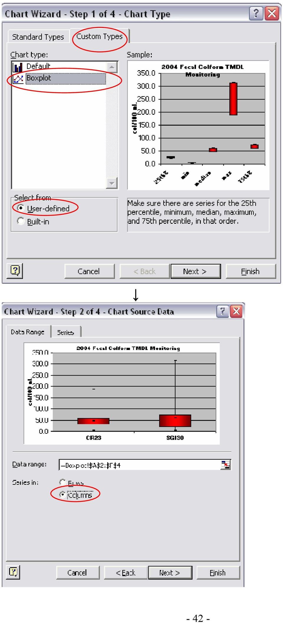
12 The preceding methods definitely work, but a user sometimes may want a worksheet dedicated to boxplots. In this case, boxplots can be created using the Chart Wizard in Microsoft Excel. Since there is no preset setting (as of Office 2000) for boxplots, the program needs to be tricked into creating a boxplot. The following step-by-step methods expound upon those found in We Have Data, Now What?, a manual compiled for the Data Analysis and Interpretation Pilot Training Workshop for Citizen Volunteer Water Quality Monitoring Programs workshop by the Red River Basin Monitoring Network, Rivers Council of Minnesota, and the River Network. 1. The first step to creating a box and whisker plot, or boxplot, is to determine which monitoring sites will be featured on the graph and create the summary statistics that will be used to create the plot. In the summary statistics table, sites should be placed in a significant order, such as upstream to downstream. The summary statistics necessary for creating a boxplot are the 25 th percentile (Q1), minimum, median (50 th percentile or Q2), maximum, and the 75 th percentile (Q3). If the columns are in this order, as shown below, you will be able to skip Step 13. Also, after saving the boxplot as a custom chart type, having summary data arranged in this order will make the creation of boxplots easier in the future. 2. Select the site name, 25 th percentile, minimum, median, maximum, and 75 th percentile column headings and data. 3. Select the Chart Wizard Button. 4. In the Chart Wizard Step 1 of 4, click on the Standard Types tab and choose the Line chart. Choose the chart sub-type labeled line with markers displayed at each data value

13 5. Click Next to continue. 6. In Chart Wizard Step 2 of 4, the data range box should automatically contain the summary data cells you selected in Step 2. Click the round button that puts the series into Columns. Click Next to continue

14 7. Skip the Chart Wizard Step 3 of 4 for now by clicking Next to continue. 8. In the Chart Wizard Step 4 of 4 Chart Location, you can choose the location of the graph. It can either be placed in its own worksheet, or in another worksheet that, for example, is dedicated to graphic analysis. 9. Now you have the beginnings of a chart that should look something like the one below. You may need to adjust the scale and fonts to make sure the chart is readable. This and other aspects of the appearance can also be adjusted when the chart is completed so it is not necessary at this point CR23 SG130 min 25th% median 75th% max 10. In the chart, double click on the line that represents the maximum values in the data set. In the Patterns tab, remove the line by choosing None under Line, change the Marker Style to a dash (-), and change the Marker Foreground Color to black

15 11. Now the graph should look similar to this: CR23 SG130 min 25th% median 75th% max

16 12. Repeat Step 10 for the minimum and median lines. When you are done, the graph should look like this: CR23 SG130 min 25th% median 75th% max 13. Double-click on the line for the 25 th or 75th data series to bring up the Format Data Series window. This time, select the Series Order tab. Make sure that the order of the series to the following: 25 th percentile, minimum, median, maximum, 75 th percentile. This series order can be changed, if needed, by using the MOVE UP and MOVE DOWN keys

17 14. Before clicking OK, click the Options tab. Check the boxes for High-low lines and Up-down bars. Adjust the Gap width number to 150. A smaller gap width value will produce larger boxes in the box and whisker plot, and vice-versa. 15. Click on the Patterns tab and repeat Step 10 for the 25 th and 75 th percentile lines to remove the remaining lines and markers. Now the graph should look similar to this: CR23 SG130 25th% min median max 75th%

18 16. Now you can begin to format the appearance of the chart. You can double-click on the boxes to bring up the Format Up Bars window and change their color, add shading, etc. Remove the legend and make your own (like the one below). Excel doesn t seem to have a legend that works for these graphs. 17. To change the scale or fonts, double-click on those specific parts of the graph (such as the site names on the X axis or the numeric values on the Y axis) to open the Format Axis window and change the formatting, scale, or font size. 18. To add a title, go to the Chart Chart Options Title and fill in the appropriate title. Also, lines can be added to the chart to indicate water quality standards. The final box and whisker may look like this: Fecal Coliform TMDL Monitoring col/100 ml Standard = 200 col/100ml CR23 SG130 Note: If there is a large degree of difference between the sites you may want to adjust the scale to show the sites that are crunched up in a small data range. You could also remove the sites

19 19. After completing the box and whisker plot, save the style so that you can skip steps 1-12 the next time you want to create a box and whisker graph. Do save the style, right click on the chart and select Chart Type. Click on the Custom Types tab. Select the User-defined button. Click the Add button. The Add Custom Chart Type window will appear. Name the new custom type Boxplot or Box and Whisker and type a description. The necessary series order is an important piece of information to put in the description box. Click OK when you are done. An option for creating boxplots will appear among the chart type options. If a custom chart type has been created for box and whisker plots, additional boxplots can be made very easily and efficiently. Some of the steps in the process can be skipped. To create a box and whisker plot using the custom chart type that was created in step 19, first complete Steps 1 3. Instead of choosing the chart type indicated in Step 4, choose the custom chart type created in Step 19: Chart Wizard Custom Types Userdefined (Name of custom box and whisker plot chart type). Perform steps 5-8, and then skip to step 13. If your columns were in the correct order (25 th min median max 75 th ), step 13 is also unnecessary and can be skipped. For step 14, look at the preview of the chart under the Format Data Series Options tab to determine whether or not you need to adjust the gap width. Step 15 and 19 can be skipped, but steps are still needed in order to adjust the appearance of the graph, add a title, etc. The following page shows what Steps 4-6 will look like when using the custom chart type for boxplots (created in Step 19)

20 - 42 -
21 3.25 Measures of Association Correlation matrixes, Pearson s correlation coefficient, Spearman s rank correlation coefficient and serial correlation coefficient are all measures of association in data sets. In other words, the purpose of determining correlation is to tell how closely x and y values are related (i.e. water temperature and dissolved oxygen or turbidity and total suspended solids). Correlation matrixes are a graphical method of determining correlation. In Microsoft Excel, x values can be plotted against y values in a scatter plot. This scatter plot can be created using methods similar to those described in section 2.3. A time series plot may be considered a correlation matrix of comparing water quality data to time. This can be used as a quick way to determine correlation between two sets of data. The difference between time series plots and correlation plots is that the data points are not chronological on correlation matrixes and correlation matrixes can have parameters on both the x and the y axis instead of just on the y axis. In Microsoft Excel, a trendline can be added to the data plot by right clicking on the data points and selecting Add Trendline and checking the Display R 2 box under the Options tab in the Add Trendline window. A user can visually assess how well the plotted points are clustered along the trendline and by observing the R 2 value. The R 2 value also shows how reliably the equation of the trendline can be used to predict y values based on x values. It is the square of the correlation coefficient. An R 2 value that is close to 1 indicates a close association between x and y values. Since not all trends are linear, using a trendline in Excel gives the user the advantage of being able to create polynomial, exponential, logarithmic, and moving average trendlines. When reporting results from trend analysis, creating a summary table of trend analysis results may be preferable to pages and pages of correlation matrix graphs. Plotting correlation matrixes is very helpful, but not always necessary. Direct calculation of a correlation coefficient may be a desirable alternative for measuring the amount of association between two sets of data. Correlation matrixes can be used to find relationships between turbidity and total suspended solids, turbidity and transparency tube readings, water temperature and dissolved oxygen, turbidity and dissolved oxygen, turbidity (or total suspended solids) and phosphorus, flow and temperature, flow and dissolved oxygen, or other parameter combinations
22 Organic Phosphorus Organic P vs TP Red Lake River Crookston - Sampson Bridge R 2 = Total Phosphorus Figure 15. Example of a Correlation Matrix Regression: Regression, as a statistic, can be used to find a relationship between two variables and to estimate the value of one variable based upon the value of another. Finding a relationship between two variables using regression is particularly useful because, especially in water quality monitoring, rarely, if ever, is there a direct mathematical relationship between variables. Although linear regression can be calculated and plotted by hand using the equations and methods found in textbooks, the goal of this document is to increase efficiency in data analysis. Therefore, the use of Microsoft Excel for the creation of scatter plots and trendlines is recommended. In Excel, a trendline (regression line) can easily added to a scatter plot. Sections 2.25 and 2.31 give further instructions for creating and analyzing xy scatter plots in Excel. The equation (including the slope) and the R 2 (coefficient of determination) value for the line can be displayed on the graph as well. Pearson s product-moment correlation coefficient: This is a commonly used method of correlation analysis that measures a linear relationship between two variables. Possible values for the Pearson s correlation coefficient range from -1 to 1. Negative values signify a negative slope and positive values signify a positive slope. A value of -1 represents a perfectly negative linear correlation. A value of +1 indicates a perfectly positive linear correlation. Values close to 0 indicate very little correlation between the two variables. The closer the correlation coefficient is to -1 or +1, or the closer its square is to 1, the more correlation there is between the two variables. The Pearson s correlation coefficient is calculated using the equation shown in the figure below, taken from the EPA s Guidance for Data Quality Assessment Practical Methods for Data Analysis, EPA QA/G
23 It can also be calculated using the Microsoft Excel equation: =PEARSON(,). To insert this function into a cell, go to Insert>Function, highlight the statistical category of available functions, and then double-click PEARSON or highlight it and click OK. A box will then appear that will ask for the two data sets that will be analyzed for correlation (array 1 and array 2). Excel also has a CORREL(,) function for calculating a correlation coefficient. Figure 16. Equations and Directions for Calculating Pearson s Correlation Coefficient by Hand Spearman s correlation is a method for calculating correlation coefficient that is less sensitive to extreme values than the Pearson s correlation coefficient and is not affected by transformed data. For this method, the same equation is used for calculating the coefficient as the Pearson s coefficient, but there is a data transformation involved. The values for each variable are changed to their rank within their respective data sets. This is relatively simple to do in Microsoft Excel. New columns can be added to a spreadsheet next to each column of raw or transformed data that is going to be used for the correlation analysis. Input the rank of each value into its respective new column (Hint: the Data>Sort function and the sort ascending ( ) button are useful for this task). Once the ranks have been entered, the correlation efficient is determined for each variable s ranking data. If there is not a good statistical relationship between each variable (Pearson s coefficient), this type of correlation analysis will determine if larger values of x correlate with larger values of y and smaller values of x correlate with smaller values of y
24 For example, the Pearson s correlation coefficient calculated to determine the correlation between total suspended solids and flow at site #760 on the Thief River was only.27. This indicates that there is not a strong relationship between the two variables. However, the Spearman s method resulted in a correlation coefficient of.74, which indicates a stronger relationship than the Pearson s correlation coefficient. This tells us that higher flows at the monitoring site may be related to higher levels of total suspended solids, even though there is not a linear relationship between the two parameters. Using a correlation matrix to identify and remove outliers can help increase any correlation coefficient. This affects the Pearson s correlation coefficient more than it affects the Spearman s correlation coefficient, since the Spearman s coefficient is affected less by extreme values. After removing only two outliers in the site #760 TSS vs. flow data set, the Pearson s correlation coefficient increased from.27 to.55, while the Spearman s correlation coefficient only increased to.74 from.76. Since a data set with nearly zero correlation can be made to look like one with a good correlation if enough outlying data is removed, the practice of removing a large number of outliers in order to improve correlation plots is not encouraged. Instead, analysis for association using the Spearman s correlation coefficient, transformation of data to natural log values, or using polynomial trendlines in Microsoft Excel may be used if a correlation is not found with other methods Pivot Tables The user guide for Microsoft Excel describes a pivot table as an interactive worksheet table that quickly summarizes large amounts of data using a format and calculation methods you choose. It is called a pivot table because you can rotate its row and column headings around the core data area to give you different views of the source data. (sic). They are useful for summarizing large amounts of data, such as continuous monitoring data, from which daily averages can be calculated from hourly data by creating a pivot table. Tables can be created that summarize a data set using sum, average, maximum, minimum, standard deviation, variance, count, or product calculations. The following is a set of step-by-step directions that show how to create a basic pivot table. Although menu composition, precise methods, and window appearance may vary among different versions of Microsoft Excel, the basic process for creating the tables should be the same. 1) Open an Excel file that contains a worksheet with the raw data you wish to analyze. 2) Arrange the data so that columns represent fields and rows represent records. 3) Start the PivotTable wizard. There are two ways to do this. a. Click on the Pivot Table Wizard button ( ) in the standard toolbar
25 b. Go to: View Toolbars and select Pivot Table Wizard. The pivot table toolbar will then be visible. Click on Wizard in the PivotTable pull-down menu on the toolbar. 4) The first step of the pivot table wizard will then appear as a window. For this example, a pivot table will be created from an Excel database. Select the Microsoft Excel List or Database option and the Pivot Table option and click Next. 5) The next window will be PivotTable Wizard Step 2 of 3. Select the spreadsheet that contains the source data. In the spreadsheet, select the range of cells containing the data you ll be working with, including the column headings (a must!). Select the entire range at once. In the example window below, the rvsdata1101!$b$2:$k$237 text in the box refers to the file name (rvsdata1101) range of cells (B$2:$K$237) that were selected. Click the Next button
26 (Before Selecting) Click here to select the data that will be used to create the pivot table. (After Selecting) 6) Now you ll see the final step of the pivot table wizard (PivotTable Wizard Step 3 of 3 see below). Click the appropriate option to tell the program whether you want the table in a new worksheet, or in the one you are working in (in this case, it will place the table in the existing worksheet with the upper left corner in cell I26. Note that you can specify a location by clicking the icon just to the right of the box and selecting the location in the spreadsheet. Click the Layout button
27 7) You ll see the following window (PivotTable Layout). The boxes on the right are the column headings ( field buttons ) in the cell range you selected in Step 6 (above). 8) Select and drag each of the field buttons to its appropriate place in the diagram. In this case, we want to create a table with the sites on the left of the table and the dates across the top. This is shown by the window below. Note that you can double click on the Count of ph field and you can proceed to the procedures described in step 13 at this point. After dragging the fields to their desired locations and/or selecting the desired summary statistics, Click OK to go back to the PivotTable Wizard Step 3 of
28 9) Next, click the Options button and make selections so that the options window looks like the window below or make modifications to suit your needs, and then click OK. 10) The window for PivotTable Wizard Step 3 of 3 will be active again. Click Finish and the table will appear in the spreadsheet. Here s the upper left corner of the table based on this example. Note the field names. 11) If the values for ph (in this case) are not the ones from the source data, it may be because they are actually calculated values. In this case, the values that appear in the cells are actually a count of the number of values in each cell of the source data. This is stated in the upper left cell which says Count of PH. What if we want to show the actual ph values? Unfortunately, PivotTables only display the results of calculations (functions). In this case, the table is displaying the results
29 of calculation which counts the number of values in each cell. This is easy to work around. If we wish to view daily results for each site, we just need to select another function that will return the original values. 12) To change the type of calculation, the Pivot Table toolbar will need to be open. If it was not opened in Step 3 of these directions, open the View menu by clicking on it, move your cursor to Toolbars, and select PivotTable. This toolbar will then appear: 13) Select a cell from the results area or a data label (Count of ph) in order to alter the type of calculation. Click on PivotTable in the upper left corner of the PivotTable toolbar. This is a pull-down menu. Select Field Settings from this menu. The Field Settings option will only be available if a cell is selected as described at the beginning of this step. The PivotTable Field window will open. In the example below, Average was selected. 14) Click OK to view your completed pivot table
30 3.3 Trend Analysis Most trend analysis that uses long term monitoring data is conducted to determine if there are changes in water quality over time. It can even be used on data that spans a relatively short period of time to show, for example, changes in water quality throughout the duration of a storm event. Trend analysis can be used to show spatial trends, like changes in water quality along the length of a stream. Whether it is applied temporally or spatially, trend analysis can be used to identify areas where water quality is being improved or degraded Graphical Trend Analysis Methods Spreadsheet programs such as Microsoft Excel are a popular method for the easy creation of graphs showing trends in data. Time series plots are created easily within this program. Due to the seasonal variability of water quality measurements, however, identifying trends can still be difficult. Software based regression analysis can be applied in order to smooth out the variation and show overall trends over a period of time. Regression analysis can be easily applied within Excel using a trendline. The methods below list the steps necessary for creating a simple time series plot and add a trendline to see if there is a trend in the data. 1. The quickest and easiest way to start a time series plot is to highlight the two columns (or rows) of data that you will be using. Highlight the values within the date column/row that you wish to use for the graph and, while holding the control key down, select the corresponding values for your parameter as well. 2. Now that your data is selected, there are two ways to get to the chart wizard. a. Click the chart wizard button on your tool bar. b. Click on the Insert pull-down menu and then click on Chart. 3. You are now at Step 1 of 4 in the chart wizard process. Select XY (Scatter) from the list of chart types. You may choose what you want the chart to look like from the sub-type options on the right. Click Next > when you are finished
31 4. When you get to Step 2, you will see a preview of your chart. Click the Series tab. 5. At this point, you can enter a name for your data series in the Name box, check to see if your graph will turn out the way you want it to. If you want to add additional data series to the chart, you can use the Add button to add another data series for the purpose of comparing data sets. Once everything looks the way you want it to, proceed to the next step by clicking Next. At any point, from this step forward, you can click the Finish button and skip to Step 9 if you are satisfied with the appearance of the graph. However, going through all the steps will result in a more presentable graph
32 6. In Step 3, you can edit details of your chart such as the chart title and axis labels. Click next when you are finished to go to the next step. 7. In Step 4 of the chart wizard process, simply select where you want the chart to appear and click finish. 8. Your time series graph is now complete. There are several aesthetic alterations that can be made to the graph at this point by right clicking on the axis, data series, or chart area and using the respective formatting windows. 9. To apply regression to your graph to try to find a trend, right click on your data series and select Add Trendline. 10. The Add Trendline window will now be visible on your screen. Select Linear for the graph type, and then click on the Options tab. Under this tab, you may choose to display the equation on the chart, or display the r-squared value if you so desire. Press OK
33 11. A trendline will now be visible on your chart. The slope of this line will indicate the direction of the trend in your data. If a linear trendline doesn t show a trend, there are other types of trendlines to try. The types available in Microsoft Excel include logarithmic, polynomial, power, exponential, and moving average trendlines. A moving average trendline is particularly useful for use on long-term monitoring data sets from sites that have experienced both upward and downward trends over time Statistical Trend Detection Methods If a trend is not easily detected by a time series plot or linear regression, this does not necessarily mean that it does not exist. There may simply be some complicating factors involved that will necessitate further statistical analysis. There are many factors that can affect the determination of trends. These include seasonal variation, day-to-day variation, and concentrations that vary with flow. One thing to consider when conducting trend analysis is to try to compare apples to apples instead of apples to oranges. For example, instead of viewing all data results at once, view just the results for one season (or month) at a time to determine a trend. This concept and others are incorporated into some more technical methods of statistical analysis for the detection of trends. Some of the concepts introduced by the more technical methods found in Statistical Methods in Water Resources by D.R. Helsel and Hirsch s Statistical Methods in Water Resources and the EPA Guidance Manual for Data Quality Assessment (G-9) can be applied to the trend analysis that can be done with Excel. Most of the descriptions of statistical methods found in Helsel and Hirsch are very technical while the EPA guidance manual (EPA QA/G-9) and, hopefully, the manual you are reading right now do a better job of explaining these methods in a more understandable fashion. The different methods mentioned in Statistical Methods in Water Resources include the Mann-Kendall test, parametric regression, LOWESS, seasonal Kendall test, data transformations, and step-trend analysis. The EPA Guidance for Data Quality Assessment covers trend detection methods such as regression, Sen s slope estimator, seasonal Kendall slope estimator, and hypothesis tests for detecting trends. A concept behind some types of statistical analysis for trend detection involves disproving the null hypothesis, which states that there is no trend. In other words, if there is not enough proof to say there is not a trend, than a trend may exist. Some of the tests and techniques do approximately the same thing that the Excel method described in Section 2.31 can do for you. Some involve data transformations (natural log) to improve the performance of statistical tests. Others involve techniques to determine a trend by reducing variability (seasonality) or by reducing the influence of flow on results. LOWESS (LOcally WEighted Scatterplot Smooth) is a nonparametric method used to create a smooth line through a scatterplot. It is useful when there is a non-linear relationship between time (x) and concentration (y). Adding a moving-average trendline to a scatter plot in Microsoft Excel will essentially accomplish this type of plot
Using Microsoft Excel to Plot and Analyze Kinetic Data
 Entering and Formatting Data Using Microsoft Excel to Plot and Analyze Kinetic Data Open Excel. Set up the spreadsheet page (Sheet 1) so that anyone who reads it will understand the page (Figure 1). Type
Figure 1. An embedded chart on a worksheet.
 8. Excel Charts and Analysis ToolPak Charts, also known as graphs, have been an integral part of spreadsheets since the early days of Lotus 1-2-3. Charting features have improved significantly over the
Technical Guidance for Exploring TMDL Effectiveness Monitoring Data
 December 2011 Technical Guidance for Exploring TMDL Effectiveness Monitoring Data 1. Introduction Effectiveness monitoring is a critical step in the Total Maximum Daily Load (TMDL) process for addressing
business statistics using Excel OXFORD UNIVERSITY PRESS Glyn Davis & Branko Pecar
 business statistics using Excel Glyn Davis & Branko Pecar OXFORD UNIVERSITY PRESS Detailed contents Introduction to Microsoft Excel 2003 Overview Learning Objectives 1.1 Introduction to Microsoft Excel
Simple Predictive Analytics Curtis Seare
 Using Excel to Solve Business Problems: Simple Predictive Analytics Curtis Seare Copyright: Vault Analytics July 2010 Contents Section I: Background Information Why use Predictive Analytics? How to use
Bill Burton Albert Einstein College of Medicine william.burton@einstein.yu.edu April 28, 2014 EERS: Managing the Tension Between Rigor and Resources 1
 Bill Burton Albert Einstein College of Medicine william.burton@einstein.yu.edu April 28, 2014 EERS: Managing the Tension Between Rigor and Resources 1 Calculate counts, means, and standard deviations Produce
Data Analysis Tools. Tools for Summarizing Data
 Data Analysis Tools This section of the notes is meant to introduce you to many of the tools that are provided by Excel under the Tools/Data Analysis menu item. If your computer does not have that tool
EXCEL Tutorial: How to use EXCEL for Graphs and Calculations.
 EXCEL Tutorial: How to use EXCEL for Graphs and Calculations. Excel is powerful tool and can make your life easier if you are proficient in using it. You will need to use Excel to complete most of your
Below is a very brief tutorial on the basic capabilities of Excel. Refer to the Excel help files for more information.
 Excel Tutorial Below is a very brief tutorial on the basic capabilities of Excel. Refer to the Excel help files for more information. Working with Data Entering and Formatting Data Before entering data
How To Run Statistical Tests in Excel
 How To Run Statistical Tests in Excel Microsoft Excel is your best tool for storing and manipulating data, calculating basic descriptive statistics such as means and standard deviations, and conducting
Using Excel (Microsoft Office 2007 Version) for Graphical Analysis of Data
 for Graphical Analysis of Data") Using Excel (Microsoft Office 2007 Version) for Graphical Analysis of Data Introduction In several upcoming labs, a primary goal will be to determine the mathematical relationship between two variable
Using Excel (Microsoft Office 2007 Version) for Graphical Analysis of Data Introduction In several upcoming labs, a primary goal will be to determine the mathematical relationship between two variable
Appendix 2.1 Tabular and Graphical Methods Using Excel
 Appendix 2.1 Tabular and Graphical Methods Using Excel 1 Appendix 2.1 Tabular and Graphical Methods Using Excel The instructions in this section begin by describing the entry of data into an Excel spreadsheet.
Using Excel for Handling, Graphing, and Analyzing Scientific Data:
 Using Excel for Handling, Graphing, and Analyzing Scientific Data: A Resource for Science and Mathematics Students Scott A. Sinex Barbara A. Gage Department of Physical Sciences and Engineering Prince
SECTION 2-1: OVERVIEW SECTION 2-2: FREQUENCY DISTRIBUTIONS
 SECTION 2-1: OVERVIEW Chapter 2 Describing, Exploring and Comparing Data 19 In this chapter, we will use the capabilities of Excel to help us look more carefully at sets of data. We can do this by re-organizing
Plots, Curve-Fitting, and Data Modeling in Microsoft Excel
 Plots, Curve-Fitting, and Data Modeling in Microsoft Excel This handout offers some tips on making nice plots of data collected in your lab experiments, as well as instruction on how to use the built-in
TIPS FOR DOING STATISTICS IN EXCEL
 TIPS FOR DOING STATISTICS IN EXCEL Before you begin, make sure that you have the DATA ANALYSIS pack running on your machine. It comes with Excel. Here s how to check if you have it, and what to do if you
Excel Tutorial. Bio 150B Excel Tutorial 1
 Bio 15B Excel Tutorial 1 Excel Tutorial As part of your laboratory write-ups and reports during this semester you will be required to collect and present data in an appropriate format. To organize and
A Guide to Using Excel in Physics Lab
 A Guide to Using Excel in Physics Lab Excel has the potential to be a very useful program that will save you lots of time. Excel is especially useful for making repetitious calculations on large data sets.
Intro to Excel spreadsheets
 Intro to Excel spreadsheets What are the objectives of this document? The objectives of document are: 1. Familiarize you with what a spreadsheet is, how it works, and what its capabilities are; 2. Using
Using Excel for descriptive statistics
 FACT SHEET Using Excel for descriptive statistics Introduction Biologists no longer routinely plot graphs by hand or rely on calculators to carry out difficult and tedious statistical calculations. These
Engineering Problem Solving and Excel. EGN 1006 Introduction to Engineering
 Engineering Problem Solving and Excel EGN 1006 Introduction to Engineering Mathematical Solution Procedures Commonly Used in Engineering Analysis Data Analysis Techniques (Statistics) Curve Fitting techniques
Spreadsheets and Laboratory Data Analysis: Excel 2003 Version (Excel 2007 is only slightly different)
") Spreadsheets and Laboratory Data Analysis: Excel 2003 Version (Excel 2007 is only slightly different) Spreadsheets are computer programs that allow the user to enter and manipulate numbers. They are capable
Spreadsheets and Laboratory Data Analysis: Excel 2003 Version (Excel 2007 is only slightly different) Spreadsheets are computer programs that allow the user to enter and manipulate numbers. They are capable
Exercise 1.12 (Pg. 22-23)
") Individuals: The objects that are described by a set of data. They may be people, animals, things, etc. (Also referred to as Cases or Records) Variables: The characteristics recorded about each individual.
Individuals: The objects that are described by a set of data. They may be people, animals, things, etc. (Also referred to as Cases or Records) Variables: The characteristics recorded about each individual.
SPSS Manual for Introductory Applied Statistics: A Variable Approach
 SPSS Manual for Introductory Applied Statistics: A Variable Approach John Gabrosek Department of Statistics Grand Valley State University Allendale, MI USA August 2013 2 Copyright 2013 John Gabrosek. All
GeoGebra Statistics and Probability
 GeoGebra Statistics and Probability Project Maths Development Team 2013 www.projectmaths.ie Page 1 of 24 Index Activity Topic Page 1 Introduction GeoGebra Statistics 3 2 To calculate the Sum, Mean, Count,
Chapter 4 Creating Charts and Graphs
 Calc Guide Chapter 4 OpenOffice.org Copyright This document is Copyright 2006 by its contributors as listed in the section titled Authors. You can distribute it and/or modify it under the terms of either
Lab 1: The metric system measurement of length and weight
 Lab 1: The metric system measurement of length and weight Introduction The scientific community and the majority of nations throughout the world use the metric system to record quantities such as length,
Calibration and Linear Regression Analysis: A Self-Guided Tutorial
 Calibration and Linear Regression Analysis: A Self-Guided Tutorial Part 1 Instrumental Analysis with Excel: The Basics CHM314 Instrumental Analysis Department of Chemistry, University of Toronto Dr. D.
Introduction to Minitab and basic commands. Manipulating data in Minitab Describing data; calculating statistics; transformation.
 Computer Workshop 1 Part I Introduction to Minitab and basic commands. Manipulating data in Minitab Describing data; calculating statistics; transformation. Outlier testing Problem: 1. Five months of nickel
Data representation and analysis in Excel
 Page 1 Data representation and analysis in Excel Let s Get Started! This course will teach you how to analyze data and make charts in Excel so that the data may be represented in a visual way that reflects
USING EXCEL ON THE COMPUTER TO FIND THE MEAN AND STANDARD DEVIATION AND TO DO LINEAR REGRESSION ANALYSIS AND GRAPHING TABLE OF CONTENTS
 USING EXCEL ON THE COMPUTER TO FIND THE MEAN AND STANDARD DEVIATION AND TO DO LINEAR REGRESSION ANALYSIS AND GRAPHING Dr. Susan Petro TABLE OF CONTENTS Topic Page number 1. On following directions 2 2.
Microsoft Excel Tutorial
 Microsoft Excel Tutorial Microsoft Excel spreadsheets are a powerful and easy to use tool to record, plot and analyze experimental data. Excel is commonly used by engineers to tackle sophisticated computations
Microsoft Excel Tutorial
 Microsoft Excel Tutorial by Dr. James E. Parks Department of Physics and Astronomy 401 Nielsen Physics Building The University of Tennessee Knoxville, Tennessee 37996-1200 Copyright August, 2000 by James
Data Analysis. Using Excel. Jeffrey L. Rummel. BBA Seminar. Data in Excel. Excel Calculations of Descriptive Statistics. Single Variable Graphs
 Using Excel Jeffrey L. Rummel Emory University Goizueta Business School BBA Seminar Jeffrey L. Rummel BBA Seminar 1 / 54 Excel Calculations of Descriptive Statistics Single Variable Graphs Relationships
Bowerman, O'Connell, Aitken Schermer, & Adcock, Business Statistics in Practice, Canadian edition
 Bowerman, O'Connell, Aitken Schermer, & Adcock, Business Statistics in Practice, Canadian edition Online Learning Centre Technology Step-by-Step - Excel Microsoft Excel is a spreadsheet software application
 T O P I C 1 2 Techniques and tools for data analysis Preview Introduction In chapter 3 of Statistics In A Day different combinations of numbers and types of variables are presented. We go through these
Exploratory data analysis (Chapter 2) Fall 2011
 Fall 2011") Exploratory data analysis (Chapter 2) Fall 2011 Data Examples Example 1: Survey Data 1 Data collected from a Stat 371 class in Fall 2005 2 They answered questions about their: gender, major, year in school,
Exploratory data analysis (Chapter 2) Fall 2011 Data Examples Example 1: Survey Data 1 Data collected from a Stat 371 class in Fall 2005 2 They answered questions about their: gender, major, year in school,
Using Excel 2003 with Basic Business Statistics
 Using Excel 2003 with Basic Business Statistics Introduction Use this document if you plan to use Excel 2003 with Basic Business Statistics, 12th edition. Instructions specific to Excel 2003 are needed
Updates to Graphing with Excel
 Updates to Graphing with Excel NCC has recently upgraded to a new version of the Microsoft Office suite of programs. As such, many of the directions in the Biology Student Handbook for how to graph with
Tutorial 3: Graphics and Exploratory Data Analysis in R Jason Pienaar and Tom Miller
 Tutorial 3: Graphics and Exploratory Data Analysis in R Jason Pienaar and Tom Miller Getting to know the data An important first step before performing any kind of statistical analysis is to familiarize
STC: Descriptive Statistics in Excel 2013. Running Descriptive and Correlational Analysis in Excel 2013
 Running Descriptive and Correlational Analysis in Excel 2013 Tips for coding a survey Use short phrases for your data table headers to keep your worksheet neat, you can always edit the labels in tables
Dealing with Data in Excel 2010
 Dealing with Data in Excel 2010 Excel provides the ability to do computations and graphing of data. Here we provide the basics and some advanced capabilities available in Excel that are useful for dealing
There are six different windows that can be opened when using SPSS. The following will give a description of each of them.
 SPSS Basics Tutorial 1: SPSS Windows There are six different windows that can be opened when using SPSS. The following will give a description of each of them. The Data Editor The Data Editor is a spreadsheet
EXCEL PIVOT TABLE David Geffen School of Medicine, UCLA Dean s Office Oct 2002
 EXCEL PIVOT TABLE David Geffen School of Medicine, UCLA Dean s Office Oct 2002 Table of Contents Part I Creating a Pivot Table Excel Database......3 What is a Pivot Table...... 3 Creating Pivot Tables
Scatter Plots with Error Bars
 Chapter 165 Scatter Plots with Error Bars Introduction The procedure extends the capability of the basic scatter plot by allowing you to plot the variability in Y and X corresponding to each point. Each
Data exploration with Microsoft Excel: analysing more than one variable
 Data exploration with Microsoft Excel: analysing more than one variable Contents 1 Introduction... 1 2 Comparing different groups or different variables... 2 3 Exploring the association between categorical
Drawing a histogram using Excel
 Drawing a histogram using Excel STEP 1: Examine the data to decide how many class intervals you need and what the class boundaries should be. (In an assignment you may be told what class boundaries to
Microsoft Excel 2010 Charts and Graphs
 Microsoft Excel 2010 Charts and Graphs Email: training@health.ufl.edu Web Page: http://training.health.ufl.edu Microsoft Excel 2010: Charts and Graphs 2.0 hours Topics include data groupings; creating
Diagrams and Graphs of Statistical Data
 Diagrams and Graphs of Statistical Data One of the most effective and interesting alternative way in which a statistical data may be presented is through diagrams and graphs. There are several ways in
Advanced Microsoft Excel 2010
 Advanced Microsoft Excel 2010 Table of Contents THE PASTE SPECIAL FUNCTION... 2 Paste Special Options... 2 Using the Paste Special Function... 3 ORGANIZING DATA... 4 Multiple-Level Sorting... 4 Subtotaling
Microsoft Excel. Qi Wei
 Microsoft Excel Qi Wei Excel (Microsoft Office Excel) is a spreadsheet application written and distributed by Microsoft for Microsoft Windows and Mac OS X. It features calculation, graphing tools, pivot
STATISTICAL ANALYSIS WITH EXCEL COURSE OUTLINE
 STATISTICAL ANALYSIS WITH EXCEL COURSE OUTLINE Perhaps Microsoft has taken pains to hide some of the most powerful tools in Excel. These add-ins tools work on top of Excel, extending its power and abilities
Data exploration with Microsoft Excel: univariate analysis
 Data exploration with Microsoft Excel: univariate analysis Contents 1 Introduction... 1 2 Exploring a variable s frequency distribution... 2 3 Calculating measures of central tendency... 16 4 Calculating
Absorbance Spectrophotometry: Analysis of FD&C Red Food Dye #40 Calibration Curve Procedure
 Absorbance Spectrophotometry: Analysis of FD&C Red Food Dye #40 Calibration Curve Procedure Note: there is a second document that goes with this one! 2046 - Absorbance Spectrophotometry. Make sure you
PERFORMING REGRESSION ANALYSIS USING MICROSOFT EXCEL
 PERFORMING REGRESSION ANALYSIS USING MICROSOFT EXCEL John O. Mason, Ph.D., CPA Professor of Accountancy Culverhouse School of Accountancy The University of Alabama Abstract: This paper introduces you to
0 Introduction to Data Analysis Using an Excel Spreadsheet
 Experiment 0 Introduction to Data Analysis Using an Excel Spreadsheet I. Purpose The purpose of this introductory lab is to teach you a few basic things about how to use an EXCEL 2010 spreadsheet to do
Introduction to Microsoft Excel 2007/2010
 to Microsoft Excel 2007/2010 Abstract: Microsoft Excel is one of the most powerful and widely used spreadsheet applications available today. Excel's functionality and popularity have made it an essential
Creating Charts in Microsoft Excel A supplement to Chapter 5 of Quantitative Approaches in Business Studies
 Creating Charts in Microsoft Excel A supplement to Chapter 5 of Quantitative Approaches in Business Studies Components of a Chart 1 Chart types 2 Data tables 4 The Chart Wizard 5 Column Charts 7 Line charts
STATS8: Introduction to Biostatistics. Data Exploration. Babak Shahbaba Department of Statistics, UCI
 STATS8: Introduction to Biostatistics Data Exploration Babak Shahbaba Department of Statistics, UCI Introduction After clearly defining the scientific problem, selecting a set of representative members
Excel Guide for Finite Mathematics and Applied Calculus
 Excel Guide for Finite Mathematics and Applied Calculus Revathi Narasimhan Kean University A technology guide to accompany Mathematical Applications, 6 th Edition Applied Calculus, 2 nd Edition Calculus:
Using SPSS, Chapter 2: Descriptive Statistics
 1 Using SPSS, Chapter 2: Descriptive Statistics Chapters 2.1 & 2.2 Descriptive Statistics 2 Mean, Standard Deviation, Variance, Range, Minimum, Maximum 2 Mean, Median, Mode, Standard Deviation, Variance,
Basic Pivot Tables. To begin your pivot table, choose Data, Pivot Table and Pivot Chart Report. 1 of 18
 Basic Pivot Tables Pivot tables summarize data in a quick and easy way. In your job, you could use pivot tables to summarize actual expenses by fund type by object or total amounts. Make sure you do not
Getting started in Excel
 Getting started in Excel Disclaimer: This guide is not complete. It is rather a chronicle of my attempts to start using Excel for data analysis. As I use a Mac with OS X, these directions may need to be
Utilizing Microsoft Access Forms and Reports
 Utilizing Microsoft Access Forms and Reports The 2014 SAIR Conference Workshop #3 October 4 th, 2014 Presented by: Nathan Pitts (Sr. Research Analyst The University of North Alabama) Molly Vaughn (Associate
DESCRIPTIVE STATISTICS. The purpose of statistics is to condense raw data to make it easier to answer specific questions; test hypotheses.
 DESCRIPTIVE STATISTICS The purpose of statistics is to condense raw data to make it easier to answer specific questions; test hypotheses. DESCRIPTIVE VS. INFERENTIAL STATISTICS Descriptive To organize,
Plotting: Customizing the Graph
 Plotting: Customizing the Graph Data Plots: General Tips Making a Data Plot Active Within a graph layer, only one data plot can be active. A data plot must be set active before you can use the Data Selector
Scientific Graphing in Excel 2010
 Scientific Graphing in Excel 2010 When you start Excel, you will see the screen below. Various parts of the display are labelled in red, with arrows, to define the terms used in the remainder of this overview.
STATGRAPHICS Online. Statistical Analysis and Data Visualization System. Revised 6/21/2012. Copyright 2012 by StatPoint Technologies, Inc.
 STATGRAPHICS Online Statistical Analysis and Data Visualization System Revised 6/21/2012 Copyright 2012 by StatPoint Technologies, Inc. All rights reserved. Table of Contents Introduction... 1 Chapter
CREATING EXCEL PIVOT TABLES AND PIVOT CHARTS FOR LIBRARY QUESTIONNAIRE RESULTS
 CREATING EXCEL PIVOT TABLES AND PIVOT CHARTS FOR LIBRARY QUESTIONNAIRE RESULTS An Excel Pivot Table is an interactive table that summarizes large amounts of data. It allows the user to view and manipulate
Assignment objectives:
 Assignment objectives: Regression Pivot table Exercise #1- Simple Linear Regression Often the relationship between two variables, Y and X, can be adequately represented by a simple linear equation of the
Analyzing Research Data Using Excel
 Analyzing Research Data Using Excel Fraser Health Authority, 2012 The Fraser Health Authority ( FH ) authorizes the use, reproduction and/or modification of this publication for purposes other than commercial
Excel 2003 Tutorial I
 This tutorial was adapted from a tutorial by see its complete version at http://www.fgcu.edu/support/office2000/excel/index.html Excel 2003 Tutorial I Spreadsheet Basics Screen Layout Title bar Menu bar
Formulas, Functions and Charts
 Formulas, Functions and Charts :: 167 8 Formulas, Functions and Charts 8.1 INTRODUCTION In this leson you can enter formula and functions and perform mathematical calcualtions. You will also be able to
Summary of important mathematical operations and formulas (from first tutorial):
:") EXCEL Intermediate Tutorial Summary of important mathematical operations and formulas (from first tutorial): Operation Key Addition + Subtraction - Multiplication * Division / Exponential ^ To enter a
EXCEL Intermediate Tutorial Summary of important mathematical operations and formulas (from first tutorial): Operation Key Addition + Subtraction - Multiplication * Division / Exponential ^ To enter a
AMS 7L LAB #2 Spring, 2009. Exploratory Data Analysis
 AMS 7L LAB #2 Spring, 2009 Exploratory Data Analysis Name: Lab Section: Instructions: The TAs/lab assistants are available to help you if you have any questions about this lab exercise. If you have any
Excel 2010: Create your first spreadsheet
 Excel 2010: Create your first spreadsheet Goals: After completing this course you will be able to: Create a new spreadsheet. Add, subtract, multiply, and divide in a spreadsheet. Enter and format column
1) (-3) + (-6) = 2) (2) + (-5) = 3) (-7) + (-1) = 4) (-3) - (-6) = 5) (+2) - (+5) = 6) (-7) - (-4) = 7) (5)(-4) = 8) (-3)(-6) = 9) (-1)(2) =
 (-3) + (-6) = 2) (2) + (-5) = 3) (-7) + (-1) = 4) (-3) - (-6) = 5) (+2) - (+5) = 6) (-7) - (-4) = 7) (5)(-4) = 8) (-3)(-6) = 9) (-1)(2) =") Extra Practice for Lesson Add or subtract. ) (-3) + (-6) = 2) (2) + (-5) = 3) (-7) + (-) = 4) (-3) - (-6) = 5) (+2) - (+5) = 6) (-7) - (-4) = Multiply. 7) (5)(-4) = 8) (-3)(-6) = 9) (-)(2) = Division is
Extra Practice for Lesson Add or subtract. ) (-3) + (-6) = 2) (2) + (-5) = 3) (-7) + (-) = 4) (-3) - (-6) = 5) (+2) - (+5) = 6) (-7) - (-4) = Multiply. 7) (5)(-4) = 8) (-3)(-6) = 9) (-)(2) = Division is
Data Visualization Techniques
 Data Visualization Techniques From Basics to Big Data with SAS Visual Analytics WHITE PAPER SAS White Paper Table of Contents Introduction.... 1 Generating the Best Visualizations for Your Data... 2 The
Statgraphics Getting started
 Statgraphics Getting started The aim of this exercise is to introduce you to some of the basic features of the Statgraphics software. Starting Statgraphics 1. Log in to your PC, using the usual procedure
CHARTS AND GRAPHS INTRODUCTION USING SPSS TO DRAW GRAPHS SPSS GRAPH OPTIONS CAG08
 CHARTS AND GRAPHS INTRODUCTION SPSS and Excel each contain a number of options for producing what are sometimes known as business graphics - i.e. statistical charts and diagrams. This handout explores
An introduction to using Microsoft Excel for quantitative data analysis
 Contents An introduction to using Microsoft Excel for quantitative data analysis 1 Introduction... 1 2 Why use Excel?... 2 3 Quantitative data analysis tools in Excel... 3 4 Entering your data... 6 5 Preparing
seven Statistical Analysis with Excel chapter OVERVIEW CHAPTER
 seven Statistical Analysis with Excel CHAPTER chapter OVERVIEW 7.1 Introduction 7.2 Understanding Data 7.3 Relationships in Data 7.4 Distributions 7.5 Summary 7.6 Exercises 147 148 CHAPTER 7 Statistical
Measurement. Customary Units of Measure
 Chapter 7 Measurement There are two main systems for measuring distance, weight, and liquid capacity. The United States and parts of the former British Empire use customary, or standard, units of measure.
Getting Started with Excel 2008. Table of Contents
 Table of Contents Elements of An Excel Document... 2 Resizing and Hiding Columns and Rows... 3 Using Panes to Create Spreadsheet Headers... 3 Using the AutoFill Command... 4 Using AutoFill for Sequences...
Generating ABI PRISM 7700 Standard Curve Plots in a Spreadsheet Program
 Generating ABI PRISM 7700 Standard Curve Plots in a Spreadsheet Program Overview The goal of this tutorial is to demonstrate the procedure through which analyzed data generated within an ABI PRISM 7700
MEASUREMENT. Historical records indicate that the first units of length were based on people s hands, feet and arms. The measurements were:
 MEASUREMENT Introduction: People created systems of measurement to address practical problems such as finding the distance between two places, finding the length, width or height of a building, finding
Data Visualization Techniques
 Data Visualization Techniques From Basics to Big Data with SAS Visual Analytics WHITE PAPER SAS White Paper Table of Contents Introduction.... 1 Generating the Best Visualizations for Your Data... 2 The
NCSS Statistical Software Principal Components Regression. In ordinary least squares, the regression coefficients are estimated using the formula ( )
") Chapter 340 Principal Components Regression Introduction is a technique for analyzing multiple regression data that suffer from multicollinearity. When multicollinearity occurs, least squares estimates
Chapter 340 Principal Components Regression Introduction is a technique for analyzing multiple regression data that suffer from multicollinearity. When multicollinearity occurs, least squares estimates
Directions for using SPSS
 Directions for using SPSS Table of Contents Connecting and Working with Files 1. Accessing SPSS... 2 2. Transferring Files to N:\drive or your computer... 3 3. Importing Data from Another File Format...
Chapter 23. Inferences for Regression
 Chapter 23. Inferences for Regression Topics covered in this chapter: Simple Linear Regression Simple Linear Regression Example 23.1: Crying and IQ The Problem: Infants who cry easily may be more easily
KaleidaGraph Quick Start Guide
 KaleidaGraph Quick Start Guide This document is a hands-on guide that walks you through the use of KaleidaGraph. You will probably want to print this guide and then start your exploration of the product.
Create Charts in Excel
 Create Charts in Excel Table of Contents OVERVIEW OF CHARTING... 1 AVAILABLE CHART TYPES... 2 PIE CHARTS... 2 BAR CHARTS... 3 CREATING CHARTS IN EXCEL... 3 CREATE A CHART... 3 HOW TO CHANGE THE LOCATION
How To Analyze Data In Excel 2003 With A Powerpoint 3.5
 Microsoft Excel 2003 Data Analysis Larry F. Vint, Ph.D lvint@niu.edu 815-753-8053 Technical Advisory Group Customer Support Services Northern Illinois University 120 Swen Parson Hall DeKalb, IL 60115 Copyright
MARS STUDENT IMAGING PROJECT
 MARS STUDENT IMAGING PROJECT Data Analysis Practice Guide Mars Education Program Arizona State University Data Analysis Practice Guide This set of activities is designed to help you organize data you collect
Introduction Course in SPSS - Evening 1
 ETH Zürich Seminar für Statistik Introduction Course in SPSS - Evening 1 Seminar für Statistik, ETH Zürich All data used during the course can be downloaded from the following ftp server: ftp://stat.ethz.ch/u/sfs/spsskurs/
Graphing Parabolas With Microsoft Excel
 Graphing Parabolas With Microsoft Excel Mr. Clausen Algebra 2 California State Standard for Algebra 2 #10.0: Students graph quadratic functions and determine the maxima, minima, and zeros of the function.
Excel -- Creating Charts
 Excel -- Creating Charts The saying goes, A picture is worth a thousand words, and so true. Professional looking charts give visual enhancement to your statistics, fiscal reports or presentation. Excel
Visualization Quick Guide
 Visualization Quick Guide A best practice guide to help you find the right visualization for your data WHAT IS DOMO? Domo is a new form of business intelligence (BI) unlike anything before an executive
Basic Excel Handbook
 2 5 2 7 1 1 0 4 3 9 8 1 Basic Excel Handbook Version 3.6 May 6, 2008 Contents Contents... 1 Part I: Background Information...3 About This Handbook... 4 Excel Terminology... 5 Excel Terminology (cont.)...