Building Applications With DUIM
|
|
|
- Amberlynn Bishop
- 8 years ago
- Views:
Transcription
1 Building Applications With DUIM Release 1.0 Dylan Hackers January 28, 2016

2

3 CONTENTS 1 Copyright 3 2 Preface About this manual Running examples in this manual Further reading Introduction Overview of the DUIM libraries The DUIM programming model Designing A Simple DUIM Application Introduction Design of the application Creating the basic sheet hierarchy Improving The Design Defining a project Starting the application Adding a default callback Defining a new frame class Adding a tool bar Adding a status bar Gluing the new design together Creating a dialog for adding new items Adding Menus To The Application A description of the menu system Creating a menu hierarchy Gluing the final design together Adding Callbacks to the Application Defining the underlying data structures for tasks Specifying a callback in the definition of each gadget Defining the callbacks Enhancing the task list manager Using Command Tables Introduction Implementing a command table Re-implementing the menus of the task list manager i

4 8.4 Including command tables in frame definitions Changes required to run Task List A Tour of the DUIM Libraries Introduction A tour of gadgets A tour of layouts A tour of sheets A tour of frames Where to go from here Source Code For The Task List Manager A task list manager using menu gadgets A task list manager using command tables Indices and tables 101 ii

5 Contents: CONTENTS 1
6 2 CONTENTS

7 CHAPTER ONE COPYRIGHT Copyright Functional Objects, Inc. Portions copyright 2011 Dylan Hackers. Companies, names and data used in examples herein are fictitious unless otherwise noted. Permission is hereby granted, free of charge, to any person obtaining a copy of this software and associated documentation files (the Software ), to deal in the Software without restriction, including without limitation the rights to use, copy, modify, merge, publish, distribute, sublicense, and/or sell copies of the Software, and to permit persons to whom the Software is furnished to do so, subject to the following conditions: The above copyright notice and this permission notice shall be included in all copies or substantial portions of the Software. THE SOFTWARE IS PROVIDED AS IS, WITHOUT WARRANTY OF ANY KIND, EXPRESS OR IMPLIED, INCLUDING BUT NOT LIMITED TO THE WARRANTIES OF MERCHANTABILITY, FITNESS FOR A PAR- TICULAR PURPOSE AND NONINFRINGEMENT. IN NO EVENT SHALL THE AUTHORS OR COPYRIGHT HOLDERS BE LIABLE FOR ANY CLAIM, DAMAGES OR OTHER LIABILITY, WHETHER IN AN ACTION OF CONTRACT, TORT OR OTHERWISE, ARISING FROM, OUT OF OR IN CONNECTION WITH THE SOFT- WARE OR THE USE OR OTHER DEALINGS IN THE SOFTWARE. Other brand or product names are the registered trademarks or trademarks of their respective holders. 3

8 4 Chapter 1. Copyright

9 CHAPTER TWO PREFACE 2.1 About this manual This manual, Building Applications using DUIM, provides an introduction to developing your own windowed applications using Open Dylan and, in particular, the interface-building functionality provided by the DUIM library suite. It is designed to complement Getting Started with Open Dylan, which provides information on using the Open Dylan development environment, and the DUIM Reference Manual, which provides a complete reference to the DUIM library suite. You are advised to look at Getting Started with Open Dylan before reading this manual in any depth. This manual is divided into several parts: Introduction provides an introduction to the concepts behind the DUIM libraries, and their intended use. The chapters Designing A Simple DUIM Application through to Adding Callbacks to the Application provide an extended example of how to use DUIM to design the user interface to an application. A simple working application is developed from first principles, and this is used as an illustration of some of the most useful features provided by the DUIM libraries. Designing A Simple DUIM Application provides an initial design for the application, Improving The Design improves on this initial design. Adding Menus To The Application shows you how you can add a menu system to an application and Adding Callbacks to the Application demonstrates how to give the application some useful functionality. Using Command Tables introduces the concept of command tables, by re-implementing some of the functionality already described in Adding Menus To The Application. For reference, the full source code of the application described in these chapters is provided in Source Code For The Task List Manager. A Tour of the DUIM Libraries provides an overall tour of what is available in the suite of DUIM libraries. It provides much less detail than the chapters covering application development, but covers a broader spectrum of functionality. This chapter can be seen as a general introduction to the material covered in the DUIM Reference Manual. The material provided in A Tour of the DUIM Libraries is reasonably independent from the material provided in Chapters Designing A Simple DUIM Application to Adding Callbacks to the Application, and if you wish, you can read through the tour before looking at the example application. Whichever order you approach them in, you should expect some repetition of subject matter, however. 2.2 Running examples in this manual Naturally, when developing your own DUIM applications, you create, edit, and compile files of source code, and organize them as projects based on Dylan libraries and modules, just as you would when developing Dylan code that uses any other library. When developing your application, you can also take advantage of the development environment to make this process smoother, and to execute sections of code using the interactor. Many of the examples in this manual can be run directly from the interactor. Furthermore, this manual assumes that you are reasonably familiar with the development environment provided by Open Dylan. If you are not, please refer to the Getting Started with Open Dylan manual. 5

10 When developing your own projects using the New Project wizard, new modules that use the DUIM library, and any other relevant libraries are created for you. You may also like to use the Dylan Playground to experiment safely with your development code while keeping your project-specific modules clean. You can open the Dylan Playground by choosing Tools > Open Playground from the Dylan the main window. The full source code for both versions of the application is provided as part of the Open Dylan installation. To load them into the environment, choose Tools > Open Example Project and look in the Documentation category, at the examples labeled Task List. 2.3 Further reading For more information about DUIM, you should refer to the DUIM Reference Manual. This provides complete reference material on all the libraries and modules provided by DUIM. A wide variety of examples are also provided as part of the standard installation. These can be loaded into the environment by choosing Tools > Open Example Project from the main window. 6 Chapter 2. Preface

11 CHAPTER THREE INTRODUCTION 3.1 Overview of the DUIM libraries The Dylan User Interface Manager (DUIM pronounced dwim ) is a Dylan-based programming interface that provides a layered set of portable facilities for constructing user interfaces. While DUIM provides an API to user interface facilities for the Dylan application programmer, it is not itself a window system toolkit. DUIM uses the service of the underlying window system and UI toolkits as much as possible. DUIM s API is intended to insulate the programmer from most of the complexities of portability, since the DUIM application need only deal with DUIM objects and functions regardless of their operating platform (that is, the combination of Dylan, the host computer, and the host window environment). DUIM is a high level library that allows you to concentrate on how the interface looks and behaves rather than how to implement it on a particular platform. It abstracts out many of the concepts common to all window environments. The programmer is encouraged to think in terms of these abstractions, rather than in the specific capabilities of a particular host system. For example, using DUIM, you can specify the appearance of output in high-level terms and those high-level descriptions are turned into the appropriate appearance for the given host. Thus, the application has the same fundamental interface across multiple environments, although the details will differ from system to system. 3.2 The DUIM programming model The Dylan User Interface Manager (DUIM) provides a complete functional interface so that you can use Open Dylan to develop and build graphical user interfaces (GUIs) for your applications. It comprises a suite of libraries, each of which provides a specific set of components necessary for developing a GUI. DUIM has a simple overall design, ensuring that developers who are relatively new to Dylan can produce results quickly and effectively. At the same time, the design is robust enough to allow more experienced developers to extend and use DUIM in non-standard ways when required, in order to produce specific behavior. Because it is completely written in Dylan, DUIM is able to harness all the power of the Dylan language. This means not only the clean object-oriented design of Dylan, but also the power of functionality such as macros and collections, together with the concise nature of the language syntax. This makes it easy to implement quite complicated GUI designs from the ground up, using small, clear pieces of code. This is in contrast to other GUI design libraries that have to rely on a much more verbose underlying language, such as C, which in turn leads to more complex GUI code that is harder to improve upon and maintain. In the functionality that it provides, DUIM has a number of goals: 7

12 3.2.1 It should be as easy to use as possible. As well as providing the minimum feature set necessary to build a GUI, DUIM provides functionality that lets you use common GUI features easily It should be as compact as possible. DUIM does not provide so much functionality that either you, or the environment, is swamped in complexity It should be as portable as possible. It should be relatively easy to compile code in, and for, as many different hardware and software configurations as possible. DUIM provides support for all the controls available in every modern GUI environment, and also allows you to develop your own controls as required. As far as possible, DUIM code is not specific to any particular platform, and whenever possible, controls native to the target environment are used in the resulting executable. This has two important consequences for your code: By using controls native to the target environment, it is easy to develop an application that has the correct look and feel for your platform. It enables DUIM code to be compiled and run on any platform for which a DUIM backend has been implemented. A DUIM interface is built from frames ; each window in your application is represented by a frame. Each frame contains a hierarchy of sheets, in which each sheet represents a unique piece of your window (the menu bar, buttons, and so on). DUIM also handles the event loop for you, allowing you to write methods to handle just the events you wish to treat specially. The components of the sheet structure itself consist of three types of DUIM object: Gadgets, which are discrete GUI controls such as buttons, panes, and menus. These are the basic behavioral element of a GUI, and provide methods to handle events such as mouse clicks. Layouts, which are controls that, rather than having a physical appearance on screen, describe the arrangement of the sheets that are their children. User-defined sheets, which are implemented by you rather than by DUIM itself. To implement a user-defined sheet, you create a new class and write methods to handle the different events that it receives, such as repainting itself, supporting mouse events, or handling the clipboard. To develop an application using DUIM, you typically have to define a number of classes of frame (one for every kind of window or dialog in your application). The definition of each frame class contains a description of the sheet hierarchy that describes the contents of the frame, together with any slots and initial values that are required by the frame class. Once the frame classes are defined, you need to define callback functions that are invoked when certain events occur within the scope of the sheet hierarchy, such as mouse button clicks or textual input. These callback functions encapsulate the behavior of the application. The chapters Designing A Simple DUIM Application to Using Command Tables provide an extended tutorial that illustrates the basic and most common principles involved in building a GUI for a simple application. As well as a rich set of GUI controls, DUIM provides support for the following features that are required in GUI design: Dialogs You can build your own dialogs, wizards, and property frames using pre-supplied DUIM classes. In addition, a number of convenience functions are provided which let you add common dialogs (such as file requesters) to your GUI without having to design the dialog from scratch. 8 Chapter 3. Introduction

13 Graphics DUIM provides portable models for colors, fonts, images, and generic drawing operations. Events DUIM provides portable models for keyboard handling and mouse handling, to simplify the process of writing your own event handling routines. Layouts DUIM makes it easy to lay out groups of controls in a variety of standard ways, letting you arrange controls in columns, rows, or tables. DUIM takes care of any necessary calculations, ensuring that the size of each control, and the spacing between controls, is correct, without the need for any explicit layout calculation on your part The DUIM programming model 9

14 10 Chapter 3. Introduction
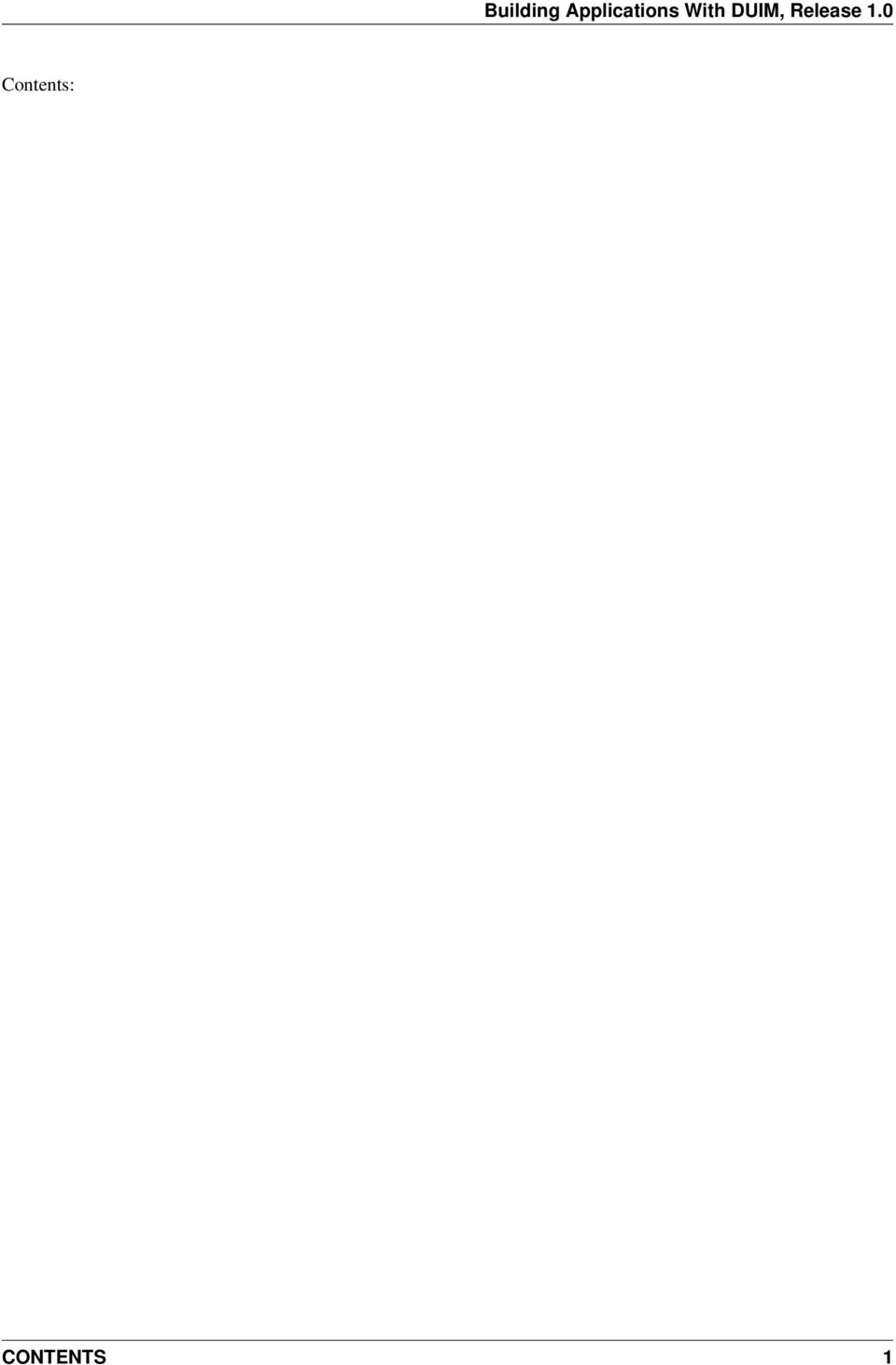
15 CHAPTER FOUR DESIGNING A SIMPLE DUIM APPLICATION 4.1 Introduction The next few chapters of the manual introduce you to some of the most important DUIM concepts, and show you how to go about designing and implementing a simple DUIM application. On a first read through, you should work through each chapter in turn, since each chapter relies heavily on the information in the previous chapters. 4.2 Design of the application For the purposes of this example, the application developed is a simple task list manager. The design of the application attempts to achieve the following goals: The design is simple enough that the principles of the programming model should not be obscured by the code itself. The design attempts to use the most common elements of the various DUIM libraries. The design is extensible, so that you can customize it to your own needs. A task list manager was chosen because it is representative of the sort of GUI application that you will probably want to develop. Although the overall design is quite simple, it demonstrates several commonly used elements and techniques, and is easily extensible beyond the scope of this manual, should you wish to experiment with the code. The concept of a task list manager is familiar to the majority of readers, so you can study the code and the programming model, without having to spend time figuring out what the application itself is supposed to do. The final task list manager is shown in Designing A Simple DUIM Application. To load the code for the final design into the environment, choose Tools > Open Example Project from any window in the environment, and load the Task List 1 project from the Documentation category of the Open Example Project dialog. The task list manager is very simple to use. You create a list of things that you need to do, assigning a priority to each task as you create it. The application can display the tasks in your list sorted in a variety of ways. You can save your task list to a file on disk, and open files of the same type. The task list manager demonstrates the use of menus and a variety of button, list, and text controls. 4.3 Creating the basic sheet hierarchy This section shows you how to create gadgets and sheets that make up the overall visual design of the interface. It shows you how to improve upon an initial design, but does not go into any details on the callbacks necessary for the application; at the end of this section you have an initial visual design. 11


16 Figure 4.1: The Task List Manager Application Placing all the elements in a single layout The main part of the task list manager is a list box that is used for displaying the tasks that you add in the course of using the program. For the initial design, there are buttons that let you add and remove tasks from the list, and a text field into which you type the text for new tasks. To begin with, the following code creates all these elements, and places them in a single window, one above the other. make(<column-layout>, children: vector (make (<list-box>, items: #(), lines:15), make (<text-field>, label: "Task text:"), make (<push-button>, label: "Add task"), make (<push-button>, label: "Remove task"))); You might notice a number of problems with this initial design: Firstly, the items have all been created correctly, but the resulting window is not particularly attractive. In order to improve the appearance, you need to rearrange the elements in the window by making better use of the layout facilities provided by DUIM. Secondly, the application does not yet look very much like a typical Windows application. Rather than individual buttons, the application should have a tool bar, and it is not common to have a text field in the main window of an application. There is no menu bar. Currently, the application has more of the feel of a dialog box, than a main application window. These issues are addressed later on in the example Redesigning the layout To address the issue of layout first, you should group the text field and the Add task button in a row; since the two elements are inherently connected (the task you add is the one whose text is displayed in the text field), it makes sense 12 Chapter 4. Designing A Simple DUIM Application

17 to group them visually as well. The following code creates the necessary row layout: horizontally () make (<text-field>, label: "Task text:"); make (<push-button>, label: "Add task"); end Note that the macro horizontally has been used here. This macro takes any expressions that are passed to it and creates a row layout from the results of evaluating those expressions. The macro vertically works in a similar way, creating a column layout from its arguments. Use vertically to combine the row layout you just created with the Remove task button that still needs to be incorporated: vertically () horizontally () make (<text-field>, label: "Task text:"); make (<push-button>, label: "Add task"); end; make (<push-button>, label: "Remove task"); end Finally, you need to add this sheet hierarchy to another row layout, so that the main list box for the application is on the left, and the sheet hierarchy containing the buttons and text field is on the right: horizontally () make (<list-box>, items: #(), lines: 15); vertically () horizontally () make (<text-field>, label: "Task text:"); make (<push-button>, label: "Add task"); end; make (<push-button>, label: "Remove task"); end; end In the last few steps, you have exclusively used horizontally and vertically. In fact, it does not matter if you use these macros, or if you create instances of <row-layout> and <column-layout> explicitly using make. Note: You may have to resize the window to see everything Adding a radio box There is one aspect of the initial design that you have not yet incorporated into the structure: the radio box. This serves two purposes in the application: 1. It lets you choose the priority for a new task. 2. It displays the priority of any task selected in the list. The code to create the radio box is as follows: make (<radio-box>, label: "Priority:", items: #("High", "Medium", "Low"), orientation: #"vertical"); Notice that the orientation: init-keyword can be used to ensure that each item is displayed one above the other. It is probably best to place the radio box immediately below the Remove task button. To do this, you need to add the definition for the radio box at the appropriate position in the call to vertically Creating the basic sheet hierarchy 13

18 (horizontally () make (<list-box>, items: #(), lines: 15); vertically () horizontally () make (<text-field>, label: "Task text:"); make (<push-button>, label: "Add task"); end; make (<push-button>, label: "Remove task"); make (<radio-box>, label: "Priority:", items: #("High", "Medium", "Low"), orientation: #"vertical"); end); Using contain to run examples interactively You can use the function contain to run any of the examples above using the interactor available in the Dylan environment. This function lets you see the results of your work immediately, without the need to compile any source code or build a project, and is extremely useful for experimenting interactively when you are developing your initial ideas for a GUI design. The contain function takes any expression that describes a hierarchy of sheets as an argument. It creates a frame which contains this sheet hierarchy, and displays the resulting frame on the screen. Thus, to run any of the code segments shown in this chapter, simply pass them to contain as an argument. Here are two examples, adapted from earlier examples in this chapter, as illustrations of how to use contain. contain (horizontally () make (<text-field>, label: "Task text:"); make (<push-button>, label: "Add task"); end); contain (make (<text-field>, label: "Task text:")); At this point, take a few minutes to go back over this chapter and practice using contain to run the code fragments that have already been discussed. 14 Chapter 4. Designing A Simple DUIM Application

19 CHAPTER FIVE IMPROVING THE DESIGN The simple layout hierarchy described in Creating the basic sheet hierarchy has a number of problems associated with it, all of which revolve around the fact that the task list manager does not yet look very much like a standard Windows application. Although it is a simple design that does not warrant a complicated user interface, the design you have already seen looks more like a dialog box than an application window. This section shows you how to improve on the basic design, adding a menu bar and replacing the buttons with a proper tool bar. It also shows you how to move the text field into a separate dialog that pops up when you click the Add task button in the tool bar. From this point on, the interface is defined more formally, using frames. Up to now, the layout hierarchy has been presented informally, and you have used contain to display the layout interactively. This is fine for code that you want to evaluate once only, perhaps using the interactor, but for permanent code, a more rigorous framework is preferable. 5.1 Defining a project From this point on, you should put the code for the task list manager into a project, rather than evaluating pieces of code using the interactor. Please refer to the Getting Started with Open Dylan for complete details on how to manage projects using the environment; this section provides brief details that tell you how to create a project specifically for the task list manager application. Use the New Project wizard to create a GUI application, and call the project task-list when prompted. The New Project wizard offers the option of generating template source code to help you get started. For this example, you must ensure that this option is switched off (this is the default setting). Two versions of the task list manager are included with Open Dylan, so that you can load the code straight into the environment if you wish. These are available in the Open Example Project dialog, in the Documentation category. You can display this dialog by choosing Tools > Open Example Project from the environment. The two versions included represent the state of the task list manager at the end of Adding Callbacks to the Application, and at the end of Using Command Tables. Note: Please note that both projects have the same name within the source code task-list and you should not load them both into the environment at the same time. The number of source code files in a given project, and the names you give them, is entirely up to you. For the purposes of this example, you will use the files suggested by the New Project wizard. When you use the New Project wizard, Open Dylan will create a number of files for a project named task-list. module.dylan and library.dylan These files define the library and modules for the project. For the purposes of this application, you can ignore these files. task-list.dylan Add non-gui-specific code to this file. 15

20 Finally, you need to create the following new file using File > New, and add it to the project using the Project > Insert File command. Make sure that this file is the last one listed in the project window. frame.dylan Add the GUI-specific code to this file. 5.2 Starting the application As you add source code to the files in your project, there will be times when you want to build the project to test it. This section defines some methods that let you run the application in a clean way. Add these methods to frame.dylan. The frame class that is used to implement the task list manager is called <task-frame>. This class will be introduced in Defining a new frame class. You can define a method to create an instance of <task-frame> as follows: define method start-task () => () let frame = make(<task-frame>); start-frame(frame); end method start-task; This method is provided as a convenient way to create the frame and then start its event loop. It returns when the event loop shuts down. Note: Obviously, you should not call this method until you have defined a frame class called <task-frame>. Finally, you can start the application with the following method, and its subsequent call: define method main (arguments :: <sequence>) => () // handle the arguments start-task(); end method main; begin main(application-arguments()) // Start the application! end; Make sure that this is the very last definition in the file frame.dylan, and remember that frame.dylan should itself be the last file listed in the project window. Once you have added these methods to your code, you can compile and link the code, and run the application to test it, using the appropriate commands in the Dylan environment. Note that, unlike languages such as C, Dylan does not insist on a single entrance point to an application such as the one given here. All the same, it is still good practice to define one if you can. The main difference between the use of the method main here, and the use of the main function in C, is in the arguments that need to be passed. In C, you need to pass two generic arguments: argc, which specifies the number of arguments you are passing, and argv, an array of strings that define the arguments themselves. In Dylan, however, you only need to pass the second of these arguments; since any Dylan collection already knows its own size, you do not need to pass the number of arguments as an additional parameter. 5.3 Adding a default callback Nothing is more frustrating than designing a user interface that does not respond to user input. Although, in the early stages at least, the user interface does nothing particularly useful, you can at least define a not yet implemented message that can be used until you define real behavior for the application. The definition of the function that gives you this default behavior is as follows: 16 Chapter 5. Improving The Design

21 define function not-yet-implemented (gadget :: <gadget>) => () notify-user("not yet implemented!", owner: sheet-frame(gadget)) end function not-yet-implemented; Add this function to frame.dylan. You can call this function from any gadget in the task list manager by defining it as the activate callback for each gadget. There are several types of callback, and this is the type that is used most in the task list manager. You can define the activate callback for any gadget using the activate-callback: init-keyword. More information about callbacks is given in Adding Callbacks to the Application, in which some real callbacks are defined, to make the task list manager do something more substantial. 5.4 Defining a new frame class To begin with, define a frame class using the layout hierarchy you have already created. Although it might seem redundant to implement an inelegant layout again, it is easier to illustrate the basic techniques using a design you are already familiar with. In addition, there are several elements in the design that can be reused successfully. Add the code described in this section to frame.dylan. Defining a new class of frame is just like defining any Dylan class, except that there are several extra options available beyond the slot options normally available to define class. Each of these extra options lets you describe a particular aspect of the user interface. To define the new frame class, use the following structure: define frame <task-frame> (<simple-frame>) // definitions of frame slots and options go here end frame <task-frame>; In this case, <task-frame> is the name of the new class of frame, and <simple-frame> is its superclass. Like ordinary Dylan classes, frame classes can have any number of superclasses, with multiple superclasses separated by commas. The superclass of any standard frame is usually <simple-frame>. If you were designing a dialog box, its superclass would be <dialog-frame>. If you were designing a wizard, its superclass would be <wizard-frame>. Adding slots to a frame class is exactly the same as adding slots to a standard Dylan class. You can define slot names, init-keywords, init-functions, default values, and so on. For this example, you are not defining any slots. Each user interface element in the new class of frame is specified as a pane with a name and a definition. A pane is a sheet within a layout, and you can think of panes as sheets that represent concrete classes in an interface (as opposed to abstract classes). In effect, specifying a pane allows you to group together existing gadgets into some meaningful relationship that effectively creates a new gadget, without actually defining a gadget class. The name is used to refer to the pane, both from within the frame definition itself, and from other code. The pane definition includes code to create the interface element. A pane specification also includes a place to declare a local variable that can be used within the pane s definition to refer to the surrounding frame. The following code fragment defines the two buttons, the text field, the radio box, and the list box from the initial design: pane add-button (frame) make(<push-button>, label: "Add task", activate-callback: not-yet-implemented); pane remove-button (frame) make(<push-button>, label: "Remove task", activate-callback: not-yet-implemented); pane task-text (frame) make(<text-field>, label: "Task text:", 5.4. Defining a new frame class 17
22 activate-callback: not-yet-implemented); pane priority-box (frame) make (<radio-box>, label: "Priority:", items: #("High", "Medium", "Low"), orientation: #"vertical", activate-callback: not-yet-implemented); pane task-list (frame) make(<list-box>, items: #(), lines: 15, activate-callback: not-yet-implemented); Note that the definition of each element is identical to the definitions included in the original layout described in Creating the basic sheet hierarchy (except that activate callbacks have been added to the code). Adding (frame) immediately after the name of each pane lets you refer to the frame itself within the frame definition using a local variable. This means that you can refer to any pane within the frame using normal slot syntax; that is, a pane called my-pane can be referred to as frame.my-pane throughout all of the definition of the frame class. This ability is essential when you come to layout each pane in the frame itself. In addition, you need to define the layout in which to place these panes. This is itself just another pane, and its definition is again identical to the original layout described in Creating the basic sheet hierarchy, with one exception; rather than defining each element explicitly, you just include a reference to the relevant pane that you have already defined using normal slot syntax, thus: pane task-layout (frame) horizontally () frame.task-list; vertically () horizontally () frame.task-text; frame.add-button; end; frame.remove-button; frame.priority-box; end; end; To describe the top-level layout for the frame, you need to refer to this pane using the layout option, as follows: layout (frame) frame.task-layout; You actually have a certain amount of freedom when choosing what to define as a pane in the definition of a frame class. For example, the layout in the task-layout pane actually contains a number of sub-layouts. If you wanted, each one of these sub-layouts could be defined as a separate pane within the frame definition. Note, however, that you only have to activate the top-most layout; there should only be one use of the layout option. Similarly, you are free to use whatever programming constructs you like when defining elements in your code. Just as in the earlier examples, you could define the layouts with explicit calls to make, rather than by using the horizontally and vertically macros. Thus, the following definition of task-layout is just as valid as the one above: pane task-layout (frame) make(<row-layout>, children: vector(frame.task-list, make(<column-layout>, children: vector(make(<row-layout>, children: vector(frame.task-text, frame.add-button))))) Notice that this construct is rather more complicated than the one using macros! Throughout this section, you may have noticed that you can identify a sequence of steps that need to occur inside the 18 Chapter 5. Improving The Design
23 definition of a frame. It is good practice to keep this sequence in mind when writing your own frame-based code: 1. Define the content panes 2. Define the layout panes 3. Use the layout option If you glue all the code defined in this section together, you end up with the following complete definition of a frame class. define frame <task-frame> (<simple-frame>) pane add-button (frame) make(<push-button>, label: "Add task", activate-callback: not-yet-implemented); pane remove-button (frame) make(<push-button>, label: "Remove task", activate-callback: not-yet-implemented); pane task-text (frame) make(<text-field>, label: "Task text:", activate-callback: not-yet-implemented); pane priority-box (frame) make(<radio-box>, label: "Priority:", items: #("High", "Medium", "Low"), orientation: #"vertical", activate-callback: not-yet-implemented); pane task-list (frame) make (<list-box>, items: #(), lines: 15, activate-callback: not-yet-implemented); pane task-layout (frame) horizontally () frame.task-list; vertically () horizontally () frame.task-text; frame.add-button; end; frame.remove-button; frame.priority-box; end; end; layout (frame) frame.task-layout; keyword title: = "Task List Manager"; end frame <task-frame>; Note the addition of a title: keyword at the end of the definition. This can be used to give any instance of the frame class a title that is displayed in the title bar of the frame s window when it is mapped to the screen. At this stage, the application still has no real functionality, and there is no improvement in the interface compared to the initial design, but by defining a frame class, the implementation is inherently more robust, making it easier to modify and, eventually, maintain. If you want to try running your code, remember that you need to define some additional methods to create a frame instance and exit it cleanly. Methods for doing this were provided in Starting the application. If you define these methods now, you can create running versions of each successive generation of the application as it is developed Defining a new frame class 19
24 5.5 Adding a tool bar So far, you have seen how to experiment interactively to create an initial interface design. You have also seen how you can take that initial design and turn it into a more rigorous definition, for use within project source code, using a frame class. However, the design of the interface still leaves a lot to be desired, and the application still does not do anything. In this section, you start to look at improving the overall design of the interface. To begin with, add a tool bar to the interface of the application. Most modern applications have a tool bar that runs along the top edge of the main application window, beneath the application menu bar. Tool bars contain a number of buttons that give you quick access to some of the most common commands in the application. Each button has a label that designates its use, or, more often, a small icon. Although you have already added buttons to the interface that perform important tasks, they have the appearance of buttons in a dialog box, rather than buttons in the main window of an application. The solution is to use a tool bar. Adding a tool bar to the definition of a frame class is very similar to defining the overall layout of the panes in a frame class. You need to create the tool bar as a pane in the frame definition, and then incorporate it using the tool-bar clause, as shown below: pane task-tool-bar (frame) make(<tool-bar>, child:...); //...more definitions here... tool-bar (frame) frame.task-tool-bar; A tool bar has a layout as its child, and each button in the tool bar is defined as a child of that layout. You can either define each button within the definition of the tool bar itself, or, more appropriately, define each button as a pane in the frame, and then refer to the names of these panes in the tool bar definition. In fact, the buttons you defined in the earlier interface design can be used just as easily in a tool bar as they can within the main layout of the application itself. However, first you must remove the buttons from the task-layout pane of the definition of <task-frame>. (If you fail to do this, DUIM attempts to use the same buttons in two different parts of the interface, with undefined results.) A complete definition of a simple tool bar containing two buttons is as follows: pane task-tool-bar (frame) make(<tool-bar>, child: horizontally () frame.add-button; frame.remove-button end); //...more definitions here... tool-bar (frame) frame.task-tool-bar; A tool bar that only contains two buttons is on the lean side, however, so let s add two more buttons to open a file and save a file to disk. pane open-button (frame) make(<push-button>, label: "Open file", activate-callback: not-yet-implemented); pane save-button (frame) make(<push-button>, label: "Save file", activate-callback: not-yet-implemented); //...more definitions here... pane task-tool-bar (frame) make(<tool-bar>, child: horizontally () frame.open-button; frame.save-button; 20 Chapter 5. Improving The Design
25 frame.add-button; frame.remove-button end); //...more definitions here... tool-bar (frame) frame.task-tool-bar; More commonly, an icon is used to label buttons in a tool bar, rather than a text label. You can do this by supplying an instance of <image> to the label: init-keyword when you define the button, rather than an instance of <string>. So now the application has a tool bar. Somewhat oddly, it does not yet have a menu bar or a system of menus most tool bars represent a subset of the commands already available from the application s menu system. A menu system is added to the task list manager in Adding Menus To The Application. 5.6 Adding a status bar As well as a tool bar, most applications have a status bar. This is a bar that runs along the bottom edge of the main application window, and displays information about the current status of the application. At its most basic, a status bar provides a label that displays text of some sort. In many applications, status bars contain a number of different fields, providing a wide range of functionality. At their most complex, a status bar may have several different labels that display information about the current state of the application, and labels that display help for the currently selected menu command. It is worth adding a very simple status bar to the task list application. This contains a label that could eventually be used to display the name of the file currently loaded into the application. Adding a status bar to the definition of a frame class is very similar to adding a tool bar: you need to define a pane that describes the status bar, and then you need to incorporate it using the status-bar clause. pane task-status-bar (frame) make(<status-bar>, label: "Task Manager"); //...more definitions here... status-bar (frame) frame.task-status-bar; Now you have added a status bar to the application. The next step is to glue all the pieces together once again to create your modified frame design. 5.7 Gluing the new design together In improving the initial design of the application, you have added a tool bar and a status bar. Adding a tool bar, in particular, has obviated the need for some of the elements that you added to the earlier version of the frame design. In this section, you throw away those elements that are no longer needed, and add in the new elements, to create a new, improved design for the frame class. One part of the initial design you have not yet improved on is the radio box that shows the priority of any task in the list. Ideally, rather than using a radio box, you would display the priority of each task alongside the task itself, within the list box. For now, however, keep the radio box. pane priority-box (frame) make(<radio-box>, items: $priority-items, orientation: #"horizontal", label-key: first, value-key: second, value: #"medium", activate-callback: not-yet-implemented); 5.6. Adding a status bar 21
26 Notice that the orientation is no longer constrained to be vertical. In the new design, a horizontal radio box looks better. By default, the orientation of a radio box is horizontal, so you could just completely remove the initialization of the orientation: init-keyword from the definition of the pane. In general, though, if you care about the orientation of a gadget, you should specify it explicitly, so leave the init-keyword in the pane definition, and change its value, as shown above. Next, notice that the items are now specified using a named constant, rather than by embedding literals in the pane definition. The definition of this constant is as follows: define constant $priority-items = #(#("Low", #"low"), #("Medium", #"medium"), #("High", #"high")); Add the definition for this constant to frame.dylan. Using lists of string and symbol values in this constant lets you assign values to the individual components of the radio box elegantly, in conjunction with the other improvements to the definition of priority-box. The label key is a function which is passed an entry from the sequence and returns a string to use as the label. Assigning first to the label key of priority-box ensures that the first element from each sub-list of $priority-items (the string) is used as the label for the appropriate item. Thus, the first button in priority box is labeled Low. The value key is a function which is passed an entry and returns the logical value of the entry. Assigning second to the value key of priority-box ensures that the second element from each sub-list of $priority-items (the symbol) is used as the value for the appropriate item. Thus, the first button in priority box has the value #"low". Lastly, priority-box is given a default value: #"medium". This ensures that the button labeled Medium is selected by default whenever priority-box is first created. The definitions for add-button, remove-button, and task-list remain unchanged from the initial design. In addition, you need to add the definitions for open-button and save-button described in Adding a tool bar. You also need to add in the definitions for the tool bar and status bar themselves, as described in Adding a tool bar and Adding a status bar. The definition for task-layout has become much simpler. Because you have added buttons to the tool bar, the main layout for the application has reduced to a single column layout whose children are task-list and priority-box. The definition for the new design of the frame class now looks as follows (button definitions vary slightly for the Task List 2 project, see A task list manager using command tables): define frame <task-frame> (<simple-frame>) // definition of buttons pane add-button (frame) make(<push-button>, label: "Add task", activate-callback: not-yet-implemented); pane remove-button (frame) make(<push-button>, label: "Remove task", activate-callback: not-yet-implemented); pane open-button (frame) make(<push-button>, label: "Open file", activate-callback: not-yet-implemented); pane save-button (frame) make(<push-button>, label: "Save file", activate-callback: not-yet-implemented); // definition of radio box 22 Chapter 5. Improving The Design
27 pane priority-box (frame) make (<radio-box>, items: $priority-items, orientation: #"horizontal", label-key: first, value-key: second, value: #"medium", activate-callback: not-yet-implemented); // definition of tool bar pane task-tool-bar (frame) make(<tool-bar>, child: horizontally () frame.open-button; frame.save-button; frame.add-button; frame.remove-button end); // definition of status bar pane task-status-bar (frame) make(<status-bar>, label: "Task Manager"); // definition of list pane task-list (frame) make (<list-box>, items: #(), lines: 15, activate-callback: not-yet-implemented); // main layout pane task-layout (frame) vertically () frame.task-list; frame.priority-box; end; // activation of frame elements layout (frame) frame.task-layout; tool-bar (frame) frame.task-tool-bar; status-bar (frame) frame.task-status-bar; // frame title keyword title: = "Task List Manager"; end frame <task-frame>; Note that this definition does not incorporate the original task-text pane defined in Defining a new frame class. In fact, this part of the original interface is handled differently in the final design, and is re-implemented in Creating a dialog for adding new items. 5.8 Creating a dialog for adding new items You may be wondering what has happened to task-text, the text field in which you typed the text of each new task. In the new design, this is moved to a new dialog box that is popped up whenever you choose a command to add a new task to the list. This section shows you how to define this dialog. The method prompt-for-task below creates and displays a dialog that asks the user to type the text for a new task. The definition of task-text is very similar to the definition you provided in the initial design, with the exception that the activate callback exits the dialog, rather than calling the not-yet-implemented function. The method takes two keyword arguments: a title, which is assigned a value by default, and an owner, which is used as the owner for the dialog that is displayed by prompt-for-task. Note that the title is never explicitly set by any calls to prompt-for-task in the task list manager; it is provided here as an illustration of how you can provide a default value for a keyword argument, rather than requiring that it either always be passed in the call to the method, or 5.8. Creating a dialog for adding new items 23

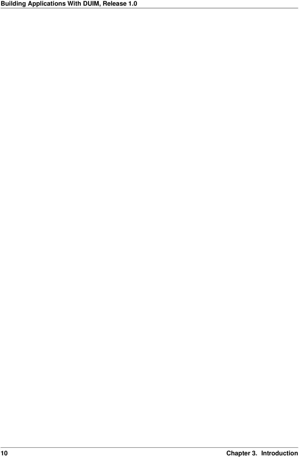
28 Figure 5.1: The dialog box created by the prompt-for-task method that it be hard-wired into the code. The method returns two values: the name of the new task, that is, the text that the user types into the text field, and the priority of the new task. Add this method to frame.dylan. define method prompt-for-task (#key title = "Type text of new task", owner) => (name :: false-or(<string>), priority :: false-or(<priority>)) let task-text = make(<text-field>, label: "Task text:", activate-callback: exit-dialog); let priority-field = make(<radio-box>, items: $priority-items, label-key: first, value-key: second, value: #"medium"); let frame-add-task-dialog = make(<dialog-frame>, title: title, owner: owner, layout: vertically () task-text; priority-field end, input-focus: task-text); if (start-dialog(frame-add-task-dialog)) values(gadget-value(task-text), gadget-value(priority-field)) end end method prompt-for-task; Notice that the dialog used in the prompt-for-task method is created inline within the method definition. In this particular case, the dialog is only ever needed within the context of prompt-for-task and so it is not necessary to use define frame to create a distinct class of frame specifically for this dialog. Note also that OK and Cancel buttons are generated automatically for a dialog box; you do not need to define them explicitly. Later on, the activate callback you define for the add-button pane calls this method, then inserts the return value into the list task-list. 24 Chapter 5. Improving The Design
29 CHAPTER SIX ADDING MENUS TO THE APPLICATION Now it is time to consider adding some menus to your application. There are two basic ways that you can create a system of menus for your application: Design a hierarchical series of panes using the <menu-bar>, <menu>, and various menu buttons classes, and glue the elements of this design together in the correct order. Use a command table. In this chapter, the first of these methods is demonstrated. For information about command tables, refer to Using Command Tables. Before discussing the first method listed above, the overall design of the menu system for the task list manager is discussed. 6.1 A description of the menu system Before implementing the menus for the task list manager, it is worth describing what you are going to implement. The menu system of the task list manager comprises four menus: a File menu, Edit menu, Task menu, and Help. Each of these menus contains a number of commands, as follows: File menu The File menu contains four commands that operate on the files loaded into the task list manager. The Open command opens a new file. The Save command saves the currently loaded file to disk. The Save As command saves the currently loaded file to disk under a new name. The Exit command quits the task application completely. Edit menu The Edit menu contains the standard clipboard commands: Cut, Copy, and Paste. Task menu The Task menu contains two commands that operate on individual tasks. The Add command adds a new task to the list. The Remove command removes the selected task from the list. Help menu In a full-blown application, you would use commands in the Help menu as one hook into your online help system (other hooks being provided by buttons in dialog boxes and the F1 key). In this application, the Help menu contains a single command that simply displays a simple About dialog for the application. 6.2 Creating a menu hierarchy As you might expect, creating a menu hierarchy in a frame definition is a matter of defining a series of panes for the frame. At the top-most level in the menu hierarchy is the menu bar itself. The menu bar contains each menu defined for the application and each menu contains the menu commands that themselves perform operations. Once the panes have been defined, the menu bar needs to be included in the frame using the menu-bar clause. First of all, you can create a pane that defines the menu bar itself as follows: 25
30 pane task-menu-bar (frame) make(<menu-bar>, children: vector(frame.file-menu, frame.edit-menu, frame.task-menu, frame.help-menu)); Next, define the File and Tasks menus themselves: pane file-menu (frame) make(<menu>, label: "File", children: vector(frame.open-menu-button, frame.save-menu-button, frame.save-as-menu-button, frame.exit-menu-button)); pane edit-menu (frame) make(<menu>, label: "Edit", children: vector(frame.cut-menu-button, frame.copy-menu-button, frame.paste-menu-button)); pane task-menu (frame) make(<menu>, label: "Task", children: vector(frame.add-menu-button, frame.remove-menu-button)); pane help-menu (frame) make(<menu>, label: "Help", children: vector(frame.about-menu-button)); Finally, you need to define the menu commands themselves. A command that appears on a menu is defined as an instance of <menu-button>, and so there is a strong similarity between these buttons and some of the buttons already defined. DUIM also generates mnemonics for each menu item; thus, the items appear as File and Edit, and so forth. (Note that the make-keyboard-gesture function that appears below is defined in Keyboard accelerators.) // Commands in the File menu pane open-menu-button (frame) make(<menu-button>, label: "Open...", activate-callback: not-yet-implemented, accelerator: make-keyboard-gesture(#"o", #"control"), documentation: "Opens an existing file."); pane save-menu-button (frame) make(<menu-button>, label: "Save", activate-callback: not-yet-implemented, accelerator: make-keyboard-gesture(#"s", #"control"), documentation: "Saves the current file to disk."); pane save-as-menu-button (frame) make(<menu-button>, label: "Save As...", activate-callback: save-as-file, documentation: "Saves the current file with a new name."); pane exit-menu-button (frame) make(<menu-button>, label: "Exit", activate-callback: not-yet-implemented, accelerator: make-keyboard-gesture(#"f4", #"alt"), documentation: "Exits the application."); //Commands in the Edit menu pane cut-menu-button (frame) make(<menu-button>, label: "Cut", activate-callback: not-yet-implemented, accelerator: make-keyboard-gesture(#"x", #"control"), 26 Chapter 6. Adding Menus To The Application
31 documentation: "Cut the selection to the clipboard."); pane copy-menu-button (frame) make(<menu-button>, label: "Copy", activate-callback: not-yet-implemented, accelerator: make-keyboard-gesture(#"c", #"control"), documentation: "Copy the selection to the clipboard."); pane paste-menu-button (frame) make(<menu-button>, label: "Paste", activate-callback: not-yet-implemented, accelerator: make-keyboard-gesture(#"v", #"control"), documentation: "Paste the selection in the clipboard at the current position."); //Commands in the Task menu pane add-menu-button (frame) make(<menu-button>, label: "Add...", activate-callback: not-yet-implemented, accelerator: make-keyboard-gesture (#"a", #"control", #"shift"), documentation: "Add a new task."); pane remove-menu-button (frame) make(<menu-button>, label: "Remove", activate-callback: not-yet-implemented, accelerator: make-keyboard-gesture (#"d", #"control", #"shift"), documentation: "Remove the selected task from the list."); //Commands in the Help menu pane about-menu-button (frame) make(<menu-button>, label: "About", activate-callback: not-yet-implemented, accelerator: make-keyboard-gesture(#"f1"), documentation: "Display information about the application."); Once you have defined the menu bar and all the children that it is to contain, you need to activate the menu bar in the frame by including the following towards the end of the frame definition. menu-bar (frame) frame.task-menu-bar; The definitions of these menu buttons demonstrate two interesting new features: the use of keyboard accelerators, and the use of documentation strings Documentation strings Documentation strings let you provide brief online help for gadgets such as menu buttons. You can specify a documentation string for any gadget using the documentation: init-keyword. Although you can make whatever use you want of these strings, using the gadget-documentation and gadget-documentation-setter methods, documentation strings for menu buttons are used in status bars without any need for special action on your part. If you display a menu and move the mouse pointer over the items in the menu, then the documentation string defined for each item is displayed in the status bar of the frame for as long as the mouse pointer is over the menu item. It is generally good practice to supply documentation strings for all the menu items in a frame. Documentation strings for other gadgets become tooltips in Windows Creating a menu hierarchy 27
32 6.2.2 Keyboard accelerators Keyboard accelerators let you define a combination of keys that can be pressed in order to invoke the activate callback of a gadget. This means that you can access the functionality of an application without having to choose commands from menus using the mouse, and can make it much quicker to use an application you are familiar with. To specify a keyboard accelerator, you need to specify an alphanumeric character, or a function key, together with any modifier keys (such as the CONTROL or ALT keys) that should be held down while the alphanumeric character is pressed. You actually create a keyboard accelerator by calling the make method on <keyboard-gesture>, though to make it a little easier, define the function below, which is used in the definition of each menu button. define function make-keyboard-gesture (keysym :: <symbol>, #rest modifiers) => (gesture :: <keyboard-gesture>) make(<keyboard-gesture>, keysym: keysym, modifiers: modifiers) end function make-keyboard-gesture; Add this definition to the file frame.dylan. The keyboard accelerators defined demonstrate the several useful points about keyboard accelerators: Whenever possible, use standard keyboard accelerators for standard application commands on your platform. Here, you use CONTROL+O to open a file, CONTROL+S to save a file, and CONTROL+X, CONTROL+C, and CONTROL+V respectively for Cut, Copy, and Paste. As well as standard alphanumeric characters, you can use function keys as keyboard accelerators. As well as the more common CONTROL key, you can use the ALT and SHIFT keys as modifiers, though you should not use the SHIFT key as the sole modifier. You can use more than one modifier key at once. If you wish, you need not use any modifier keys at all, as is the case with the (slightly non-standard) keyboard accelerator for the About command. 6.3 Gluing the final design together You can now add the definitions of the menu bar, menus, and menu buttons, to the definition of the <task-frame> class, to give the code shown below. At this stage, the only thing missing from the final application are real callback functions. Callbacks are dealt with in Adding Callbacks to the Application. Note that the final definition of <task-frame> includes the definition of a slot: frame-task-list. This takes an instance of the class <task-list> as a value, the default value being an empty <task-list>. Although it has not been referred to so far, this class will be used as the basic data structure in which task lists are stored, and a more complete description of these data structures is given in Defining the underlying data structures for tasks. It transpires that defining the frame-task-list slot is essential for some of the file handling routines that are described in Handling files in the task list manager. define frame <task-frame> (<simple-frame>) slot frame-task-list :: <task-list> = make(<task-list>); // definition of menu bar pane task-menu-bar (frame) make(<menu-bar>, children: vector(frame.file-menu, frame.edit-menu, frame.task-menu, frame.help-menu)); 28 Chapter 6. Adding Menus To The Application
33 // definition of menus pane file-menu (frame) make(<menu>, label: "File", children: vector(frame.open-menu-button, frame.save-menu-button, frame.save-as-menu-button, frame.exit-menu-button)); pane edit-menu (frame) make(<menu>, label: "Edit", children: vector(frame.cut-menu-button, frame.copy-menu-button, frame.paste-menu-button)); pane task-menu (frame) make(<menu>, label: "Task", children: vector(frame.add-menu-button, frame.remove-menu-button)); pane help-menu (frame) make(<menu>, label: "Help", children: vector(frame.about-menu-button)); // definition of menu buttons // Commands in the File menu pane open-menu-button (frame) make(<menu-button>, label: "Open...", activate-callback: not-yet-implemented, accelerator: make-keyboard-gesture(#"o", #"control"), documentation: "Opens an existing file."); pane save-menu-button (frame) make(<menu-button>, label: "Save", activate-callback: not-yet-implemented, accelerator: make-keyboard-gesture(#"s", #"control"), documentation: "Saves the current file to disk."); pane save-as-menu-button (frame) make(<menu-button>, label: "Save As...", activate-callback: save-as-file, documentation: "Saves the current file with a new name."); pane exit-menu-button (frame) make(<menu-button>, label: "Exit", activate-callback: not-yet-implemented, accelerator: make-keyboard-gesture(#"f4", #"alt"), documentation: "Exits the application."); //Commands in the Edit menu pane cut-menu-button (frame) make(<menu-button>, label: "Cut", activate-callback: not-yet-implemented, accelerator: make-keyboard-gesture(#"x", #"control"), documentation: "Cut the selection to the clipboard."); pane copy-menu-button (frame) make(<menu-button>, label: "Copy", activate-callback: not-yet-implemented, accelerator: make-keyboard-gesture(#"c", #"control"), documentation: "Copy the selection to the clipboard."); pane paste-menu-button (frame) make(<menu-button>, label: "Paste", 6.3. Gluing the final design together 29
34 activate-callback: not-yet-implemented, accelerator: make-keyboard-gesture(#"v", #"control"), documentation: "Paste the selection in the clipboard at the current position."); //Commands in the Task menu pane add-menu-button (frame) make(<menu-button>, label: "Add...", activate-callback: not-yet-implemented, accelerator: make-keyboard-gesture (#"a", #"control", #"shift"), documentation: "Add a new task."); pane remove-menu-button (frame) make(<menu-button>, label: "Remove", activate-callback: not-yet-implemented, accelerator: make-keyboard-gesture (#"d", #"control", #"shift"), documentation: "Remove the selected task from the list."); //Commands in the Help menu pane about-menu-button (frame) make(<menu-button>, label: "About", activate-callback: not-yet-implemented, accelerator: make-keyboard-gesture(#"f1"), documentation: "Display information about the application."); // definition of buttons pane add-button (frame) make(<push-button>, label: "Add task", activate-callback: not-yet-implemented); pane remove-button (frame) make(<push-button>, label: "Remove task", activate-callback: not-yet-implemented); pane open-button (frame) make(<push-button>, label: "Open file", activate-callback: not-yet-implemented); pane save-button (frame) make(<push-button>, label: "Save file", activate-callback: not-yet-implemented); // definition of radio box pane priority-box (frame) make (<radio-box>, items: $priority-items, orientation: #"horizontal", label-key: first, value-key: second, value: #"medium", activate-callback: not-yet-implemented); // definition of tool bar pane task-tool-bar (frame) make(<tool-bar>, child: horizontally () frame.open-button; frame.save-button; 30 Chapter 6. Adding Menus To The Application
35 frame.add-button; frame.remove-button end); // definition of status bar pane task-status-bar (frame) make(<status-bar>, label: "Task Manager"); // definition of list pane task-list (frame) make (<list-box>, items: #(), lines: 15, activate-callback: not-yet-implemented); // main layout pane task-layout (frame) vertically () frame.task-list; frame.priority-box; end; // activation of frame elements layout (frame) frame.task-layout; tool-bar (frame) frame.task-tool-bar; status-bar (frame) frame.task-status-bar; menu-bar (frame) frame.task-menu-bar; // frame title keyword title: = "Task List Manager"; end frame <task-frame>; 6.3. Gluing the final design together 31
36 32 Chapter 6. Adding Menus To The Application
37 CHAPTER SEVEN ADDING CALLBACKS TO THE APPLICATION At this point, the task list manager still does very little. If you try running the code (as described in Starting the application), and interacting with any of the elements in the GUI (clicking on a button, choosing a menu command, and so on), then only the not yet implemented message is displayed. This section shows you how to remedy this situation, by adding callback functions to the task list manager. Getting the application to respond to mouse events such as clicking on a button or choosing a menu command consists of two things: For each gadget in the GUI, you need to specify which callbacks to use. There are several different types of callback, depending on the type of event for which you want to define behavior. You need to define the callback functions themselves. These are the functions that are invoked when a particular callback type is detected, and are the functions you use to define the correct behavior for your application. In addition, you need to set up the basic data structures that allow you to work with tasks in your application. At this point, you may be wondering exactly what a callback is, and why they are used to respond to application events, rather than event handlers. If you have developed GUI applications using other development environments, you may be more used to writing event handlers that work for a whole class of objects, and discriminating on which instance of a class to work on at any one time by means of case statements. Writing event handlers in this way can be cumbersome. It turns out to be much simpler to define a function that works only for a particular instance of a class, and then refer to this function when defining the class instance. This function is what is referred to as a callback. This makes the source code for your application much clearer and easier to write, and the only price you pay is that you have to specify a callback for each gadget when you define the gadget itself. In fact, DUIM provides a complete protocol for defining and handling events of all descriptions. However, you only need to use this protocol if you are creating new classes of gadgets, for which you need to define the event behavior, or new classes of events (for example, support for different input devices or notification of low resources). If you are just using gadgets, then you only ever need to use callbacks. 7.1 Defining the underlying data structures for tasks Before defining any real callbacks, it is time to consider how you can represent task lists, and the information contained in them. This is essential, not just for handling tasks within the application, but for saving task lists to disk, and loading them back into the application. Add the code described in this section to task-list.dylan. There are two basic kinds of object that you need to model: task lists and tasks. A task list is a collection of one or more tasks. The best way to represent these is by defining a <task-list> class and a <task> class. The definition of <task-list>, below, contains three slots: task-list-tasks 33
38 This slot specifies a sequence of tasks that are contained in the task list. Each object in the sequence will be an instance of <task>. The default for new task lists is an empty stretchy vector. An init-keyword has been specified so that this slot can be set when an instance of the class is initialized. task-list-filename This slot specifies the file on disk to which the task list has been saved, if it has been saved at all. The default for new task lists is #f, since the task list has not yet been saved to disk. An init-keyword has been specified so that this slot can be set when an instance of the class is initialized. task-list-modified? The purpose for this slot is less obvious. It is useful to flag whether or not a task list has been modified so that, for instance, the Save command in the application can be disabled if the task list is unmodified. There is no init-keyword defined for this class, because you only ever want to use the supplied default value for new instances of <task-list>. define class <task-list> (<object>) constant slot task-list-tasks = make(<stretchy-vector>), init-keyword: tasks:; slot task-list-filename :: false-or(<string>) = #f, init-keyword: filename:; slot task-list-modified? :: <boolean> = #f; end class <task-list>; Next, consider the information that needs to be encoded in each individual task. There are two pieces of information that need to be recorded: The text of the task, which should be a string. The priority, which should be one of high, medium, or low. Priorities can be recorded using a constant, as shown below: define constant <priority> = one-of(#"low", #"medium", #"high"); Notice that it is most straightforward to encode each priority as a symbol. Later on, you will see how you can use as to convert each symbol to a format that can be saved to disk and read back into the application as a symbol. The <task> class can then be defined as having two slots: one for the task text itself, and another for the priority. Both have init-keywords so that they can be specified when a new instance is created, and both init-keywords are required; they must be specified whenever a task is created. define class <task> (<object>) slot task-name :: <string>, required-init-keyword: name:; slot task-priority :: <priority>, required-init-keyword: priority:; end class <task>; These three definitions are all that is needed to be able to represent tasks and task lists within the task list application. In order to handle tasks effectively in the GUI of the task list manager, some changes are necessary to the definition of the task-list pane in the definition of <task-frame>. These changes are needed to ensure that information about tasks is passed to the task-list pane correctly. Make these changes to the existing definition in the file frame.dylan. In Gluing the final design together, the definition of task-list was given as: // definition of list pane task-list (frame) 34 Chapter 7. Adding Callbacks to the Application
39 make (<list-box>, items: #(), lines: 15, activate-callback: not-yet-implemented); First, you need to ensure that the items passed to task-list are the tasks in the <task-list> associated with the frame. Recall that a frame-task-list slot was specified in the definition of <task-frame> ; this slot is used to hold the instance of <task-list> that is associated with the <task-frame>. The sequence of tasks contained in the associated frame-task-list can then be found using the frame-task-list.task-list-tasks accessor. To display these tasks in the task-list pane, the items: init-keyword needs to be set to the value of this accessor: items: frame.frame-task-list.task-list-tasks, Next, you need to ensure that the label for each task in the task-list pane is the text of the task itself. As described above, the text of any task is stored in its task-name slot. In order to display this text as the label for every item in the list box, you need to specify the task-name slot as the gadget-label-key of the list box. A label key is a function that is used to calculate the label of each item in a gadget, and it can be specified using the label-key: init-keyword: label-key: task-name, This gives the following new definition for the task-list pane: // definition of list pane task-list (frame) make (<list-box>, items: frame.frame-task-list.task-list-tasks, label-key: task-name, lines: 15, activate-callback: not-yet-implemented); There is one final change that still needs to be made to this pane definition. This is described in Updating the user interface. 7.2 Specifying a callback in the definition of each gadget As you have already seen when using the not-yet-implemented callback, providing a callback for a gadget is just a matter of specifying another keyword-value pair in the definition of the gadget. There are two ways that you can specify the callback function to use. If you wish, you can define the callback function inline, making the definition itself the value part of the keyword-value pair. This can be useful for a simple callback function that you only need to invoke from a single callback type in a single pane. However, if several panes, or several types of callback, need to invoke the same callback function, you need to define the function explicitly in each gadget that uses it. Alternatively, you can define a callback function explicitly in your application code, and then refer to it by name in the keyword-value pair. This method is best for portability and reusability of your code, since the same callback function can be referred to by name in as many gadgets as you need to use it in, without having to redefine the callback function in each gadget. It can also lead to more readable source code. This technique is the one used throughout this example application. As already mentioned, there are a number of different kinds of callback available, depending on the behavior that you want to specify, and the gadget for which you are defining a callback. When defining different callbacks for a gadget, you need to use a different init-keyword for each callback Specifying a callback in the definition of each gadget 35
40 As you have already seen, by far the most common callback is the activate callback. This type of callback is invoked when you activate any instance of <action-gadget>. For buttons, the activate callback is invoked when you click on the button. For menu commands, the activate callback is invoked when you choose the command from the menu. The activate callback is the callback that is used most in the task list manager. You can specify an activate callback for any gadget using the activate-callback: init-keyword. In addition, you have seen the valuechanged callback, which is invoked when the gadget-value has been changed. You can specify this callback using the value-changed-callback: init-keyword. You have already defined a callback for all the gadgets in the GUI. All you need to do now is replace the reference to not-yet-implemented with the real function name that should get called when each gadget is activated. Thus, to specify an activate callback for the Add task button in the tool bar, redefine the button as follows in the definition of the <task-frame> class: pane add-button (frame) make(<push-button>, label: "Add task", activate-callback: frame-add-task); You can use exactly the same callback in the new definition of add-menu-button : pane add-menu-button (frame) make(<menu-button>, label: "Add...", activate-callback: frame-add-task, accelerator: make-keyboard-gesture (#"a", #"control", #"shift"), documentation: "Add a new task."); Notice how both of these gadgets specify the same activate callback. This is because the Add command in the menu should perform exactly the same action as the Add task button in the tool bar. At this point, redefine the callback for each gadget listed in the table below, making sure that you supply the same callback to those gadgets that perform the same functions. The callback functions used in the Task List Manager Gadget Callback open-menu-button open-file save-menu-button save-file save-as-menu-button save-as-file exit-menu-button exit-task add-menu-button frame-add-task remove-menu-button frame-remove-task about-menu-button about-task 36 Chapter 7. Adding Callbacks to the Application
41 add-button frame-add-task remove-button frame-remove-task open-button open-file save-button save-file The following sections show you how to define the callbacks themselves. You will need to define other functions and methods, as well as the callback functions listed above. These other functions and methods are called by some of the callbacks themselves. 7.3 Defining the callbacks This section shows you how to define the callbacks that are necessary in the task list manager, as well as any other associated functions and methods. First, you will look at methods and functions that enable file handling in the task list manager; that is, functions and methods that let you save and load files into the application. Next, you will look at methods and functions for adding and removing tasks from the task list. Last, you will define a few additional methods that are necessary to update the GUI elegantly, when other operations are performed. All the code discussed in this chapter is structured so that callbacks which affect the GUI do not also perform other tasks that are not related to the GUI. This helps to keep the design of the application clean, so that you can follow the code more easily, and is recommended for all GUI design. Separating GUI code and non-gui code also lets you produce code that is more easily reusable, either in other parts of a developing application, or in completely different applications Handling files in the task list manager To begin with, you will define the functions and methods that let you save files to disk and load them back into the task list manager. Once you have added these to your code, you will be able to save and reload your task lists into the application; this type of functionality is essential in even the most trivial application. There are three methods and two functions necessary for handling files. The methods handle GUI-specific operations involved in loading and saving files. The functions deal with the basic task of saving data structures to disk, and loading them from disk. Add the definitions of the methods to frame.dylan, and the definitions of the functions to task-list.dylan. Each method is invoked as a callback in the definition of the <task-frame> class: open-file This method prompts the user to choose a filename, and then loads that file into the task list manager by calling the function load-task-list. It is used as the activate callback for both open-button (on the application tool bar) and open-menu-button (in the File menu of the application). save-file This method saves the task list currently loaded into the application to disk. It is used as the activate callback for both save-button (on the application tool bar) and save-menu-button (in the File menu of the application) Defining the callbacks 37
42 save-as-file This method saves the task list currently loaded into the application to disk, and prompts the user to supply a name. It is used as the activate callback for save-as-menu-button (in the File menu of the application). The following functions are called by the methods described above: save-task-list This function saves an instance of <task-list> to a named file. save-as-file. It is called by load-task-list This function takes the contents of a file on disk and converts it into an instance of <task-list>. It is called by open-as-file. The following sections present and explain the code for each of these methods and functions in turn The open-file method The code for open-file is shown below. Add this code to frame.dylan. define method open-file (gadget :: <gadget>) => () let frame = sheet-frame(gadget); let task-list = frame-task-list(frame); let filename = choose-file(frame: frame, default: task-list.task-list-filename, direction: #"input"); if (filename) let task-list = load-task-list(filename); if (task-list) frame.frame-task-list := task-list; refresh-task-frame(frame) else notify-user(format-to-string("failed to open file %s", filename), owner: frame) end end end method open-file; The method takes a gadget as an argument and returns no values. The argument is the gadget that is used to invoke it, which in the case of the task list manager means either open-menu-button (in the File menu of the application) or open-button (on the tool bar). The open-file method then sets three local variables: frame This contains the frame of which the gadget argument is a part. This is a simple way of identifying the main application frame. task-list This contains the value of the frame-task-list slot for frame. This identifies the instance of <task-list> that is being used to hold the task list information currently loaded into the task list manager. filename This is the name of the file that is to be loaded into the task list manager, and the user is always prompted to supply it. The method choose-file (a method provided by DUIM) is used to prompt for a file to load. The portion of code that performs this task is repeated here: choose-file(frame: frame, default: task-list.task-list-filename, direction: #"input"); 38 Chapter 7. Adding Callbacks to the Application
43 This method displays a standard file dialog box so that the user can select a file on any disk connected to the host computer. For open-file, you need to supply three arguments to choose-file : the frame that owns the dialog, a default value to supply to the user, and the direction of the interaction. You need to supply a frame so that the system knows how to treat the frame correctly, with respect to the dialog box. Thus, while the dialog is displayed, the frame that owns it cannot be minimized, resized, or interacted with in any way; this is standard behavior for modal dialog boxes. In this case, supplying a default value is useful in that it lets us supply the filename for the currently loaded task list as a default value. It determines this by examining the task-list-filename slot of task-list (which, remember, is defined as a local variable and represents the instance of <task-list> in use). If this slot has a value, then it is offered as a default. (Note that if the currently loaded task list has never been saved to disk, then this slot is #f, and so no default is offered.) The direction of interaction should also be specified when calling choose-file, since the same generic function can be used to prompt for a filename using a standard Open File dialog or a standard Save File dialog. In this case, the direction is #"input", which indicates that data is being read in (that is, Open File is used). The rest of the open-file method deals with loading in the task list information safely. It consists of two nested if statements as shown below. if (filename) let task-list = load-task-list(filename); if (task-list) frame.frame-task-list := task-list; refresh-task-frame(frame) else notify-user(format-to-string("failed to open file %s", filename), owner: frame) end end The clause if (filename)... end is necessary to handle the case where the user cancels the Open file dialog: on cancelling the dialog, the open-file method should return silently with no side effects. If a filename is supplied, then it is read from disk and converted into a format that is readable by the application, in the line that reads let task-list = load-task-list(filename); The function load-task-list is described in The load-task-list function. The clause if (task-list)... else... end is necessary to handle the case where the filename specified does not contain data that can be interpreted by load-task-list. If task-list cannot be assigned, then the else code is run. This calls the function notify-user, which is a simple way to display a short message to the user in a message box. If task-list can be assigned (that is, the contents of the specified file have been successfully read by load-task-list ), then two lines of code are run. The line 7.3. Defining the callbacks 39
44 frame.frame-task-list := task-list; assigns the frame-task-list slot of frame to the value of task-list. The line refresh-task-frame(frame) calls a method that refreshes the list of tasks displayed in the task list manager, so that the contents of the newly loaded file are correctly displayed on the screen. The method refresh-task-frame is described in Updating the user interface The save-file method The code for save-file is as follows: define method save-file (gadget :: <gadget>) => () let frame = sheet-frame(gadget); let task-list = frame-task-list(frame); save-as-file(gadget, filename: task-list.task-list-filename) end method save-file; Add this code to frame.dylan. This method is very simple, in that it just calls the method save-as-file, passing it a filename as an argument. The save-as-file method then does the real work of updating the GUI and calling the relevant code to save information to disk. Just like the open-file method, save-file takes the gadget used to invoke it as an argument and returns no values. In the case of the task list manager the gadget is either open-menu-button (in the File menu of the application) or open-button (on the tool bar). The save-file method sets the following two local variables: frame The frame of which the gadget argument is a part, so that the main application frame can be identified. task-list This contains the value of the frame-task-list slot for frame. This identifies the instance of <task-list> that needs to be saved to disk. Note that similar local variables are used in the definition of open-file. The save-file method then calls save-as-file, passing it the following two arguments: The gadget that invoked save-file. The filename associated with the instance of <task-list> that needs to be saved to disk. Notice that the second of these arguments may be #f, if the task list has not previously been saved to disk The save-as-file method The code for save-as-file is as follows: define method save-as-file (gadget :: <gadget>, #key filename) => () let frame = sheet-frame(gadget); let task-list = frame-task-list(frame); let filename = filename choose-file(frame: frame, 40 Chapter 7. Adding Callbacks to the Application
45 default: task-list.task-list-filename, direction: #"output"); if (filename) if (save-task-list(task-list, filename: filename)) frame.frame-task-list := task-list; refresh-task-frame(frame) else notify-user(format-to-string ("Failed to save file %s", filename), owner: frame) end end end method save-as-file; Add this code to frame.dylan. Like open-file and save-file, this method takes a gadget as an argument and returns no values. This argument is the gadget which is used to invoke it. In addition, an optional keyword argument, a filename, can be passed. This method is a little unusual; as well as being the activate callback for the save-as-menu-button (the command File > Save As ), it is also called by the save-file method. When directly invoked as an activate callback, the filename argument is not passed to save-as-file. Instead, the user is prompted to supply it. In addition, the gadget is save-as-menu-button. When invoked by save-file, a filename may be passed, if the associated task list has been saved before. In addition, the gadget is either save-button or save-menu-button. As with open-file, save-as-file sets three local variables: frame This is the frame containing the gadget passed as an argument. task-list This contains the value of the frame-task-list slot for frame, and identifies the instance of <task-list> to be saved. filename The filename to which the instance of <task-list> is saved. Unless filename is passed as an optional argument, the user is prompted to supply a filename in which the task list information is to be saved. As with open-file, the choose-file method is used to do this. In fact, the call to choose-file here is identical to the call to choose-file in open-file, with the exception of the direction argument, which is set to #"output". The rest of the save-as-file method deals with saving the task list information safely. It is similar to the equivalent code in open-file, and consists of two nested if statements as shown below. if (filename) if (save-task-list(task-list, filename: filename)) frame.frame-task-list := task-list; refresh-task-frame(frame) else notify-user(format-to-string("failed to save file %s", filename), owner: frame) end end As with open-file, the clause if (filename)... end 7.3. Defining the callbacks 41
46 is necessary in case the user cancels the Save file dialog: on cancelling the dialog, save-as-file should fail silently with no side effects. The second if statement is more interesting. The body of the if statement is like the body of the equivalent if statement in open-file : frame.frame-task-list := task-list; refresh-task-frame(frame) This sets the frame-task-list slot of frame and then calls refresh-task-frame to ensure that the correct information is shown on the screen. Similarly, the body of the else clause warns that the task list could not be saved, when the if condition does not return true: notify-user(format-to-string("failed to save file %s", filename), owner: frame) The interesting part of this if statement is the if condition itself: save-task-list(task-list, filename: filename) As well as providing a test for whether the task list frame should be updated, it actually performs the save operation, by calling the function save-task-list with the required arguments. The function save-task-list is described in The save-task-list function and the method refresh-task-frame is described in Updating the user interface The load-task-list function The code for load-task-list is shown below. Because this function does not use any DUIM code, it is described only briefly. define function load-task-list (filename :: <string>) => (task-list :: false-or(<task-list>)) let tasks = make(<stretchy-vector>); block (return) with-open-file (stream = filename, direction: #"input") while (#t) let name = read-line(stream, on-end-of-stream: #f); unless (name) return() end; let priority = read-line(stream, on-end-of-stream: #f); unless (priority) error("unexpectedly missing priority!") end; let task = make(<task>, name: name, priority: as(<symbol>, priority)); add!(tasks, task) end end end; make(<task-list>, tasks: tasks, filename: filename) end function load-task-list; Add this code to task-list.dylan. The function load-task-list reads a file from disk and attempts to convert its contents into an instance of <task-list>, which itself contains any number of instances of <task>. It takes one argument, the filename, and returns one value, the instance of <task-list>. 42 Chapter 7. Adding Callbacks to the Application
47 This function uses a generic function and a macro from the Streams library to read information from the file. For full information about this library, please refer to the I/O and Networks Library Reference. The file format used by the task list manager is very simple, with each element of a task occupying a single line in the file. Suppose load-task-list is called on a file containing the following information: Wash the dog medium Video Men Behaving Badly high This would create an instance of <task-list> whose task-list-tasks slot was a sequence of two instances of <task>. The first <task> would have a task-name of Wash the dog and a task-priority of #"medium". The second <task> would have a task-name of Video Men Behaving Badly and a task-priority of #"high". The task-list-filename slot of the <task-list> is the filename itself. Note that the task-list-modified? slot of the <task-list> is set to #f, reflecting the fact that the task list is loaded, but unchanged. This does not have to be done explicitly by load-task-list, since #f is the default value of this slot, as you can see from its definition in Defining the underlying data structures for tasks. The file is opened for reading using the with-open-file macro. It is then read a line at a time, setting the local variables name and priority with each alternate line. After successfully setting both name and priority, an instance of <task> is created, and added to the stretchy vector tasks using add!. When the end of the file is reached, #f is returned and an instance of <task-list> is created from tasks and returned by the function. Note how the as method is used to convert a string value such as "medium" into a symbol such as #"medium". This is a useful technique to use when you wish to save and load symbol information in an application The save-task-list function The code for save-task-list is shown below. Because this function does not use any DUIM code, it is described only briefly. define function save-task-list (task-list :: <task-list>, #key filename) => (saved? :: <boolean>) let filename = filename task-list-filename(task-list); with-open-file (stream = filename, direction: #"output") for (task in task-list.task-list-tasks) format(stream, "%s\\n%s\\n", task.task-name, as(<string>, task.task-priority)) end end; task-list.task-list-modified? := #f; task-list.task-list-filename := filename; #t end function save-task-list; Add this code to task-list.dylan. The function save-task-list takes an instance of <task-list> as an argument, and optionally a filename. It then attempts to save the instance of <task-list> to the file specified by filename. It returns a boolean value that indicates whether the file was successfully saved or not. If filename is not passed as an argument to save-task-list (in the case where the user has chosen File > Save or clicked the Save button when working 7.3. Defining the callbacks 43
48 with a task list file that has previously been saved), then the task-list-filename slot of the <task-list> is used instead. Like load-task-list, this function uses the Streams library to save information to a file. For full information about this library, please refer to the I/O and Networks Library Reference. It also uses the format function from the Format library, which is described in the same reference. The file is opened for saving using the with-open-file macro (just like load-task-list, but in the opposite direction), A for loop is used to save each element in each task to the file. The format function then writes each element to the file, separated by a newline character. Note how the as method is used to convert the task-priority symbol to a string when saving each priority value: this is the reverse situation to load-task-list, where a method for as was used to convert the string to a symbol. Once every element in the file has been saved, the task-list-modified slot of the <task-list> is reset to #f, and the task-list-filename slot of the <task-list> is set to the filename used by save-task-list. This last step is necessary to allow for the case where the user has chosen the File > Save As command to save the file under a different name. Finally, save-task-list returns #t to indicate that the file has been successfully saved Adding and removing tasks from the task list This section describes the functions and methods necessary for adding to the task list and removing tasks from the task list. A total of two methods and two functions are necessary. frame-add-task This prompts the user for the details of a new task and adds it to the list. frame-remove-task add-task This removes the currently selected task from the list, prompting the user before removing it completely. This adds an instance of <task> to an instance of <task-list>. remove-task This removes an instance of <task> from an instance of <task-list>. As with the file handling code, DUIM code and non-duim code has been separated. The methods beginning with frame- deal with the GUI-related issues of adding and removing tasks, and the functions deal with the underlying data structures. Add the definitions of the methods to frame.dylan, and the definitions of the functions to task-list.dylan DUIM support for adding and removing tasks This section describes the methods necessary to provide support in the task list manager GUI for adding and removing tasks. Add the code described in this section to frame.dylan. The code for frame-add-task is as follows: define method frame-add-task (gadget :: <gadget>) => () let frame = sheet-frame(gadget); let task-list = frame-task-list(frame); let (name, priority) = prompt-for-task(owner: frame); if (name & priority) 44 Chapter 7. Adding Callbacks to the Application
49 let new-task = make(<task>, name: name, priority: priority); add-task(task-list, new-task); refresh-task-frame(frame); frame-selected-task(frame) := new-task end end method frame-add-task; The method takes a gadget as an argument and returns no values. The argument is the gadget which is used to invoke it, which in the case of the task list manager means either add-menu-button (in the Task menu of the application) or add-button (on the tool bar). The frame-add-task method then sets a number of local variables: frame The frame containing the gadget passed as an argument. task-list The value of the frame-task-list slot for frame. <task-list> to which a task is to be added. name The text of the task to be added. priority The priority of the task to be added. This identifies the instance of As with other DUIM methods you have seen, frame and task-list are specified using known slot values about the gadget supplied to frame-add-task, and the frame that contains the gadget. The name and priority values are specified by calling the prompt-for-task method defined in Creating a dialog for adding new items. This method displays a dialog into which the user types the text for the new task and chooses the priority, both of which values are returned from prompt-for-task. Once all the local variables have been specified, the main body of code for the method, repeated below, is executed. if (name & priority) let new-task = make(<task>, name: name, priority: priority); add-task(task-list, new-task); refresh-task-frame(frame); frame-selected-task(frame) := new-task end This consists of four expressions around which is wrapped an if statement. 1. The first expression creates a new task from the values of the name and priority local variables. 2. The second expression adds the new task to task list, by calling the add-task function. 3. The third expression refreshes the display of the task list in the task list manager, so that the new task is displayed on the screen once it has been added. 4. The fourth expression ensures that the new task is selected in the task list manager. The frame-selected task method is described in Updating the user interface. The if statement ensures that all the information needed to construct the new task is specified before the new task is created. The add-task function is described in Non-DUIM support for adding and removing tasks. The code for frame-remove-task is as follows: define method frame-remove-task (gadget :: <gadget>) => () let frame = sheet-frame(gadget); let task = frame-selected-task(frame); let task-list = frame-task-list(frame); if (notify-user(format-to-string ("Really remove task %s", task.task-name), owner: frame, style: #"question")) frame-selected-task(frame) := #f; remove-task(task-list, task); 7.3. Defining the callbacks 45
50 refresh-task-frame(frame) end end method frame-remove-task; As with frame-add-task, this method takes the gadget that is used to invoke it as an argument and returns no values. In the case of the task list manager, the gadget is either remove-menu-button (in the Task menu of the application) or remove-button (on the tool bar). The frame-remove-task method then sets a number of local variables: frame The frame containing the gadget passed as an argument. task The task that is to be removed. The task to be removed is the one selected in the list of tasks on screen. The method frame-selected-task is called to determine which task this is. task-list The value of the frame-task-list slot for frame. <task-list> from which a task is to be removed. The method frame-selected-task is described in Updating the user interface. This identifies the instance of Once these local variables have been set, the rest of the code goes about removing the task. The code consists of three expressions around which is wrapped an if statement, as shown below. if (notify-user(format-to-string ("Really remove task %s", task.task-name), owner: frame, style: #"question")) frame-selected-task(frame) := #f; remove-task(task-list, task); refresh-task-frame(frame) end Notice here that the method notify-user is used as the condition in the if statement: if the call to notify-user returns #t, then the subsequent expressions are executed. This use of notify-user illustrates how you can use the method to generate a yes-no question for the user to answer, by using the style: init-keyword. You might like to compare the user of notify-user in this method with its use in open-file or save-as-file ; essentially, the only difference is in the use of the style: init-keyword. If the call to notify-user returns #t, then three expressions are executed: 1. The first calls the setter for frame-selected-task, to ensure that no items in the task list are selected. 2. The second calls the function remove-task, which removes task from task-list. 3. Then, refresh-task-frame is called to ensure that the task that has been removed is no longer displayed in the list of tasks on the screen. The methods defined for frame-selected-task are described in Updating the user interface. The function remove-task is described in Non-DUIM support for adding and removing tasks. The refresh-task-frame method is described in Updating the user interface Non-DUIM support for adding and removing tasks This section describes the functions necessary for adding an instance of <task> to a <task-list>, and removing a <task> from a <task-list>. These functions are called by the callback functions frame-add-task and frame-remove-task, respectively. Because these functions do not use any DUIM code, they are described only briefly. Add the code described in this section to task-list.dylan. The code for add-task is as follows: 46 Chapter 7. Adding Callbacks to the Application
51 define function add-task (task-list :: <task-list>, task :: <task>) => () add!(task-list.task-list-tasks, task); task-list.task-list-modified? := #t end function add-task; This function takes two arguments, a <task-list> and the <task> that is to be added to it, and returns no values. The add-task function first adds the <task> to the end of the sequence bound to the task-list-tasks slot of the <task-list>, and then sets the task-list-modified? slot of the <task-list> to #t, to indicate that a change in the <task-list> has occurred. The code for remove-task is as follows: define function remove-task (task-list :: <task-list>, task :: <task>) => () remove!(task-list.task-list-tasks, task); task-list.task-list-modified? := #t end function remove-task; This function is analogous to add-task. It takes the same arguments, and returns no values. The function first removes the <task> from the task-list-tasks slot of the <task-list>, and then sets the task-list-modified? slot of the <task-list> to #t, to indicate that a change in the <task-list> has occurred Updating the user interface This section describes a number of miscellaneous methods that are required for smooth operation of the task list manager. Each of the methods defined here ensures that the task list manager displays the correct information and gives the user access to appropriate commands in any given situation. Here is a list of the methods defined in this section, together with a brief description of each one: initialize An initialize method is provided for <task-frame> that ensures information is displayed correctly when the task list manager is first displayed. This method is described in Initializing a new instance of <task-frame>. frame-selected-task This method returns the task that is currently selected in the task list manager. This method is described in Determining and setting the selected task. frame-selected-task-setter This is a setter method for frame-selected-task, and is used to select or deselect item in the task list manager. This method is described in Determining and setting the selected task. note-task-selection-change Two methods are defined that deal with updating the GUI whenever a change is made to the task selection state. This method is described in Enabling and disabling buttons in the interface. refresh-task-frame This method can be called to refresh the task frame at any time. This method is described in Refreshing the list of tasks. Each of these methods should be added to the file frame.dylan Defining the callbacks 47
52 Initializing a new instance of <task-frame> The code below provides an initialize method for the class <task-frame>. This simply ensures that the display in a <task-frame> is refreshed as soon as it is created, and calls any subsequent methods that may be defined for it (although, in the case of the task list manager, there are none). While not strictly necessary, this initialize method illustrates general good practice when defining your own classes of frame. If the application was associated with files of a particular type on disk, then the initialize method would be necessary to ensure that tasks were displayed correctly after starting the task list manager by double-clicking on a file of tasks. define method initialize (frame :: <task-frame>, #key) => () next-method(); refresh-task-frame(frame); end method initialize; Add the code for this method to frame.dylan Determining and setting the selected task Two methods are used to determine which task is selected in the task list manager, and to set a specific task in the task list manager: frame-selected-task and frame-selected-task-setter. The frame-selected-task method returns the task that is currently selected in the task list manager, or #f if no task is selected. This method is used by frame-remove-task to determine which task should be deleted from the task list. It is also used by note-task-selection-change to determine whether or not a task is selected. define method frame-selected-task (frame :: <task-frame>) => (task :: false-or(<task>)) let list-box = task-list(frame); gadget-value(list-box) end method frame-selected-task; The frame-selected-task method works by determining the gadget-value of the list box that displays the tasks in the task list manager. The gadget-value of a collection such as a list box is the selected item. Notice how you can access the value of a pane in a frame instance in exactly the same way that you can access the value of a slot in a class instance; the definition of the pane creates an accessor that is just like a slot accessor. Recall that the name of the list box in the definition of the <task-frame> class is task-list. A setter method is also defined for frame-selected-task, as shown below: define method frame-selected-task-setter (task :: false-or(<task>), frame :: <task-frame>) => (task :: false-or(<task>)) let list-box = task-list(frame); gadget-value(list-box) := task; note-task-selection-change(frame); task end method frame-selected-task-setter; This method takes two arguments: the task to select in the task list manager, and the frame to which the task belongs. It returns the task. The method determines the list box used to display tasks in frame, and then sets the gadget-value of that list box to task. Finally, it calls note-task-selection-change, described below, to update other parts of the user interface appropriately, such as buttons on the tool bar. As with most setter methods, frame-selected-task-setter is not called directly. Instead, it is called implicitly by setting a value using frame-selected-task. For example, 48 Chapter 7. Adding Callbacks to the Application
53 frame-selected-task(frame) := #f; ensures that no tasks are selected in frame. The frame-selected-task-setter method is called by two other methods: frame-add-task (to ensure that the task added is subsequently selected) and frame-remove-task (to ensure that no tasks are selected once a task has been removed from the list). These methods are described in DUIM support for adding and removing tasks. Add the code for these methods to frame.dylan Enabling and disabling buttons in the interface The two methods for note-task-selection-change make a number of changes to the GUI of the task list manager, to ensure that the correct information is displayed to the user. In particular, they perform any changes necessary after an item in the task list has been selected or deselected. They ensure that the correct priority is displayed in the radio box, depending on whether there is a task currently selected, and they also enable or disable the Remove task button and its equivalent command in the Task menu, depending on whether there is a task selected or not (if there is no task selected, then the button and menu command should both be disabled). There are two methods defined, one on an instance of <task-frame>, and one on an instance of <gadget>. The Task List 1 project requires both of these methods. For the Task List 2 project, however, the first method requires a slightly different definition, and the second method is not required at all. The note-task-selection-change method defined on <task-frame> is called by refresh-task-frame, described on page The refresh-task-frame method is called whenever the list of tasks needs to be refreshed for whatever reason. This happens most commonly after adding or removing a task from the list, or loading in a new task list from a file on disk. The method refresh-task-frame takes an instance of <task-frame> as an argument and returns no values. For the Task List 1 project the definition is:. For the Task List 1 project, the note-task-selection-change method is defined: define method note-task-selection-change (frame :: <task-frame>) => () let task = frame-selected-task(frame); if (task) frame.priority-box.gadget-value := task.task-priority; end; let selection? = (task ~= #f); frame.remove-button.gadget-enabled? := selection?; frame.remove-menu-button.gadget-enabled? := selection?; end method note-task-selection-change; For the Task List 2 project the note-task-selection-change method is defined: define method note-task-selection-change (frame :: <task-frame>) => () let task = frame-selected-task(frame); if (task) frame.priority-box.gadget-value := task.task-priority; end; command-enabled?(frame-remove-task, frame) := task ~= #f; end method note-task-selection-change; The method takes an instance of <task-frame> as an argument, and returns no values. It works by calling frame-selected-task to determine which, if any, task is currently selected, and sets that to a local variable, task. The expression 7.3. Defining the callbacks 49
54 if (task) frame.priority-box.gadget-value := task.task-priority; end; sets the gadget value of the priority-box pane in the task list manager to the value of the task-priority slot of the selected task, if a task is selected. This ensures that if a task is selected, its priority is displayed correctly beneath the list of tasks. Note that priority-box may take the same set of values as the task-priority slot, namely #"low", #"medium", and #"high", so it is straightforward to make this kind of assignment. The rest of the method deals with enabling or disabling gadgets that let the user remove a task from the task list. If there is no task selected, then remove-button and remove-menu-button need to be disabled. If there is a task selected, then they need to be enabled. This behavior is achieved by converting the value of the variable task, which can take a value of false-or(<task>), into a boolean value, called selection?. This is done in the expression let selection? = (task ~= #f); This sets selection? to the result of performing an inequality comparison on task and #f. Thus, if task is #f (there is no task selected), then selection? is #f, but if task is an instance of <task> (there is a task selected), then selection? is #t. The two calls to gadget-enabled? then set the gadget-enabled slot of the appropriate gadgets to the value of selection?, enabling or disabling each gadget as appropriate. The second method for note-task-selection-change is defined for an instance of <gadget>, as follows: define method note-task-selection-change (gadget :: <gadget>) => () let frame = gadget.sheet-frame; note-task-selection-change(frame) end method note-task-selection-change; This takes a gadget as an argument. It simply finds the frame that the gadget belongs to, and calls the other method for note-task-selection-change on that frame. The second method for note-task-selection-change needs to be used as the value-changed callback of the task-list pane in the definition of <task-frame> ; a value-changed callback is invoked whenever the gadget-value of a gadget changes. Because the gadget-value of a list box is the currently selected item, whenever a different item is selected in the list box, note-task-selection-change is called. In order to achieve this, a small change is needed to the definition of the task-list pane in frame.dylan. In this definition for the Task List 1 project, change the line that reads: activate-callback: not-yet-implemented); to value-changed-callback: note-task-selection-change); and for the Task List 2 project change the line to value-changed-callback: method (gadget) note-task-selection-change(frame) end); to give a final definition for this pane as follows: // definition of list pane task-list (frame) make (<list-box>, items: frame.frame-task-list.task-list-tasks, label-key: task-name, 50 Chapter 7. Adding Callbacks to the Application
55 lines: 15, value-changed-callback: note-task-selection-change); Add the code for these methods to frame.dylan Refreshing the list of tasks The refresh-task-frame method is called whenever the list of tasks needs to be refreshed for whatever reason. This happens most commonly after adding or removing a task from the list, or loading in a new task list from a file on disk. The method refresh-task-frame takes an instance of <task-frame> as an argument and returns no values. For the Task List 1 project the definition is: define method refresh-task-frame (frame :: <task-frame>) => () let list-box = frame.task-list; let task-list = frame.frame-task-list; let modified? = task-list.task-list-modified?; let tasks = task-list.task-list-tasks; if (gadget-items(list-box) == tasks) update-gadget(list-box) else gadget-items(list-box) := tasks end; gadget-enabled?(frame.save-button) := modified?; gadget-enabled?(frame.save-menu-button) := modified?; note-task-selection-change(frame); end method refresh-task-frame; However, the Task List 2 project requires a call to command-enabled?, so the definition is: define method refresh-task-frame (frame :: <task-frame>) => () let list-box = frame.task-list; let task-list = frame.frame-task-list; let modified? = task-list.task-list-modified?; let tasks = task-list.task-list-tasks; if (gadget-items(list-box) == tasks) update-gadget(list-box) else gadget-items(list-box) := tasks end; command-enabled?(save-file, frame) := modified?; note-task-selection-change(frame); end method refresh-task-frame; To begin, refresh-task-frame sets a number of local variables: list-box The list box used to display the list of tasks in task list manager. task-list The task list currently loaded in the task list manager. modified? The value of the task-list-modified? slot of task-list. tasks The sequence of tasks stored in task-list. Next, the following code is executed: if (gadget-items(list-box) == tasks) update-gadget(list-box) 7.3. Defining the callbacks 51
56 else gadget-items(list-box) := tasks end; This code ensures that if the items in the list box are the same as the sequence of tasks in the task list, then the display in the list box is updated to ensure all the items are displayed correctly. If the items in the list box are not the same as the sequence of tasks, then the items in the list box are updated to reflect the current task list. The items in the list box could be different if a task had been added or removed from the list, or if a completely new set of tasks had been loaded into the task list manager. Lastly, the following three lines gadget-enabled?(frame.save-button) := modified?; gadget-enabled?(frame.save-menu-button) := modified?; note-task-selection-change(frame); ensure that the Save button and File > Save menu command are enabled if the task list has been modified, and then any changes that need to be made to the GUI as a result of changing the selected item are performed, by calling note-task-selection-change. Add the code for this method to frame.dylan Creating an information dialog The following function displays a simple dialog box that provides information about the application. This dialog is displayed when you choose the Help > About menu command. define function about-task (gadget :: <gadget>) => () notify-user("task List Manager", owner: sheet-frame(gadget)) end function about-task; Exiting the task list manager The exit-task method allows you to exit the task list manager. It is invoked by choosing File > Exit. The definition of this method is quite simple. define method exit-task (gadget :: <gadget>) => () let frame = sheet-frame(gadget); let task-list = frame-task-list(frame); save-file (gadget); exit-frame(frame) end method exit-task; Add this method to the file frame.dylan. The method takes the gadget used to invoke it and returns no values. In this case, exit-task is only ever invoked by the exit-menu-button gadget. As with many other callbacks in this example, exit-task sets a number of local variables: frame The frame that the gadget argument belongs to. task-list The task list associated with frame. The method begins by calling the save-file method (defined in The save-file method) to save the current task list to disk. This ensures that the user does not lose any work. Next, the exit-frame generic function is invoked to exit the task list manager window. 52 Chapter 7. Adding Callbacks to the Application
57 7.4 Enhancing the task list manager This concludes the tutorial on building application with DUIM. At this point, you can build and run a functional task list manager, but it is a very basic application. Using Command Tables introduces command tables as a way of defining hierarchies of menu commands. To do this, it re-implements the menu hierarchy you defined in Adding Menus To The Application, but does not add any new functionality to the application. There are many ways that the task list manager could be extended, and you might like to try experimenting with the code. To begin with, very little error checking has been written into the application, and you might like to add some in order to make the task list manager more robust. For example, it is currently possible to exit the task list manager and lose any changes in an unsaved list of tasks. In addition to error checking, there is a wide range of new functionality you might like to add. A few ideas are listed below: Re-implement the list box and radio box in the main window of the task list manager as a table control, so that the priority of each task is displayed next to the text for the task. Implement the facility to define categories, so that tasks could be assigned categories such as Home and Business. Categories could be listed in the table control alongside priorities. Allow sorting the list of tasks according to a key. Tasks could then be sorted by priority or category. Implement the ability to mark tasks as complete. Allow users to add text memos to any task. This is only a very limited list of ideas. After learning about command tables in Using Command Tables, read through A Tour of the DUIM Libraries to learn more about the features that DUIM provides. Then, using the DUIM Reference Manual as your reference source, get coding! 7.4. Enhancing the task list manager 53
58 54 Chapter 7. Adding Callbacks to the Application
59 CHAPTER EIGHT USING COMMAND TABLES 8.1 Introduction Another way that you can define a set of menus is by defining a command table. A command table lets you create the complete set of commands for an application in a more compact and reusable way than the standard menus you have seen so far. As well as making the definition of each command in a menu shorter and easier to code, it lets you handle effects such as the disabling of menu commands more elegantly, by removing the need to use gadget-enabled. You can include a command table in the definition of a frame in the same way that you can include a tool bar, or a status bar, and because of this, and the fact that you can include command tables within other command tables, it is easy to reuse the same command table across different frames in your application. Command tables are best used in the following situations: If your menu commands do not use check or radio buttons. If the menu bar in your application is not context sensitive (that is, the available commands on the menu remain consistent as the application state changes). In other cases, you should define your menu hierarchy by defining panes that combine specific gadgets, as demonstrated in Adding Menus To The Application. Using a combination of command tables and standard menu definitions in a GUI design is not recommended. The task list manager application does not use check or radio buttons in any of its menu commands, and the menu bar is not context sensitive. This means that, if you wish, you can define the commands in the task list manager using command tables, rather than standard menus. This chapter provides an introduction to command tables by showing you how to re-implement the menu system of the task list manager as a set of command tables. It does not provide a complete copy of all the source code necessary to implement the task list manager. For a complete copy of the code, please refer to Source Code For The Task List Manager. To load the code into the environment, choose Tools > Open Example Project from any window in the environment, and load the Task List 2 project from the Documentation category of the Open Example Project dialog. Note: Please note that this project, like the Task List 1 project, is called task-list within the source code, and you should not load them both into the environment at the same time. 8.2 Implementing a command table You use define command-table to define a new command table. Consider the following command table defined for the File menu in the task list manager: 55
60 define command-table *file-command-table* (*global-command-table*) menu-item "Open" = open-file, accelerator: make-keyboard-gesture(#"o", #"control"), documentation: "Opens an existing file."; menu-item "Save" = save-file, accelerator: make-keyboard-gesture(#"s", #"control"), documentation: "Saves the current file to disk."; menu-item "Save As..." = save-as-file, documentation: "Saves the current file with a new name."; menu-item "Exit" = exit-task, accelerator: make-keyboard-gesture(#"f4", #"alt"), documentation: "Exits the application."; end command-table *file-command-table*; This defines a command table, called *file-command-table*, that contains all the menu commands required in the File menu of the task list manager. It replaces the definition of each menu button, as well as the definition of the File menu itself, in the original implementation of the task list manager application that was given in Adding Menus To The Application. As you can see, this definition is considerably shorter than the individual definitions of the menu and menu buttons previously required, When defining a command table, you should provide a list of other command tables from which the command table you are defining inherits. This is done in the clause define command-table *file-command-table* (*global-command-table*) above. This is analogous to the way that the superclasses of any frame class are listed in the frame s definition. Any items defined by the command tables which are to be inherited are automatically added to the command table being defined. In the example above, *file-command-table* inherits from only one command table: *global-command-table*. This is defined globally for the whole Dylan environment, and every command table that does not explicitly inherit from other command tables must inherit from this command table. Each menu item is introduced using the menu-item option, and a command is specified for each menu item immediately after the = sign. Each command is just the activate callback that was defined for the equivalent menu button gadget in Adding Callbacks to the Application. Notice that you can use the accelerator: and documentation: init-keywords to specify a keyboard accelerator and a documentation string for each menu item in the command table, just like you can when you define each menu button in a menu using a specific gadget. In the same way, you can specify the value of any init-keyword that can be specified for an instance of <menu-button>. 8.3 Re-implementing the menus of the task list manager The code below provides definitions for the entire menu hierarchy of the task list manager, using the same activate callbacks that are described and implemented in Adding Callbacks to the Application. Note that the labels, documentation strings, and keyboard accelerators for each menu item are identical to the ones used in the original implementation of the task list manager. For completeness, the definition of *file-command-table*, described in Using Command Tables, is repeated below. define command-table *file-command-table* (*global-command-table*) menu-item "Open" = open-file, accelerator: make-keyboard-gesture(#"o", #"control"), documentation: "Opens an existing file."; menu-item "Save" = save-file, accelerator: make-keyboard-gesture(#"s", #"control"), 56 Chapter 8. Using Command Tables
61 documentation: "Saves the current file to disk."; menu-item "Save As..." = save-as-file, documentation: "Saves the current file with a new name."; menu-item "Exit" = exit-task, accelerator: make-keyboard-gesture(#"f4", #"alt"), documentation: "Exits the application."; end command-table *file-command-table*; define command-table *edit-command-table* (*global-command-table*) menu-item "Cut" = cut-command, accelerator: make-keyboard-gesture(#"x", #"control"), documentation: "Cut the selection to the clipboard."; menu-item "Copy" = copy-command, accelerator: make-keyboard-gesture(#"c", #"control"), documentation: "Copy the selection to the clipboard."; menu-item "Paste" = paste-command, accelerator: make-keyboard-gesture(#"v", #"control"), documentation: "Paste the selection in the clipboard at the current position."; end command-table *edit-command-table*; define command-table *task-command-table* (*global-command-table*) menu-item "Add..." = frame-add-task, accelerator: make-keyboard-gesture(#"a", #"control", #"shift"), documentation: "Add a new task."; menu-item "Remove" = frame-remove-task, accelerator: make-keyboard-gesture(#"d", #"control", #"shift"), documentation: "Remove the selected task from the list."; end command-table *task-command-table*; define command-table *help-command-table* (*global-command-table*) menu-item "About" = about-task, accelerator: make-keyboard-gesture(#"f1"), documentation: "Display information about the application."; end command-table *help-command-table*; The definitions above can be used in place of the definition of each menu and menu button in the original implementation of the task list manager. You must place the command table definitions provided above after the callback definitions themselves, to avoid forward references. 8.4 Including command tables in frame definitions In the previous section, you defined four command tables: one for each menu in the task list manager. Next, you need to combine these command tables and include them in the definition of the <task-frame>. The way to do this is to define an additional command table which has each of the other command tables as its components, and then supply this command table as an option in the definition of <task-frame>. define command-table *task-list-command-table* (*global-command-table*) menu-item "File" = *file-command-table*; menu-item "Edit" = *edit-command-table*; menu-item "Task" = *task-command-table*; menu-item "Help" = *help-command-table*; end command-table *task-list-command-table* Just like the menu commands in each menu, every menu in the menu bar is defined as a menu item in the definition of the command table Including command tables in frame definitions 57
62 You can add a command table to the definition of a frame class in much the same way as you add a layout, tool bar, status bar, or menu bar, using the command-table option. In the definition of <task-frame>, replace the line that reads: menu-bar (frame) frame.task-menu-bar; with command-table (frame) *task-list-command-table*; A complete listing of the implementation of <task-frame> using command tables is given in Source Code For The Task List Manager. 8.5 Changes required to run Task List 2 In order for the Task List 2 project to run properly, you must modify some of the definitions you constructed in Adding Callbacks to the Application. This section outlines the required changes. For your convenience, the complete source code for both of the Task List projects is provided in Source Code For The Task List Manager Changes to button definitions The definition of each button in the definition of <task-frame> needs to be modified compared to their definition in the Task List 1 project, as described in Gluing the new design together. Broadly speaking, you need to update the command: keyword/argument pair for each button gadget, and you need to redefine the activate callback to allow for the fact that the callbacks now take frames as arguments. Thus, for a button that is defined as: pane add-button (frame) make (<push-button>, label: "Add task", activate-callback: frame-add-task); the new definition is: pane add-button (frame) make(<push-button>, label: "Add task", command: frame-add-task, activate-callback: method (gadget) frame-add-task(frame) end); This change must also be made for the definition of radio box, which then becomes: // Definition of radio box pane priority-box (frame) make(<radio-box>, items: $priority-items, orientation: #"horizontal", label-key: first, value-key: second, value: #"medium", command: not-yet-implemented activate-callback: method (gadget) not-yet-implemented(frame) end); 58 Chapter 8. Using Command Tables
63 For complete definitions, you should refer to the source code available in Appendix A or from the Open Example Project dialog in the environment Changes to callback definitions The following callbacks should be redefined so as to take an instance of <task-frame> as an argument, rather than an instance of <gadget>. frame-add-task frame-remove-task open-file save-file save-as-file about-task exit-task For complete definitions of these callbacks, you should refer to the source code available in Appendix A or from the Open Example Project dialog in the environment Changes to method definitions The definitions for the methods given in Chapter 5 must be redefined so as to take an instance of <frame> as an argument, rather than an instance of <gadget>. This change results in these new definitions: define method open-file (frame :: <task-frame>) => () let task-list = frame-task-list(frame); let filename = choose-file(frame: frame, default: task-list.task-list-filename, direction: #"input"); if (filename) let task-list = load-task-list(filename); if (task-list) frame.frame-task-list := task-list; refresh-task-frame(frame) else notify-user(format-to-string("failed to open file %s", filename), owner: frame) end end end method open-file; define method save-file (frame :: <task-frame>) => () let task-list = frame-task-list(frame); if (task-list.task-list-modified?) save-as-file(frame, filename: task-list.task-list-filename) end end method save-file; define method save-as-file (frame :: <task-frame>, #key filename) => () 8.5. Changes required to run Task List 2 59
64 let task-list = frame-task-list(frame); let filename = filename choose-file(frame: frame, default: task-list.task-list-filename, direction: #"output"); if (filename) if (save-task-list(task-list, filename: filename)) frame.frame-task-list := task-list; refresh-task-frame(frame) else notify-user(format-to-string ("Failed to save file %s", filename), owner: frame) end end end method save-as-file; define method frame-add-task (frame :: <task-frame>) => () let task-list = frame-task-list(frame); let (name, priority) = prompt-for-task(owner: frame); if (name & priority) let new-task = make(<task>, name: name, priority: priority); add-task(task-list, new-task); refresh-task-frame(frame); frame-selected-task(frame) := new-task end end method frame-add-task; define method frame-remove-task (frame :: <task-frame>) => () let task = frame-selected-task(frame); let task-list = frame-task-list(frame); if (notify-user(format-to-string ("Really remove task %s", task.task-name), owner: frame, style: #"question")) frame-selected-task(frame) := #f; remove-task(task-list, task); refresh-task-frame(frame) end end method frame-remove-task; define method note-task-selection-change (frame :: <task-frame>) => () let task = frame-selected-task(frame); if (task) frame.priority-box.gadget-value := task.task-priority; end; command-enabled?(frame-remove-task, frame) := task ~= #f; end method note-task-selection-change; For details about note-task-selection-change, see Enabling and disabling buttons in the interface. See A task list manager using command tables for the complete source code for the Task List 2 project. 60 Chapter 8. Using Command Tables
65 CHAPTER NINE A TOUR OF THE DUIM LIBRARIES 9.1 Introduction This chapter provides an overview of the gadgets and functionality that are provided by DUIM. Of necessity, it covers a lot of ground in as short a space as possible, and does not attempt to place any information in the more general context of application development. To gain an understanding of how different pieces of DUIM functionality can be glued together to create a working application, you should follow the extended example given in this manual in Designing A Simple DUIM Application through Adding Callbacks to the Application. If you need more complete information on any particular aspect of DUIM, you should refer to the DUIM Reference Manual. The most important DUIM classes are as follows: <frame> A window in your application. <sheet> A unique piece of any window. <gadget> Sheets that are window controls. <layout> Sheets that control the arrangement of other sheets in the sheet hierarchy. All of these are subclasses of <object>, except <layout> which is a subclass of <sheet>. As with any other Dylan class, use make to create an instance of a DUIM class. This chapter introduces you to the most important and useful of all these elements. A tour of gadgets describes many of the gadgets available in DUIM. A wide variety of different gadgets are available in DUIM, to enable you to create applications that utilize all of the controls for the target operating system. A tour of layouts describes layouts. These are classes that allow you to group together other sheets hierarchically (typically gadgets and other layouts) in order to put together the elements in any window. A tour of sheets introduces you to the more general concept of sheets. If you intend defining your own sheet classes (for instance, to design your own controls), then you will need to understand how to handle sheets on a more general level than is needed to use gadgets or layouts. A tour of frames introduces the different kinds of frame available. There are two basic types of frame: normal windows and dialog boxes. This section also describes how to create your own classes of frame. You can use the Dylan Playground to run the examples in this chapter. Reminder: to interactively run the segments of example code presented in this chapter, you must pass them to contain (see Using contain to run examples interactively for details). 61
66 9.2 A tour of gadgets The DUIM-Gadgets library provides you with all the controls you can use to create an interface. Objects like buttons, menus, boxes, and other common interface elements are defined as subclasses of the base class <gadget> General properties of gadgets Each class of gadget has a set of associated slots that help define the properties for that class. Different classes of gadget have different sets of slots. This section describes some of the more important slots available. The following slots are common across most (though not necessarily all) gadget classes. gadget-label This slot holds the label that is associated with a gadget. For an item on a menu or a button, for example, this label appears on the gadget itself. For a gadget such as a text field or a border, the label may be displayed next to the gadget. A label is usually a text string, but can often be an icon, such as is often found on the buttons of an application s toolbar. If a gadget does not have a label, gadget-label returns #f. gadget-enabled? This slot specifies whether or not the gadget is active that is, whether the user of your application can interact with the gadget. All gadgets have a gadget-enabled? slot. The gadget-enabled? slot returns either #t or #f. When a gadget is disabled, it is usually grayed out on the screen, and cannot be interacted with in any way. gadget-value This slot holds the value of the gadget. Most gadgets can have a value of some kind; these are general instances of the <value-gadget> class. However, gadgets such as borders that are placed around elements have no associated value. Generally speaking, you can think of the gadget value as a value that the user of your application has assigned to the gadget. The gadget-value-type depends on the class of gadget involved. For a text field, the gadget value is the string typed into the text field. For a gadget with several items (see gadget-items below), such as a list, the gadget value is the selected item. For a radio button, the gadget value is a boolean that denotes whether the button is selected or not. If a gadget does not have any values, gadget-value returns #f. All of the slots described above can also be specified as init-keyword values when creating an instance of a gadget. In all cases, the init-keyword name is the same as the slot name, but without the preceding gadget-. Thus, a gadget can be enabled or disabled when it is first created by specifying the enabled?: init-keyword appropriately. Gadgets can also have a variety of associated callbacks. A callback is a function that is invoked when a particular event occurs that is associated with a given gadget, such as pressing a button. It is the primary technique you use to make your applications do something. Like gadget properties, different classes of gadget can have different callback types available. For an introduction to callbacks, see Assigning callbacks to gadgets Button gadgets Broadly speaking, these are gadgets whose value can be changed, or for which some user-defined functionality can be invoked, by clicking on the gadget. Button gadgets encompass obvious controls such as push buttons, radio buttons, and check boxes, and, less obviously, menu items Standard buttons DUIM provides three standard button gadget classes: 62 Chapter 9. A Tour of the DUIM Libraries
67 <push-button> Sometimes referred to as command button in Microsoft documentation. <radio-button> Sometimes referred to as option button in Microsoft documentation. <check-button> Sometimes referred to as check box in Microsoft documentation. Figure 9.1: A push button, a radio button, and a check button The chapters covering the task list manager application (chapters Designing A Simple DUIM Application to Using Command Tables) introduced you to the <push-button> class. This is the default type of button (that is, creating an instance of <button> actually creates an instance of <push-button> ). make(<push-button>, label: "Hello"); Radio buttons let you choose one option out of a group of several. They are usually implemented in groups of several buttons (using the <radio-box> class), although they can also be created singly, as shown in A push button, a radio button, and a check button. For more information about creating groups of radio buttons, see Button boxes. make(<radio-button>, label: "Hello"); Check buttons are buttons whose setting can be toggled on and off. Like radio buttons, they are often implemented in groups, although unlike radio buttons, they are frequently used individually. For more information about creating groups of check buttons, see Button boxes. define variable *my-check-button* := make(<check-button>, label: "Hello" value: #f); Remember that you can use gadget-label to set or return the label for any button. As demonstrated in the examples above, it is also good practice to set the label when defining any button, using the label: init-keyword. Radio and check buttons have a gadget-value of #t or #f, depending on whether or not the button is selected. For example: gadget-value(*my-check-button*) returns #f if the check button is not selected. You can set the gadget-value with the := operator. gadget-value(*my-check-button*) := #t; Supplying a value for a push button is a useful way of sending information to your application. The value of a push button can be used by any callback defined on the push button. You can make any push button the default option for the frame it is a part of using the default?: init-keyword when defining the button. By default, this is #f, but if specified as #t, the button is displayed on the screen with a heavier border, and any callback defined for the button is invoked by pressing the RETURN key on the keyboard, as well as by clicking the button itself. define variable *my-default-button* := make(<push-button>, label: "Click me or press Return", default?: #t)); 9.2. A tour of gadgets 63
68 It is good practice to define a default button in most dialog boxes, so that the user can easily perform a default action. Generally, the OK or Yes button in a dialog box is the most acceptable default button, though for particularly destructive operations you should consider another choice. Buttons are intrinsically non-stretchy objects. That is, the width of a button is computed from the length of its label, and the button will not automatically size itself according to the size of the sheet that it is a part of. You should use the max-width: init-keyword to make a button fill all the available space, by setting it to the constant $fill. Thus, the button created by make(<button>, label: "Red"); will only be as wide as the label it is given Red, in this case but the button created by make(<button>, label: "Red", max-width: $fill); will have a width that is determined by the sheet that it is a child of and will still have the same minimum width, so it cannot be resized too small Menu buttons Standard buttons described buttons that are all displayed in windows on the screen. For each of those buttons, there is an analogous type of button that is displayed as an item in a menu. The <push-menu-button> class is used to create a standard menu item. This class is the menu-specific equivalent to <push-button>. Like push buttons, you can make a given push menu button the default command in a menu by specifying the default?: init-keyword. The label for a default menu button is highlighted in the menu that it is displayed in, usually by displaying the label using a bold font. The <radio-menu-button> class is used to create a menu item that has the properties of a radio button. The value of a radio menu button may be toggled on and off, just like a radio button, and from any group of radio menu buttons, only one may be on at any one time. In appearance, a selected radio menu button is usually shown with a small dot to the left of the command name on the menu. As with radio buttons, radio menu buttons are most useful when used in group form. The class <radio-menu-box> is provided for this purpose. See Menu boxes for more details. The <check-menu-button> class is used to create a menu item that has the properties of a check button. The value of a check menu button may be toggled on and off, just like a check button, by repeatedly choosing the menu item. In a group of check menu buttons, any number may be on at any one time. In appearance, a selected check menu button is usually shown with a check mark to the left of the command name on the menu. For more information about creating menus, see Adding Menus To The Application Collection gadgets Collection gadgets are gadgets whose items can consist of any Dylan collection. They are typically used to group together a number of related objects, such as items in a list or a group of buttons. All collection gadgets are general instances of the protocol class <collection-gadget>. Note that collection gadgets are not actually defined as collections of gadgets, as you might assume. Instead, they contain a sequence of items, such as strings, numbers, or symbols, that describe the contents of the collection gadget. It is worth emphasizing this distinction since, visually, collection gadgets often look like groups of individual gadgets. 64 Chapter 9. A Tour of the DUIM Libraries
69 9.2.6 Useful properties of collection gadgets All collection gadgets share certain essential properties. These can either be specified when an instance of a gadget is created, using an init-keyword, or set interactively via a slot value. gadget-items This slot contains a Dylan collection representing the contents of a collection gadget. gadget-label-key The label key is a function that is used to compute the label of each item in a collection gadget, and therefore defines the printed representation of each item. If gadget-label-key is not explicitly defined for a collection gadget, its items are labeled numerically. gadget-value-key Similar to the label key, the value key is used to compute a value for each item in a collection gadget. The gadget value of a collection gadget is the value of any selected items in the collection gadget. gadget-selection-mode The selection mode of a collection gadget determines how many items in the gadget can be selected at any time. This takes one of three symbolic values: #"single" (only one item can be selected at any time), #"multiple" (any number of items can be selected at once), #"none" (no items can be selected at all). Note that you can use gadget-selection-mode to read the selection mode of a gadget, but you cannot reset the selection mode of a gadget once it has been created. Instead, use the selection-mode: initkeyword to specify the selection mode when the gadget is created. Generally, different subclasses of collection gadget specify this property automatically. For example, a radio box is single selection, and a check box is multiple selection. To specify any of these slot values as an init-keyword, remove the gadget- prefix. Thus, the gadget-value-key slot becomes the value-key: init-keyword Button boxes Groups of functionally related buttons are placed in button boxes. The superclass for button boxes is the <button-box> class. The two most common types of button box are <check-box> (groups of check buttons) and <radio-box> (groups of radio buttons). In addition, <push-box> (groups of push buttons) can be used. Figure 9.2: A push box Note: You should be aware of the distinction between the use of the term box in DUIM, and the use of the term box in some other development documentation (such as Microsoft s interface guidelines). In the context of DUIM, a box always refers to a group containing several gadgets (usually buttons). In other documentation, a box may just be a GUI element that looks like a box. For example, a check button may sometimes be called a check box. A <radio-box> is a button box that contains one or more radio buttons, only one of which may be selected at any time. define variable *my-radio-box* := make(<radio-box>, items: #[1, 2, 3], value: 2); Note the use of value: to choose the item initially selected when the box is created. For all boxes, the gadget-value is the selected button. In the illustration above the gadget-value is A tour of gadgets 65
70 ? gadget-value(*my-radio-box*); => 2 You can set the gadget-value to 3 and the selected button changes to 3: gadget-value(*my-radio-box*) := 3; As with all collection gadgets, use gadget-items to set or return the collection that defines the contents of a radio box.? gadget-items(*my-radio-box*); => #[1, 2, 3] If you reset the gadget-items in a collection gadget, the gadget resizes accordingly: gadget-items(*my-radio-box*) := range(from: 5, to: 20, by: 5); A check box, on the other hand, can have any number of buttons selected. The following code creates a check box. After creating it, select the buttons labelled 4 and 6, as shown below. define variable *my-check-box* := make(<check-box>, items: #(4, 5, 6)); You can return the current selection, or set the selection, using gadget-value. gadget-value(*my-check-box*); => #[4, 6] gadget-value(*my-check-box*) := #[5, 6]; Remember that for a multiple-selection collection gadget, the gadget value is a sequence consisting of the values of all the selected items. The value of any given item is calculated using the value key Menu boxes In addition to groups of buttons, groups of menu items can be created. <menu-box>. All of these are subclasses of the class A <push-menu-box> is a group of several standard menu items. A <push-menu-box> is the menu-specific version of <push-box>. This is the default type of <menu-box>. A <radio-menu-box> is a group of several radio menu items. A <radio-menu-box> is the menu-specific version of <radio-box>. A <check-menu-box> is a group of several check menu items. A <check-menu-box> is the menu-specific version of <check-box>. All the items in a menu box are grouped together on the menu in which they are placed. A divider separates these items visually from any other menu buttons or menu boxes placed above or below in the menu. It is useful to use push menu boxes to group together related menu commands such as Cut, Copy, and Paste, where the operations performed by the commands are related, even though the commands themselves do not act as a group. Note that you can also use command tables to create and group related menu commands. See Using Command Tables for more details. 66 Chapter 9. A Tour of the DUIM Libraries
71 9.2.9 Lists A <list-box>, although it has a different appearance than a <radio-box>, shares many of the same characteristics: make(<list-box>, items: #(1, 2, 3)); Figure 9.3: A list box As with other boxes, gadget-value is used to return and set the selection in the box, and gadget-items is used to return and set the items in the box. Like button boxes, list boxes can be specified as either single, multiple, or no selection when they are created, using the selection-mode: init-keyword. Unlike button boxes, different values for selection-mode: do not produce gadgets that are different in appearance; a single selection list box is visually identical to a multiple selection list box. Two init-keywords let you specify different characteristics of a list box. The borders: init-keyword controls the appearance of the border placed between the list itself, and the rest of the gadget. It takes a number of symbolic arguments, the most useful of which are as follows: #"sunken" The list looks as if it is recessed compared to the surrounding edge of the gadget. #"raised" The list looks as if it is raised compared to the surrounding edge of the gadget. #"groove" Rather than raising or lowering the list with respect to its border, a groove is drawn around it. #"flat" No border is placed between the list and the edges of the gadget. The scroll-bars: init-keyword controls how scroll bars are placed around a list box. It takes the following values: #"vertical" The list box is given a vertical scroll bar. #"horizontal" The list box is given a horizontal scroll bar. #"both" The list box is given both vertical and horizontal scroll bars. #"none" The list box is given no scroll bars. #"dynamic" The list box is given vertical and horizontal scroll bars only when they are necessary because of the amount of information visible in the list. The <option-box> class is another list control that you will frequently use in your applications. This gadget is usually referred to in Microsoft documentation as a drop-down list box. It differs from a standard list box in that it looks rather like a text field, with only the current selection visible at any one time. In order to see the entire list, the user must click on an arrow displayed to the right of the field. make(<option-box>, items: #("&Red", "&Green", "&Blue")); Notice the use of the & character to denote a keyboard shortcut. Pressing the R key when the option box has focus selects Red, pressing G selects Green, and pressing B selects Blue. Like list boxes, option boxes also support the borders: and scroll-bars: init-keywords. The <combo-box> class is visually identical to the <option-box> class, except that the user can type into the text field portion of the gadget. This is a useful way of allowing the user to specify an option that is not provided in the list, and a common technique is to add any new options typed by the user into the drop-down list part of the gadget for future use. Like list boxes and option boxes, combo boxes support the borders: and scroll-bars: init-keywords A tour of gadgets 67
72 Display controls Display controls describe a set of collection gadgets that provide a richer set of features for displaying more complex objects, such as files on disk, that may have properties such as icons associated with them. A number of display controls are available that, like lists, are used to display information in a variety of ways Tree controls The <tree-control> class (also known as a tree view control in Microsoft documentation) is a special list control that displays a set of objects in an indented outline based on the logical hierarchical relationship between the objects. A number of slots are available to control the information that is displayed in the control, and the appearance of that information. Figure 9.4: A tree control The tree-control-children-generator slot contains a function that is used to generate any children below the root of the tree control. It is called with one argument, which can be any instance of <object>. The icon-function: init-keyword specifies a function that returns an icon to display with each item in the tree control. The function is called with the item that needs an icon as its argument, and it should return an instance of <image> as its result. Typically, you might want to define an icon function that returns a different icon for each type of item in the control. For example, if the control is used to display the files and directories on a hard disk, you would want to return the appropriate icon for each registered file type. Typically, icons should be no larger than 32 pixels high and 32 pixels wide: if the icon function returns an image larger than this, then there may be unexpected results. Note that there is no setter for the icon function, so the function cannot be manipulated after the control has been created. In the example below, $odd-icon and $even-icon are assumed to be icons that have been defined. make(<tree-control>, roots: #[1], children-generator: method (x) vector(x * 2, 1 + (x * 2)) end, icon-function: method (item :: <integer>) case odd?(item) => $odd-icon; even?(item) => $even-icon; end); Like list boxes and list controls, tree controls support the scroll-bars: init-keyword List controls The <list-control> class is used to display a collection of items, each item consisting of an icon and a label. In Microsoft documentation, this control corresponds to the List View control in its icon, small icon, and list views. Like other collection gadgets, the contents of a list control is determined using the gadget-items slot. 68 Chapter 9. A Tour of the DUIM Libraries
73 Like tree controls, list controls support the icon-function: init-keyword. Note, however, that unlike tree controls, you can also use the list-control-icon-function generic function to retrieve and set the value of this slot after the control has been created. A number of different views are available, allowing you to view the items in different ways. These views let you choose whether each item should be accompanied by a large or a small icon. You can specify the view for a list control when it is first created, using the view: init-keyword. After creation, the list-control-view slot can be used to read or set the view for the list control. The list control in the example below contains a number of items, each of which consists of a two element vector. The first element (a string) represents the label for each item in the list control. The second element (beginning with reply- ) represents the value of each item in the list control in this case the callback function that is invoked when that item is double-clicked. The example assumes that you have already defined these callback functions elsewhere. make(<list-control>, items: vector(vector("yes or No?", reply-yes-or-no), vector("black or White?", reply-black-or-white), vector("left or Right?", reply-left-or-right), vector("top or Bottom?", reply-top-or-bottom), vector("north or South?", reply-north-or-south)), label-key: first, value-key: second, scroll-bars: #"none", activate-callback: method (sheet :: <sheet>) gadget-value(sheet)(sheet-frame(sheet)) end); In the example above, first is used to calculate the label that is used for each item in the list, and second specifies what the value for each item is. The activate callback examines this gadget value, so that the callback specified in the items: init-keyword can be used. Note that the scroll-bars: init-keyword can be used to specify which, if any, scroll bars are added to the control. Like list boxes, and tree controls, list controls support the borders: and scroll-bars: init-keywords Table controls The <table-control> class (which corresponds to the List View control in its report view in Microsoft documentation) allows you to display items in a table, with information divided into a number of column headings. This type of control is used when you need to display several pieces of information about each object, such as the name, size, modification date and owner of a file on disk. Typically, items can be sorted by any of the columns shown, in ascending or descending order, by clicking on the column header in question. Because a table control displays more complex information than a list control, two init-keywords, headings: and generators: are used to create the contents of a table control, based on the control s items. headings: This takes a sequence of strings that are used as the labels for each column in the control. generators: This takes a sequence of functions. Each function is invoked on each item in the control to calculate the information displayed in the respective column. Thus, the first element of the headings: sequence contains the heading for the first column in the control, and the first function in the generators: sequence is used to generate the contents of that column, and so on for each element in each sequence, as shown here: 9.2. A tour of gadgets 69

74 Figure 9.5: Defining column headings and contents in table controls Note that the sequences passed to both of these init-keywords should contain the same number of elements, since there must be as many column headings as there are functions to generate their contents. Like list boxes and list controls, table controls support the borders: and scroll-bars: init-keywords. Like list controls, the view: init-keyword and table-control-view slot can be used to manipulate the view used to display the information: choose between #"table", #"small-icon", #"large-icon", and #"list". The widths: init-keyword can be used to determine the width of each column in a table control when it is created. This column takes a sequence of integers, each of which represents the width in pixels of its respective column in the control Spin boxes A <spin-box> is a collection gadget that only accepts a limited set of ordered values as input. To the right of the text field are a pair of buttons depicting an upward pointing image11 arrow and a downward pointing arrow. Clicking on the buttons changes the value in the text field, incrementing or decrementing the value as appropriate. A typical spin box might accept the integers You could specify a value in this spin box either by typing it directly into the text field, or by clicking the up or down arrows until the number 50 was displayed in the text field. The gadget-items slot is used to specify the possible values that the spin box can accept. Consider the following example: make(<spin-box>, items: range(from: 6, to: 24, by: 2)); This creates a spin box that accepts any even integer value between 6 and Text gadgets Several text gadgets are provided by the DUIM-Gadgets library. These represent gadgets into which the user of your application can type information. The superclass of all text gadgets is the <text-gadget> class. There are three kinds of text gadget available: text fields, text editors, and password fields. 70 Chapter 9. A Tour of the DUIM Libraries
75 Useful properties of text gadgets You an initialize the text string in a text gadget using the text: init-keyword. The gadget-text slot can then be used to manipulate this text after the gadget has been created. The value-type: init-keyword (and the gadget-value-type slot) is used to denote that a given text gadget is of a particular type. Currently, three types are supported: <string>, <integer>, and <symbol>. The type of a text gadget defines the way that the text typed into a text gadget is treated by gadget-value. The default is <string>. The gadget-text slot always returns the exact text contents of a text gadget. However, gadget-value interprets the text and returns a value of the proper type, depending on the gadget-value-type, or #f if the text cannot be parsed. Setting the gadget-value prints the value and inserts the appropriate text into the text field. For example, if you specify value-type: <integer>, then gadget-text always returns the exact text typed into the text gadget, as an instance of <string>, even if the text contains non-integer characters. However, gadget-value can only return an instance of <integer>, having interpreted the gadget-text. If the gadget-text contains any non-integer characters, then interpretation fails, and gadget-value returns #f. Note that the combo boxes and spin boxes also contains a textual element, though they are not themselves text gadgets Text fields The <text-field> class is a single line edit control, and is the most basic type of text gadget, consisting of a single line into which you can type text. make(<text-field>, value-type: <integer>, text: "1234"); Use the x-alignment: init-keyword to specify how text typed into the field should be aligned. This can be either #"left", #"center", or #"right", the default being #"left" Text editors The <text-editor> class is a multiple line edit control, used when more complex editing controls and several lines of text are needed by the user. The columns: and lines: init-keywords control the size of a text editor when it is created. Each init-keyword takes an integer argument, and the resulting text editor has the specified number of character columns (width) and the specified number of lines (height). In addition, text editors support the scroll-bars: init-keyword described in Lists. make(<text-editor>, lines: 10, fixed-height?: #t); Password fields The <password-field> class provides a specialized type of single line edit control for use in situations where the user is required to type some text that should not be seen by anyone else, such as when typing in a password or identification code. Visually, a password field looks identical to a text field. However, when text is typed into a password field, it is not displayed on the screen; a series of asterisks may be used instead A tour of gadgets 71

76 Range gadgets Range gadgets are gadgets whose gadget-value can be any value on a sliding scale. The most obvious examples of range gadgets are scroll bars and sliders. The protocol class of all range gadgets is the class <value-range-gadget> Useful properties of range gadgets When creating a range gadget, you must specify the range of values over which the gadget-value of the gadget can vary, using the gadget-value-range slot. An instance of type <range> must be passed to this slot. You can initialize this value when creating a value range gadget using the value-range: init-keyword. The default range for any value range gadget is the set of integers from 0 to 100. When first created, the value of a range gadget is the minimum value of the gadget-value-range of the gadget, unless value: is specified. As with all other gadgets, use gadget-value to return or set this value, as shown in Returning or setting the gadget-value of a scroll-bar, which illustrates this behavior for a scroll bar. Figure 9.6: Returning or setting the gadget-value of a scroll-bar Scroll bars The <scroll-bar> class is the most common type of value range gadget. Interestingly, it is probably also the class that is explicitly used the least. Because most gadgets that make use of scroll bars support the scroll-bars: init-keyword; you rarely need to explicitly create an instance of <scroll-bar> and attach it to another gadget. define variable *my-scroll-bar* := contain(make(<scroll-bar>, value-range: range(from: 0, to: 50))); On the occasions when you do need to place scroll bars around a gadget explicitly, use the scrolling macro. scrolling (scroll-bars: #"vertical") make(<radio-box>, orientation: #"vertical", items: range(from: 1, to: 50)) end 72 Chapter 9. A Tour of the DUIM Libraries
77 Sliders Sliders can be created in much the same way as scroll bars. By default, the gadget value is displayed alongside the slider itself. You can display tick marks along the slider using the tick-marks: init-keyword, which is either #f (no tick marks are displayed) or an integer, which specifies the number of tick marks to display. The default is not to show tick marks. If tick marks are used, they are distributed evenly along the length of the slider. You can use as many or as few tick marks as you wish, and you are advised to use a number that is natural to the user, such as 3, 5, or 10. While it is possible to use oddball numbers such as 29, this could confuse the user of your application, unless there is a compelling reason to do so. define variable *my-slider* := make(<slider>, value-range: range(from: 0, to: 50) tick-marks: 10); Progress bars The <progress-bar> class is used to display a dialog that provides a gauge illustrating the progress of a particular task. Possible uses for progress bars include the progress of an installation procedure, downloading messages from a mail server, performing a file backup, and compiling one or more files of source code. Any situation in which the user may have to wait for a task to complete is a good candidate for a progress bar Assigning callbacks to gadgets To make gadgets actually do something, you have to assign them callback functions. A callback is a function that is invoked when a particular event occurs on a gadget, such as pressing a button. When the user presses a button, the appropriate callback method is invoked and some behavior, defined by you, occurs. It is the main way of providing your applications with some kind of interactive functionality. Most classes of gadget have a number of different callbacks available. Like gadget properties, different classes of gadget can have different callback types available. The most common type of callback is the activate callback. This is the callback that is invoked whenever a general instance <action-gadget> is activated: for instance, if a push button is clicked. All the gadget classes you have seen so far are general instances of <action-gadget>. The following code creates a push button that has an activate callback defined: make(<push-button>, label: "Hello", activate-callback: method (button) notify-user("pressed button!", owner: button) end))); The notify-user function is a useful function that lets you display a message in a dialog. Now when you click on the button, a notification pops up saying Pressed button! Two callbacks are unique to general instances of <value-gadget> : the value-changing and the value-changed callbacks. The value-changing callback is invoked as the gadget value of the gadget changes, and the value-changed callback is invoked when the value has changed, and is passed back to the gadget A tour of gadgets 73

78 Figure 9.7: Simple behavior of notify-user In practice, a value-changing callback is of most use in a gadget whose value you need to monitor constantly, such as a <value-range-gadget>. A value-changed callback is of most use when the user enters a value explicitly and returns it to the application, for instance by clicking on a button or pressing RETURN. In a text field, for example, a value-changing callback would be invoked whenever a character is typed in the text field, whereas a value-changed callback would be invoked once the user had finished typing and had returned the value to the gadget. For a text field, the value-changed callback is usually more useful than the value-changing callback. contain(make(<text-field>, value-changed-callback: method (gadget) notify-user ("Changed to %=", gadget-value(gadget)) end)); 9.3 A tour of layouts Layouts determine how the elements that make a GUI are presented on the screen. Together with gadgets, layouts are an important type of sheet that you need to be familiar with in order to develop basic DUIM applications. Support for layouts is provided by the DUIM-Layouts library. You can think of layouts as containers for gadgets and other layouts. They have little or no physical substance on the screen, and simply define the way in which other elements are organized. The sheet at the top of the sheet hierarchy will always be a layout. Any layout takes a number of children, expressed as a sequence (usually a vector), and lays them out according to certain constraints. Each child must be an instance of a DUIM class. Typically, the children of any layout will be gadgets or other layouts. There are six main classes of layouts, as follows: <column-layout> This lays out its children in a single column, with all its children left-aligned by default. <row-layout> This lays out its children in a single row. <pinboard-layout> This does not constrain the position of its children in any way. It is up to you to position each child individually, like pins on a pinboard. <fixed-layout> This class is similar to pinboard layouts, in that you must specify the position of each child. Unlike pinboard layouts, however, you must also specify the size of each child. <stack-layout> This lays out its children one on top of another, with all the children aligned at the top left corner by default. It is used to design property sheets, tab controls, or wizards, which contain several layouts, only one of which is visible at any one time. <table-layout> This lays out its children in a table, according to a specified number of rows and columns. 74 Chapter 9. A Tour of the DUIM Libraries
Introduction to Microsoft Access 2003
 Introduction to Microsoft Access 2003 Zhi Liu School of Information Fall/2006 Introduction and Objectives Microsoft Access 2003 is a powerful, yet easy to learn, relational database application for Microsoft
Microsoft Access 2010 handout
 Microsoft Access 2010 handout Access 2010 is a relational database program you can use to create and manage large quantities of data. You can use Access to manage anything from a home inventory to a giant
Microsoft Office Access 2007 Basics
 Access(ing) A Database Project PRESENTED BY THE TECHNOLOGY TRAINERS OF THE MONROE COUNTY LIBRARY SYSTEM EMAIL: TRAININGLAB@MONROE.LIB.MI.US MONROE COUNTY LIBRARY SYSTEM 734-241-5770 1 840 SOUTH ROESSLER
Programming in Access VBA
 PART I Programming in Access VBA In this part, you will learn all about how Visual Basic for Applications (VBA) works for Access 2010. A number of new VBA features have been incorporated into the 2010
Microsoft Access 2010 Part 1: Introduction to Access
 CALIFORNIA STATE UNIVERSITY, LOS ANGELES INFORMATION TECHNOLOGY SERVICES Microsoft Access 2010 Part 1: Introduction to Access Fall 2014, Version 1.2 Table of Contents Introduction...3 Starting Access...3
SPSS: Getting Started. For Windows
 For Windows Updated: August 2012 Table of Contents Section 1: Overview... 3 1.1 Introduction to SPSS Tutorials... 3 1.2 Introduction to SPSS... 3 1.3 Overview of SPSS for Windows... 3 Section 2: Entering
Programmabilty. Programmability in Microsoft Dynamics AX 2009. Microsoft Dynamics AX 2009. White Paper
 Programmabilty Microsoft Dynamics AX 2009 Programmability in Microsoft Dynamics AX 2009 White Paper December 2008 Contents Introduction... 4 Scenarios... 4 The Presentation Layer... 4 Business Intelligence
Tips and Tricks SAGE ACCPAC INTELLIGENCE
 Tips and Tricks SAGE ACCPAC INTELLIGENCE 1 Table of Contents Auto e-mailing reports... 4 Automatically Running Macros... 7 Creating new Macros from Excel... 8 Compact Metadata Functionality... 9 Copying,
Intellect Platform - The Workflow Engine Basic HelpDesk Troubleticket System - A102
 Intellect Platform - The Workflow Engine Basic HelpDesk Troubleticket System - A102 Interneer, Inc. Updated on 2/22/2012 Created by Erika Keresztyen Fahey 2 Workflow - A102 - Basic HelpDesk Ticketing System
Intellect Platform - Tables and Templates Basic Document Management System - A101
 Intellect Platform - Tables and Templates Basic Document Management System - A101 Interneer, Inc. 4/12/2010 Created by Erika Keresztyen 2 Tables and Templates - A101 - Basic Document Management System
Getting Started with Excel 2008. Table of Contents
 Table of Contents Elements of An Excel Document... 2 Resizing and Hiding Columns and Rows... 3 Using Panes to Create Spreadsheet Headers... 3 Using the AutoFill Command... 4 Using AutoFill for Sequences...
8 CREATING FORM WITH FORM WIZARD AND FORM DESIGNER
 8 CREATING FORM WITH FORM WIZARD AND FORM DESIGNER 8.1 INTRODUCTION Forms are very powerful tool embedded in almost all the Database Management System. It provides the basic means for inputting data for
Hypercosm. Studio. www.hypercosm.com
 Hypercosm Studio www.hypercosm.com Hypercosm Studio Guide 3 Revision: November 2005 Copyright 2005 Hypercosm LLC All rights reserved. Hypercosm, OMAR, Hypercosm 3D Player, and Hypercosm Studio are trademarks
Business Insight Report Authoring Getting Started Guide
 Business Insight Report Authoring Getting Started Guide Version: 6.6 Written by: Product Documentation, R&D Date: February 2011 ImageNow and CaptureNow are registered trademarks of Perceptive Software,
Microsoft Migrating to Access 2010 from Access 2003
 In This Guide Microsoft Access 2010 looks very different, so we created this guide to help you minimize the learning curve. Read on to learn key parts of the new interface, discover free Access 2010 training,
Making Visio Diagrams Come Alive with Data
 Making Visio Diagrams Come Alive with Data An Information Commons Workshop Making Visio Diagrams Come Alive with Data Page Workshop Why Add Data to A Diagram? Here are comparisons of a flow chart with
What is a Mail Merge?
 NDUS Training and Documentation What is a Mail Merge? A mail merge is generally used to personalize form letters, to produce mailing labels and for mass mailings. A mail merge can be very helpful if you
Access 2007 Creating Forms Table of Contents
 Access 2007 Creating Forms Table of Contents CREATING FORMS IN ACCESS 2007... 3 UNDERSTAND LAYOUT VIEW AND DESIGN VIEW... 3 LAYOUT VIEW... 3 DESIGN VIEW... 3 UNDERSTAND CONTROLS... 4 BOUND CONTROL... 4
Quick Start Program Advanced Manual ContactWise 9.0
 Quick Start Program Advanced Manual ContactWise 9.0 Copyright 2010 GroupLink Corporation. All Rights Reserved. ContactWise is a registered trademark of GroupLink Corporation. All other trademarks are the
Creating Interactive PDF Forms
 Creating Interactive PDF Forms Using Adobe Acrobat X Pro Information Technology Services Outreach and Distance Learning Technologies Copyright 2012 KSU Department of Information Technology Services This
Enterprise Interface User Guide
 Enterprise Interface User Guide http://www.scientia.com Email: support@scientia.com Ref: 3094 ISO 9001:2000 / TickIT certified Copyright Scientia Ltd 2010 This document is the exclusive property of Scientia
Sample- for evaluation purposes only! Advanced Outlook. TeachUcomp, Inc. A Presentation of TeachUcomp Incorporated. Copyright TeachUcomp, Inc.
 A Presentation of TeachUcomp Incorporated. Copyright TeachUcomp, Inc. 2012 Advanced Outlook TeachUcomp, Inc. it s all about you Copyright: TeachUcomp, Inc. Phone: (877) 925-8080 Web: http://www.teachucomp.com
Writer Guide. Chapter 15 Using Forms in Writer
 Writer Guide Chapter 15 Using Forms in Writer Copyright This document is Copyright 2005 2008 by its contributors as listed in the section titled Authors. You may distribute it and/or modify it under the
Desktop, Web and Mobile Testing Tutorials
 Desktop, Web and Mobile Testing Tutorials * Windows and the Windows logo are trademarks of the Microsoft group of companies. 2 About the Tutorial With TestComplete, you can test applications of three major
Introduction To Microsoft Office PowerPoint 2007. Bob Booth July 2008 AP-PPT5
 Introduction To Microsoft Office PowerPoint 2007. Bob Booth July 2008 AP-PPT5 University of Sheffield Contents 1. INTRODUCTION... 3 2. GETTING STARTED... 4 2.1 STARTING POWERPOINT... 4 3. THE USER INTERFACE...
Asset Track Getting Started Guide. An Introduction to Asset Track
 Asset Track Getting Started Guide An Introduction to Asset Track Contents Introducing Asset Track... 3 Overview... 3 A Quick Start... 6 Quick Start Option 1... 6 Getting to Configuration... 7 Changing
NDA-30141 ISSUE 1 STOCK # 200893. CallCenterWorX-Enterprise IMX MAT Quick Reference Guide MAY, 2000. NEC America, Inc.
 NDA-30141 ISSUE 1 STOCK # 200893 CallCenterWorX-Enterprise IMX MAT Quick Reference Guide MAY, 2000 NEC America, Inc. LIABILITY DISCLAIMER NEC America, Inc. reserves the right to change the specifications,
Migrating to Excel 2010 from Excel 2003 - Excel - Microsoft Office 1 of 1
 Migrating to Excel 2010 - Excel - Microsoft Office 1 of 1 In This Guide Microsoft Excel 2010 looks very different, so we created this guide to help you minimize the learning curve. Read on to learn key
Learn About Analysis, Interactive Reports, and Dashboards
 Learn About Analysis, Interactive Reports, and Dashboards This document supports Pentaho Business Analytics Suite 5.0 GA and Pentaho Data Integration 5.0 GA, documentation revision February 3, 2014, copyright
Implementação. Interfaces Pessoa Máquina 2010/11. 2009-11 Salvador Abreu baseado em material Alan Dix. Thursday, June 2, 2011
 Implementação Interfaces Pessoa Máquina 2010/11 2009-11 baseado em material Alan Dix 1 Windowing systems Architecture Layers Higher level Tool UI Toolkit (Widgets) Window System OS Application Hardware
Business Objects Version 5 : Introduction
 Business Objects Version 5 : Introduction Page 1 TABLE OF CONTENTS Introduction About Business Objects Changing Your Password Retrieving Pre-Defined Reports Formatting Your Report Using the Slice and Dice
Task Force on Technology / EXCEL
 Task Force on Technology EXCEL Basic terminology Spreadsheet A spreadsheet is an electronic document that stores various types of data. There are vertical columns and horizontal rows. A cell is where the
Introduction to Application Development with Silverlight for Windows Embedded. Abstract. Windows Embedded CE 6.0 R3 Technical Article
 Introduction to Application Development with Silverlight for Windows Embedded Windows Embedded CE 6.0 R3 Technical Article Writers: David Franklin Published: September 2009 Applies To: Windows Embedded
MAS 500 Intelligence Tips and Tricks Booklet Vol. 1
 MAS 500 Intelligence Tips and Tricks Booklet Vol. 1 1 Contents Accessing the Sage MAS Intelligence Reports... 3 Copying, Pasting and Renaming Reports... 4 To create a new report from an existing report...
So you want to create an Email a Friend action
 So you want to create an Email a Friend action This help file will take you through all the steps on how to create a simple and effective email a friend action. It doesn t cover the advanced features;
Microsoft Outlook 2010. Reference Guide for Lotus Notes Users
 Microsoft Outlook 2010 Reference Guide for Lotus Notes Users ContentsWelcome to Office Outlook 2010... 2 Mail... 3 Viewing Messages... 4 Working with Messages... 7 Responding to Messages... 11 Organizing
Liferay Portal 4.0 - User Guide. Joseph Shum Alexander Chow
 Liferay Portal 4.0 - User Guide Joseph Shum Alexander Chow Liferay Portal 4.0 - User Guide Joseph Shum Alexander Chow Table of Contents Preface... viii User Administration... 1 Overview... 1 Administration
History Explorer. View and Export Logged Print Job Information WHITE PAPER
 History Explorer View and Export Logged Print Job Information WHITE PAPER Contents Overview 3 Logging Information to the System Database 4 Logging Print Job Information from BarTender Designer 4 Logging
Advanced Presentation Features and Animation
 There are three features that you should remember as you work within PowerPoint 2007: the Microsoft Office Button, the Quick Access Toolbar, and the Ribbon. The function of these features will be more
Microsoft Access Basics
 Microsoft Access Basics 2006 ipic Development Group, LLC Authored by James D Ballotti Microsoft, Access, Excel, Word, and Office are registered trademarks of the Microsoft Corporation Version 1 - Revision
Module One: Getting Started... 6. Opening Outlook... 6. Setting Up Outlook for the First Time... 7. Understanding the Interface...
 2 CONTENTS Module One: Getting Started... 6 Opening Outlook... 6 Setting Up Outlook for the First Time... 7 Understanding the Interface...12 Using Backstage View...14 Viewing Your Inbox...15 Closing Outlook...17
Fundamentals of Java Programming
 Fundamentals of Java Programming This document is exclusive property of Cisco Systems, Inc. Permission is granted to print and copy this document for non-commercial distribution and exclusive use by instructors
Import Filter Editor User s Guide
 Reference Manager Windows Version Import Filter Editor User s Guide April 7, 1999 Research Information Systems COPYRIGHT NOTICE This software product and accompanying documentation is copyrighted and all
Microsoft Access 2007 Module 1
 Microsoft Access 007 Module http://pds.hccfl.edu/pds Microsoft Access 007: Module August 007 007 Hillsborough Community College - Professional Development and Web Services Hillsborough Community College
Excel Companion. (Profit Embedded PHD) User's Guide
 User's Guide") Excel Companion (Profit Embedded PHD) User's Guide Excel Companion (Profit Embedded PHD) User's Guide Copyright, Notices, and Trademarks Copyright, Notices, and Trademarks Honeywell Inc. 1998 2001. All
Excel Companion (Profit Embedded PHD) User's Guide Excel Companion (Profit Embedded PHD) User's Guide Copyright, Notices, and Trademarks Copyright, Notices, and Trademarks Honeywell Inc. 1998 2001. All
Avaya Network Configuration Manager User Guide
 Avaya Network Configuration Manager User Guide May 2004 Avaya Network Configuration Manager User Guide Copyright Avaya Inc. 2004 ALL RIGHTS RESERVED The products, specifications, and other technical information
Microsoft Access 2010: Basics & Database Fundamentals
 Microsoft Access 2010: Basics & Database Fundamentals This workshop assumes you are comfortable with a computer and have some knowledge of other Microsoft Office programs. Topics include database concepts,
Working with Excel in Origin
 Working with Excel in Origin Limitations When Working with Excel in Origin To plot your workbook data in Origin, you must have Excel version 7 (Microsoft Office 95) or later installed on your computer
Chapter 15 Using Forms in Writer
 Writer Guide Chapter 15 Using Forms in Writer OpenOffice.org Copyright This document is Copyright 2005 2006 by its contributors as listed in the section titled Authors. You can distribute it and/or modify
Microsoft Office 2010: Access 2010, Excel 2010, Lync 2010 learning assets
 Microsoft Office 2010: Access 2010, Excel 2010, Lync 2010 learning assets Simply type the id# in the search mechanism of ACS Skills Online to access the learning assets outlined below. Titles Microsoft
3 What s New in Excel 2007
 3 What s New in Excel 2007 3.1 Overview of Excel 2007 Microsoft Office Excel 2007 is a spreadsheet program that enables you to enter, manipulate, calculate, and chart data. An Excel file is referred to
Avery DesignPro 2000 User Guide
 Avery DesignPro 2000 User Guide Creating labels and cards for your personal needs is easy with Avery DesignPro 2000 Avery DesignPro 2000 User Guide First edition of the condensed user manual for Avery
Table of Contents. Part I Welcome. Part II Introduction. Part III Getting Started. Part IV The User Interface. Part V Quick Start Tutorials
 Contents I Table of Contents Part I Welcome 5 Part II Introduction 5 1 Overview... 5 2 Product... Levels 5 3 Technical... Support 6 4 Copyright... 7 Part III Getting Started 7 1 Installation... 7 2 Register...
Microsoft Access 2010 Overview of Basics
 Opening Screen Access 2010 launches with a window allowing you to: create a new database from a template; create a new template from scratch; or open an existing database. Open existing Templates Create
For Introduction to Java Programming, 5E By Y. Daniel Liang
 Supplement H: NetBeans Tutorial For Introduction to Java Programming, 5E By Y. Daniel Liang This supplement covers the following topics: Getting Started with NetBeans Creating a Project Creating, Mounting,
 JetBrains ReSharper 2.0 Overview Introduction ReSharper is undoubtedly the most intelligent add-in to Visual Studio.NET 2003 and 2005. It greatly increases the productivity of C# and ASP.NET developers,
OX Spreadsheet Product Guide
 OX Spreadsheet Product Guide Open-Xchange February 2014 2014 Copyright Open-Xchange Inc. OX Spreadsheet Product Guide This document is the intellectual property of Open-Xchange Inc. The document may be
SiteBuilder 2.1 Manual
 SiteBuilder 2.1 Manual Copyright 2004 Yahoo! Inc. All rights reserved. Yahoo! SiteBuilder About This Guide With Yahoo! SiteBuilder, you can build a great web site without even knowing HTML. If you can
Developing Rich Web Applications with Oracle ADF and Oracle WebCenter Portal
 JOIN TODAY Go to: www.oracle.com/technetwork/java OTN Developer Day Oracle Fusion Development Developing Rich Web Applications with Oracle ADF and Oracle WebCenter Portal Hands on Lab (last update, June
Search help. More on Office.com: images templates
 Page 1 of 14 Access 2010 Home > Access 2010 Help and How-to > Getting started Search help More on Office.com: images templates Access 2010: database tasks Here are some basic database tasks that you can
EXCEL PIVOT TABLE David Geffen School of Medicine, UCLA Dean s Office Oct 2002
 EXCEL PIVOT TABLE David Geffen School of Medicine, UCLA Dean s Office Oct 2002 Table of Contents Part I Creating a Pivot Table Excel Database......3 What is a Pivot Table...... 3 Creating Pivot Tables
Sample- for evaluation purposes only! Advanced QuickBooks. TeachUcomp, Inc. A Presentation of TeachUcomp Incorporated. Copyright TeachUcomp, Inc.
 A Presentation of TeachUcomp Incorporated. Copyright TeachUcomp, Inc. 2012 Advanced QuickBooks TeachUcomp, Inc. it s all about you Copyright: Copyright 2012 by TeachUcomp, Inc. All rights reserved. This
Excel 2007 Basic knowledge
 Ribbon menu The Ribbon menu system with tabs for various Excel commands. This Ribbon system replaces the traditional menus used with Excel 2003. Above the Ribbon in the upper-left corner is the Microsoft
Amicus Link Guide: Outlook/Exchange E-mail
 Amicus Link Guide: Outlook/Exchange E-mail Applies to: Amicus Premium 2015 Synchronize your Amicus and Outlook e-mail. Choose a client-side link with your local Microsoft Outlook or a Server-side link
Content Author's Reference and Cookbook
 Sitecore CMS 6.2 Content Author's Reference and Cookbook Rev. 091019 Sitecore CMS 6.2 Content Author's Reference and Cookbook A Conceptual Overview and Practical Guide to Using Sitecore Table of Contents
Microsoft Dynamics GP. Electronic Signatures
 Microsoft Dynamics GP Electronic Signatures Copyright Copyright 2007 Microsoft Corporation. All rights reserved. Complying with all applicable copyright laws is the responsibility of the user. Without
Creating and Using Databases with Microsoft Access
 CHAPTER A Creating and Using Databases with Microsoft Access In this chapter, you will Use Access to explore a simple database Design and create a new database Create and use forms Create and use queries
Microsoft Publisher 2010 What s New!
 Microsoft Publisher 2010 What s New! INTRODUCTION Microsoft Publisher 2010 is a desktop publishing program used to create professional looking publications and communication materials for print. A new
2-Bay Raid Sub-System Smart Removable 3.5" SATA Multiple Bay Data Storage Device User's Manual
 2-Bay Raid Sub-System Smart Removable 3.5" SATA Multiple Bay Data Storage Device User's Manual www.vipower.com Table of Contents 1. How the SteelVine (VPMP-75211R/VPMA-75211R) Operates... 1 1-1 SteelVine
KaleidaGraph Quick Start Guide
 KaleidaGraph Quick Start Guide This document is a hands-on guide that walks you through the use of KaleidaGraph. You will probably want to print this guide and then start your exploration of the product.
Getting Started Guide
 Getting Started Guide Mulberry IMAP Internet Mail Client Versions 3.0 & 3.1 Cyrusoft International, Inc. Suite 780 The Design Center 5001 Baum Blvd. Pittsburgh PA 15213 USA Tel: +1 412 605 0499 Fax: +1
Lesson 07: MS ACCESS - Handout. Introduction to database (30 mins)
") Lesson 07: MS ACCESS - Handout Handout Introduction to database (30 mins) Microsoft Access is a database application. A database is a collection of related information put together in database objects.
Lesson 07: MS ACCESS - Handout Handout Introduction to database (30 mins) Microsoft Access is a database application. A database is a collection of related information put together in database objects.
Configuration Manager
 After you have installed Unified Intelligent Contact Management (Unified ICM) and have it running, use the to view and update the configuration information in the Unified ICM database. The configuration
Scribe Online Integration Services (IS) Tutorial
 Tutorial") Scribe Online Integration Services (IS) Tutorial 7/6/2015 Important Notice No part of this publication may be reproduced, stored in a retrieval system, or transmitted in any form or by any means, photocopying,
Scribe Online Integration Services (IS) Tutorial 7/6/2015 Important Notice No part of this publication may be reproduced, stored in a retrieval system, or transmitted in any form or by any means, photocopying,
Software Application Tutorial
 Software Application Tutorial Copyright 2005, Software Application Training Unit, West Chester University. No Portion of this document may be reproduced without the written permission of the authors. For
Appointment Scheduler
 EZClaim Appointment Scheduler User Guide Last Update: 11/19/2008 Copyright 2008 EZClaim This page intentionally left blank Contents Contents... iii Getting Started... 5 System Requirements... 5 Installing
Operating Systems. and Windows
 Operating Systems and Windows What is an Operating System? The most important program that runs on your computer. It manages all other programs on the machine. Every PC has to have one to run other applications
Applications Development
 Paper 21-25 Using SAS Software and Visual Basic for Applications to Automate Tasks in Microsoft Word: An Alternative to Dynamic Data Exchange Mark Stetz, Amgen, Inc., Thousand Oaks, CA ABSTRACT Using Dynamic
The Microsoft Access 2007 Screen
 1 of 1 Office Button The Microsoft Access 2007 Screen Title Bar Help Ribbon Quick Access Toolbar Database Components Active Component NOTE: THIS HELP DOCUMENT EXPLAINS THE LAYOUT OF ACCESS. FOR MORE INFORMATION
Generating lesson plans with. Adobe Acrobat
 Generating lesson plans with Adobe Acrobat Introduction Being a teacher requires so many non-teaching administrative tasks that sometimes just teaching gets lost in the paper shuffle. You can automate
Introduction to Microsoft Word 2008
 1. Launch Microsoft Word icon in Applications > Microsoft Office 2008 (or on the Dock). 2. When the Project Gallery opens, view some of the available Word templates by clicking to expand the Groups, and
House Design Tutorial
 Chapter 2: House Design Tutorial This House Design Tutorial shows you how to get started on a design project. The tutorials that follow continue with the same plan. When we are finished, we will have created
Simply Accounting Intelligence Tips and Tricks Booklet Vol. 1
 Simply Accounting Intelligence Tips and Tricks Booklet Vol. 1 1 Contents Accessing the SAI reports... 3 Running, Copying and Pasting reports... 4 Creating and linking a report... 5 Auto e-mailing reports...
Event Manager. LANDesk Service Desk
 Event Manager LANDesk Service Desk LANDESK SERVICE DESK EVENT MANAGER GUIDE This document contains information that is the proprietary and confidential property of LANDesk Software, Inc. and/or its affiliated
How to Design a Form Report (RTF) Output
 Output") How to Design a Form Report (RTF) Output Applicable to SIMS.net version 7.108 onwards. Permissions required You will need to be a member of any of the following user groups in System Manager to design
How to Design a Form Report (RTF) Output Applicable to SIMS.net version 7.108 onwards. Permissions required You will need to be a member of any of the following user groups in System Manager to design
Advanced Excel 10/20/2011 1
 Advanced Excel Data Validation Excel has a feature called Data Validation, which will allow you to control what kind of information is typed into cells. 1. Select the cell(s) you wish to control. 2. Click
Creating a Database in Access
 Creating a Database in Access Microsoft Access is a database application. A database is collection of records and files organized for a particular purpose. For example, you could use a database to store
Adobe Dreamweaver CC 14 Tutorial
 Adobe Dreamweaver CC 14 Tutorial GETTING STARTED This tutorial focuses on the basic steps involved in creating an attractive, functional website. In using this tutorial you will learn to design a site
Excel Integrated Reporting
 Excel Integrated Reporting Copyright statement Sage (UK) Limited, 2012. All rights reserved We have written this guide to help you to use the software it relates to. We hope it will be read by and helpful
Microsoft Dynamics GP. Manufacturing Management Functions
 Microsoft Dynamics GP Manufacturing Management Functions Copyright Copyright 2010 Microsoft. All rights reserved. Limitation of liability This document is provided as-is. Information and views expressed
Creating Carbon Menus. (Legacy)
") Creating Carbon Menus (Legacy) Contents Carbon Menus Concepts 4 Components of a Carbon Menu 4 Carbon Menu Tasks 6 Creating a Menu Using Nibs 6 The Nib File 7 The Menus Palette 11 Creating a Simple Menu
Creating Carbon Menus (Legacy) Contents Carbon Menus Concepts 4 Components of a Carbon Menu 4 Carbon Menu Tasks 6 Creating a Menu Using Nibs 6 The Nib File 7 The Menus Palette 11 Creating a Simple Menu
Intro to Mail Merge. Contents: David Diskin for the University of the Pacific Center for Professional and Continuing Education. Word Mail Merge Wizard
 Intro to Mail Merge David Diskin for the University of the Pacific Center for Professional and Continuing Education Contents: Word Mail Merge Wizard Mail Merge Possibilities Labels Form Letters Directory
One of the fundamental kinds of Web sites that SharePoint 2010 allows
 Chapter 1 Getting to Know Your Team Site In This Chapter Requesting a new team site and opening it in the browser Participating in a team site Changing your team site s home page One of the fundamental
Where do I start? DIGICATION E-PORTFOLIO HELP GUIDE. Log in to Digication
 You will be directed to the "Portfolio Settings! page. On this page you will fill out basic DIGICATION E-PORTFOLIO HELP GUIDE Where do I start? Log in to Digication Go to your school!s Digication login
JumpStart Guide. Trimble QuickPen PipeDesigner 3D Software
 L JumpStart Guide Trimble QuickPen PipeDesigner 3D Software Revision A February 2013 F Englewood Office Trimble Navigation Limited 384 Inverness Parkway, Suite 200 Englewood, Colorado 80112 (800) 234-3758
About XML in InDesign
 1 Adobe InDesign 2.0 Extensible Markup Language (XML) is a text file format that lets you reuse content text, table data, and graphics in a variety of applications and media. One advantage of using XML
BLUECIELO MERIDIAN ASSET MANAGEMENT MODULE 2014
 BLUECIELO MERIDIAN ASSET MANAGEMENT MODULE 2014 User's Guide Manual BlueCielo ECM Solutions bluecieloecm.com December 09 2014 LEGAL NOTICE 2014 BlueCielo ECM Solutions B. V. Polarisavenue 1 2132 JH Hoofddorp
Microsoft Dynamics GP. Advanced Financial Analysis
 Microsoft Dynamics GP Advanced Financial Analysis Copyright Copyright 2010 Microsoft. All rights reserved. Limitation of liability This document is provided as-is. Information and views expressed in this
Legal Notes. Regarding Trademarks. Model supported by the KX printer driver. 2010 KYOCERA MITA Corporation
 Legal Notes Unauthorized reproduction of all or part of this guide is prohibited. The information in this guide is subject to change for improvement without notice. We cannot be held liable for any problems
Access Tutorial 8: Combo Box Controls
 Access Tutorial 8: Combo Box Controls 8.1 Introduction: What is a combo box? So far, the only kind of control you have used on your forms has been the text box. However, Access provides other controls